
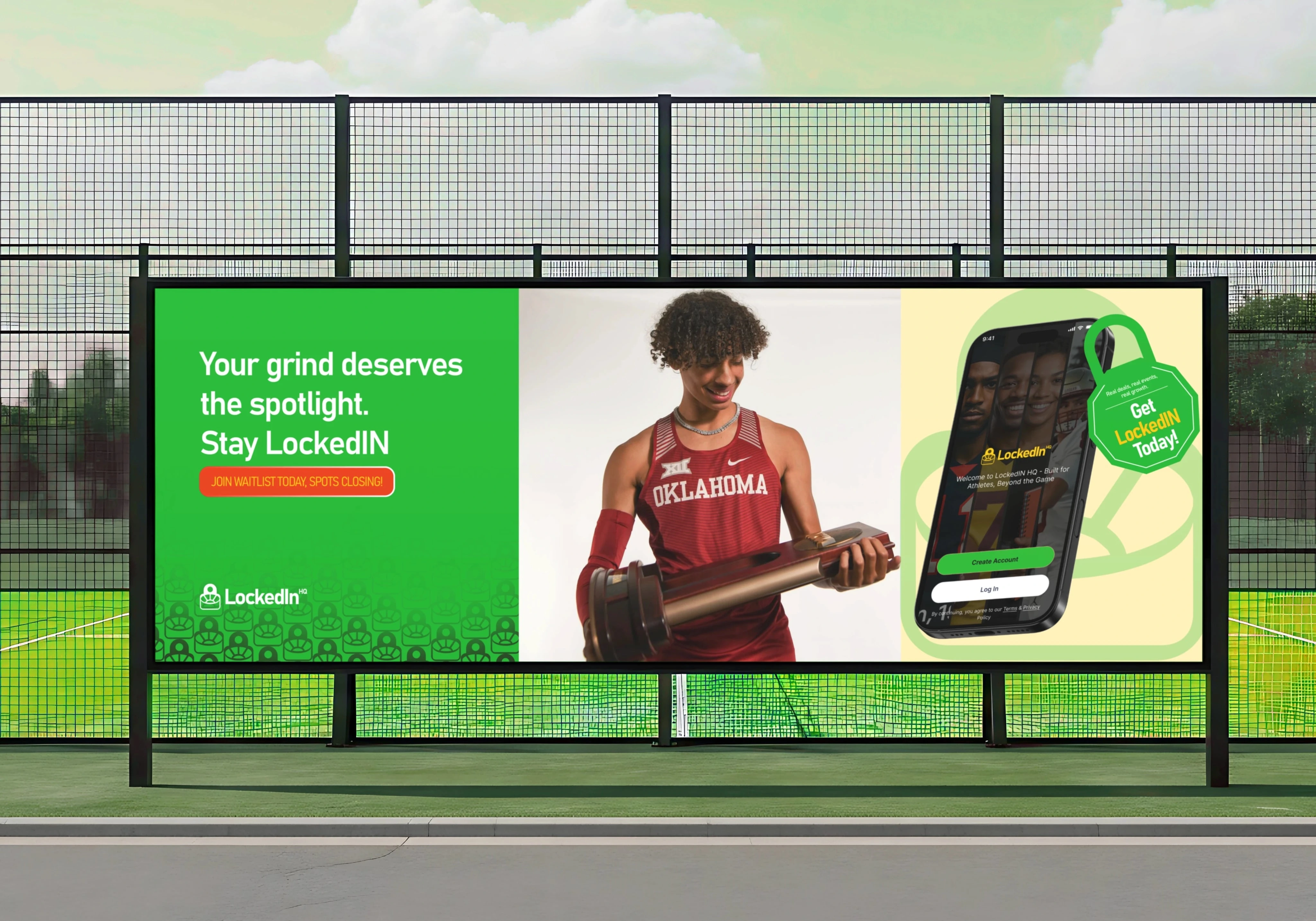
Lockedin HQ | Full Brand Architecture and Identity System
Designing the Visual DNA of the Athlete Economy
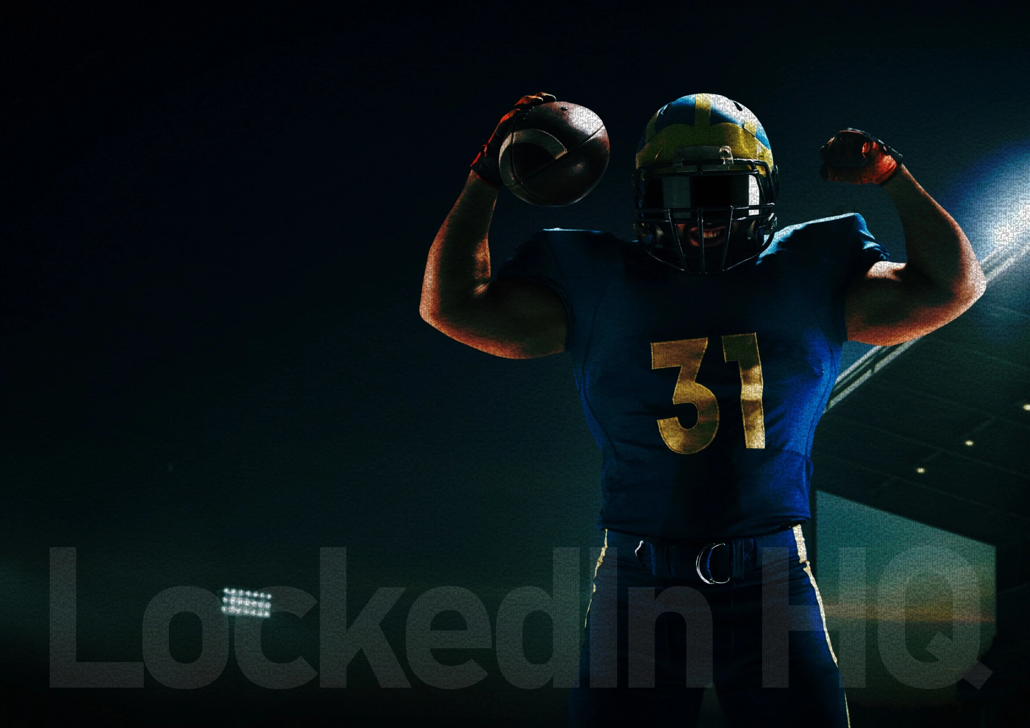
Jemirae was tasked with building the foundational identity for Lockedin HQ, a lifestyle and empowerment platform for the modern athlete. We moved beyond simple logo design to craft a comprehensive visual movement based on the Locked In mindset: discipline, clarity, and ownership.
The logo animation we designed
The Strategy: Focus Over Noise
Our objective was to create a bold, athlete-first identity that positions Lockedin HQ as a centralized digital hub. We developed a strategic framework that balances the raw energy of sports with the technical sophistication of a digital ecosystem.
The Jemirae Strategy focused on three pillars:
Focus over Noise: Cutting through digital distraction with high-intent clarity.
Empowerment over Exposure: Giving athletes the visual tools to own their narrative.
Performance over Hype: Building institutional credibility through strict design consistency.
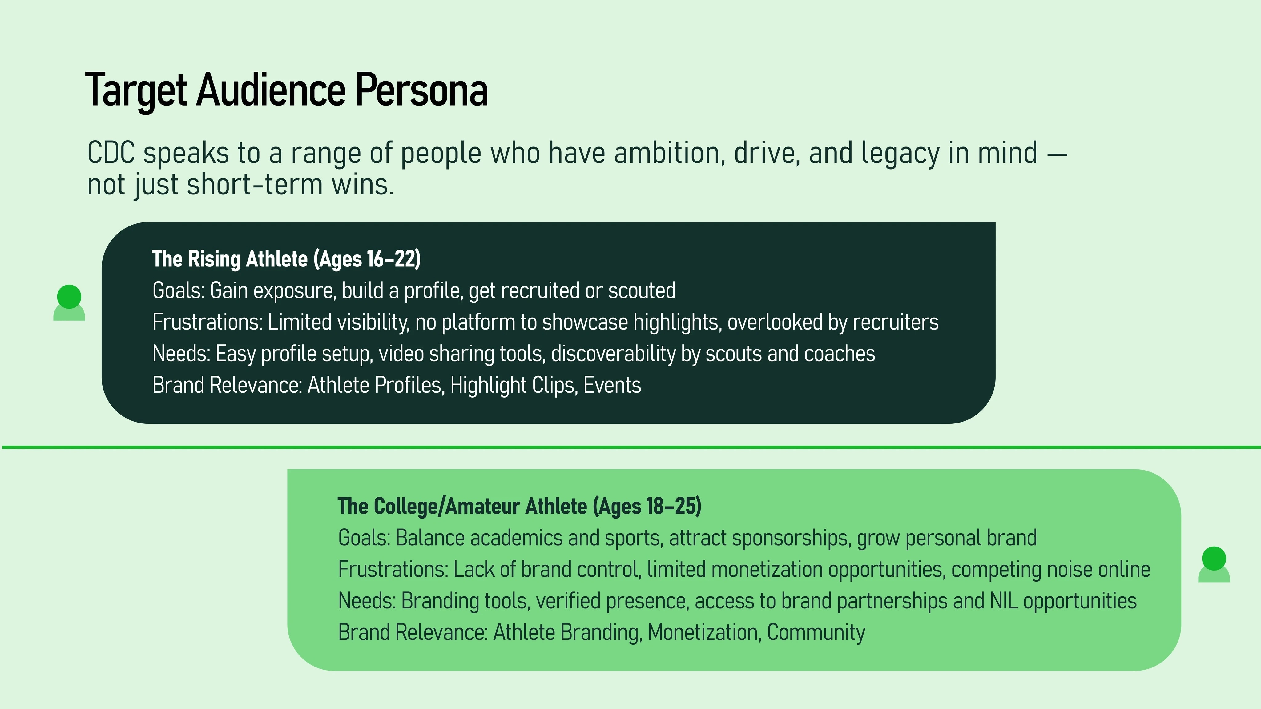
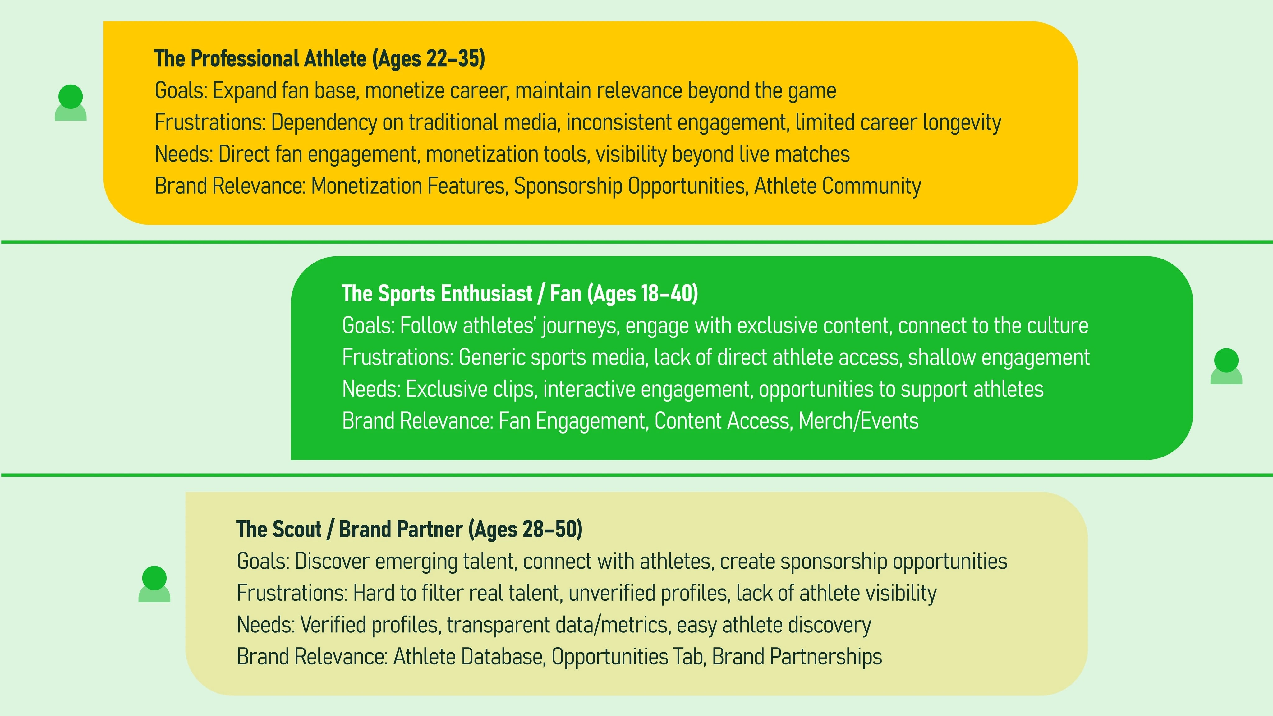
The Visual Identity: Engineering a Movement
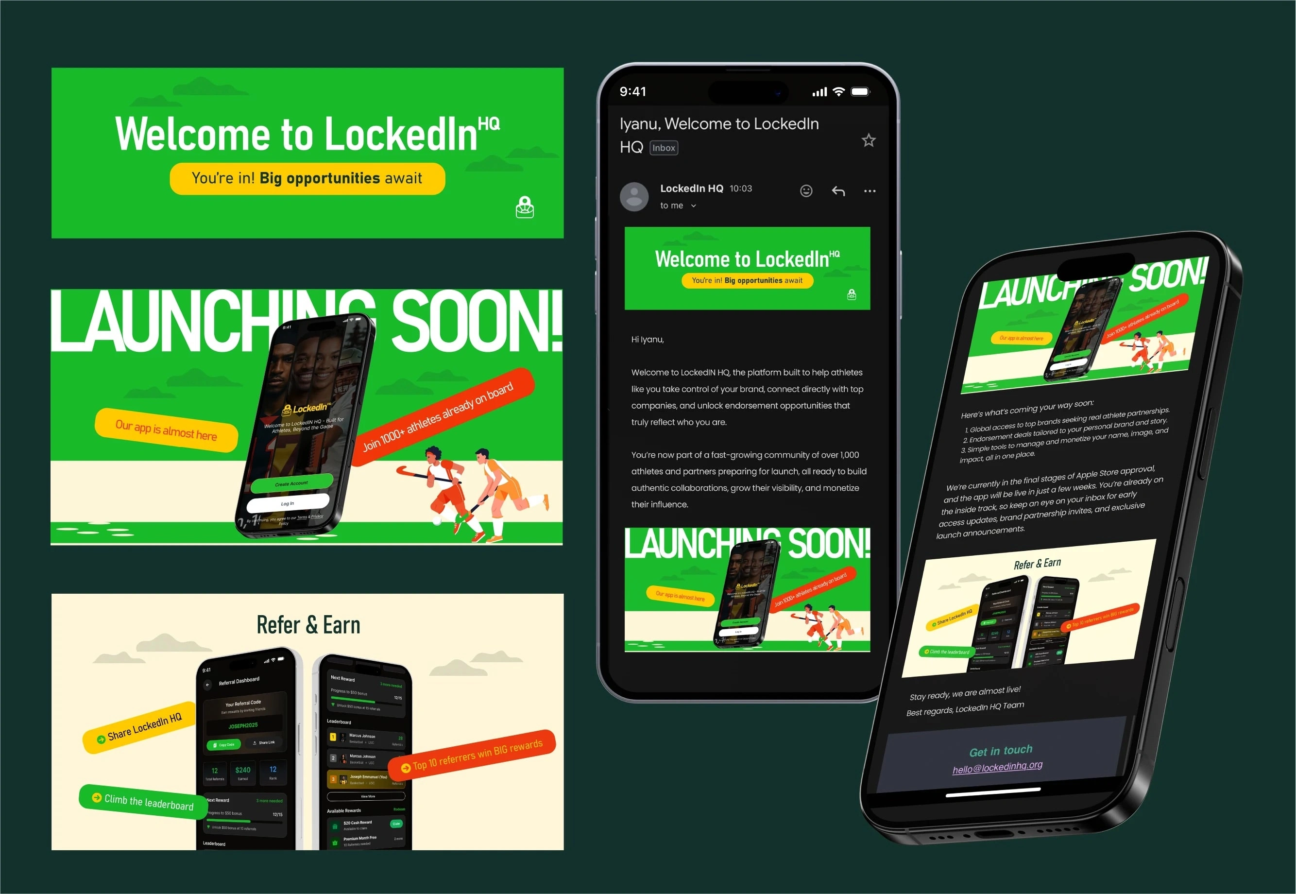
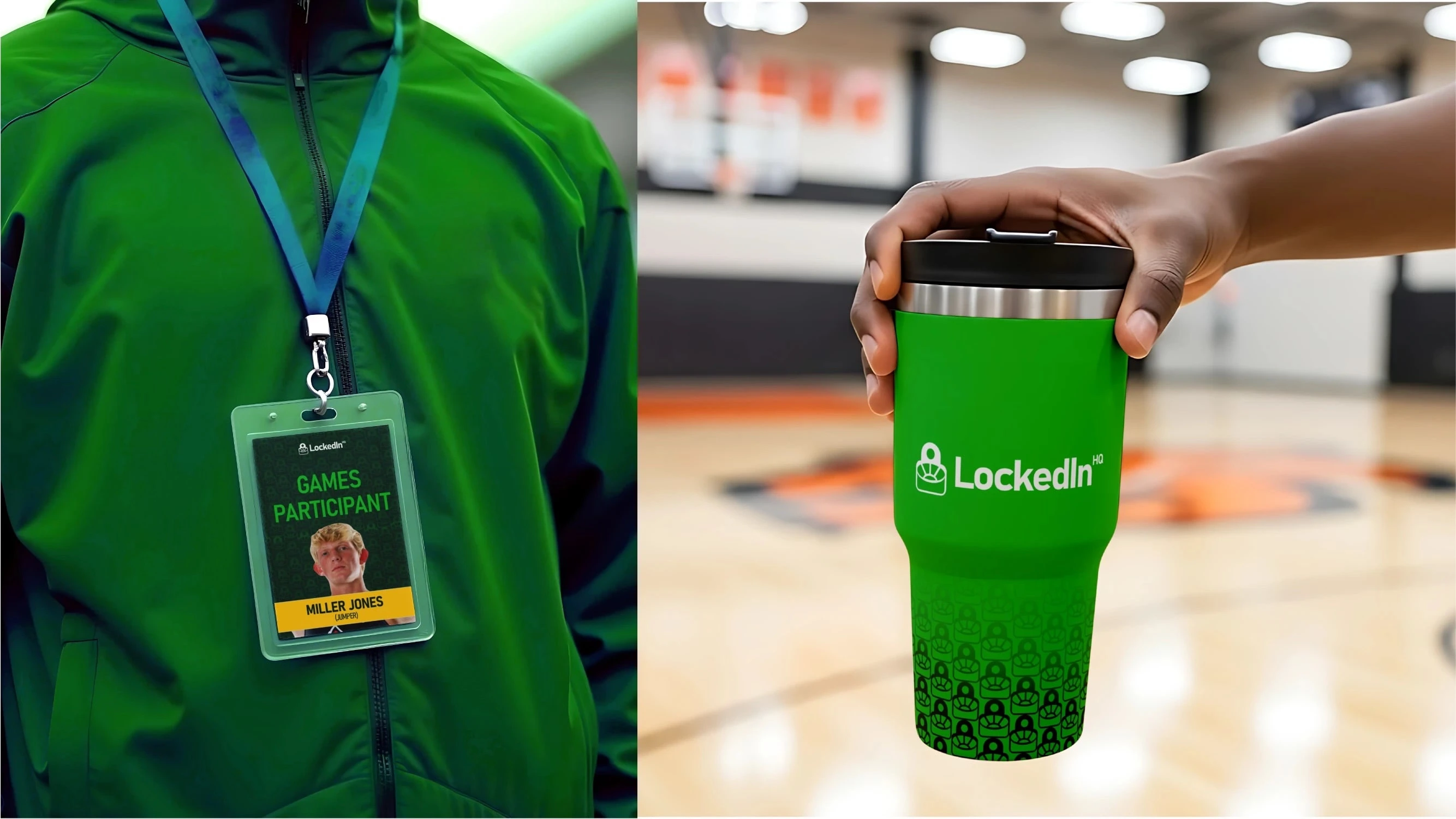
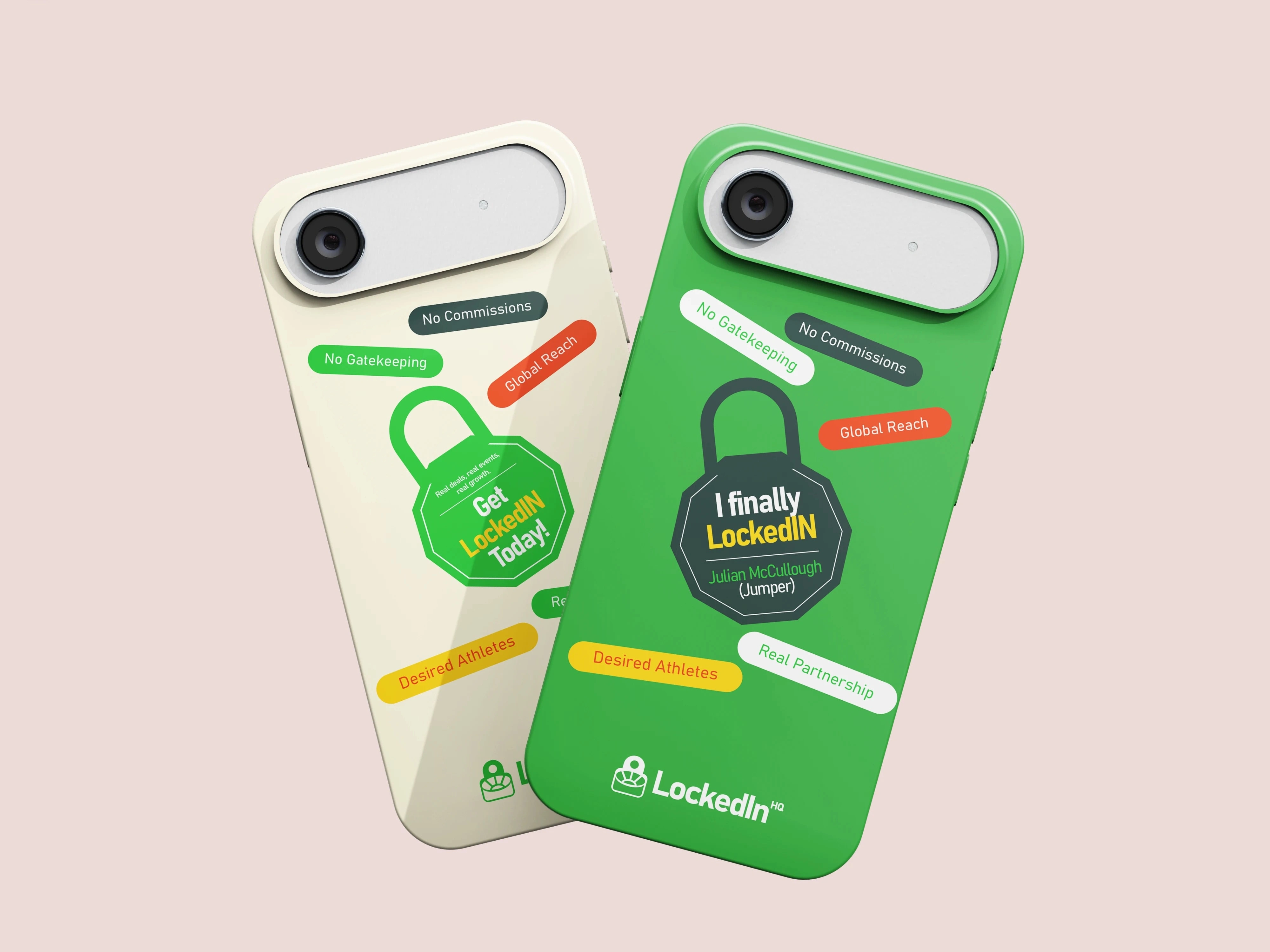
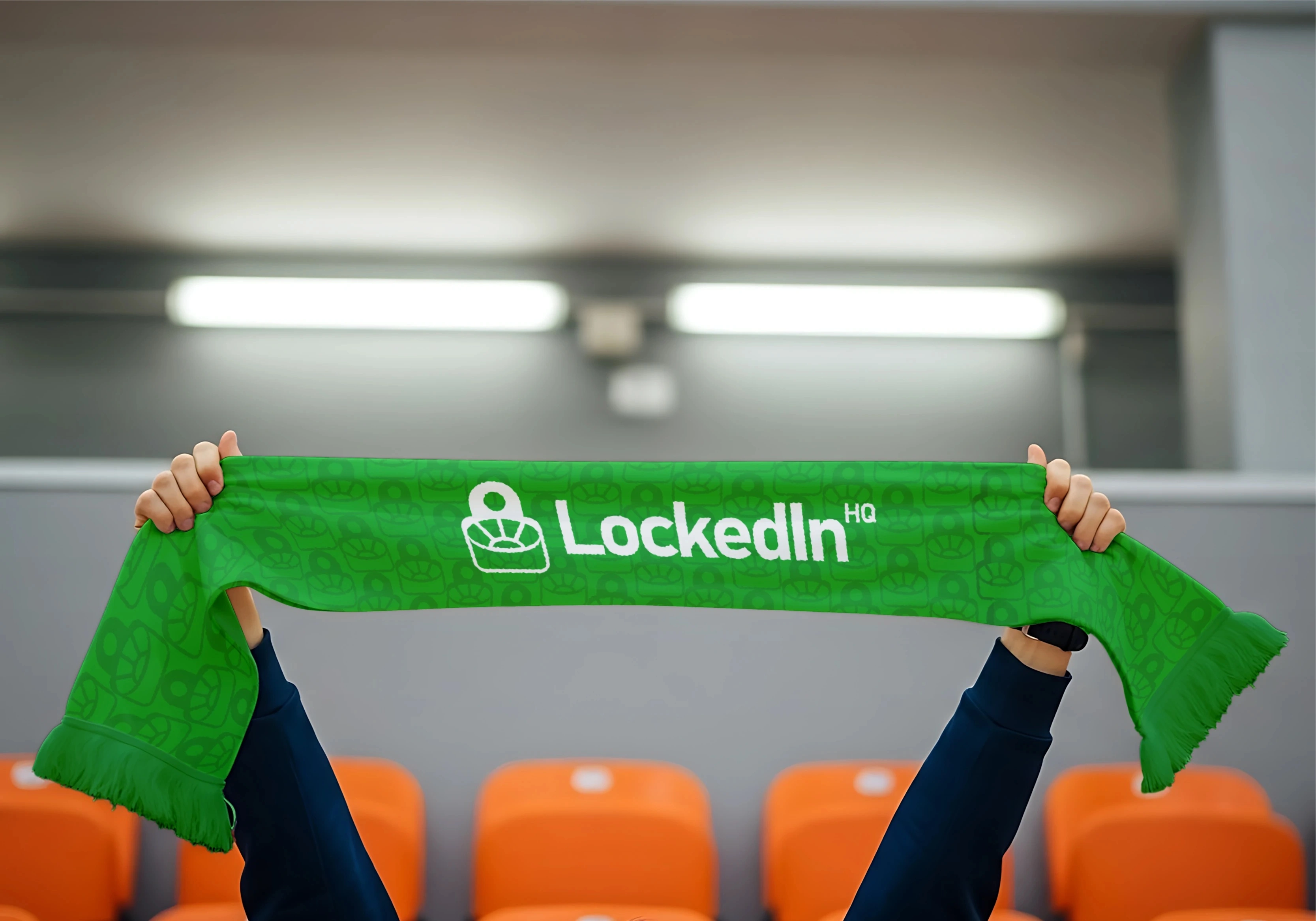
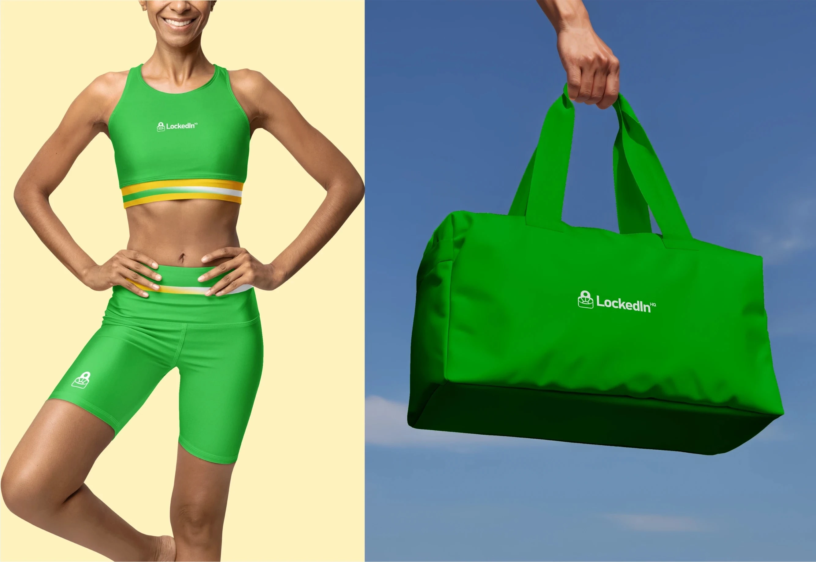
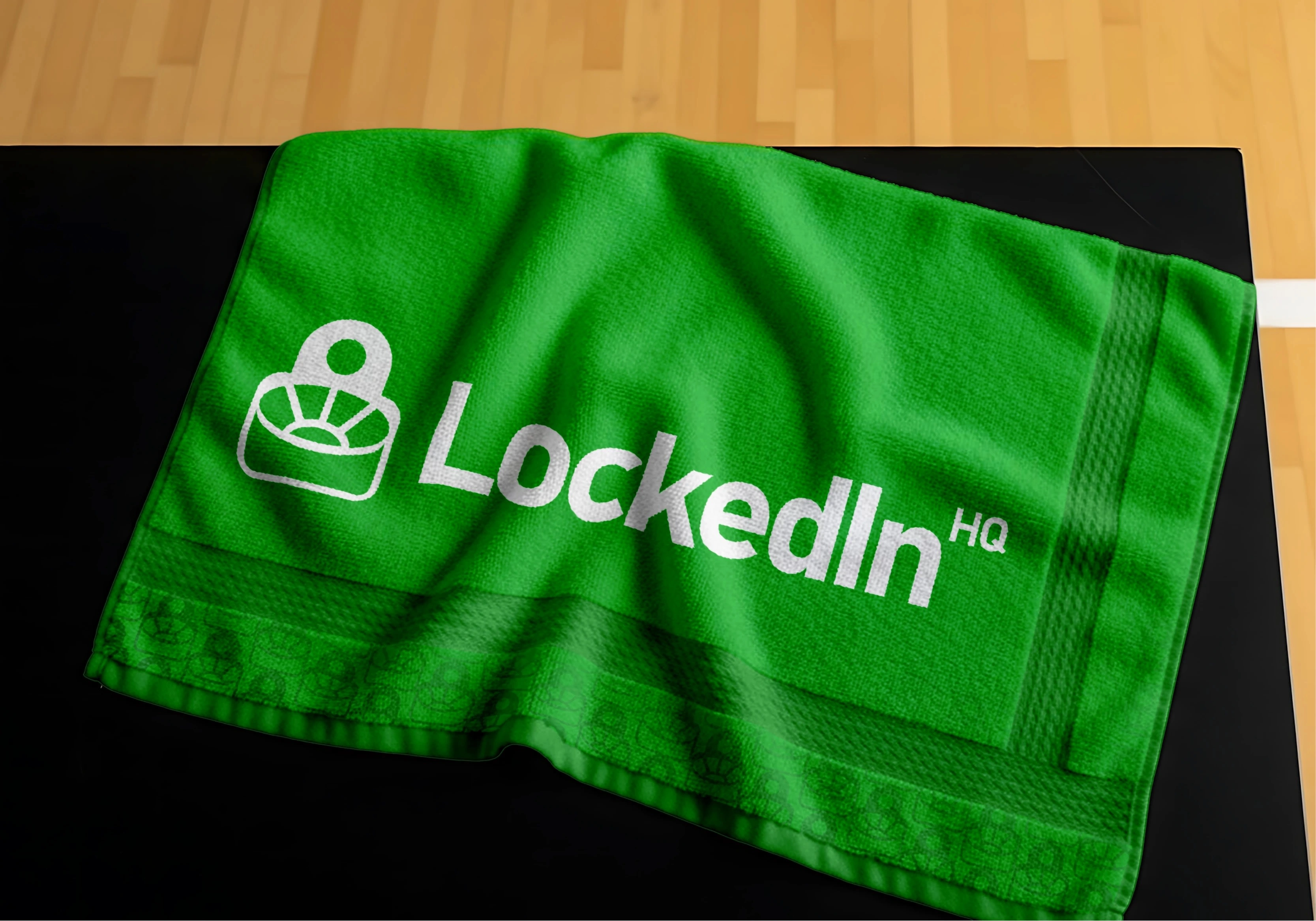
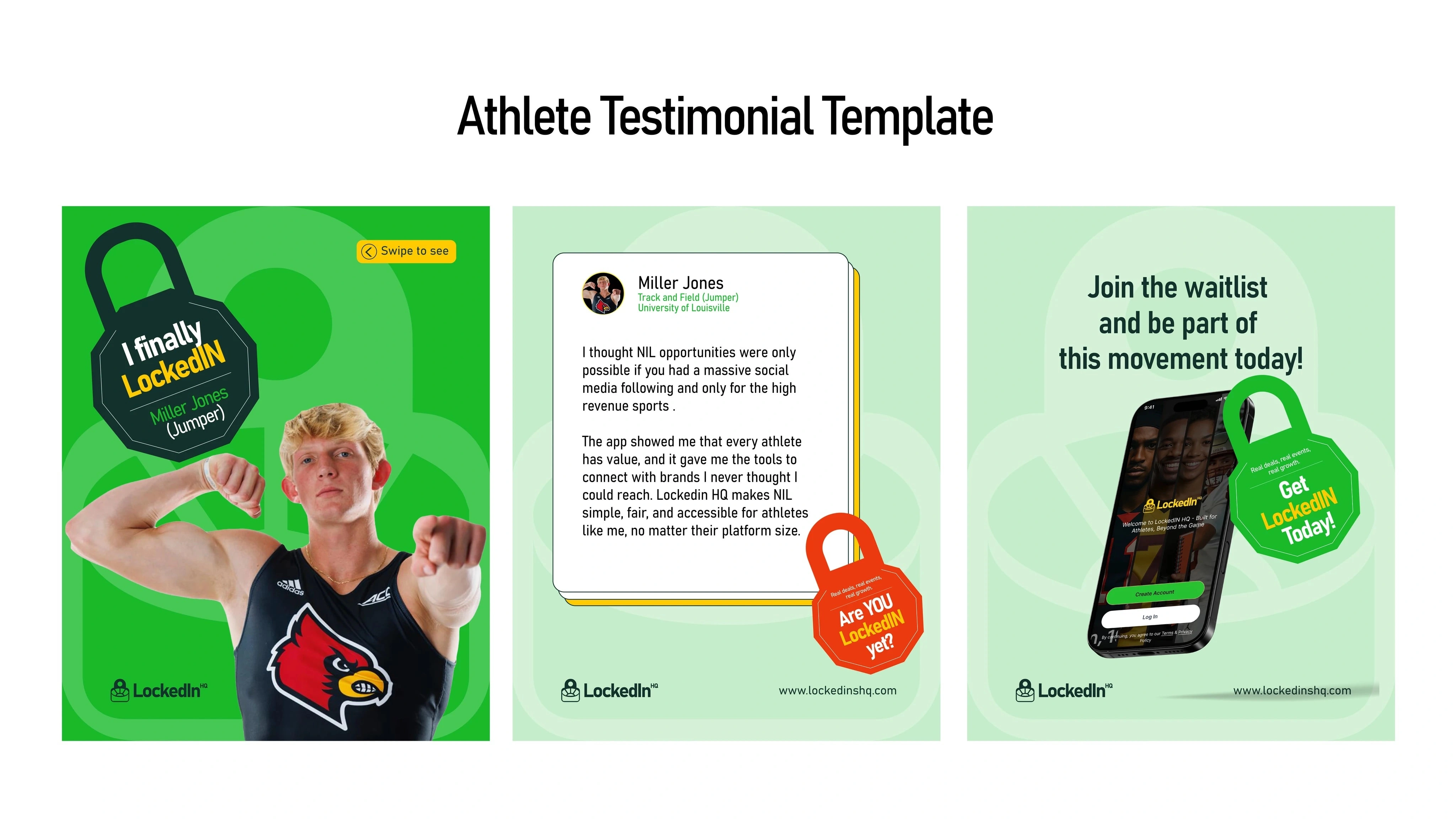
We engineered a high-performance visual system designed for instant recognition across web, app, and merchandise.
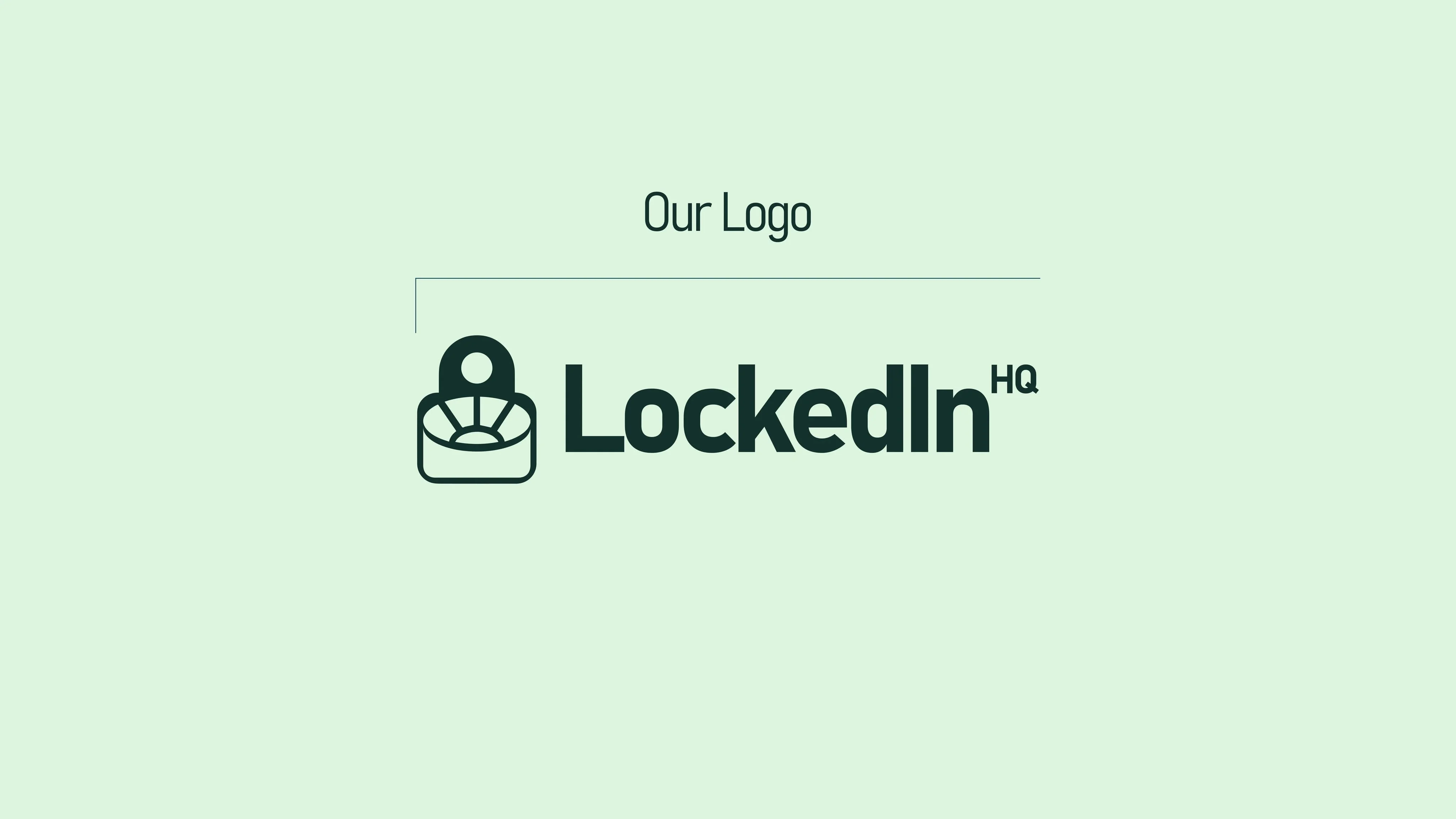
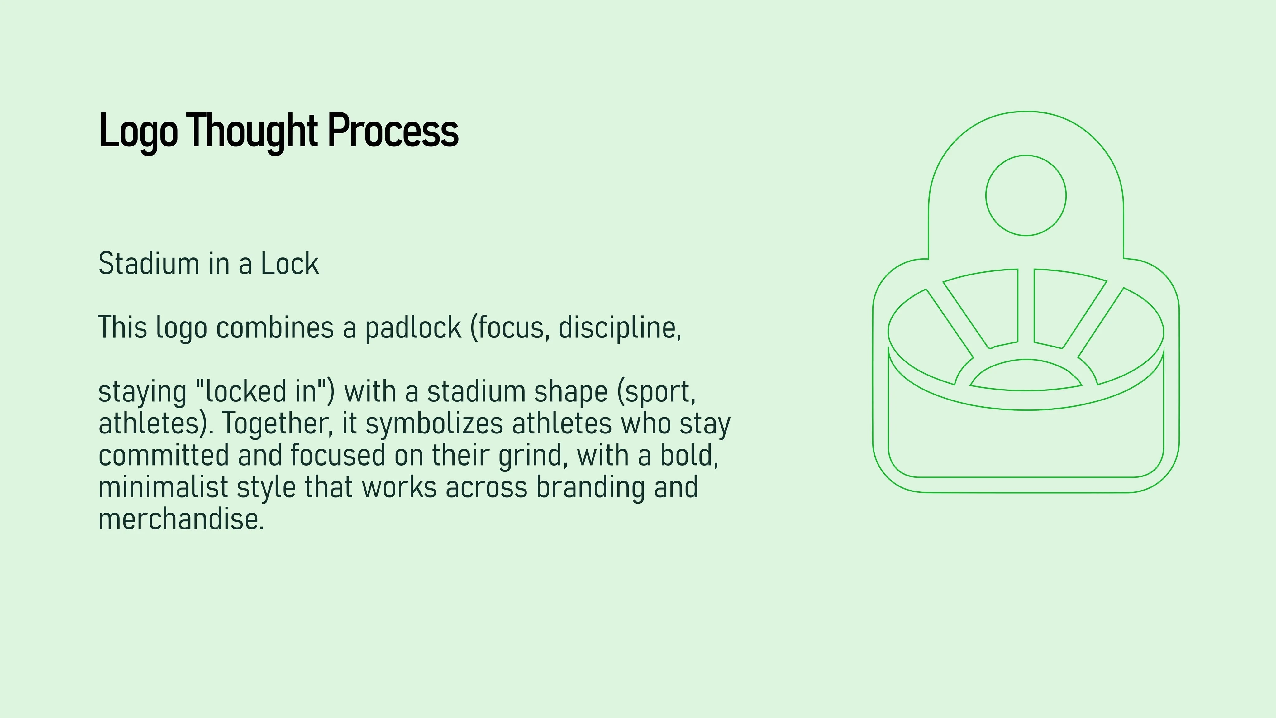
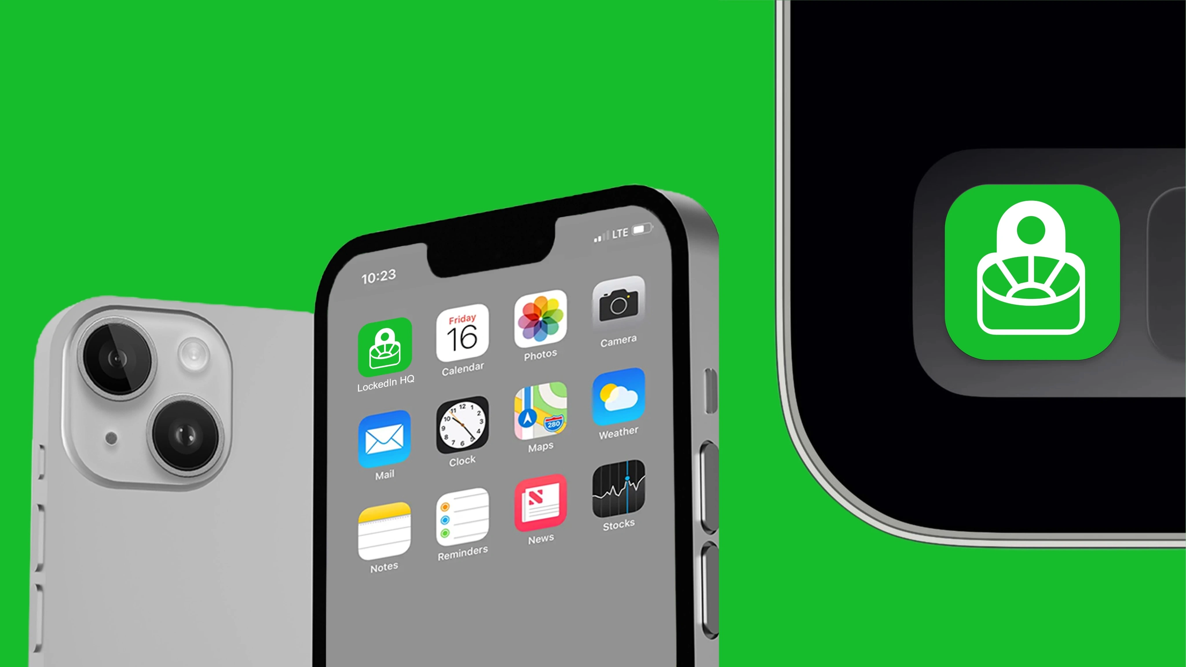
The Logo Mark: A stadium-meets-padlock icon symbolizing the intersection of discipline and opportunity.
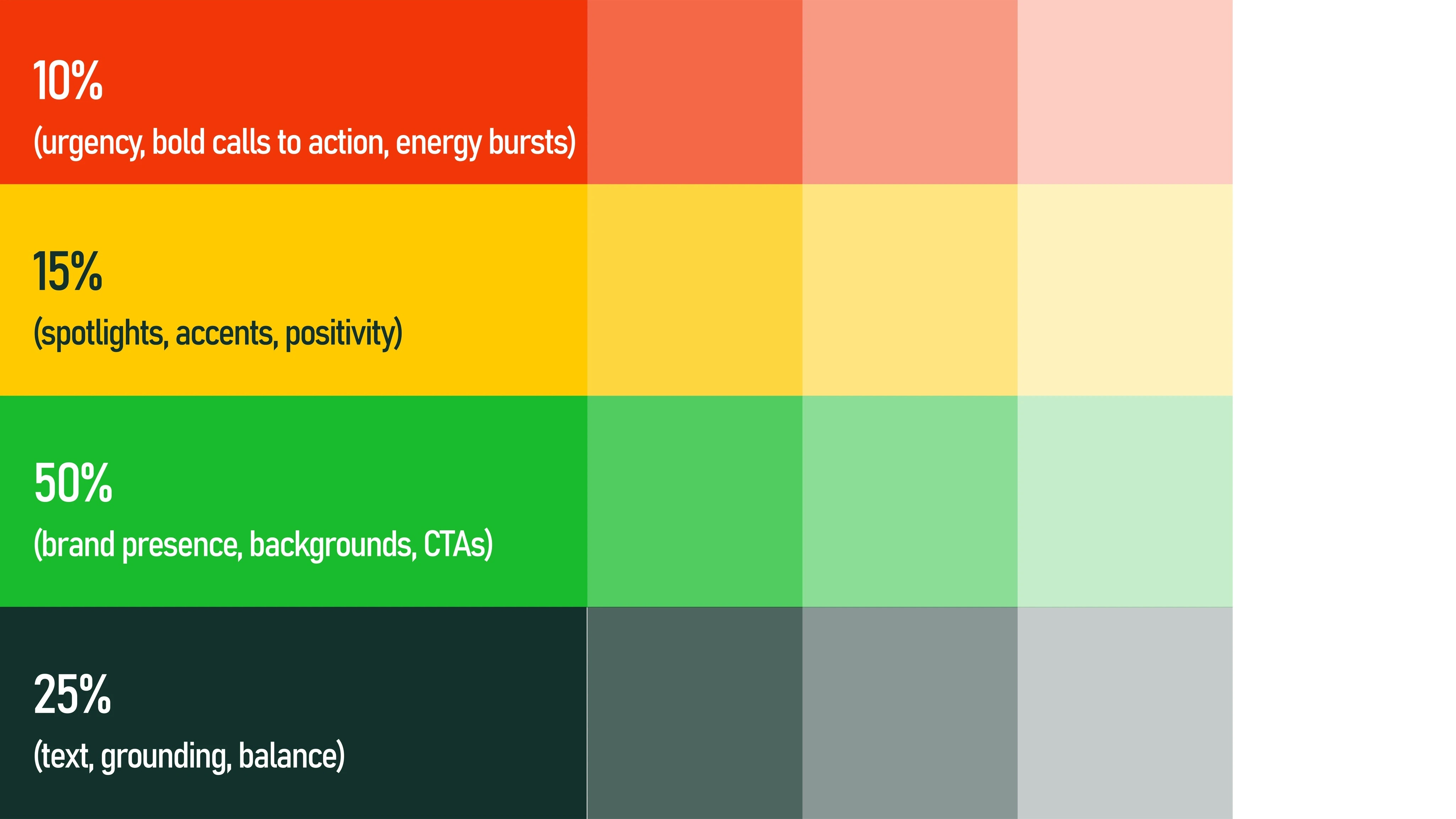
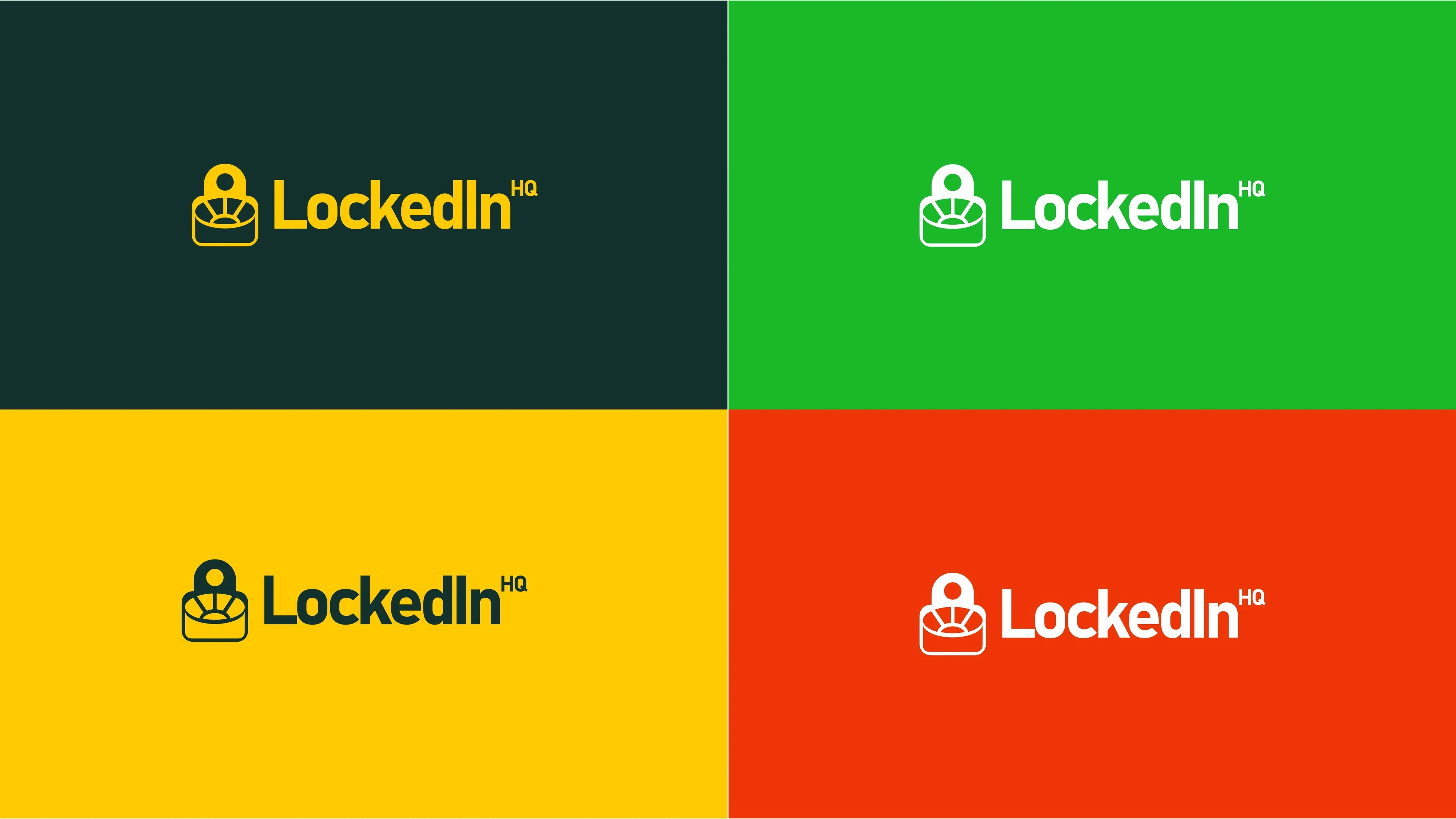
Color System: A high-contrast palette designed to balance focus and energy, optimized for high-readability on mobile interfaces.
Typography: Confident, modern typefaces selected for their scalability across digital platforms and physical apparel.
The Brand Voice: A Global Teammate
Jemirae defined a tone that is bold, empowering, and focused. We designed the voice to adapt across different channels:
Social Platforms: Fast-paced, high-energy, and athlete-centric.
Web & App: Clear, confident, and focused on goal-oriented navigation.
Community: Motivational and grounded in real athlete experiences.
Brand Governance & Scalability
To ensure long-term growth, Jemirae developed comprehensive Brand Identity Guidelines. This manual details logo usage, color specifications, and typographic hierarchy. This governance-first approach ensures a cohesive visual experience across all digital and print media, effectively turning the brand into a reusable enterprise asset.
Institutional Impact & ROI
$1M Seed Funding Milestone: The comprehensive visual identity system was a core component of the investor deck that successfully secured the startups initial seven-figure funding.
1,000+ Organic Pre-Launch Signups: The professional authority of the brand architecture directly contributed to the high conversion rate of the marketing landing page without any paid ad spend.
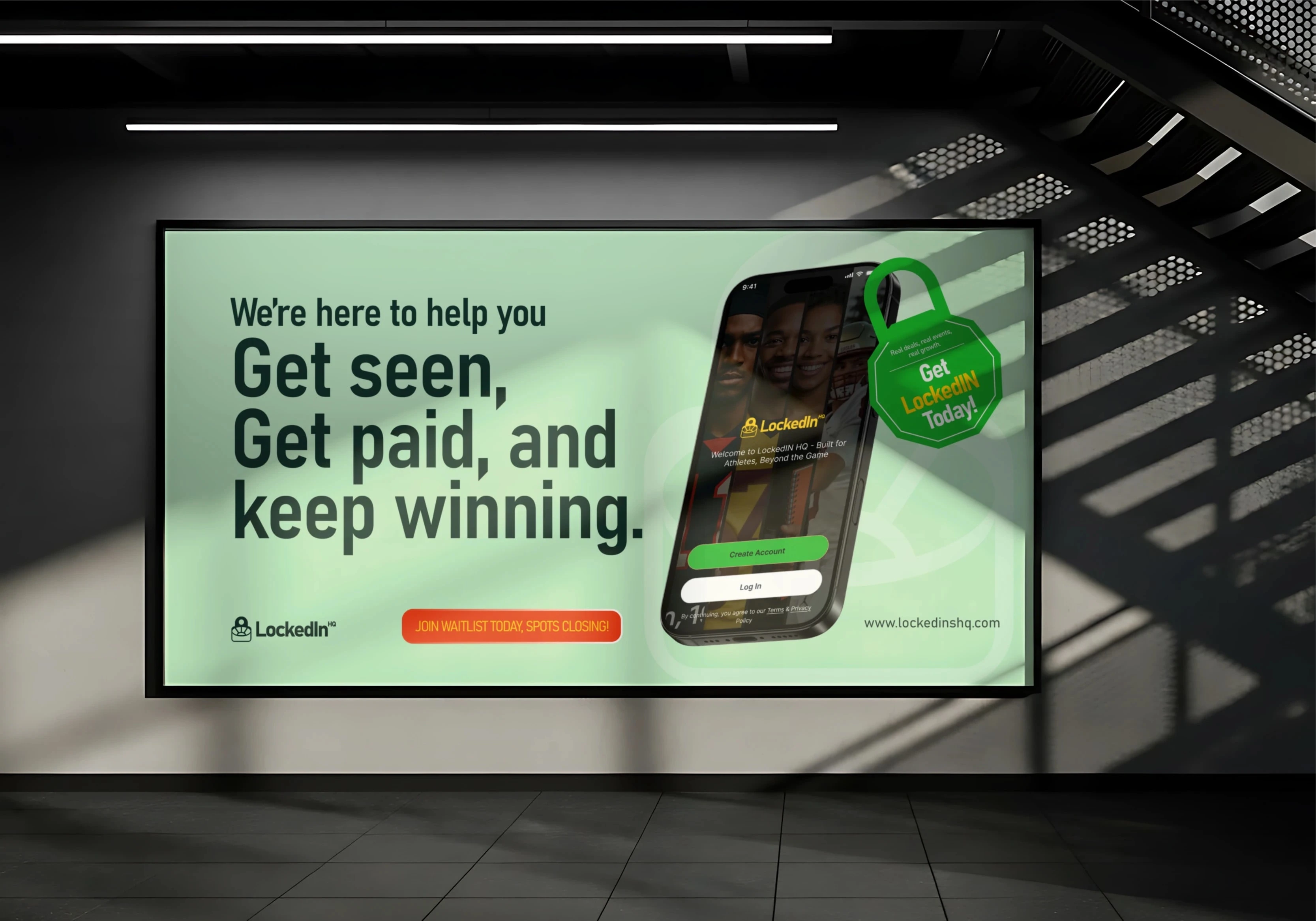
100% Cross-Platform Consistency: Successful deployment of the brand DNA across the mobile app, web platform, and physical athlete merchandise within 90 days.
Market Authority: Established Lockedin HQ as the primary source of truth in the NIL space, leading to three major brand partnership inquiries within the first month of the identity launch.
3 likes · 23 views · Apr 8, 2026
Jemirae designed the visual DNA for LockedInHQ, crafting a bold athlete-first identity system with a stadium meetspadlock logo and high-performance guidelines
Timeline
Aug 13, 2025 - Sep 2, 2025
Tags


Collaborators
