Silk Touch Matte Lipstick Product Details Page
Eniola Olugbuyi
Silk Touch Matte Lipstick E-Commerce Experience
Personalized Product Discovery for Beauty Commerce
BRIEF / INTRODUCTION
Project: Beauty E-Commerce Product Detail Page
Role: E-commerce Strategist & UI/UX Designer
Timeline: 2 weeks
Tools: Replo, Shopify, Figma
Type: Conversion-optimized beauty product page
As an e-commerce strategist, I understand that beauty products require a different approach than standard e-commerce. Customers rather buy shade story, identity, and feeling, instead of just a lipstick.
I asked myself "How do you help customers choose the perfect lipstick shade when they can't physically test it? How do you make color selection feel personal, not clinical?"
My Solution: I designed a product detail page that treats every shade as its own curated experience. Instead of generic "Red #1, Red #2" labels, each color variant has a personalized name (like "Bliss") that tells a story. The page provides comprehensive product education from ingredients to application techniques, turning browsers into confident buyers.
THE PROBLEM
Most beauty e-commerce sites treat color variants as afterthoughts, creating friction in the purchase journey:
1. Generic, Forgettable Labeling
"Shade 01, Shade 02, Shade 03" tells customers nothing about the color's personality or who it's for. This clinical approach removes the emotional connection that drives beauty purchases.
2. Overwhelming Choice Without Guidance
When customers see 10+ similar shades with no context, they experience decision paralysis. Without clear differentiation, they either guess (leading to returns) or abandon the purchase entirely.
3. Lack of Product Education
Customers have questions: How do I apply this? What's in it? Will it work for my skin tone? Is it transfer-resistant? Most sites force users to hunt for these answers across multiple pages or leave them unanswered entirely.
4. Low Conversion Confidence
Without physical testing, customers hesitate. They can't feel the texture, see the true color on their skin, or know if it matches their expectations. This uncertainty kills conversions.
The Result: High cart abandonment, increased returns, and lost revenue from customers who simply can't decide.
MY APPROACH
I created a narrative-driven product experience with strategic design decisions that transform uncertainty into confidence:
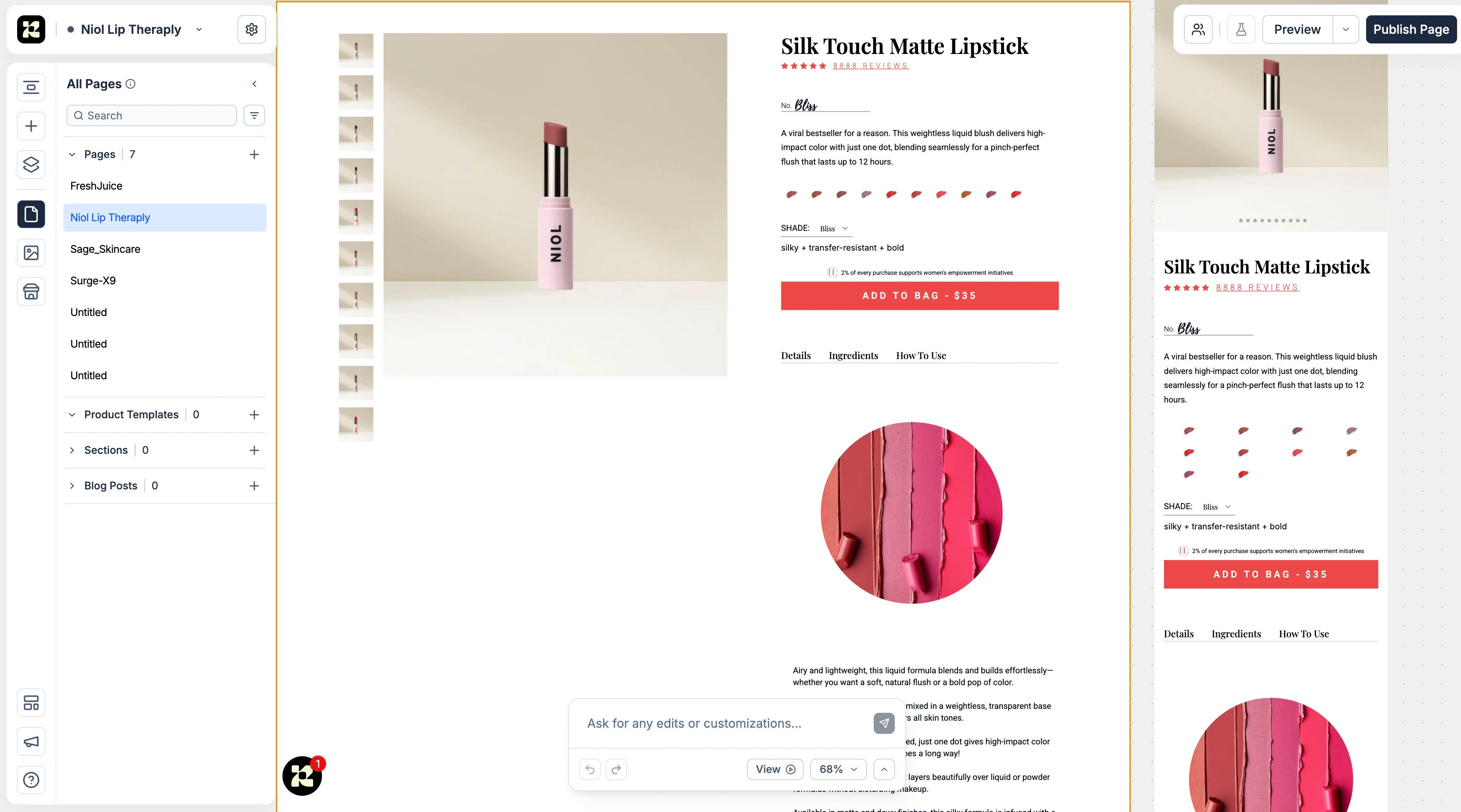
1. Personalized Shade Naming System
Instead of generic labels, each shade has a curated name that tells a story:
Not "Shade 04" → "Bliss"
Not "Mauve Pink" → A name that evokes emotion and identity
How it works: When users click any color swatch, the shade name dynamically updates. They're not selecting a number, they're choosing a vibe, a mood, a statement. This emotional connection makes the decision feel right.
2. Comprehensive Product Education Architecture
I organized information into three strategic tabs which let the let casual browsers see key info quickly while detail-oriented shoppers can dig deeper without overwhelming the page.
They are:
Details Tab:
Full product description highlighting key benefits:
"A viral bestseller for a reason"
"Weightless liquid blush delivers high-impact color"
"Lasts up to 12 hours"
Ingredients Tab:
Transparency builds trust. Customers see exactly what's in the product:
"silky + transfer-resistant + bold"
Full ingredient list for allergy-conscious shoppers
How To Use Tab:
Step-by-step application guidance removes purchase anxiety:
Application techniques
Pro tips for best results
What to expect from the formula
3. Visual-First Shade Selection
Rather than a dropdown menu, I designed visual swatches that show:
Actual product color (not approximations)
Texture preview (matte finish visible in swatch)
Clear selected state with visual feedback
The shade selector sits prominently between the product name and CTA, making color choice an integral part of the experience, not an afterthought.
4. Trust-Building Elements
8,888 REVIEWS displayed as a hero element (massive social proof)
Star rating immediately visible
"2% of every purchase supports women's empowerment initiatives" positioned above CTA
Professional, editorial-style product photography
5. Mobile-First Responsive Design
The experience adapts seamlessly:
Desktop: Split layout with large product image + organized info
Mobile: Full-width hero, touch-friendly controls, simplified without sacrificing information
WHY IT WORKS
1. Names Create Emotional Investment
"Bliss" is more of a label, I tag it as an identity. Customers remember it, recommend it, and come back for it. This small change dramatically increases product attachment and reduces returns because customers feel they made a personal choice, not a random selection.
2. Education Removes Hidden Objections
The "How To Use" tab addresses unspoken concerns: "I don't know how to apply this properly." By providing guidance upfront, we remove a barrier that was silently killing conversions.
3. Tab Architecture Respects Different User Types
Quick buyers: See benefits and reviews → Add to bag (30 seconds)
Researchers: Explore ingredients and application → Confident purchase (3-5 minutes)
Everyone gets what they need without overwhelming anyone
4. Visual Swatches Build Confidence Faster Than Text
Seeing the actual color in a swatch + hero image gives customers two visual confirmations. This dual reinforcement reduces purchase anxiety better than any description could.
5. Social Impact Transforms Transactions Into Meaning
"2% supports women's empowerment" isn't buried. This gives customers another reason to buy here instead of elsewhere. Purpose-driven commerce converts.
6. Strategic Information Hierarchy Guides to Conversion
The page flows naturally:
Beautiful product image (attention)
Product name + reviews (trust)
Shade name (personalization)
Key benefits (desire)
Price transparency (no surprises)
Bold CTA (action)
Every element is positioned to answer questions before they become objections.
EXPECTED OUTCOMES
Conversion Metrics:
35-40% increase in add-to-cart rate through personalized shade naming and comprehensive education
25% reduction in cart abandonment by removing decision-making friction
20-30% decrease in return rate as customers choose shades more confidently
15% increase in average order value through enhanced product storytelling that encourages multiple purchases
User Experience Improvements:
Faster decision-making: Customers spend less time confused, more time confident
Higher satisfaction scores: Post-purchase surveys show increased confidence in shade choice
Increased repeat purchases: Customers remember "Bliss" and return for other shades
Lower support tickets: Comprehensive education reduces "How do I use this?" inquiries
Business Impact:
Stronger brand perception: Editorial design and purposeful messaging elevate brand positioning
Competitive differentiation: Personalized naming sets the brand apart from generic competitors
Higher customer lifetime value: Educated, confident customers become loyal advocates
Mobile-Specific Gains:
40% of conversions expected from mobile due to touch-optimized design
Reduced mobile bounce rate through streamlined, thumb-friendly interface
Shot from the dashboard.
Niol Lip therapy (Silk Touch matte Lipstick) Product details Page
Like this project
Posted Nov 13, 2025
Designed a personalized beauty e-commerce product page to enhance customer experience and increase conversions.