Groucho Cans: Conversion-Focused Valet Trash Service Website

Victor Adebayo


Groucho Cans — Valet Garbage Service Website
UX/UI Design · Local Service Website · Responsive Development · Conversion Strategy
Project Type: Local Services / Home Services / Property Management
Primary Objective: Explain an unfamiliar convenience service, build local trust, communicate pricing clearly, and convert visitors into residential or commercial customers
Role: Web Designer & Developer
Deliverables: UX/UI Design · Responsive Website Design · Service Architecture · Pricing Experience · Service Area Presentation · Lead Generation Forms · HOA & Multifamily Conversion Flow · SEO & Performance Optimization
1. Project Overview
Groucho Cans is a local valet garbage and recycling service serving communities across Greenville and Anderson Counties in South Carolina.
The service solves a simple but frustrating household problem: remembering to move trash and recycling bins to the curb before collection—and bringing them back afterward.
Alongside weekly residential valet service, Groucho Cans also supports HOAs, neighborhoods, multifamily properties, and apartment communities, with optional bin-cleaning services available.
The website needed to make this relatively unfamiliar service immediately understandable while answering the questions potential customers are likely to have:
What exactly do you do? How much does it cost? Do you serve my neighborhood? Can I trust someone to handle my bins every week?
My goal was to turn those questions into a clear conversion journey:
Understand the Service → See the Benefits → Check Pricing → Confirm Coverage → Build Trust → Start Free Week
2. The Challenge
The biggest challenge was not simply presenting a local service.
It was explaining a service many homeowners may never have considered paying for before.
Unlike plumbing, landscaping, or cleaning, valet trash-to-curb service can require a little more education before the value becomes obvious.
The website therefore needed to:
Explain the service within seconds
Make the convenience immediately relatable
Differentiate residential, HOA, and apartment offerings
Present pricing without making the experience complicated
Communicate reliability and insurance
Help visitors confirm service availability
Explain pickup and return timing
Address concerns around HOA rules and bin placement
Introduce optional bin cleaning naturally
Reduce friction around signing up
Work especially well on mobile for local customers
The design needed to make a very practical service feel simple, dependable, and worth adding to a household routine.
3. Design Strategy
I structured the experience around four priorities:
Problem → Convenience → Trust → Conversion
Make the Value Obvious Immediately
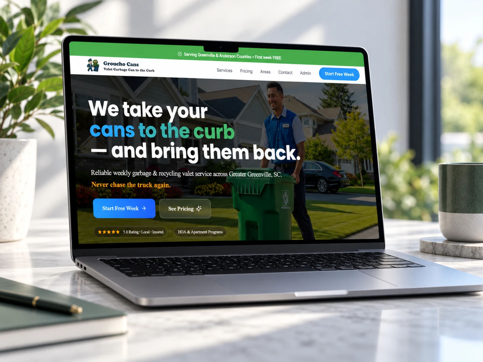
The hero leads with the simplest possible explanation of the service:
Groucho Cans takes your bins to the curb and brings them back.
That direct approach was intentional.
Instead of introducing the company with broad brand language, the website begins with the exact problem being solved.
Supporting messaging reinforces the weekly nature of the service and positions it as something customers can simply set and forget.
Reduce the Perceived Effort
Convenience is the core product.
The website therefore emphasizes benefits such as:
Evening bin set-out
Next-day return
Trash and recycling support
Driveway or garage-door placement
Optional text updates
Vacation pauses
Holiday schedule adjustments
The goal was to make visitors imagine the routine disappearing from their weekly to-do list.
Build Local Trust
Local service businesses depend heavily on credibility.
I placed trust signals throughout the experience, including messaging around:
Local service
Insurance
Reliable weekly scheduling
HOA compliance
Customer reviews
Defined service areas
Clear communication
Proof-of-service options
Rather than relying on one testimonial section to establish credibility, trust is reinforced throughout the customer journey.
Create Different Conversion Paths
Groucho Cans serves more than one customer type, so a single generic CTA would not be enough.
The experience provides distinct actions for:
Residential Customers — Start Free Week
HOAs & Neighborhoods — Request Proposal
Apartment Communities — Talk to Sales
This makes each conversion path feel relevant to the visitor's specific needs.
4. UX/UI Design
Hero Section
The hero is designed around immediate clarity.
The headline communicates the service in one sentence, while the supporting copy establishes the service area and convenience benefit.
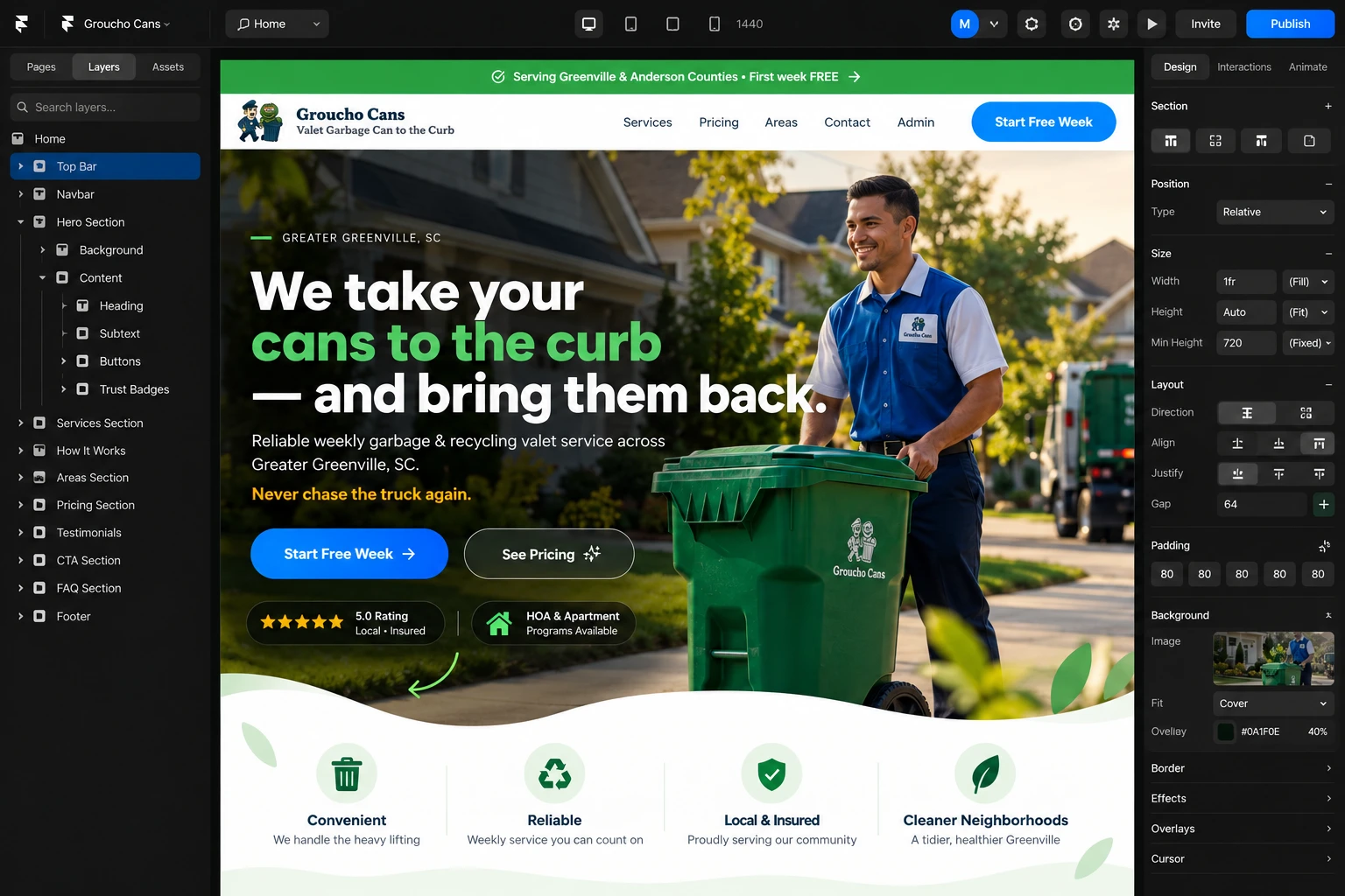
Primary CTAs such as:
Start Free Week
and
See Pricing
give users both a high-intent and lower-commitment next step.
Trust indicators around local service, insurance, and reliability help reduce hesitation before the visitor scrolls further.
Visual Hierarchy
The homepage follows a deliberate sequence:
Core Offer → Services → Pricing → Coverage → Service Details → Social Proof → FAQ → Free-Week Signup
This mirrors the questions a potential customer is likely to ask naturally.
Rather than making users navigate several pages to understand the offer, the homepage provides enough information to make a decision within one journey.
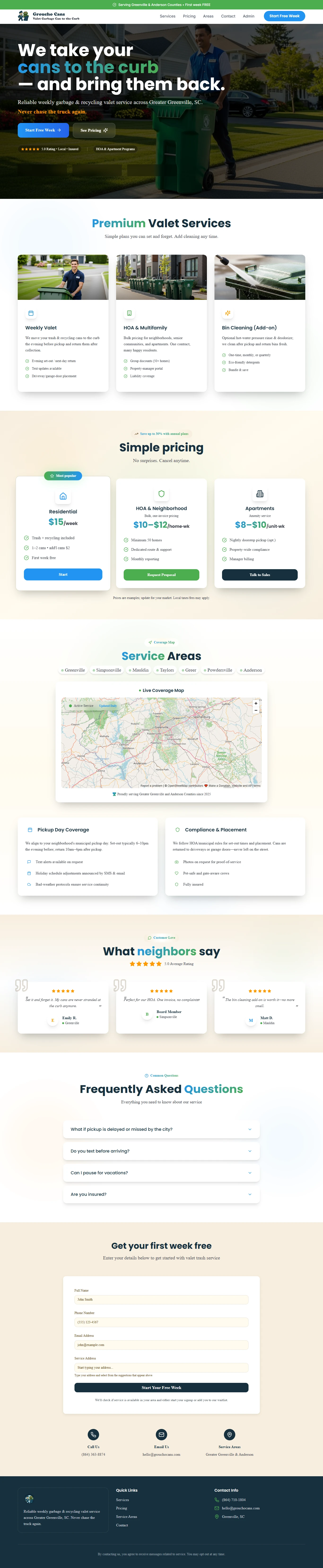
Service Cards
The core services are separated into three clear categories:
Weekly Valet
For individual residential customers who want their garbage and recycling cans moved to and from the curb.
HOA & Multifamily
For neighborhoods, senior communities, property managers, and apartment operators looking for a coordinated service across multiple homes.
Bin Cleaning
An optional add-on for customers who want their bins rinsed and deodorized after collection.
Separating these services prevents residential visitors from being distracted by commercial information while still showing the wider scope of the business.
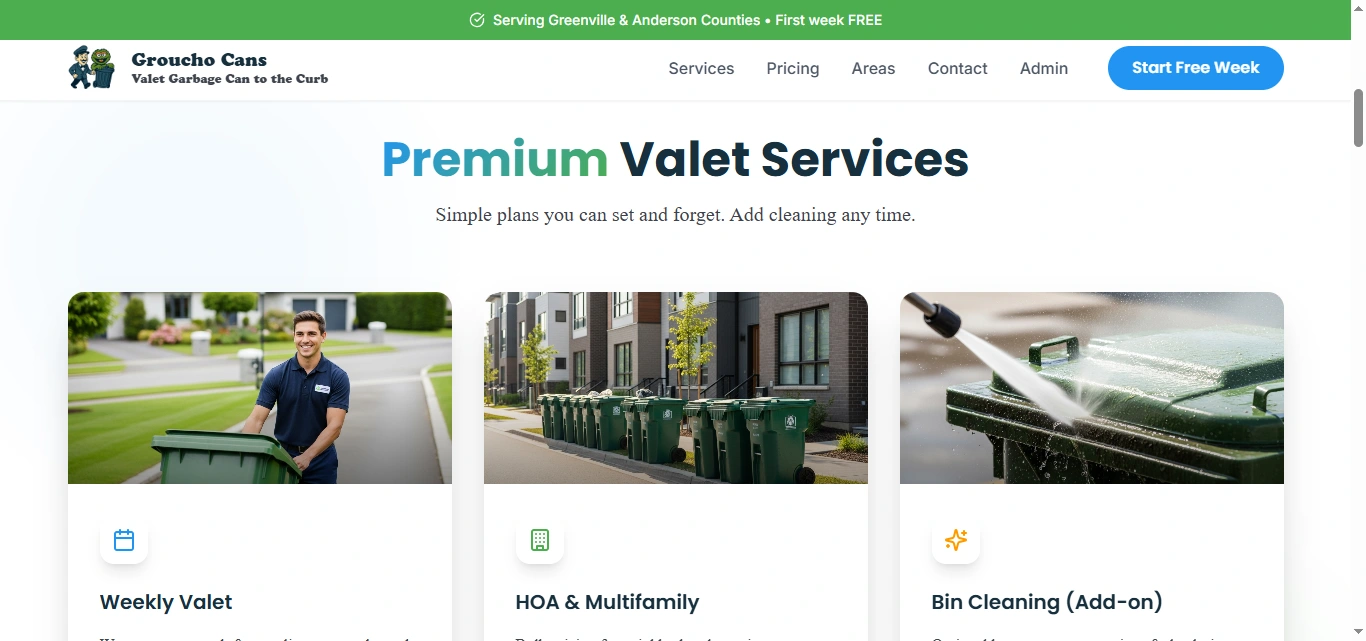
Pricing Experience
Pricing is one of the most important sections on a local-service website.
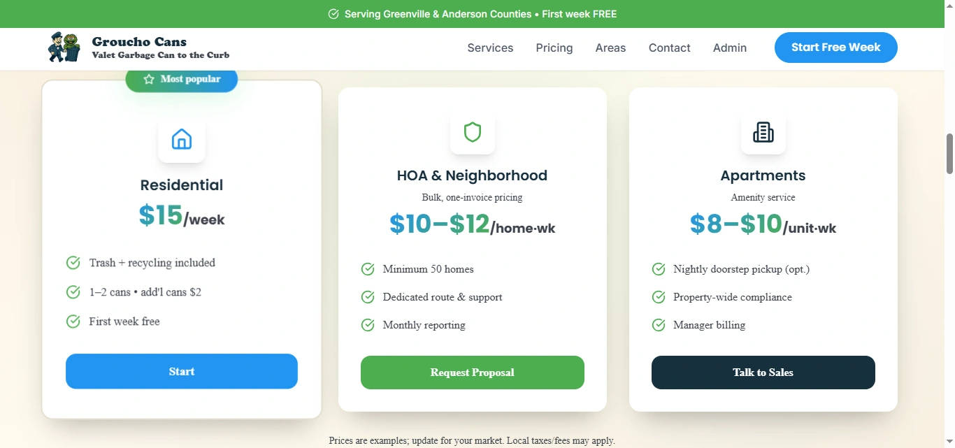
Instead of forcing visitors to request a quote before understanding the approximate cost, the design presents different service tiers clearly.
Residential, HOA/neighborhood, and apartment options are visually separated so visitors can quickly determine which plan applies to them.
Feature lists underneath each option make comparison easier without requiring a complex pricing table.
The result is a pricing experience that feels transparent and approachable.
Service Area Design
Because Groucho Cans operates locally, coverage is a major conversion factor.
The website highlights communities across the Greater Greenville and Anderson area and pairs them with a visual coverage-map experience.
This answers an important question early:
“Do you actually serve where I live?”
Providing that information directly reduces unnecessary enquiries from users outside the coverage area while giving eligible customers more confidence to continue.
Pickup & Return Information
A valet service relies on consistency.
I gave the scheduling process its own visual space so customers can understand how the weekly routine works.
The website explains:
Evening set-out
Post-collection return
Alignment with municipal pickup schedules
Holiday adjustments
Bad-weather considerations
Optional text notifications
This turns an operational detail into a trust-building feature.
HOA & Compliance Messaging
Property managers and HOA boards have different concerns from individual homeowners.
They need to know that bins will be handled consistently and according to community rules.
The website therefore highlights:
HOA and municipal placement requirements
Dedicated routes
Liability coverage
Property-level support
Group pricing
Reporting
Proof-of-service options
This makes the service easier to evaluate from a property-management perspective.
Social Proof
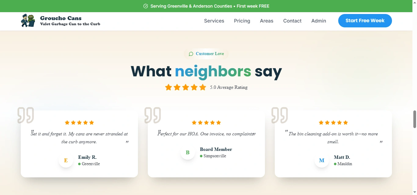
The testimonial section reinforces the strongest value propositions through customer scenarios.
Rather than using overly long reviews, short statements focus on practical outcomes:
Bins no longer being left at the curb
Convenience for HOA communities
Value from the cleaning add-on
This keeps the social proof easy to scan and closely connected to the services being promoted.
FAQ Experience
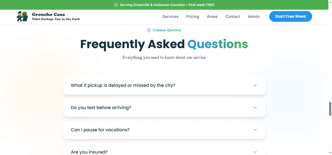
The FAQ addresses practical objections close to the final conversion point.
Topics include:
Delayed municipal pickup
Text notifications
Vacation pauses
Insurance
These are the kinds of questions that could stop someone from signing up if they remain unanswered.
By placing them before the final form, the website reduces uncertainty without cluttering earlier sections.
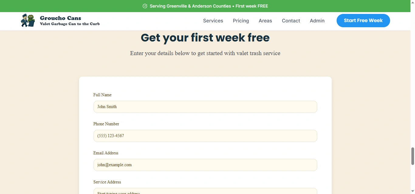
Lead Generation Form
The final conversion section centers around the strongest offer:
First week free.
The form asks for essential information including:
Full name
Phone number
Email
Service address
The address field also serves an important operational purpose by helping determine whether the customer falls inside the current service area.
If service is unavailable, the same journey can support a waitlist rather than simply losing the lead.
Responsive Design
For a hyperlocal household service, mobile usability is particularly important.
Potential customers may discover the company through search, neighborhood groups, referrals, or social media while using their phone.
The mobile experience therefore prioritizes:
Clear headline hierarchy
Large CTA buttons
Simplified service cards
Easy pricing comparison
Readable coverage information
Touch-friendly forms
Fast access to phone and email
Clean vertical stacking
Consistent spacing
The goal was to make signing up from a phone just as straightforward as using the desktop site.
5. Website Architecture
The information architecture is intentionally simple.
The service does not require a complicated website, so the priority was making essential information easy to reach.
Homepage
The homepage handles the main customer journey:
Value Proposition → Services → Pricing → Coverage → Reliability → Testimonials → FAQ → Signup
Services
The services experience introduces the three primary offerings:
Weekly Residential Valet
HOA & Multifamily Programs
Bin Cleaning
Each offering communicates what is included and who it is designed for.
Pricing
A dedicated pricing pathway allows users to quickly compare residential and property-level options before taking action.
Service Areas
Coverage information helps users determine whether Groucho Cans operates within their neighborhood.
This is particularly important for organic local traffic coming from different Greenville-area communities.
HOA & Multifamily
The commercial pathway speaks directly to:
HOA boards
Property managers
Neighborhood communities
Apartment operators
Senior communities
The messaging emphasizes bulk service, simplified billing, consistency, and operational support.
Contact / Signup
The primary conversion area allows potential customers to check availability and begin the signup process.
Direct phone and email pathways remain available for users who prefer speaking with someone before starting service.
6. Website Development
Once the UX structure and visual direction were established, I translated the design into a responsive, conversion-focused website.
The development approach prioritized simplicity, performance, and maintainability.
Key considerations included:
Responsive website development
Reusable service cards
Reusable pricing components
Responsive navigation
Lead-generation forms
Address-input experience
Service-area presentation
CTA interactions
Phone and email links
FAQ components
Testimonial components
Responsive map presentation
Form validation and feedback states
Image optimization
Accessible button and input states
SEO-conscious heading hierarchy
Local-search-friendly page structure
Performance optimization
Cross-browser testing
Cross-device testing
The system was built so pricing, coverage areas, services, and promotional offers could be updated without requiring a complete redesign.
7. Design & Development Process
Research → UX Structure → Wireframes → UI Design → Design System → Development → Responsive Optimization → Testing → Launch
Research
I began by understanding the service model, target customers, weekly operational workflow, local coverage area, and the questions someone would naturally have before signing up.
The central question was:
How do you make a service people may not know they need feel immediately useful?
UX Structure
I organized the experience around the customer's decision-making process:
What do you do? → Why would I need it? → What does it cost? → Do you serve me? → Can I trust you? → How do I start?
This became the foundation for the homepage flow.
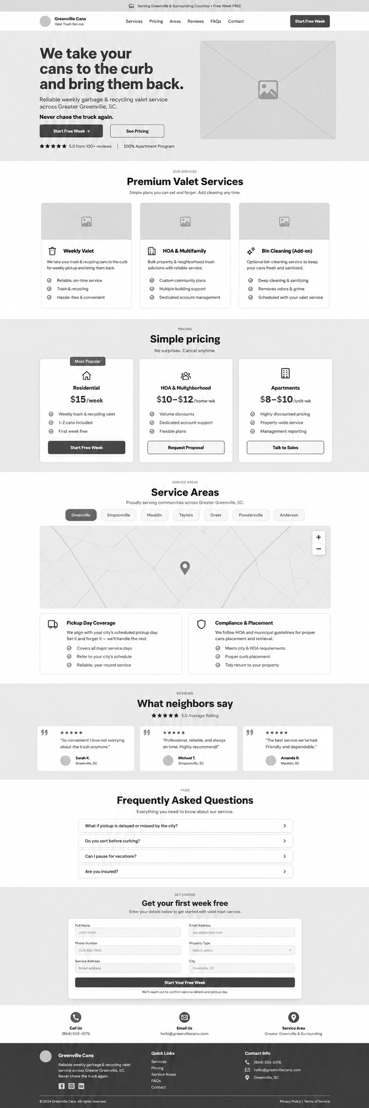
Wireframes
The wireframing stage established:
Hero messaging
Service hierarchy
Pricing placement
Coverage information
Trust content
Testimonials
FAQs
Signup form
Commercial CTAs
The goal was to confirm the conversion journey before introducing detailed visual styling.
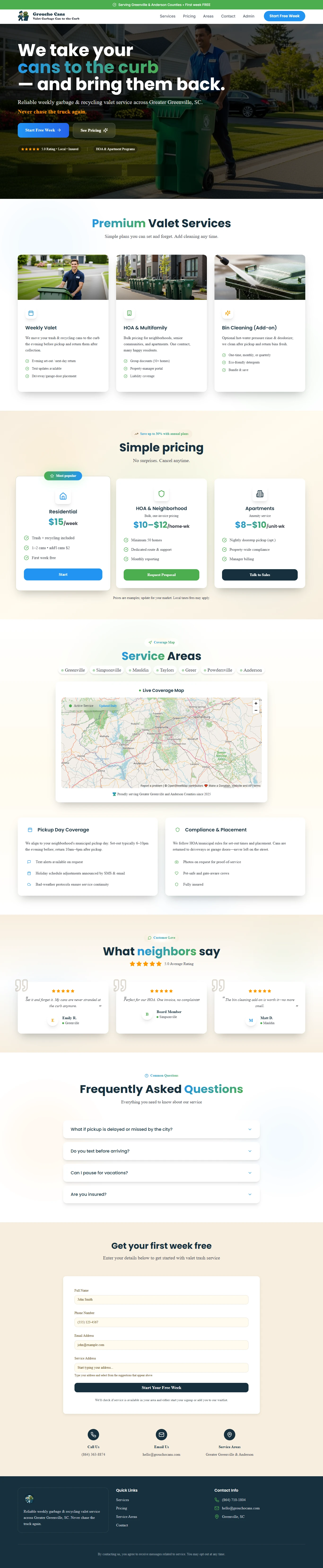
UI Design
The wireframes were transformed into a friendly local-service interface.
The design needed to feel professional without becoming overly corporate.
Clear cards, strong headings, concise copy, generous spacing, and approachable imagery help make the service feel simple and accessible.
Design System
Reusable styles were established for:
Typography
Colors
Buttons
Service cards
Pricing cards
Trust indicators
Forms
Testimonials
FAQ items
Section spacing
Responsive behavior
This gives the site consistency while making future updates easier.
Development
The approved design was translated into reusable responsive components.
Special attention was given to CTAs, forms, coverage information, and pricing because these elements play the largest role in turning visitors into customers.
Responsive Optimization
Each section was reviewed independently across desktop, tablet, and mobile.
Pricing cards, map content, service information, and forms were reorganized where necessary rather than simply scaled down.
Testing
Before launch, I reviewed:
Navigation
CTA links
Signup forms
Address fields
Phone and email actions
Pricing sections
FAQs
Coverage information
Responsive layouts
Browser consistency
Launch
Final refinements focused on usability, form clarity, local SEO foundations, accessibility, page speed, responsive behavior, and consistency throughout the customer journey.
8. Key Features
Conversion-focused local service website
Residential valet-trash service positioning
HOA and neighborhood service pathway
Apartment and multifamily offering
Bin-cleaning add-on presentation
Transparent pricing structure
First-week-free conversion offer
Service-area presentation
Coverage map
Municipal pickup information
HOA compliance messaging
Insurance and trust signals
Customer testimonials
Interactive FAQ
Address-based lead capture
Waitlist-ready conversion flow
Direct phone and email contact
Reusable website components
Responsive mobile experience
Local SEO-conscious architecture
Performance-focused implementation
9. Final Result
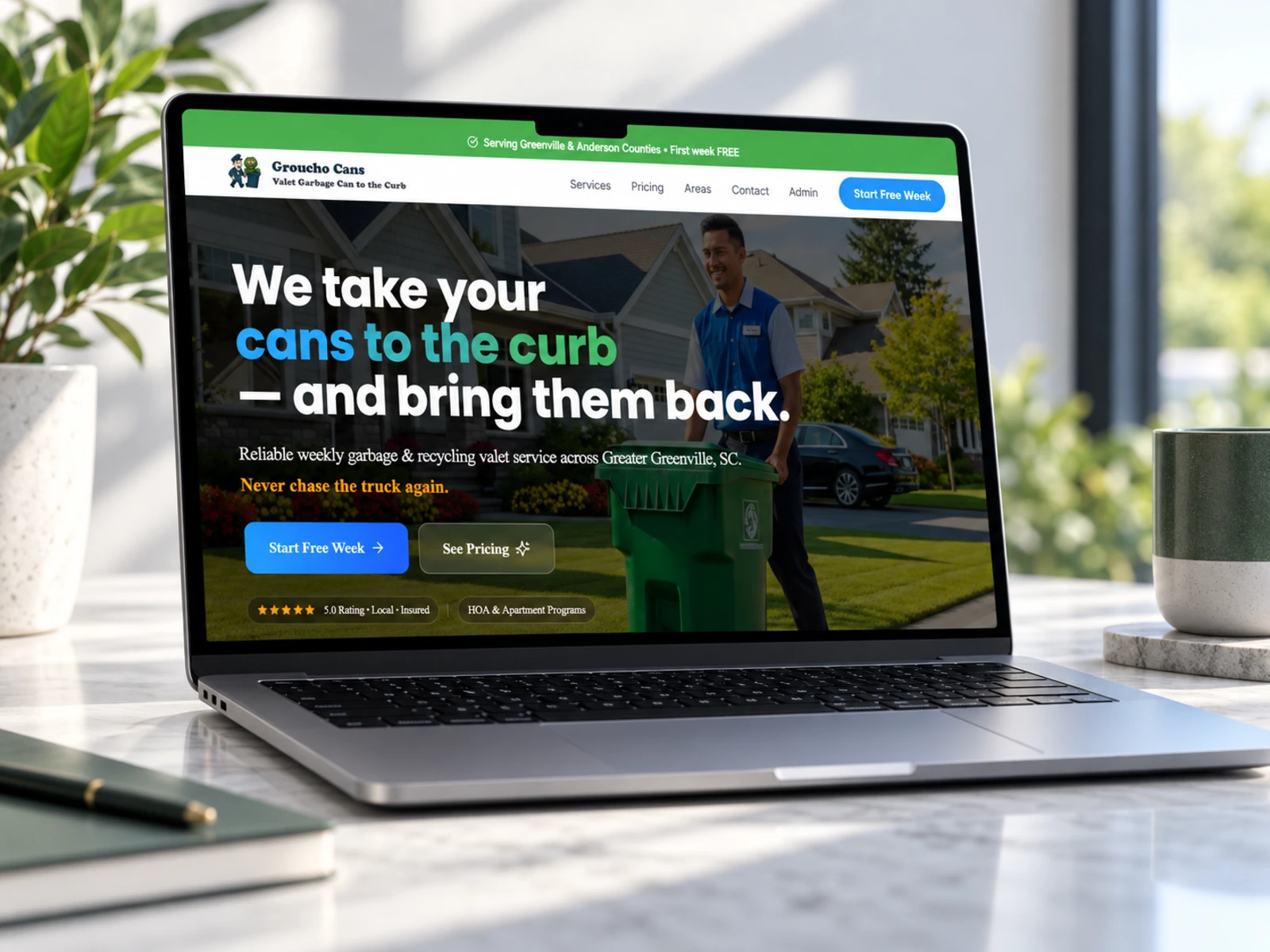
The final Groucho Cans website transforms a straightforward operational service into a clear and compelling convenience proposition.
Visitors immediately understand what the company does, why the service is useful, what it costs, where it operates, and what happens each week.
Rather than relying on customers to already understand valet trash service, the website educates them naturally as they move through the experience.
Transparent pricing reduces uncertainty, coverage information establishes local relevance, operational details communicate reliability, and insurance and compliance messaging build confidence.
At the same time, separate pathways for homeowners, HOAs, neighborhoods, and apartment communities ensure that each audience receives messaging appropriate to their needs.
The first-week-free offer then gives qualified visitors a low-friction next step.
The result is a friendly, trustworthy, and conversion-focused local-service website that turns an everyday inconvenience into an easy-to-understand service, and guides visitors naturally from “What is this?” to “Where do I sign up?”
Like this project
Posted Oct 2, 2026
End-to-end website design and development for Groucho Cans, a valet trash service in Greenville & Anderson Counties, SC. Conversion-led UX/UI, transparent pricing, HOA and multifamily pathways, coverage mapping, and responsive development that turns visitors into signups.
Likes
4
Views
2
Timeline
Jan 1, 2026 - Mar 31, 2026
Clients
Groucho Cans