Melody Hollis Performer Portfolio Website

Victor Adebayo


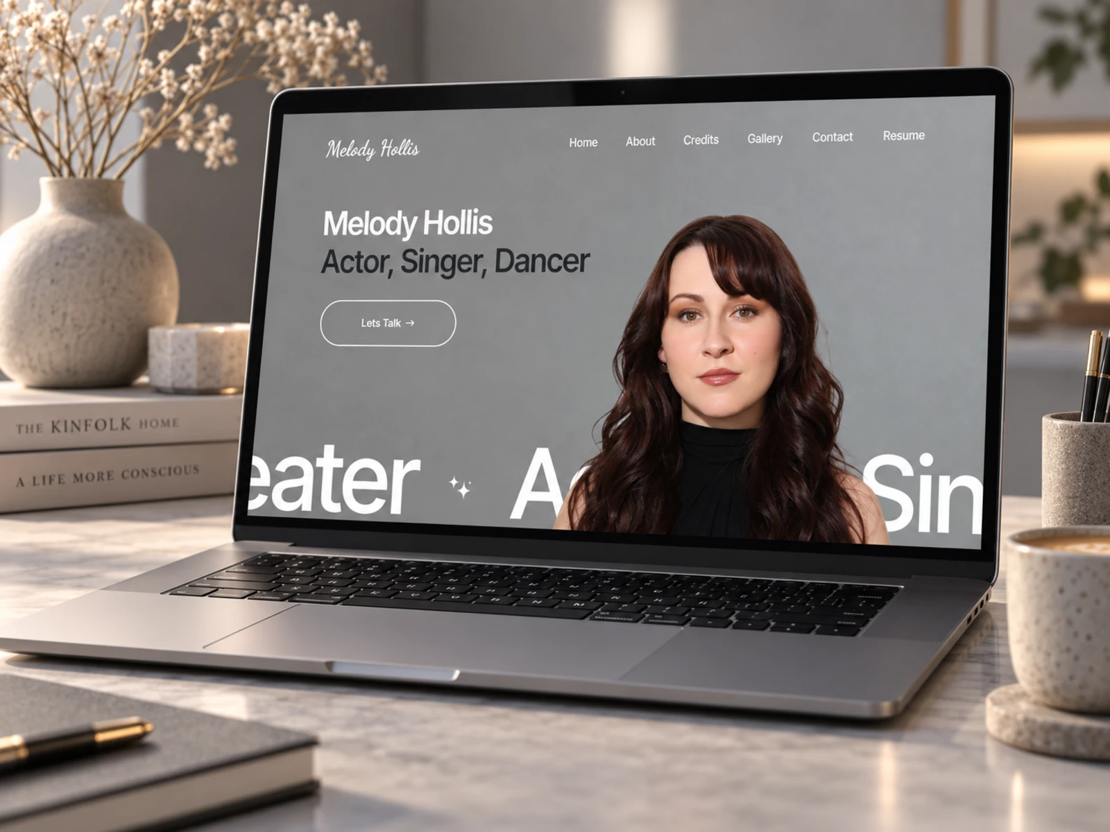
Melody Hollis — Actor & Performer Portfolio Website
Kajabi Website Design · UX/UI Design · Personal Branding · Responsive Development
Project Type: Actor / Performer / Personal Portfolio
Primary Objective: Build a polished professional presence, showcase performance credits and imagery, and make it easy for casting professionals and collaborators to access key information
Platform: Kajabi
Role: Kajabi Web Designer & Developer / UX/UI Designer
Deliverables: UX/UI Design · Responsive Kajabi Website · Portfolio Design · Gallery Experience · Credits Presentation · Résumé Integration · Custom Kajabi Sections · Contact Experience · SEO & Performance Optimization
1. Project Overview
Melody Hollis is a professional actor, singer, dancer, and performer with experience across Broadway, national tours, theatre, film, television, commercials, and live performance.
Her credits include work such as White Christmas, Vice, Criminal Minds, The Young and the Restless, A Golden Christmas, and Annie, alongside an extensive background in regional theatre and musical performance.
The objective of this project was to create a personal portfolio website in Kajabi that could present that experience clearly without feeling like a digital résumé.
The website needed personality.
It needed to feel professional enough for casting directors, agents, producers, and creative collaborators while still communicating the person behind the credits.
My focus was to create a simple journey:
Meet Melody → Understand Her Story → Explore Her Work → View Her Credits → Access Her Résumé → Get in Touch
2. The Challenge
Performer websites have a very specific job.
Visitors are often not coming to read long marketing copy. A casting director or producer may only spend a short amount of time deciding whether they want to explore further.
That means the experience has to communicate identity, credibility, range, and personality quickly.
The challenge was organizing several different types of content:
Professional headshots
Acting credits
Theatre experience
Film and television work
Personal biography
Performance imagery
Downloadable résumé
Professional profile links
Contact information
Social media and external projects
Without a clear hierarchy, the website could easily become a collection of images and credits with no real story connecting them.
The goal was therefore not to add more content.
It was to present the right content in the right order.
3. Design Strategy
I structured the website around four priorities:
Personality → Credibility → Work → Contact
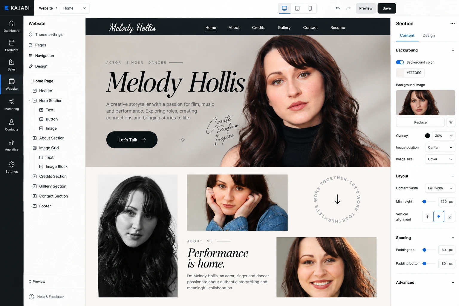
Put Melody First
The website needed to feel personal immediately.
Rather than opening with a long list of credits, the hero introduces Melody and her core disciplines:
Actor · Singer · Dancer
This quickly tells visitors who they are looking at before moving them deeper into the portfolio.
Let the Career Tell a Story
The About section does more than provide a short biography.
It creates a timeline of Melody's career — from beginning professional stage work at a young age, through theatre and Broadway, to film and television.
That storytelling gives context to the credits instead of making them feel like disconnected achievements.
Make Important Work Easy to Find
A casting professional should not have to search through the entire website to understand Melody's experience.
Featured credits were therefore treated as a major visual section.
Projects are supported by recognizable imagery so visitors can scan the work visually before moving into the full résumé.
Keep Contact Simple
The final objective is not a traditional online sale.
It is a professional conversation.
The website therefore keeps communication straightforward, giving agents, producers, casting teams, and collaborators clear access to contact details and professional profiles.
4. UX/UI Design
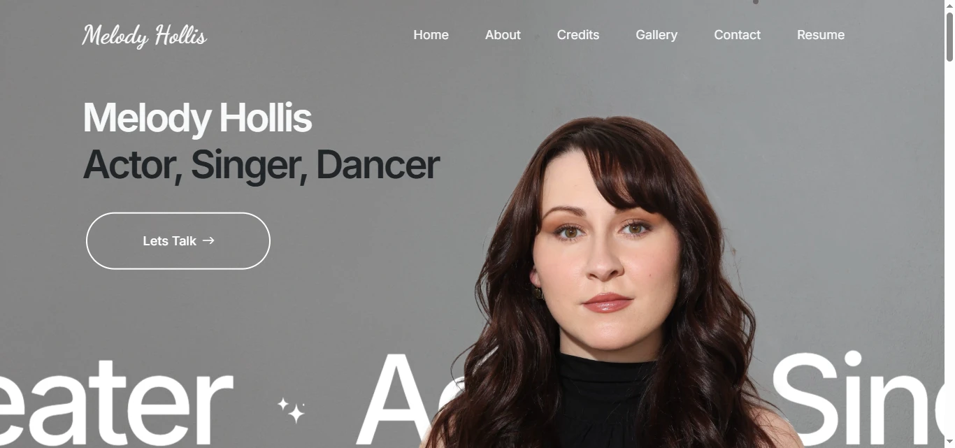
Hero Section
The hero was intentionally kept simple.
The priority was immediately establishing:
Who she is
Melody Hollis
What she does
Actor, Singer, Dancer
What the visitor can do next
Learn more or get in touch
Rather than filling the opening section with career information, the design uses strong photography and concise typography to establish identity first.
Personal Brand Direction
A performer portfolio should not feel like a corporate business website.
I used an editorial, personality-led approach where photography, typography, whitespace, and career imagery do most of the visual work.
The interface was designed to feel:
Personal
Confident
Creative
Professional
Approachable
This allows Melody's own presence to become the strongest part of the brand.
Typography System
I created a simple but clear typography hierarchy for:
Hero titles
Performer disciplines
Section headings
Biography copy
Production names
Credit information
Contact details
Buttons and links
Large typography creates strong visual moments while smaller supporting copy keeps longer career information readable.
The goal was to make the portfolio easy to scan without making it feel minimal to the point of losing personality.
About Section
The About experience was designed around storytelling rather than simply listing qualifications.
Melody's professional journey spans stage, Broadway, touring productions, film, television, and independent performance work.
I structured this content so visitors can understand both her professional background and her personality.
This creates a stronger emotional connection than a résumé alone can provide.
Featured Credits
The Featured Credits section gives important work a stronger visual presence.
Instead of forcing visitors into the résumé immediately, selected projects are surfaced through imagery and recognizable titles.
This includes work across theatre, film, and television, allowing visitors to understand the range of the portfolio before exploring the complete credit list.
The section also includes a clear route to the full résumé for users who need detailed professional information.
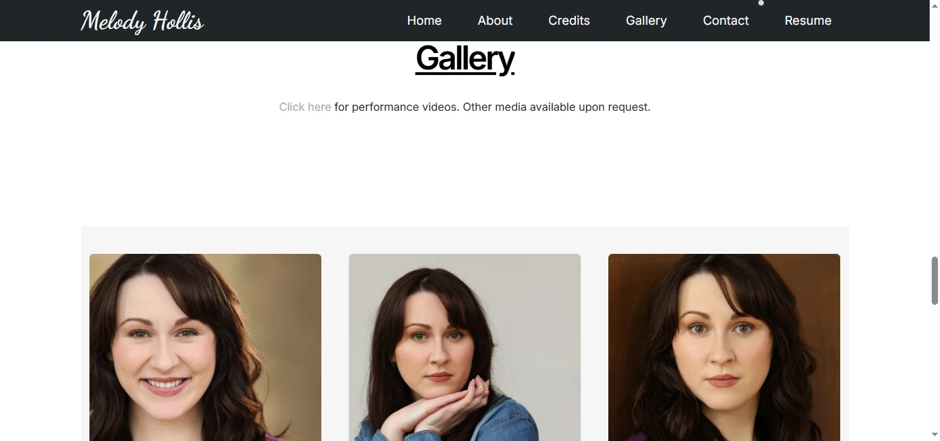
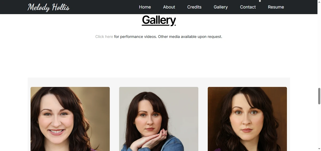
Gallery Experience
The gallery serves a different purpose from the résumé.
Where the résumé communicates experience, the gallery communicates presence and range.
I designed the gallery around strong photography with minimal interface distraction.
The layout allows images to carry the experience while maintaining enough spacing and structure to avoid feeling like a basic image grid.
This is particularly important for a performer portfolio because casting decisions can be highly visual.
Résumé Integration
The résumé needed to remain easily accessible without overwhelming the website itself.
Instead of duplicating every theatre, film, television, training, and skills credit inside multiple page sections, the website provides direct access to the professional résumé.
This gives different visitors the level of detail they need:
Casual visitor: Featured work and imagery
Casting professional: Full résumé and professional credits
That keeps the main site clean while still supporting deeper evaluation.
Professional Profile Integration
The experience also connects visitors to relevant external professional platforms.
These include industry and social destinations such as:
IMDb
Actors Access
Instagram
Podcast content
These links extend the portfolio beyond the website and allow users to continue exploring Melody's work through the platforms most relevant to them.
Contact Experience
The Contact section was kept intentionally straightforward.
Rather than introducing a complicated lead funnel, the website provides a direct professional communication path.
For this type of portfolio, that simplicity is important.
Casting directors, producers, and collaborators should be able to move from reviewing the work to making contact without completing unnecessary steps.
Responsive Design
A performer portfolio is likely to be opened from many environments — laptops during casting sessions, tablets, or phones after receiving a referral or profile link.
The responsive system therefore focused on:
Portrait image handling
Headshot composition
Typography scaling
Gallery grids
Navigation
Featured-credit layouts
Résumé access
Contact links
Touch-friendly buttons
Consistent spacing
The mobile version shifts naturally into a vertical storytelling experience without reducing access to important professional information.
5. Website Architecture
I kept the site architecture intentionally focused.
A performer website does not need unnecessary pages simply to appear larger.
Every page has a clear purpose.
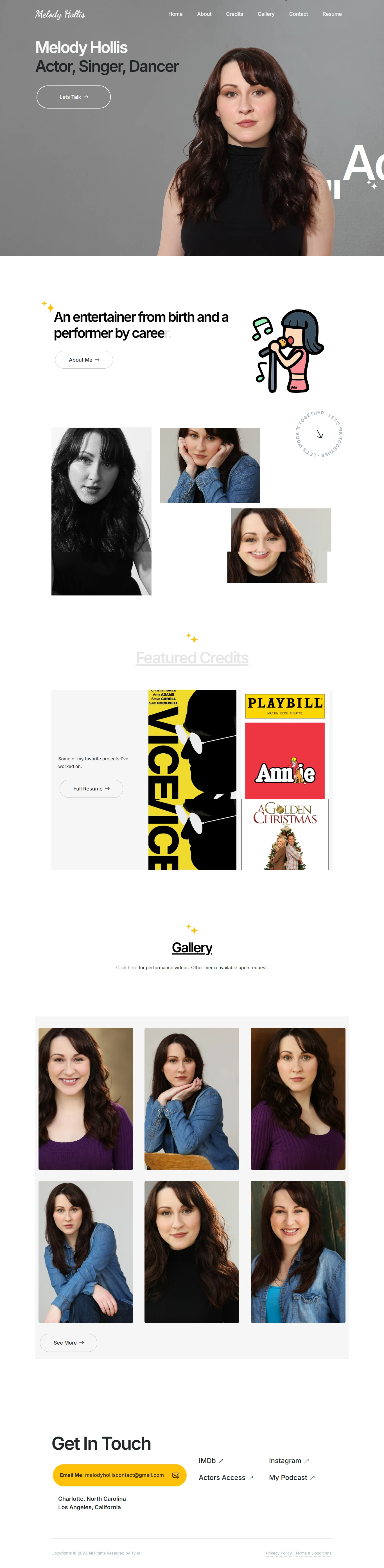
Home
The homepage introduces Melody, establishes her disciplines, provides a short career story, showcases featured credits, and creates pathways into deeper portfolio content.
About
The About experience provides more context around Melody's professional journey and background.
Instead of positioning it as a traditional corporate biography, the page helps visitors understand the progression of her career and creative identity.
Credits
The Credits section organizes professional experience across relevant areas such as:
Broadway and National Tours
Regional Theatre
Film
Television
Concert and Cabaret
Training
Professional Skills
This makes a substantial body of work easier to navigate.
Gallery
The Gallery creates a dedicated visual experience for professional imagery, production photography, and selected career moments.
This keeps visual exploration separate from more information-heavy pages.
Résumé
A clear résumé pathway gives casting and production professionals direct access to the detailed professional document.
Contact
The Contact area provides the final professional conversion point.
It also supports links to external profiles and additional creative projects.
6. Kajabi Development
Once the UX and visual direction were established, I translated the design into a customized Kajabi implementation.
The goal was to avoid the standard appearance associated with many Kajabi websites and instead create something that felt like a purpose-built creative portfolio.
Development focused on:
Custom Kajabi page design
Responsive Kajabi sections
Custom section layouts
Reusable content blocks
Custom typography styling
Image-led portfolio sections
Gallery layouts
Featured-credit components
Resume link integration
External professional profile links
Custom navigation
Mobile menu optimization
Contact CTA integration
Custom CSS where appropriate
Button and hover states
Subtle transition effects
Responsive image optimization
SEO page titles and metadata
Accessibility-conscious content hierarchy
Cross-browser testing
Cross-device testing
Performance optimization
Kajabi was used as the central platform for managing the website while custom styling allowed the experience to move beyond the look of a typical Kajabi template.
7. Design & Development Process
Research → Content Strategy → UX Structure → Wireframes → UI Design → Design System → Kajabi Development → Responsive Optimization → Testing → Launch
Research
I started by reviewing Melody's career, professional credits, photography, external profiles, résumé, and the types of people most likely to visit the website.
The key question was:
What does someone in casting or production need to understand within the first minute?
That informed the entire experience.
Content Strategy
I separated the content into three levels:
Immediate Identity
Who Melody is and what she does.
Professional Proof
Selected projects, credits, experience, and imagery.
Deeper Evaluation
Full résumé, gallery, professional profiles, and contact information.
This helped prevent the homepage from becoming overloaded.
UX Structure
I mapped the user journey around a straightforward sequence:
Who is she? → What has she done? → What does she look like across different roles? → Where can I see the full résumé? → How can I contact her?
This became the foundation of the site structure.
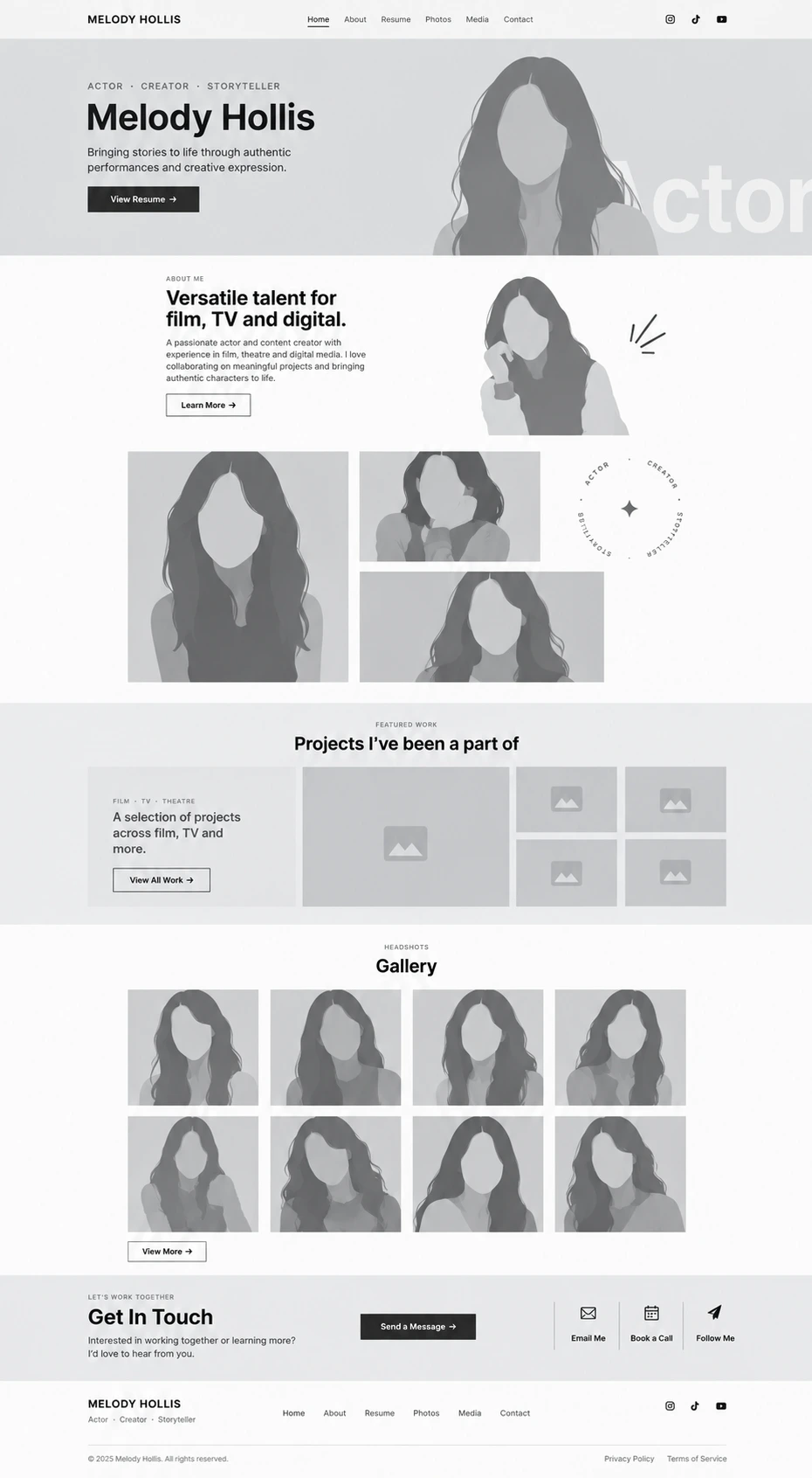
Wireframes
The wireframing stage focused on:
Hero composition
Biography hierarchy
Image placement
Featured credits
Gallery structure
Résumé CTA placement
Contact information
Navigation
The objective was to make the site useful even before visual styling was introduced.
UI Design
The wireframes were developed into a polished creative portfolio with photography taking priority.
Instead of using excessive UI elements, I relied on:
Large imagery
Strong typography
Controlled spacing
Clean section transitions
Simple calls-to-action
This keeps attention where it belongs — on the performer.
Design System
I created reusable design rules for:
Typography
Buttons
Links
Image ratios
Section spacing
Gallery elements
Credit displays
Navigation
CTA areas
Responsive behavior
This maintains consistency across the entire Kajabi website.
Kajabi Development
The final layouts were recreated in Kajabi using customized page sections and responsive styling.
Where native Kajabi controls were limiting, custom CSS was used to refine spacing, typography, image behavior, and interaction states.
The build was structured so future images, credits, and portfolio updates could be handled without redesigning the entire experience.
Responsive Optimization
Each section was reviewed independently across desktop, tablet, and mobile.
Particular attention was given to:
Portrait imagery
Gallery layouts
Long biography content
Featured credits
Navigation
Résumé buttons
External profile links
This ensured that the portfolio remained polished regardless of screen size.
Testing
Before launch, I reviewed:
Navigation
Responsive layouts
Image loading
Gallery behavior
Contact links
Résumé access
IMDb and external profile links
Button states
Typography
Browser compatibility
Launch
The final stage focused on polishing spacing, responsive behavior, image quality, accessibility, performance, SEO foundations, and overall presentation consistency.
8. Key Features
Custom Kajabi portfolio website
Performer-focused personal branding
Responsive UX/UI design
Image-led hero experience
Professional biography
Featured film, television, and theatre credits
Dedicated credits structure
Visual portfolio gallery
Professional résumé integration
IMDb integration
Actors Access integration
Social media pathways
Podcast/external project links
Direct professional contact pathway
Reusable Kajabi sections
Custom Kajabi styling
Custom CSS enhancements
Responsive navigation
Mobile-friendly gallery
SEO-conscious page structure
Optimized portfolio imagery
Accessibility-conscious design
Cross-device optimization
9. Final Result
The final Melody Hollis website turns an extensive performance career into a clear, personal, and professionally structured Kajabi portfolio.
Rather than presenting visitors with a long résumé immediately, the experience introduces Melody as a person first, then progressively reveals her story, featured work, imagery, professional credits, and full résumé.
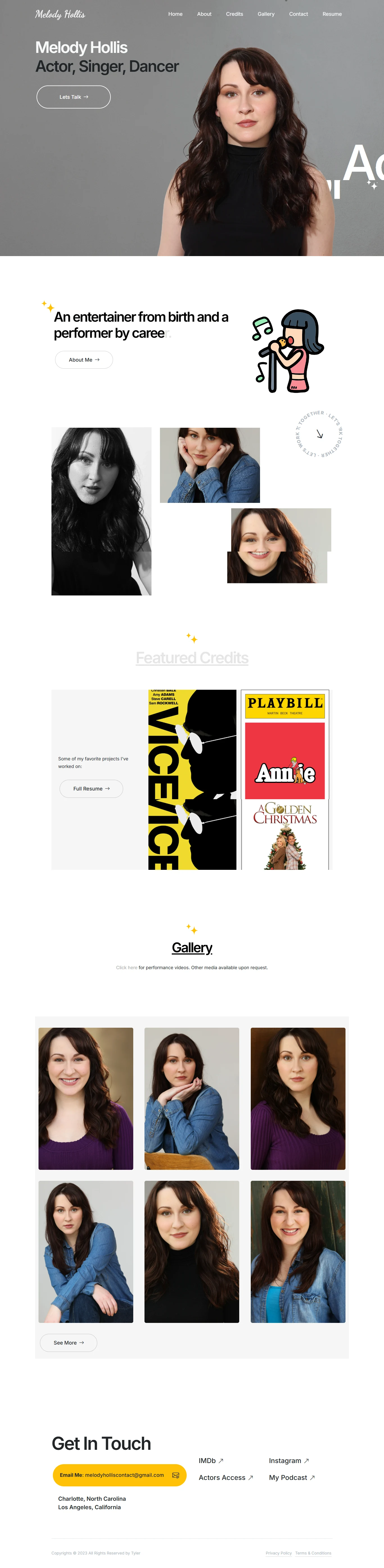
This creates two levels of engagement.
Someone discovering Melody for the first time can quickly understand who she is and the type of work she does, while casting professionals and producers can move directly into detailed credits and professional resources when needed.
The photography-led visual system keeps the experience personal, while the simple information architecture ensures that important career details never become difficult to find.
Building the project in Kajabi also provides an easy-to-manage foundation for future portfolio updates, new credits, photography, external projects, and content without sacrificing the customized visual experience.
The result is a responsive, polished, and personality-driven performer website that balances personal branding with professional credibility, giving Melody a central digital home for her work while making it easier for the right people to discover, evaluate, and contact her.
Like this project
Posted Sep 30, 2026
Kajabi portfolio website for Melody Hollis, an actor, singer, and dancer: editorial personal branding that routes casting pros from intro to credits, résumé, and contact without friction.