VYROFIT Brand Direction and Visual System
Samson Ojedokun
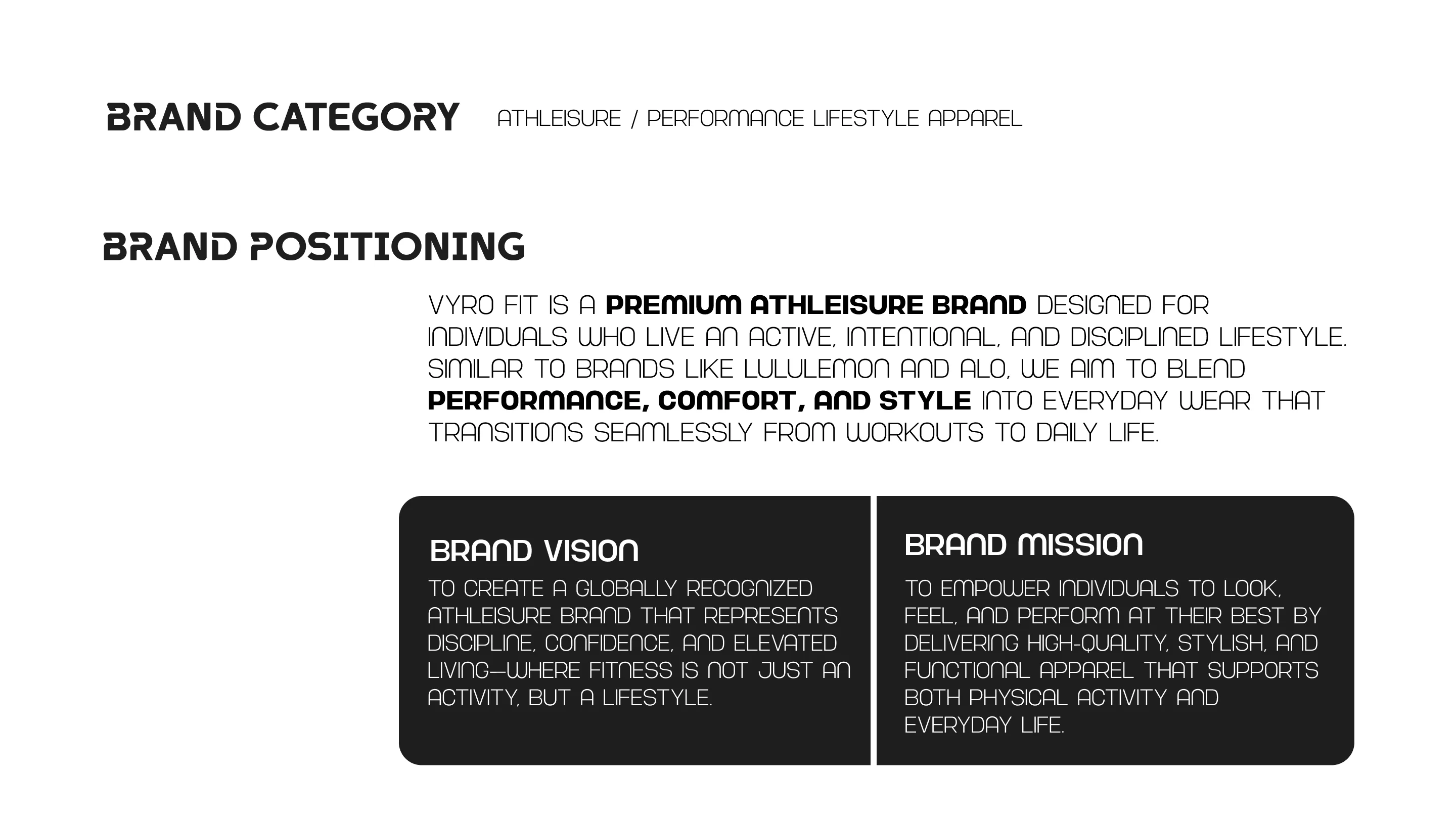
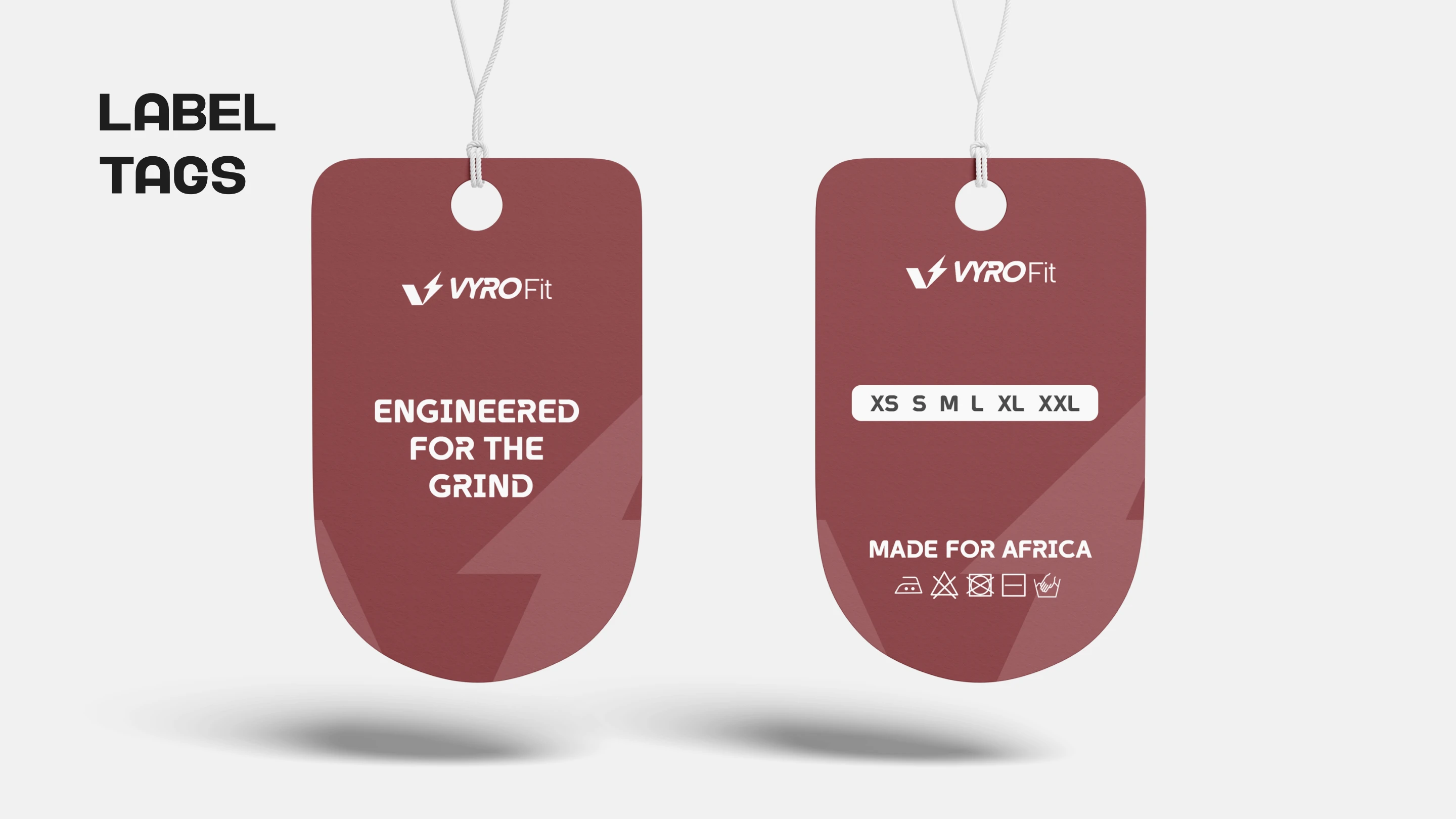
VYRO FIT — Engineered for the Grind
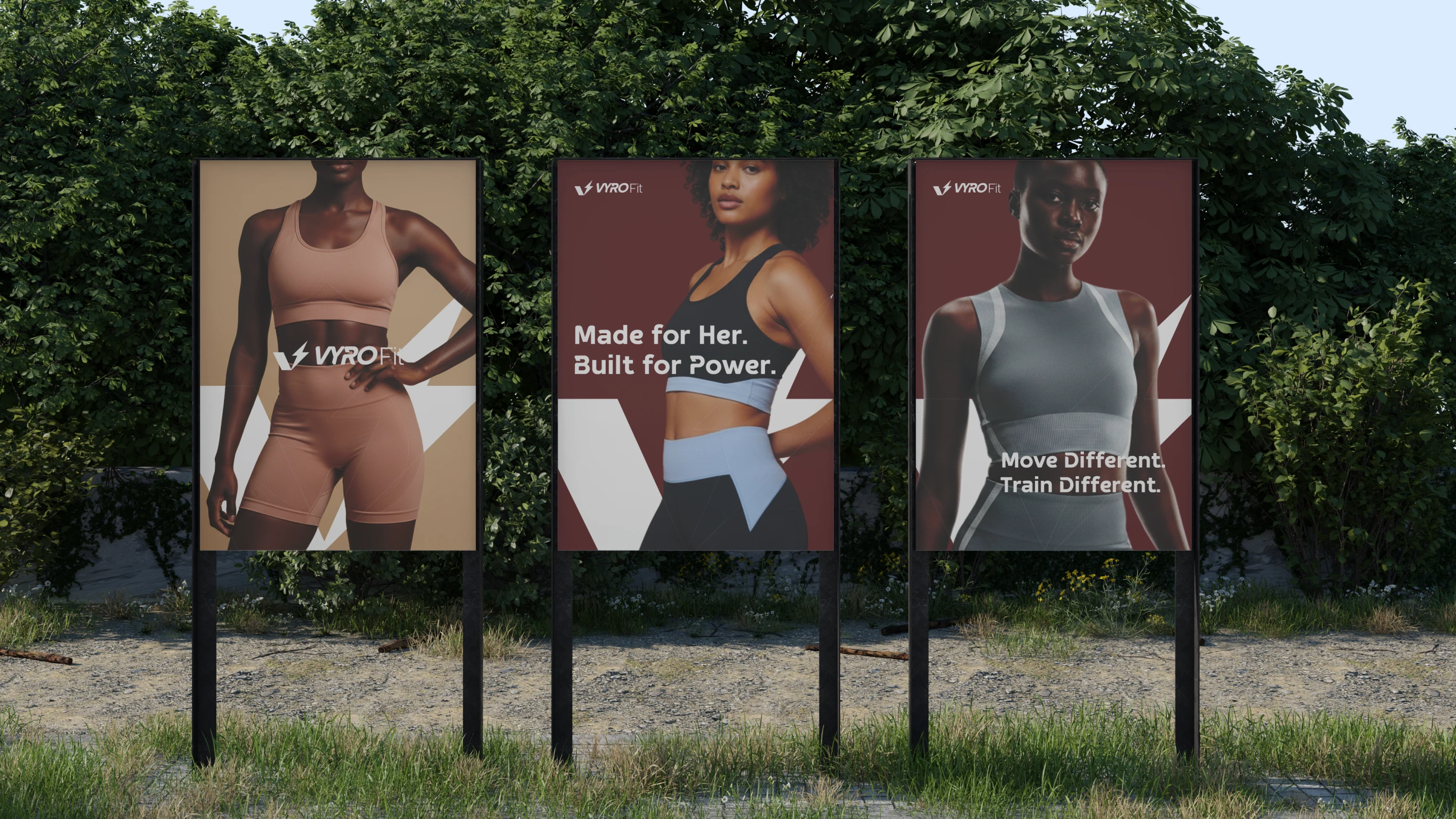
VYRO FIT is a premium athleisure and performance lifestyle brand built for individuals who embody discipline, intention, and movement. Positioned at the intersection of performance and everyday wear, the brand is designed to transition effortlessly between workouts and daily life, without compromising style, comfort, or function.
Inspired by the evolving culture of modern fitness, VYRO FIT is not just apparel, it is a reflection of a mindset. A commitment to growth. A lifestyle built on consistency.
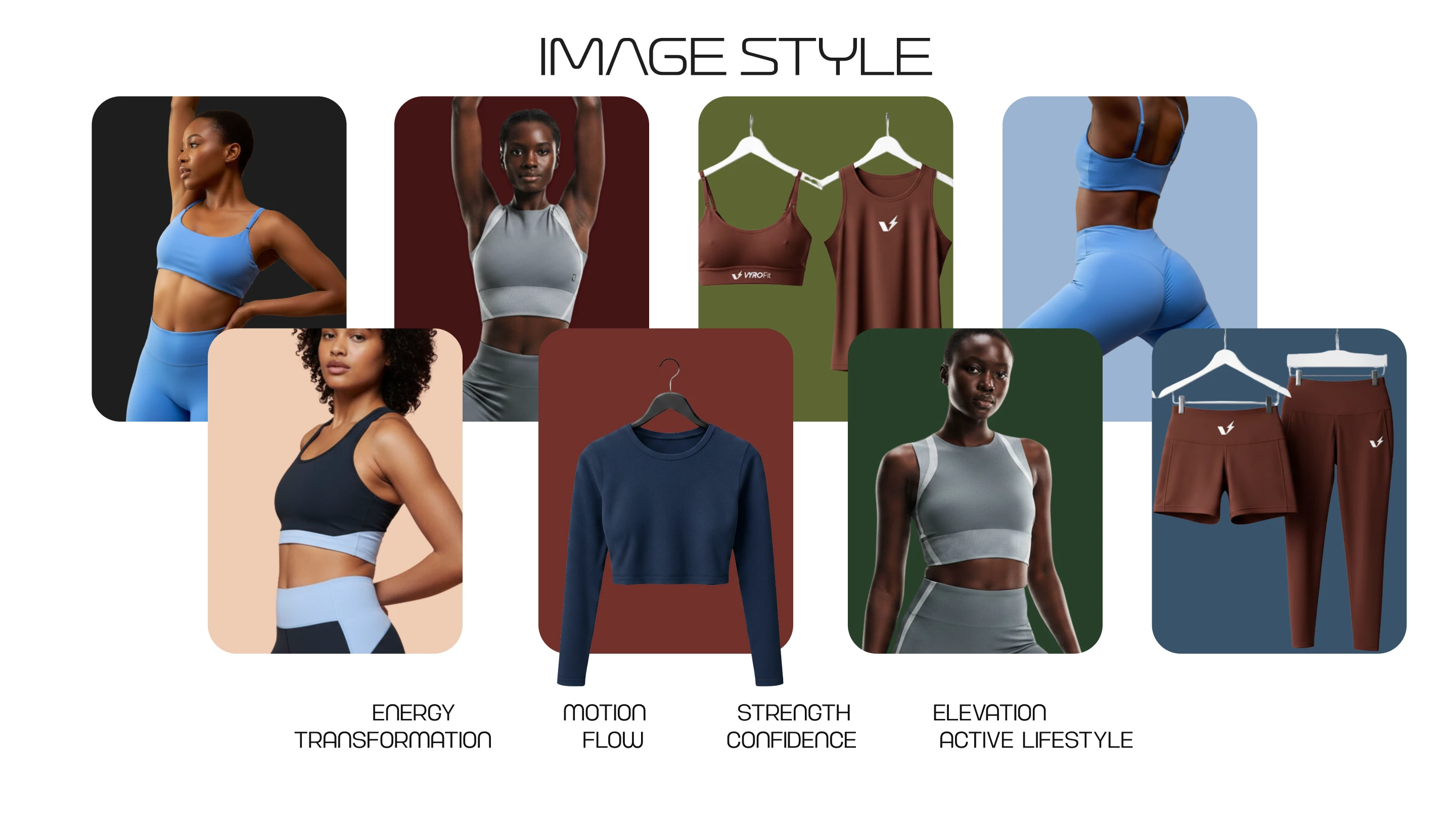
The Idea
At its core, VYRO FIT represents energy in motion.
The brand is rooted in the belief that fitness is not confined to the gym, it is expressed in how you move, live, and show up daily. Every design decision reflects this philosophy: clean, bold, and purposeful.
This is where performance meets identity.
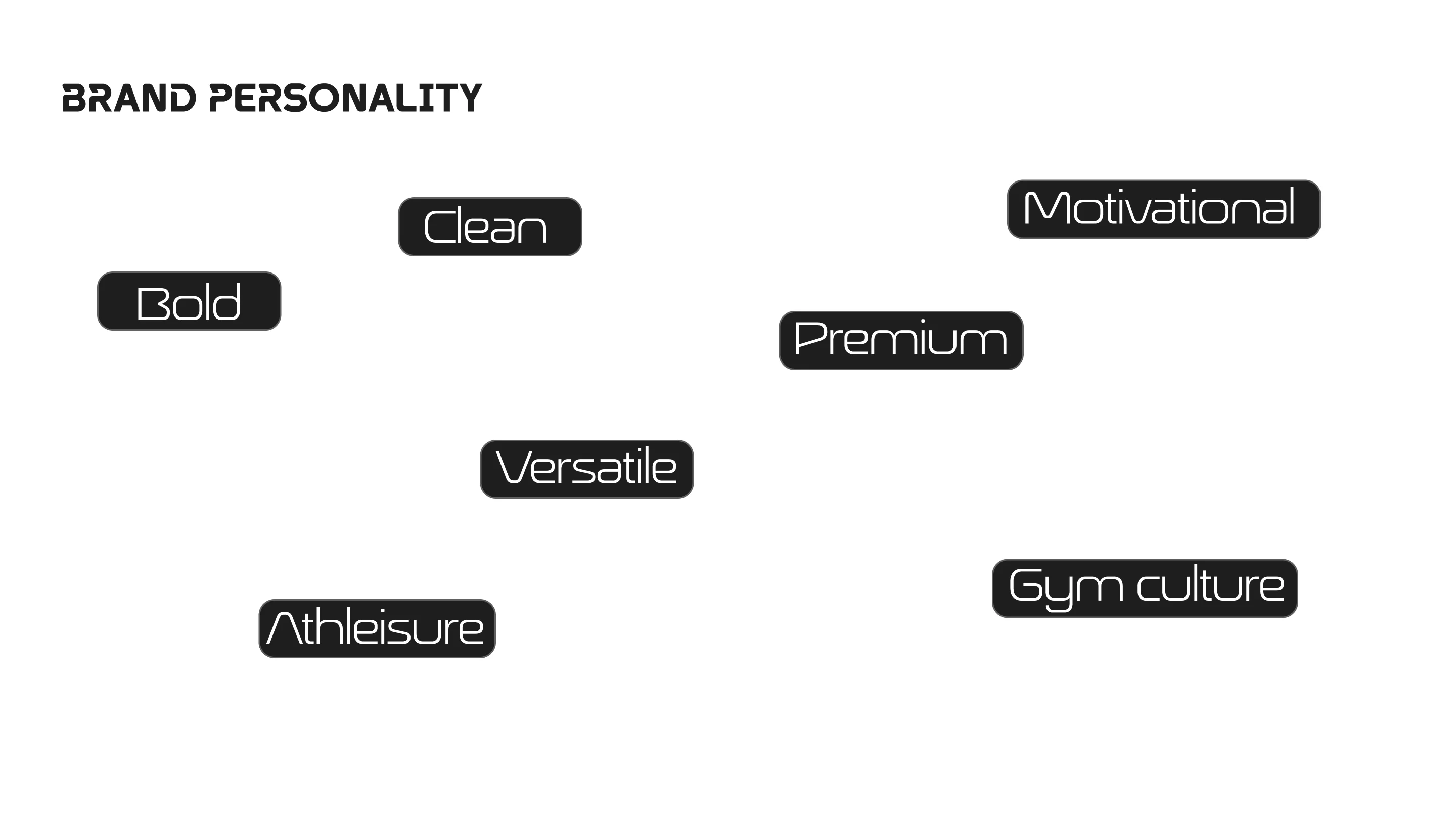
The personality of the brand is defined by:
Clean. Bold. Versatile. Premium. Motivational.
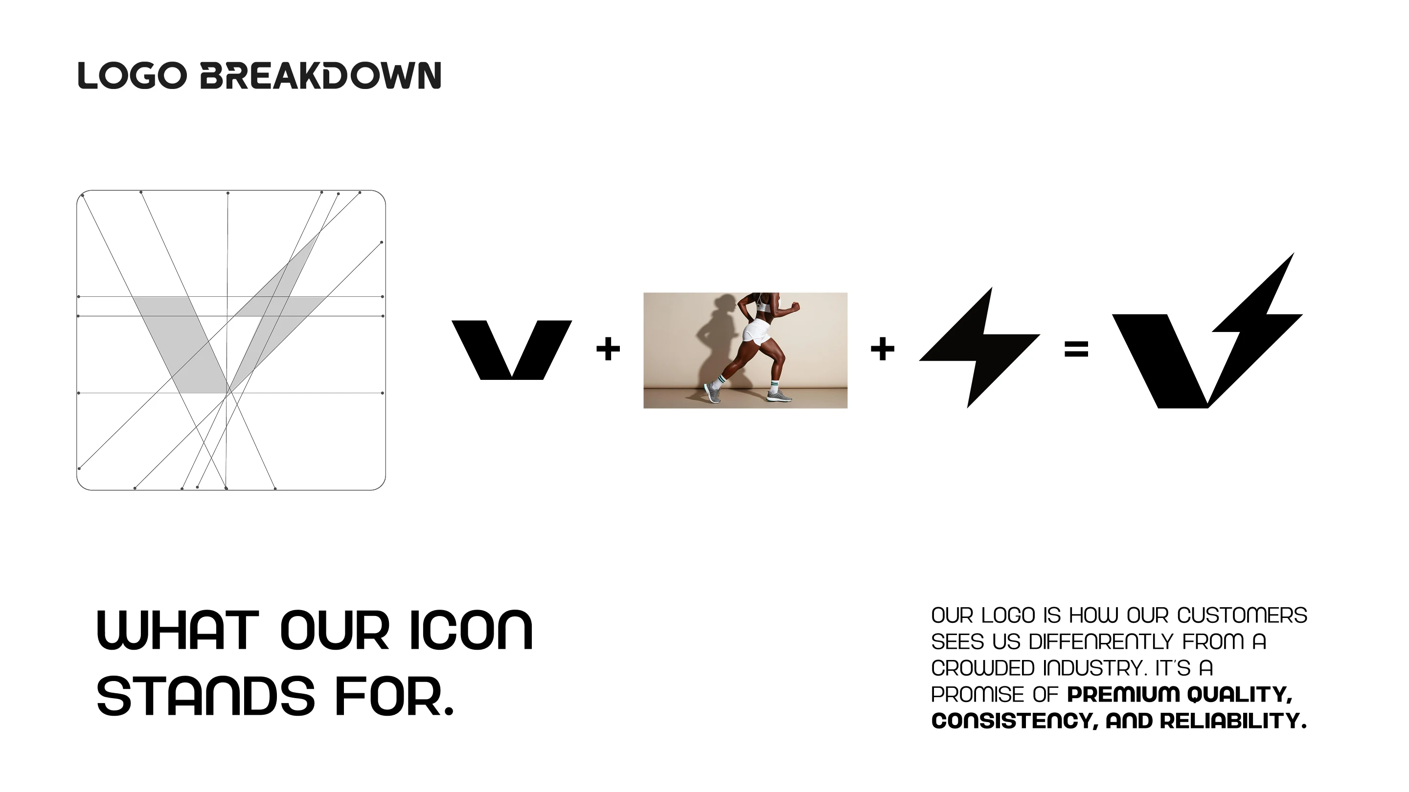
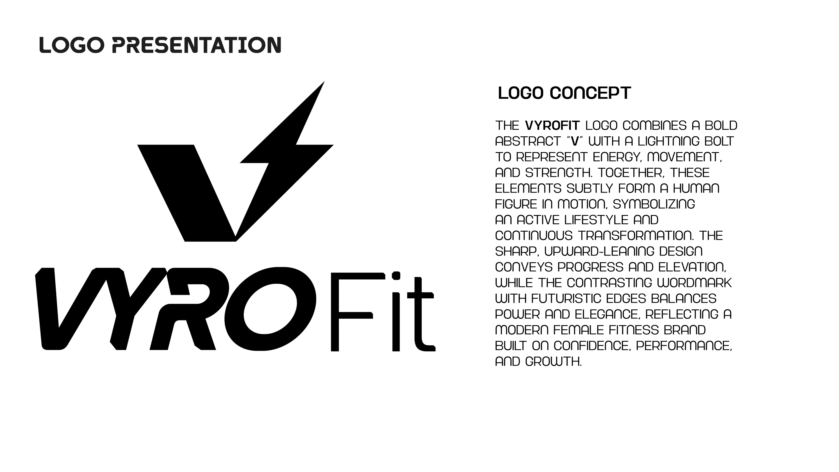
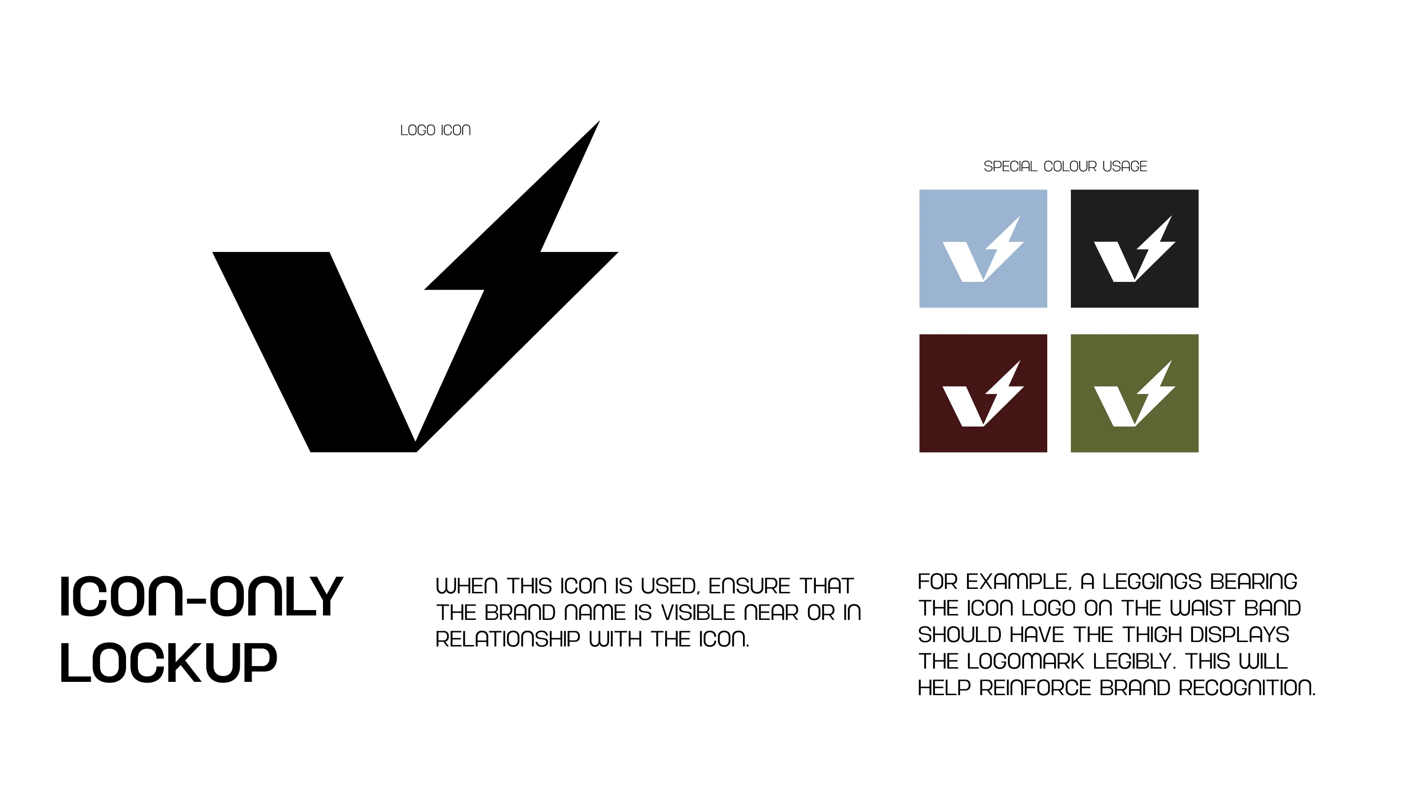
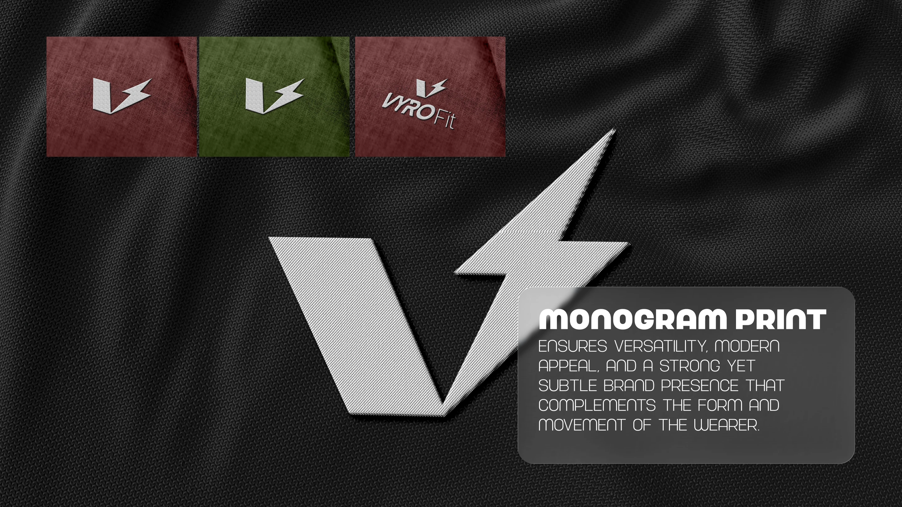
Logo Concept
The VYRO FIT logo is built around a powerful visual idea: movement embodied in form. Subtly, this combination forms a human figure in motion, reinforcing the brand’s connection to transformation and active living.
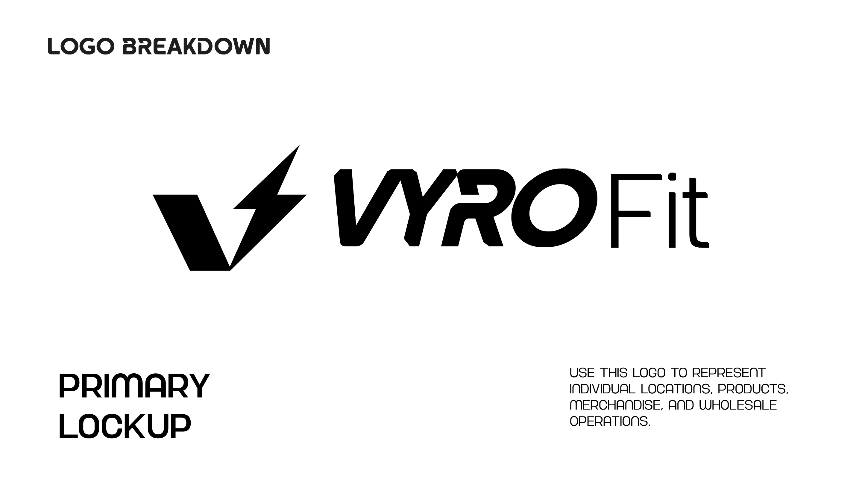
A Mark Designed to Stand Out
In a saturated athleisure market, differentiation is key.
The VYRO FIT mark is not just a logo, it is a visual signature of performance and reliability. It is designed to scale seamlessly across all applications.
From icon to full lockup, the system ensures consistency while allowing flexibility.
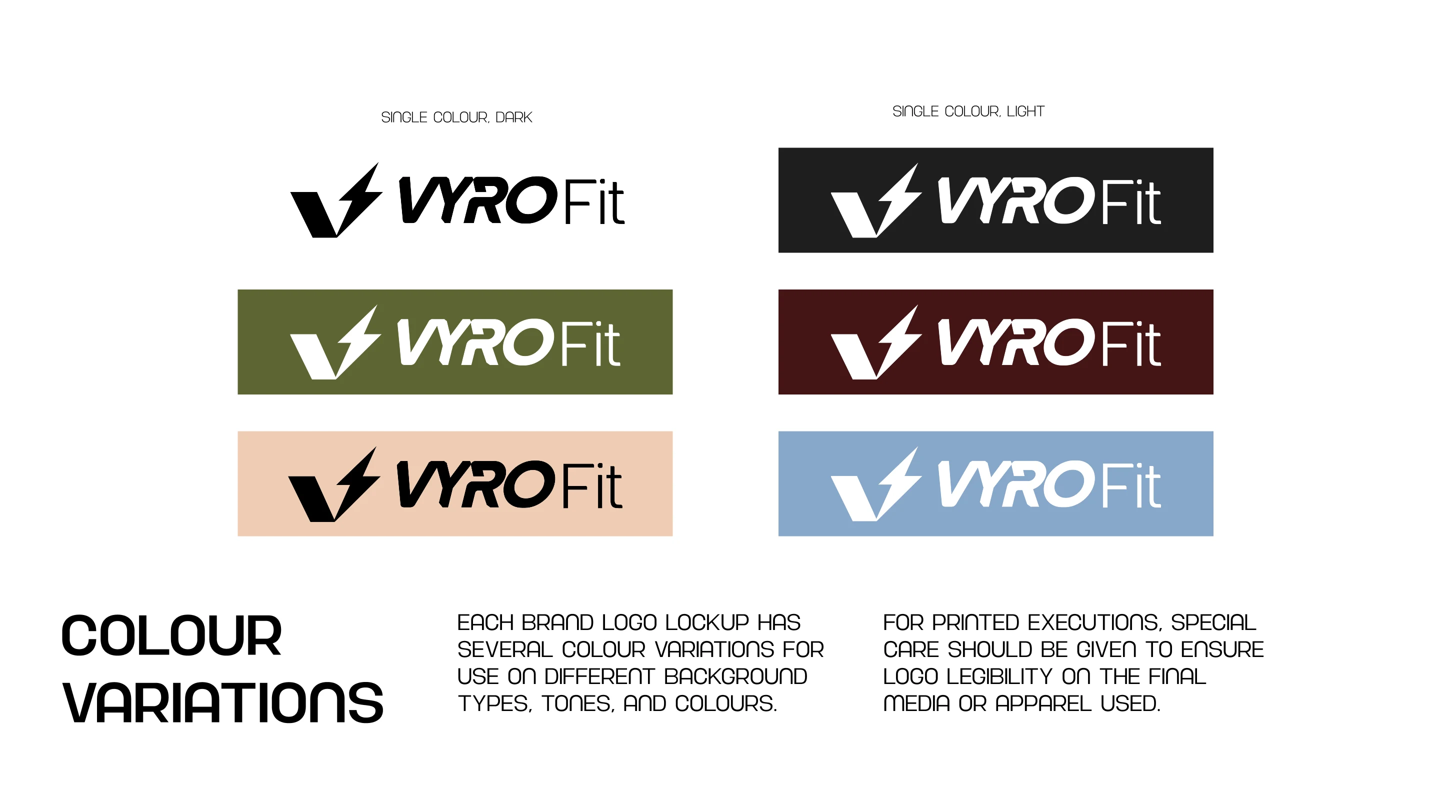
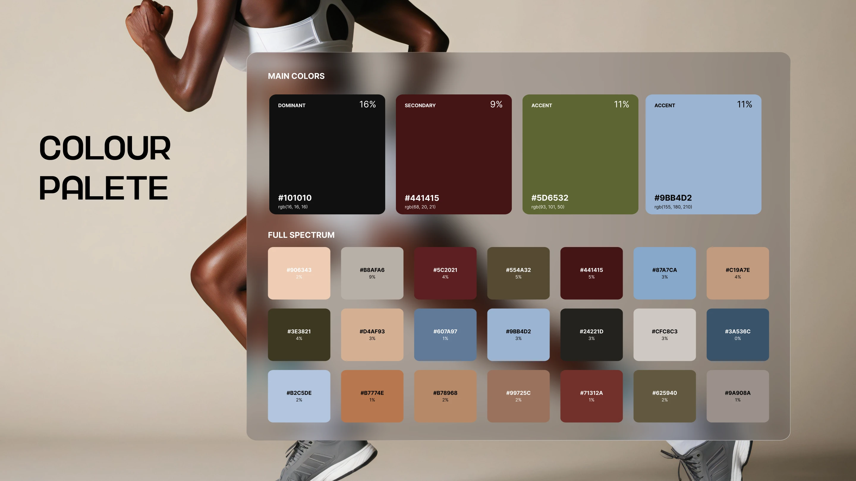
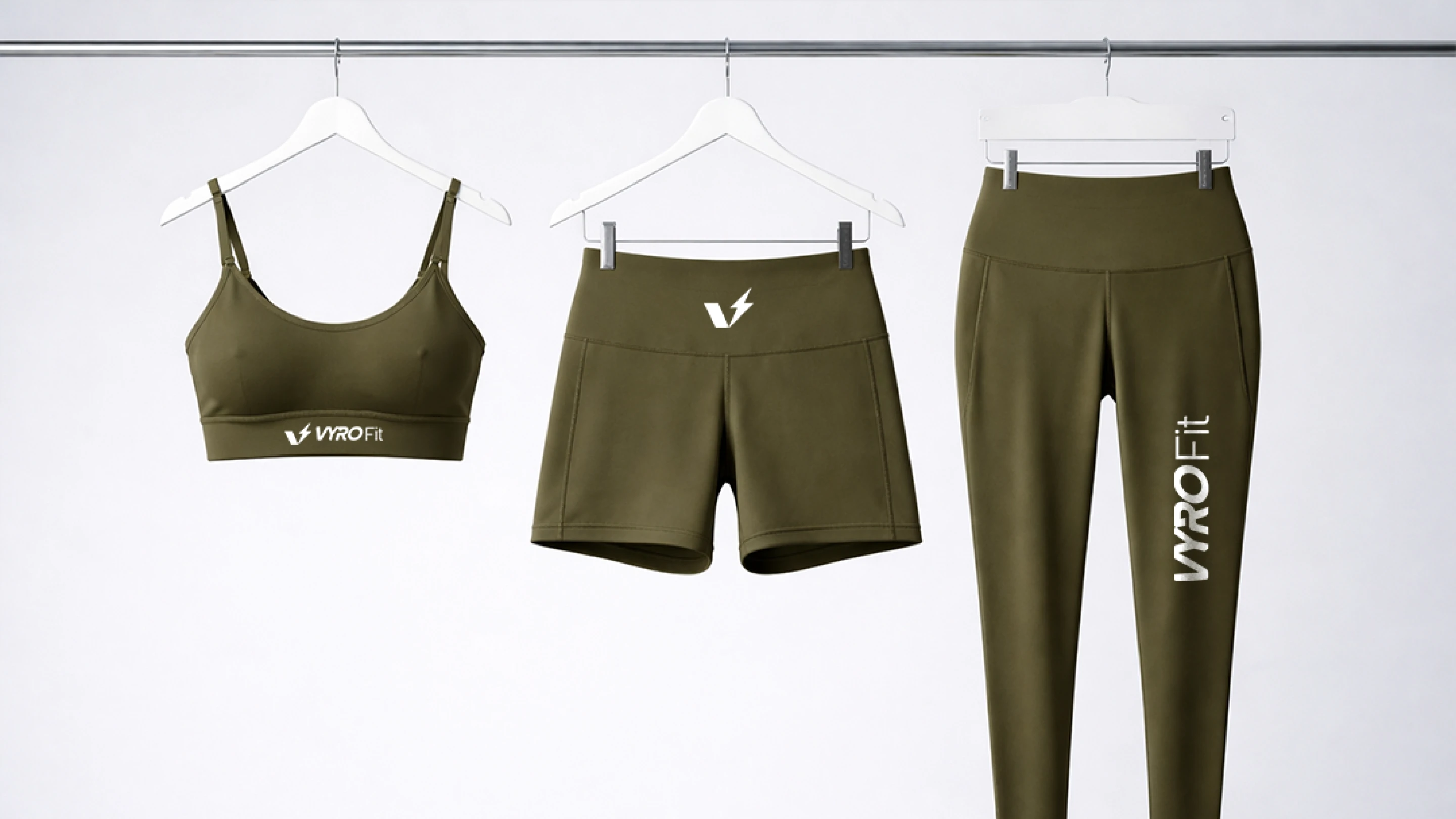
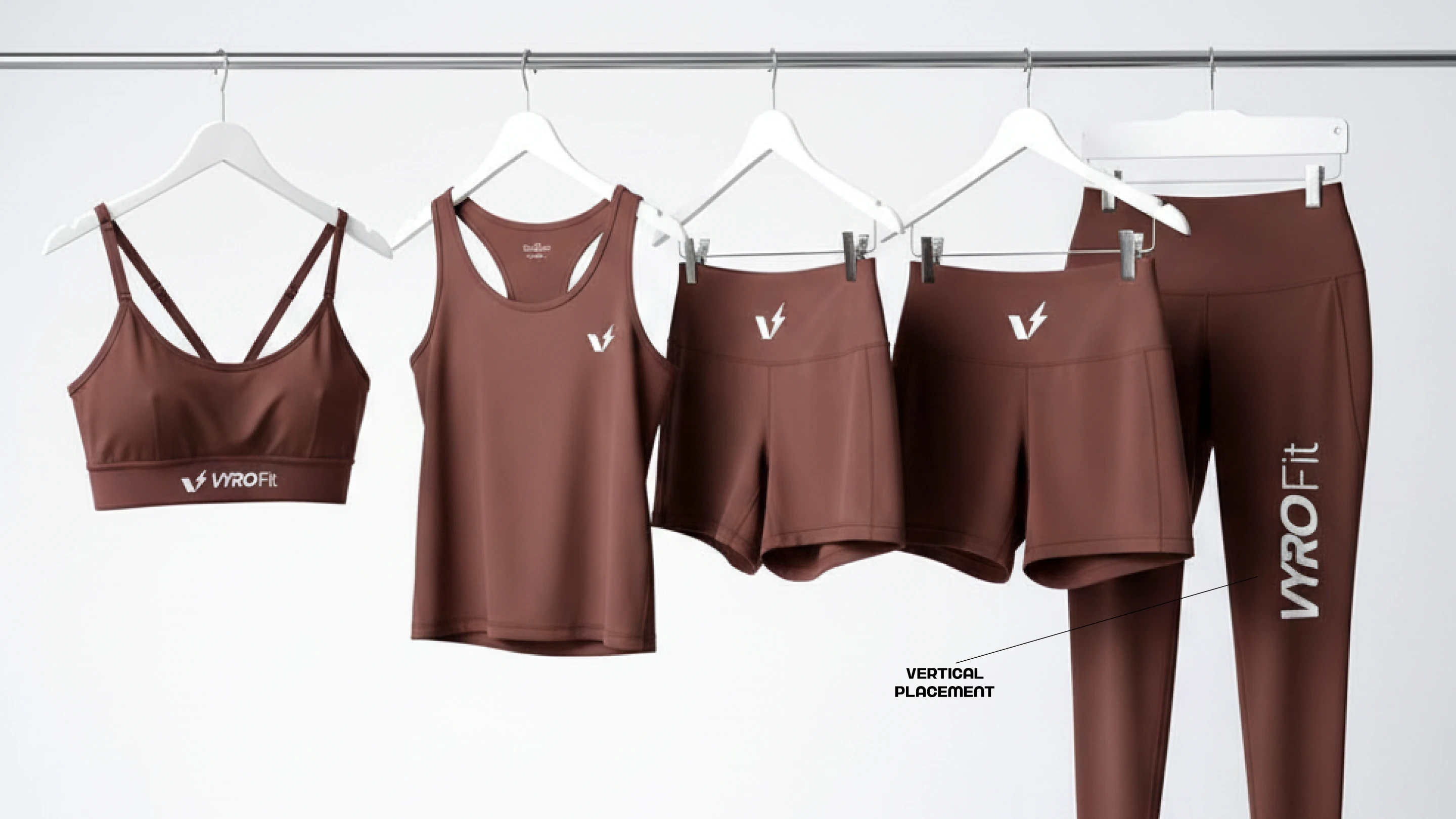
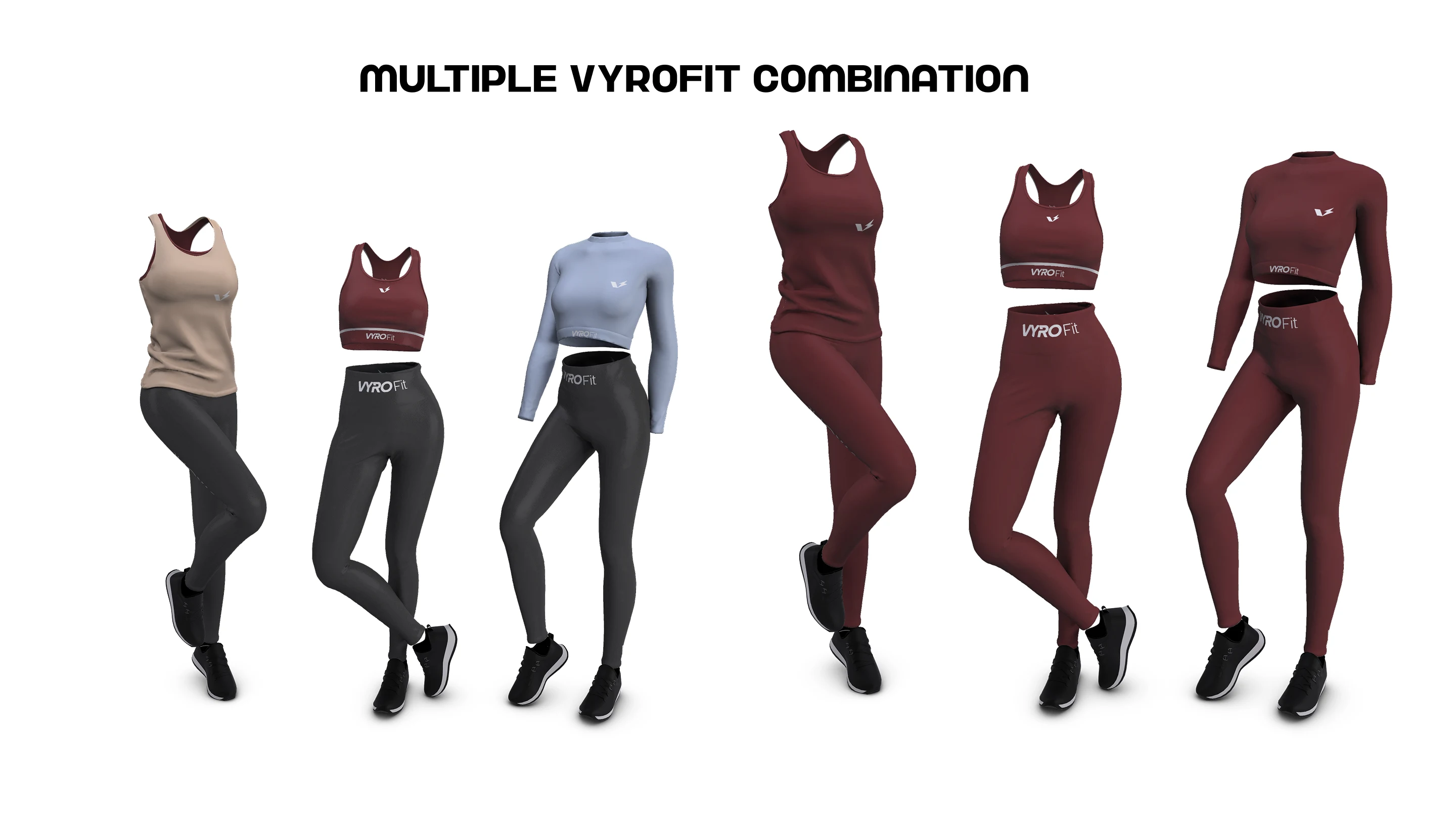
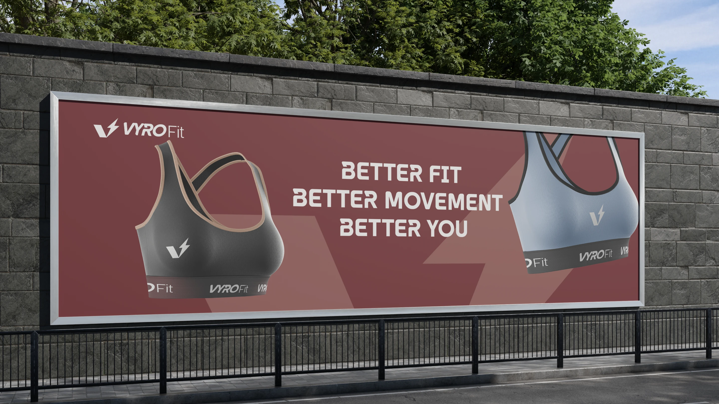
Color System
The VYRO FIT color palette is grounded in depth and restraint, led by a dominant near-black base (#101010). Supporting tones introduce warmth and energy, while accent colors add controlled vibrancy ensuring the brand remains visually dynamic without losing its premium feel.
The palette is designed to work seamlessly across fabric, print, and digital environments.
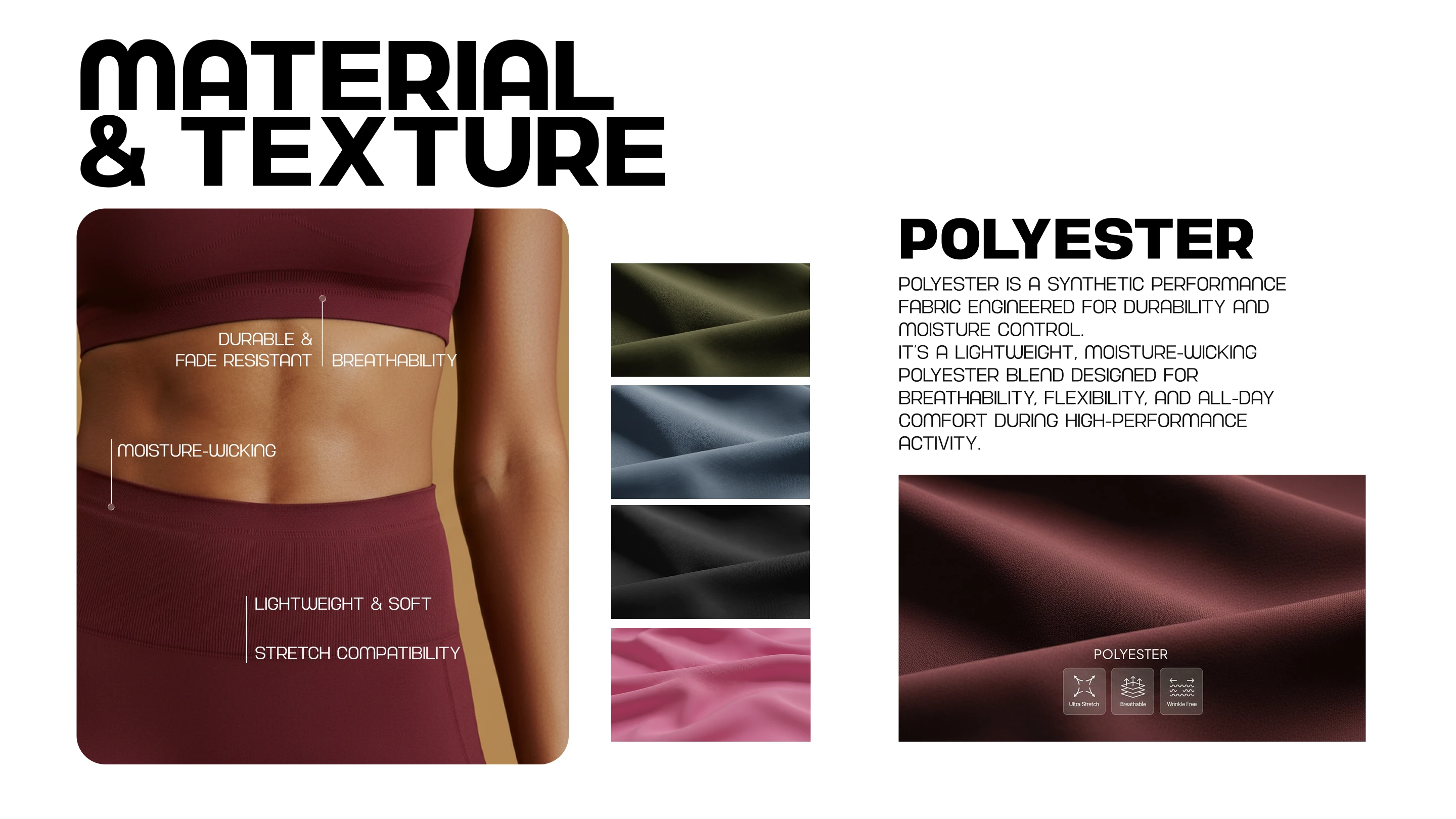
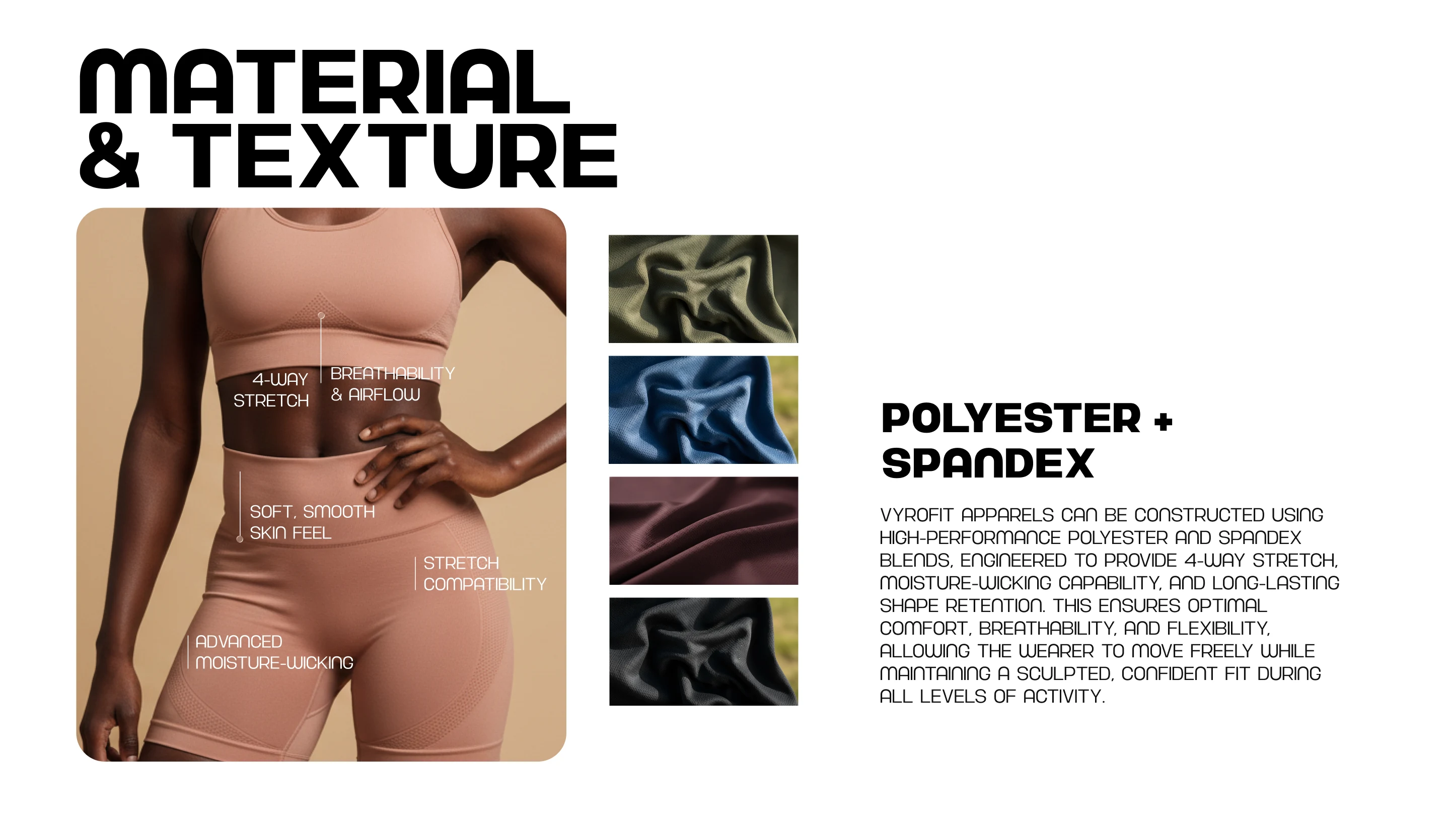
Material & Performance Thinking
VYRO FIT is engineered with performance at its core.
Every material choice is intentional supporting both performance and aesthetics.
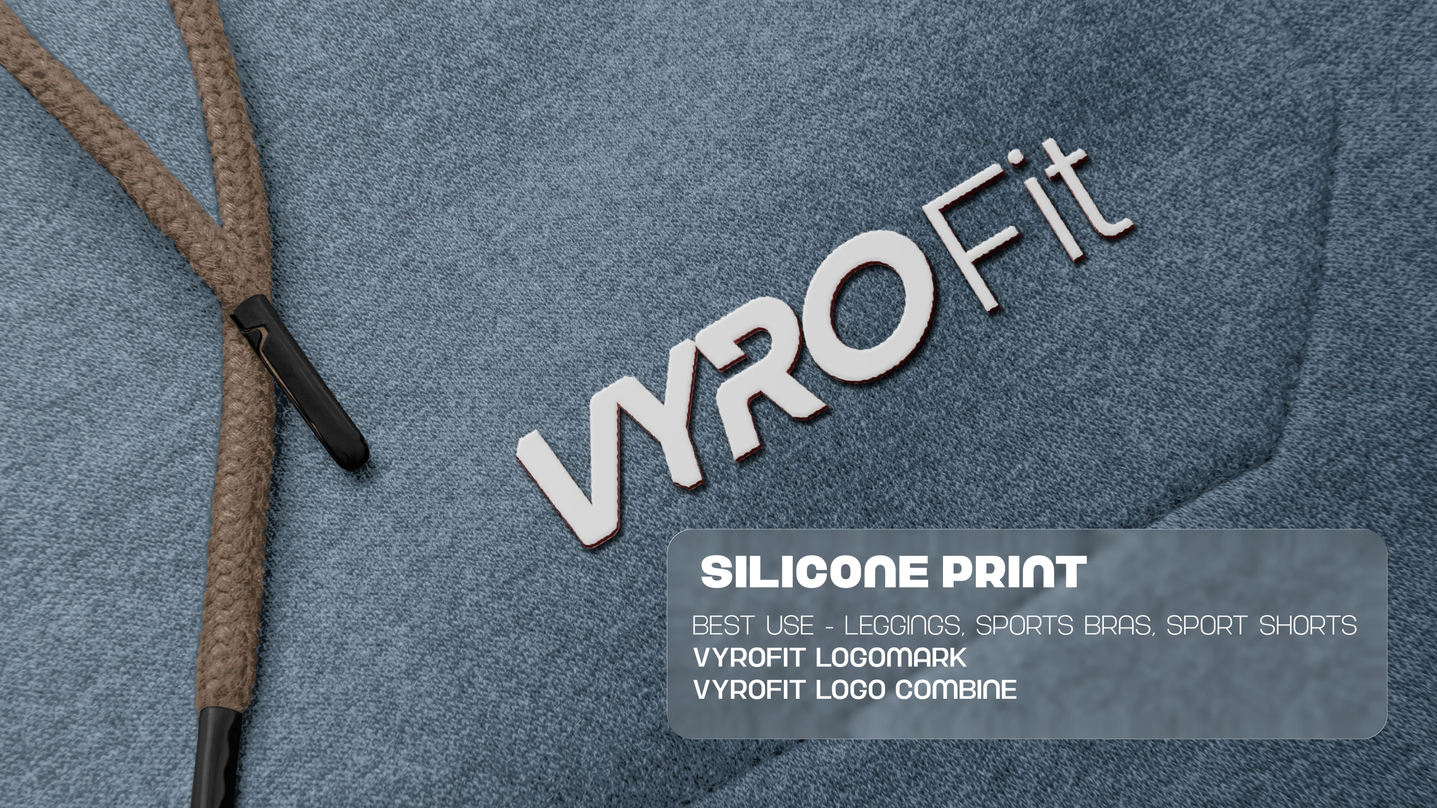
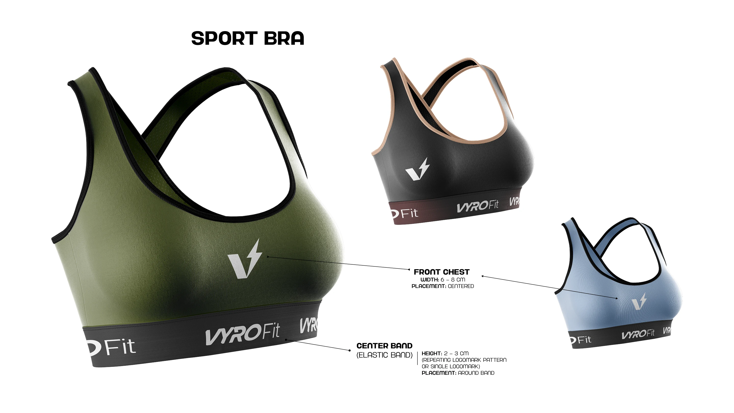
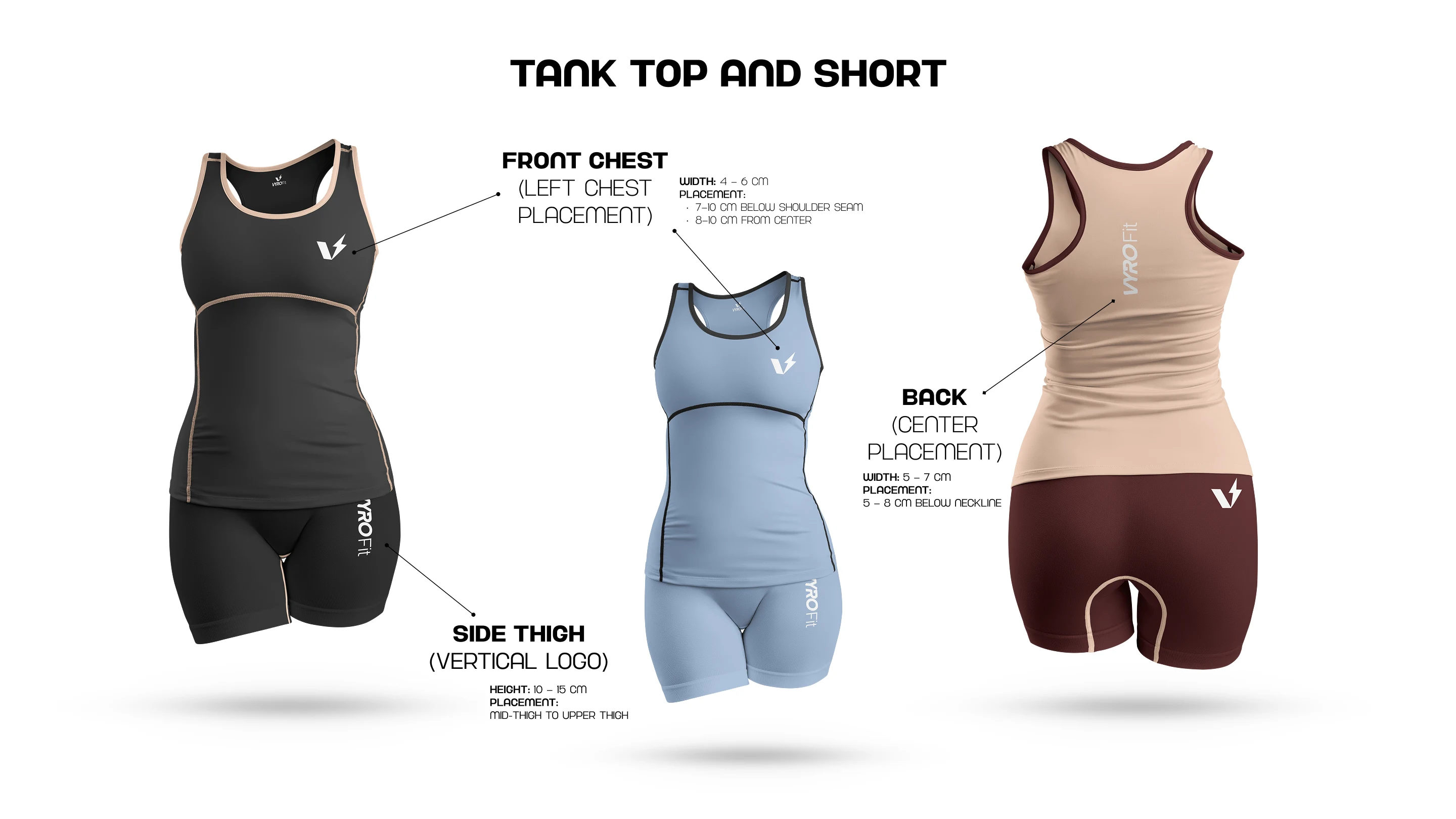
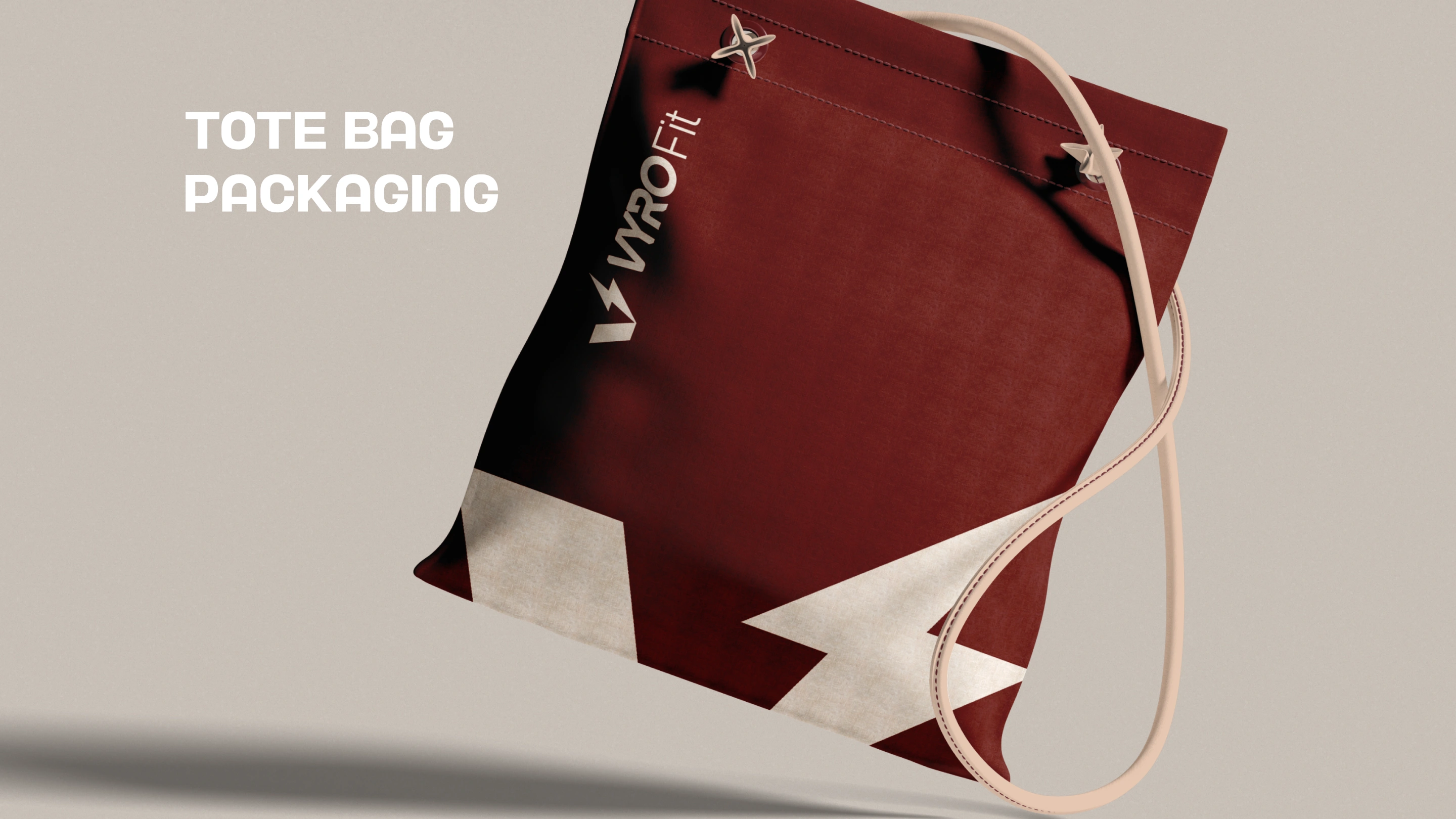
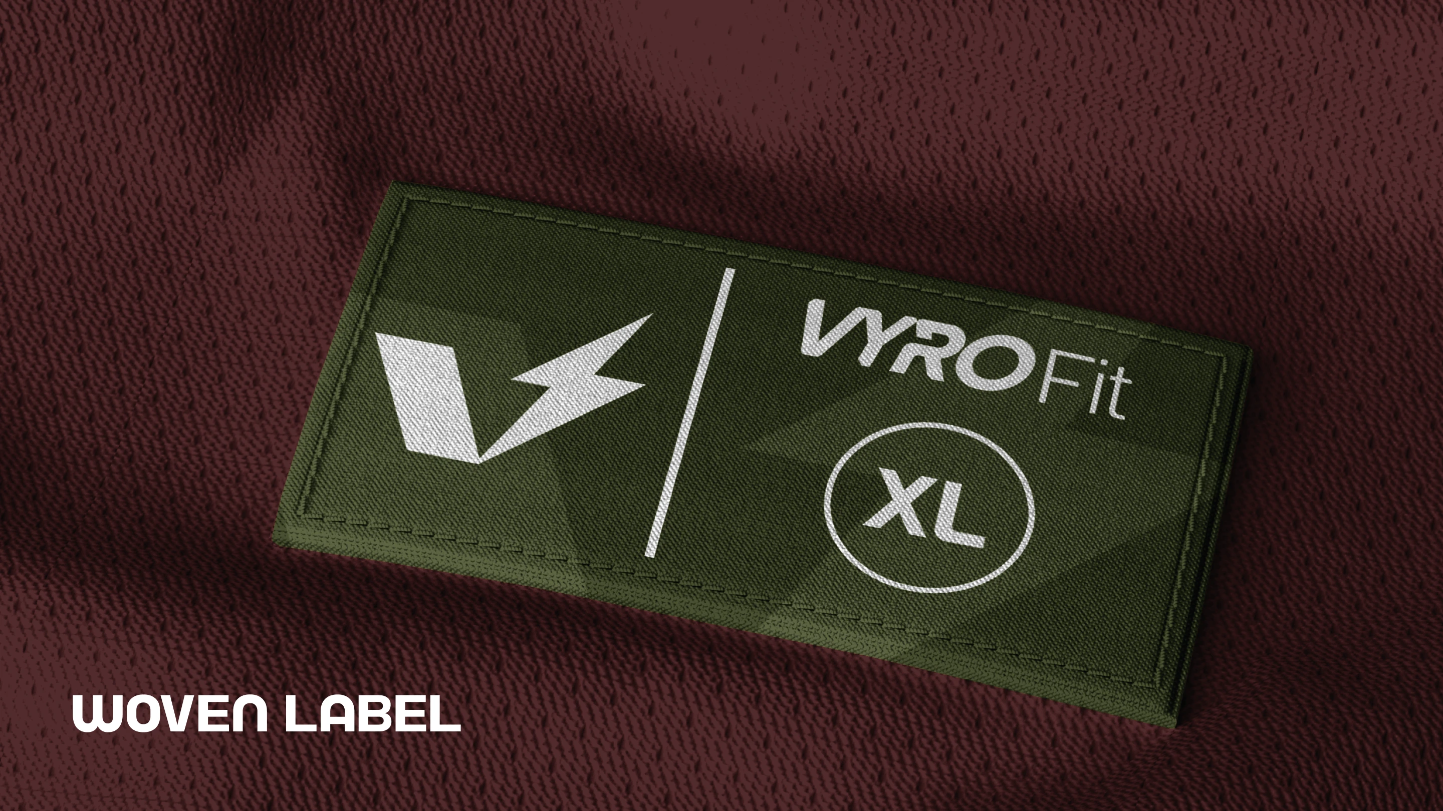
Printing & Brand Application
Heat transfer methods are intentionally excluded to preserve longevity and quality.
This ensures that every product not only looks premium but stays premium.

Conclusion
VYRO FIT is more than an athleisure brand it is a system built around movement, discipline, and growth.
Every element from the logo to material choices works together to create a cohesive identity that performs as hard as the people who wear it.
Like this project
Posted Apr 22, 2026
Developed a logo and brand direction system for VYROFIT