UX/UI Design for E-commerce Platform
Priyanka Patel
SONNY — B2B2C E-commerce Platform
Project Overview
SONNY (ShopOnlineNewYork) is a dual-audience e-commerce platform designed for New York state. It bridges manufacturers/distributors and end-users, enabling bulk and individual purchases with a streamlined UX for both buyer and seller sides.
My Contribution:
At SONNY, I focused on creating seamless user experiences by designing wireframes and mockups for buyer and seller interfaces across desktop and mobile platforms. My contributions included developing user flows to optimize navigation, creating and maintaining a cohesive design system, and refining designs based on user testing and feedback. I actively participated in review sessions to ensure the platform aligned with project goals and user needs.
Problem:
New York lacked a dedicated platform connecting manufacturers & distributors with both retail & bulk buyers.
Users (both buyers & sellers) faced confusing navigation, inconsistent UI, and a cumbersome onboarding process.
Solution:
Built separate buyer and seller flows with clear navigation and simplified onboarding.
Updated design system to enforce consistency and improve developer handoff speed.
Introduced prioritized features, sidebar categories, and clearer calls to action for both audiences.
Process Highlights
1. Research & Insights
Identified buyer pain: hidden fees, complex checkout, unclear product discovery.
Seller pain: confusing onboarding, lack of clear dashboard guidance.
2. Wireframes & Prototypes
Designed iterative wireframes for both buyer and seller flows.
Usability testing revealed key interface confusions, which drove revisions.
3. Design System & UI Iterations
Refined components for consistency across both buyer and seller dashboards.
Placed frequently used elements (search, cart, profile) in more prominent positions.
4. Responsive Design
Ensured desktop and mobile versions maintained usability, clarity, and visual hierarchy.
Prioritized mobile-friendly interactions (thumb zone, simple navigation)./
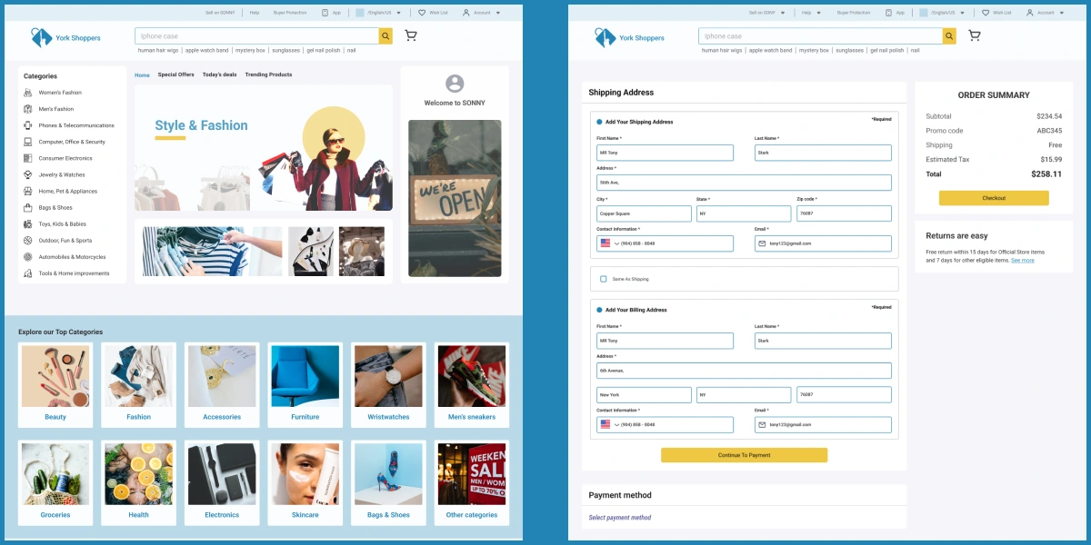
Design Iteration & Usability Testing (BUYER Homepage)
Improved Navigation: Added product categories to the left sidebar for easier access and better navigation for shoppers.
Prioritized Key Features: Placed frequently used features like account, cart, and wish list prominently at the top of the navigation bar.
Streamlined Search Experience: Displayed popular searches under the search bar to help users quickly find what they need.
Footer Refinements: Made the footer more user-friendly by reorganizing content and integrating the subscription section into it for a cohesive design.
Space Optimization: Removed unnecessary elements like the standalone subscribe section, improving visual balance and usability.
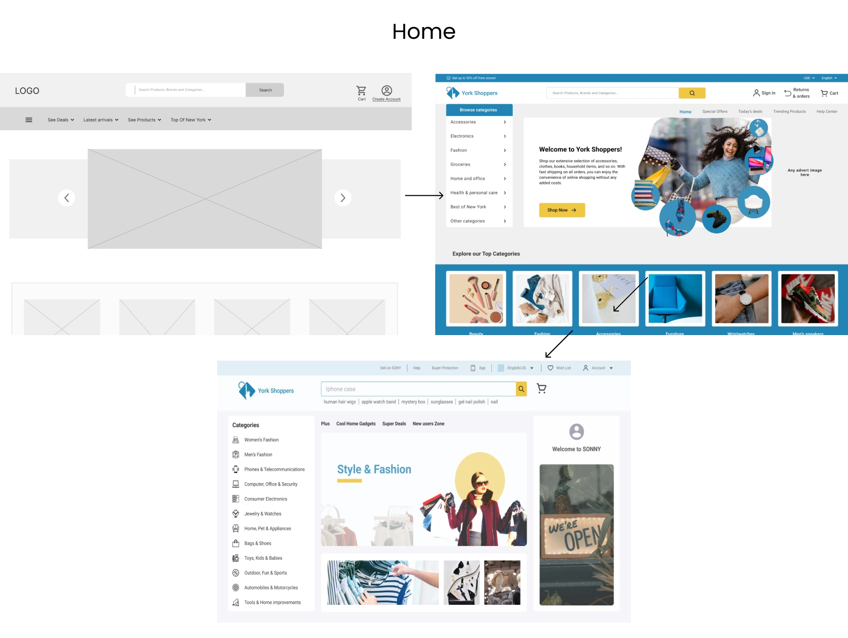
Home Page
Design Iteration & Usability Testing (SELLER Homepage)
Simplified Onboarding Process: Initially, the SELLER dashboard included four primary CTAs for onboarding (e.g., "Get Verified," "Select Payment Method"). Users found this confusing, so we emphasized the "Get Verified" step as the primary action, graying out the others to guide the process effectively.
Dynamic Content Update: Recognized that once sellers completed onboarding tasks (verification, payment, and shipping setup), these steps were redundant. Added a new page to display relevant data like orders, inventory, and financial summaries, providing a more streamlined and actionable experience.
Effortless Product Management: Introduced an "Add Items" CTA button allowing sellers to upload products, stored as drafts until verification was completed, ensuring a seamless transition into their active catalog.
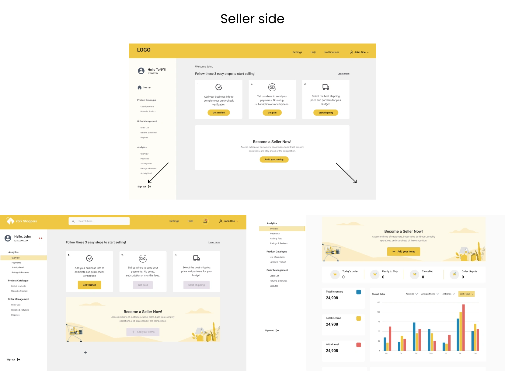
Seller Dashboard
Impact & Outcomes
Developer handoff speed improved by ~30% due to a more polished design system.
Buyer navigation efficiency improved by ≈20% via a reorganized homepage, improved search prominence, and sidebar categories.
Seller onboarding completion rate increased by ≈40% after streamlining steps and clarifying key actions.
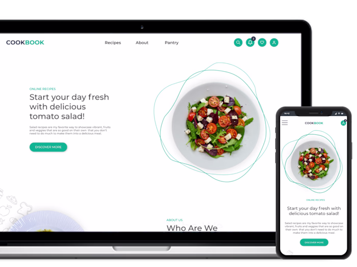
Buyer's experience
Seller's Experience
Like this project
Posted Sep 15, 2025
Designed UX/UI for SONNY B2B2C e-commerce platform, creating buyer & seller flows, responsive design, and a design system that boosted efficiency & onboarding.
Likes
1
Views
13