Redesigning a website for a small business.
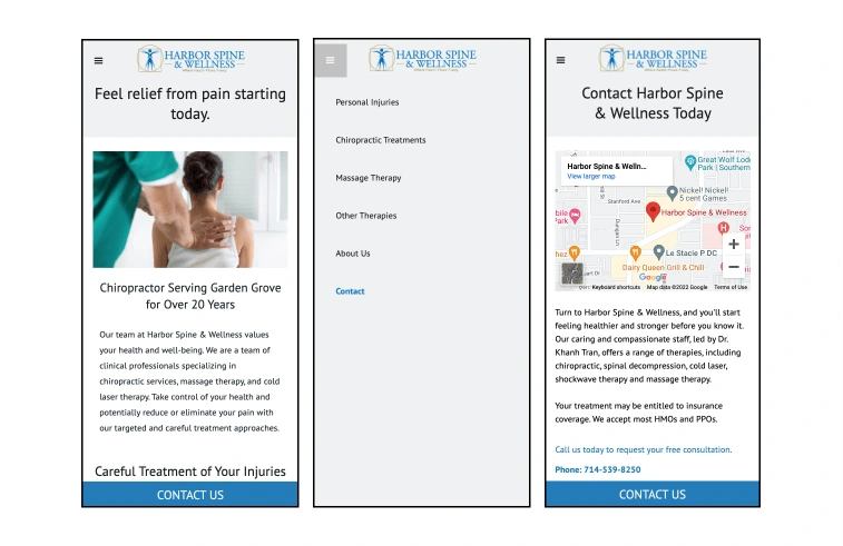
A chiropractor based out of California had been in business for over twenty years. They needed a refresh of their website, making it more accessible and mobile-friendly.
This client came to me with a website that hadn’t been updated in a few years. The desktop site wasn’t too bad, but the mobile site was difficult to navigate.
The goal was to redesign the website while using their current branding and assets. Sometimes, you don’t have full control over a project and have to use what is there.

The challenge was how do you make existing assets—there were many—work with an entirely different concept.
To solve this, we looked at the main issue: navigation. We started by spreading the content out and making menus easier to read and navigate—mobile first. By spreading out the content & assets, we didn’t need to rebrand while still solving the main issue.
There were other updates too, such as simplifying colors and simplifying the copy.
Like this project
Posted Feb 22, 2024
Revamped a long-standing small business's site for mobile-friendly experiences.
Likes
0
Views
5


