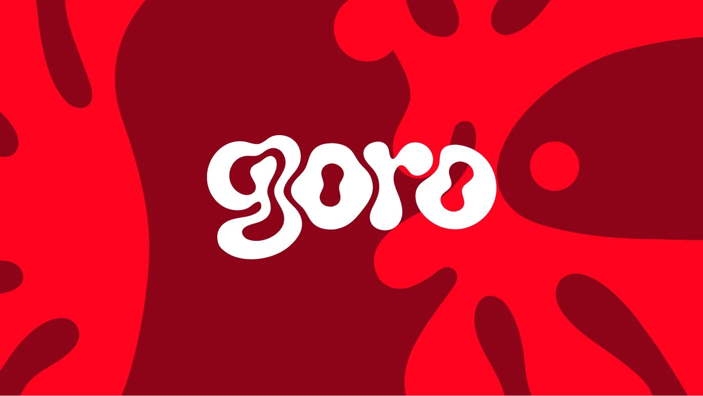
Goro — Hibiscus (Zobo) Drink Brand & Packaging
Zazzy
Every now and then a challenge comes along that doesn't let you sleep until you answer it properly. A friend bet me I couldn't make zobo look like it belongs on a shelf next to Coke and Pepsi. I took that personally.
Zobo is one of Nigeria's most beloved drinks. Deep red, tart, hibiscus-forward, spiced with ginger and cloves. Complex, interesting, culturally rich. The drink has always been world-class. The packaging never was. That was the brief I gave myself — close that gap.
The Name
I needed a name that felt premium without losing its roots. Something short, punchy, and ownable globally. Goro. One word. Rolls off the tongue. Carries no baggage but leaves room to build meaning around it. The tagline did the rest — Taste the Bloom. Two words that tell you it's botanical, experiential, and worth your attention.
The Logo
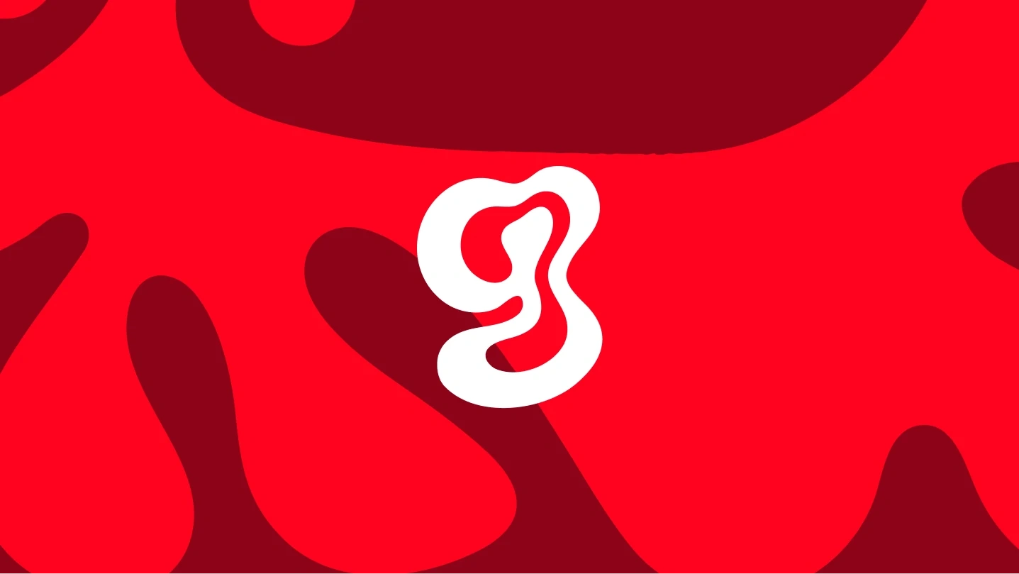
The mark came first. I built around a fluid organic "g" letterform — a bold blob shape with a thick stroke and interior negative space. The decision was intentional. Hibiscus petals are soft, rounded, and layered. The mark needed to feel grown, not manufactured. Nothing geometric. Nothing rigid. Just something that felt like it came from the earth.
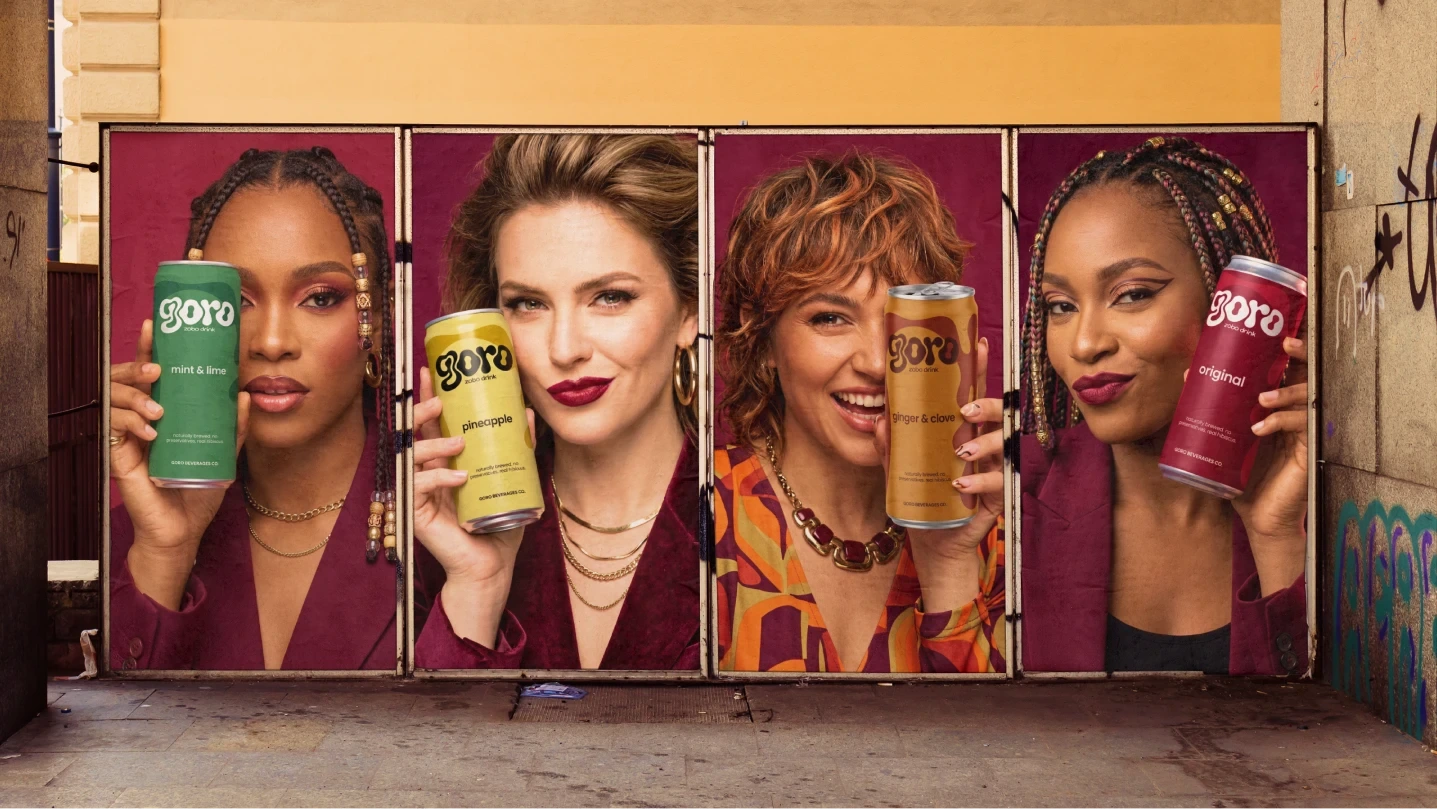
I posted two logo directions publicly on X and asked my audience to vote. The open, airy version won by a landslide. At can scale that openness gives the mark breathing room and presence. The people were right. Lesson learned — your audience is a free focus group. Use them.
Colour System
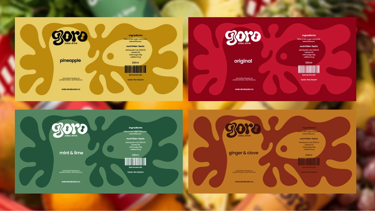
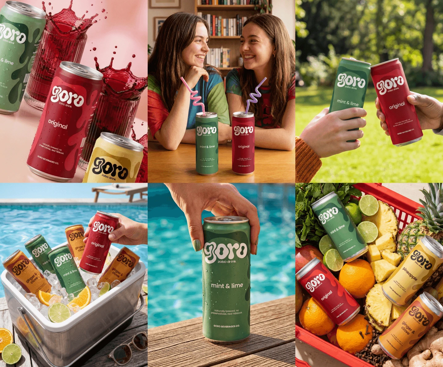
The colour system was built flavour-first. No trend boards. No arbitrary palette decisions. Every hex code is justified by the ingredient itself.
Original — Deep Crimson Red
#8B1A1A. The exact colour of brewed zobo in a glass held up to light.Ginger & Clove — Warm Amber
#C47A2B. The colour of dried ginger root and raw spice.Pineapple — Butter Yellow
#E8D07A. Ripe pineapple flesh at peak sweetness.Mint & Lime — Sage Green
#4A7C59. Fresh mint leaf pulled straight from the stem.Four flavours. Four colours. Zero guesswork.
Typography
The wordmark carries the personality. Supporting type stays clean, minimal, and editorial — small tracked-out sans-serif for the sub-brand text, light weight for the can copy. The hierarchy is clear. Goro leads. Everything else supports.
Case Study Visuals — Flora AI & Nano Banana
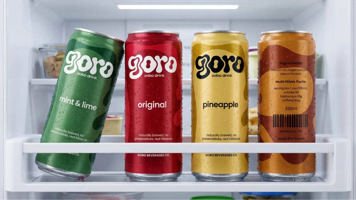
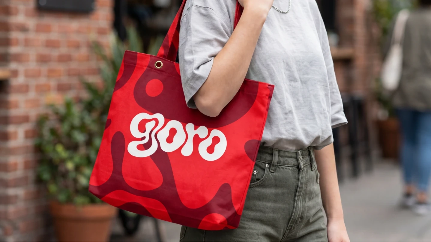
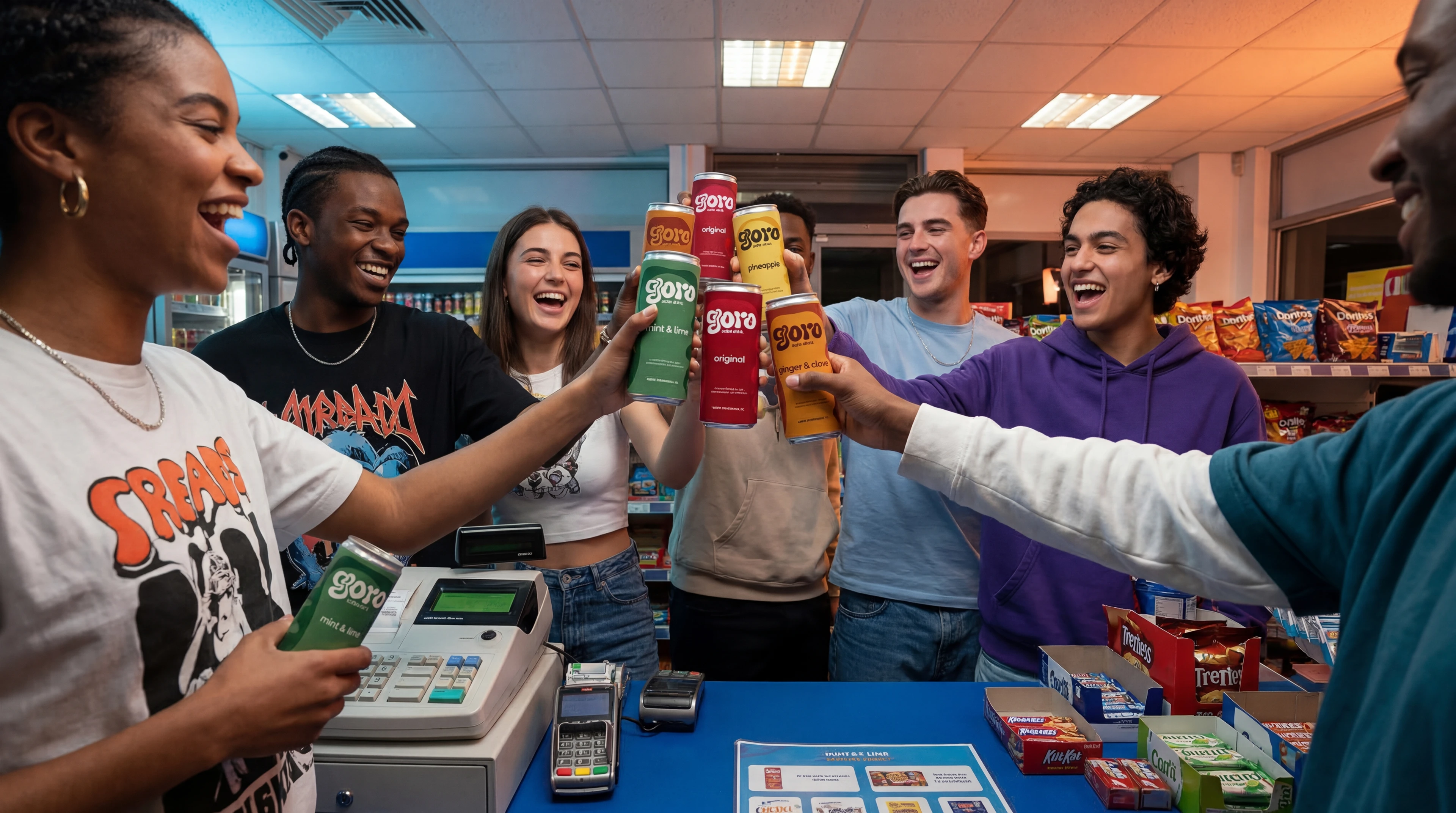
This is where the workflow gets interesting. Once the packaging was fully designed in Figma I needed to show it in the real world — on shelves, in hands, in fridges, at poolsides. Traditionally that means booking a photographer, hiring a studio, sourcing props, and spending days on production.
Instead I used Nano Banana within Flora AI to generate every case study visual. Fridge shots. Lifestyle photography. Tote bag mockups. Hands clinking cans in a garden. Cans in an ice bucket by a pool. All of it rendered from prompts without a single photoshoot.
The key was prompting with intention. Vague prompts give vague results. Every prompt I wrote specified the exact can colours, label details, scene composition, lighting direction, background, props, and mood. The more specific the instruction the closer the output to the vision.
The result was a full campaign-quality visual case study produced in an afternoon. What used to require a full production day and a significant budget now requires a well-built prompt and the right tool.
AI didn't design Goro. I did. AI just helped me show it to the world.
The Response
The project was shared publicly on X and the response was immediate. Thousands of impressions within hours. Designers engaging with the process. Non-designers asking where they could buy it. Some people genuinely thought it was a real brand already on shelves — which is the biggest compliment a concept project can receive.
The challenge was to make zobo look like it belongs next to the world's biggest soft drink brands. I think we got there.
Zobo has always deserved this. It just needed someone to take it seriously.
Taste the Bloom.
Like this project
Posted Mar 21, 2026
Goro — a canned hibiscus drink brand built to sit on a shelf next to Coke. Full identity, packaging & AI-generated case study visuals using Flora AI.
Likes
1
Views
91