🧘♂️ Equinox+ | E-commerce, Subscription (B2C)

Ary Mega
UX Designer
Product Designer
UI Designer
Figma
Notion
Slack
Equinox
📜 Overview
Equinox+ is like having a premium fitness studio in your pocket - it's a digital transformation of the luxury gym experience into an accessible mobile app.
Just as Netflix revolutionized how we consume entertainment, Equinox+ aims to revolutionize how people access premium fitness content and connect with instructors, whether at home or on the go.
Equinox+ promo video
🎖️ The results
17% increase in mobile app downloads and free trial starts
12% increase in website traffic with 8% longer session duration
6% increase in SoulCycle bike sales
11% improvement in conversion through simplified navigation
15% increase in engagement with new dynamic video banner
🧗♂️ The problem
The website wasn't effectively communicating the value of their digital fitness platform, resulting in low conversion rates for free trial sign-ups.
This gap between physical and digital experiences was limiting their ability to expand their user base and establish themselves in the competitive digital fitness market.
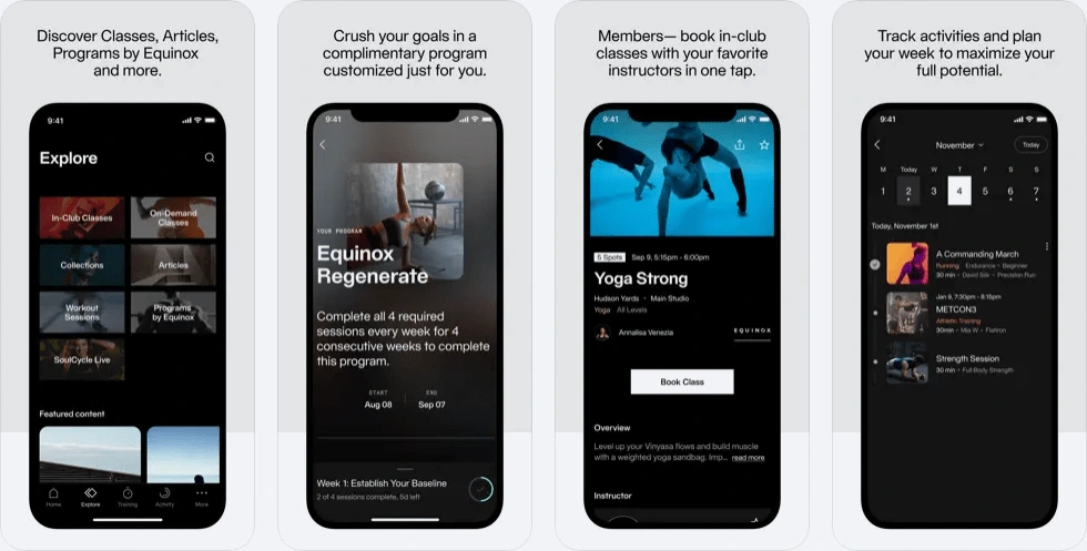
Screenshot of Equinox+ on the App Store
🔑 Key decisions
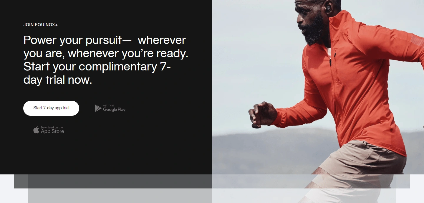
Marketing card variant that won during an A/B test to drive more free trial sign-ups
Technology Stack Decision
Implemented dynamic video banners over static images
Think of it as the difference between a photo and a movie trailer - the video provides a more immersive preview of the experience
Result: 14% increase in user engagement
Architecture/Implementation Approach
Restructured the site architecture to prioritize free trial conversion
Similar to how a retail store places its best-selling items at eye level
Outcome: 19% increase in free trial starts after moving CTA above the fold
User Experience Direction
Simplified navigation and user flow, similar to how a well-designed store layout guides shoppers naturally through departments
Created clear pathways to free trial sign-up, bike purchase, and support
Results: 9% increase in conversion rates
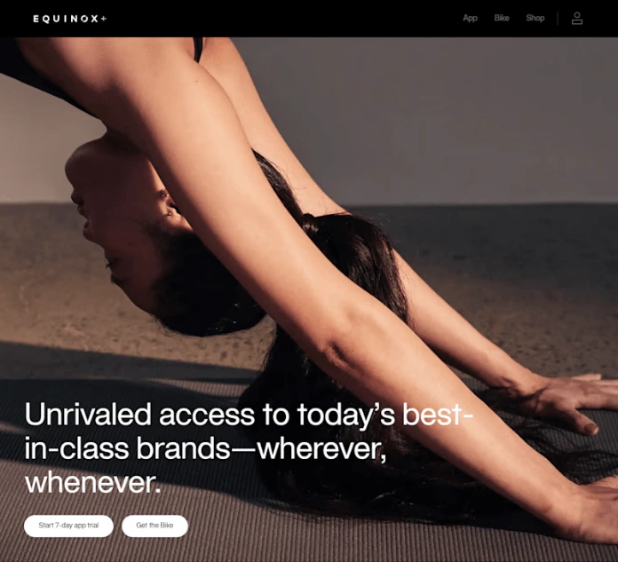
+11% conversion when we simplified the navigation
🧩 The process
I owned the complete redesign of key conversion pages and conducted A/B testing for marketing cards and calls-to-action.
Throughout the project, I created comprehensive user flows and sitemaps to guide the development process. I also developed interactive prototypes that were used for stakeholder reviews and user testing sessions.
Our success relied heavily on close collaboration with the marketing, app development, and e-commerce teams.
I actively participated in regular design reviews and iteration cycles, making sure all stakeholder feedback was effectively integrated into the design process.
Throughout the project, I maintained consistent communication across all phases of design and established testing strategies to validate new features before launch.
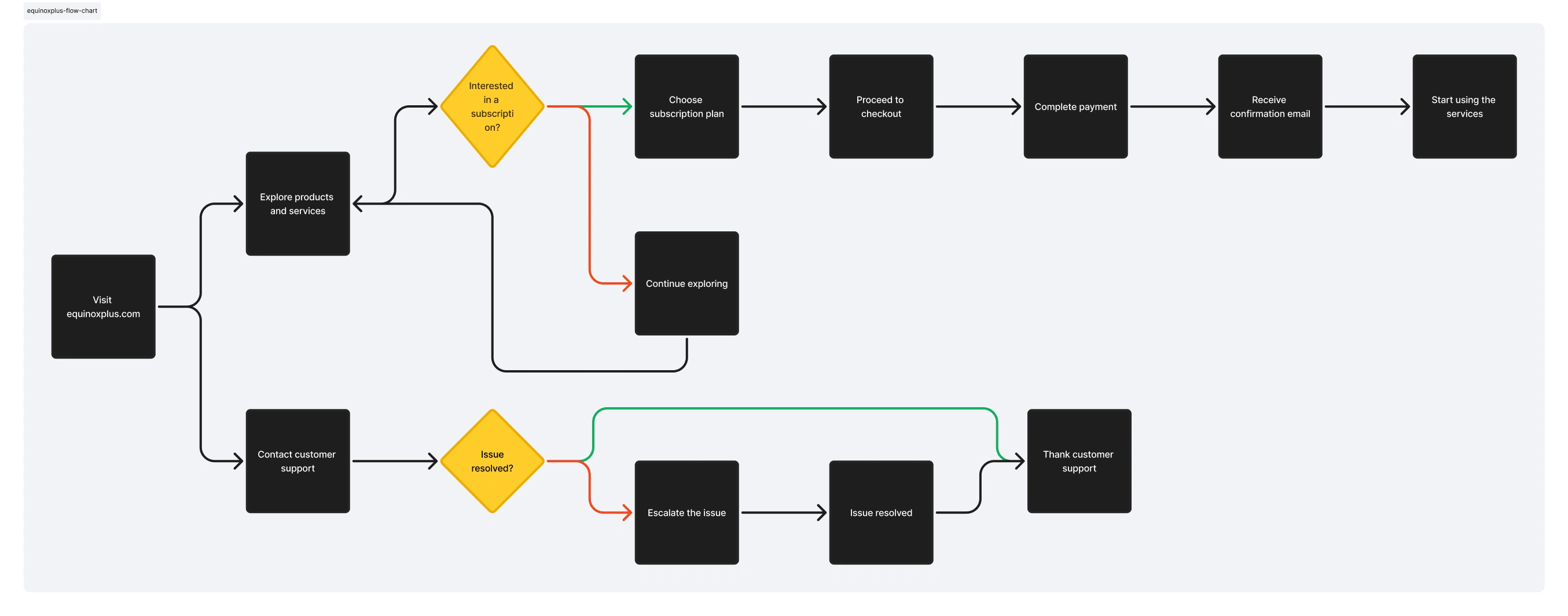
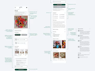
Simplified end-to-end user flow for Equinox+ marketing site
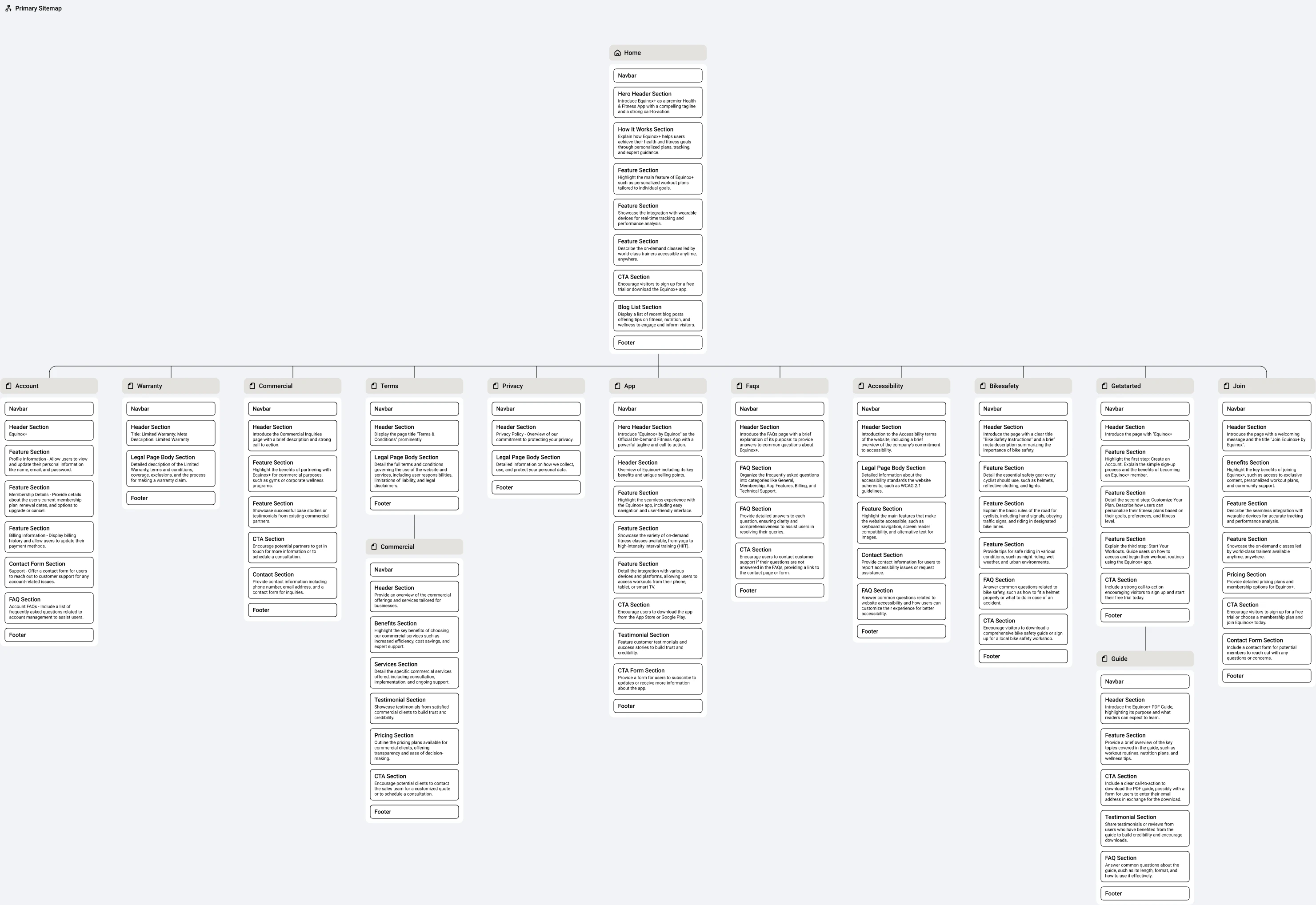
New sitemap for Equinox+

Stages of iterations of the marketing site
📷 Visuals
Promo video for the app

Screenshot of new marketing home page
💡 Learnings and next steps
Our data revealed poor conversion rates from free trials due to low feature engagement during the trial period. We implemented an enhanced onboarding experience to address this issue.
High bounce rates on the SoulCycle bike page stemmed from insufficient product information. Users needed clearer details about financing and delivery options before making purchase decisions.
Dynamic video content drove 16% higher engagement than static images, leading us to prioritize motion-based storytelling across the platform.
We're focusing on two key areas: improving the free trial conversion through better onboarding and redesigning the SoulCycle product page with comprehensive purchase information.
Long-term, we'll expand into personalized coaching and community features while maintaining our premium brand position.


