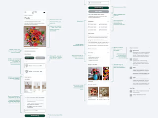
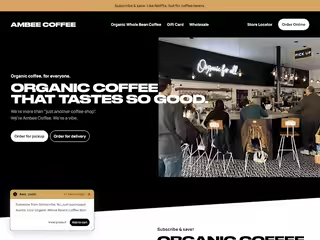
☕ Four Sigmatic | E-commerce, Wholesale (B2C, B2B)

Ary Mega
Web Designer
Product Designer
Responsive Design
Figma
Jira
Slack
Four Sigmatic
📜 Overview
The company: Four Sigmatic
My role: Freelance UX/UI Designer
The goal: Redesign the home page to drive more users to product pages and ultimately increase online sales of their mushroom-based coffee, tea, and elixir products.
Promo video, displayed on the home page that generated high conversion rate to product pages
🧗♂️ The challenge
Context: Four Sigmatic, a company specializing in functional mushrooms and adaptogens, wanted to improve their website's effectiveness in converting visitors into customers. Analysis revealed that the existing homepage lacked a clear explanation of their unique product offerings and benefits, leading to low click-through rates to product pages and a high bounce rate.
Constraints: The redesign needed to maintain brand consistency and integrate seamlessly with their existing website structure and e-commerce platform.
User needs: Users needed a compelling introduction to Four Sigmatic's products, their benefits, and how they differ from traditional coffee and tea options. They also needed clear navigation to explore different product categories and easily make a purchase.
💡 The solution
A user-centered approach focused on clearly communicating the value proposition of Four Sigmatic, showcasing the unique features of their mushroom-based products, and simplifying the user journey to product pages.
Key features:
Compelling Hero Section: Redesigned the hero section with high-quality visuals and concise messaging highlighting the benefits of incorporating functional mushrooms into daily routines.
Product Showcasing: Created dedicated sections showcasing the different product categories (coffee, tea, elixirs) with clear visuals, concise descriptions, and prominent calls to action to "Shop Now" or "Learn More."
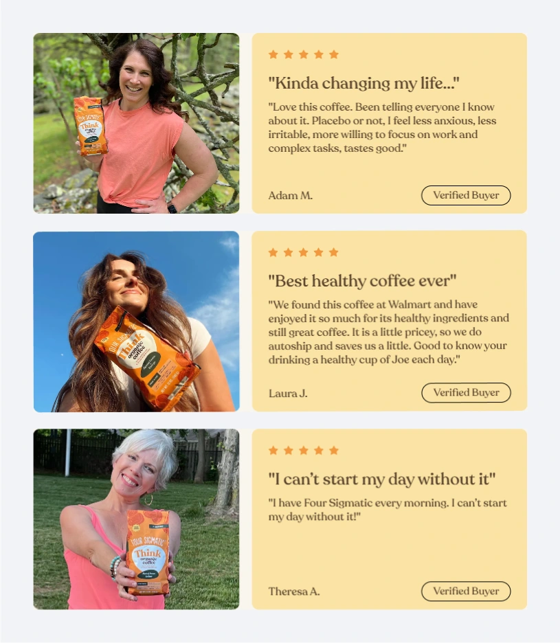
Benefits Highlighting: Developed sections emphasizing the key benefits of Four Sigmatic products, such as increased focus, improved immunity, and reduced stress, supported by customer testimonials and scientific research.
Ingredient Education: Integrated informative sections explaining the different types of functional mushrooms used in their products and their unique health benefits.
Simplified Navigation: Improved the website navigation to provide clear pathways to product pages, blog articles, and customer support.
People often accept default suggestions.
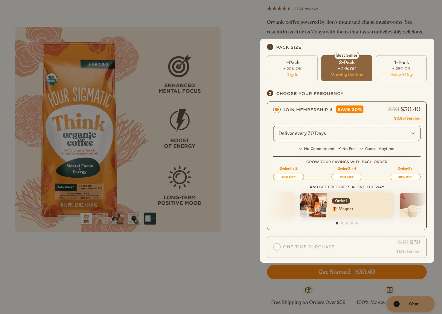
We wanted to encourage more repeat customers, so we ran an A/B test.
We made our best-selling 2-pack with a subscription the default selection on product pages. The idea is that most people prefer the path of least resistance. By making subscribing the easiest option, we hoped to see an increase in sign-ups.
📷 Visuals

✨ In conclusion
The "Ingredient Education" section exemplifies a 0 to 1 design process. This section was conceived and implemented during the homepage redesign to address the user need for better understanding of functional mushrooms and their benefits.
Here's how it demonstrates 0 to 1 design:
Identifying the need: Through user research and feedback, we discovered that many users were unfamiliar with functional mushrooms and their potential benefits. This lack of knowledge presented a barrier to purchase, as users were hesitant to try products containing ingredients they didn't understand.
Ideation and conceptualization: To address this, we conceived the "Ingredient Education" section. This involved brainstorming different ways to present information about the mushrooms in a clear, concise, and engaging manner. We explored options like:
Interactive infographics: Visually showcasing each mushroom with information about its benefits and uses.
Short videos: Featuring experts explaining the properties of each mushroom.
Illustrated guides: Creating downloadable PDFs with detailed information about each mushroom.
Prototyping and testing: We developed prototypes of different approaches and conducted A/B testing to determine which resonated best with users. We found that a combination of concise descriptions, high-quality images, and clear calls to action to learn more performed best in driving user engagement and click-throughs to product pages.
Implementation and iteration: We designed the final "Ingredient Education" section, incorporating user feedback and iterating on the design based on A/B testing results. This involved collaborating with content writers to create informative and engaging descriptions, sourcing high-quality images of the mushrooms, and working with developers to seamlessly integrate the section into the homepage.
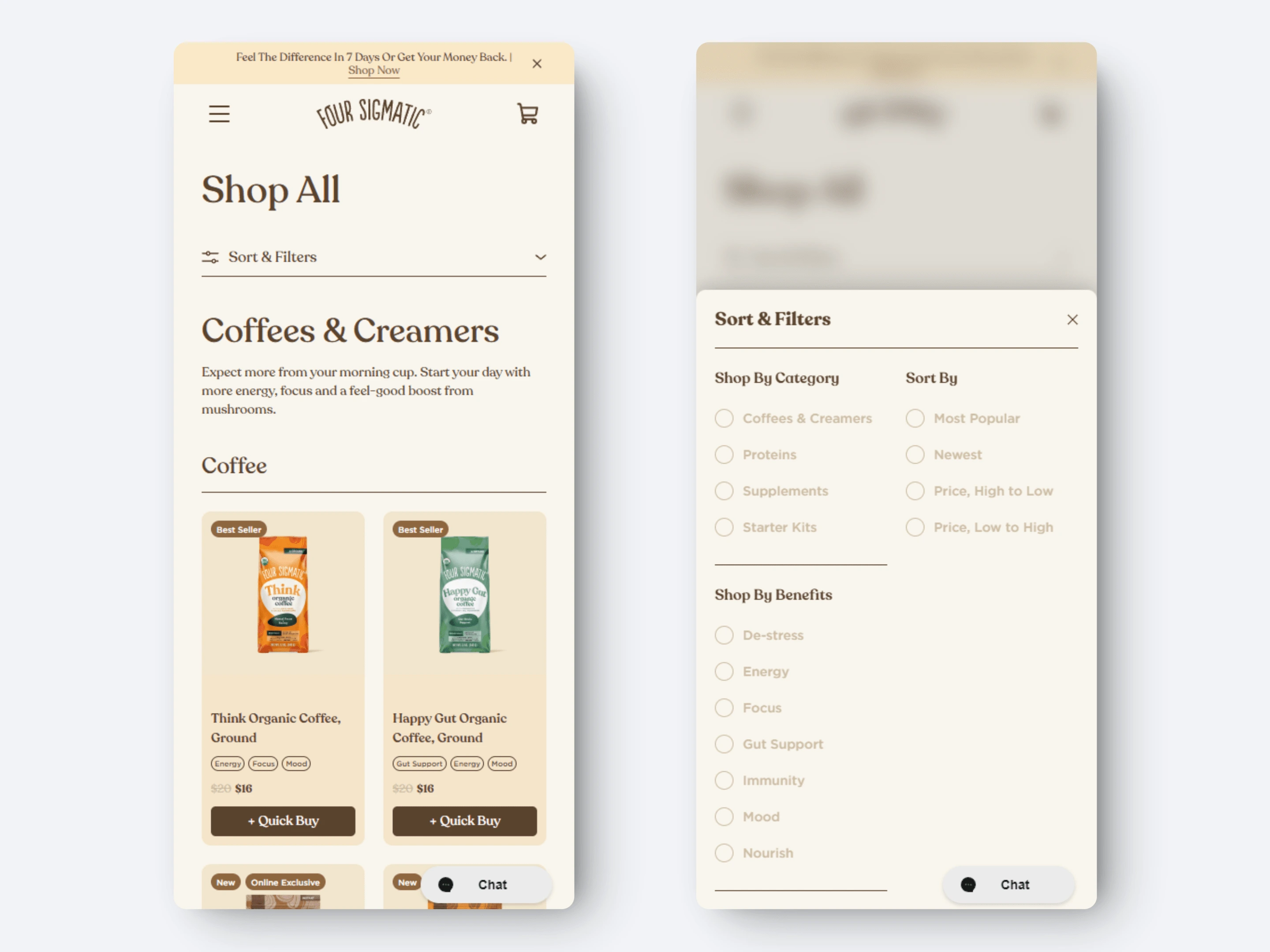
Mobile variant with blurred background showed slight lift in conversion
Outcome: The "Ingredient Education" section successfully addressed the initial user need by providing clear and accessible information about functional mushrooms. This contributed to increased user understanding and confidence in Four Sigmatic's products, ultimately driving higher engagement and conversions.
This example highlights my ability to take a design concept from its initial ideation (0) to a fully implemented feature (1) on the website.
It demonstrates my skills in:
Identifying user needs: Through research and analysis.
Conceptualizing solutions: Brainstorming and developing innovative design ideas.
Prototyping and testing: Creating interactive prototypes and conducting user testing to validate design decisions.
Collaboration: Working effectively with cross-functional teams to implement the final design.
Iteration and optimization: Continuously improving the design based on user feedback and data analysis.


