Slide Deck Design for Nest Journals App

Marvis Ighedosa


Project Overview
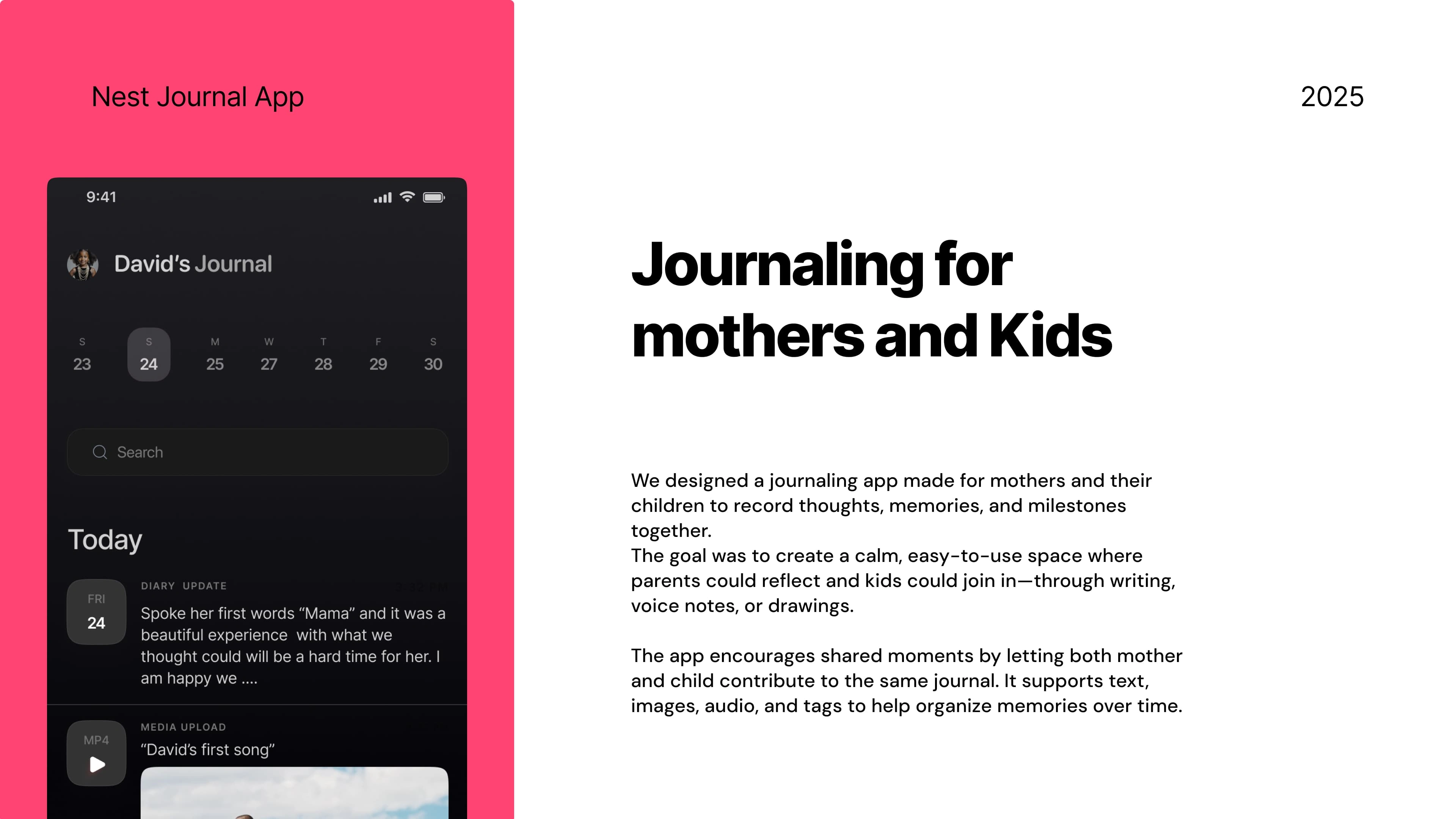
Client Name: Nest Journals
Industry: Health and Wellness
Role: Creative director and Presentation Design
Duration: 1 week.
My Approach
I followed a simple, focused process to understand the product, shape the story, and design a deck that connects emotionally and communicates clearly.
1. Understand the Product
Started with a short discovery session to learn the product’s goals, audience, and features.
• Who is it for?
• What does it solve?
• Why now?
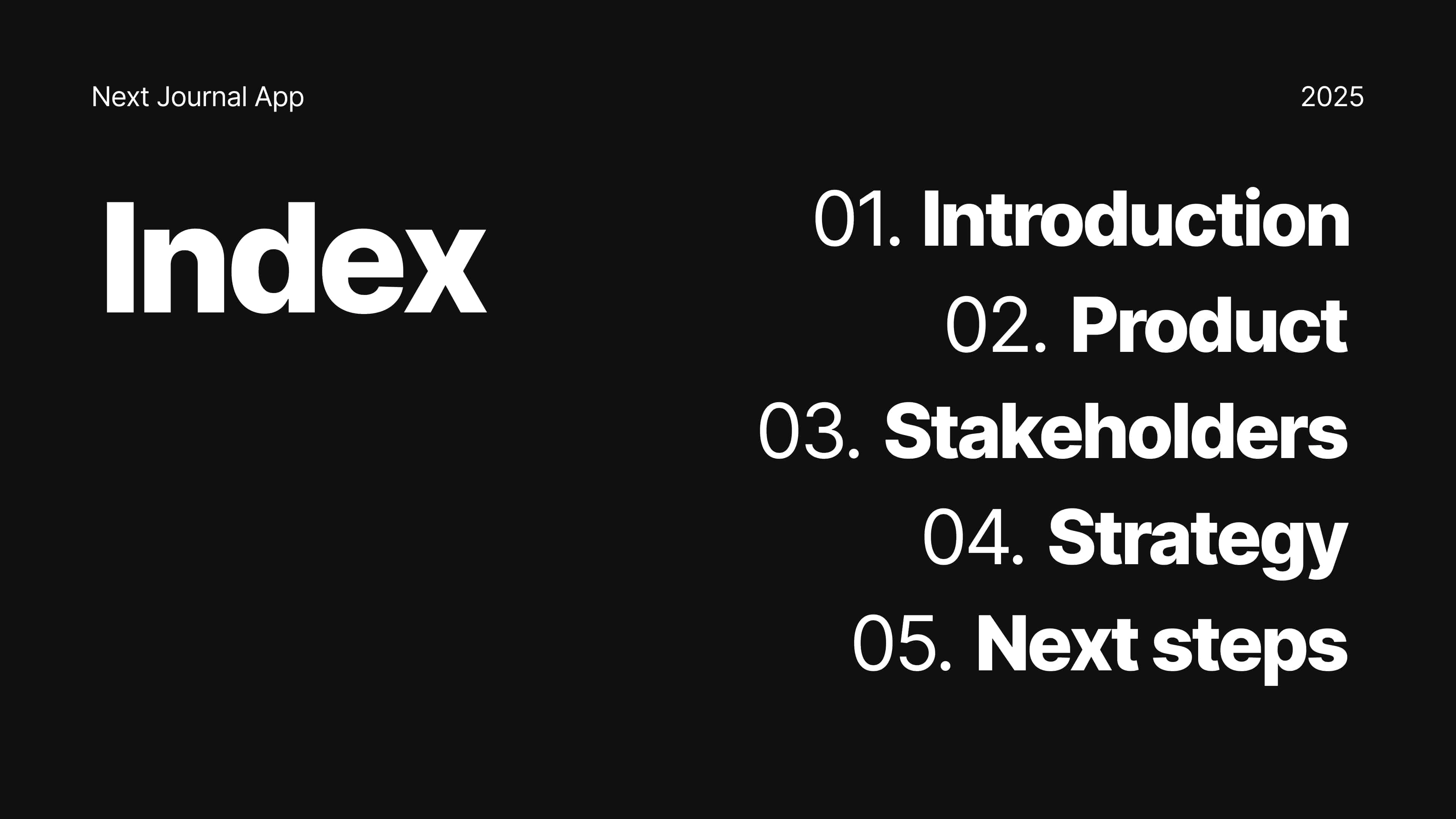
2. Structure the Story
I outlined a clear slide flow to keep things simple and engaging.
• Start with the problem
• Show how the product helps
• Highlight features, feedback, and value
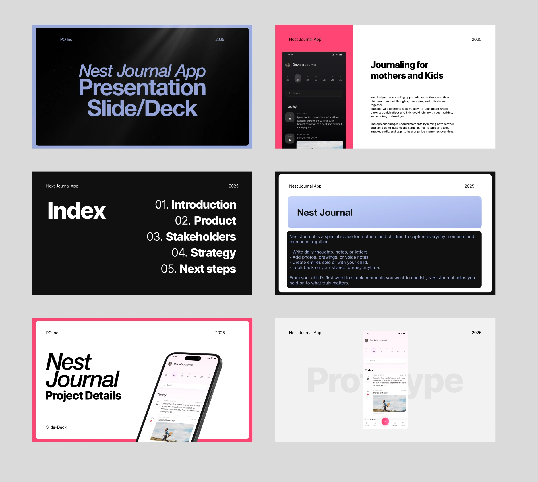
Pages from the Nest Journal Slide Deck
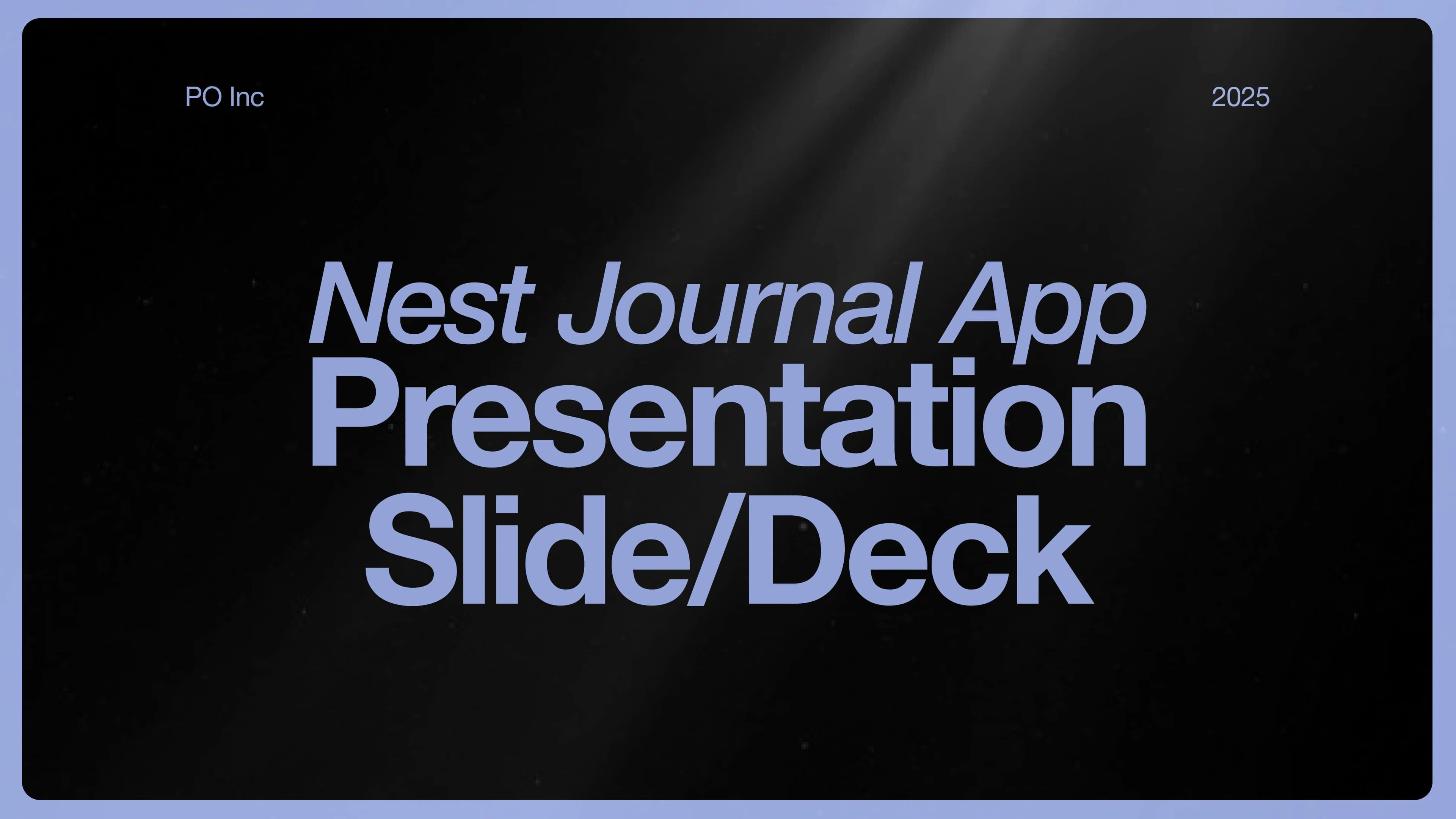
Cover Page of the Nest Journal App Slide Deck
3. Diving Deep into the Visuals
I designed a clean, soft visual style to reflect the emotional tone of the app.
• Calm colors, clear text, friendly layout
• Consistent use of icons, imagery, and spacing
• Designed for both mobile and desktop viewing
4. Refine and Deliver
We reviewed the full deck for clarity and flow, then shared the final export.
• Final files in Figma and PDF
• Editable, shareable, and pitch-ready
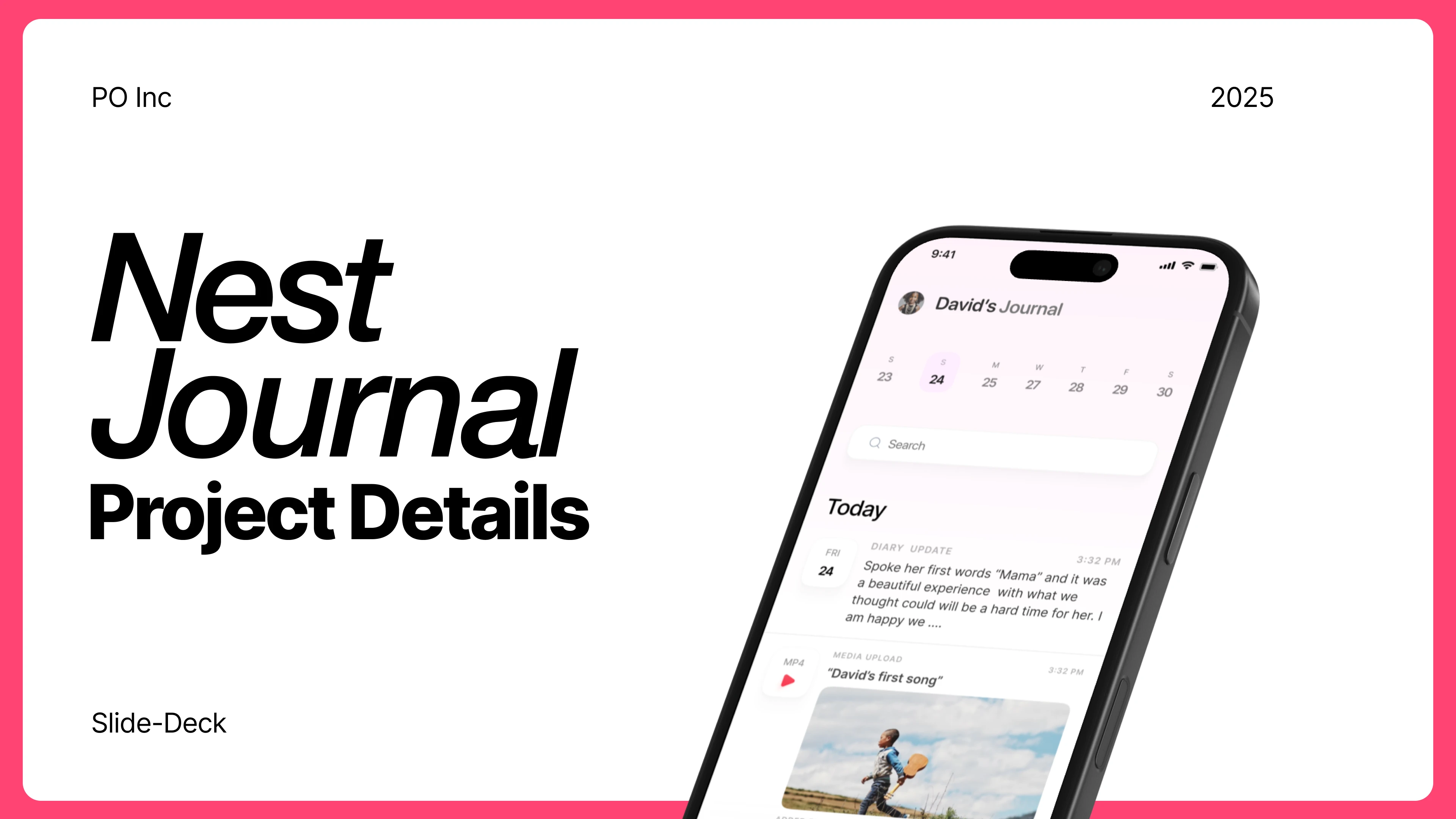
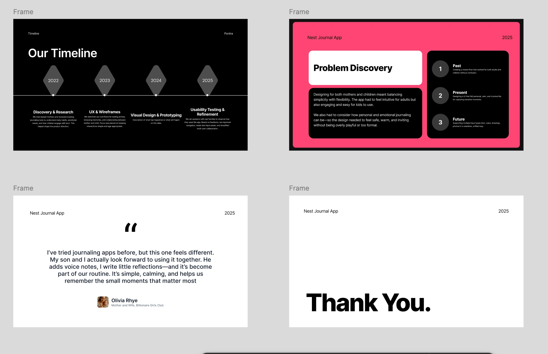
One Page from the slide deck
Results
The new slide deck didn’t just tell the story—it opened doors.
Secured 5+ Strategic Partners
After presenting with the new deck, the team landed 3 key partnerships with parenting communities and early education groups.
Boosted Early Signups
The deck helped drive over 1,200 pre-launch downloads in just 3 weeks by making the product easy to understand and share.
Sparked Investor Interest
The clarity and emotional tone of the deck helped the team land 2 investor meetings one of which moved into early-stage talks.
Confidence in Every Pitch
The founders reported feeling more confident and clear during every presentation, knowing their visuals matched their mission.
Like this project
Posted May 20, 2025
Designed a compelling slide deck for Nest Journals, enhancing partnerships and investor interest.
Likes
1
Views
3
Timeline
Jan 13, 2025 - Jan 21, 2025


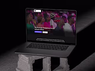
Ottersec.io : B2B Saas Website Figma Design
PaintlyAi Mobile App Design: Generate any thing with one prompt

Redxam Crypto: B2C Saas Website Figma Design
UD Website: Figma to Framer Landing Page Design and Development