Redesigning UI and consulting on UX strategy for travel iOS app
Calista Mateuszczyk
TravelBuddy ~ 2023
Mobile Design | Design Consulting
This case study highlights my UX strategy as a design consultant and my interface design abilities as lead UI designer for a mobile travel app.
Project brief
As a UX strategy consultant and UI designer, I created wireframes, icons, and mockups for a travel app. This case study offers a glimpse into how I tackled the project and delivered results. Explore my approach and the design skills that brought this app to life.
Timeline: 2 months
Industry: Travel
Problem
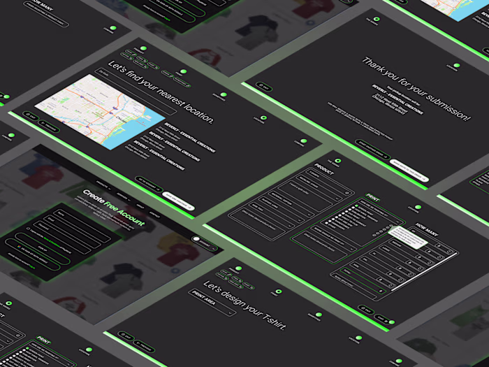
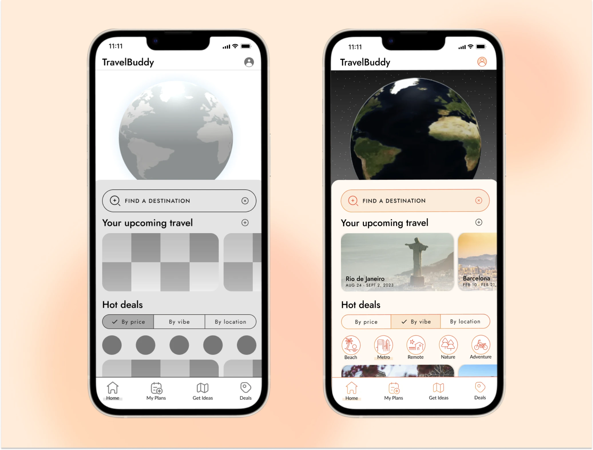
TravelBuddy initially invested into the backend and business development of their platform. They needed to revisit the UI as it was not up to par with the quality of the information and deals available through the app. Before onboarding, the team planned to do a simple interface lift. Through discovery, we identified that there was a need for new UX as well. I operated as a design consultant for the UX strategy for all structural changes, redesigned the interface of the home page and created a complex component library for the remaining pages.
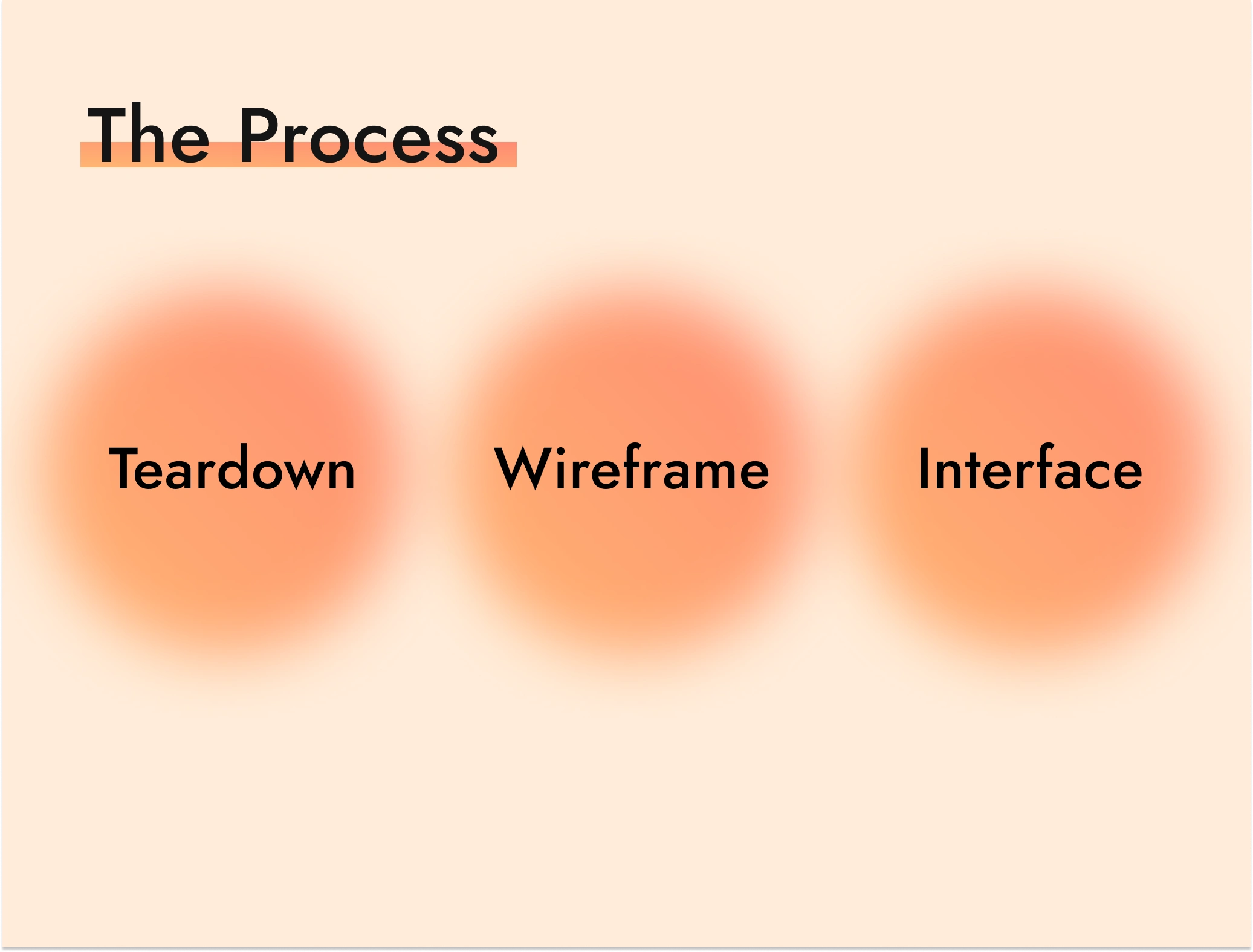
Teardown
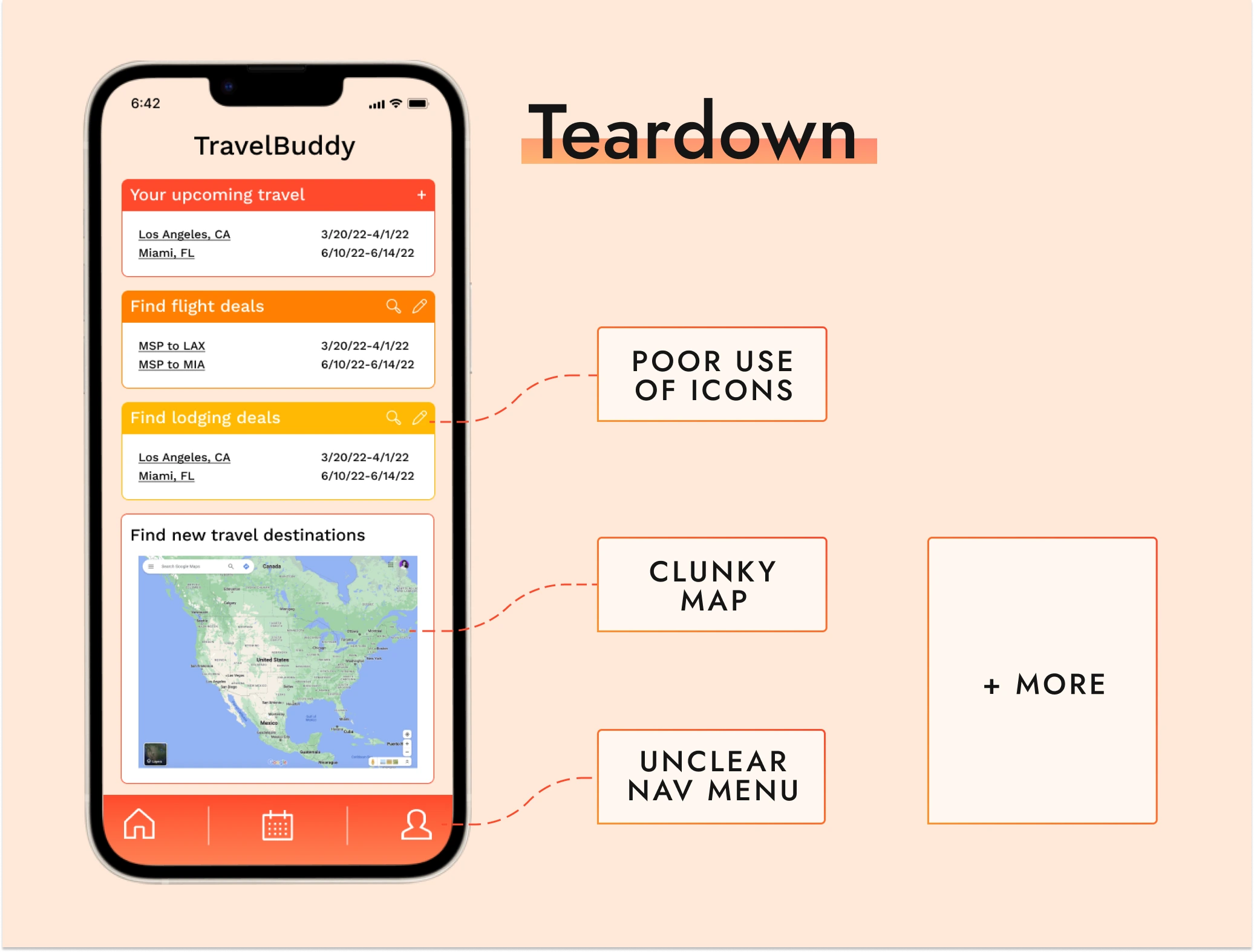
The first step was to do a teardown on the current interface. Through this process is when we discovered we would need an entirely new UX strategy to be inline with the business goals of TravelBuddy. Some of the key areas that clearly needed changes were:
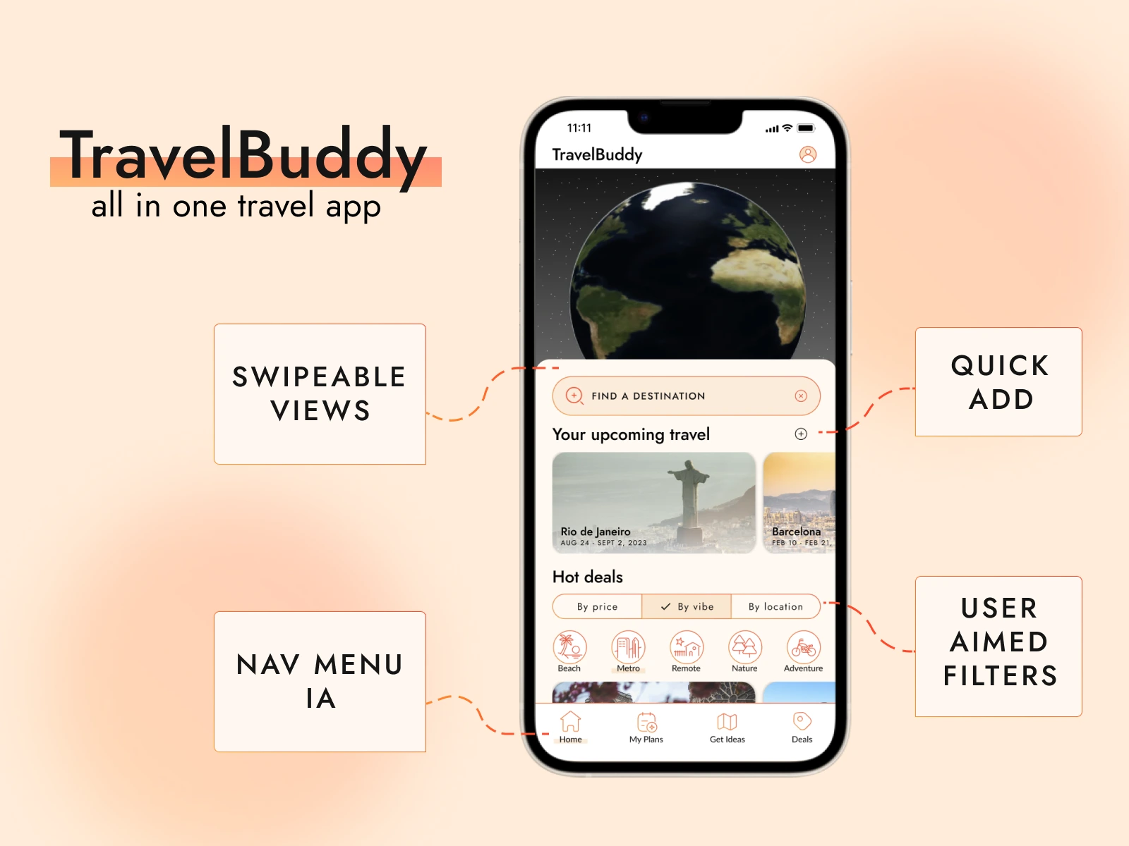
Nav menu: Unclear and possibly not the best use of space for what the app aims to guide users to do.
Hierarchy: Repetition is good, but the color gradient and heavy block style makes the app feel outdated.
Map: Not integrated, and does not clearly guide the user to take any intended action.
Motion: Very static design also makes it feel a bit cheap.
Icons: Unclear use and unbalanced in weight.
Approach
From completing the teardown I knew I wanted to focus on:
Revisiting the nav menu and implementing new IA.
Creating more opportunities for users to browse interesting trips and deals while also driving them towards conversion.
Integrating the map.
Improving the hierarchy and adding more visual appeal using design principles.
Adding motion with multiple types of scrolling and interactive icons.
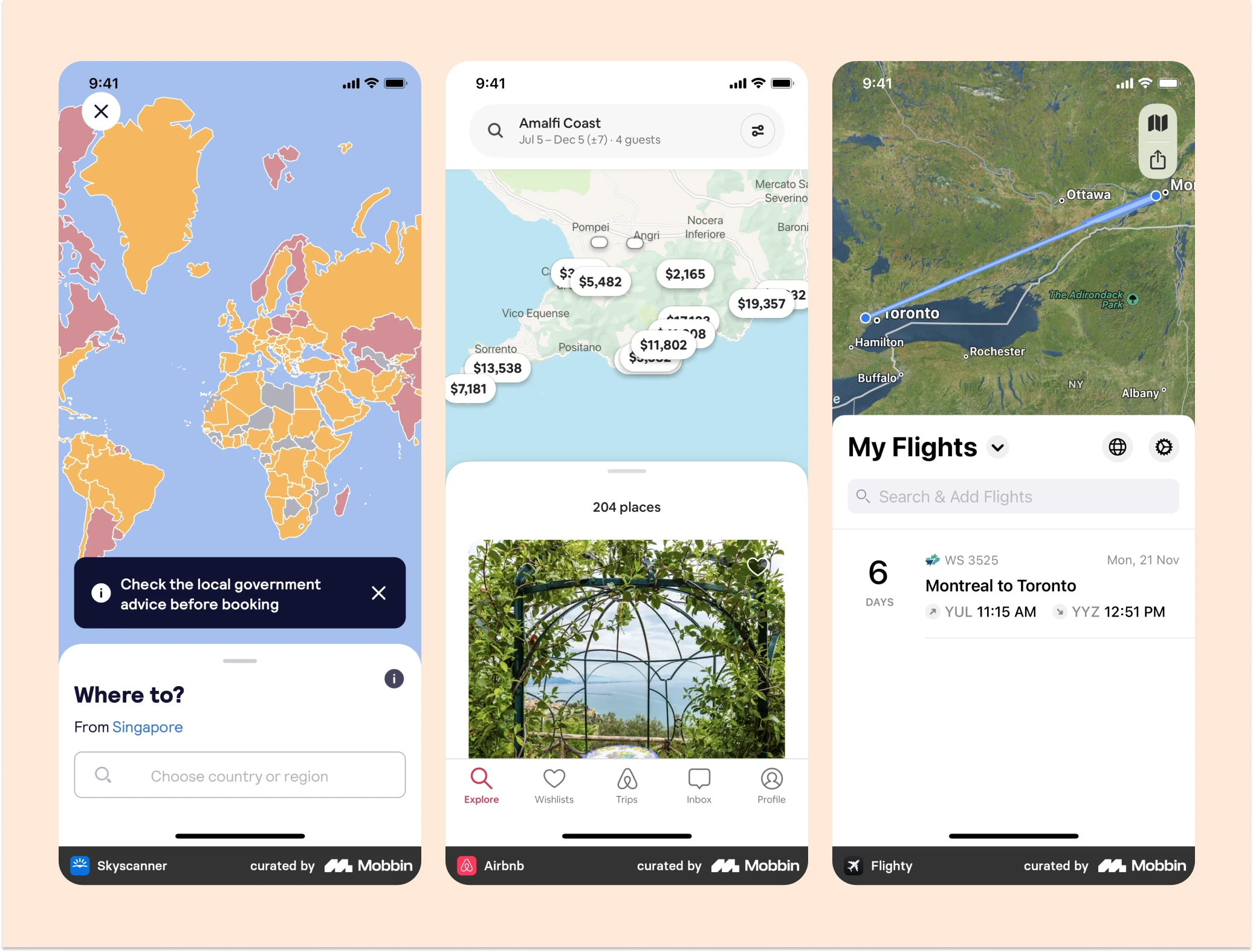
Implement "best practices" from other top travel apps: Flighty, Airbnb & Skyscanner.
Key iterations + design choices
Identified common "best practices" from other well-designed, popular and successful travel apps. Some key UX factors I identified and implemented included:
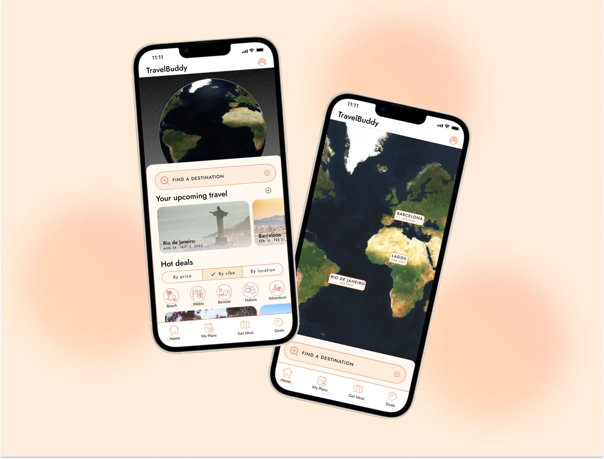
Vertical swipe to toggle between map and list view.
Clear search bar on main page.
Integrated map view behind a fully detailed list view.
Ability to filter and set searched to custom needs.
Interface factors such as rounded corners, clear use of icons, and gentle shadows.
Like this project
Posted Sep 8, 2023
As lead UI designer and UX strategy consultant I helped TravelBuddy audit their outdated application design to bring in a modernized version.
Likes
0
Views
37