Optimizing UX of subscription flow for women's health iOS app
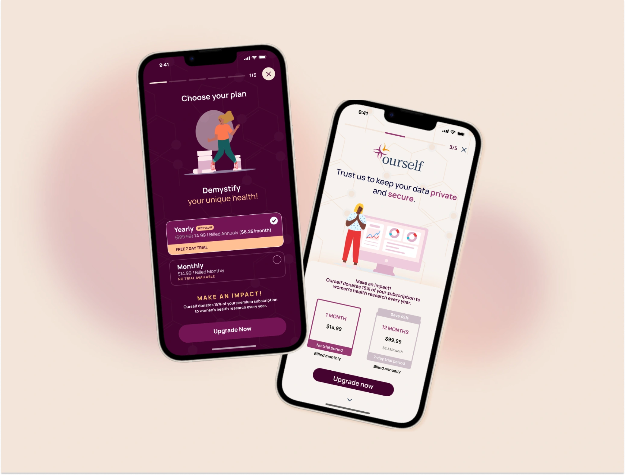
Ourself ~ 2023
Mobile Design | Design Consulting
Get a glimpse into my design approach with this case study that displays how I developed a subscription flow for a VC-backed women's health app. The purpose of this case study is to zoom into my design thinking with a micro-example of my process.Ourself
Project brief
As a junior interaction designer for a VC-backed women's health app, one of my key responsibilities was designing the subscription flow and checkout process. Scroll through how I integrated established standards from the competitive landscape to create an intuitive subscription journey, employing clear information architecture, and persuasive design techniques. This study is a zoomed in look at my work with this client and at my ability to balance user needs and stakeholder expectations.
Timeline: 2 weeks | Industry: Femtech
Problem
Ourself runs on a subscription model. I was responsible for designing a subscription flow that would meet stakeholder expectations and maintain user satisfaction. Stakeholders want conversions and users want clear value props and transparency. My background in marketing and conversion rate optimization was especially useful in this assignment. I was able to develop smart hypothesis about design choices to split test with users and go with the highest converting design.
Research
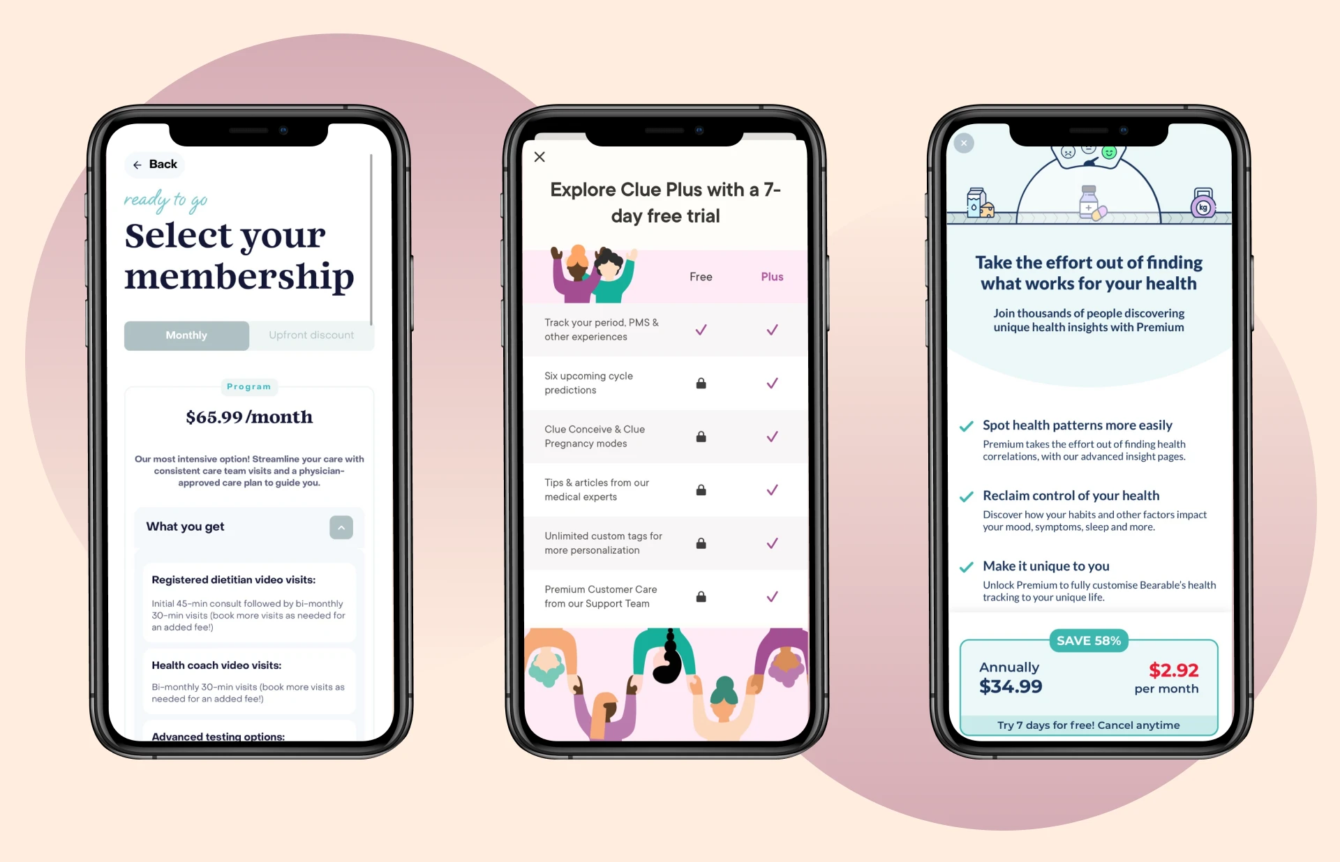
There was limited budget and time for user research on the subscription flow, so I utilized references to identify common practices among other health apps. The following three apps were the primary references for the Ourself subscription flow. Using references also helps me understand what users are already used to and might expect from a subscription flow in a health app.
Approach
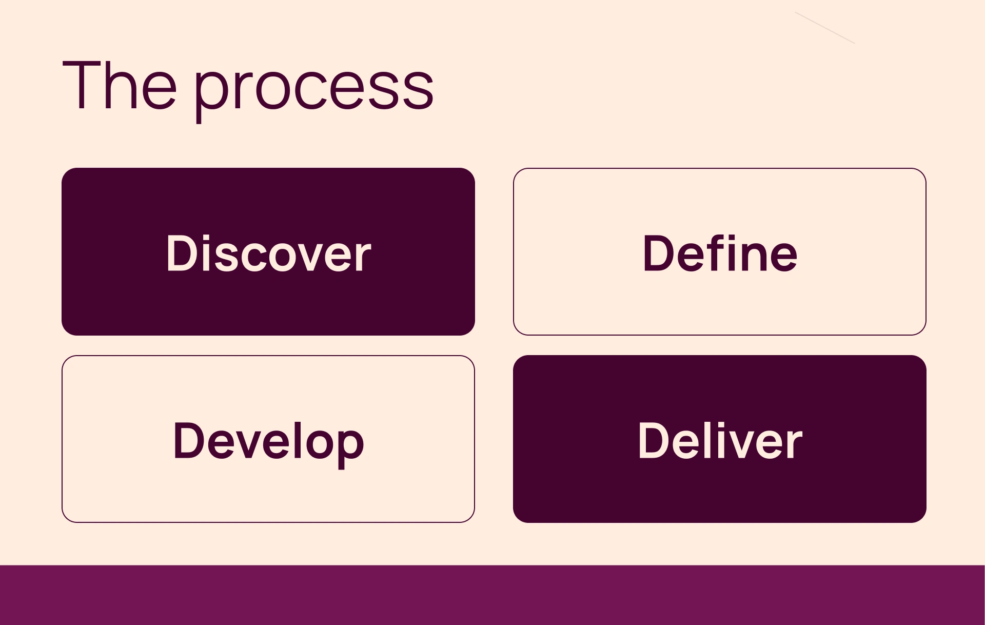
From the references, I created a list of key elements that I needed to include in the subscription flow. I had to keep both user satisfaction and stakeholder value in mind - especially because the subscription flow is where conversions happen and revenue is generated.
Value prop bullet points
Clear "exit" or "go back" button
Comparison chart or details
Full width conversion button
Highlighted check out button
Clear pricing language + options
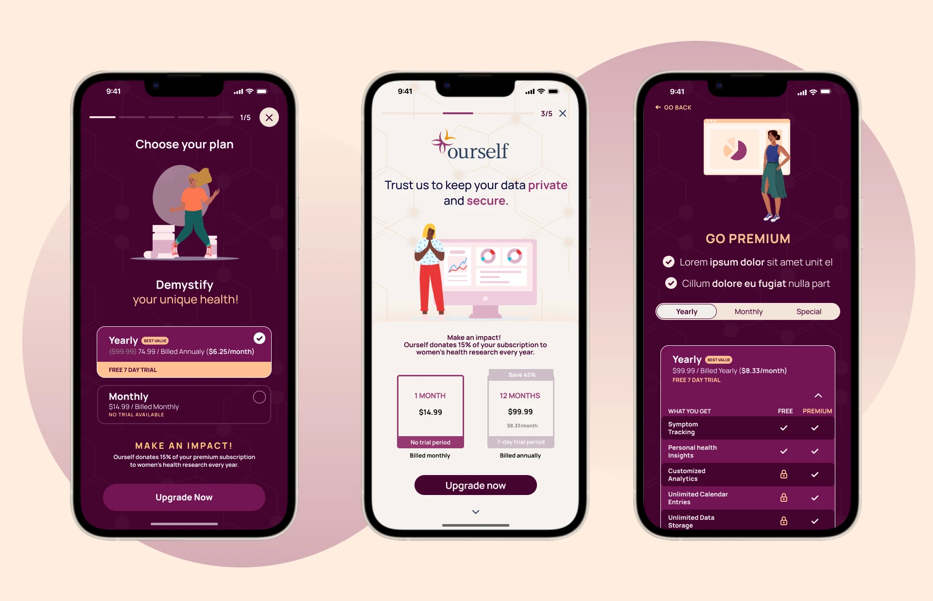
Key iterations + design choices
These are the three layouts we started with. Here is a quick summary of problems I handled and design choices I made in collaboration with our product manager.
Initially got stuck on the idea of having a value prop slideshow. Tested with users, got feedback that it was distracting from getting info they needed.
Iterated on IA several times. Moving “Make an Impact” to different spaces on the screen. Used research on how important impact is to our users to find its final position: after value props and before pricing.
Improved UI to be more balanced, round, and soft.
Went with a darker appearance so that the subscription flow would stand out from the rest of the app which is a lighter color.
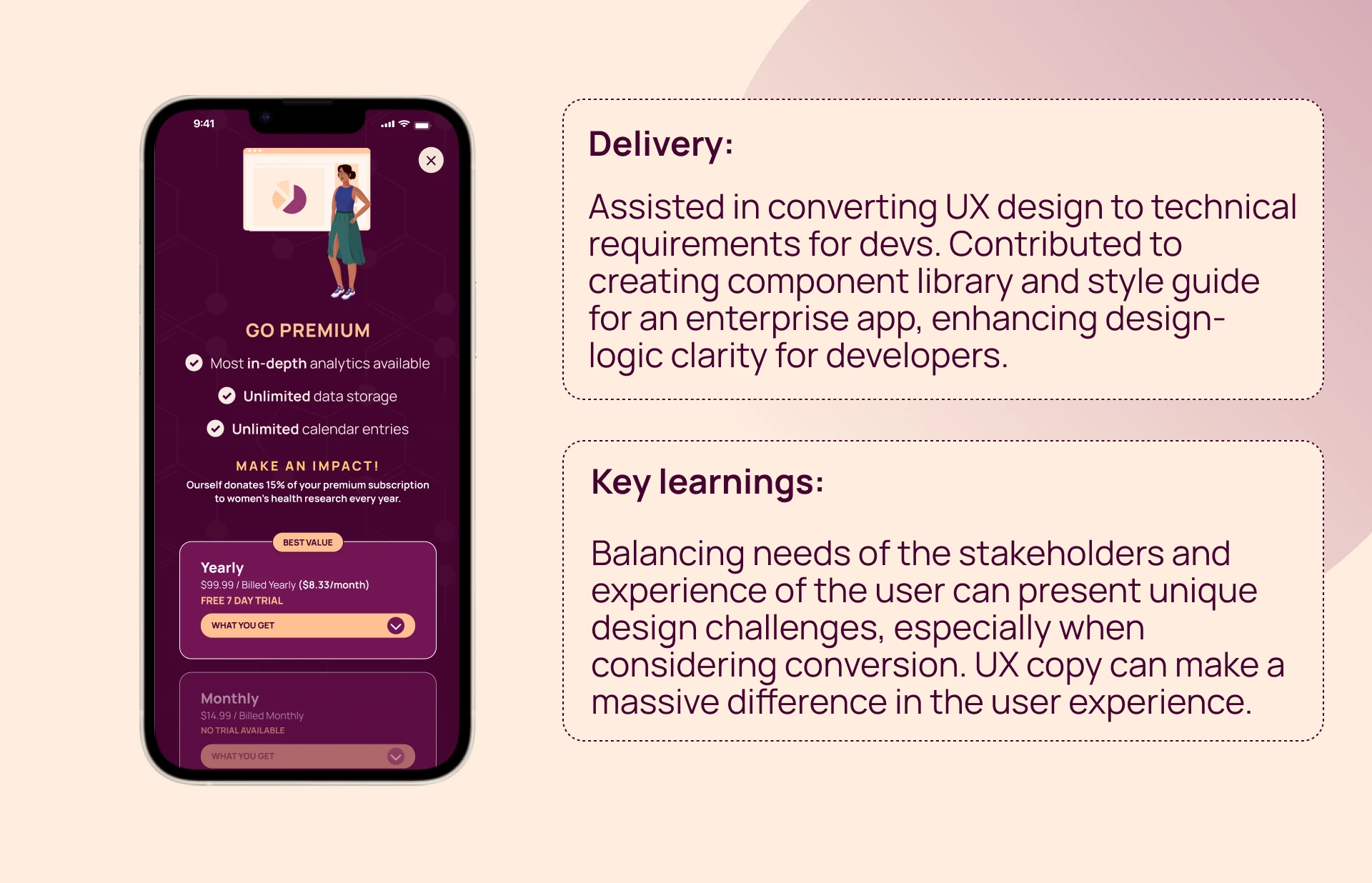
Combined the first and third designs to deliver the final subscription flow that would both provide users with all the info they need and drive conversions for our stakeholders.
©
2023
Like this project
Posted Sep 8, 2023
Examine my precise design thinking with this case study on how I optimized the subscription flow for a women's health app.
Likes
0
Views
22
