Regal | Gypsum Trading Brand

Hussain Shekh


Regal | Gypsum Trading Brand Identity Design
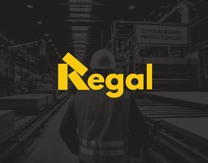
Industrial building material brands usually depend on old designs that hide in busy warehouses and on busy construction sites. To fix this for Regal I created a wordmark that's very visible and precise so it stands out in the field. Using a math grid I built a special letter 'R' from overlapping rectangle shapes that copy the way gypsum drywall sheets stack. By mixing this shape with an industrial charcoal and construction yellow color pair I made a bold lasting identity that lets people see Regal right away on heavy boxes, trucks and, on the internet.
Interested in building a distinctive brand identity or elevating your business presence?
Let's create something meaningful together
✉️ husenshekh0039@gmail.com
📱 WhatsApp: +91 9023300854
Your support and feedback are always appreciated.
© 2026 All Rights Reserved
Thank you for watching.
Like this project
Posted Aug 31, 2026
Regal | Gypsum Trading Brand Identity Design Industrial building material brands usually depend on old designs that hide in busy warehouses and on busy const...