Regal | Gypsum Trading Brand Identity Design

Hussain Shekh


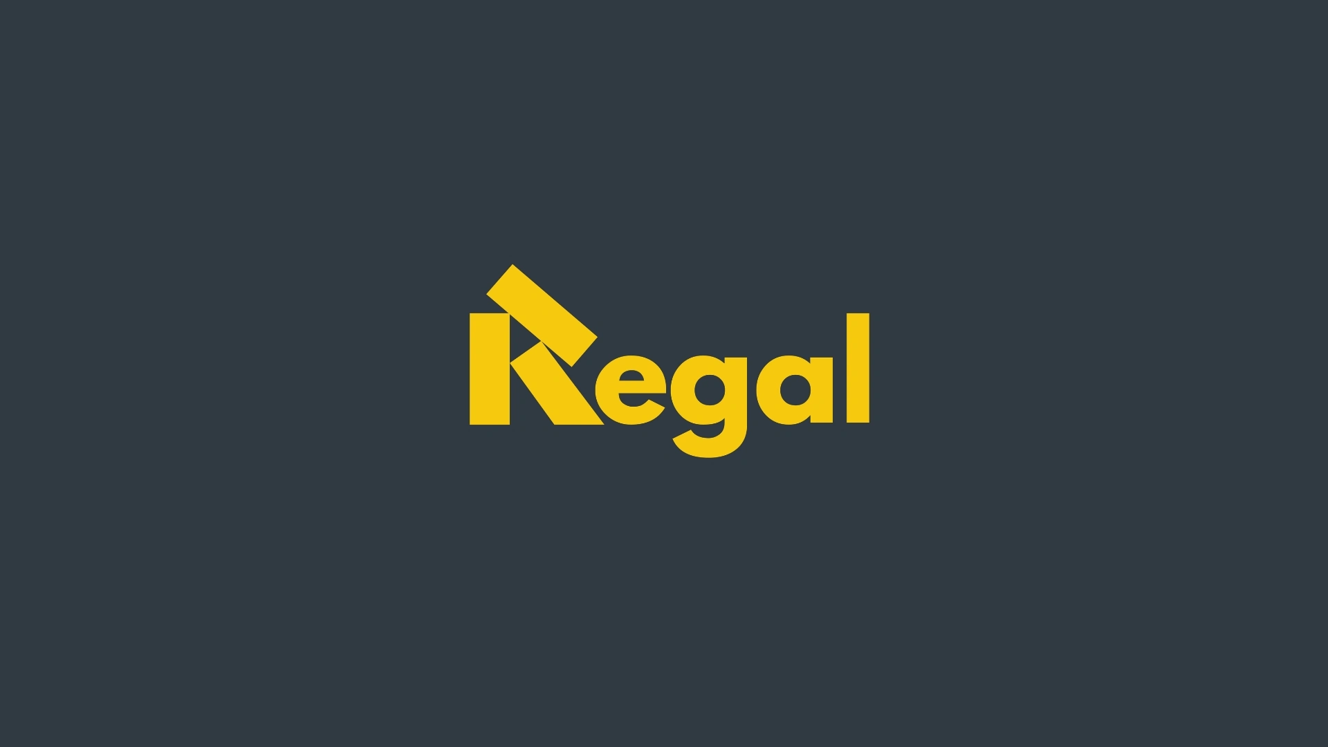
Regal | Building Strong Foundations
Regal is a modern gypsum trading and manufacturing company dedicated to supplying high-quality gypsum solutions for residential, commercial, and industrial construction projects. Built on a commitment to quality, reliability, and innovation, Regal delivers products that help shape stronger, safer, and more efficient spaces.
The foundation of Regal is driven by three core principles: quality, trust, and performance. Every product and service is designed to meet the evolving demands of the construction industry while supporting architects, contractors, developers, and builders in achieving exceptional results.
Our expertise spans across multiple sectors:
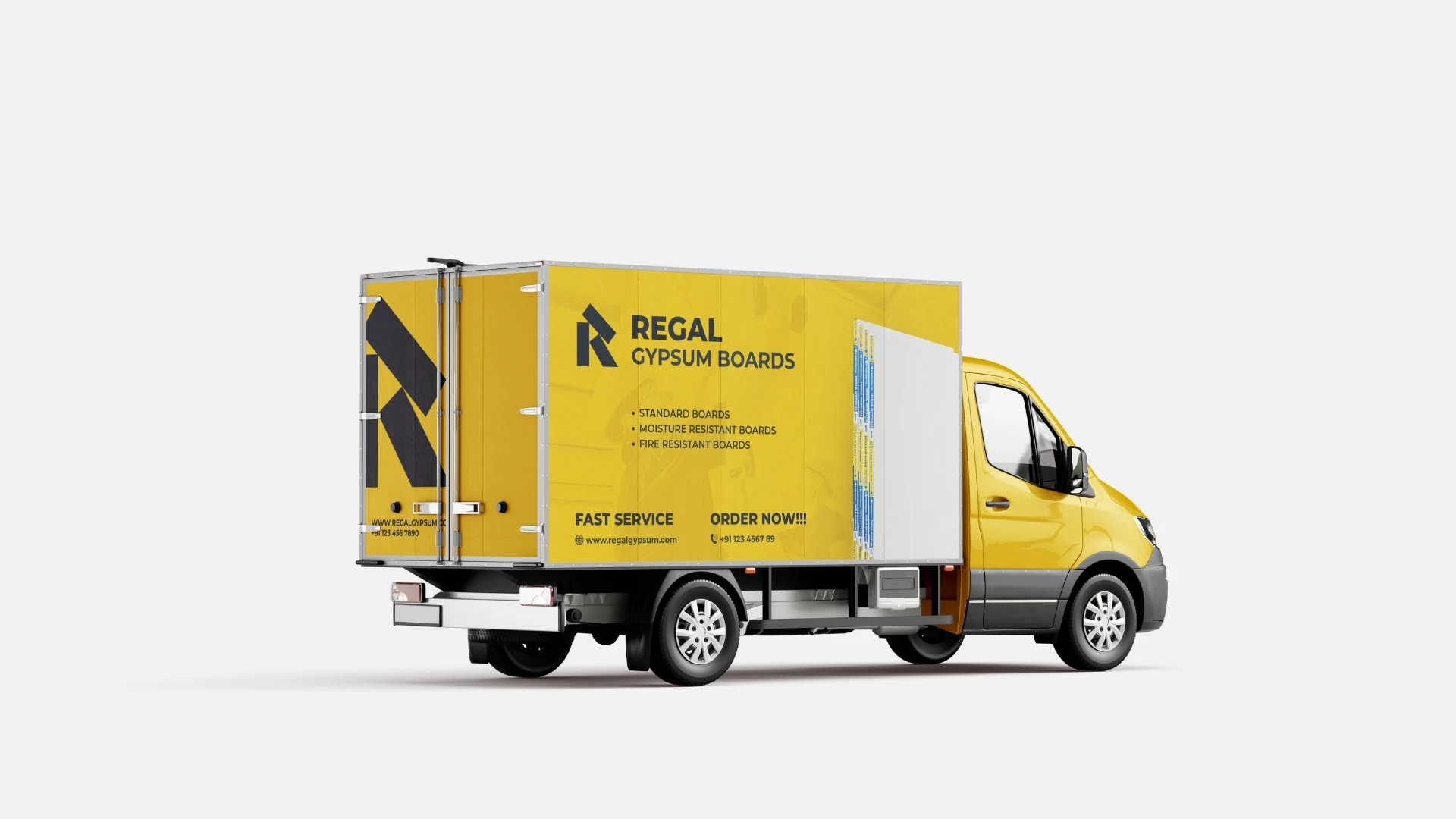
• Gypsum Boards & Panels
• Ceiling & Partition Solutions
• Interior Construction Materials
• Commercial & Residential Projects
• Industrial Building Applications
Brand Vision: The objective behind the Regal identity was to create a visual system that reflects strength, reliability, and industry expertise. The brand needed to appear professional and established while maintaining a clean, contemporary aesthetic suitable for today's construction and building materials market.
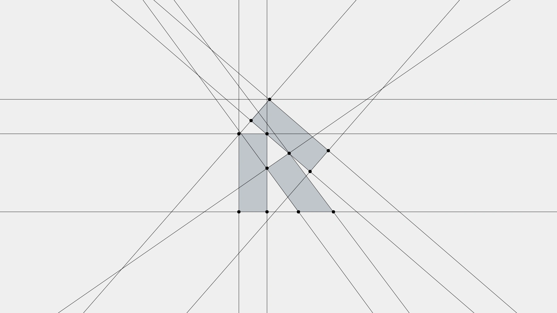
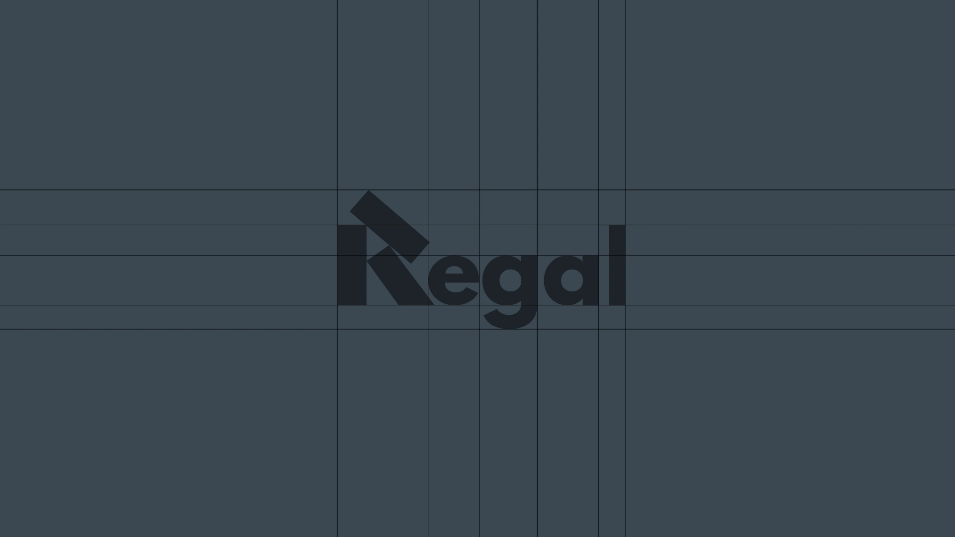
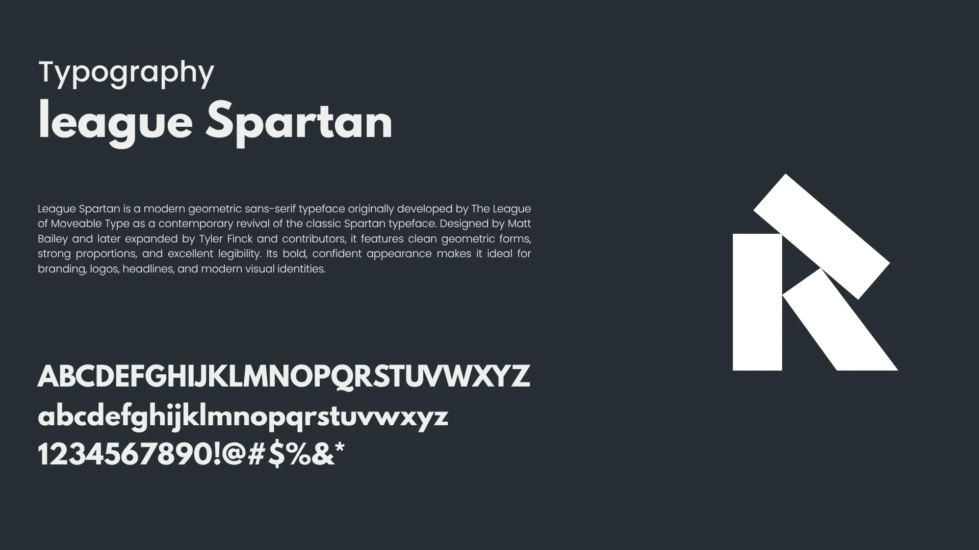
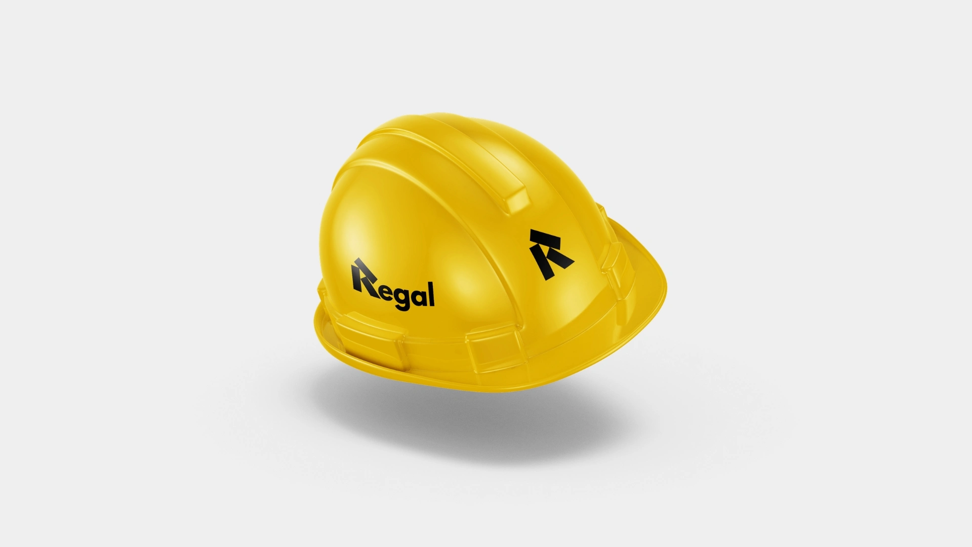
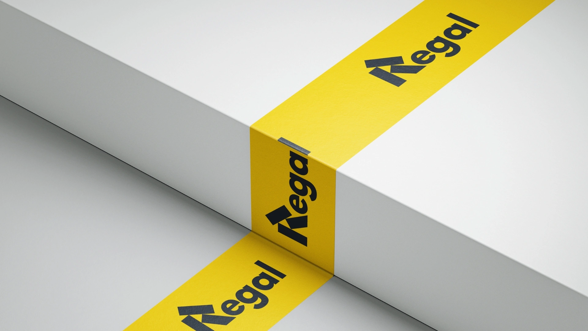
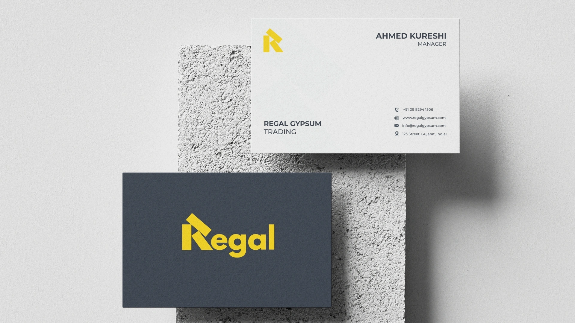
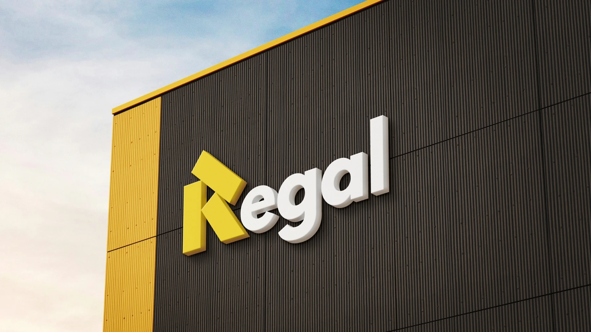
Visual Identity: The logo is inspired by the structure and geometry of gypsum boards, forming a distinctive letter "R" through bold architectural shapes. The design represents stability, precision, and progress—qualities that define both the construction industry and the Regal brand.
The strong geometric composition communicates durability and confidence, while the dynamic angles symbolize growth, innovation, and forward-thinking development. The visual language reinforces Regal's position as a dependable partner for modern construction solutions.
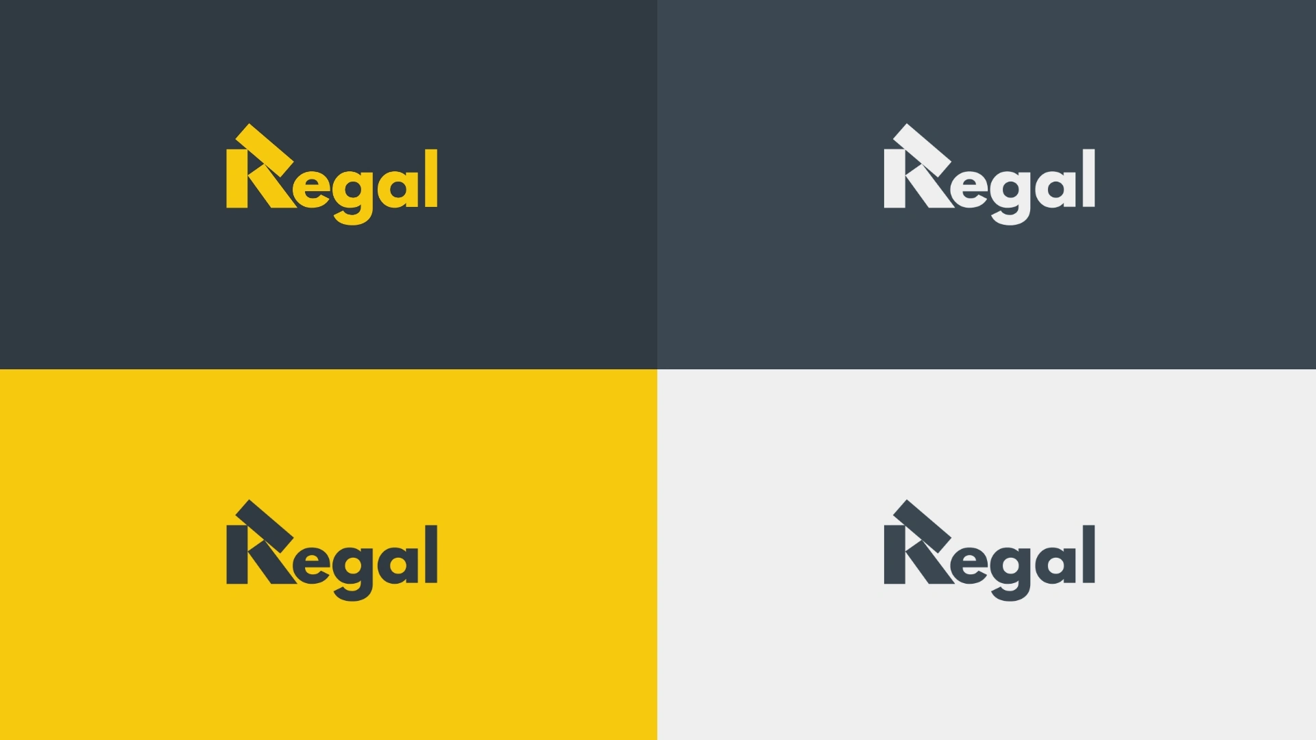
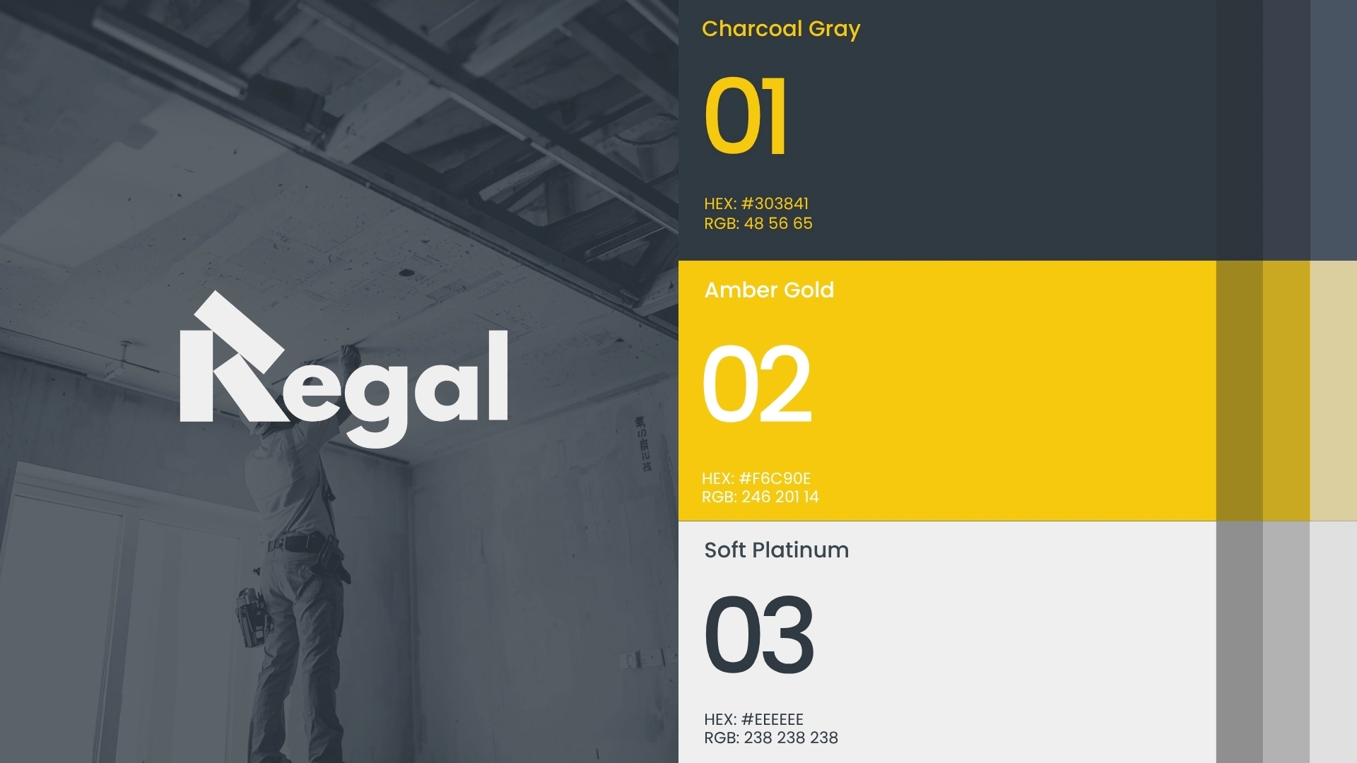
A bold blue color palette was selected to represent trust, professionalism, and reliability, complemented by a vibrant construction-inspired gold that conveys energy, quality, and progress. Modern typography enhances clarity and ensures strong brand recognition across both digital and physical applications.
More than a logo, the identity serves as a visual representation of Regal's mission to provide premium gypsum solutions that support the creation of stronger structures and lasting value for future generations.
Regal Gypsum Trading
Building Strong Foundations.
Thank you for viewing this project.
Interested in building a distinctive brand identity or elevating your business presence? Let's create something meaningful together
.
✉️ husenshekh0039@gmail.com
📱 WhatsApp: +91 9023300854
Your support and feedback are always appreciated.
© 2026 All Rights Reserved
Thank you for watching.
Like this project
Posted Sep 1, 2026
Regal is a gypsum trading and manufacturing brand focused on quality, reliability, and modern construction solutions. Inspired by the geometric form of the letter "R", the identity represents strength, precision, and growth, creating a bold and professional presence across all brand touchpoints. Regal — Strength Behind Every Structure.