Uber Trip Analysis Dashboard

Onanibosi Babajide


Uber Trip Analysis Dashboard
Project Overview
A comprehensive Power BI dashboard for analyzing Uber trip data to gain insights into booking trends, revenue generation, and trip efficiency. This project helps stakeholders make data-driven decisions by visualizing key performance indicators and trends in an interactive dashboard.
Dashboard Previews
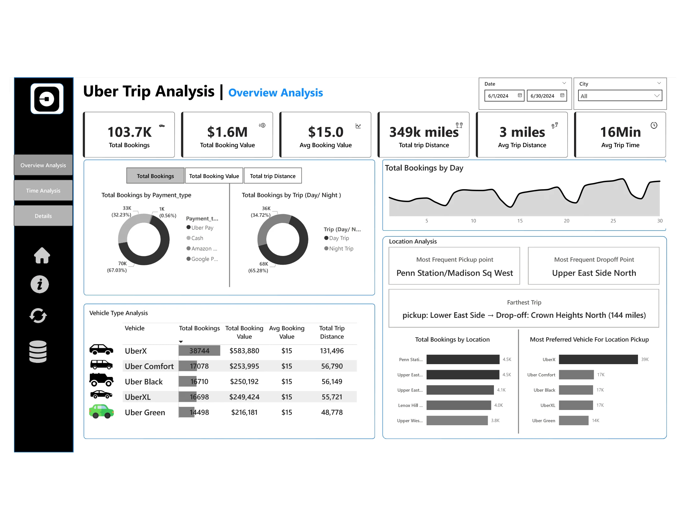
Dashboard 1: Overview Analysis
Dashboard 2: Time Analysis
Dashboard 3: Details View
Business Requirements
The project provides three interconnected dashboards:
Dashboard 1: Overview Analysis
Provides a high-level summary of key performance indicators and trip metrics.
Dashboard 2: Time Analysis
Focuses on temporal patterns with visualizations segmented by different time intervals.
Dashboard 3: Details Tab
Offers granular access to individual trip records with drill-through capabilities.
Key Performance Indicators
The dashboards track the following KPIs:
Total Bookings: Number of trips booked over a given period
Total Booking Value: Total revenue generated from all bookings
Average Booking Value: Average revenue per booking
Total Trip Distance: Total distance covered by all trips
Average Trip Distance: Average customer travel distance per trip
Average Trip Time: Average duration of trips
Features & Visualizations
Overview Analysis Dashboard
Dynamic Measure Selector: Toggle between different KPIs using a disconnected table
Payment Type Analysis: Breakdown of metrics by payment method (Card, Cash, Wallet)
Trip Type Analysis: Comparison between day and night trips
Vehicle Type Analysis: Grid view showing KPIs across different vehicle categories
Daily Booking Trends: Line chart showing total bookings by day of the week
Location Analysis:
Most frequent pickup points
Most frequent drop-off points
Farthest trip details
Top 5 booking locations
Most preferred vehicle by location
Time Analysis Dashboard
Global Dynamic Measure: Filter that updates all charts based on user selection
10-Minute Interval Analysis: Area chart showing bookings in 10-minute intervals
Day of Week Analysis: Line chart showing booking trends from Monday to Sunday
Hour and Time Heatmap: Matrix grid showing peak booking hours across days
Details Dashboard
Grid Table: Comprehensive view of all trip details
Drill-Through Functionality: Access detailed records from other dashboard visuals
Full Data View Bookmark: Toggle between filtered and complete datasets
Enhanced User Experience
Dynamic Titles: Chart titles update based on selected measures
Interactive Slicers: Filters for date, city, and other parameters
Enhanced Tooltips: Show additional details on hover
Data Details Bookmark: Provides explanations for metrics and data sources
Clear Filters Button: Reset all selections with one click
Export Functionality: Download raw data for external analysis
Dataset Description
The analysis is based on the "Uber Trip Details" dataset containing over 100,000 trip records with the following fields:
Trip ID
Pickup Time
Drop Off Time
Passenger Count
Trip Distance
PULocationID (Pickup Location ID)
DOLocationID (Drop-off Location ID)
Fare Amount
Surge Fee
Vehicle Type
Payment Type
Tools & Technologies
Power BI: Primary tool for dashboard development
Power Query: Data cleaning and transformation
DAX: Advanced calculations and measures
Excel: Source data management
DAX Measures
Core KPI Measures
Time Intelligence Measures
Dynamic Measure Selection
Location Analysis Measures
Vehicle & Payment Analysis
Expected Outcomes
Identify trends in ride bookings and revenue generation
Analyze trip efficiency in terms of distance and duration
Compare booking values and trip patterns across different time periods
Provide insights to optimize pricing models and improve customer satisfaction
Repository Contents
Uber Trip Details.xlsx: Source data containing trip recordsUber analysis.pdf: PDF export of the final dashboard visualizationsProblem Statement.docx: Original business requirements documentUber_Trip_Analysis.pbix: Power BI file with complete dashboard implementationData Model & Relationships
The data model for this project consists of the following tables and relationships:
Key Table Structures
Trip Details (Fact Table)
Trip ID (Key)
Pickup Time (DateTime)
Drop Off Time (DateTime)
passenger_count (Integer)
trip_distance (Decimal)
PULocationID (Integer) - Foreign Key to Locations
DOLocationID (Integer) - Foreign Key to Locations
fare_amount (Decimal)
Surge Fee (Decimal)
Vehicle (Text)
Payment_type (Text)
Date Dimension
Date (Key)
Year (Integer)
Month (Integer)
Month Name (Text)
Quarter (Integer)
Day of Week (Integer)
Day Name (Text)
Is Weekend (Boolean)
Is Holiday (Boolean)
Time Dimension
Time Key (Key)
Hour (Integer)
Minute (Integer)
Second (Integer)
AM/PM (Text)
Hour Band (Text) - Morning/Afternoon/Evening/Night categorization
Location Dimension
LocationID (Key)
Location Name (Text)
Borough (Text)
Zone (Text)
Service Zone (Text)
Measure Selector (Disconnected Table)
Measure (Text) - Contains values for dynamic measure selection
How to Use
Clone this repository
Open the Power BI file using Power BI Desktop
Ensure the data source connection points to the included Excel file
Refresh the data if needed
Interact with the dashboard using the provided slicers and filters
Data Preparation & ETL Process
The raw Uber trip data required several transformation steps before analysis:
Additional Data Processing Steps:
Generated Date Dimension: Created a date dimension table spanning the date range in the dataset
Location Data Integration: Merged location details with the main trip data
Calculated Fields: Added calculated fields for trip duration, total fare, and time categorizations
Outlier Handling: Removed trips with unrealistic distances or durations
Disconnected Tables: Created disconnected tables for measure selection and visualization control
Sample Insights & Key Findings
From the analysis of over 100,000 Uber trips, the following insights were derived:
Booking Patterns
Peak Hours: Highest booking volume occurs between 5-8 PM on weekdays
Weekly Pattern: Friday shows 22% higher booking rates than the weekly average
Weekend Trend: Weekend trips are 15% more valuable but 18% fewer in volume compared to weekdays
Vehicle Usage
UberX Dominance: UberX accounts for 68% of all bookings across the dataset
Premium Service: Uber Black generates 37% of total revenue despite representing only 18% of total rides
Vehicle Preferences: UberX is preferred for short trips (< 3 miles), while Uber Black is preferred for longer journeys
Payment Analysis
Payment Methods: Cash payments represent 45% of all transactions
Digital Growth: Uber Pay usage increased by 12% over the analyzed period
Value Distribution: Cash payment average value is $8.50, while digital payments average $11.75
Trip Efficiency
Distance vs. Duration: Trips during peak hours show 22% longer duration for the same distance compared to off-peak
Route Efficiency: Certain routes show consistent deviations in the distance-to-time ratio, suggesting traffic issues
Revenue Optimization: Top 5 most profitable routes generate 27% of total revenue
Geographic Insights
Location Concentration: The top 5 pickup locations generate 42% of total bookings
Zonal Patterns: Downtown areas show higher short-trip frequency, while airport pickups show longer average distances
Underserved Areas: Several locations show high demand but lower vehicle availability, presenting opportunities for optimization
Recommendations
Dynamic Pricing: Implement more granular surge pricing in high-demand areas during peak hours
Vehicle Allocation: Strategically position Uber Black vehicles near locations with historically higher premium service demand
Digital Payment Incentives: Introduce incentives to shift cash users toward digital payment methods
Route Optimization: Address inefficient routes through driver education and navigation improvements
Location-Based Promotions: Create targeted promotions for underserved high-potential areas
This project was created as part of a data visualization portfolio demonstrating Power BI dashboard development and data analysis skills using advanced DAX, data modeling techniques, and interactive dashboard design.
Like this project
Posted Jul 3, 2025
Developed a Power BI dashboard for Uber trip data analysis.