Website for a Creative Agency
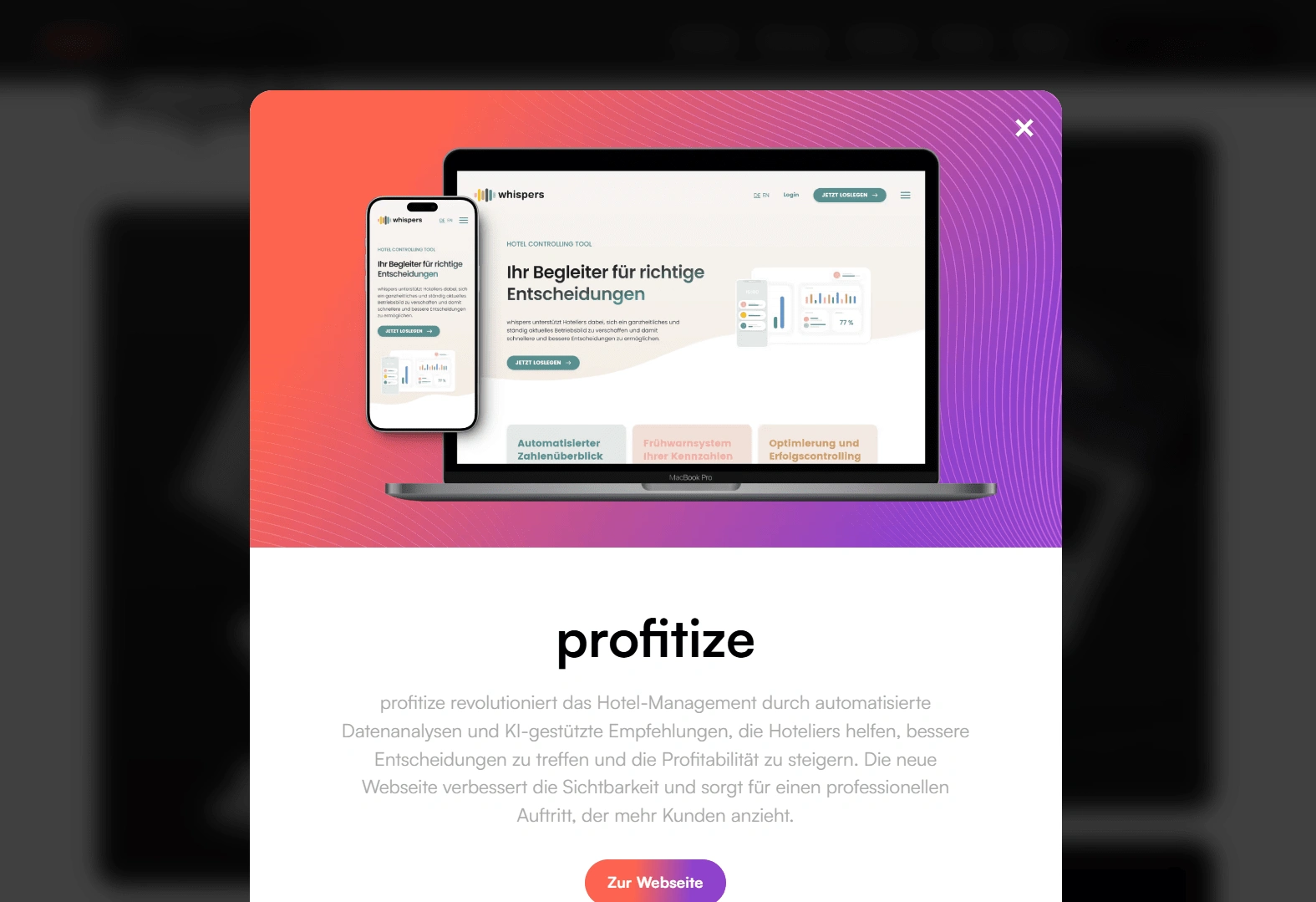
Website Case Study: Crafting a Modern Swiss Webflow Agency Site
Project Overview
Client: Upgreight, a Swiss web agency specializing in creating and optimizing websites on Webflow.
Project Objective: Design and develop a responsive website that reflects Upgreight’s brand values and showcases their services effectively, with a primary focus on usability, modernity, and mobile responsiveness.
Role: UI/UX Designer, collaborating closely with stakeholders for ideation, design, and prototyping stages.
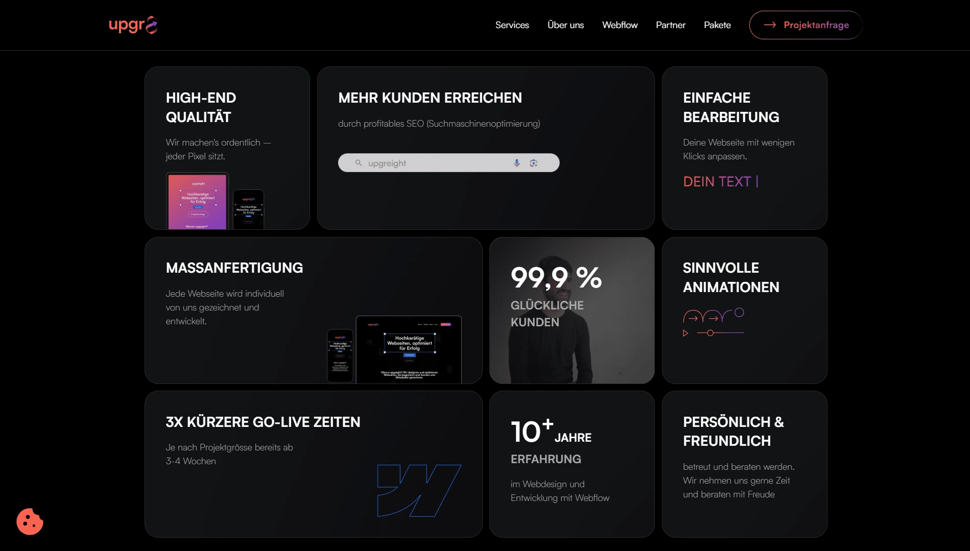
2. Process and Approach
Step 1: Research & Stakeholder Collaboration
Tools: Miro
Goal: To establish a clear understanding of Upgreight's brand essence and desired visual identity.
Outcome: Solidified a visual direction, with the finalized color scheme and design mood established as the foundation for all upcoming pages.
Step 2: Designing Core Pages in Figma
Tools: Figma
Goal: Create a visually cohesive, user-friendly interface that conveys Upgreight’s services and values.
Pages Designed:
Homepage: Designed to engage visitors immediately, with clear navigation and prominent calls-to-action.
Services Page: Provides an overview of Upgreight’s offerings in a digestible, visually appealing layout.
About Us & About Webflow Pages: Details Upgreight’s story, mission, and values, with a section devoted to the benefits of using Webflow as a CMS.
Partners Page: A section that showcases Upgreight’s key collaborations and partnerships.
Contact Page: Includes custom contact forms designed to encourage easy communication and inquiries.
Outcome: Each page aligns with the brand’s visual identity, offers a seamless user experience, and emphasizes Upgreight’s strengths and specialties.
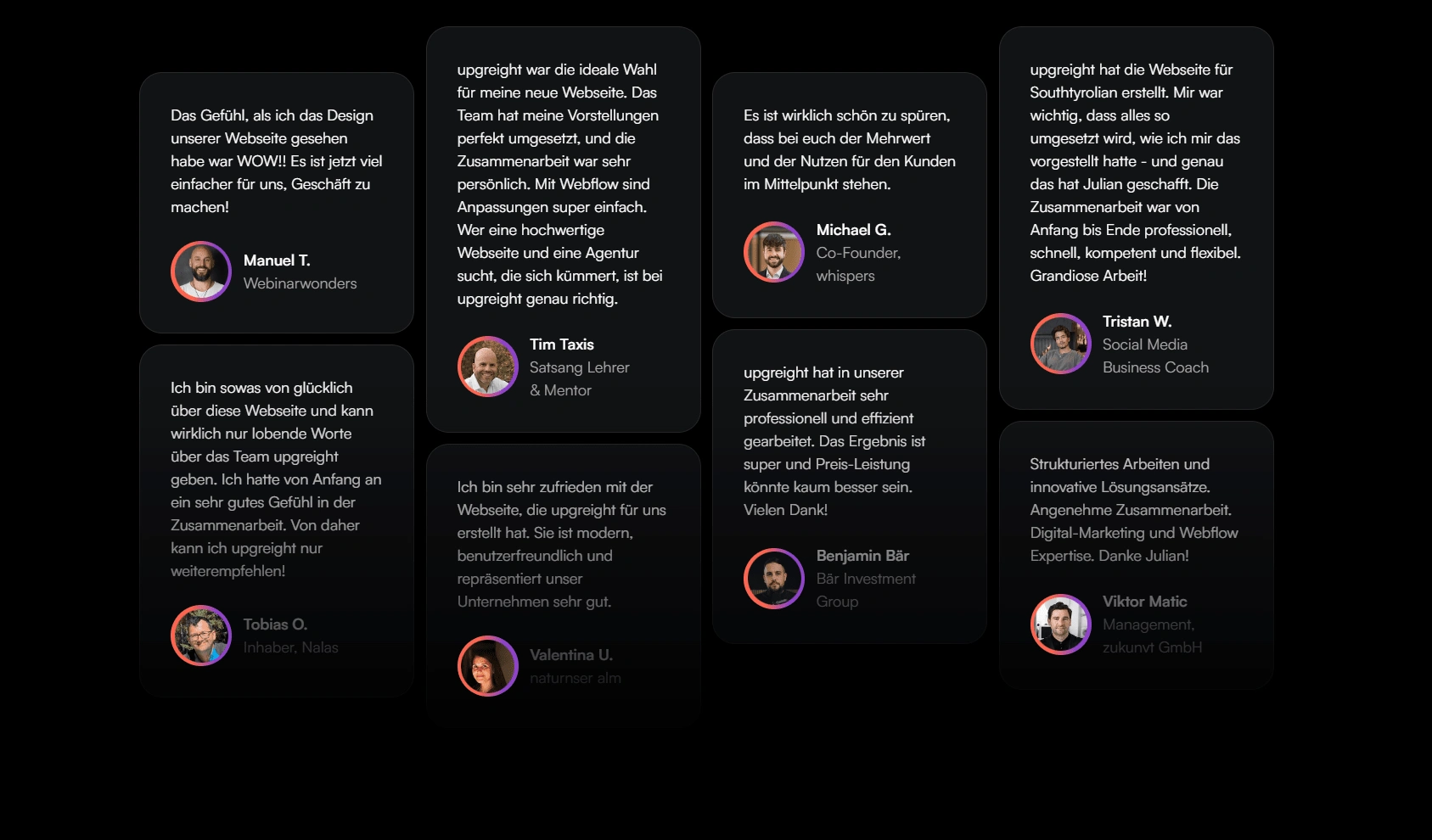
Step 3: Form Flow Design and Interaction
Tools: Figma (for prototyping)
Goal: Ensure user-friendly contact flows for both potential clients and partners.
Designs:
Created and optimized flows for the Contact Form and Partner Form to make them intuitive and efficient.
Integrated cues for error prevention and clear, actionable success messages to enhance user satisfaction.
Outcome: Simplified interactions for inquiries and partnerships, helping build trust and facilitate communication with Upgreight.
Step 4: Responsive Design for Mobile Devices
Goal: Guarantee that the website is equally functional and aesthetically pleasing across devices.
Approach:
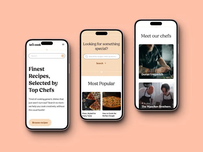
Adapted the desktop UI for smaller screens while preserving the brand’s modern look and feel.
Ensured that content readability, navigation, and visual elements adapted fluidly to mobile constraints.
Outcome: Delivered a responsive design that maintains brand consistency and functionality across all devices, providing a cohesive user experience.
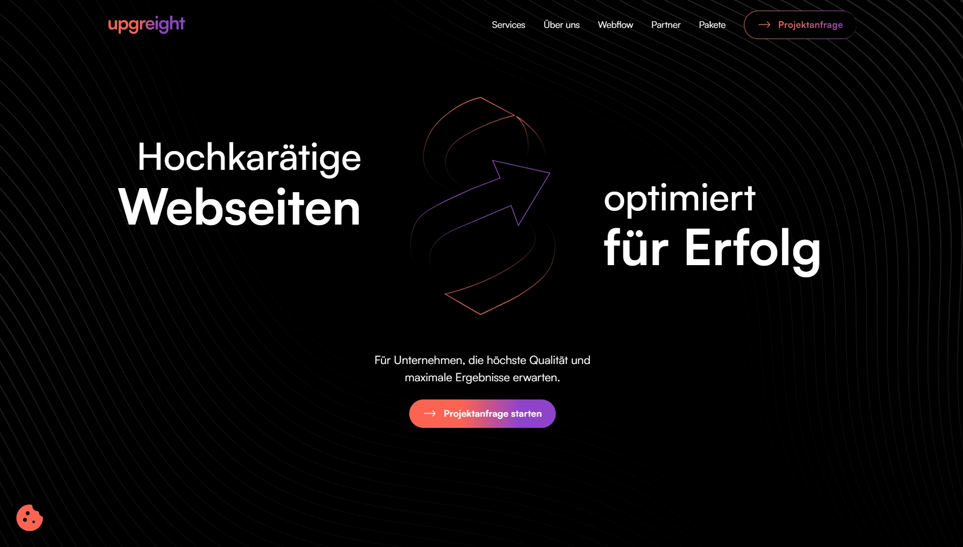
Like this project
Posted Oct 27, 2024
Responsive web design for a Swiss creative agency. I designed core pages and created intuitive flows for Contact and Partner registration forms.
Likes
0
Views
6
