Lumen | logo design
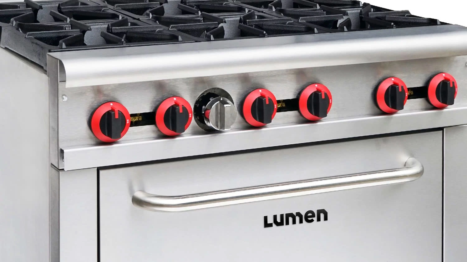
My client needed a simple yet meaningful name and logo for a new brand of industrial kitchen appliances and supplies.
They wanted a name that would be easy to pronounce and remember. It needed to be relevant to the brand's niche—restaurants, diners, food trucks, coffee shops, etc.—while remaining open to future product lines and services.
I came up with several names that met the criteria, and after some testing, the client chose 'Lumen' (from the Latin word for light). I then proceeded to sketch out tons of ideas for the logo.
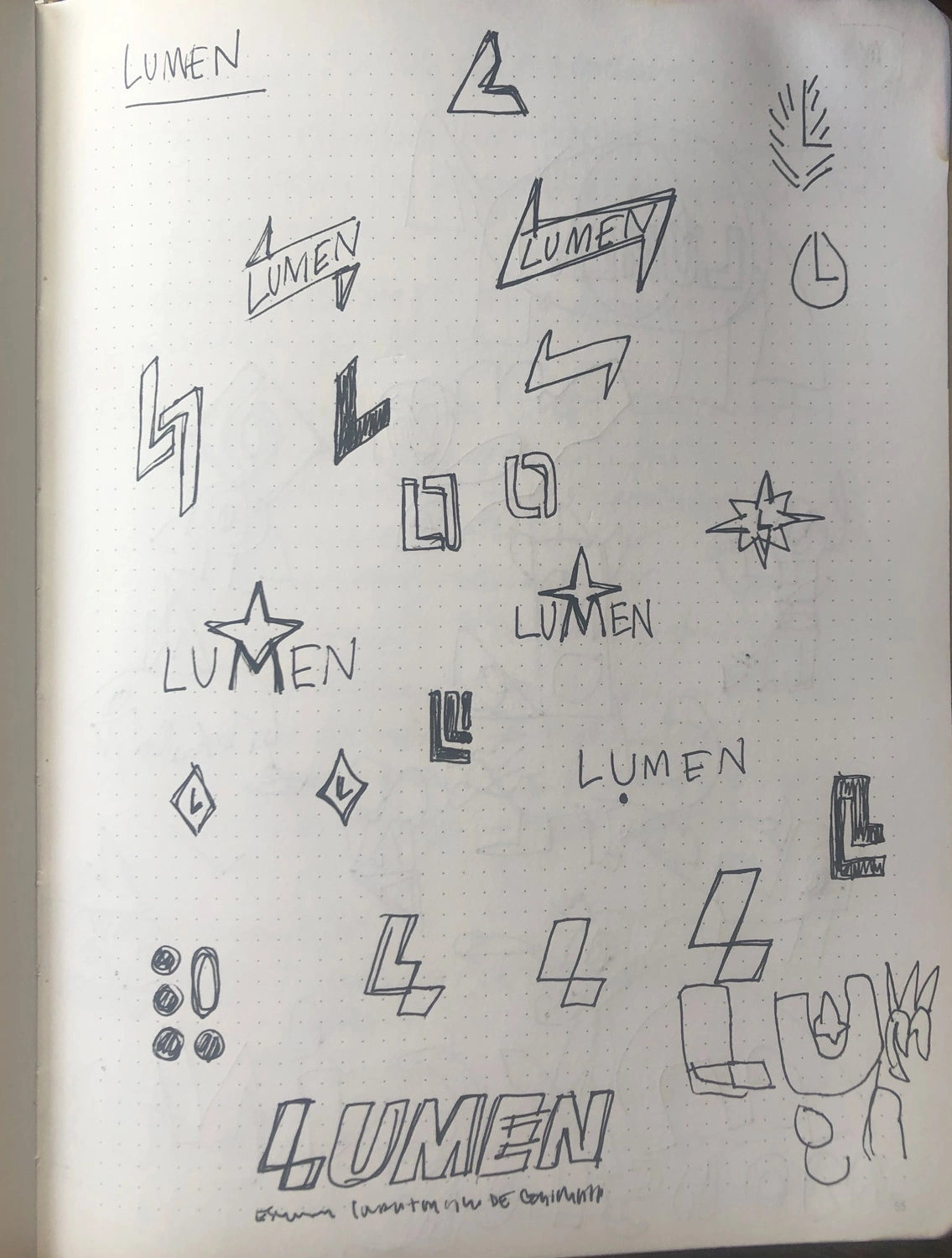
The initial phase of the design process is all about exploration. This is one of dozens of sketchbook pages.
Lumen makes products for professional kitchen users, so the logo needed to convey an image of strength and reliability. However, the client did not want their brand to come across as overly serious or corporate.
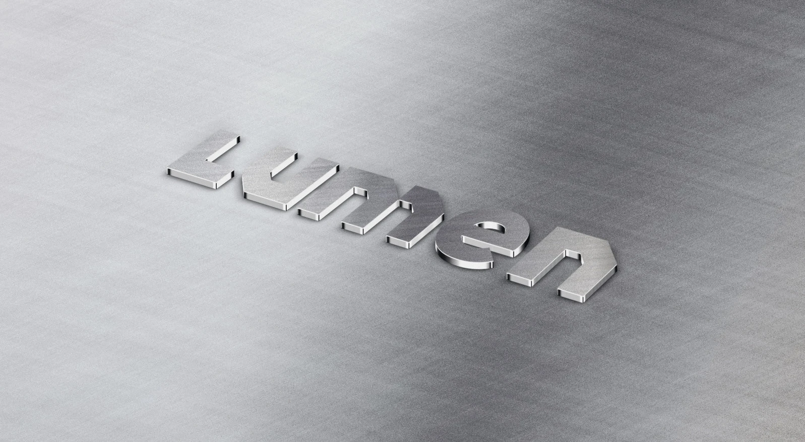
The brief called for a robust yet friendly design. I struck this balance by giving the logo a strong foundation of straight lines and 45° angles, then softening the overall effect by using lowercase type and a round 'e'. The initial 'L' remained uppercase, but its stem was adjusted to match the word's x-height to keep the logotype sleek and compact.
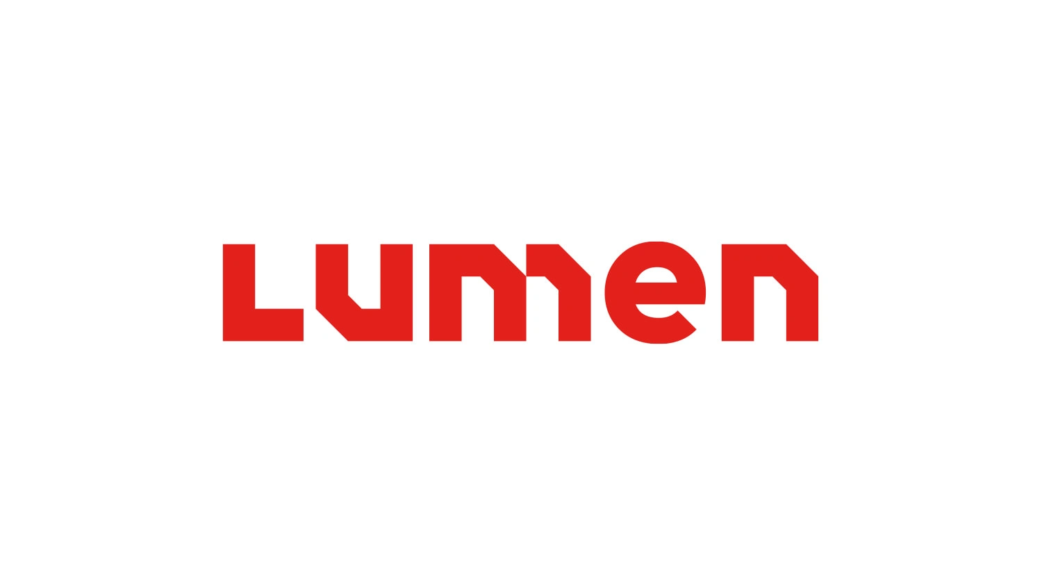
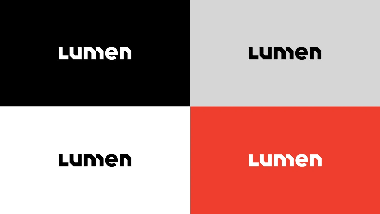
Red as the primary logo color makes a bold statement and stands out from the competition.
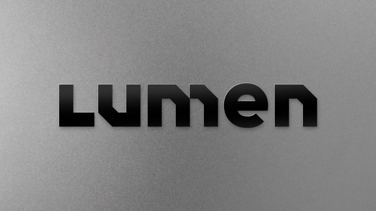
The logo feels sturdy and reliable yet friendly.
Like this project
Posted May 26, 2023
A bold logo for a new brand of professional kitchen appliances.

