Redesigning a Global E-Commerce Platform
Alison Wenner
Overview
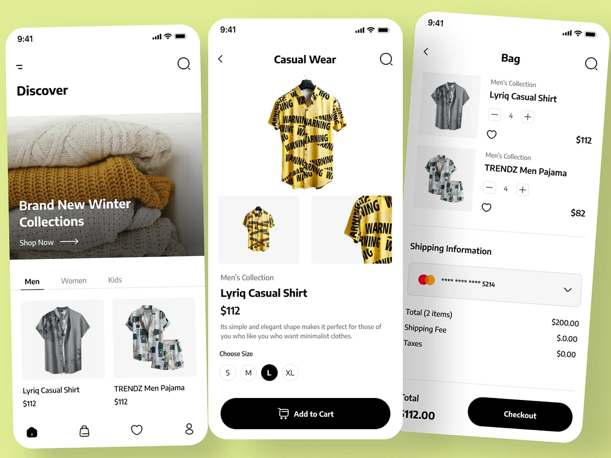
In this project, I led the complete redesign of a global e-commerce platform, creating a seamless, responsive, and engaging user experience. Using Figma, I designed over 50 screen user flows and developed a full design system with a comprehensive component library for e-commerce, ensuring the platform’s consistency and scalability across devices. The goal was to deliver a visually compelling and easy-to-navigate online shopping experience from desktop to mobile.
Project Goals
The key objectives of the redesign were to:
Create a responsive design that offers an optimal shopping experience across devices, from desktop to mobile
Streamline user flows for faster, more intuitive navigation and checkout
Develop a comprehensive design system to ensure consistency and future scalability
Enhance the platform’s user interface to improve overall engagement and conversion rates
Process Breakdown
Discovery & UX Strategy
I started with a discovery phase, working closely with stakeholders to define the platform's key pain points and areas for improvement. The e-commerce platform had to cater to a global audience, meaning that user flows needed to be efficient, intuitive, and localized for different markets. We also mapped out key user journeys, focusing on reducing friction in high-traffic areas like product browsing, cart management, and checkout.
Key Deliverables:
Detailed analysis of the current platform’s pain points and user feedback
Mapping of critical user journeys (e.g., product discovery, cart abandonment, and checkout)
UX strategy that prioritized ease of use and conversion optimization
Responsive Design Across Devices
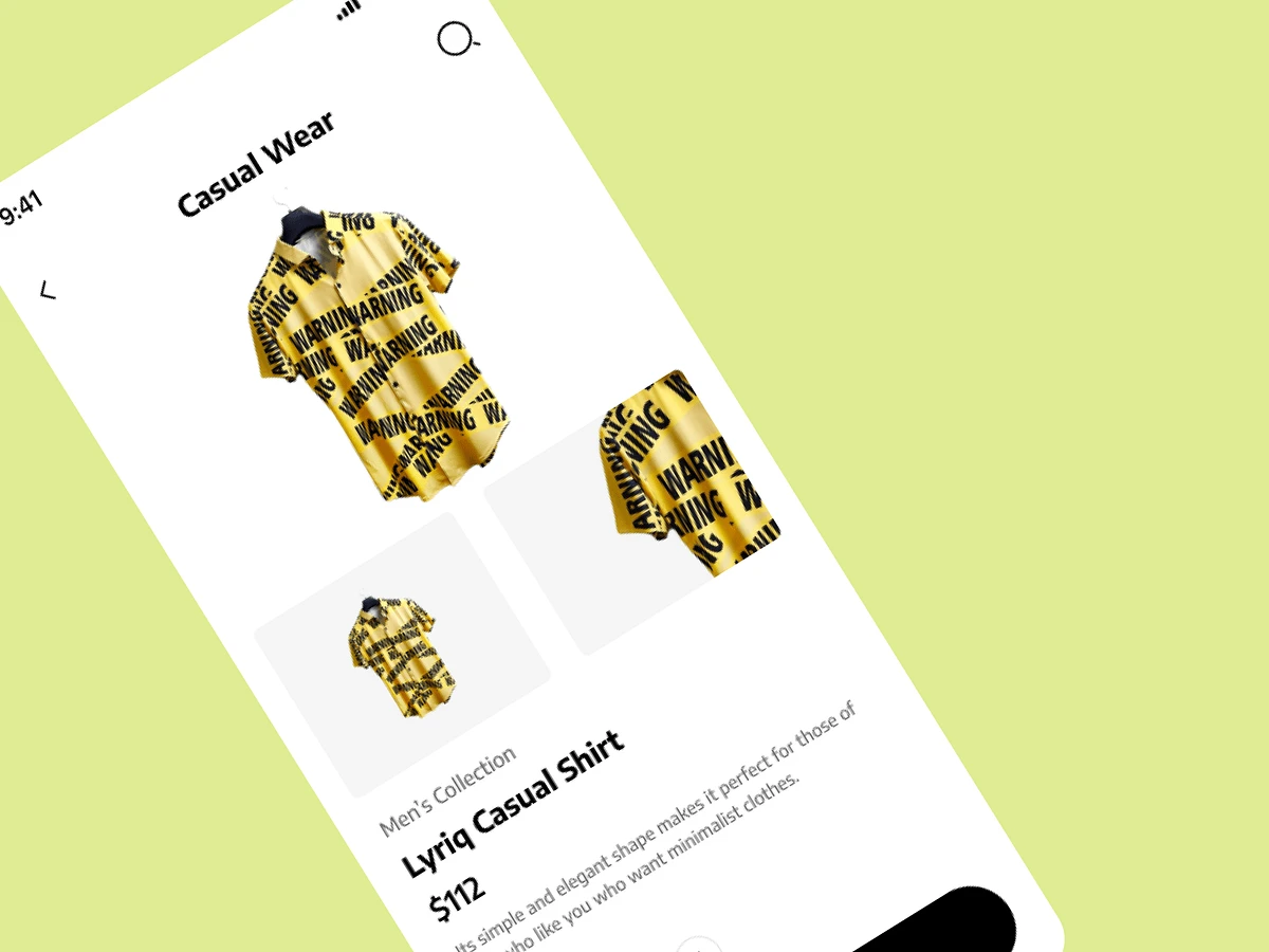
A major focus of the project was creating desktop-to-mobile responsive screens. Using Figma, I designed layouts that adapted flawlessly across all screen sizes, ensuring an optimal user experience on desktops, tablets, and mobile devices. The responsive design allowed users to shop seamlessly, regardless of their device, improving usability and engagement.
Key Deliverables:
Over 50 screen user flows designed in Figma, covering desktop, tablet, and mobile
Fully responsive designs that ensured a smooth user experience across all devices
Prioritization of a mobile-first approach to cater to the growing trend of mobile e-commerce shopping
Design System & Component Library
To ensure long-term scalability and design consistency, I created a comprehensive design system within Figma. This included a full component library that standardized elements like buttons, forms, modals, and product cards across the platform. This system was designed for ease of maintenance and future iterations, allowing for rapid development without compromising on visual cohesion.
Key Deliverables:
A full design system including typography, color palettes, grid systems, and UI components
A robust component library for e-commerce elements like product grids, filters, and checkout forms
Detailed design specifications and interaction guidelines to ensure smooth handoff to the development team
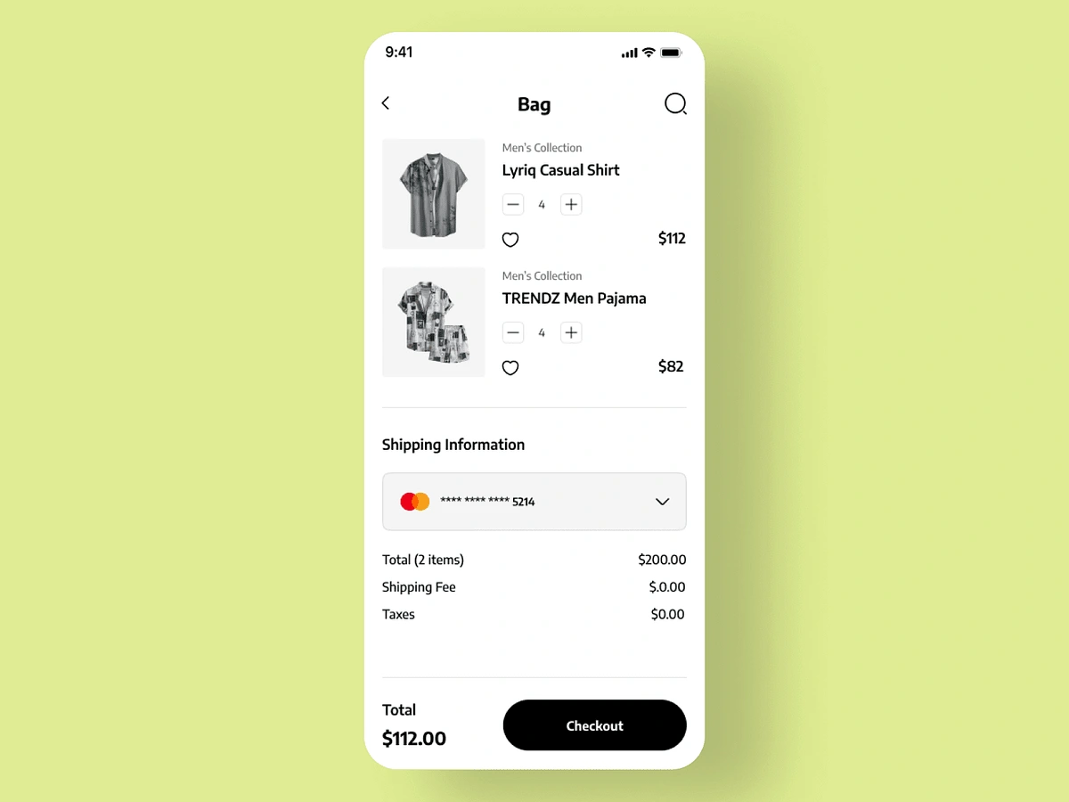
User Flows & Interaction Design
The platform redesign required optimizing over 50 user flows, ranging from product discovery to checkout. I carefully mapped out each flow, ensuring that users could easily navigate the site, find products, and complete their purchases. Special attention was given to interaction design, making sure that every user action felt smooth and intuitive, with a focus on reducing friction at key touchpoints like the cart and checkout.
Key Deliverables:
Streamlined user flows to guide users through the platform efficiently, from browsing to checkout
Enhanced interaction design to make the shopping experience smoother and more engaging
Focused improvements on high-impact areas like product search, cart, and payment
Results
The redesign delivered a seamless, responsive e-commerce platform that provided an optimized shopping experience across all devices. The new design system allowed the team to scale the platform efficiently, while the improved user flows and interactions helped increase user engagement and reduce cart abandonment. The refreshed interface led to higher conversions and overall satisfaction among the platform's global user base.
Key Outcomes:
A responsive platform that significantly improved mobile user engagement
Streamlined user flows that reduced friction and improved the checkout process
A comprehensive design system that ensured consistency and allowed for future scalability
A noticeable increase in conversion rates and lower cart abandonment
Conclusion
This project illustrates the power of responsive design and a well-structured design system in transforming a global e-commerce platform. By focusing on creating smooth user flows and ensuring design consistency across devices, I helped deliver an enhanced shopping experience that caters to a global audience, driving higher engagement and conversions for the brand.
Like this project
Posted Oct 24, 2024
Using Figma, I designed 50 screen user flows, a full design system with a component library for ecom, ensuring consistency and scalability across devices.