SearchLight charity rebrand
Neil Robinson
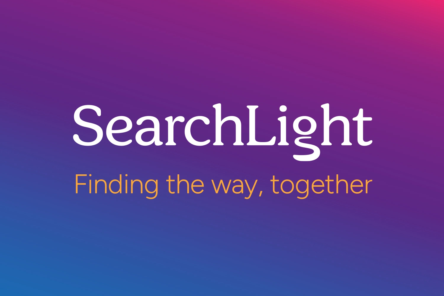
Main Logo Banner
Project Overview
SearchLight is the new identity for a long-established counselling and therapy charity, formerly operating under a national umbrella brand. The rebrand marked a significant moment of change, allowing the organisation to establish a clearer, more independent presence while retaining the trust built through years of community support.
The objective of the project was to create a visual identity that communicated hope, guidance, and professionalism without feeling corporate or clinical. The brand needed to resonate with a wide and diverse audience, including children, young people, adults, couples, and families, while remaining appropriate for use across charity communications, funding materials, and digital platforms.
My Role
I led the project from initial brand exploration through to the delivery of the final logo and visual system. This included defining the core visual direction, designing the primary wordmark, developing the colour palette and gradient system, and documenting the identity within a clear and practical style guide.
The work focused on creating a flexible foundation that could support future communications while remaining accessible and emotionally appropriate for those seeking counselling and therapy.
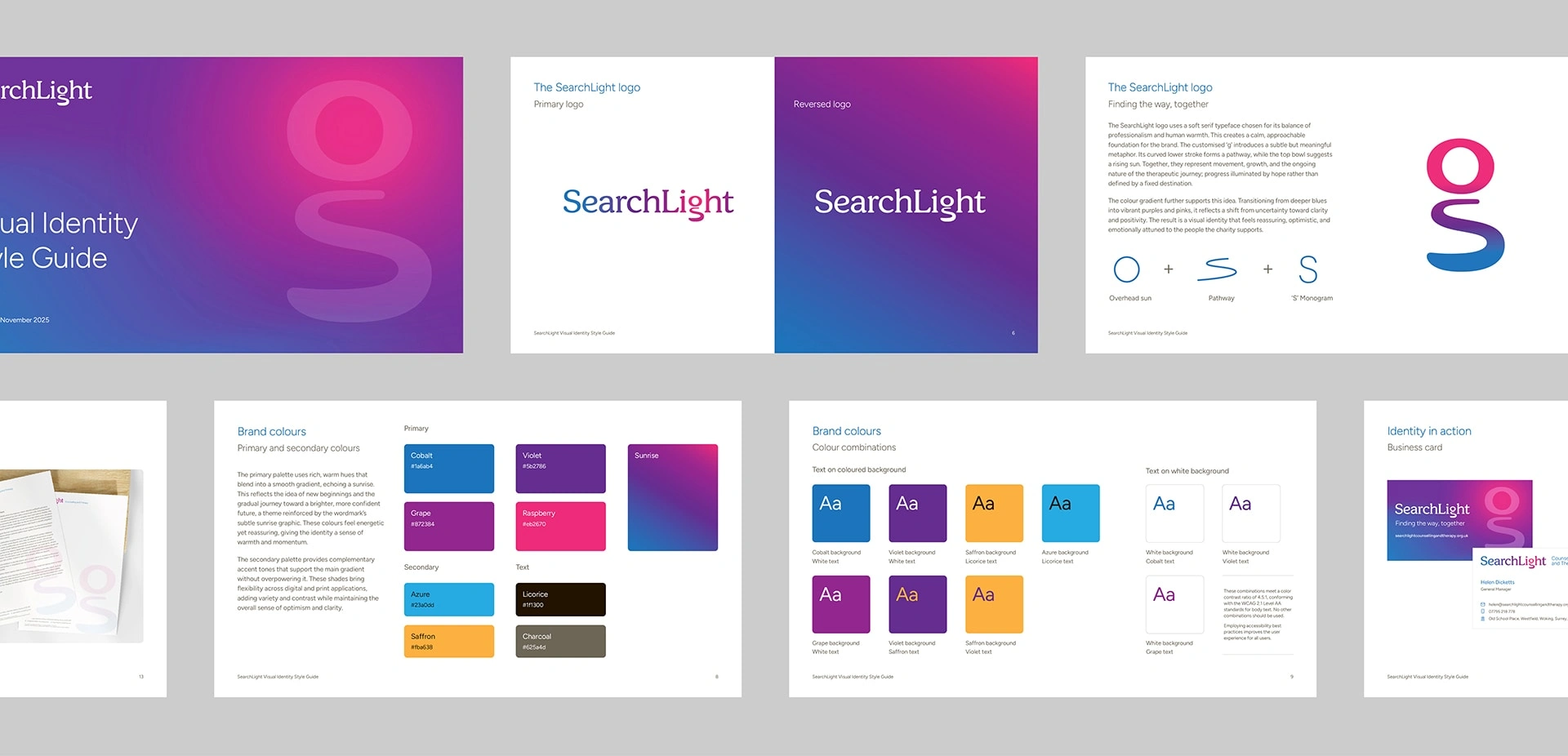
Brand Guidelines
Creative Direction
The creative approach centred on the idea of guidance rather than direction. Therapy was framed as an ongoing process, not a fixed destination, which informed the use of abstract symbolism throughout the identity.
Rather than relying on literal imagery, the logo uses subtle visual metaphors to suggest progress, communication, and hope. The softened serif typography introduces warmth and humanity, while the customised ‘g’ glyph references a pathway and rising sun, reinforcing the idea of movement toward a brighter future. Colour was used carefully to balance calm reassurance with optimism, drawing on sunrise-inspired transitions to reflect gradual positive change.
The overall system was intentionally restrained, prioritising clarity, inclusivity, and longevity over trend-led design.
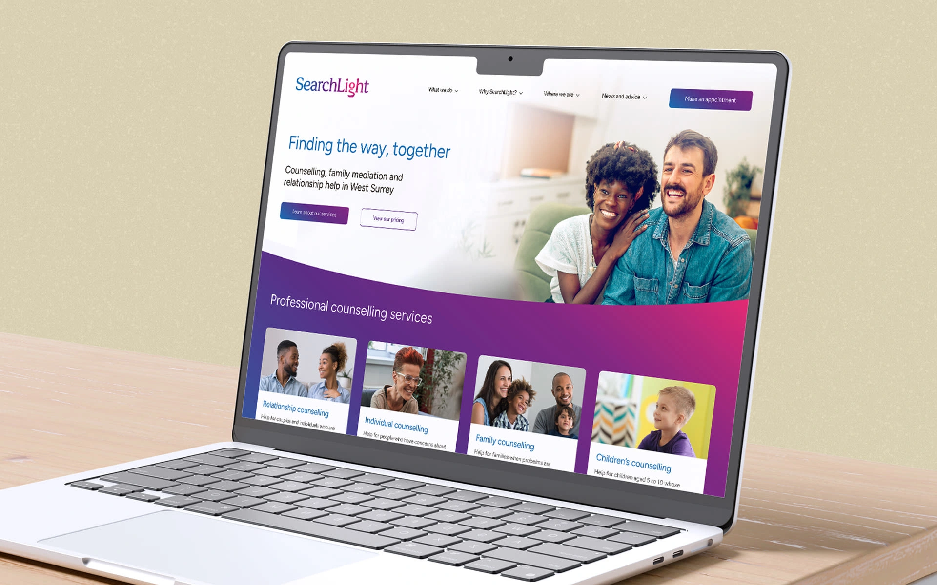
Website Design
Results
The project delivered a calm, confident visual identity that reflects SearchLight’s values and purpose. The new brand provides a clear and distinctive presence that feels professional yet approachable, suitable for a broad audience and sensitive context.
With a defined visual foundation in place, SearchLight now has an identity that supports consistent communication across channels, while remaining flexible enough to evolve as the organisation grows and adapts.
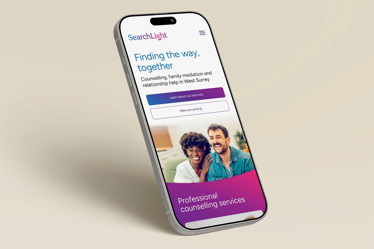
Mobile Site Design
Like this project
Posted Jan 30, 2026
Rebranding a counselling and therapy charity to create a calm, hopeful, and inclusive visual identity focused on guidance, clarity, and connection.