Securvig: Designing a Modular Displayface
Aluko Studio

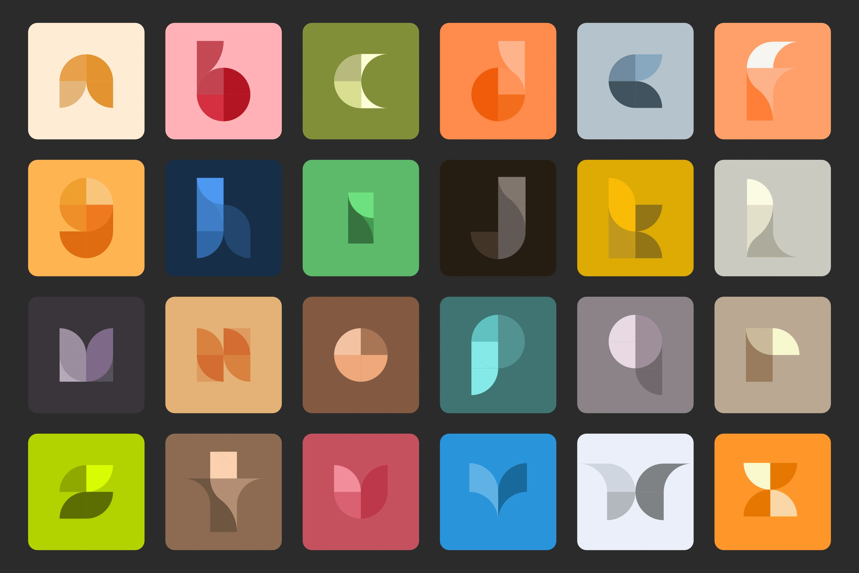
Securvig is a modular displayface partly inspired by the Bauhaus era of design. This was an exercise on creating letterforms with a limited amount of shapes.
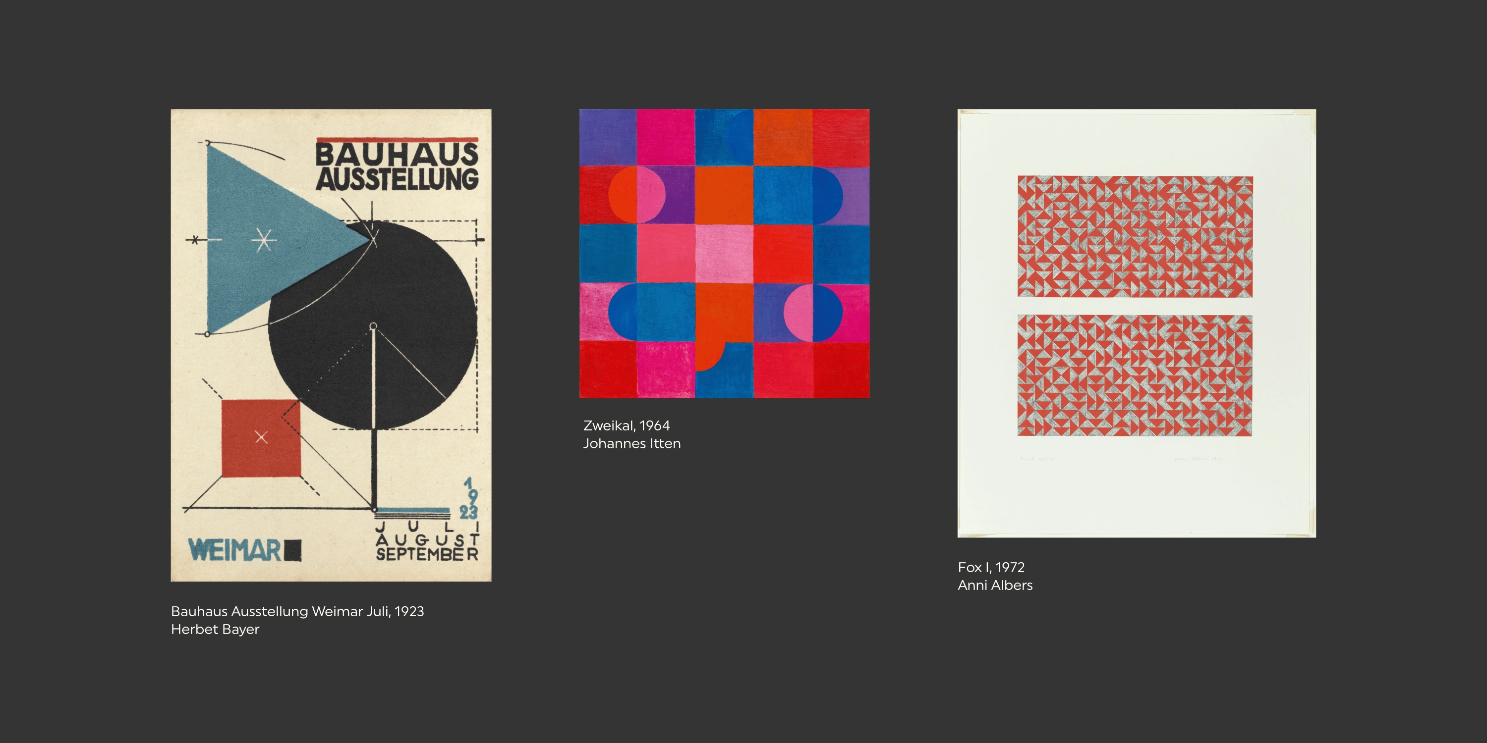
INSPIRATION
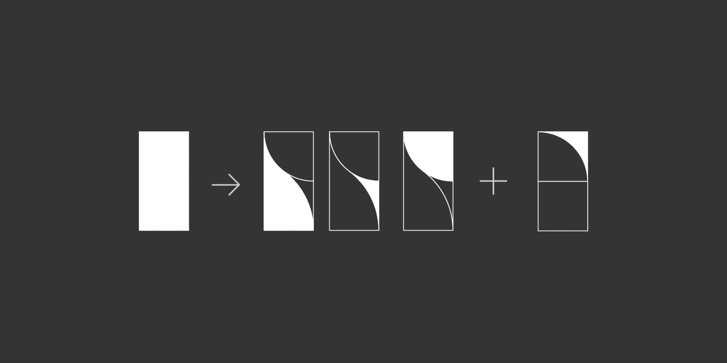
MAKING THE CUT
DESIGNING THE ALPHABET
Building Letterforms
Letterforms were created to closely match a standard serif alphabet. Most letters fit within double width of the source rectangle. For those that didn’t, kerning was adjusted to accommodate the extra with when placed next to other letters, as seen with “T” and “W”.
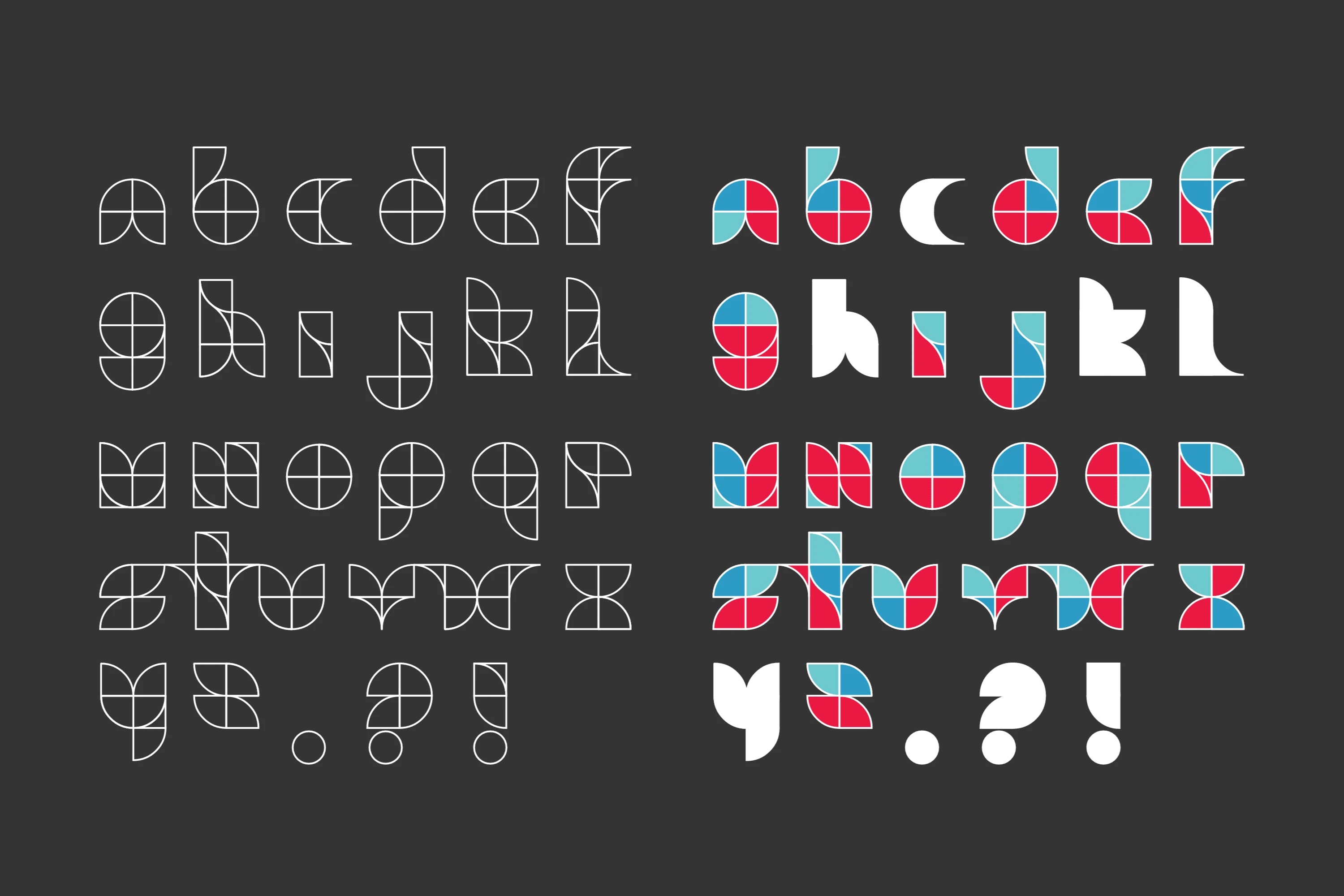
Applying Color
A palette was chosen, and applied following the stroke direction used to write the letter from left to right. Lighter colors were used at the beginning of the stroke and darker colors toward the end of the stroke, with a few exceptions.
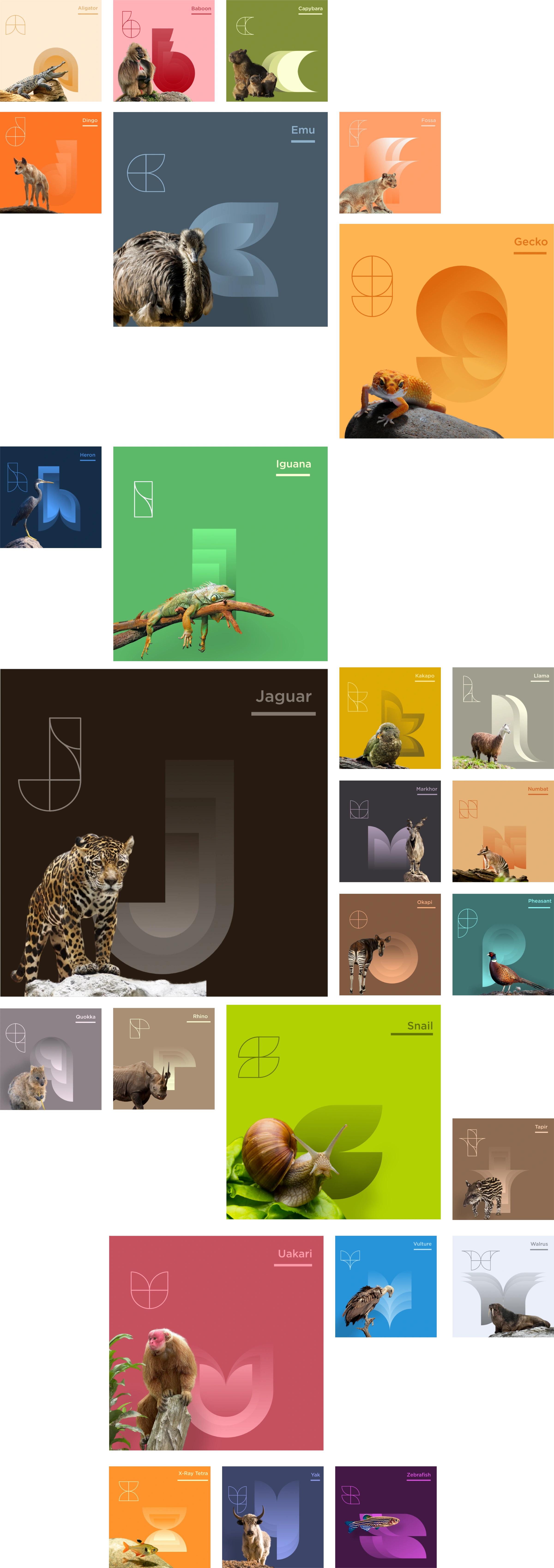
DISPLAYING THE ALPHABET
Like this project
Posted Aug 15, 2023
Securvig is a modular displayface partly inspired by the Bauhaus era of design. This was an exercise on creating letterforms with a limited amount of shapes.