Warm and Supportive Period Tracker App Design

Cansaas Agency

Overview
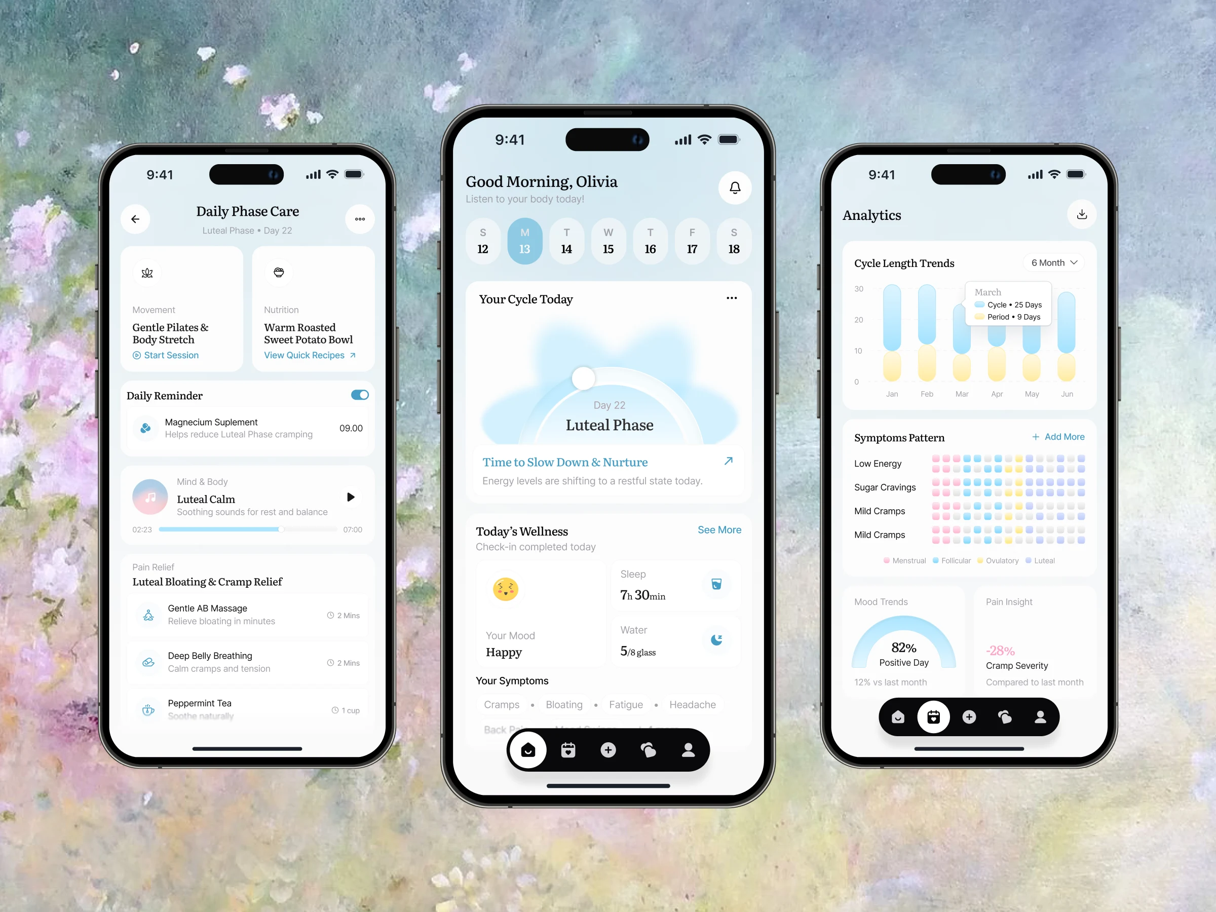
This is a period tracker mobile app concept reimagined as a gentle daily companion rather than a clinical logging tool. The app helps users understand their cycle, track symptoms, and actively care for their body through phase-based guidance. Across three core screens — a calming home dashboard, a phase-specific self-care screen, and a data-rich analytics view — the goal was to make women's health tracking feel warm, supportive, and genuinely nurturing. By pairing soft pastel tones, a serene watercolor backdrop, and elegant serif typography with empathetic copy, the design positions cycle tracking as an act of self-care instead of a chore.
The Challenge
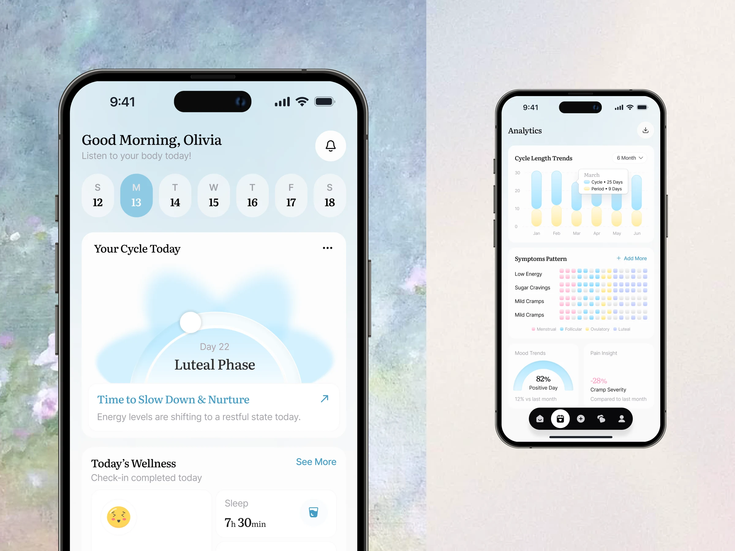
Most period trackers feel cold and clinical, treating a deeply personal experience as pure data entry. That disconnect is a real problem: when the product is about your body and how you feel, an interface that feels sterile can be alienating. The challenge was to surface genuinely useful information — cycle phase, symptoms, mood, trends, and care recommendations — while keeping the experience emotionally warm and calm. The design also needed to balance two modes in one product: a quick daily check-in for users who just want to know how they're doing today, and a deeper analytics view for those looking to understand patterns over time.
Research & Insight
Looking at how people relate to health tracking revealed a clear gap: users don't just want to know what is happening in their cycle, they want to know what to do about it. Many existing apps stop at logging — recording symptoms and predicting dates — without offering support for how a person actually feels day to day. This insight shaped the core direction: the app should move beyond passive tracking into active, phase-aware care. A second insight was emotional. Cycle tracking is intimate, and the visual tone carries as much weight as the data itself, which is why the design leans into soft color, gentle language, and calming imagery rather than clinical charts alone.
The Approach
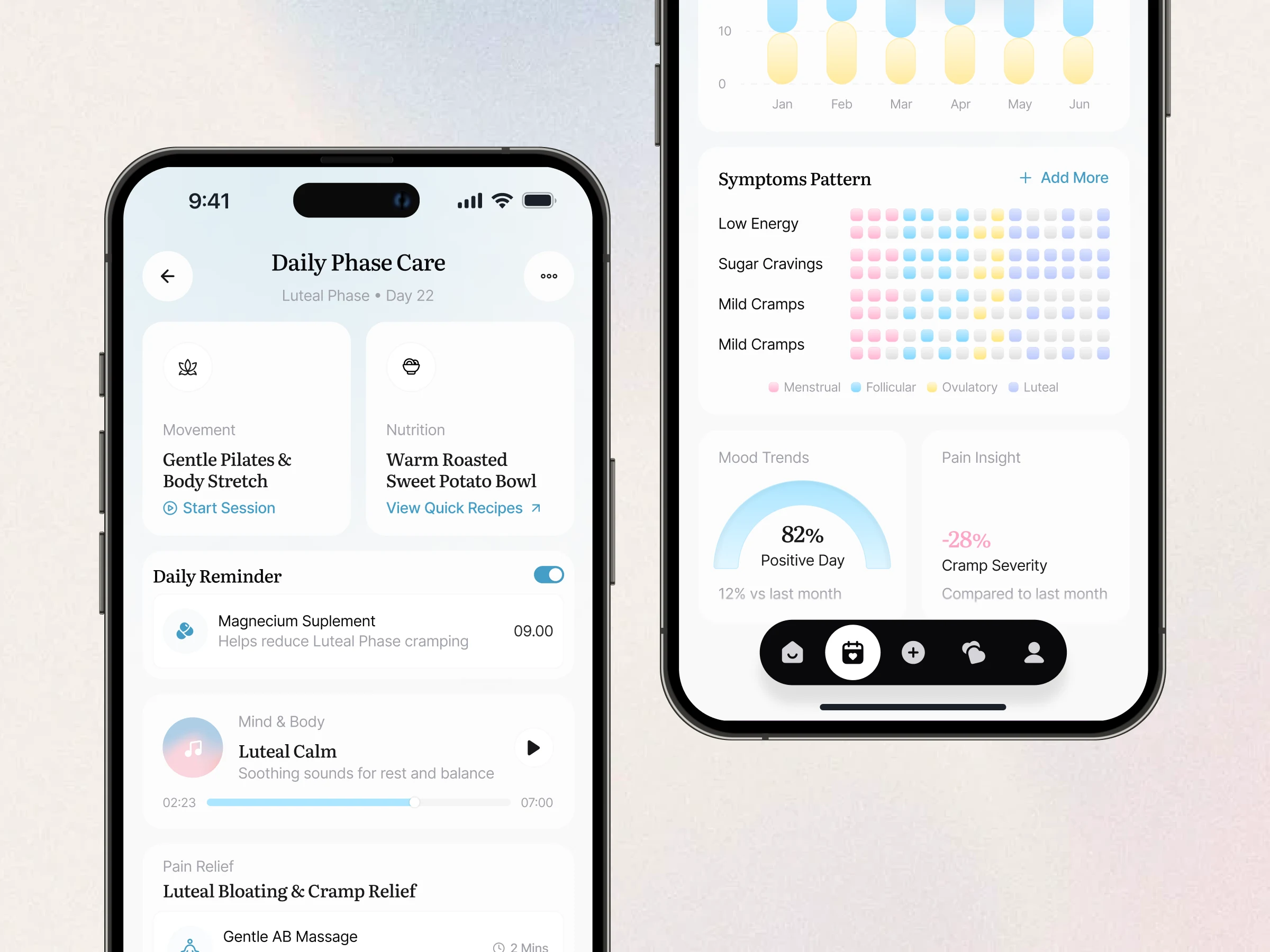
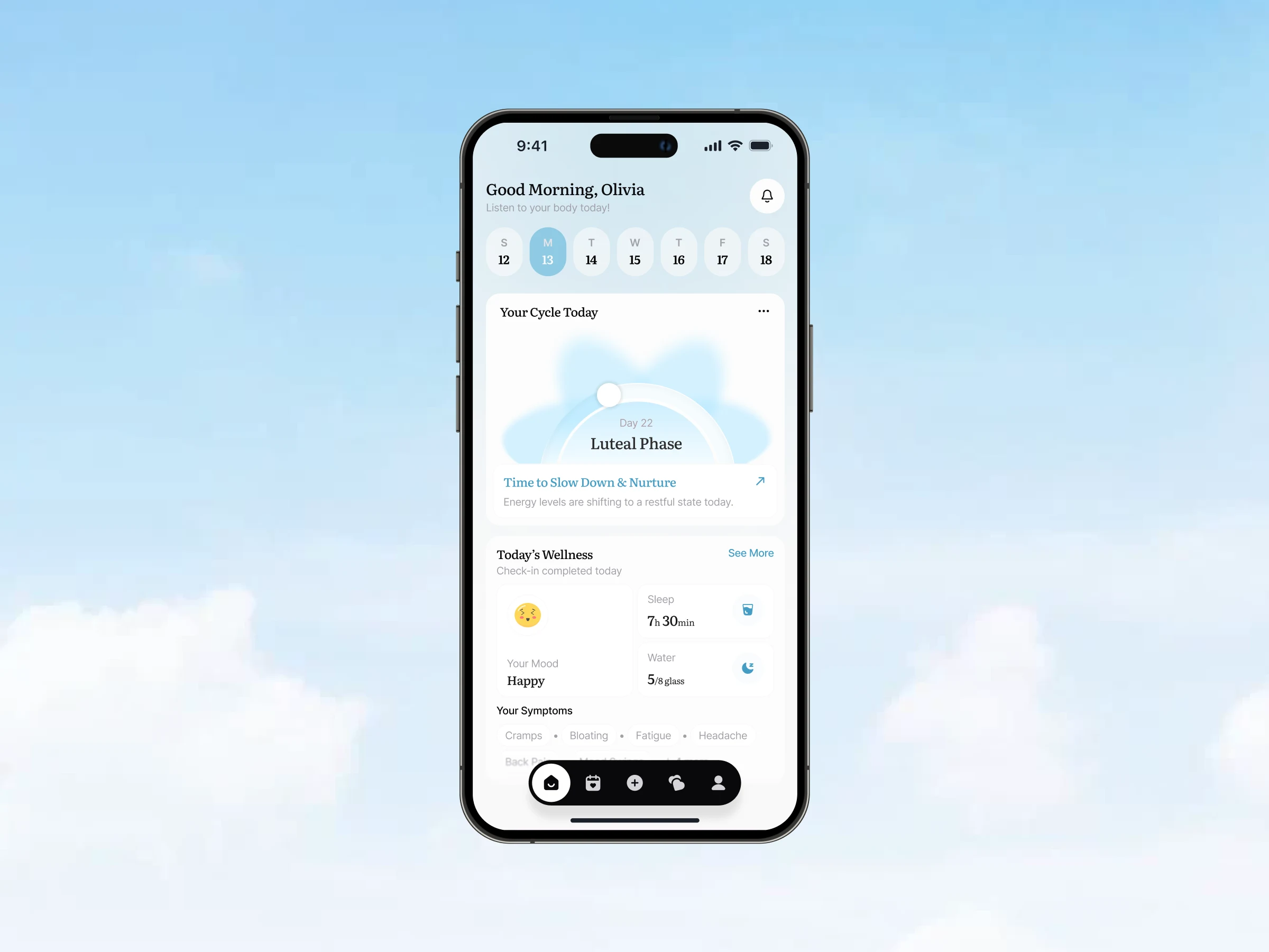
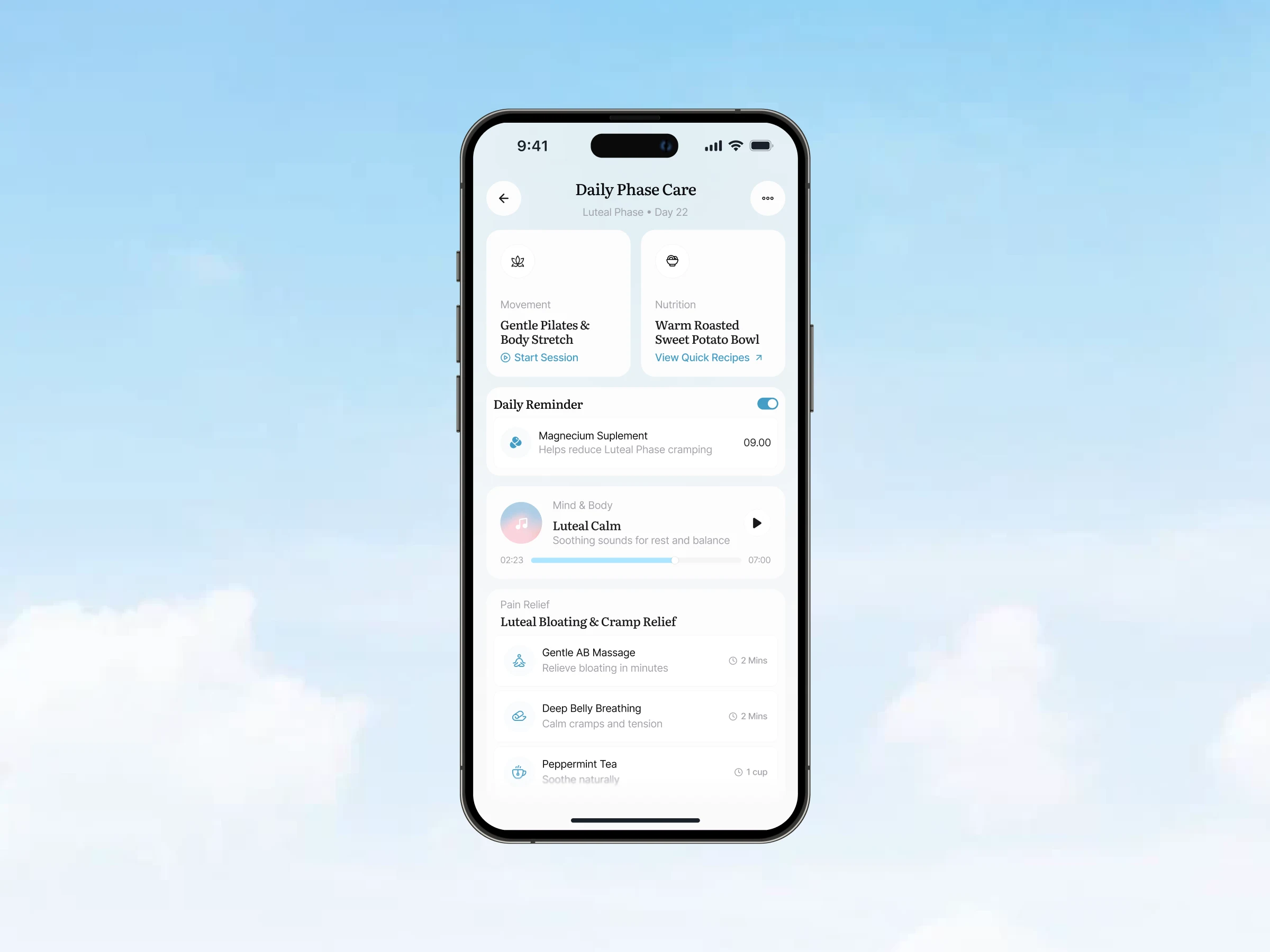
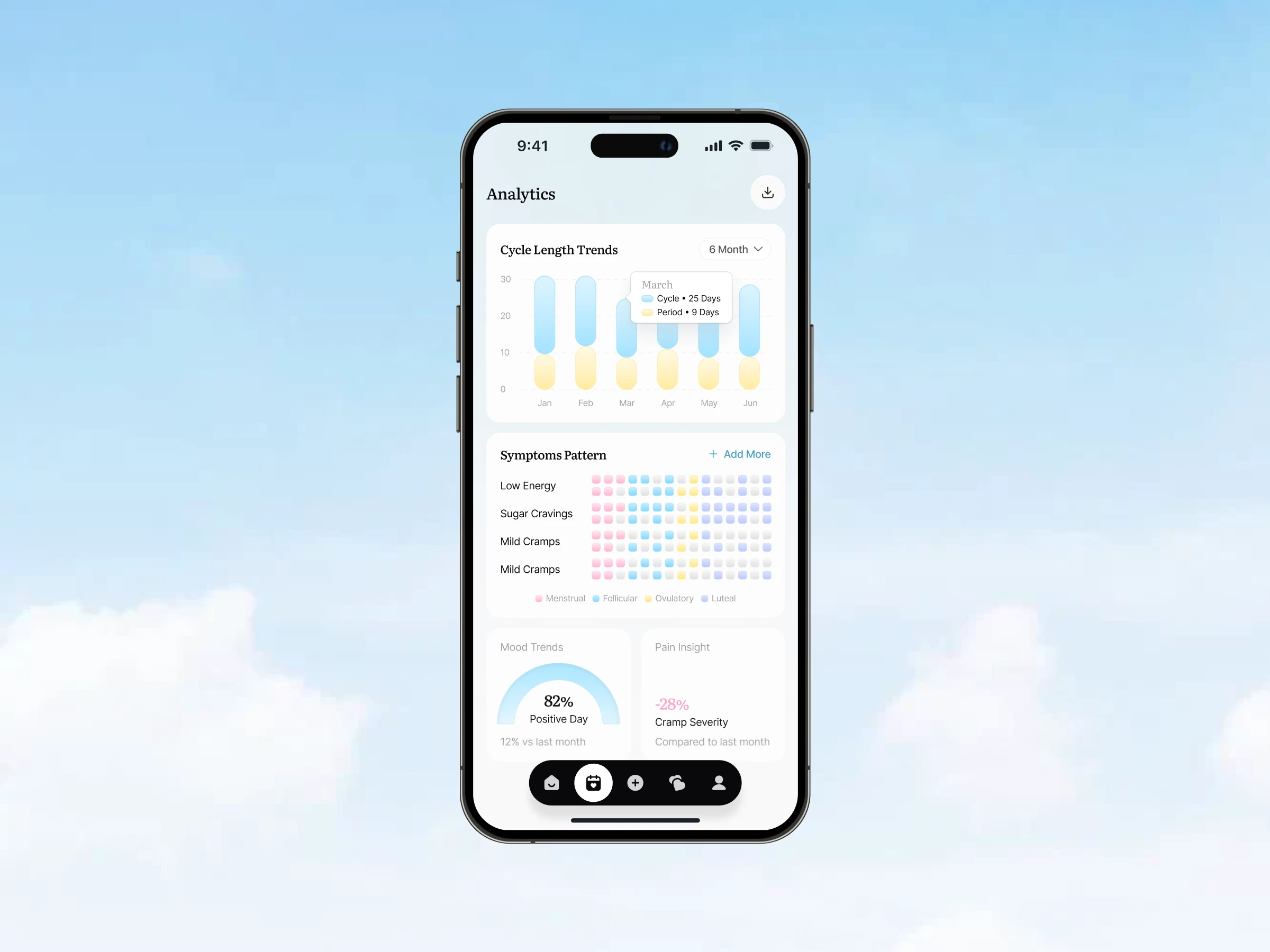
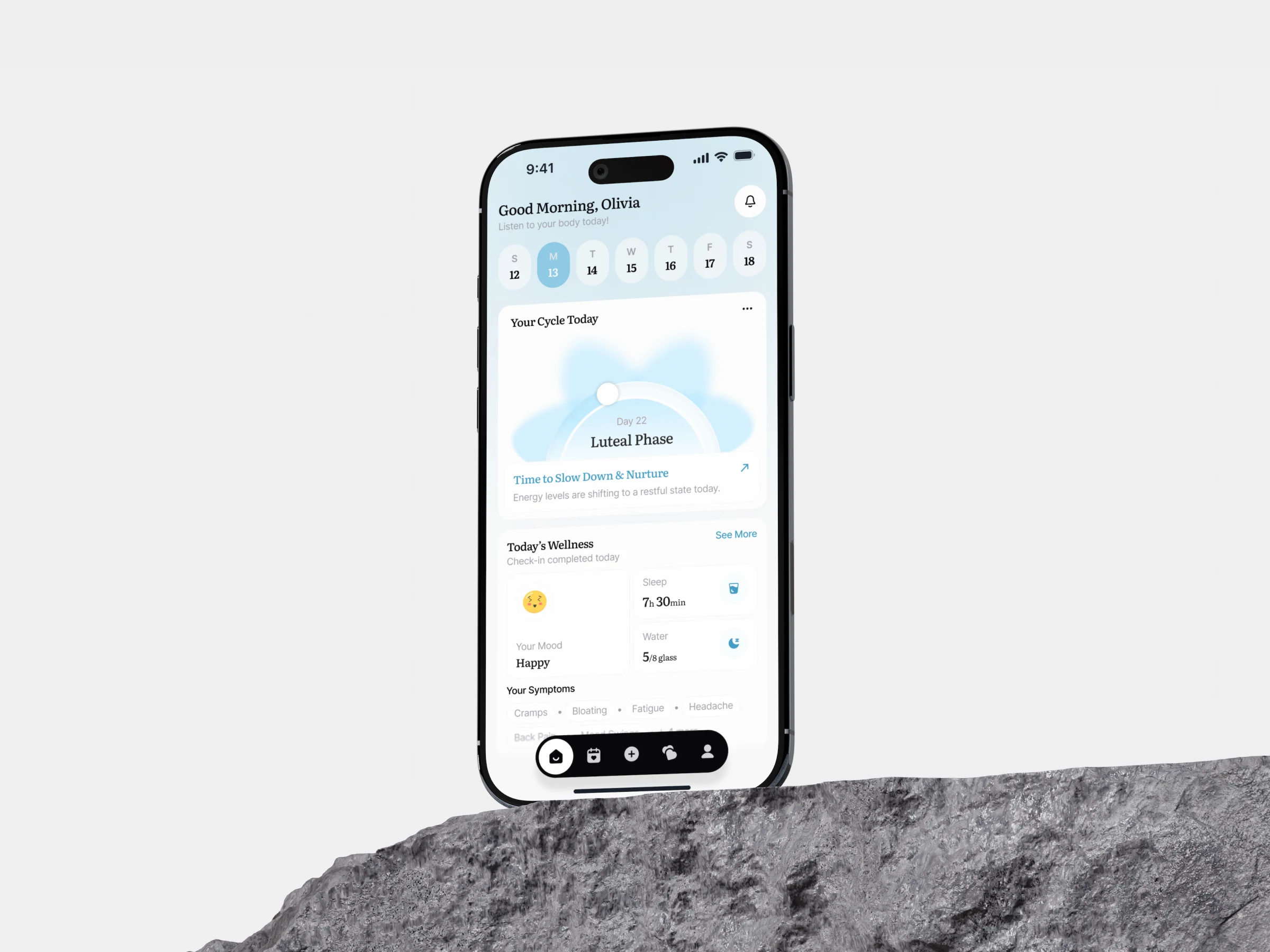
The design was built around empathy first. A soft pastel palette and watercolor backdrop set a calm, nurturing mood, while serif headlines add warmth and a personal, editorial quality. Color was assigned functionally to each cycle phase — menstrual, follicular, ovulatory, and luteal — so the same visual language carries meaning across every screen, from the home indicator to the analytics heatmap. The home screen was designed as a gentle daily check-in, leading with the current phase and supportive guidance. The Daily Phase Care screen then translates that phase into concrete action — movement, nutrition, sound therapy, and pain relief — turning insight into care. Finally, the analytics screen visualizes trends with soft charts and a symptom heatmap, keeping dense data readable and never overwhelming.
Key Features & Highlights
The home dashboard combines a weekly date selector, a signature cloud-like cycle phase indicator showing the current day and phase, and wellness check-ins for mood, sleep, water, and symptoms. The Daily Phase Care screen delivers phase-specific recommendations — gentle movement, nourishing recipes, a supplement reminder, a calming audio player, and quick cramp-relief activities with duration tags. The analytics screen brings it all together with a dual bar chart for cycle and period length, a color-coded symptom heatmap mapping patterns across phases, and gauge cards for mood trends and pain insights. A floating pill navigation keeps the core actions within easy reach across the entire app.
Visual Direction & Design System
The interface leans emotional rather than clinical, and every visual decision reinforces that. A serif display typeface gives headlines a warm, editorial quality, while a clean sans-serif keeps labels, values, and supporting text highly legible — a pairing that balances feeling with function. The pastel palette is more than decoration: menstrual pink, follicular blue, ovulatory yellow, and luteal lavender form a consistent phase-based color system that carries meaning across the phase indicator, the symptom heatmap, and the charts. The watercolor backdrop softens the whole experience without competing with content, and rounded cards, generous spacing, and gentle shadows keep even data-heavy screens feeling calm. A single dark floating navigation bar anchors the palette, providing just enough contrast to keep the primary actions grounded and easy to find.
The Result
The final design reframes period tracking as something gentle, supportive, and genuinely caring. By leading with empathy, applying phase-based color as a functional system, and moving beyond passive logging into active daily care, the app makes sensitive health data feel calm and approachable rather than clinical. It's a study in warmth — proving that a health product can be both genuinely informative and emotionally nurturing when tone, color, and care are designed together from the start.
Like this project
Posted Jul 29, 2026
Designed a nurturing period tracker mobile app enhancing self-care.
Likes
0
Views
29