Voice Models Explorer UI/UX Enhancement

Cansaas Agency

Overview
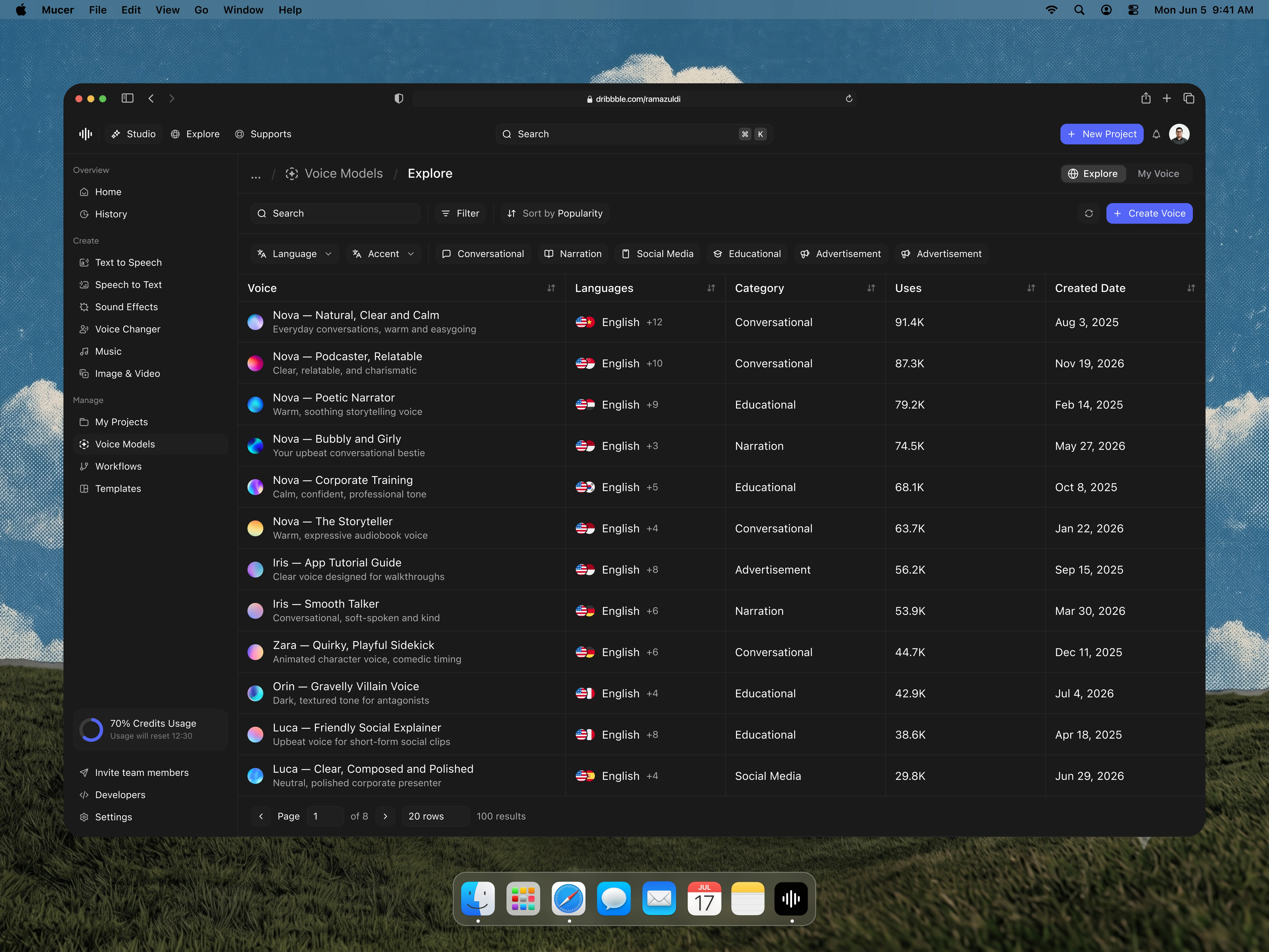
Mucer is an AI voice generation platform that lets creators produce speech, music, and sound from a single workspace. This case study focuses on the Voice Models Explorer — the screen where users browse, filter, and select from a large library of AI voices before bringing them into a project. The goal was to make a deep, data-heavy catalog feel effortless to navigate, wrapped in a refined dark-mode interface that stays comfortable during long creative sessions. Rather than hiding complexity, the design organizes it, giving both casual creators and professional teams a fast path to the exact voice they need.
The Challenge
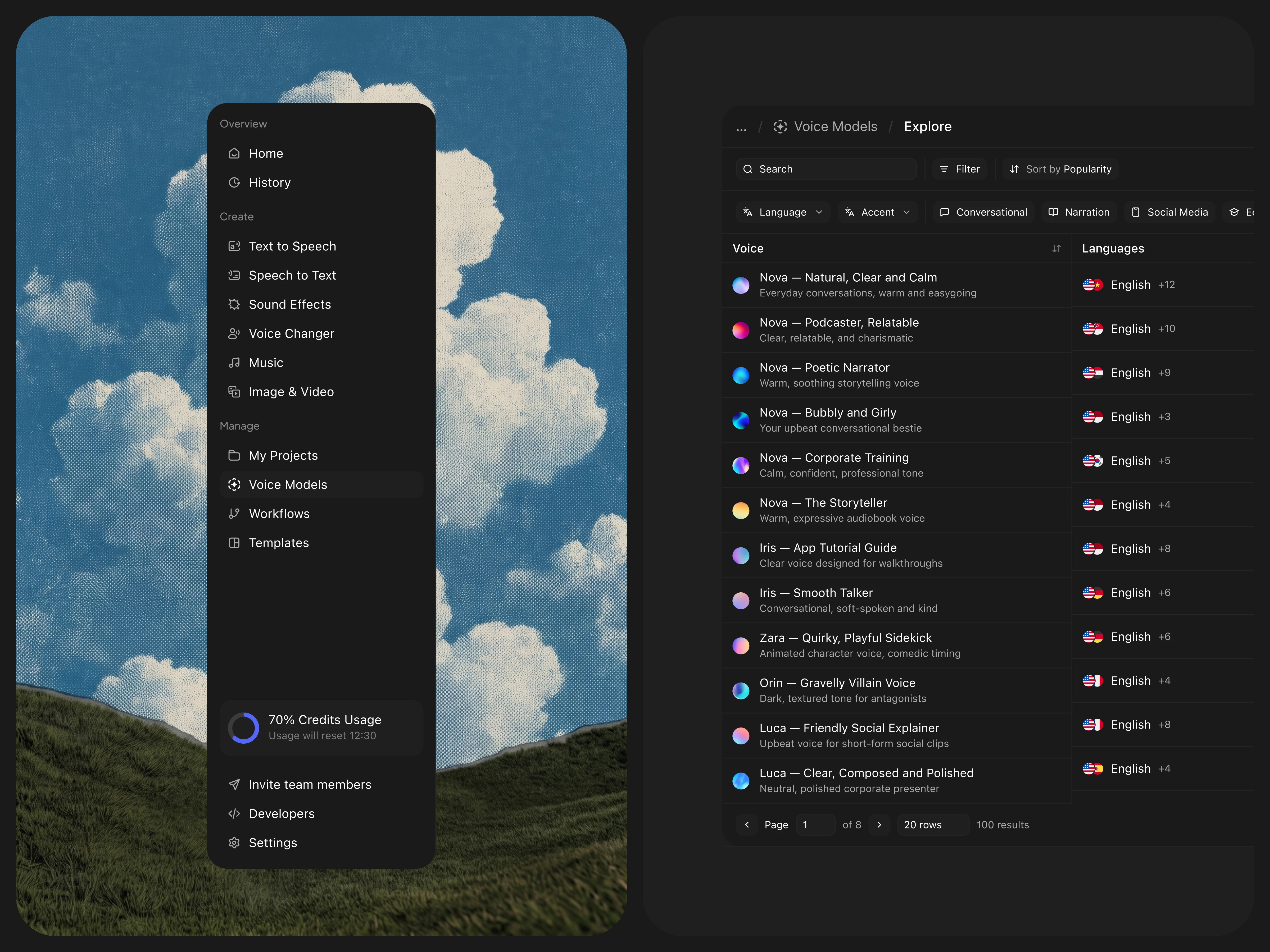
Voice libraries grow quickly, and browsing them is deceptively hard. Each voice carries multiple attributes — tone, language, accent, use case, popularity — and users arrive with very different goals: some want a warm narrator, others a quirky character voice, others a polished corporate presenter. The challenge was presenting dozens of voices and their metadata in one view without overwhelming the user, while keeping the interface legible in dark mode where poor contrast can quickly become fatiguing. We also needed the screen to scale gracefully from a handful of results to hundreds.
The Approach
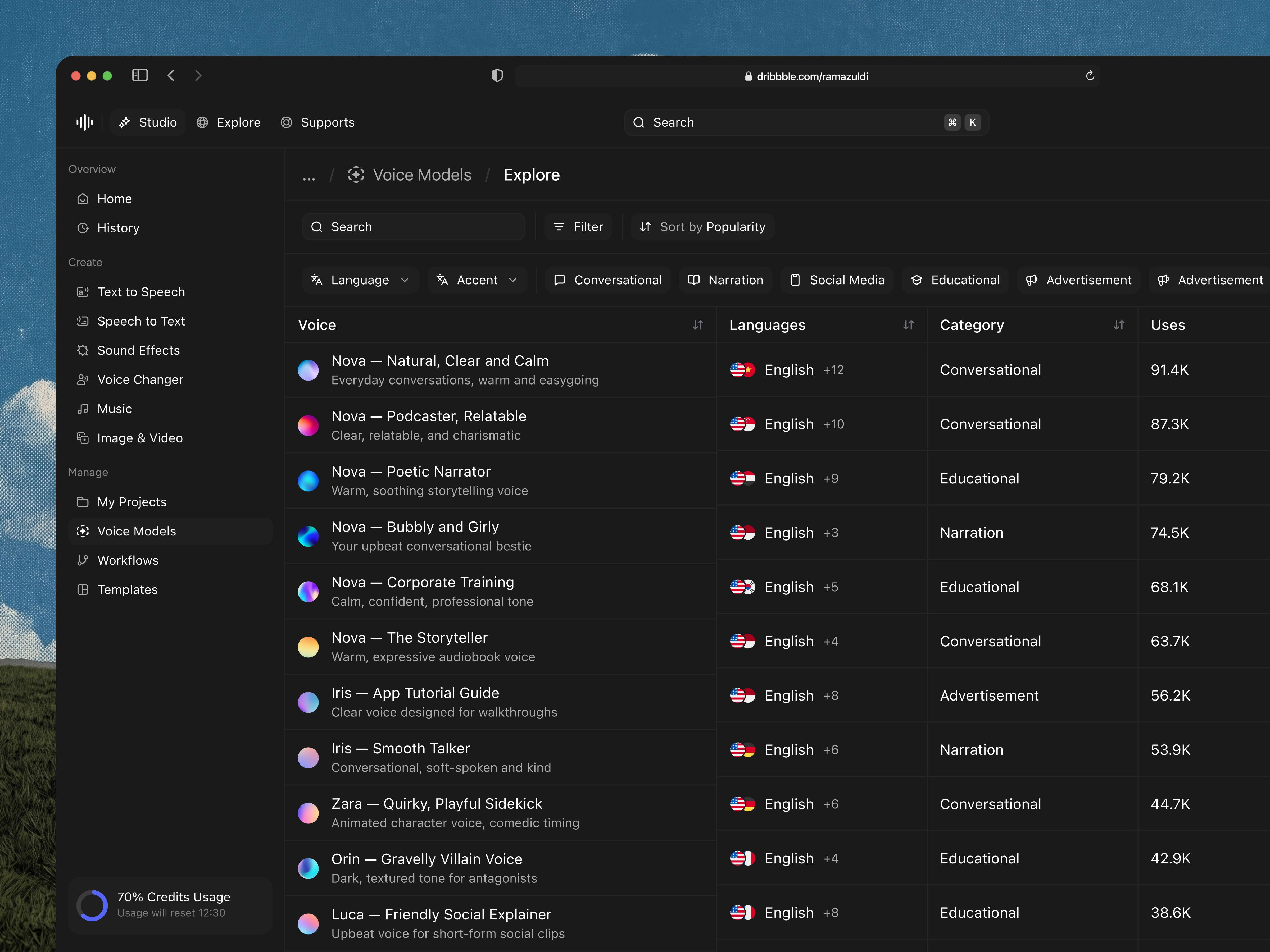
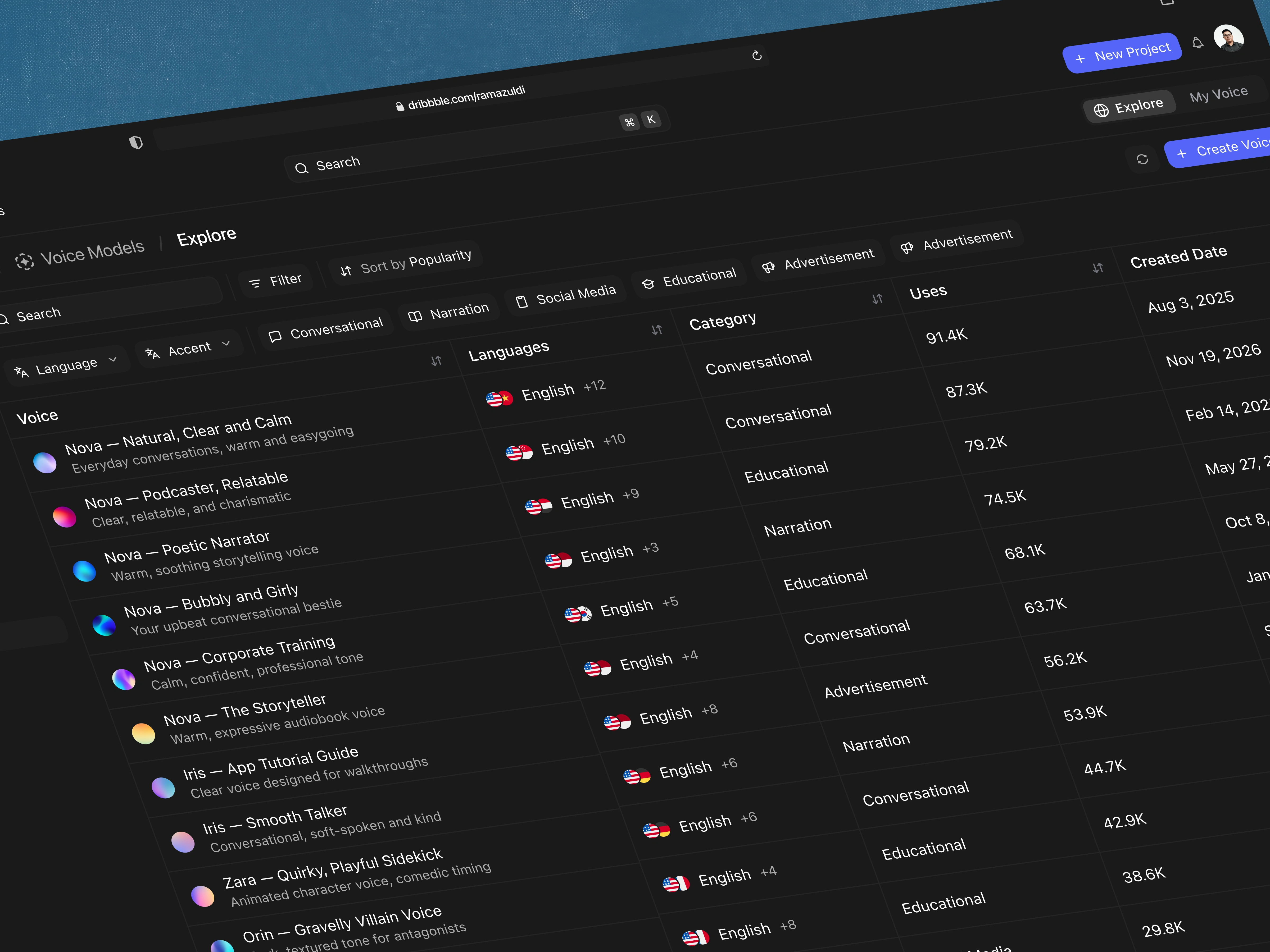
We structured the screen around a data table, the clearest pattern for comparing many items across shared attributes. Voice, Languages, Category, Uses, and Created Date each became a sortable column, letting users reorganize the library around whatever matters most to them. To make scanning faster, every voice received a unique gradient avatar — turning an otherwise uniform list into something visually distinct. Filtering was split into two layers: structured dropdowns for Language and Accent, and quick-access category chips for use cases like Conversational, Narration, and Social Media. On the dark canvas, colour was reserved for data and key actions, so the interface stays calm while the important elements still stand out.
Key Features & Highlights
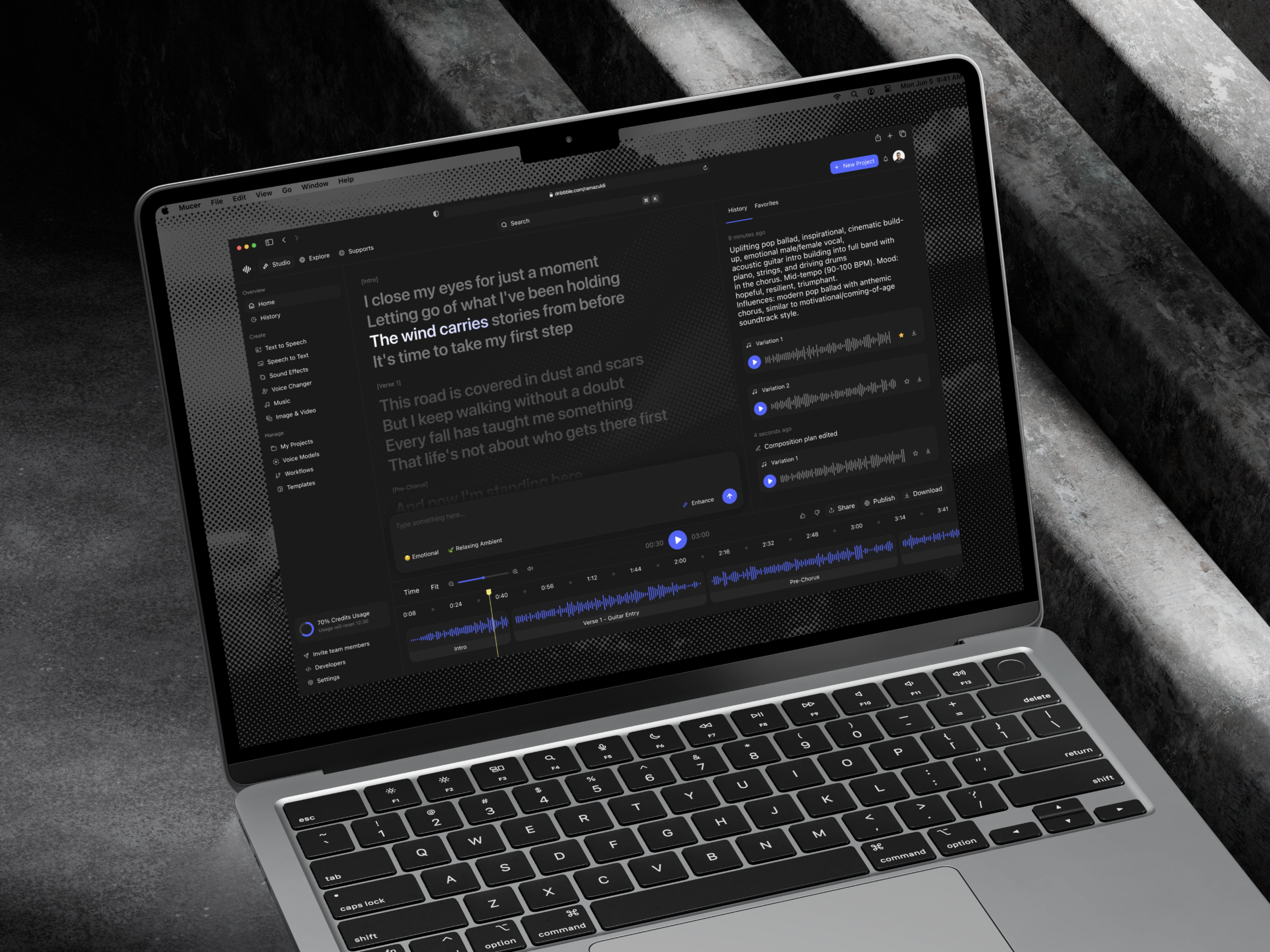
The explorer pairs a persistent three-zone sidebar — Overview, Create, and Manage — with a focused content area led by a breadcrumb, search bar, and filter row. Each table row combines a gradient avatar, voice name, and short tonal description with language badges that use an overflow counter, such as "English +12," to communicate multilingual support without clutter. A usage meter anchored in the sidebar keeps credit consumption visible at all times, and a clear pagination footer manages large result sets. Beyond browsing, the connected Studio view brings lyrics, a composition plan, a waveform timeline, and version history into one editing space — showing how selection flows naturally into creation.
The Result
The final design turns a dense voice catalog into something genuinely enjoyable to explore. By leaning on a sortable table, functional colour, and a layered filtering system, Mucer makes a large library feel navigable at a glance while remaining visually calm in dark mode. It is a study in structured density — proving that a professional, data-rich tool can still feel modern, focused, and easy to move through.
Like this project
Posted Jul 27, 2026
Redesigned Mucer's AI voice library browsing interface for ease of navigation.
Likes
1
Views
17