iOS Nutrition Tracking App Design

Cansaas Agency

Overview
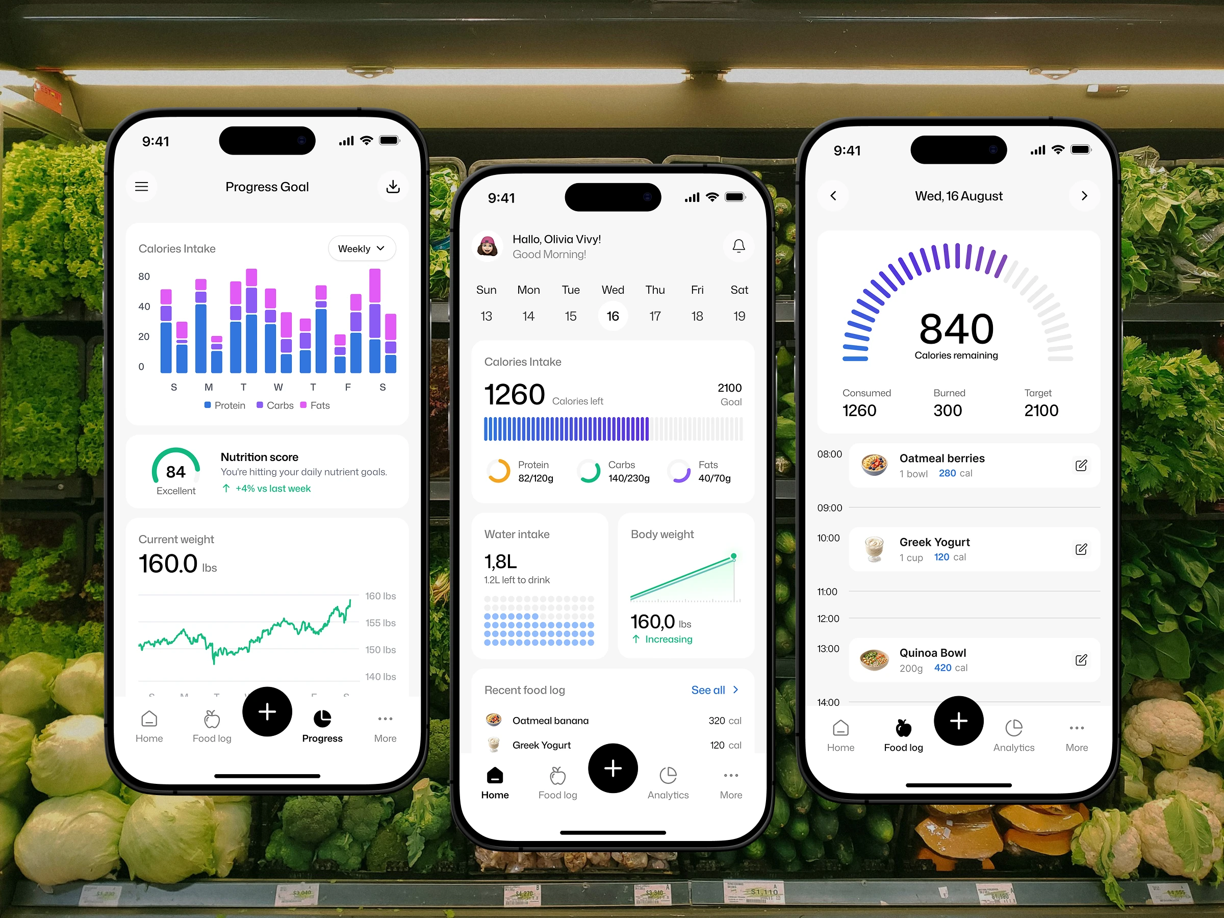
Nutrition Tracker is a mobile app concept designed to help people log their meals, monitor macro nutrients, and stay consistent with their daily health goals. The objective of this project was to take a category known for clutter — calorie counting apps packed with numbers, forms, and endless lists — and rebuild it around clarity. Rather than showing users everything at once, the app answers three distinct questions across three focused screens: how am I doing today, what have I eaten, and how am I trending over time. Every layout decision was made in service of one goal: making dense health data feel light enough that logging becomes a habit rather than a task. The result is a clean iOS interface where nutrition tracking fits naturally into a normal day.
The Challenge
Nutrition apps fail for a simple reason: logging food is a daily habit, and any friction compounds fast. Most existing apps overwhelm users with raw numbers, bury key metrics behind multiple taps, or present charts that require real effort to interpret. The challenge here was balancing depth with speed — surfacing calories, protein, carbs, fats, water intake, and body weight without turning the home screen into a spreadsheet. We also needed the interface to serve two very different mindsets in the same product: the user checking in quickly between meals who wants a single number, and the user reviewing their week on a Sunday evening who wants patterns, comparisons, and context. Designing one system that satisfies both without compromising either was the core tension of this project.
Research & Insight
Looking at how people actually use tracking apps revealed a clear pattern: the majority of sessions last under thirty seconds. Users open the app, check one number, and close it. Deep analytics sessions happen far less often, usually once or twice a week. This insight shaped the entire information architecture. Instead of treating every metric as equally important on every screen, we ranked them by frequency of use — the remaining calorie count earned the largest type on the home screen, while trend charts were moved to a dedicated space users visit intentionally. A second insight came from meal logging behaviour: people rarely remember exactly what they ate, but they almost always remember roughly when. That observation directly led to the timeline structure in the food log.
The Approach
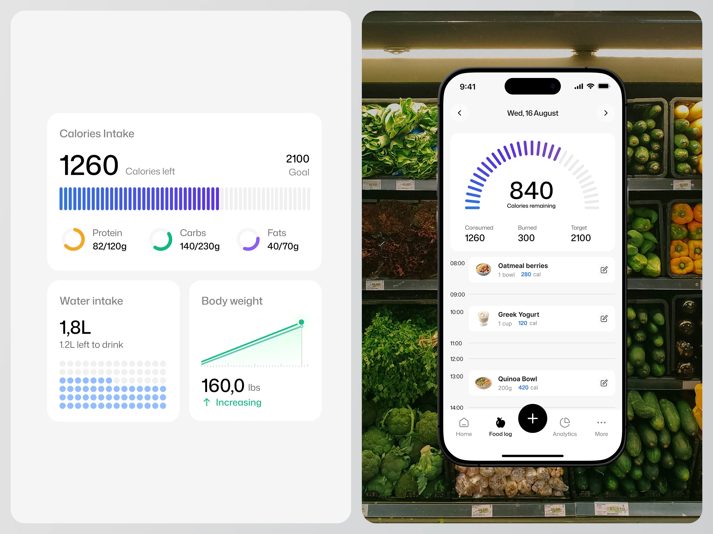
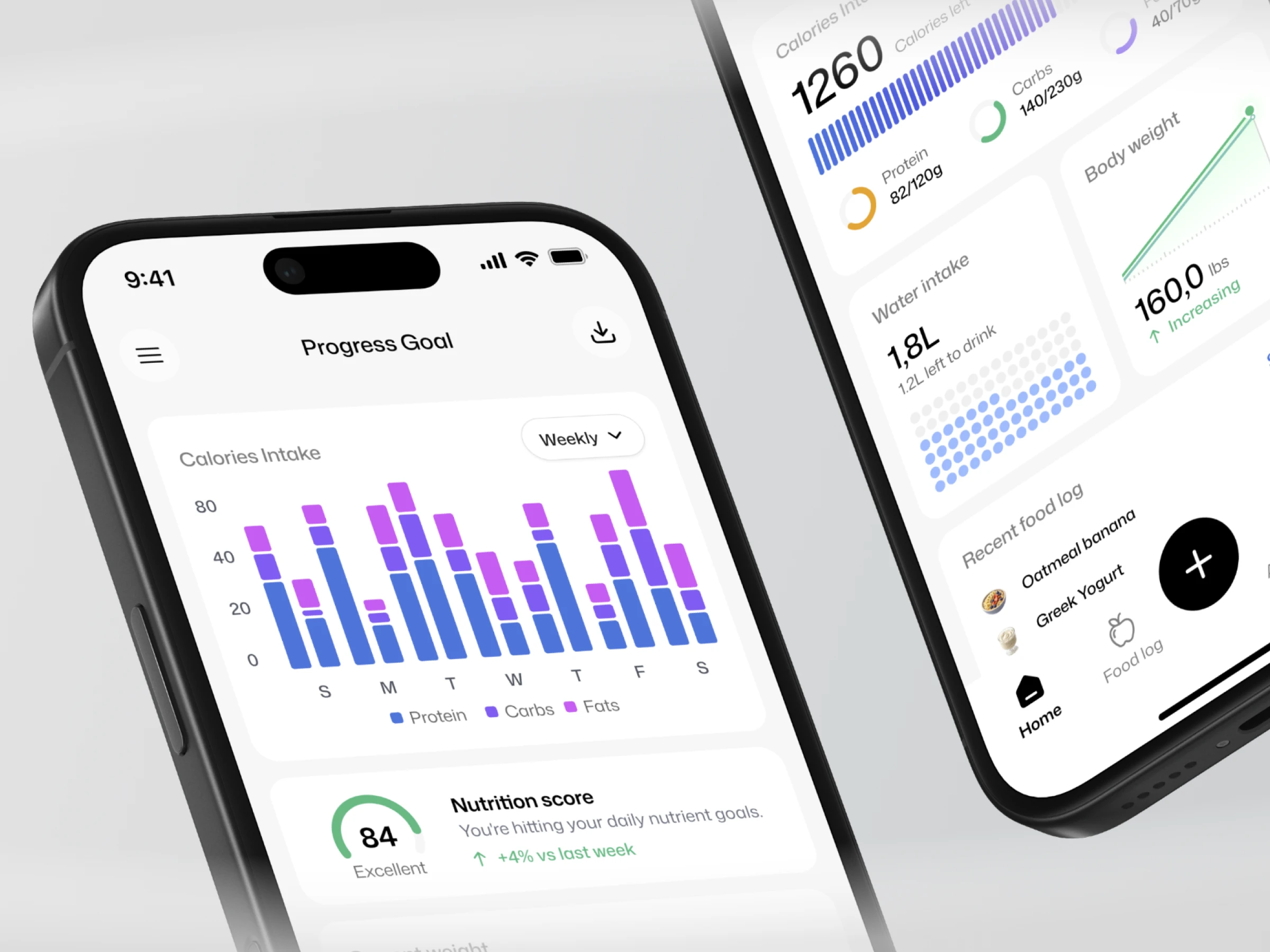
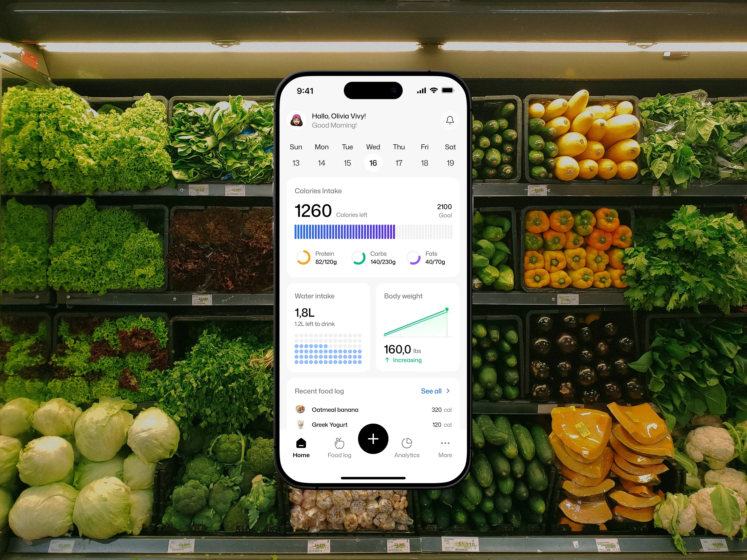
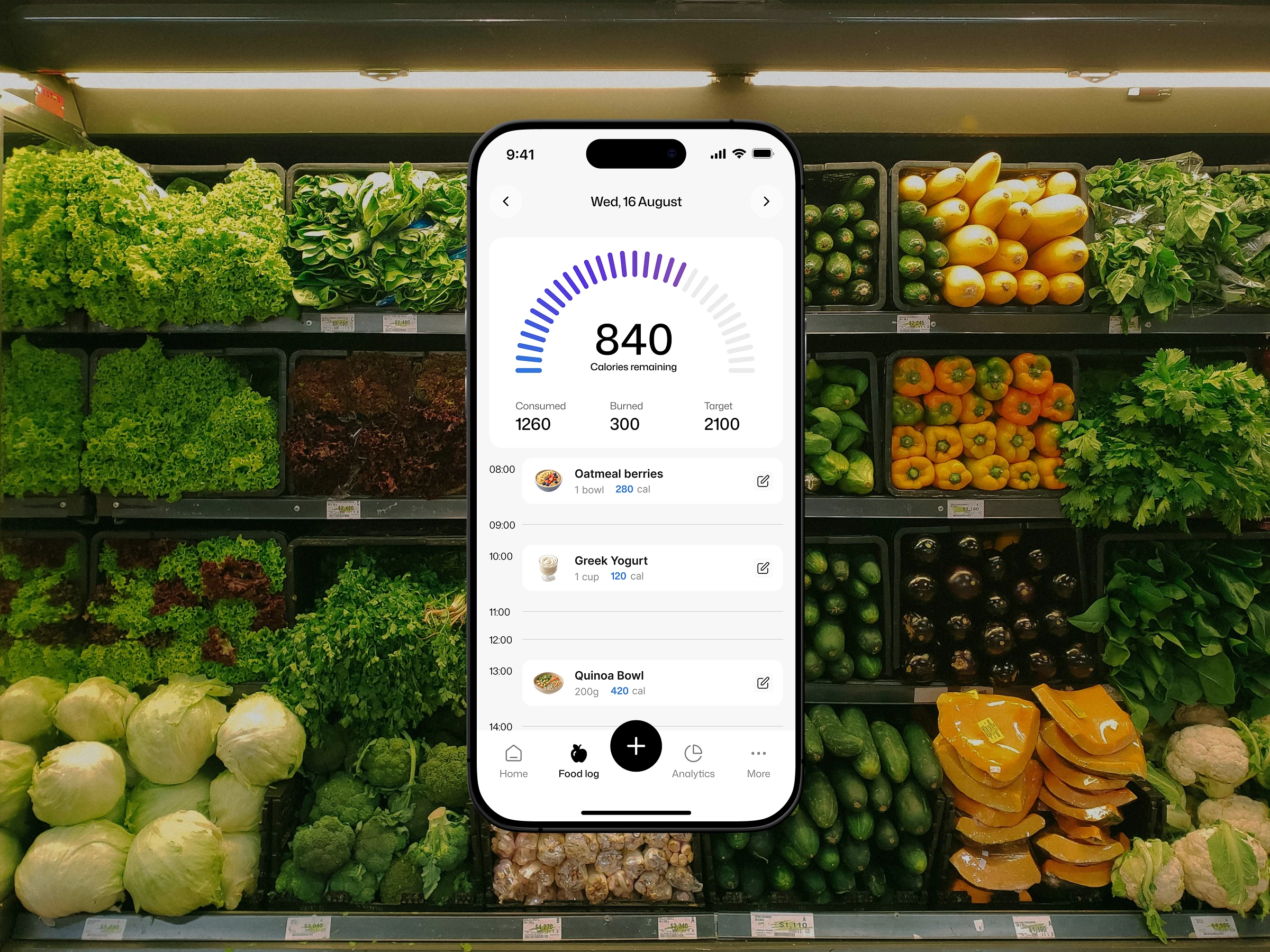
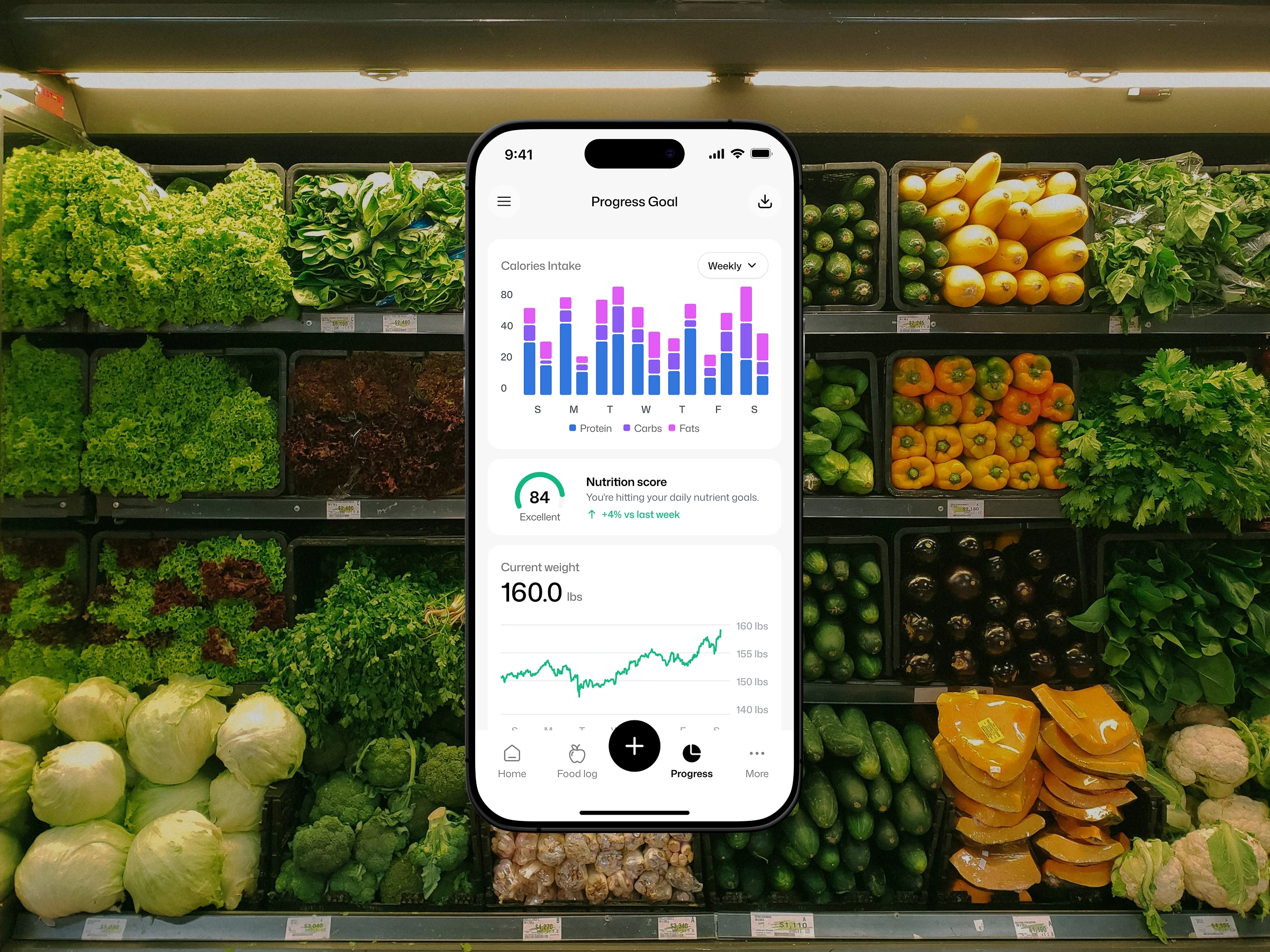
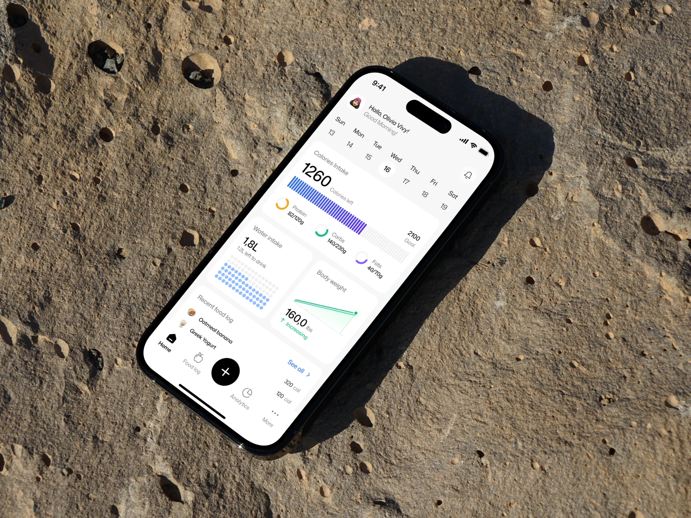
We started by separating daily action from long-term insight. The home screen was designed as a glanceable summary — one large calorie figure, three macro rings, and compact stat cards for water and weight — so users get their answer in under three seconds. Colour was assigned functionally rather than decoratively: orange for protein, green for carbs, purple for fats, applied consistently across every screen so the visual language becomes learnable after a single session. For the food log, we replaced the conventional list with an hour-by-hour timeline, letting empty time slots communicate eating gaps as clearly as the meals themselves. Chart types were selected deliberately by data shape rather than by visual appeal — radial rings for ratios, arc gauges for progress toward a target, stacked bars for composition over time, and line charts for continuous trends.
Visual Direction & Design System
The interface is built on a light neutral base with generous white space, soft rounded corners, and no heavy borders — a deliberate choice to keep the app feeling calm even when it carries a lot of information. Cards act as the primary containment method, grouping related metrics without visual noise. Typography does most of the hierarchy work: oversized numerals for primary values, medium weights for labels, and muted greys for supporting text. The colour system is intentionally restrained, reserving saturation for data only, so charts and progress indicators become the visual focus by default. A consistent bottom navigation with a central floating action button anchors the experience, ensuring the primary action stays within thumb reach across all three screens.
Key Features & Highlights
The home dashboard combines a segmented calorie progress bar with three radial macro indicators, paired with a horizontal week selector for quick date switching, plus compact cards showing water intake as a dot grid and body weight as a mini trend line. The food log screen leads with a semi-circular calorie gauge that breaks the day into consumed, burned, and remaining, followed by a timeline of meal entries showing portion size, calorie count, and a one-tap edit action. The progress screen shifts into analytics mode, using a stacked bar chart to show macro composition across seven days, a nutrition score gauge with a week-over-week comparison, and a line chart tracking body weight over time — all filterable through a simple period selector.
The Result
The final design turns nutrition tracking from a chore into a quick daily check-in. By assigning each screen a single clear job, applying colour as a functional system, and choosing the right chart type for each kind of data, the app makes complex health metrics readable at a glance without sacrificing depth. It is a study in restraint — proving that a data-heavy product can feel spacious, calm, and modern when hierarchy and consistency come first. More importantly, it is designed for the metric that matters most in health apps: not features, but consistency over time.
Like this project
Posted Jul 24, 2026
Designed a user-friendly iOS app for streamlined nutrition tracking.
Likes
2
Views
59