Anna Bass Photography - Brand & Website Design
✨ The Brand:
Anna has been doing some wedding photography around her full-time job and got in touch with me when her bookings were really picking up and she wanted to give her DIY brand identity and website a facelift. Her aim was to provide her current and prospective clients with a more professional, user-friendly space to browse her work and book her services.
She wanted a brand identity that was bright, airy and uplifting reflecting both her temperament with her clients and her style of photography.
🔍 The Design:
Brand Identity:
I explored many design ideas for this project (find a few examples at the bottom) but we settled for a clear and elegant logo font, and a beautiful but legible handwritten secondary font. We considered a range of colour palettes but agreed that the coral and white palette felt unique and gave off a kind, genuine feel that was important to us during this project. As Anna specialises in wedding photography we wanted to tie that in without it feeling too sweet or girly. We thought the colour palette did a great job of that too.
Anna Bass Photography - Main logo
The Deliverables:
+ Main logo & Alternate files
+ Secondary logo & Alternate files
+ Submark logo & Alternate files
+ Colour palette and brand fonts
+ TOV
+ ‘File types & how to use them’ document
+ Full Brand Guidelines document
+ Website
+ Business cards & thank you cards
+ Social media templates
+ A digital wedding planner
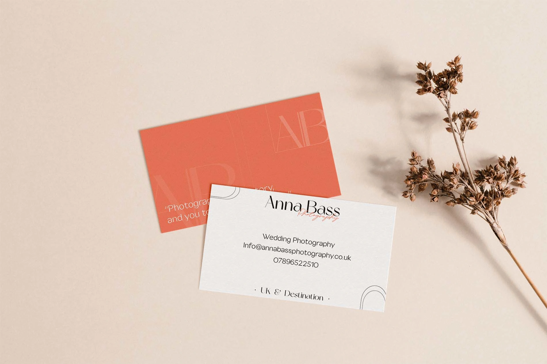
Anna Bass - Business cards
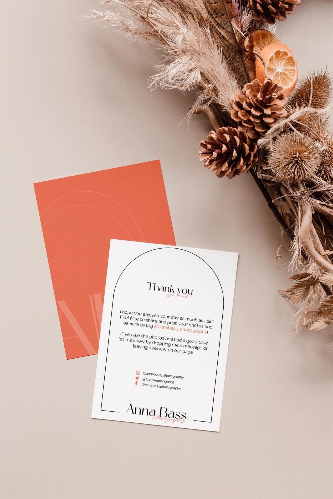
Anna Bass Photography - Thank you cards
Website:
Any good website will feel like an extension of the brand identity and this certainly has the brand fluidity I hoped it would.
As always I started by designing the home page and undertaking a feedback session with Anna to ensure we are moving in the right direction creatively. Once I have the green light I can get to work on the rest of the webiste.
It was important to us both that her work was showcased elegantly and the webiste didn't feel too 'full' of unnecessary content. I used her new sub-mark logo designs as a tool to decorate and help reduce the amount of white space whilst ensuring the light airy style we were aiming for.
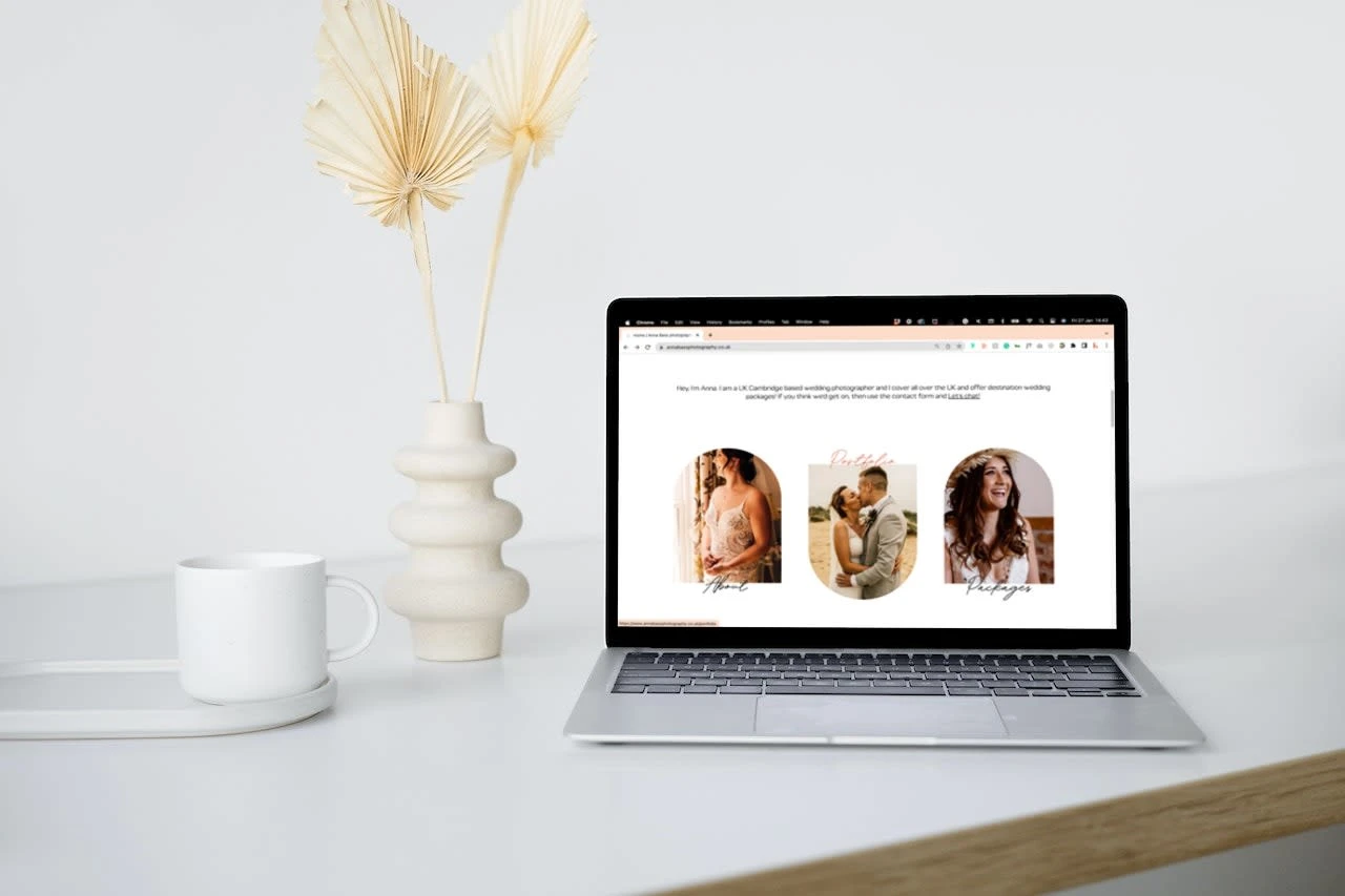
Anna Bass Photography - Website design, home page
The Arches:
I decided to use arch shapes throughout the whole design for a number of reasons. First and foremost they look like an open door which provides the viewer with a welcoming and approachable feel as soon as they enter the website.
By placing Anna's work inside them they almost look like you're looking through a window at someone's memory and on top of that the rounded corners give a soft touch to the thin lines and minimalistic design approach we used here in the same way the handwritten font adds balance to the design.
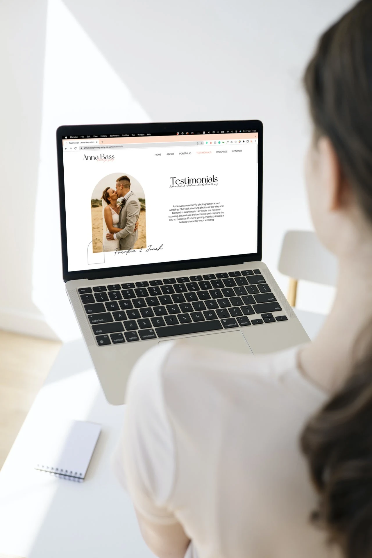
Anna Bass Photography - Website design, Testimonials
📽️ Brand Video:
Here is a short video showcasing one of the ideas that we decided didn't fit Anna's brand but was too beautiful to lose.
Scrapped Design Ideas For This Project:
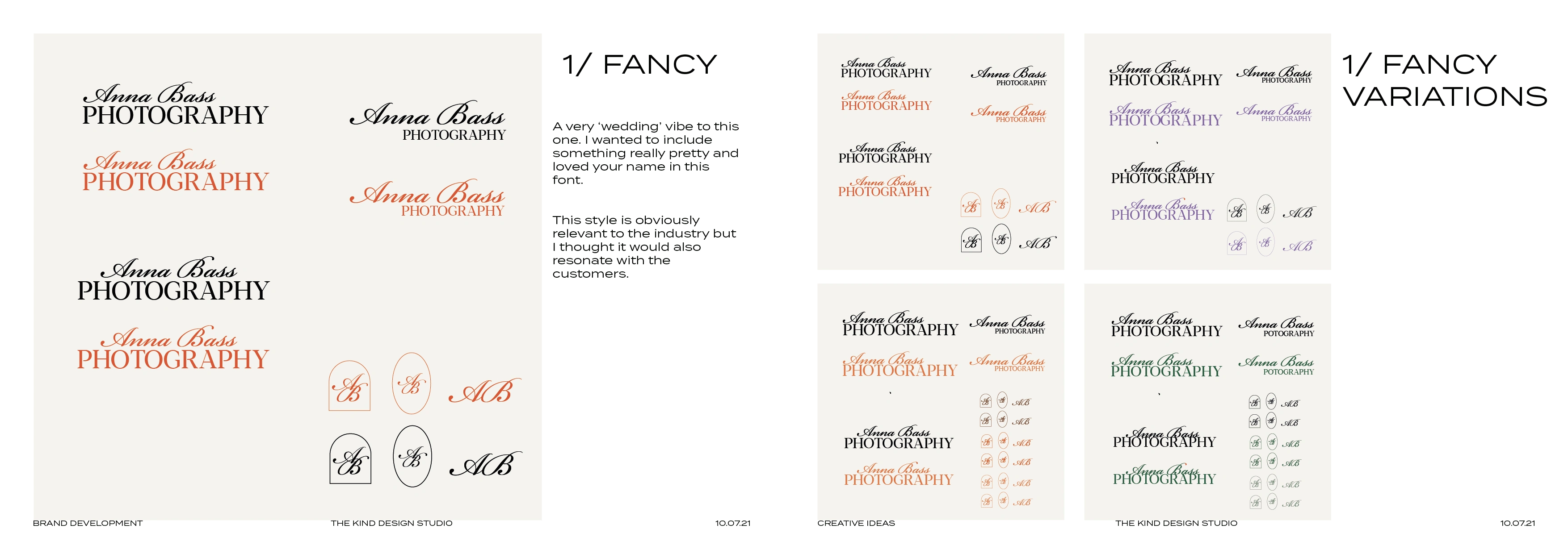
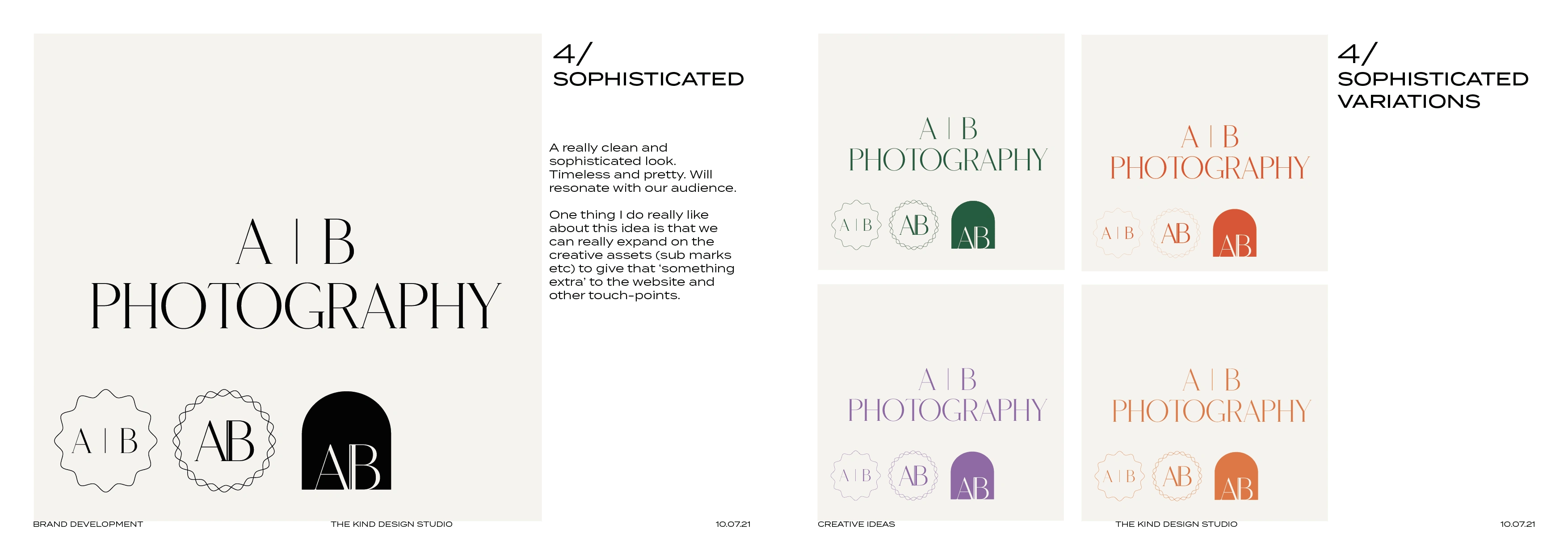
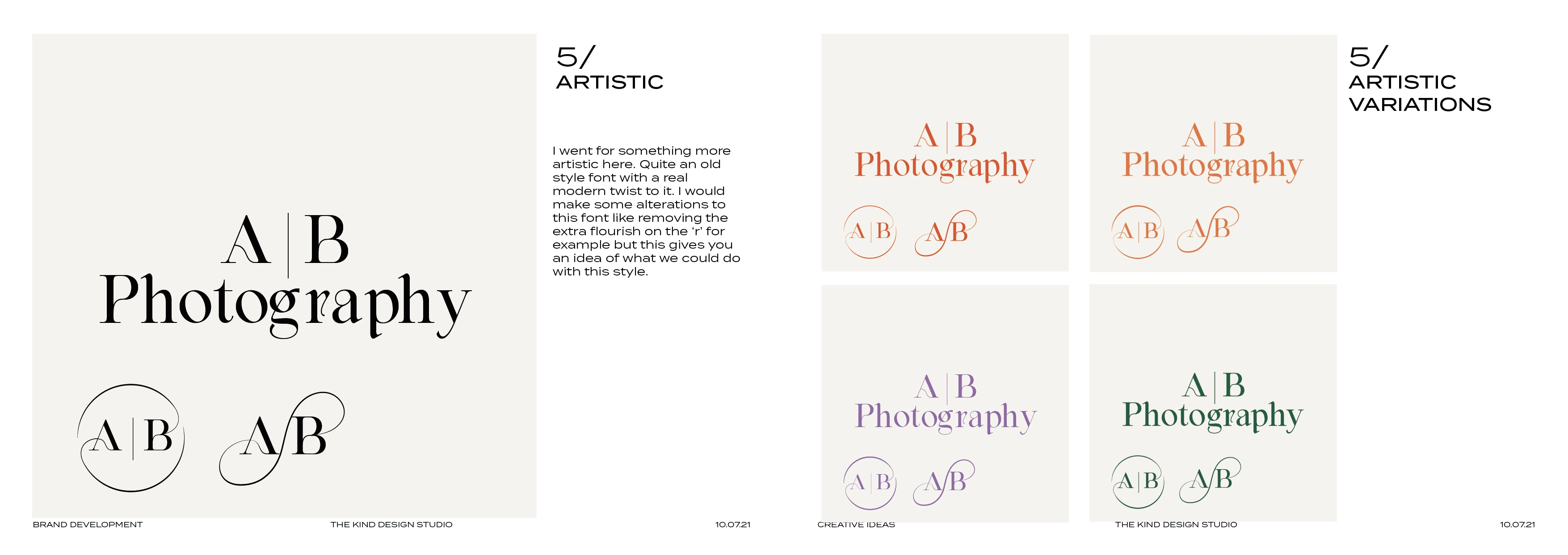
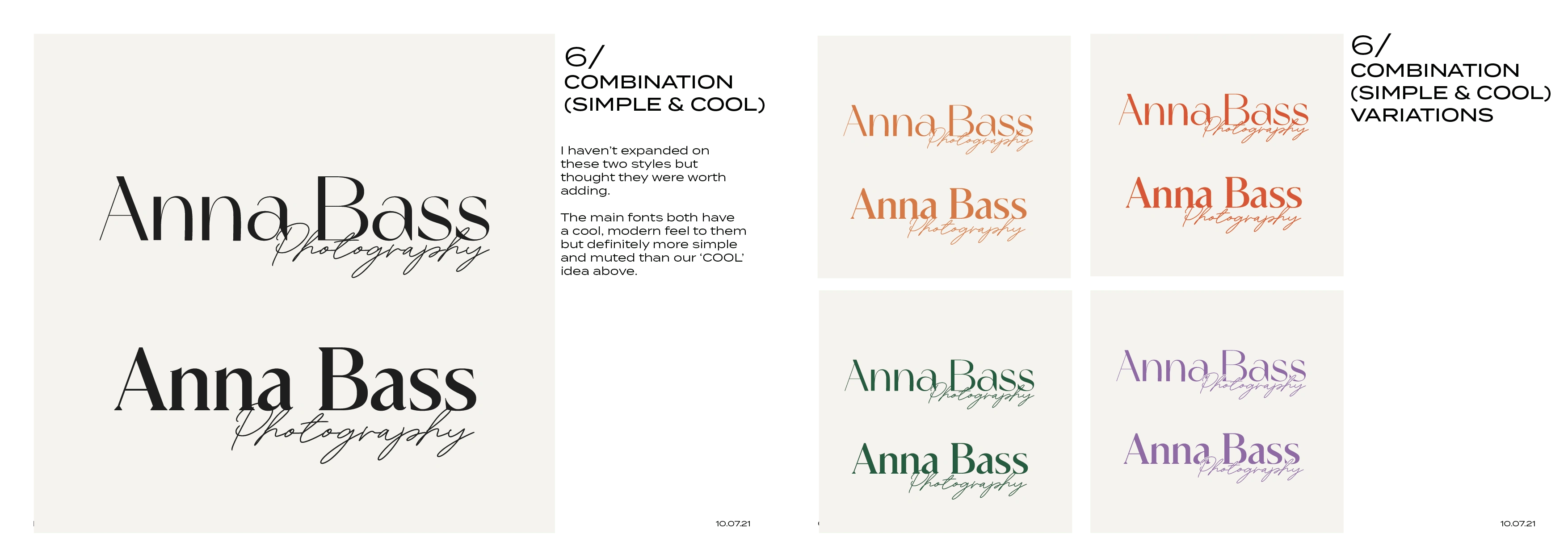
These were the very first ideas I sent over to Anna at the start of this project, you can see how we ended up narrowing in on idea 6, the phases past this point were exploring other logo fonts and colour palettes to perfect the design.

Like this project
Posted Mar 9, 2022
Brand Identity design and website design for Anna, an extremely talented, Cambridge-based wedding photographer. An elegant brand that represents her character.
