Fleur: Luxury Digital Brand Identity Development
Jere Diberto
Fleur
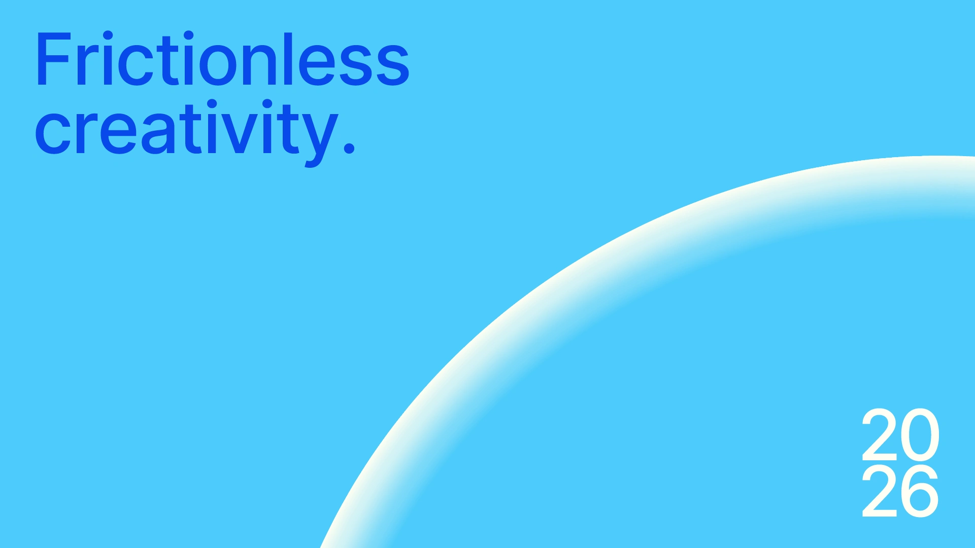
Cultivating Digital Elegance.
01. Overview
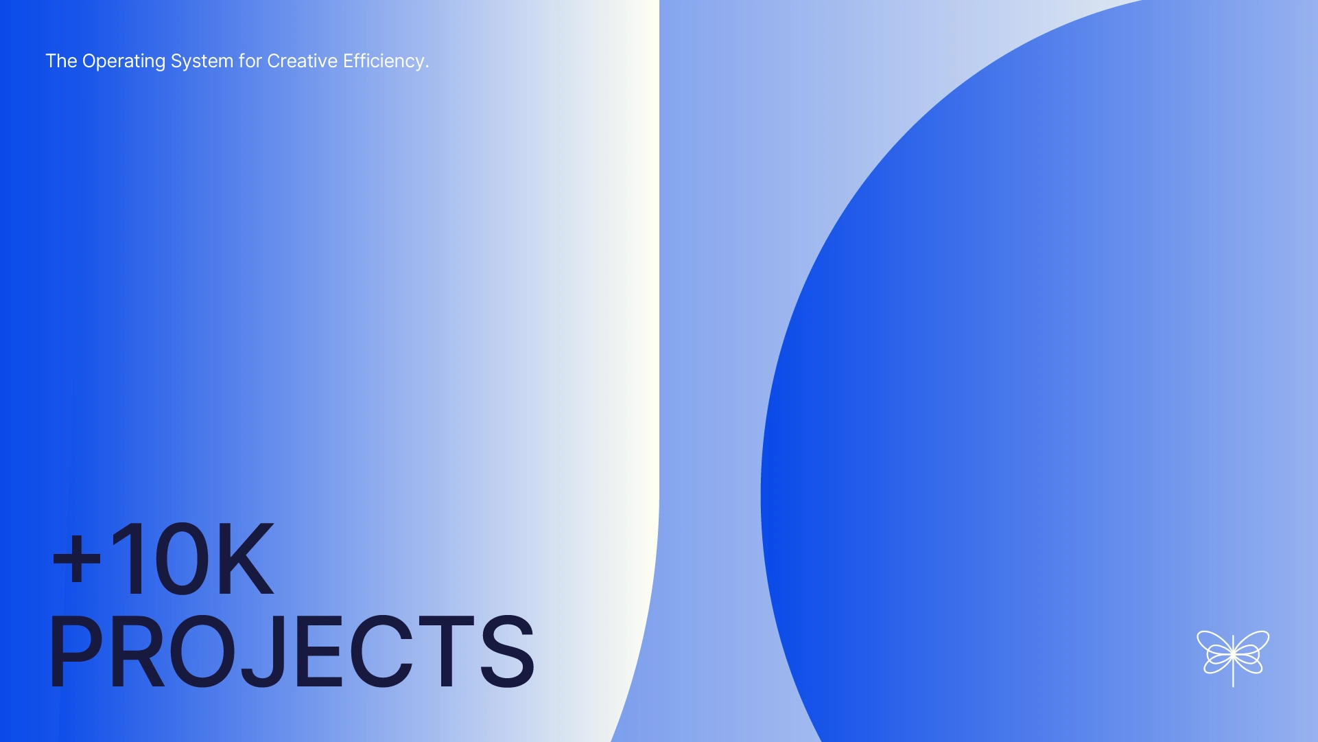
Fleur is a high-end SaaS platform designed for independent creators and boutique brands, enabling them to build immersive digital experiences. Unlike generic site builders, Fleur emphasizes fluid typography, editorial layouts, and organic transitions, allowing brands to truly "bloom" in the digital realm.
Role: Brand Identity
Industry: Lifestyle & Luxury Tech
02. The Challenge
Luxury brands often lose their essence when transitioning to standardized digital templates. The challenge was to establish a visual identity that feels structured yet organic, providing a tool that resembles a design studio more than typical software.
03. Brand Values & Personality
We defined three core pillars to build the identity:
Sophisticated: Minimalist design with high-end detail.
Fluid: Moving away from rigid grids towards a more natural flow.
Poetic: Using technology to narrate a brand's story, not just display products.
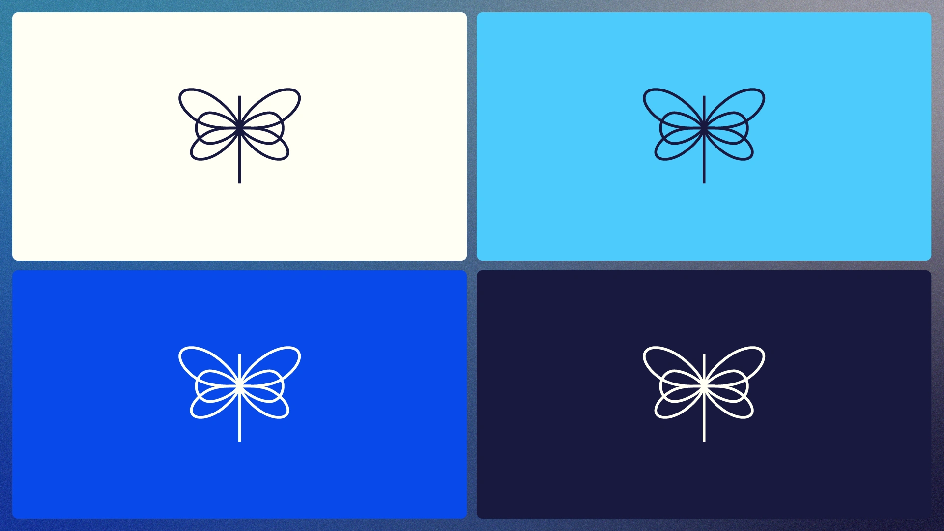
04. Visual Language: The Iconography
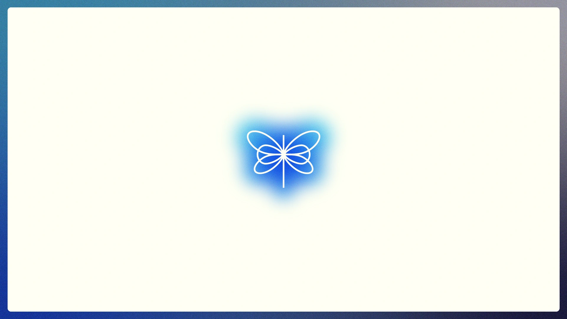
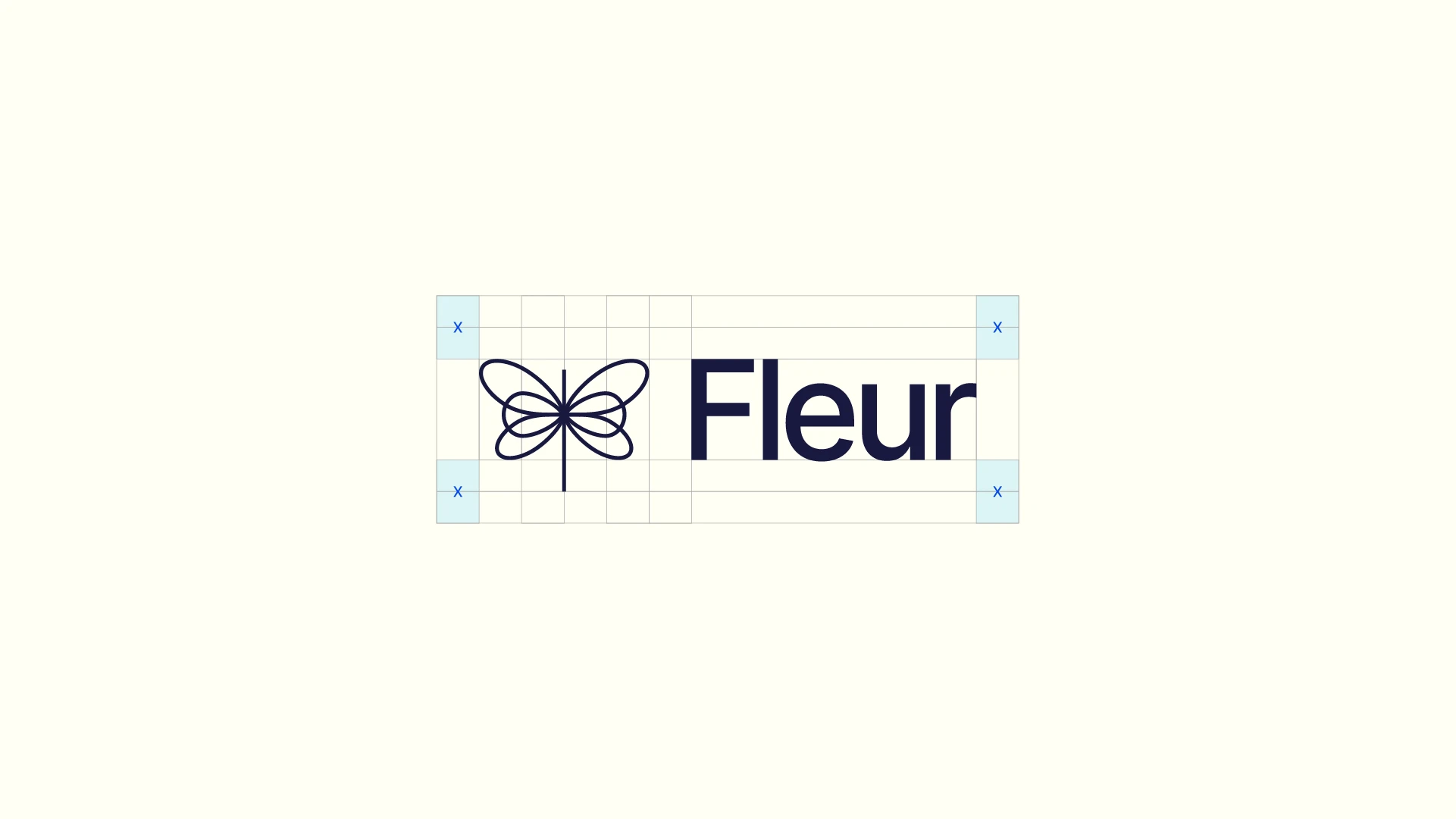
The Dragonfly Symbol
The centerpiece of Fleur’s identity is a stylized dragonfly, meticulously crafted through geometric linear strokes. This design is both aesthetic and metaphorical, embodying the brand’s essence of fluidity, movement, and freshness.
Design Philosophy:
Precision & Perfection: The icon’s mathematical construction reflects the flawless execution and technical rigor behind Fleur’s software.
Modern Simplicity: By distilling the form to its essential lines, we created a mark that feels both cutting-edge and timeless.
Agility in Motion: The dragonfly symbolizes the brand's adaptability, capturing the organic speed users experience within the platform.
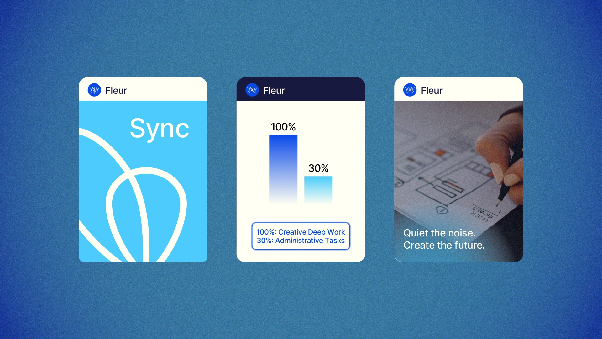
05. Social Media & Brand Activation
To bring Fleur to life, I developed three distinct visual pillars for social media. These pieces were designed to showcase the interface and communicate the brand's rhythm, seamlessly integrating into a creator’s lifestyle.
Visual Execution:
Signature Gradients: The brand’s characteristic gradients shift from deep, organic tones to ethereal highlights, creating depth and a "digital glow" in every post.
Geometric Wing Patterns: Drawing from the intricate structures of the dragonfly's wings, I repurposed these as graphic patterns that serve as framing elements and textures, emphasizing the balance of nature and technical perfection.
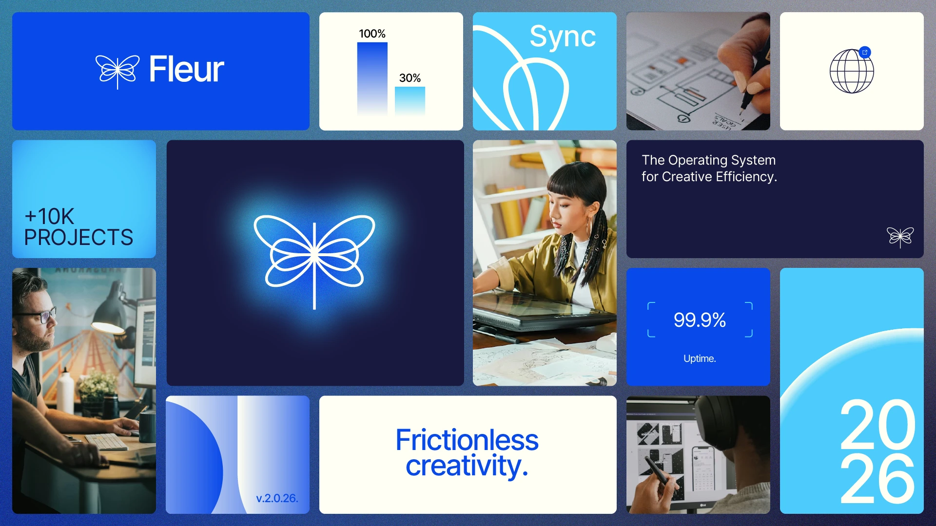
06. The Brand Moodboard
To synthesize the visual direction, I curated a comprehensive brand moodboard that contextualizes Fleur in real-world scenarios. This serves as the North Star for the identity, illustrating how the brand breathes and functions across various touchpoints.
Key Composition Elements:
Contextual Application: The moodboard displays the logo, dragonfly-inspired patterns, and signature gradients in harmony, ensuring a consistent brand experience from first impression to final user interaction.
Atmosphere: Every element evokes a sense of quiet luxury, high-speed performance, and artistic clarity.
Like this project
Posted Dec 27, 2025
Crafted a sophisticated brand identity for Fleur, integrating luxury design elements for a compelling digital presence.