Analysis of information collected for prioritization
Streamlining product registration: achieving time reduction for retailers.
Year
2023 - 2024
Duration
8 months
Scope of work
Research
Design System
Visual Design
Prototyping
User Flow
User Interview
User Testing
Context
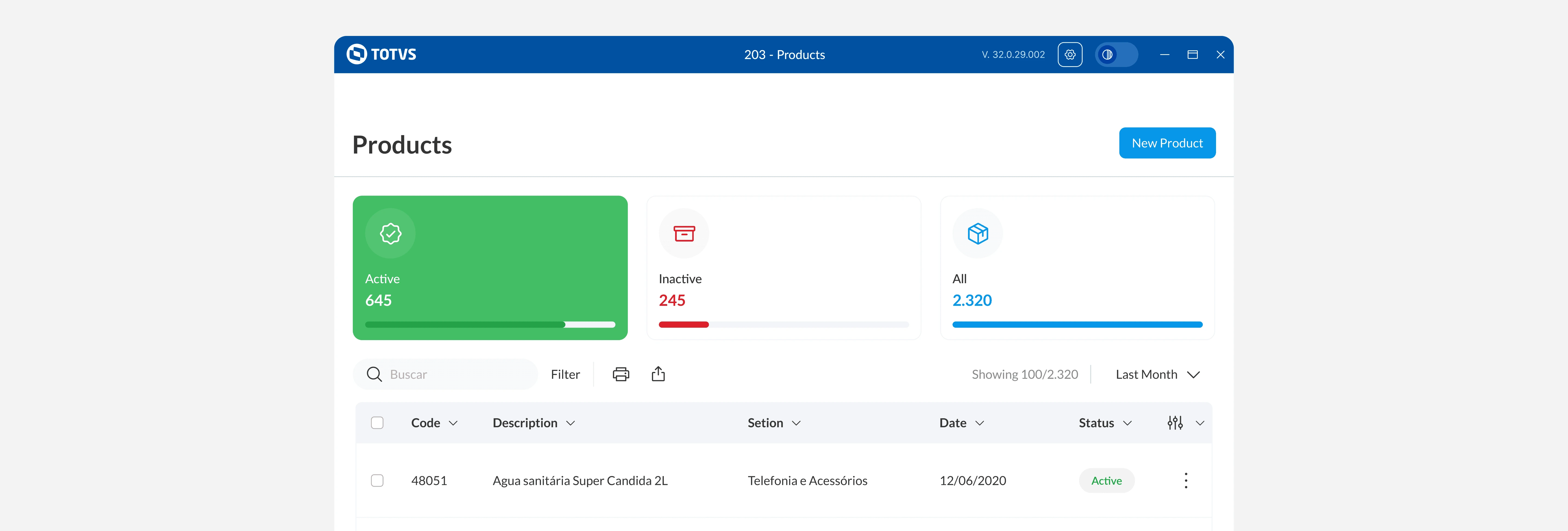
Winthor is a leading tool in this industry. It was created to help wholesalers and distributors work more efficiently on daily tasks, speed up decision-making, and boost productivity. The project aims to give our customers a great, consistent experience.
Modernize design to improve user experience
The system's outdated appearance and lack of modern elements and intuitive navigation affect the user experience. Updating the visual design could greatly enhance usability and user satisfaction.
Simplify registration for better efficiency
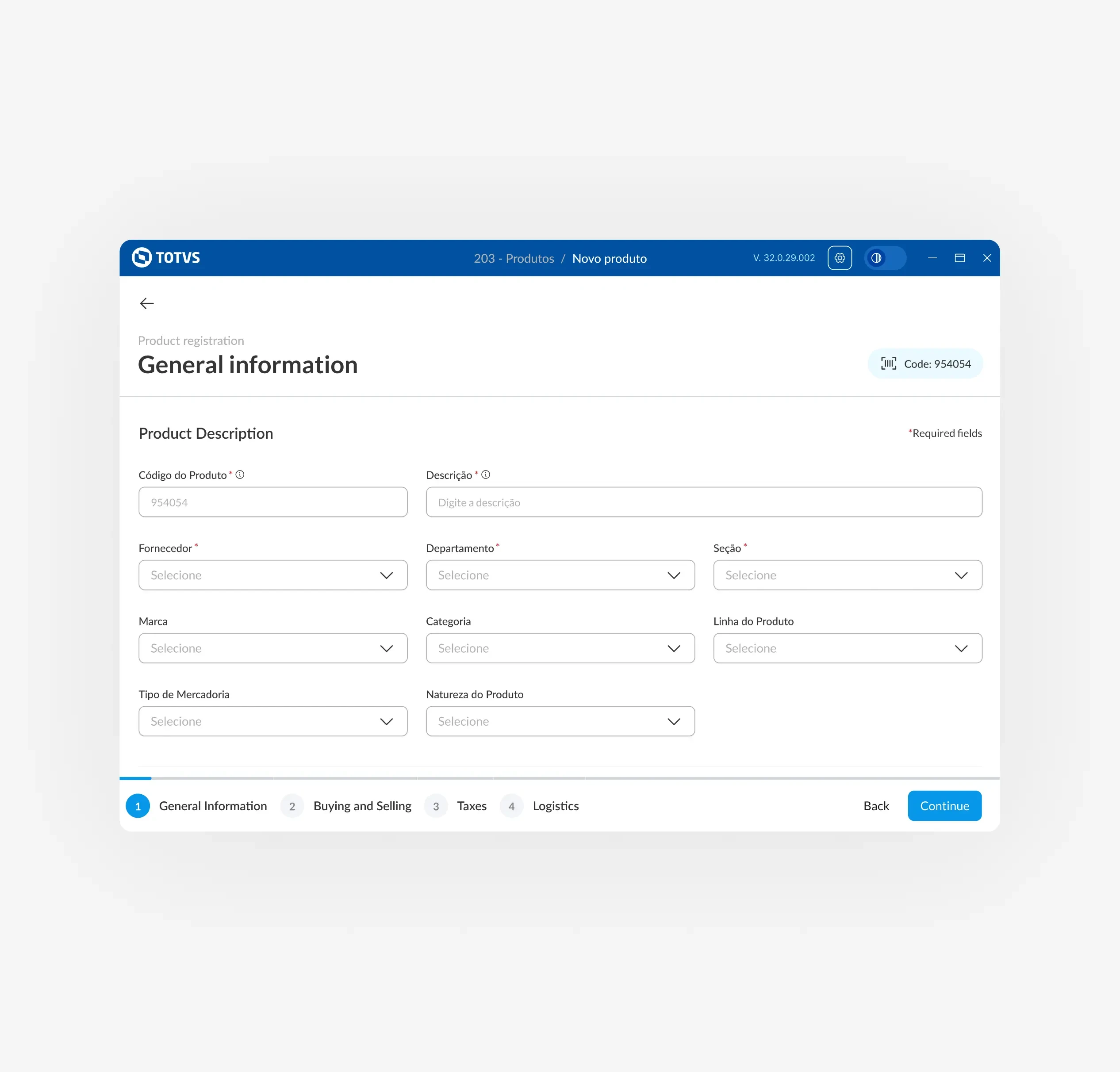
The current registration process is overly complex, involving multiple screens to add an product information on the system. Simplifying this process could greatly enhance efficiency and user satisfaction.
Reduce visual clutter for improved efficiency
The screen is displaying too many irrelevant items, leading to visual clutter and hindering efficient work. Simplifying the interface by focusing on the most important elements could improve overall efficiency.
But how was the whole process?
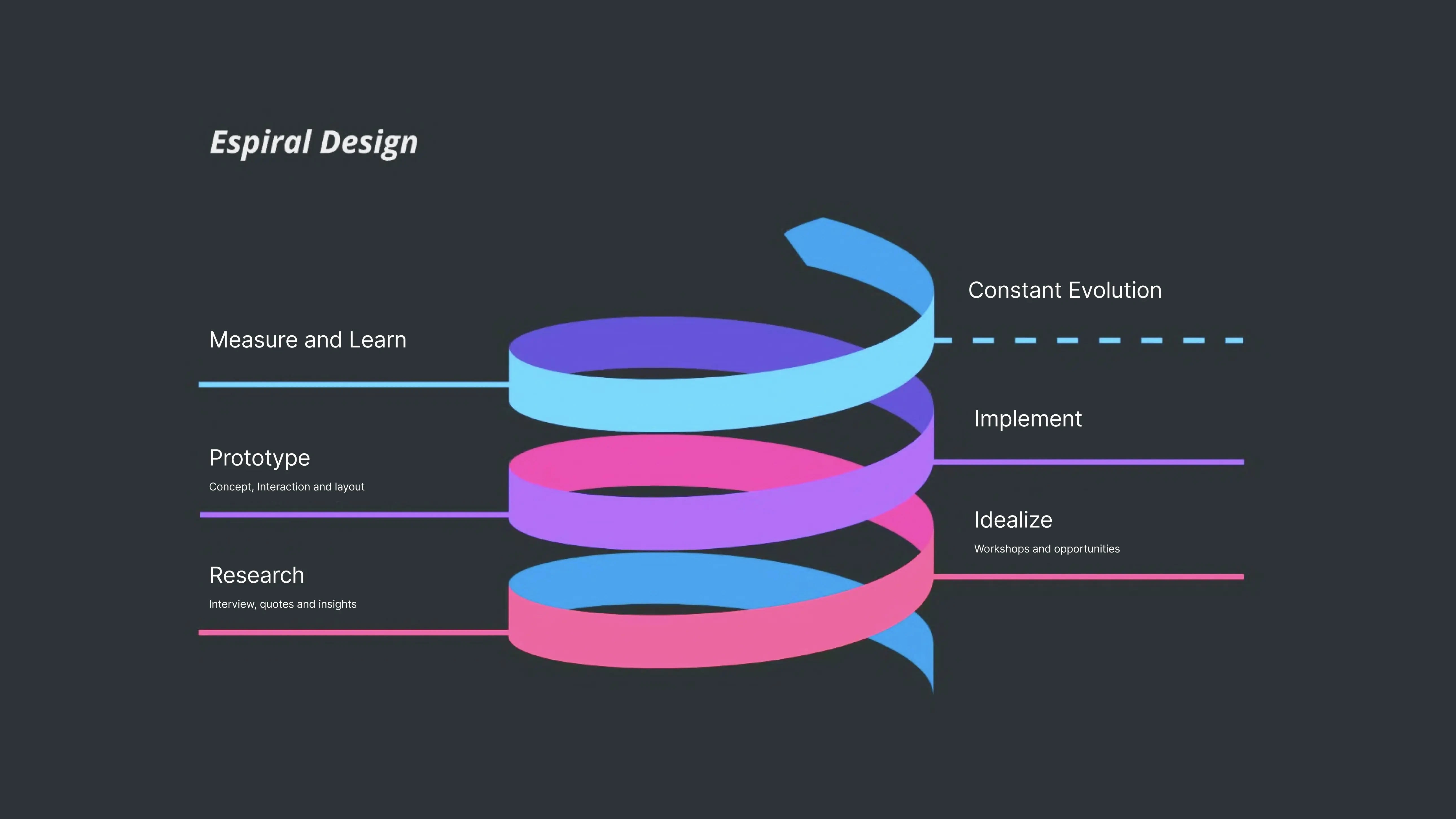
Spiral Methodology
Our methodology is based on Spiral Design, which allows for continuous improvement by revisiting each stage for further development even after implementation. This iterative approach ensures that the solution evolves to better meet the needs and expectations of users. To create the new routine, we followed the process outlined below, incorporating feedback and insights at each step to refine and enhance the final outcome.
Understanding the scenario requires total immersion.
System Analysis
Collaborating closely with Product Owners and stakeholders to gain deep insights into user needs and challenges, we aim to create tailored solutions that improve user satisfaction and align with their workflows.
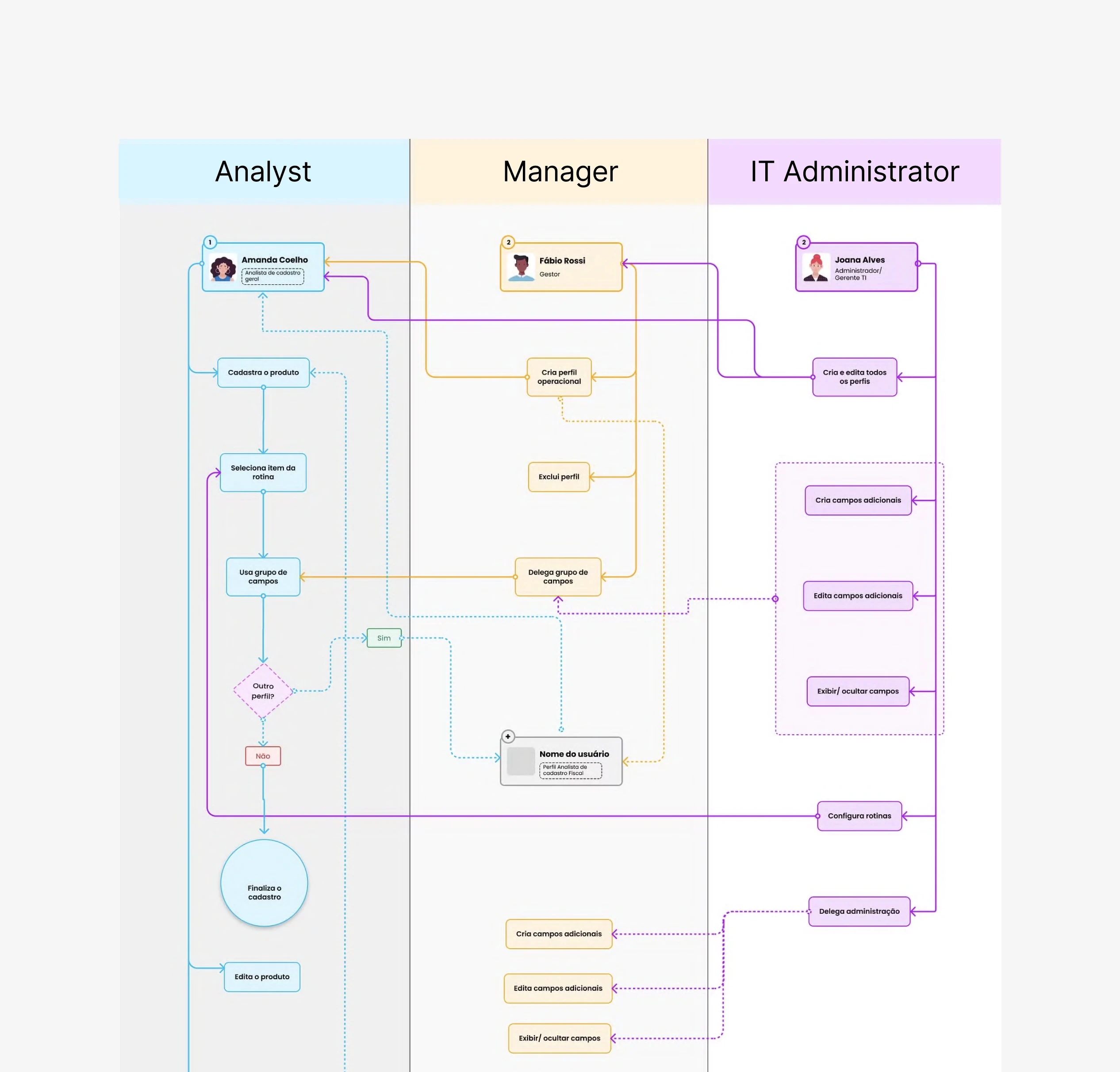
Study of user flows
Studying user interactions to improve system navigation, streamline processes, and enhance the overall user experience.
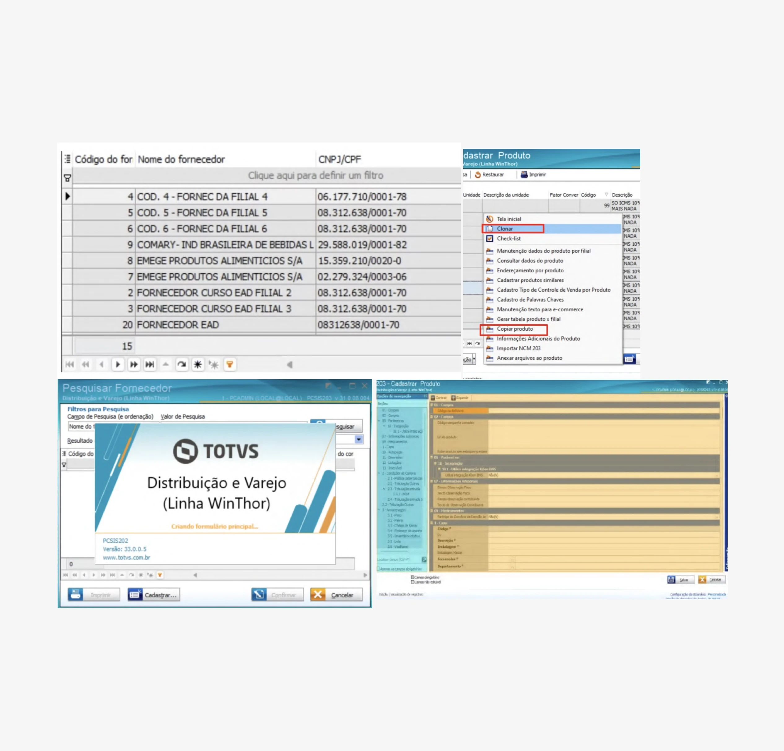
Desk Research
In this phase, we reviewed all registration process screens and input fields to improve workflow and user-friendliness. This analysis helped us optimize and streamline the process.
Discovery with customers to understand their pain points
CSD Matrix
We utilize the CSD methodology to gain insight into the assumptions, certainties, and doubts encountered in the initial process and to confirm or deny them during the interviews.
Client categorization
To streamline the process of acquiring clients from different markets, we classify our clients into categories.
Interview script and customer categorization
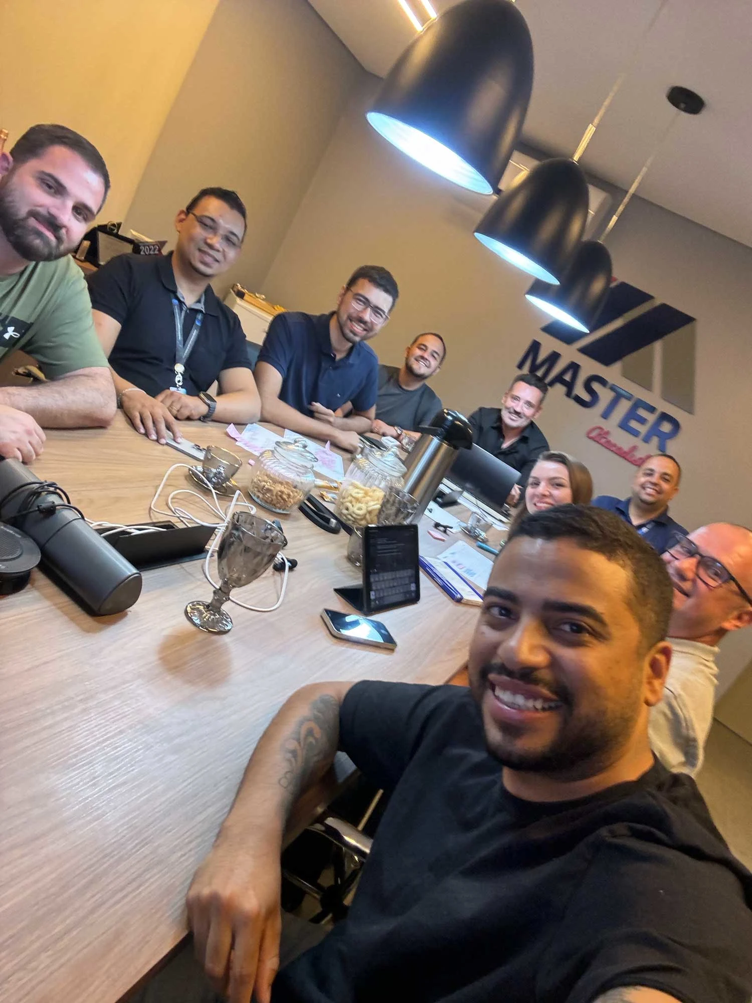
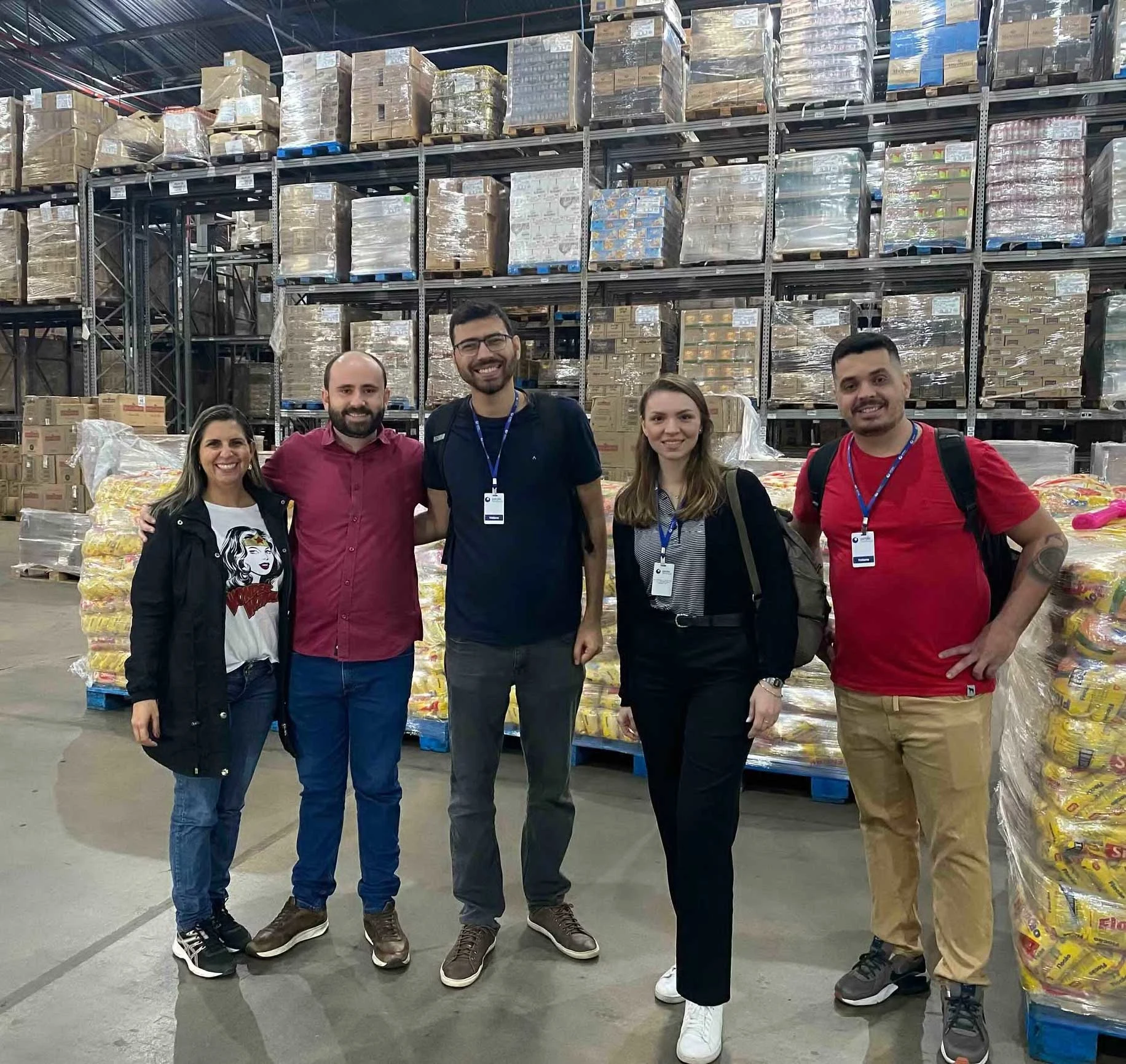
In this stage, we visit and remotely interview some key clients to understand their daily routines, validate certain points from previous processes, and gather valuable insights.
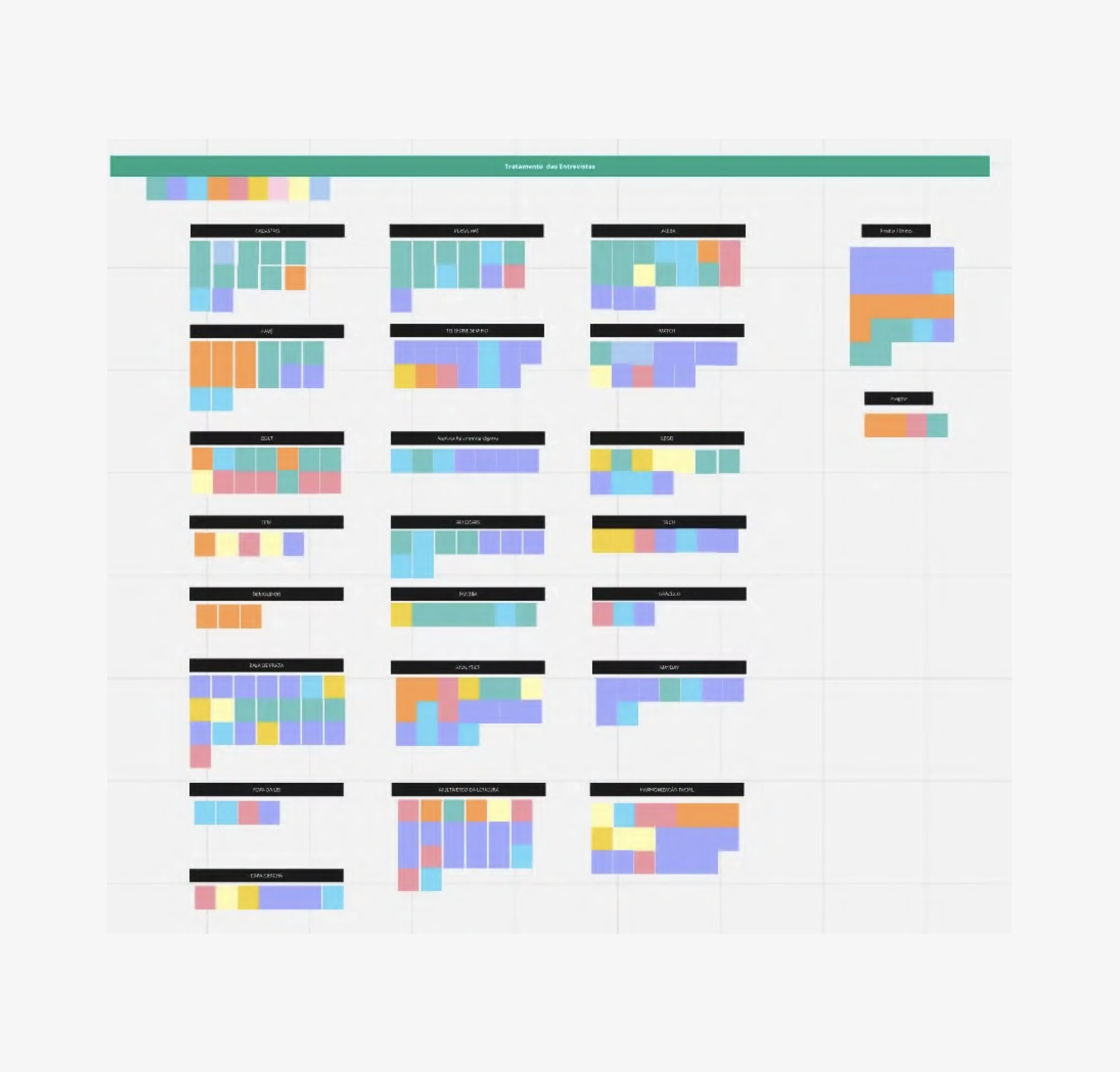
Analysis of information collected for prioritization
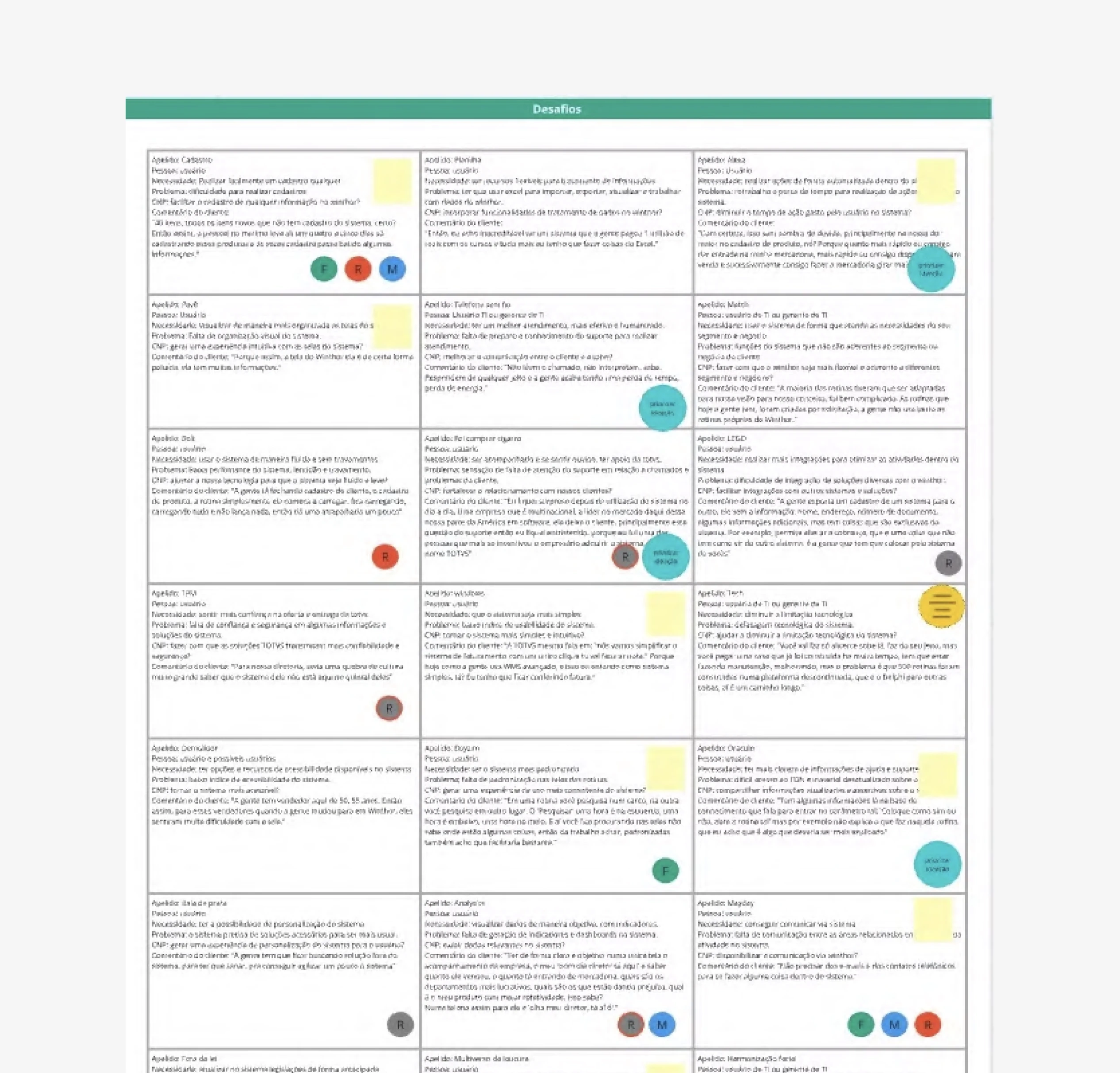
Challenge generation for ideation dynamics
After transcribing the interviews, we categorize the insights gathered and create a report on the patterns identified among users. We then generate challenges to guide the ideation workshops.
Client categorization
To streamline the process of acquiring clients from different markets, we classify our clients into categories.
Ideation rounds with clients and various internal roles
Challenge generation for ideation dynamics
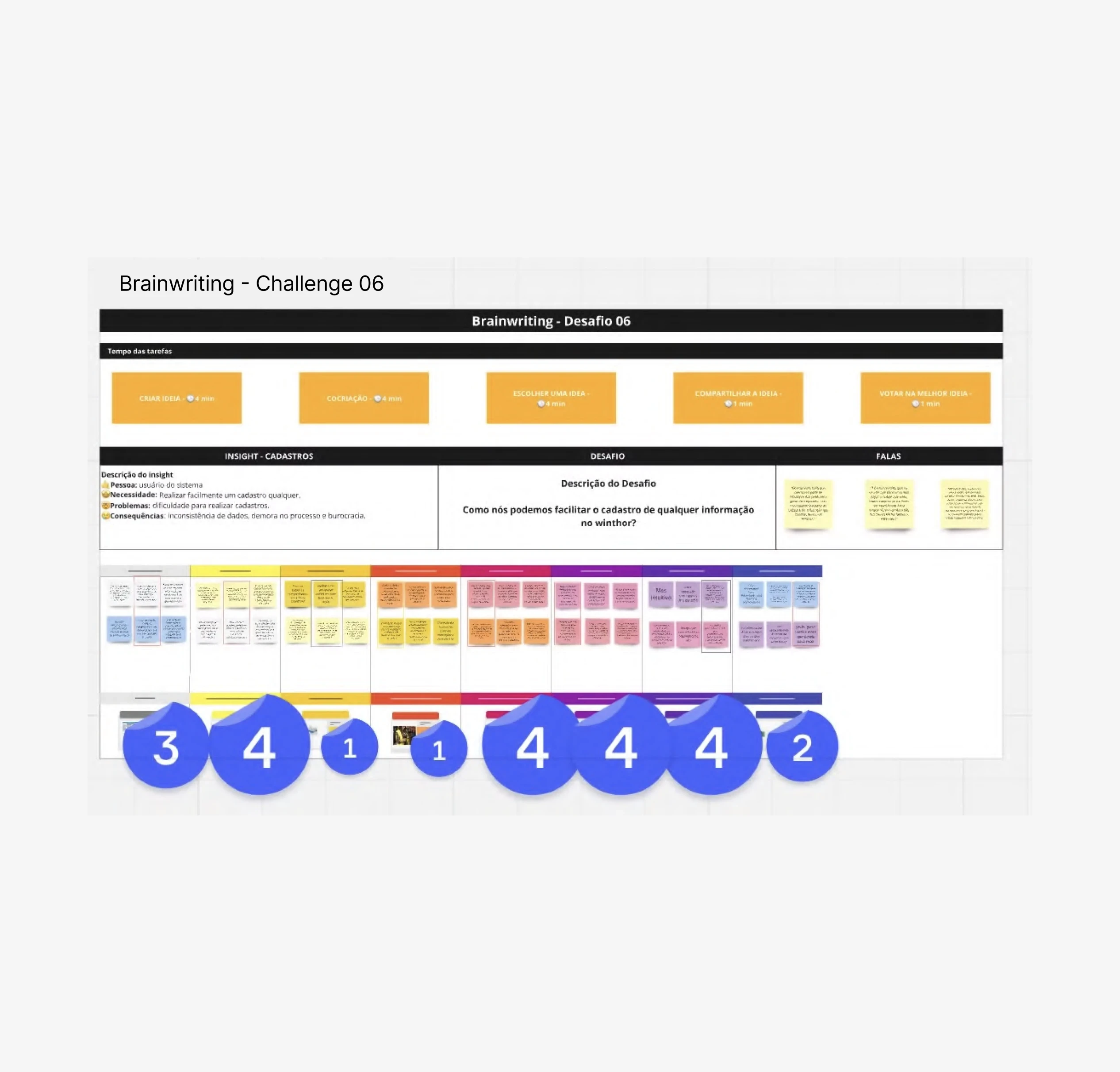
Using the challenges we created, we conduct an ideation workshop with clients and various team members from our company to generate more insights and solutions for our prototypes.
Feature Prioritization
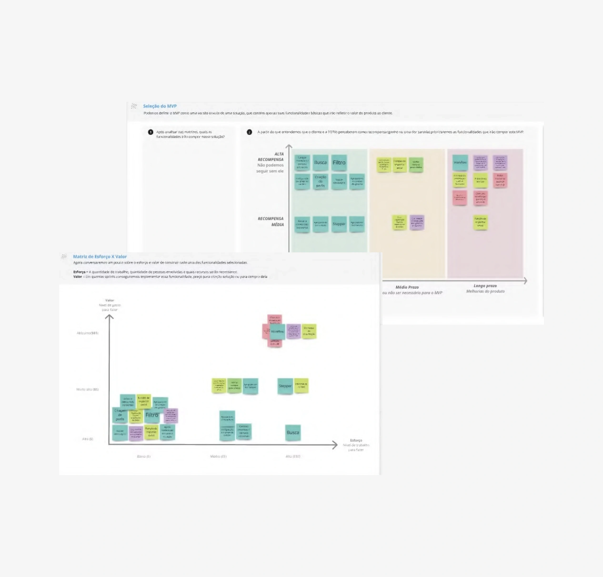
Next, we analyze the ideas with the design team and prioritize them based on effort and impact to incorporate into the prototype.
Creation of new components to align with stakeholder expectations
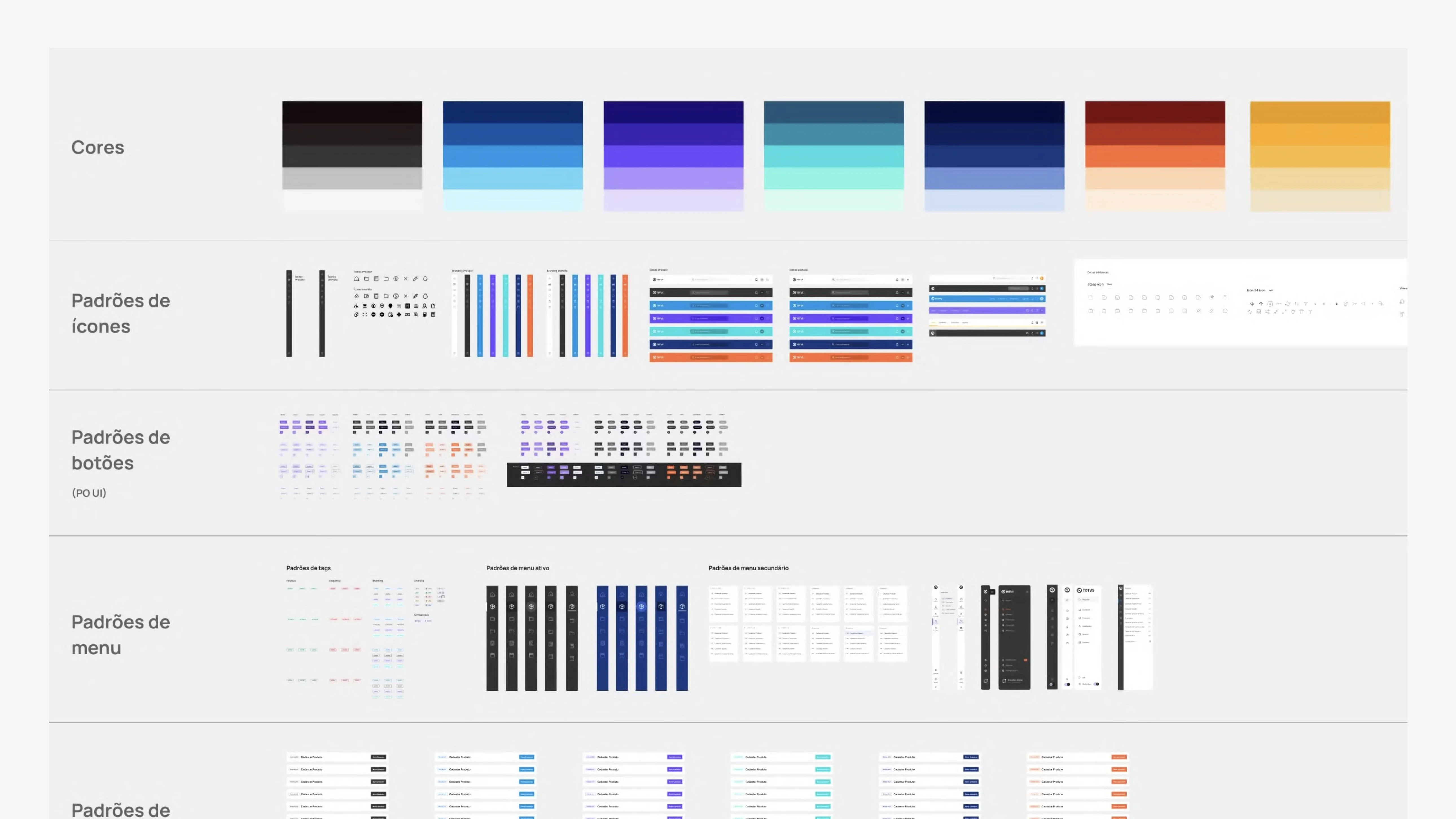
Design System
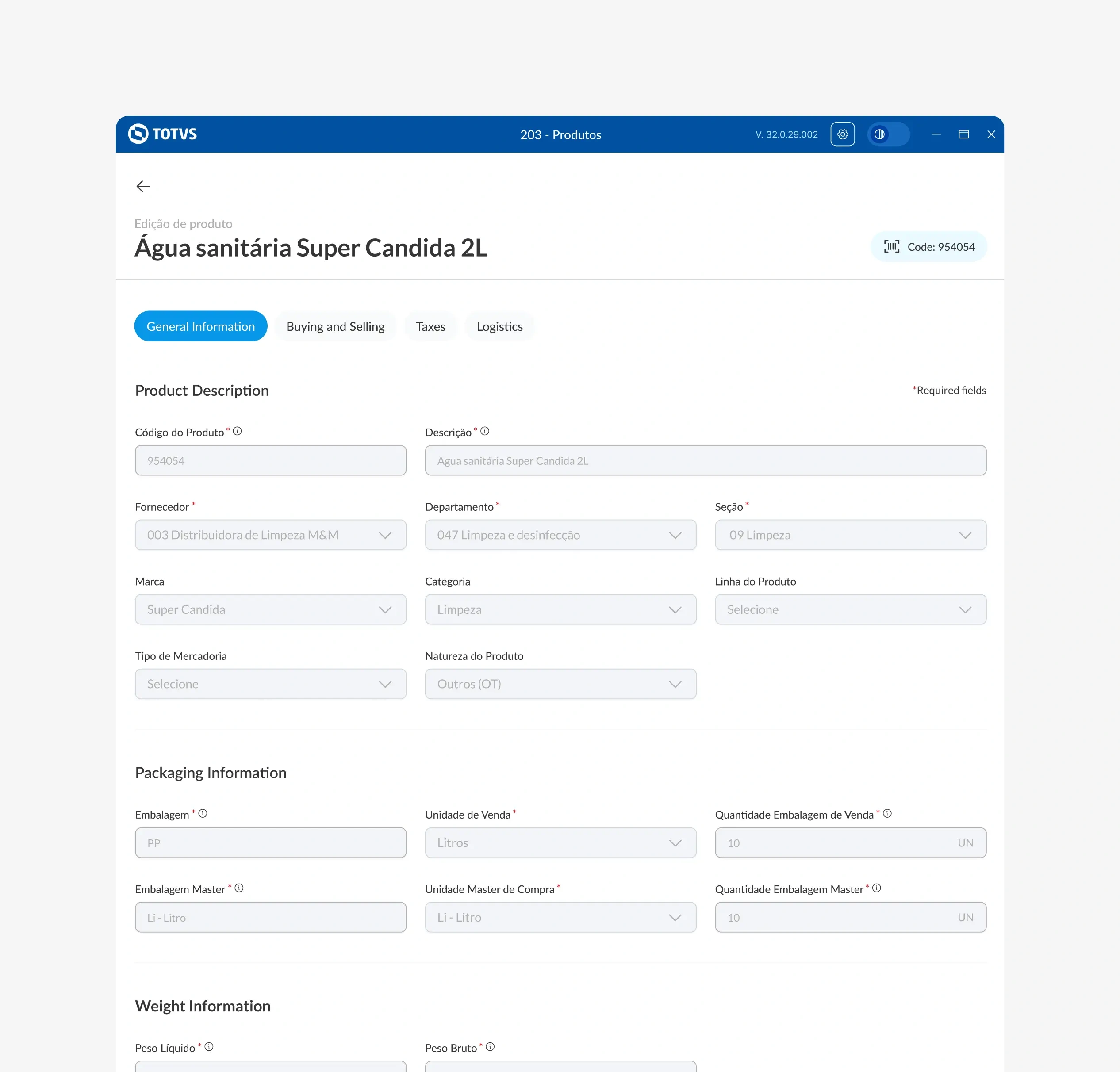
Since it was a new project with high expectations for the visual proposal, we conducted some preliminary tests with colors, typography, icons, etc., without focusing too much on functionality at this stage. This helped us establish a clearer direction.
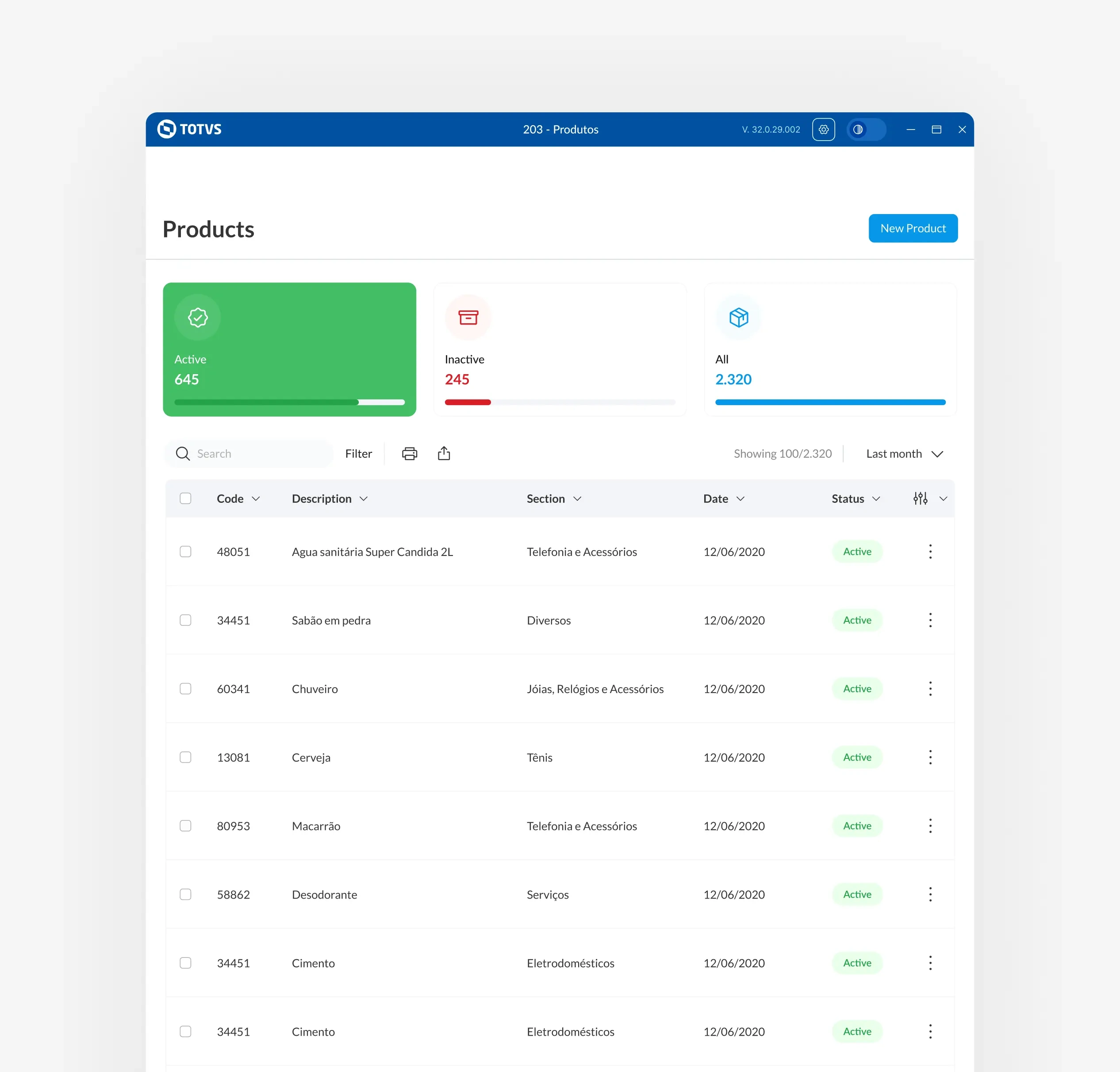
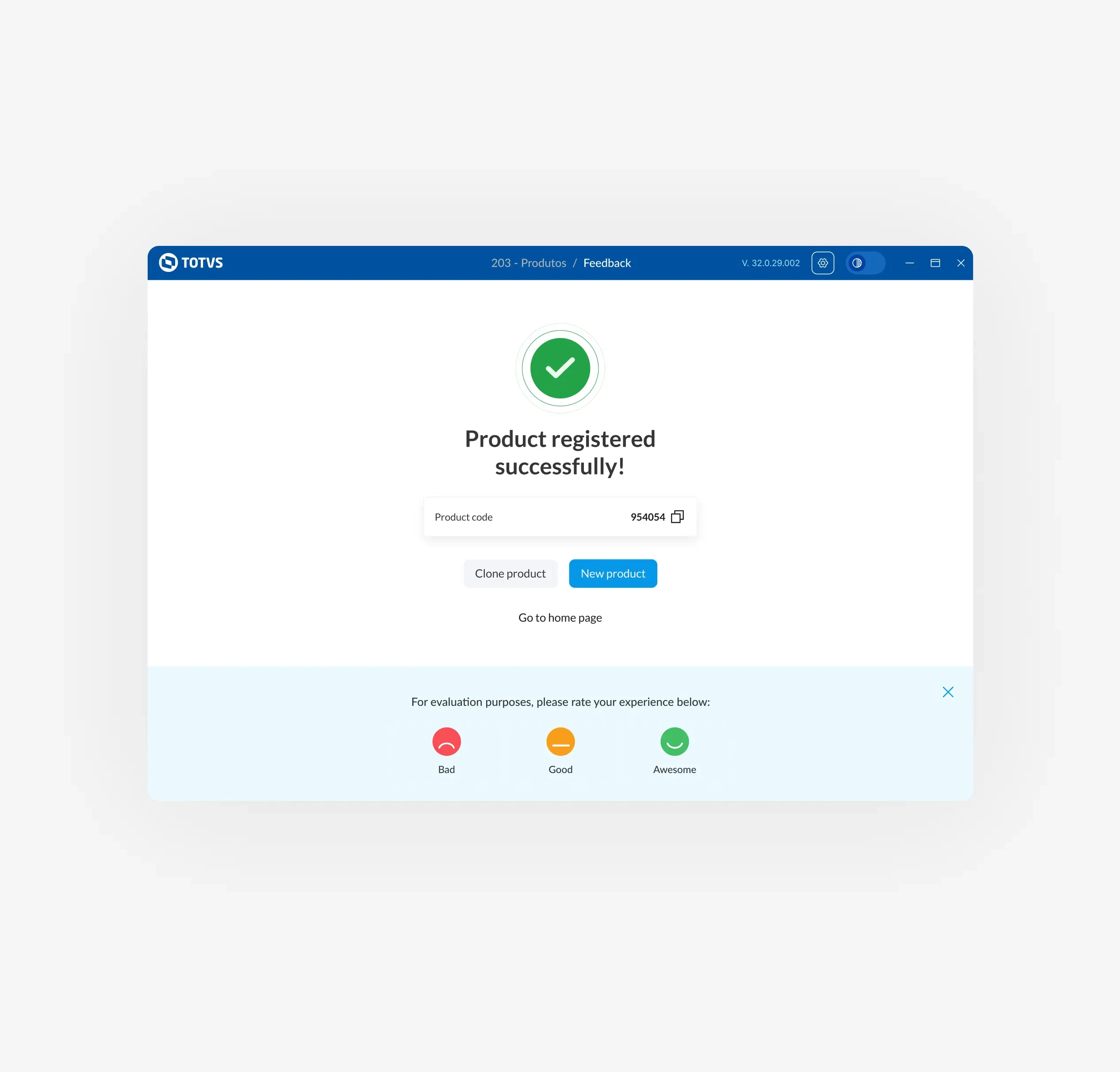
New Design Visual
With the visual components and patterns defined and the discovery analysis completed, we created a prototype focusing on the features with the highest impact and value for a user.
Measure and testing
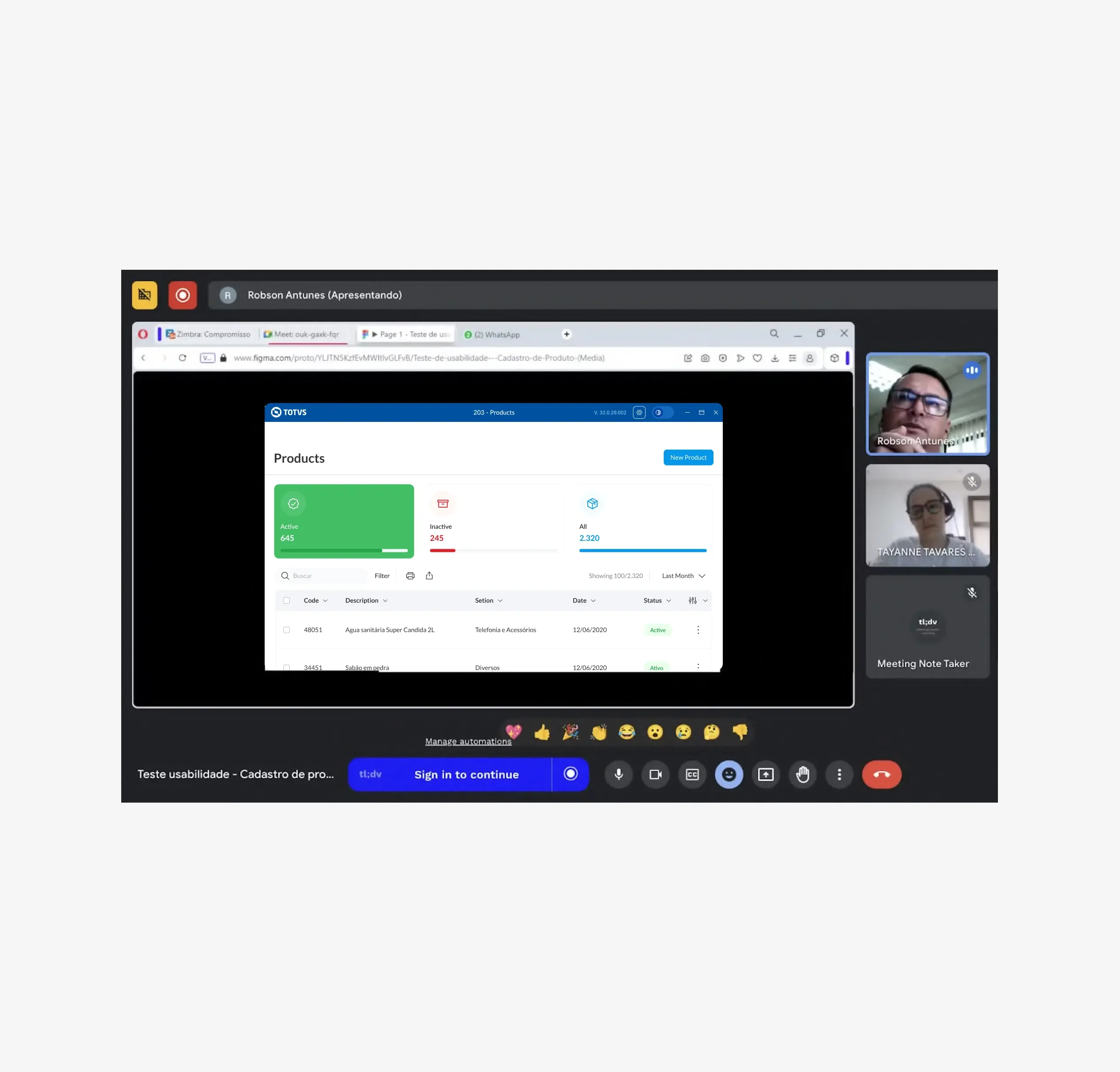
User Testing
With the prototype ready, we conducted some usability tests and confirmed that the product was on the right track.
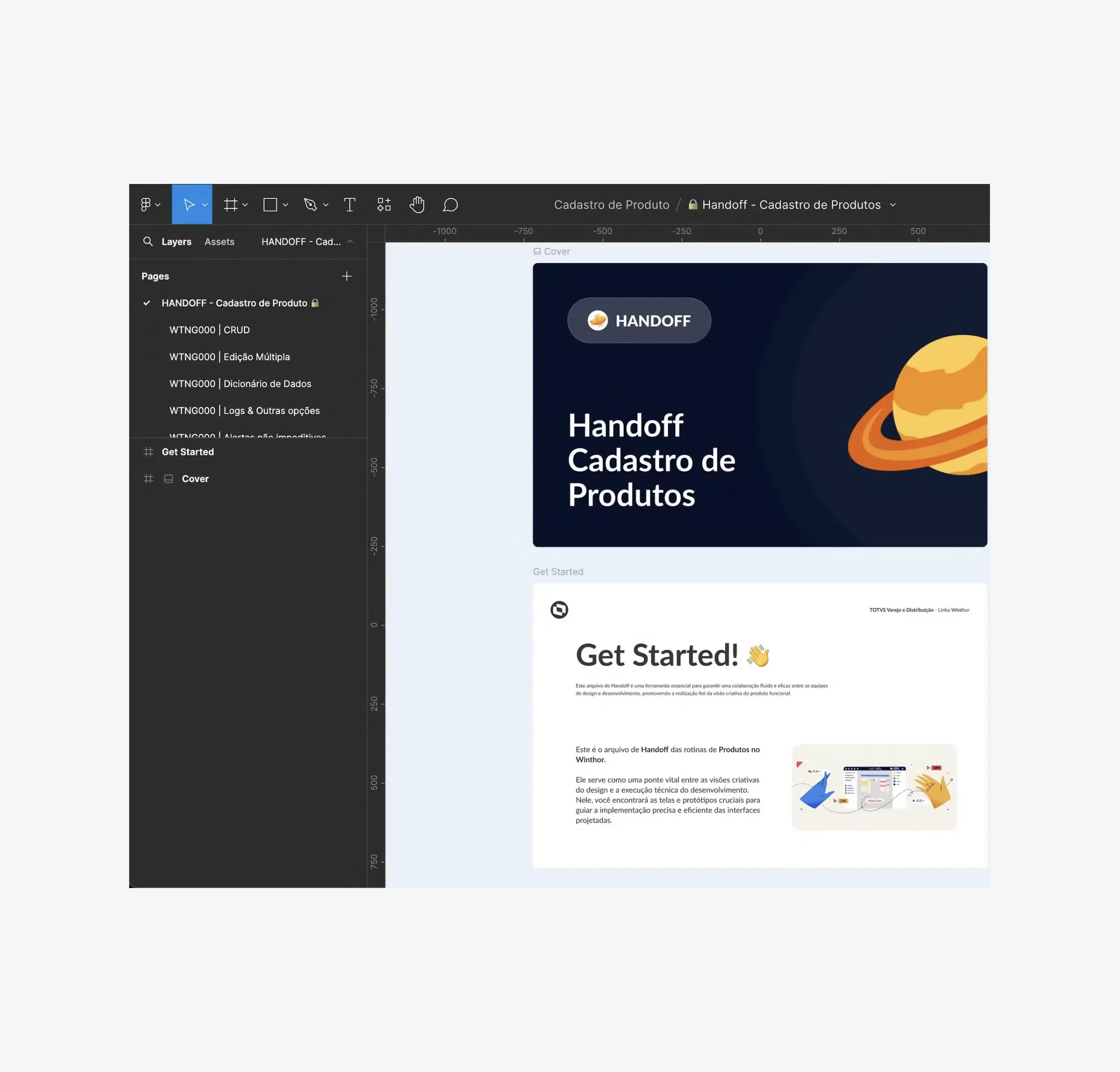
Handoff to the Dev team
With the file ready, we prepare a development document that includes all the requirements and interactive prototypes for a thorough analysis of the new proposal.
Results
How it impacted the company
After the tests and client feedback, we were able to identify some areas for improvement in the process:
60% reduction in fields and filling
40% Reduced Time spent on clients daily processes.
150% More clients have updated to the new version compared to the old version.
Like this project
Posted Oct 9, 2024
With 9 years of experience as a Product Designer in the B2B and B2C space. I specialize in creating human-centered experiences with meticulous attention to vis…
Likes
0
Views
8
Clients
TOTVS

