Introducing life insurance simulator during COVID-19
Year
2020
Duration
3 months
Scope of work
Research
Interaction Design
Visual Design
Prototyping
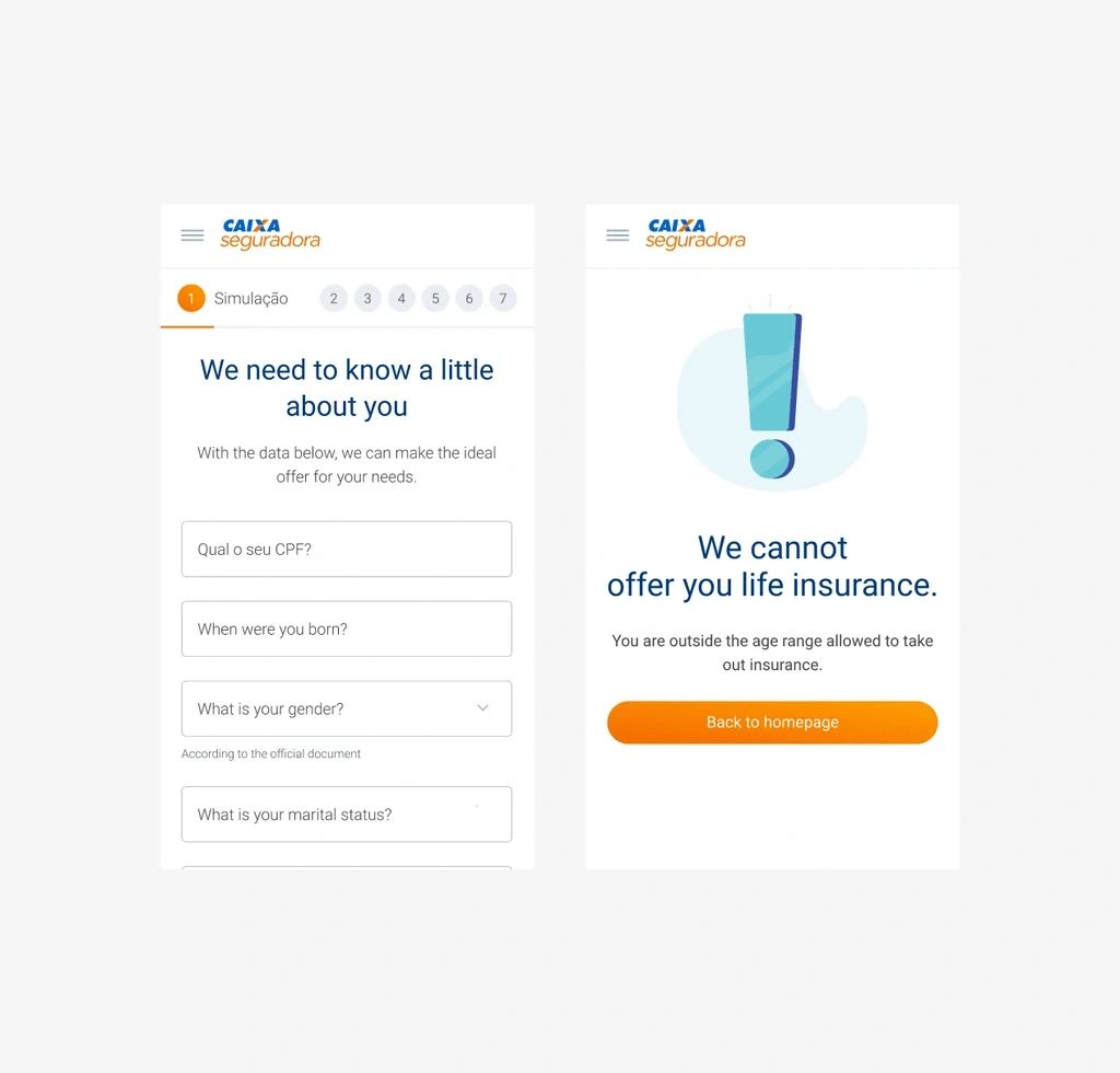
Caixa Seguradora introduced a user-friendly life insurance simulator during COVID-19 for online purchases, providing families with security.
The Why
During the Covid-19 pandemic in Brazil, demand for life insurance surged, yet only 19% of Brazilians were covered.
Technological limitation
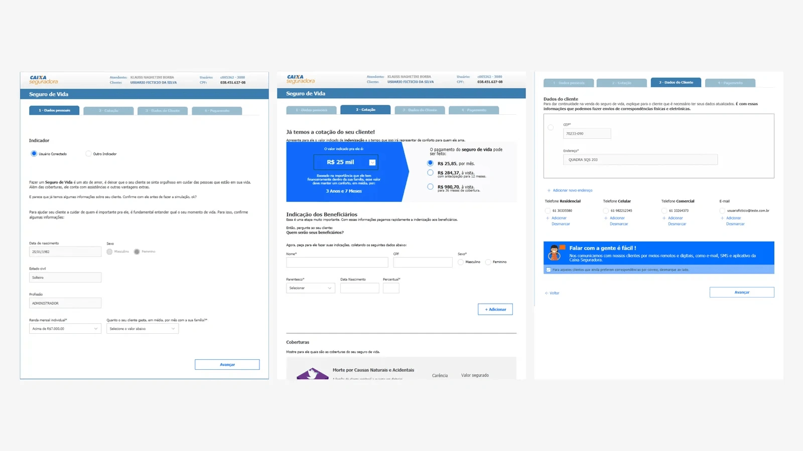
However, our efforts were hindered by outdated technology at Caixa Econômica Federal agencies, where the life insurance sales platform lacked updates for over 5 years. This antiquated system posed challenges, complicating the sales process with unfriendly user experiences and technical impediments.
Research phase
To address this, we dove into research to grasp user needs, guided by stakeholder discussions that pinpointed key target audiences.
For bank salespersons:
Challenge: Difficulty in selling and explaining products.
Objective: Achieve sales targets, including life insurance.
For Caixa bank customers:
Challenge: Difficulty finding a simple life insurance solution.
Objective: Provide financial support to loved ones.
Main pains and notes found
Very long forms
The API needed a very large amount of information. That was something we couldn’t change at first. This improvement was mapped for future implementations.
Signature need
More than 40% of the life insurance policies tended to get cancelled a few days after closing the deal. The main problem was with the contracts: some pages went missing or missed the client’s signature. We needed to make sure the new sales platform could solve this problem.
Confused experience
Both users and end-users found the product complex – hard to sell and difficult to understand. Also no visual hierarchy, which made filling out difficult.
Main features created
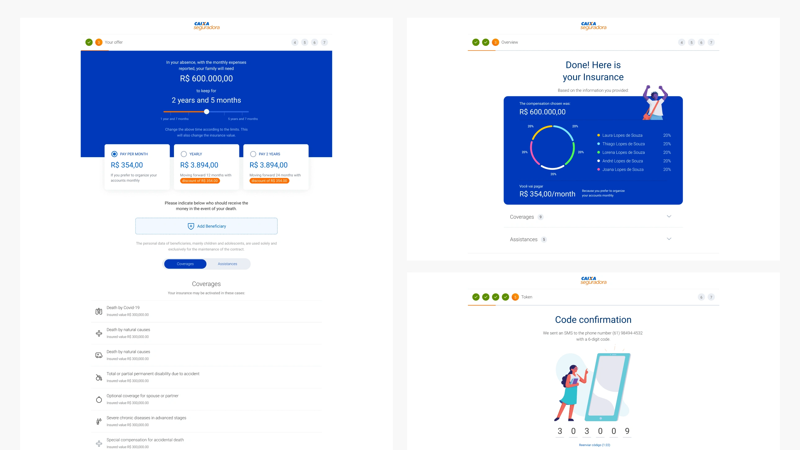
Insurance customization
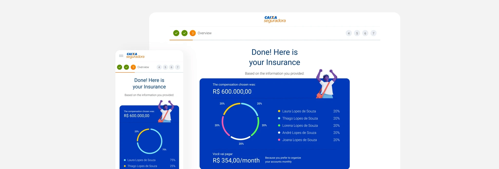
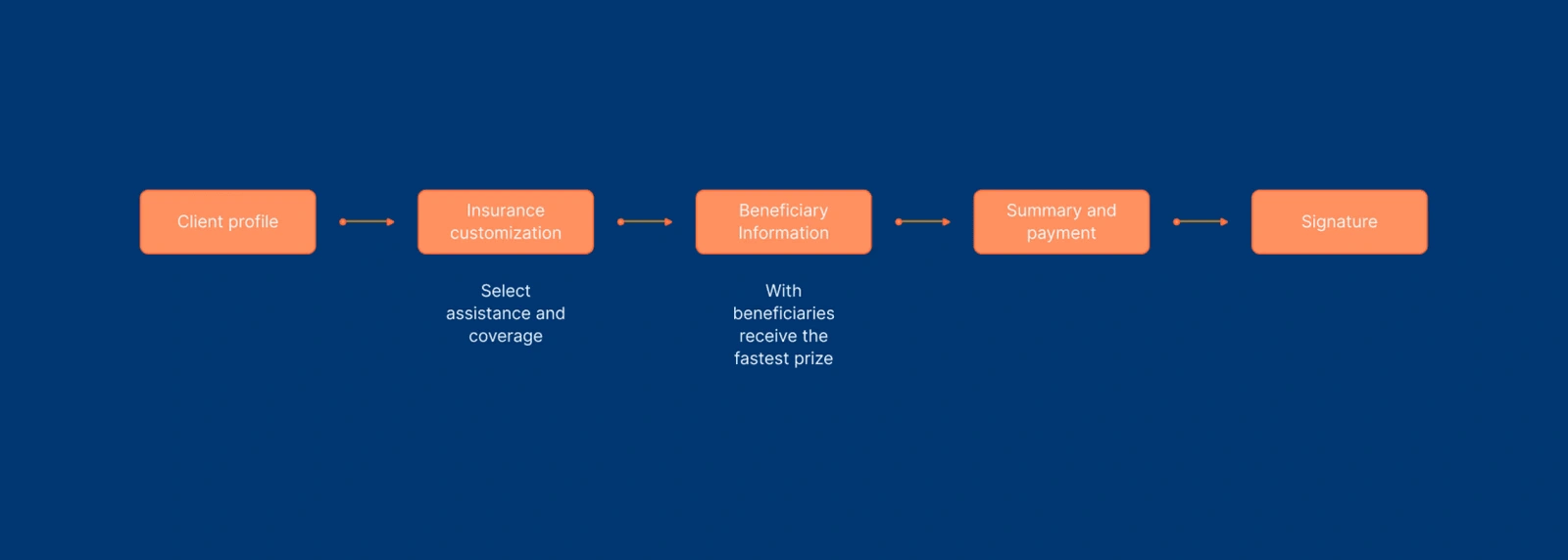
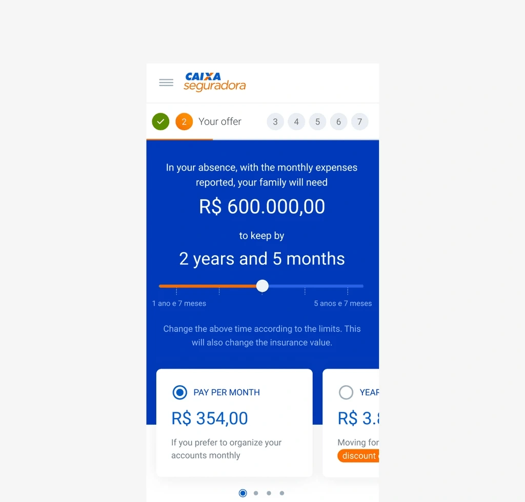
In this phase of the purchase, the user can customize the amount he wants to pay per year or per month and also customize according to his needs.
Simple explanation
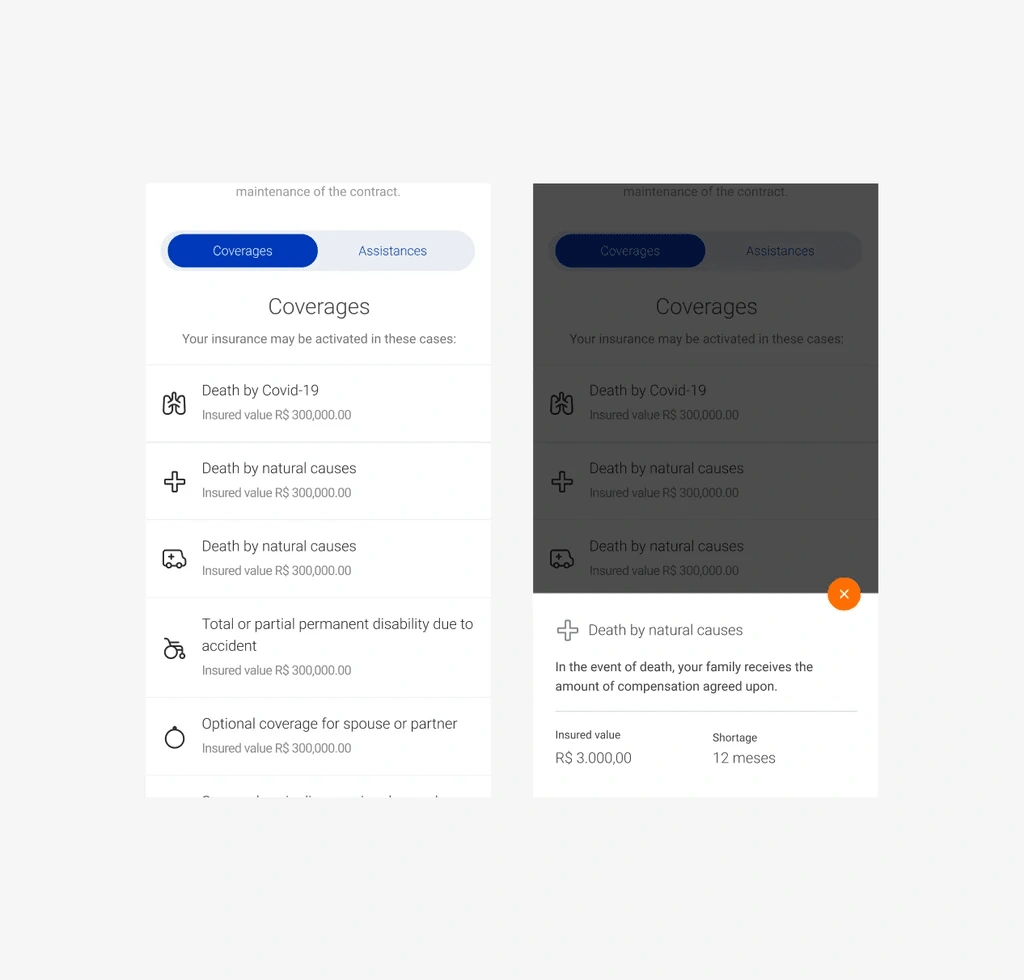
Insurance coverage and assistance are often complex. Trying to make the explanation of each one as simple and straightforward for the user.
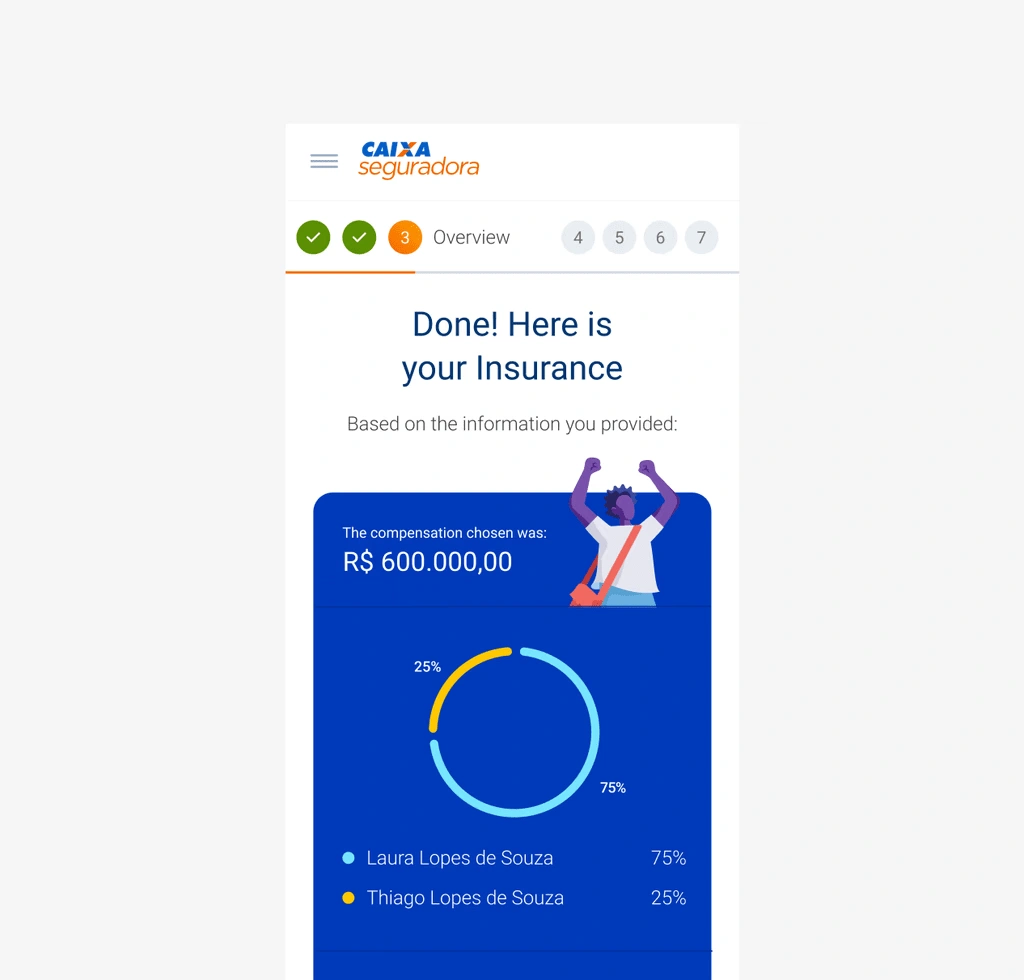
Offer summary
At this stage, the user can clearly and intuitively see how many people he/she has allocated the insurance to, the amount and the coverage and assistance contracted.
Payment on the platform
In the current platform, the client would purchase insurance and would have to go to an agency to make the payment. With the improvement and the need for people to stay at home, we suggest this implementation.

Like this project
Posted Oct 9, 2024
Introducing Caixa Seguradora introduced a user-friendly life insurance simulator during COVID-19 for online purchases, providing families with security.
Likes
0
Views
7
Clients
Caixa Seguradora

