Hey Ernesto: Brand Identity System

Ernesto Carrazana


A visual identity system for a founder-focused brand practice
A self-initiated visual identity for Hey Ernesto, my own independent brand practice.
I created this identity to give my practice a clear, human, and dependable visual system across digital and client-facing touchpoints.
The Brief
For my own brand, Hey Ernesto, I needed a visual system that could make my founder-focused practice feel clear, human, and dependable across digital and client-facing touchpoints.
The identity needed to support practical communication, create consistency across formats, and avoid the distance of a rigid corporate system.
My Role
I created the visual identity for my own brand, Hey Ernesto, as the Brand Designer.
My scope included:
Visual identity direction
Logo and graphic elements
Typography system
Color palette
Layout and hierarchy principles
Applications for website, proposals, content, and client-facing materials.
The Visual Direction
The system is built to make information feel easier to follow. It balances structure with warmth, using clear typographic hierarchy, generous space, and focused moments of emphasis.
Rather than adding decorative complexity, each element has a job: guide attention, organize information, or make the brand feel more human.
Symbols with a Clear Purpose
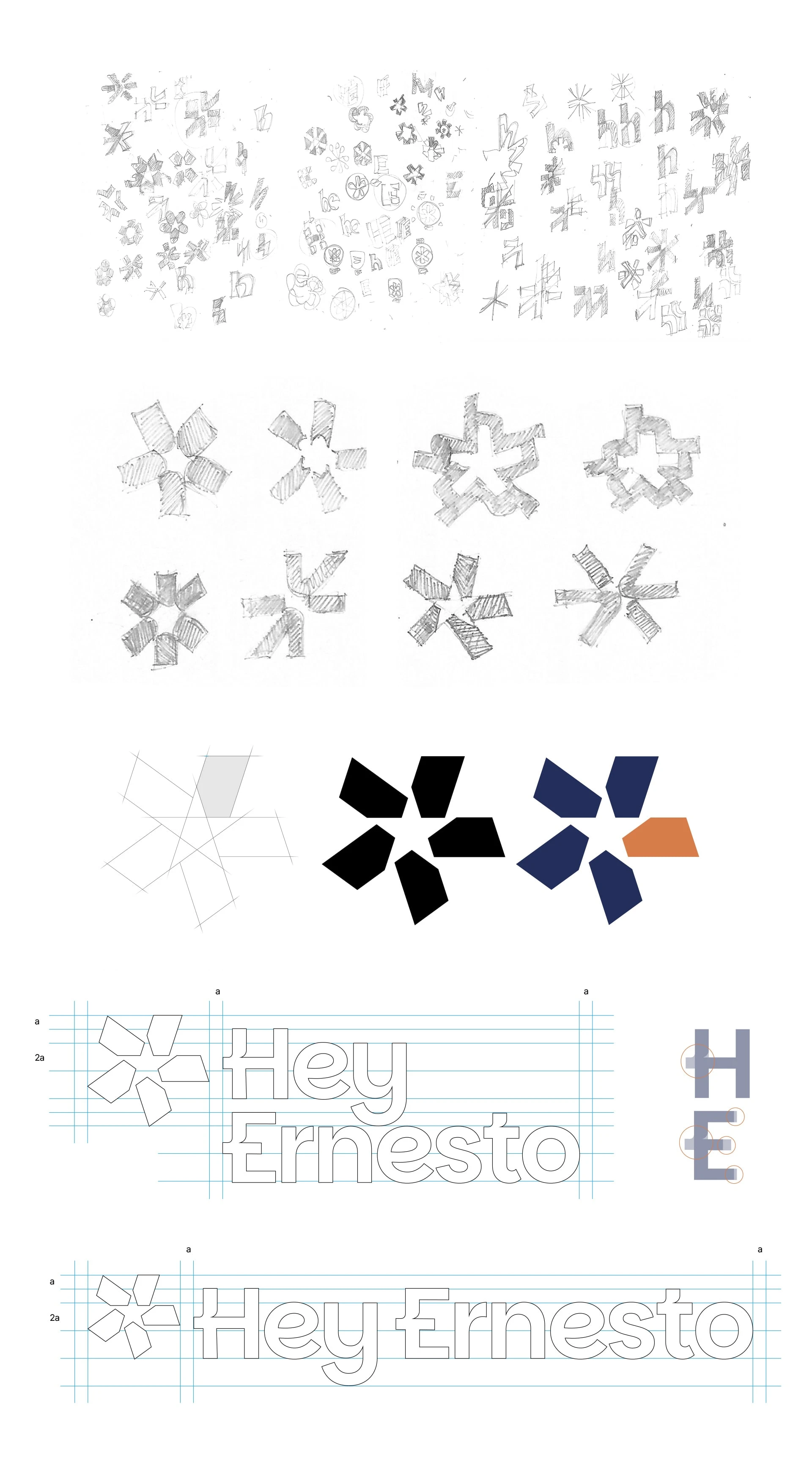
The identity combines an asterisk and a star as its core graphic elements.
The asterisk creates a point of attention. It signals that there is something worth noticing more intentionally.
The star acts as a visual guide, representing direction, clarity, and support.
Together, they create a flexible graphic language that highlights important ideas without relying on excessive elements.
Typography and Color
Plus Jakarta Sans was selected for readability, friendly shapes, and flexibility across digital formats. It keeps content direct and easy to scan in proposals, web pages, and editorial content.
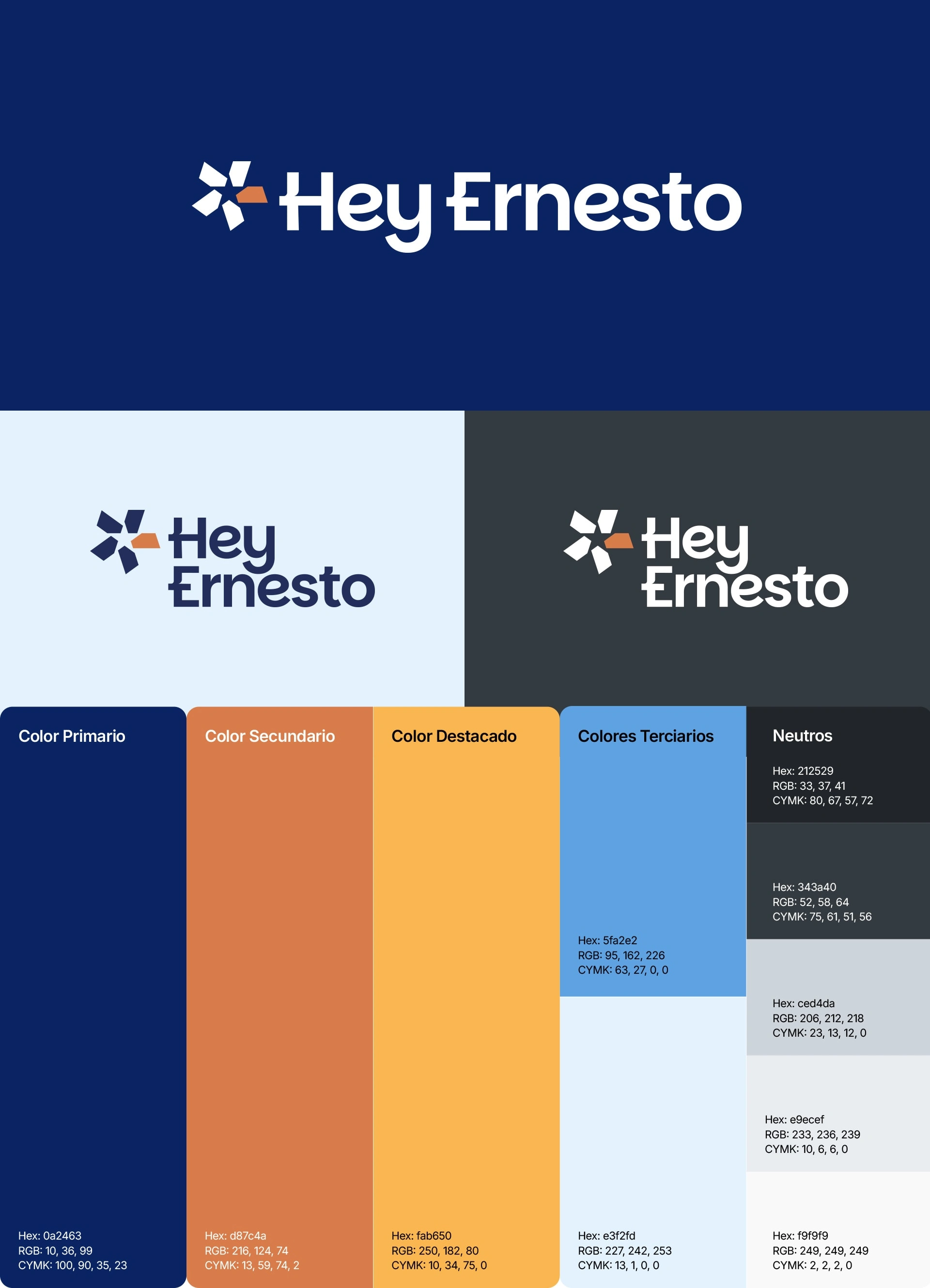
The palette assigns a clear function to each color:
Deep Blue: clarity, trust, and strategic thinking
Soft White: visual space that lets ideas breathe
Terracotta: warmth and human connection
Amber: focused moments of emphasis
Color supports hierarchy and navigation while keeping the system approachable.
A System Designed to Be Used
The identity is designed to stay consistent across the everyday materials of the practice:
Website and service pages
Client proposals and documents
Presentations and working materials
Social media content
Business cards and other client-facing materials
The goal was a visual system that could be used repeatedly without becoming rigid or difficult to maintain.

Result
Hey Ernesto now has a consistent visual foundation for communicating a founder-focused practice across touchpoints. The system turns core brand ideas into a recognizable, practical language for everyday use.
Like this project
Posted Jan 12, 2026
A self-initiated visual identity system for Hey Ernesto, my independent brand practice, designed for clear and human communication across everyday touchpoints.
Likes
1
Views
61