0-1 Platform Build of NetBase Pro
Building of NetBase Pro Platform
Overview
NetBase, (now NetBase Quid) based in Santa Clara, CA, is the premium social intelligence solution that the most prominent brands and forward-thinking agencies trust to monitor, understand and engage with customers at the speed of social, providing social intelligence solutions that enable brands to publish, monitor, analyze and engage with customers in real-time.
What was the problem?
Difficult to use
The core enterprise product required weeks of training to fully understand how to use and implement
Low Adoption
Because the product was complicated, we were not selling as many licenses per sale as we would like
Outdated visualizations
Out-of-the-box Highcharts data visualizations that were not customized to the user's needs and experience
Our Hypothesis on how to fix it
If you build it (& make it easier) they will come . . .
If we built a product that used a smaller subset of the enterprise product functionality and made it easier to use, more people across an entire organization would be able to quickly obtain and use relevant social data to do their jobs without needing an analyst to build reports & run data for easy queries, thereby freeing their time to do more detailed work that moves the overall company in the right direction
So, we started with what we had

Current Inventory
Looked at analytics for all the different ways to slice data and how often it's accessed
Identify Trends
Pulled the top 500 most accessed features to do an in-depth analysis of the feasibility
Client Wishlist
Examine existing client wishlist to confirm trends and make sure we can fully meet client needs
Finalize Choices
Finalize list of data filters and features with engineering, marketing, and sales
... and then looked at what others were doing....
Competitive Analysis
We took a look at two of the top players in the SMB social media landscape to understand where our current deficiencies were that were illustrated in their strengths
.. and found what they were doing right...
Ease of onboarding
Competitors had self-service onboard
Ease of Upgrade
Competitors had self-service upgrade/downgrade
Meaningful Analytics
Easy to understand analytics
Modern Visualizations
Visualizations were in alignment with current web standards and user expectations
... and what we were not doing right ....
Too many Choices
The app has too many features, and is so specific that it requires a fair amount of training to use properly
Outdated
The app has an outdated UI and visualizations that don’t pop, therefore adding additional work to make the data palatable to current standards, which usually requires people to go out of our program to others
So we put together a Skunkworks project to explore what we could possibly do to enhance our product.
What is Skunkworks?
noun (usually lowercase) Also skunkworks, skunk·works [skuhngk-wurks]
a phrase commonly used to describe a small and loosely structured team in an innovative undertaking, that is outside the normal research and development channels within an organization
Highlights
Development team from Taiwan in US office
Excited to try new visualizations and methodologies
Limited time together to explore options before team returned home
Tasks and Decisions
Decided to upgrade using new visualization engine (d3)
Explored all existing functionality from our inventory and came up with concepts
Collaborated real time in both code (d3) and design tools (sketch) to explore visualization language
Began exploring the concept of a “Super Lite” version of the existing product functionality
Concept: Super Lite
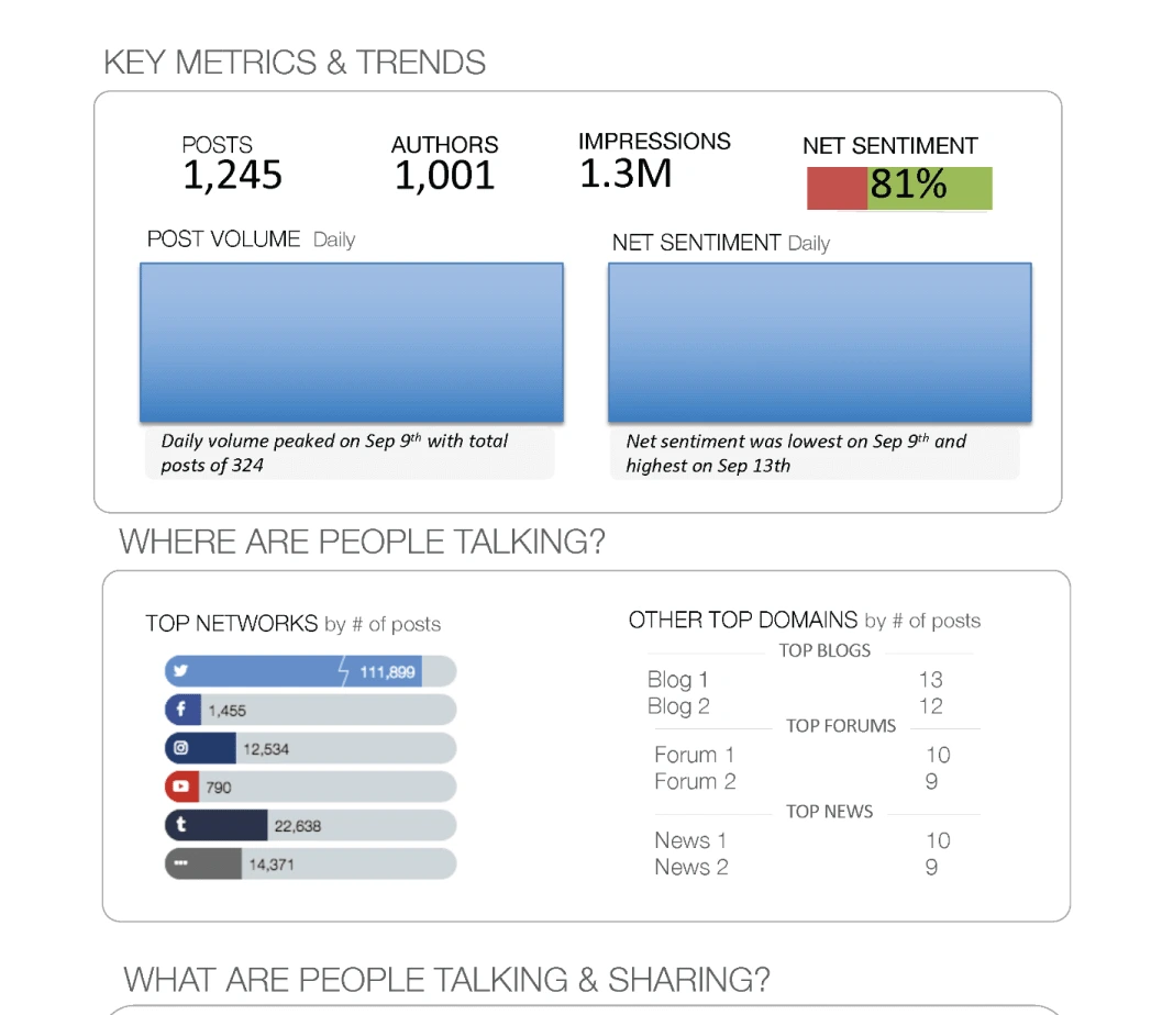
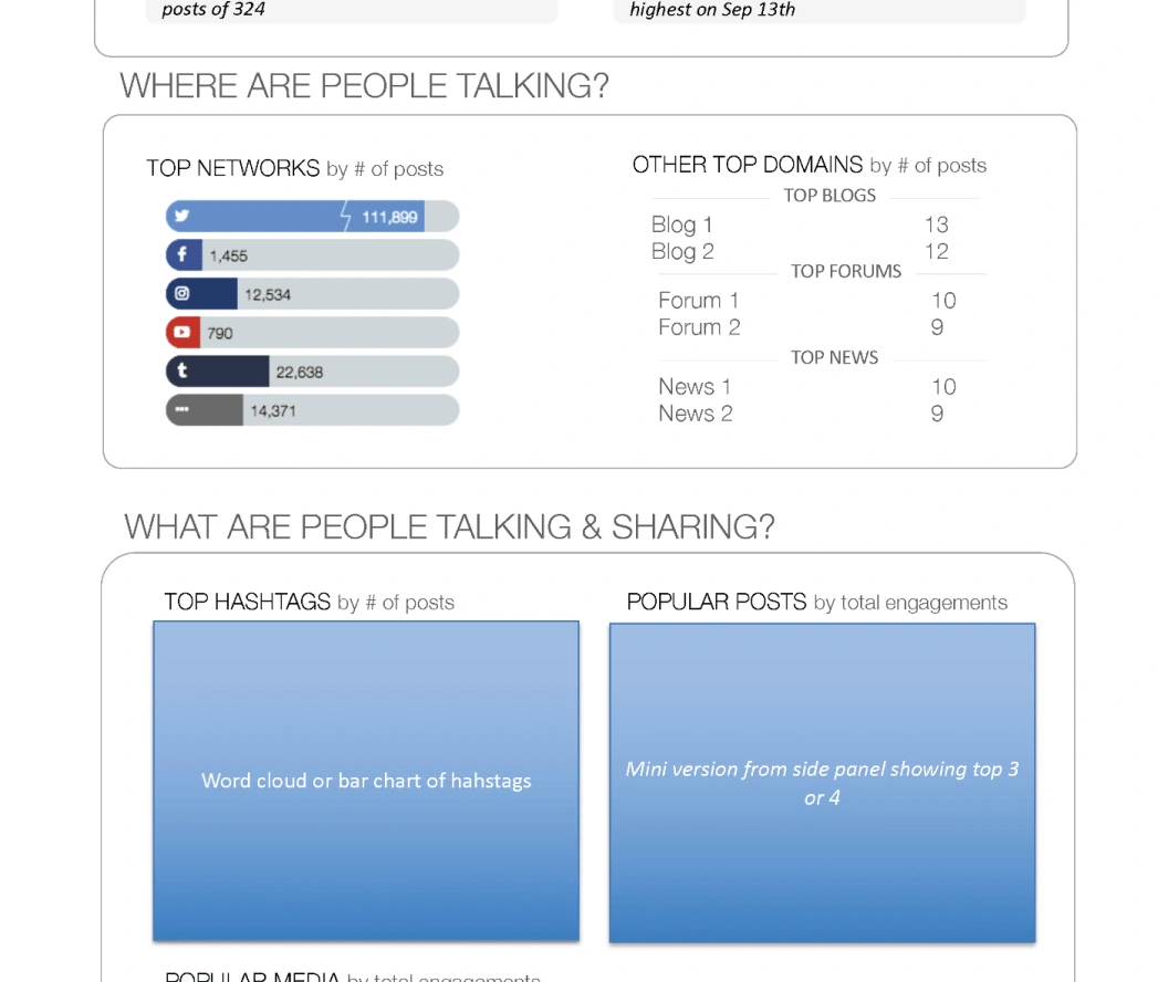
Super Lite was a very stripped down version of a report using existing data in our enterprise product without much change to the overall concepts
Where are people talking is key to understanding where the focus should be in terms of ad spend and interaction
what is the data?
what platforms?
who is saying it?
what are they saying?
Concept Feedback
Presented as both as an overview presentation and an interactive demo kiosParagraph 1Presented as both as an overview presentation and an interactive demo kiosk at our first ever user conferencek at our first ever user conference
We were on the right track but needed to understand user needs more clearly So..
....We talked to people!
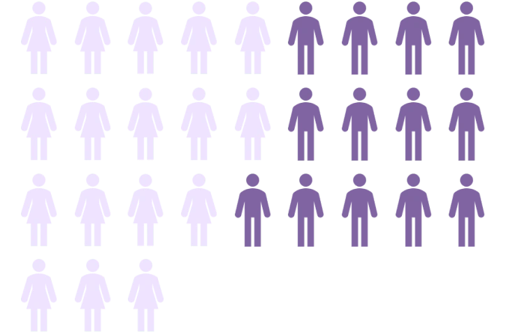
8 Executives and Managers
6 had no experience on the platform
6 had some experience on the platform
10 daily platform users
.. and Here's what they said...

User Personas
While data had us build 5 personas, we built the product to the 3 active personas that had direct contact with our platform or were affected directly by the data from our system
Active Personas
Data Analyst
I get pulled in a lot of different directions. I need people to be able to do some stuff on their own or I will drown.
Executive
I have a lot to do but keeping up with social media is key to making sure I am in the loop on our social media efforts
Active Social Listener
Keeping up with social media is a large part of my job, and I am frequently checking the social pulse
Out of Scope Personas
Casual Explorer
I occasionally dip into social media stuff. Usually that's someone else on my team
Researcher
I fully know how to use the platform but sometimes its overkill for what I need to find out
Onto the build and its features!
Search Dashboard
Our starting point for finding the data you need
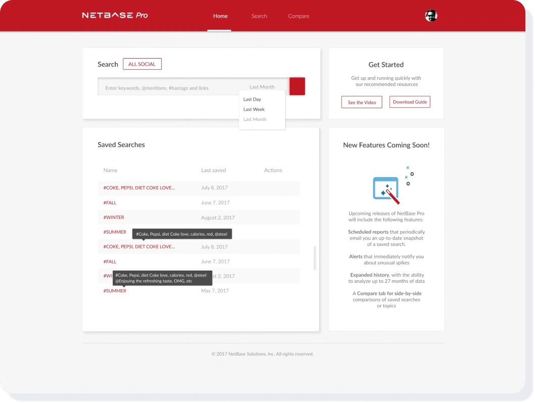
We have two entry points for searches - a general global search and saved
Saved Searches
Allows enterprise user to share detailed search parameters that they’ve built in the enterprise product with a pro user
Data Dashboard
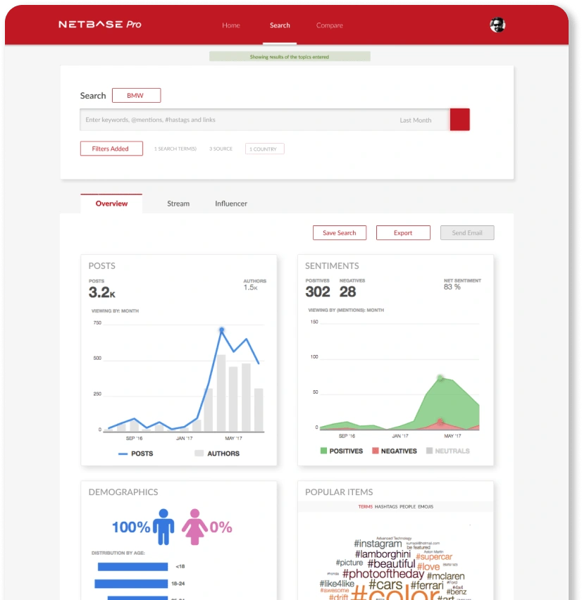
Where your Data Lives
Future Proofing
To mitigate the idea of our existing product bloat we’ve broken up data into tabs for ease of future features
Save/Export/Emailt Search
All facilitate the idea that came from our interviews about easily sharing data with others
Cards
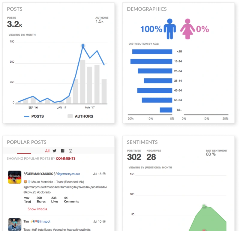
Our data visualizations for all kinds of data
New Data
While we took some data from the existing platform, our interviews allowed us to look at our existing data visualizations in a new way and add new data sets
Future Development
While the cards were locked at launch, future development will allow you to select your own data to show on the cards and relocate them to any place on the grid that makes sense to you.
Beta

If you build it, will they come?
Who Tested
Existing Alpha users
People who were involved in our interviews
People from our top 5 clients
What did they test
Existing features built in Alpha
Any additions and enhancements built during beta
How we received feedback
Bi-weekly phone calls
existing user community forums
1:1 Feedback sessions
Monthly virtual user testing
3 multi day site visits
Feedback
Visualization feedback
Missing some key data people wanted
Some visualizations were not clear so they were reworked
User research and sites visits
Allowed to see it out in the wild
Showed us that additional additional features (like compare) would help people tremendously, even though they didn’t mention it explicitly
Community forums
Leveraged existing tools
Allowed users to feel consistently heard
Post-Beta Addition: Compare
Is Coke better than Pepsi?
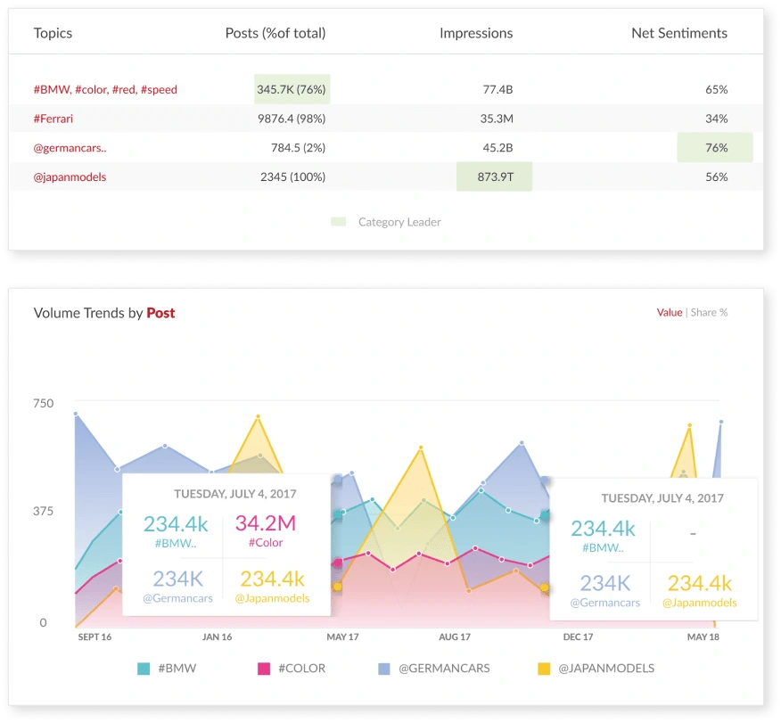
Why we added this
Found during visits and user testing that a lot of people were doing or were asked to make comparisons on a regular basis but we had no easy way in any product offering for that to occur
Functionality
Can compare up to 4 terms - any more was too hard to decipher
Can filter by any number or highlight just one in data table
Like this project
Posted Nov 29, 2024
Was the sole designer in charge of designing and delivering NetBase Pro, transforming social intelligence analytics into a scalable, user-friendly platform fo

