Forest Goods
Andranik Hakobyan
1 collaborator
Forest
[ project year: 2019 ]
In 2019 we were approached by Forest company with the request to create the visual identity and packaging for their production line. The company makes healthy and organic canned food from only natural ingredients bringing to the market a wide variety of fresh, tasty and quality products.
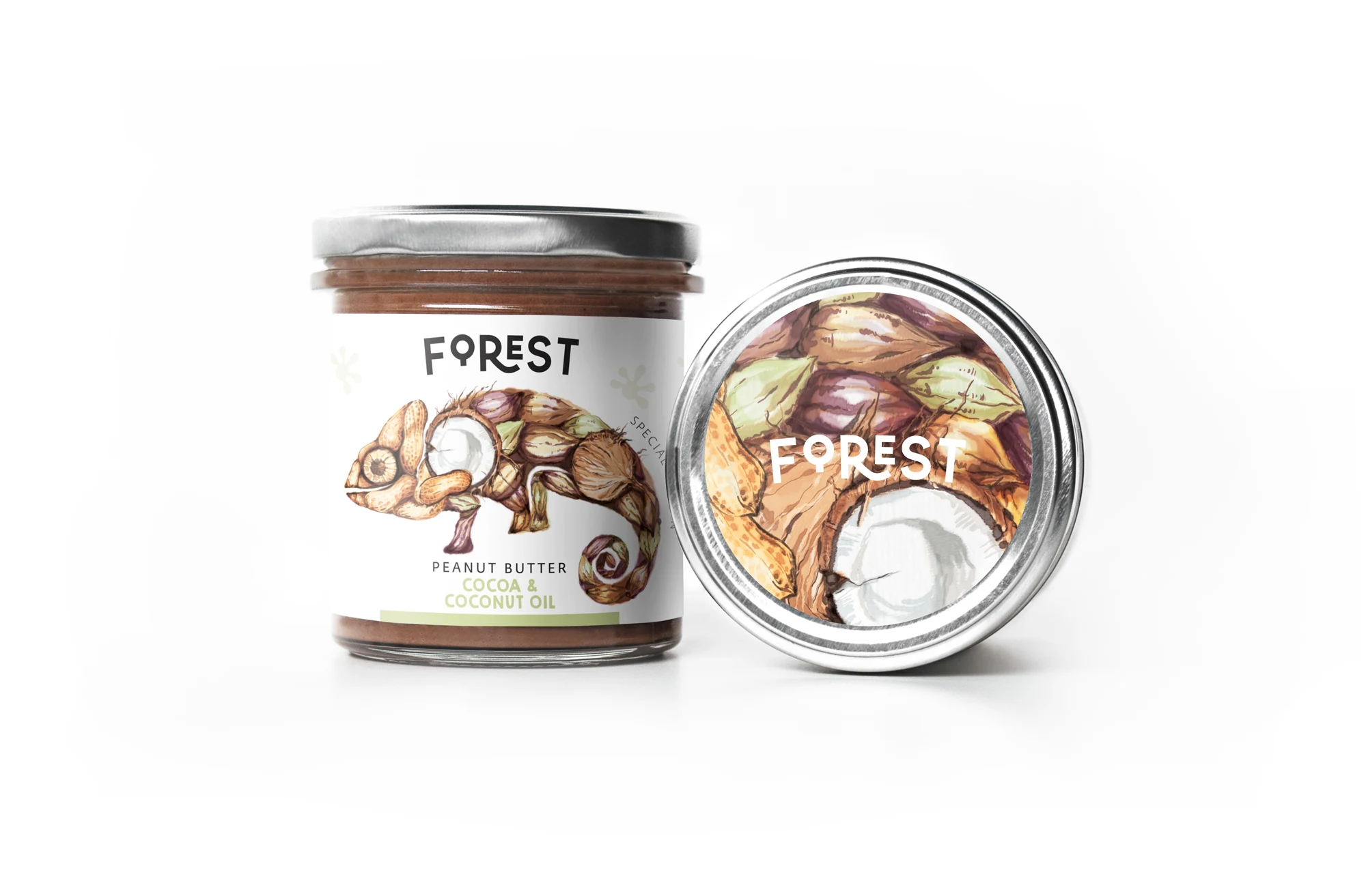
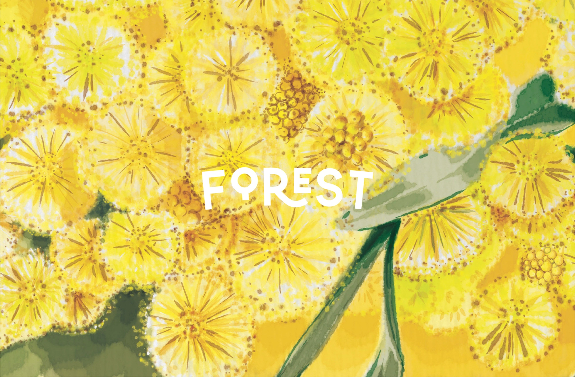
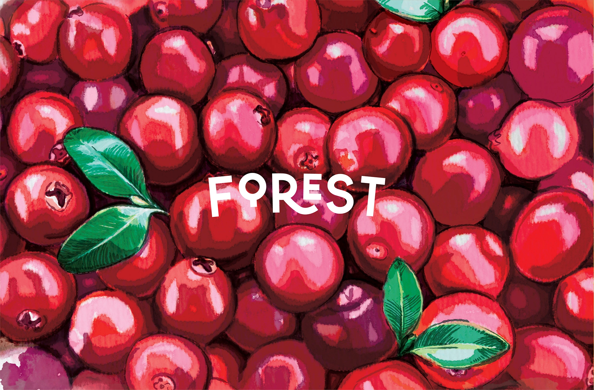
While designing, our main goal was to reflect the values and the purity of the brand. We challenged ourselves to illustrate the rich diversity of the production meanwhile keeping it simple yet catchy. The name “Forest” inspired us to create the clear and authentic logotype with smooth typography and a hidden symbol in it. Here the letter O replicates the image of a tree.
When it came to the design of the packaging we started exploring the visual codes and peculiarities of the forest and its dwellers. We were aiming to find the core for our concept which would reflect the variety of the production the brand offers.
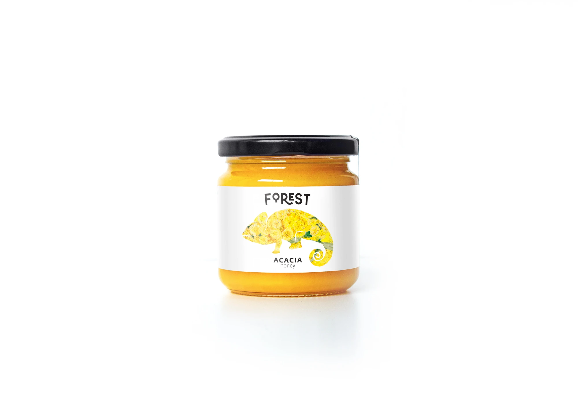
Our research has allowed us to draw parallels between the ever-changing nature of the forest and the character of the chameleon, which changes its appearance depending on the environment in which it is found. This idea paired perfectly with the material we were looking for.
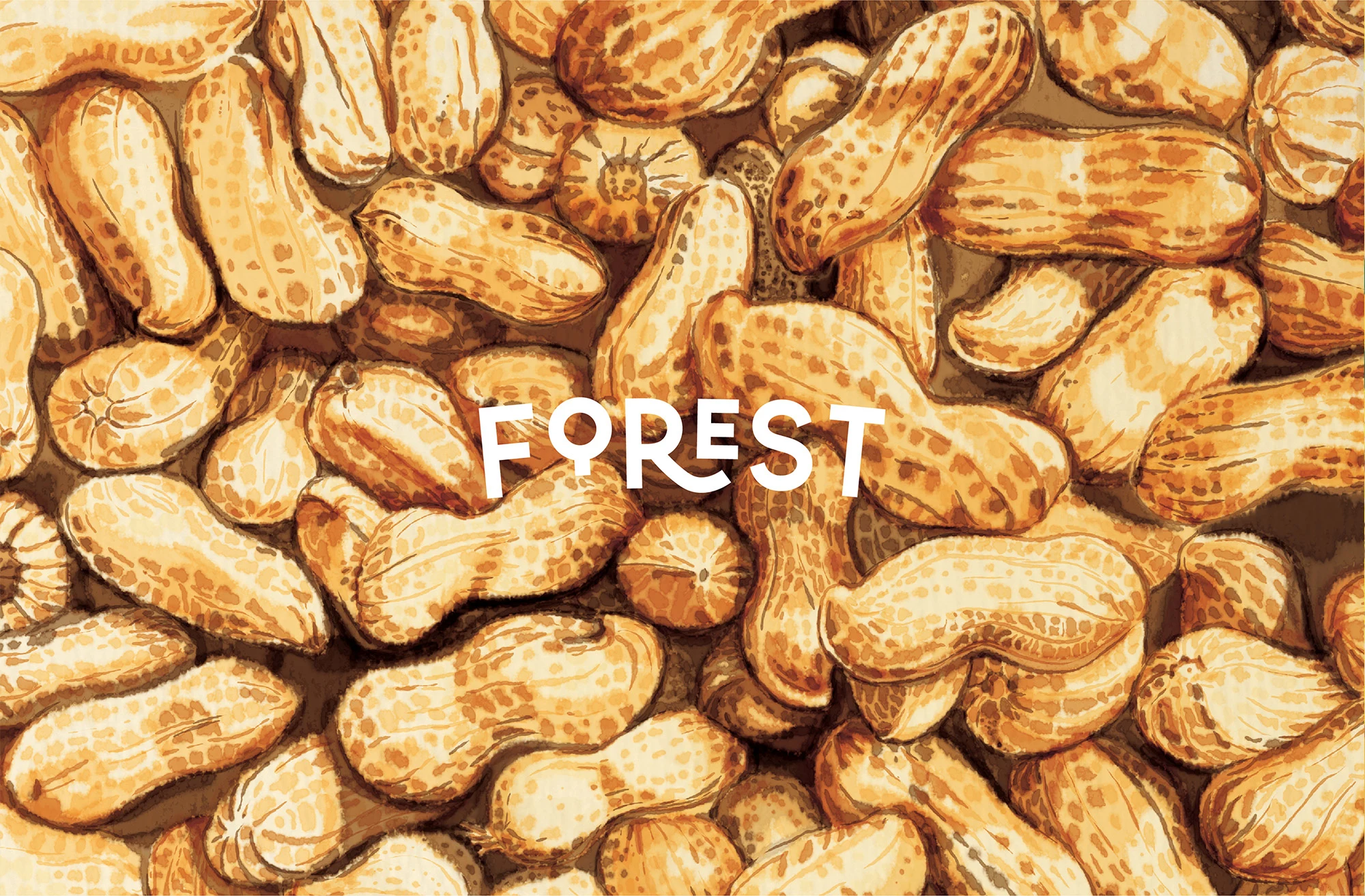
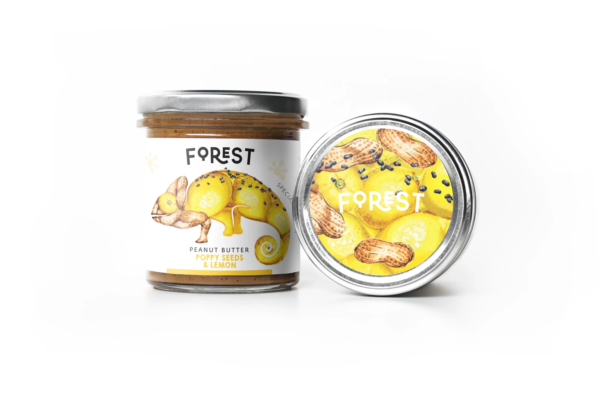
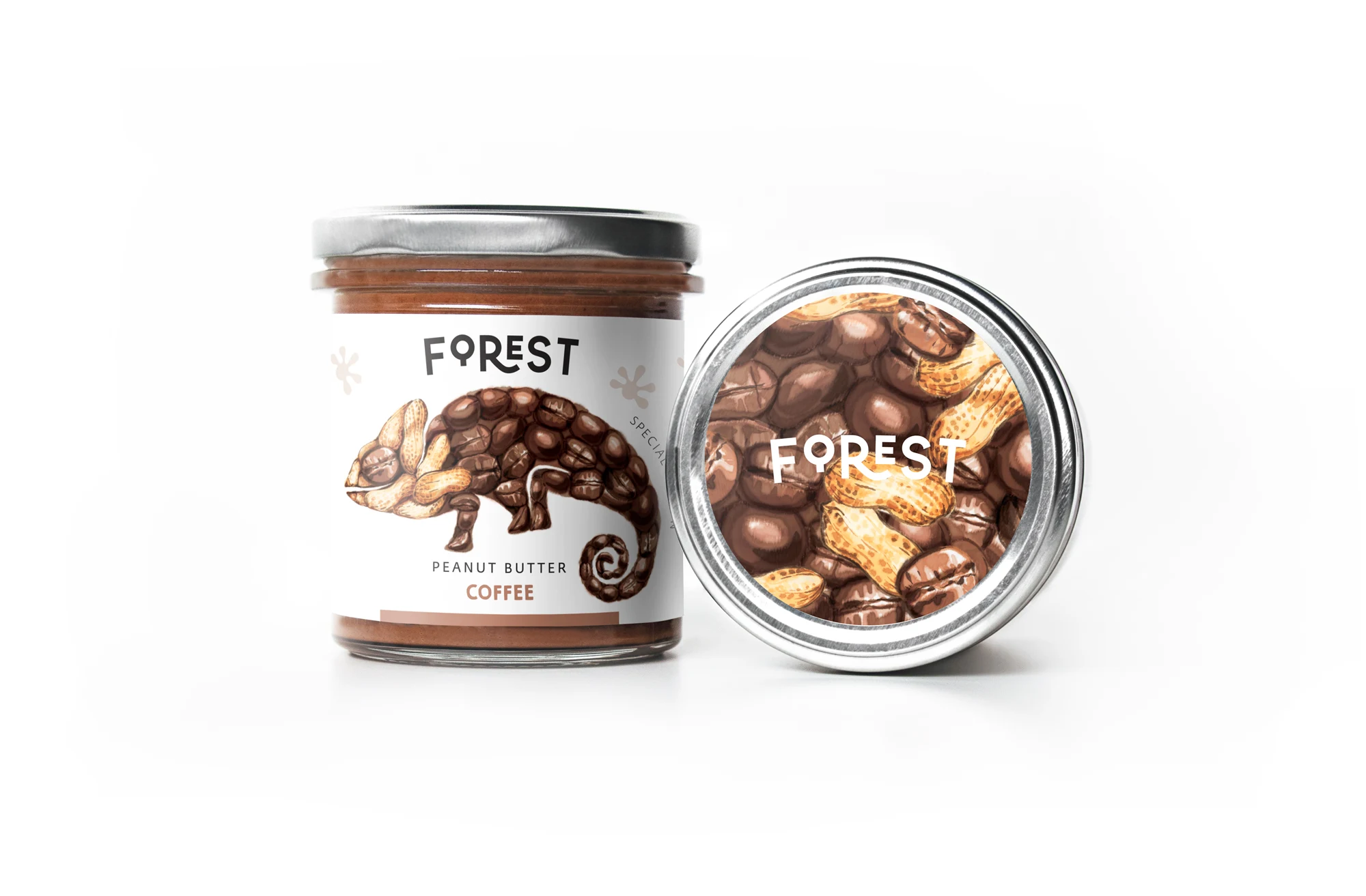
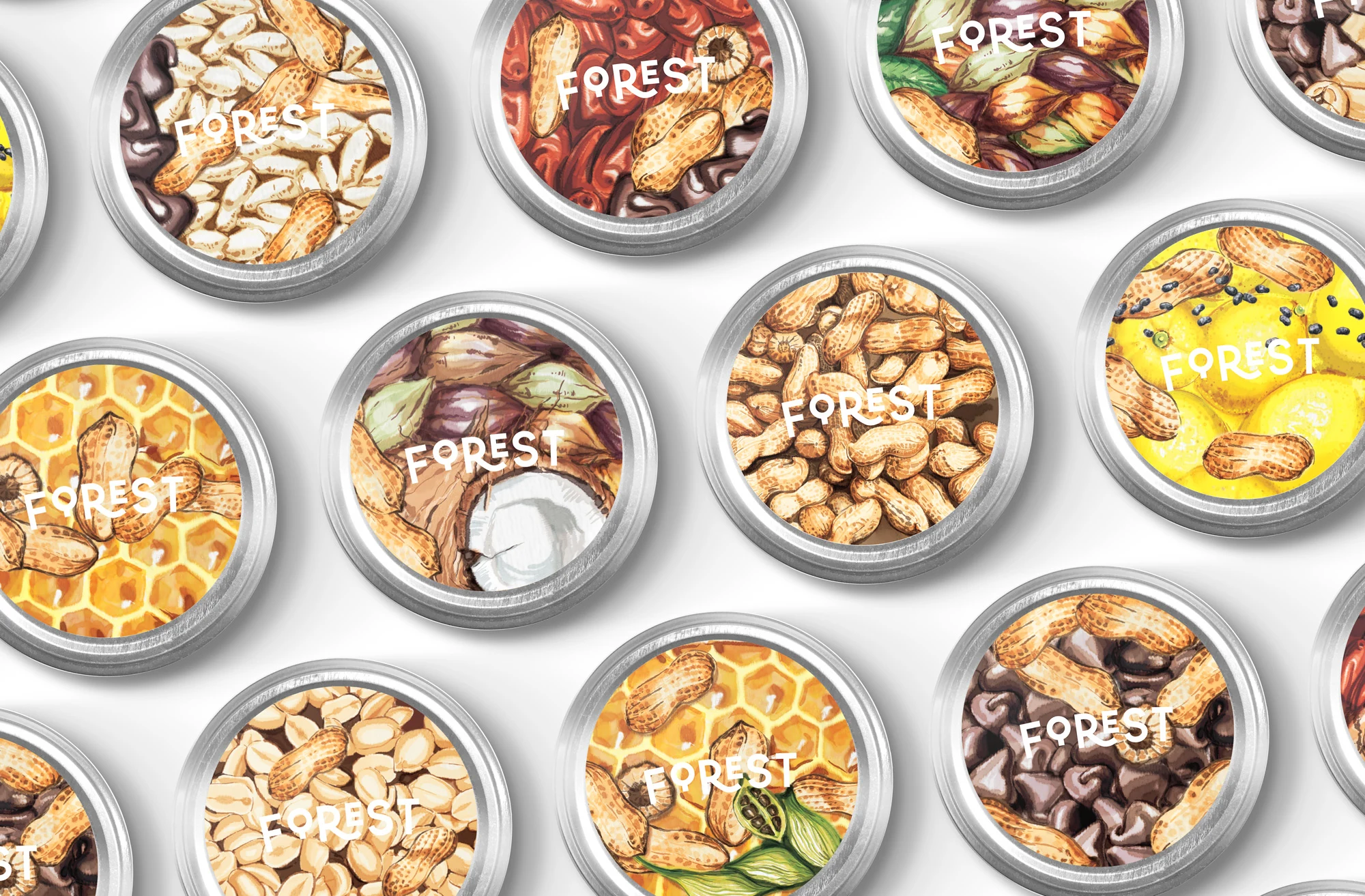
So to breathe life to the visual identity we decided to make chameleon our brand hero.We named him Forest and gave him a new superpower to change his appearance according to the flavour of the particular product. We made a series of vibrant and tasty looking illustrations of the goods and ingredients, that consequently served as a textured mask for Forest on the packaging. We used bright watercolour shades and textured brushes so illustrations would convey the crunchiness and juiciness of the products. This allowed us to make each product unique and eye-catching on the shop shelf. Along with illustrations we made a series of simple graphic patterns from footprints of the chameleon that were also used on the packaging of some products.
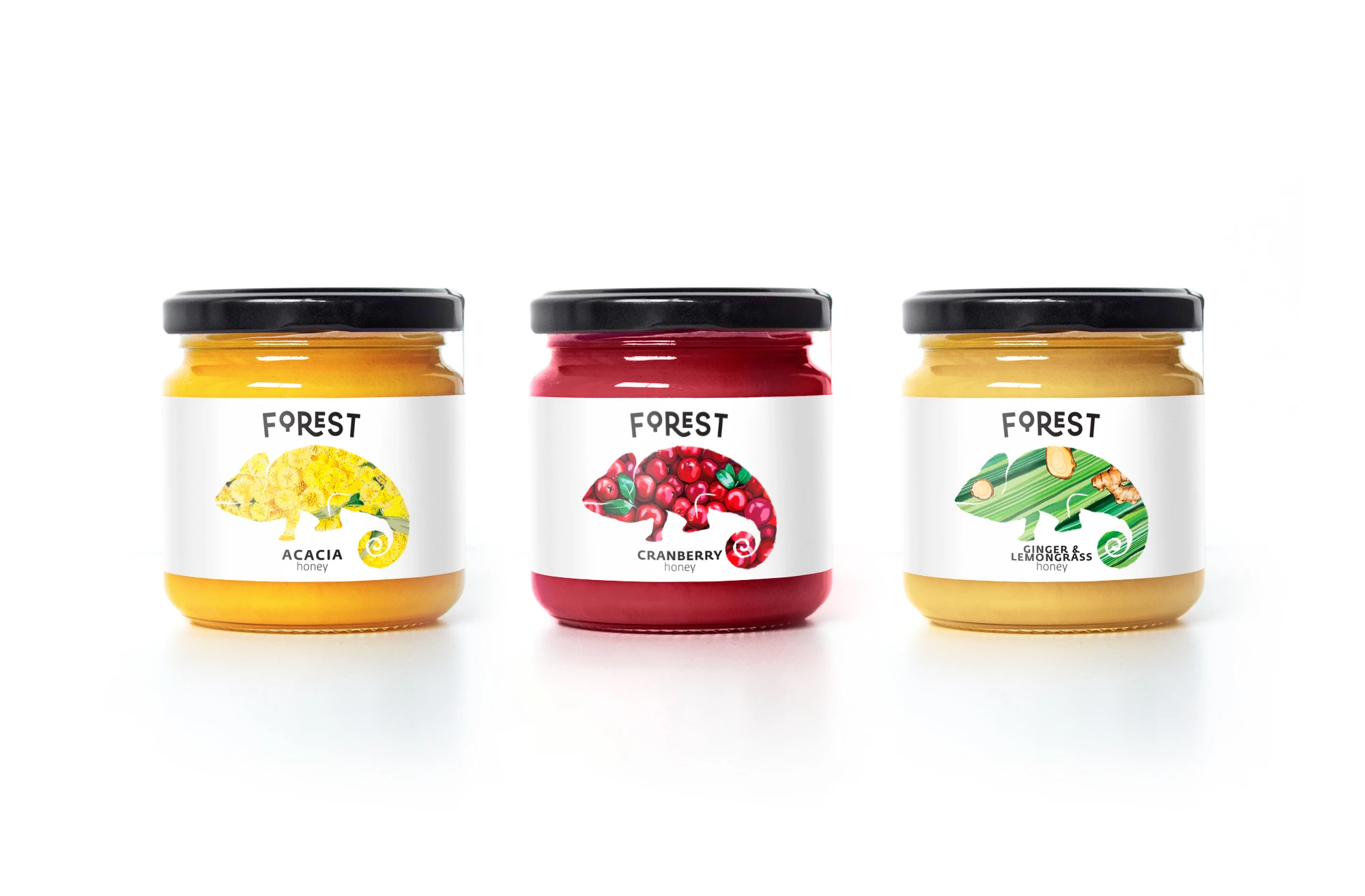
Through this approach we achieved balanced composition of discreet logotype and lively illustrations. As a result we got a simple yet colorful and positive visual story about the toothsome chameleon that travels from can to can changing its appearance and bringing joy to the eyes.
Like this project
Posted Jul 4, 2025
A vibrant identity with a playful chameleon mascot, colorful packaging, and a fresh design that reflects the brand’s natural, organic values.
Likes
2
Views
10
Collaborators