FC ArLeAM
Andranik Hakobyan
1 collaborator
FC ArLeAM
Sports | Logo & Visual Identity
[ project year: 2022 ]
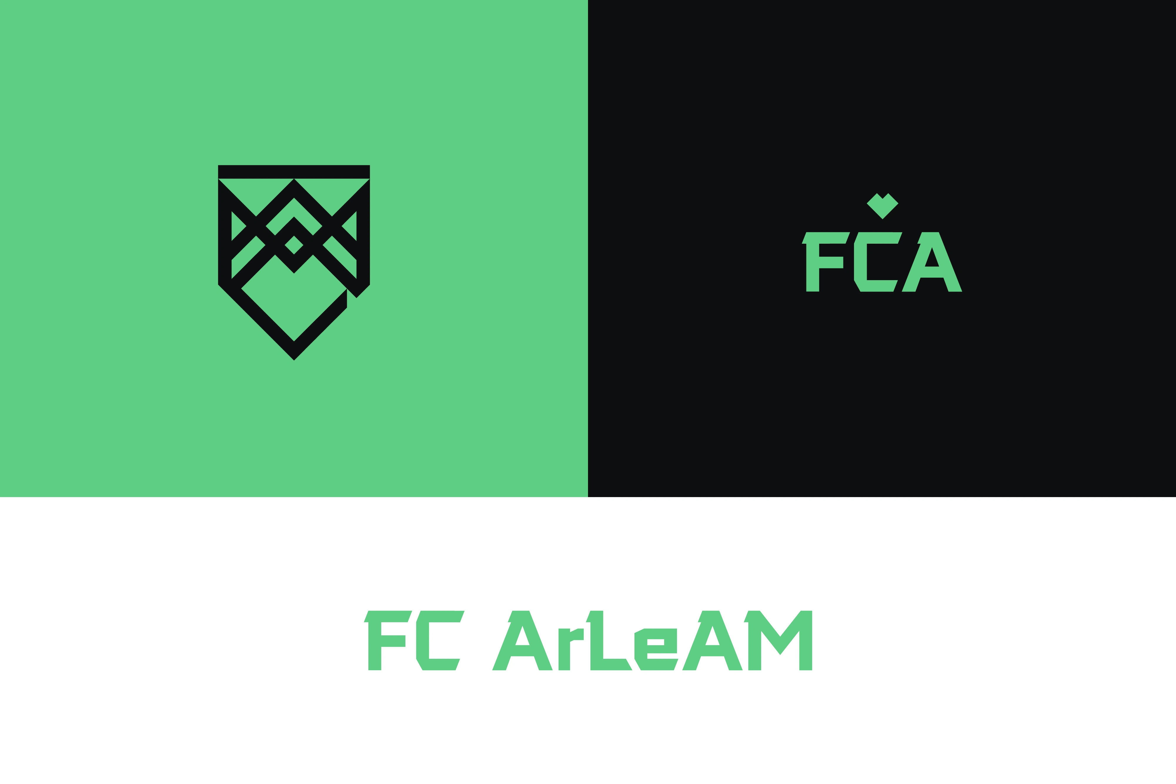
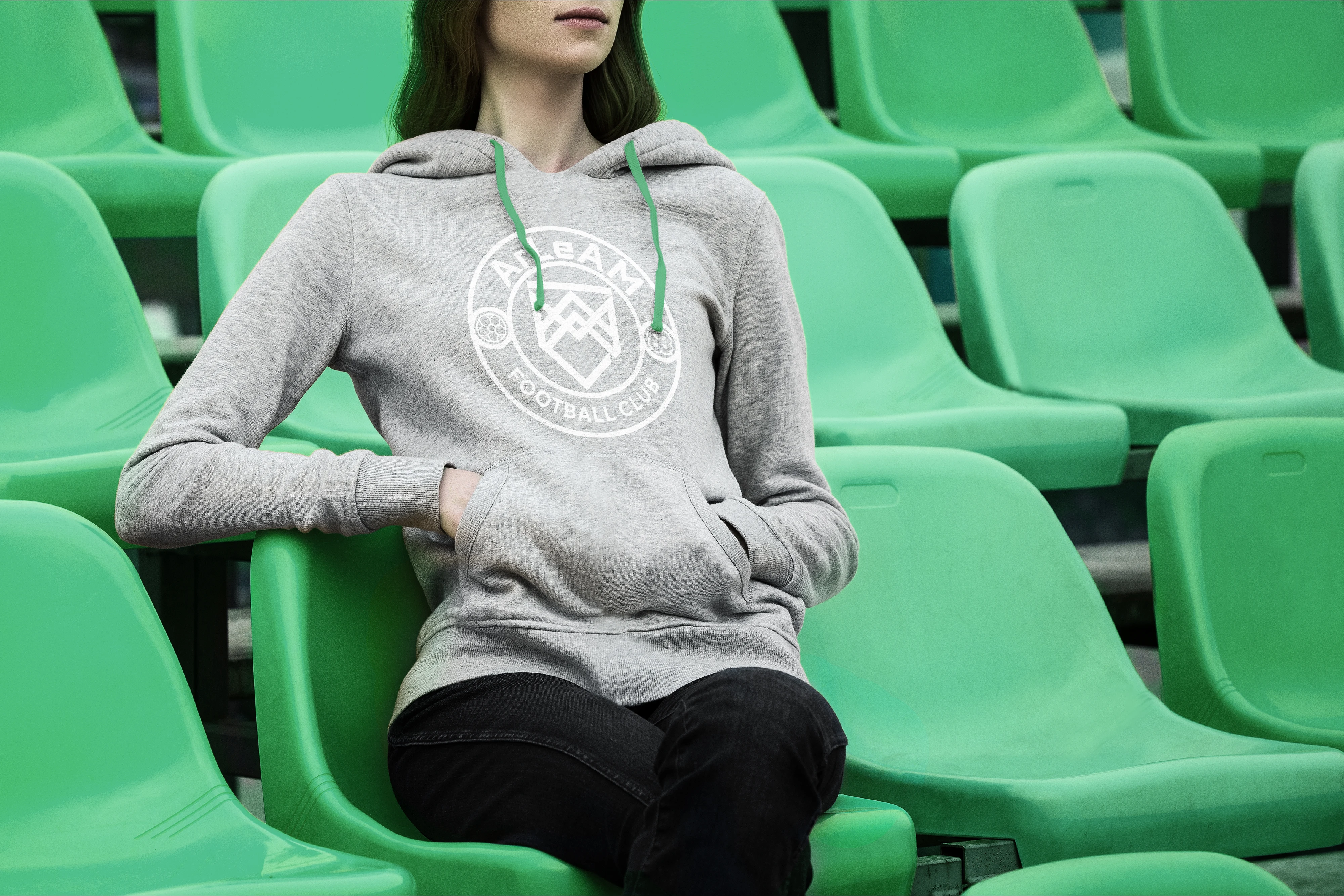
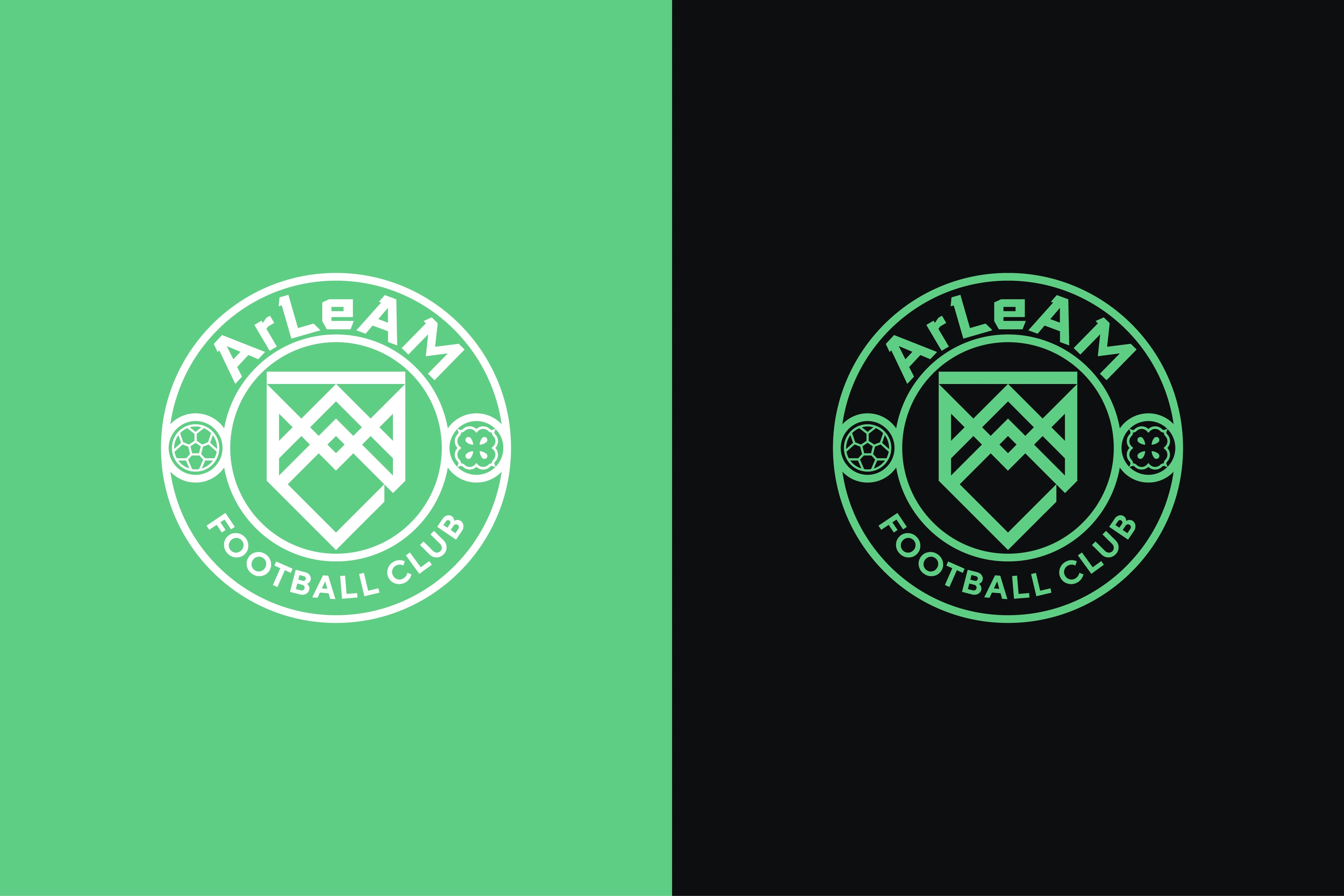
FC ArLeAM is a prominent food and beverage supplying company that has recently decided to open a football club as part of their corporate operations. Initially prioritizing the establishment of a women's team, they have also made plans to introduce a men's team in the future. The company chose not to stylistically connect to the food and beverage producing brand's identity, opting instead for a more traditional football style.
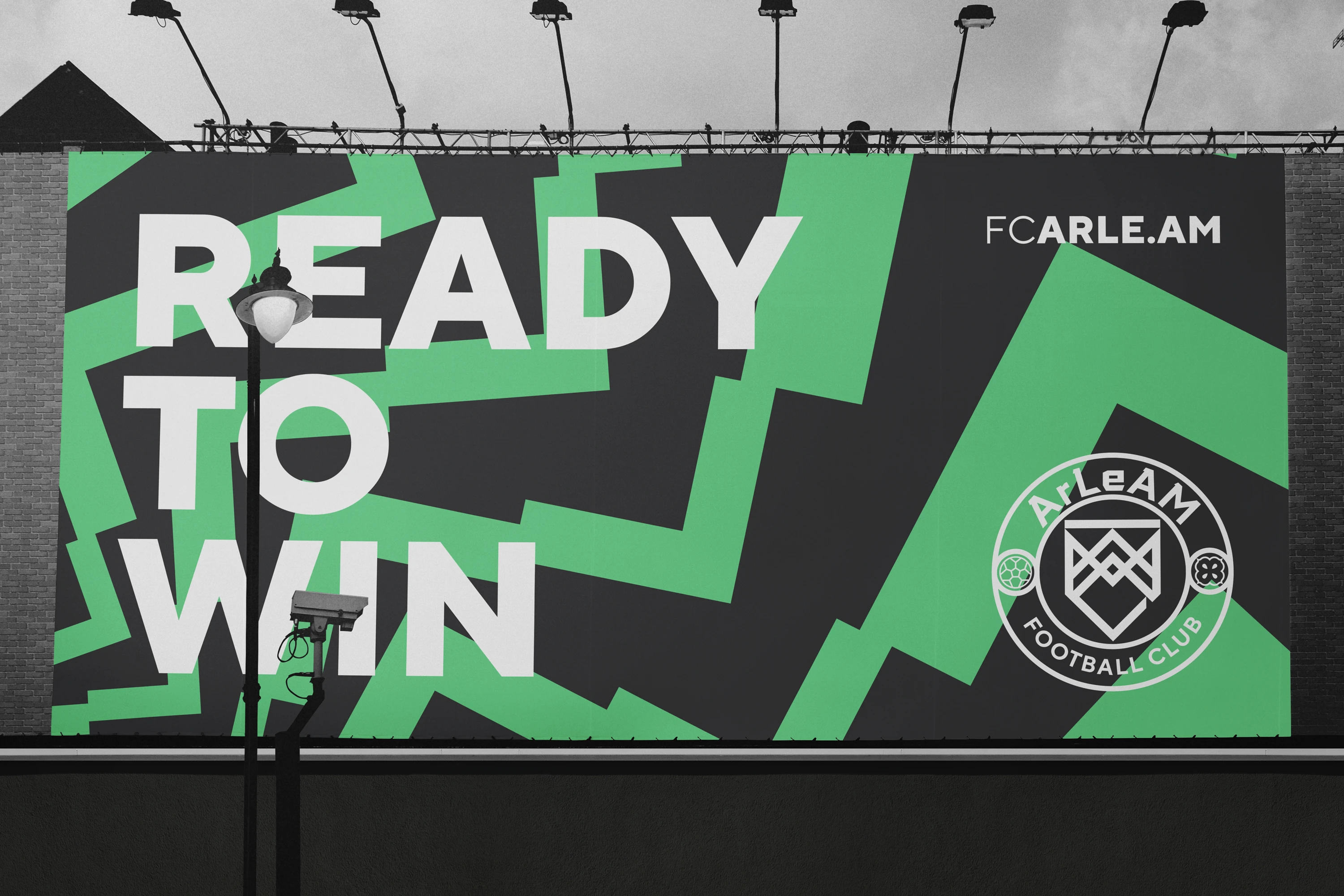
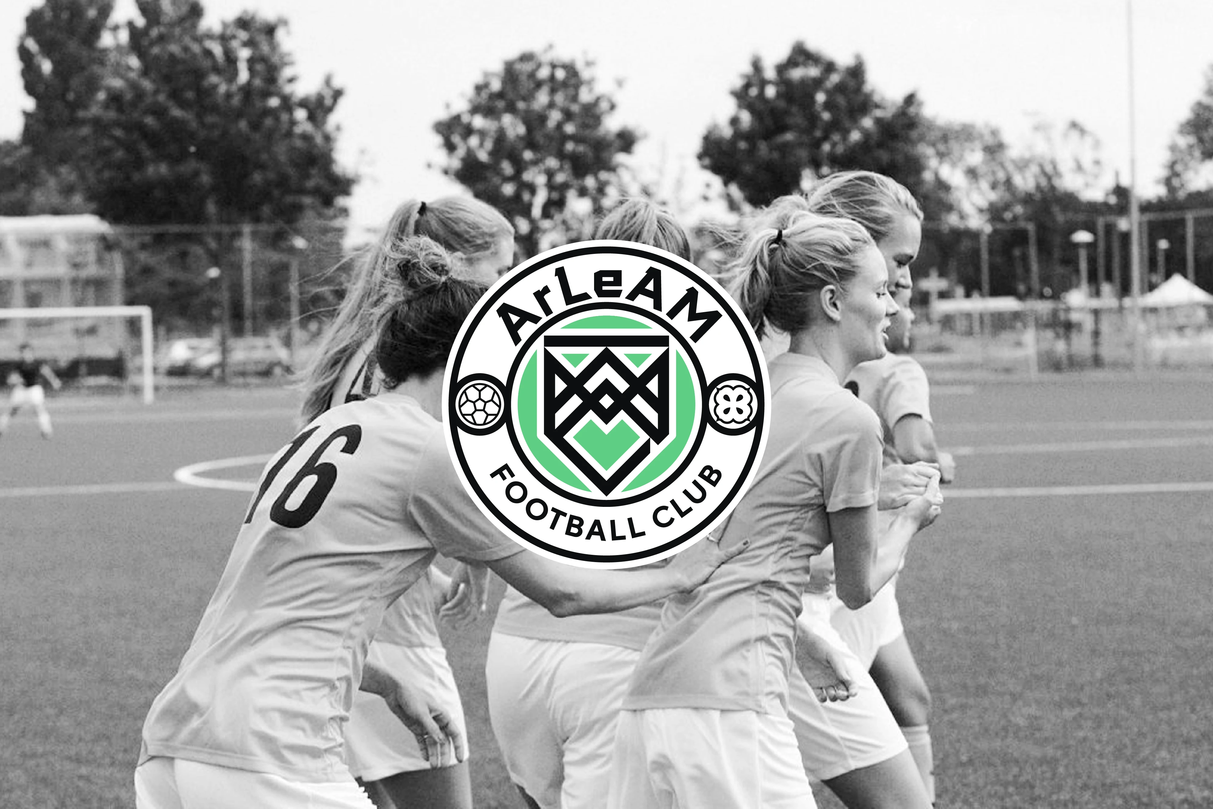
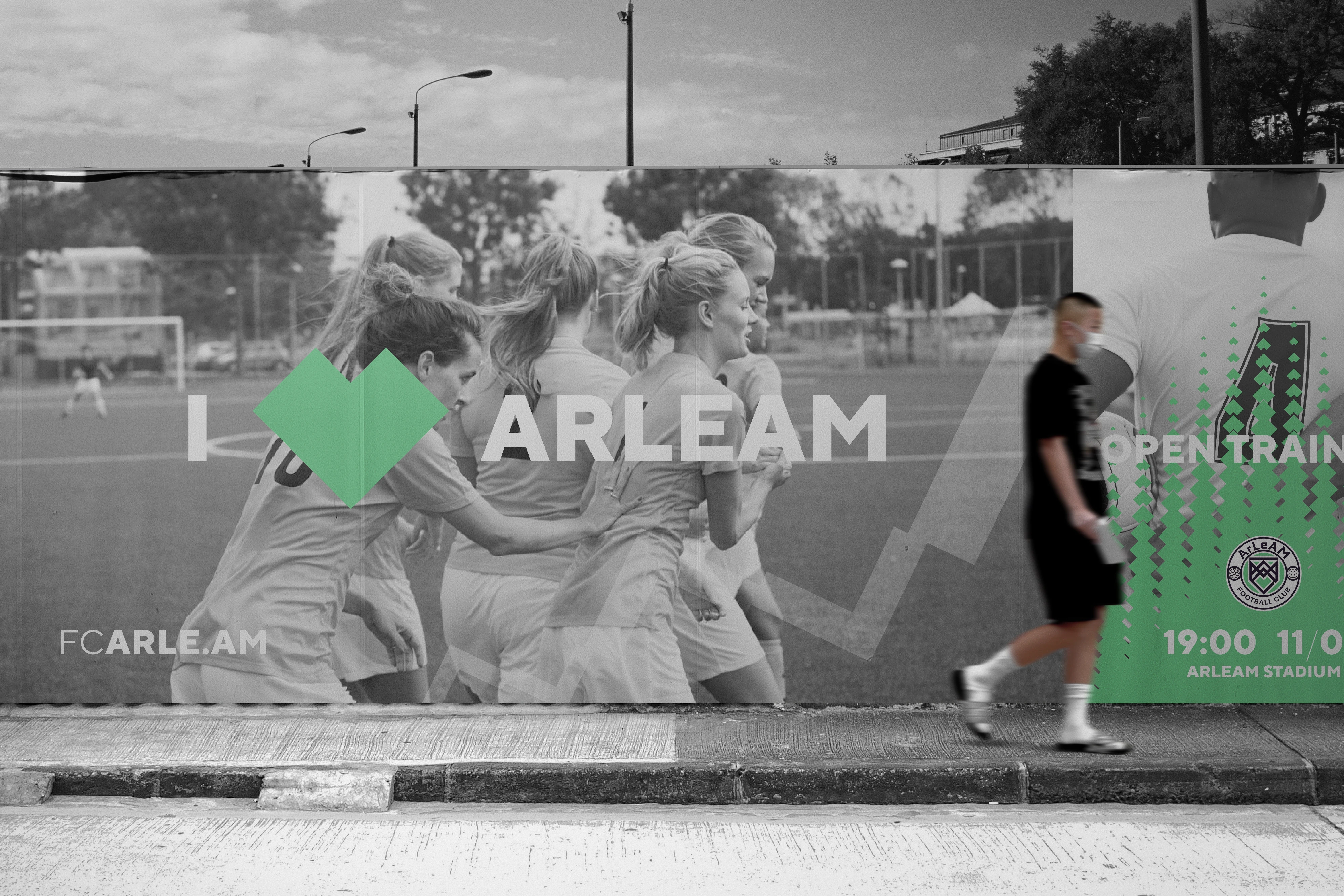
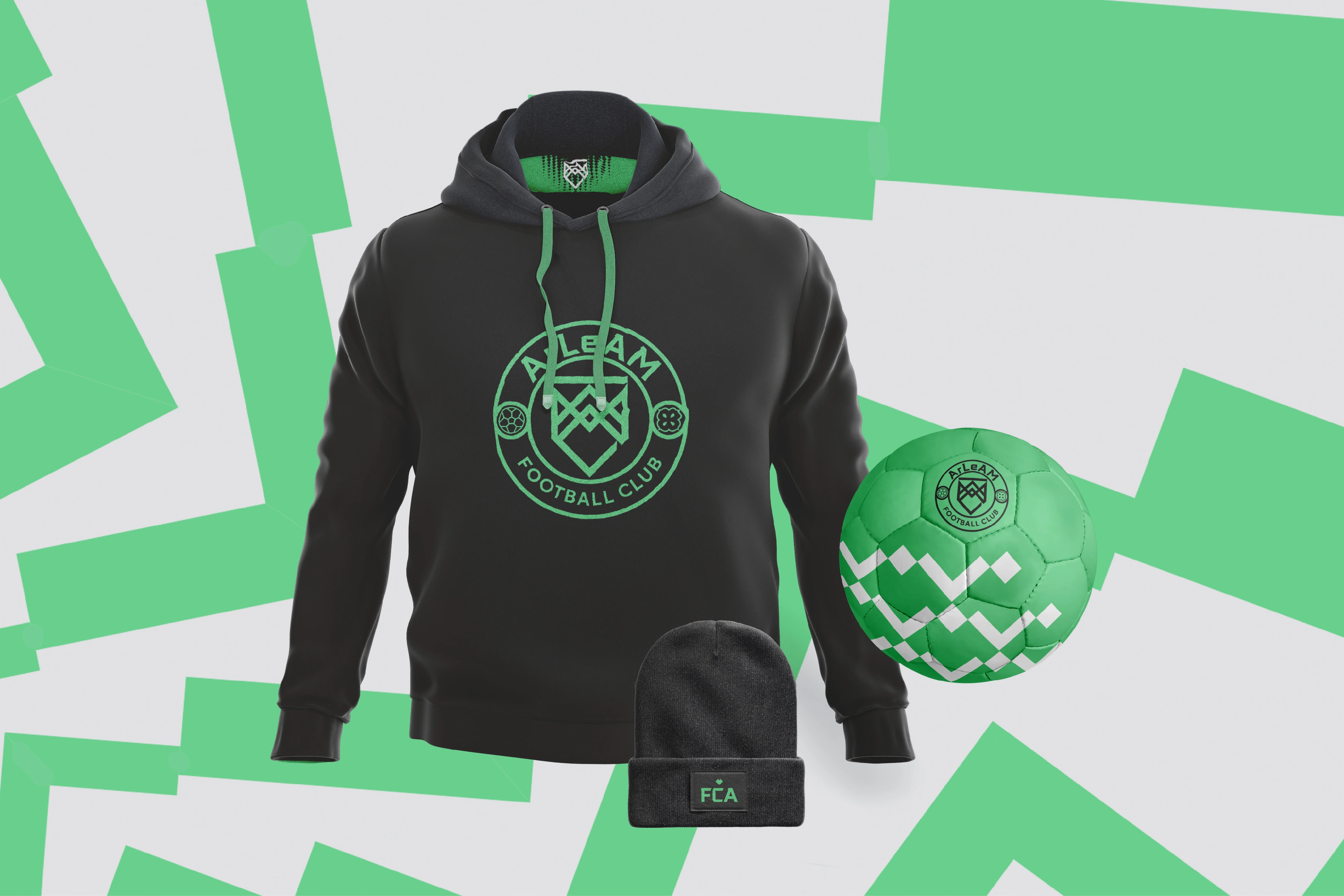
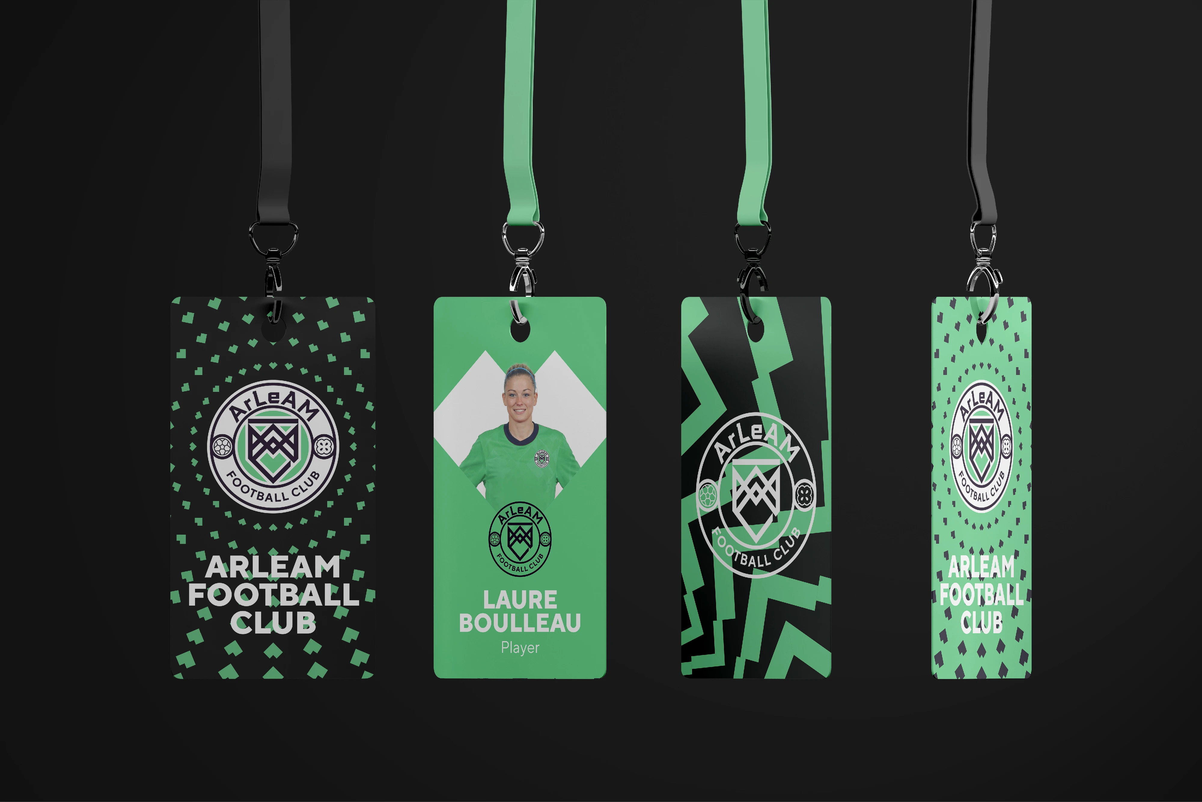
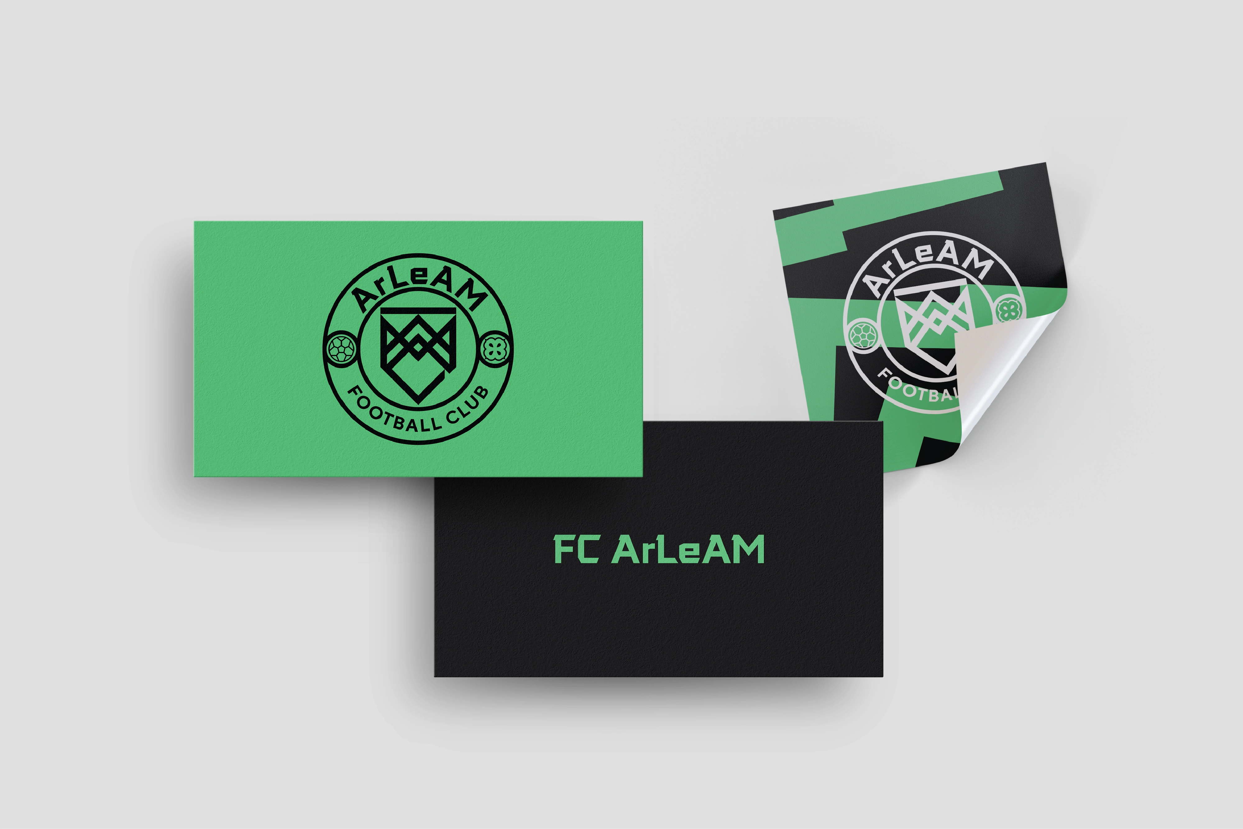
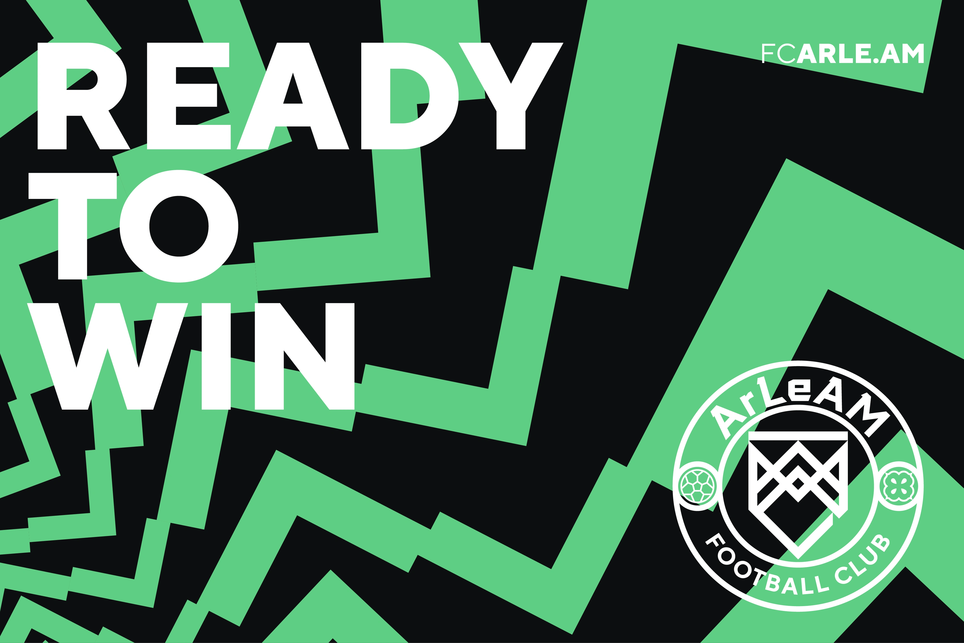
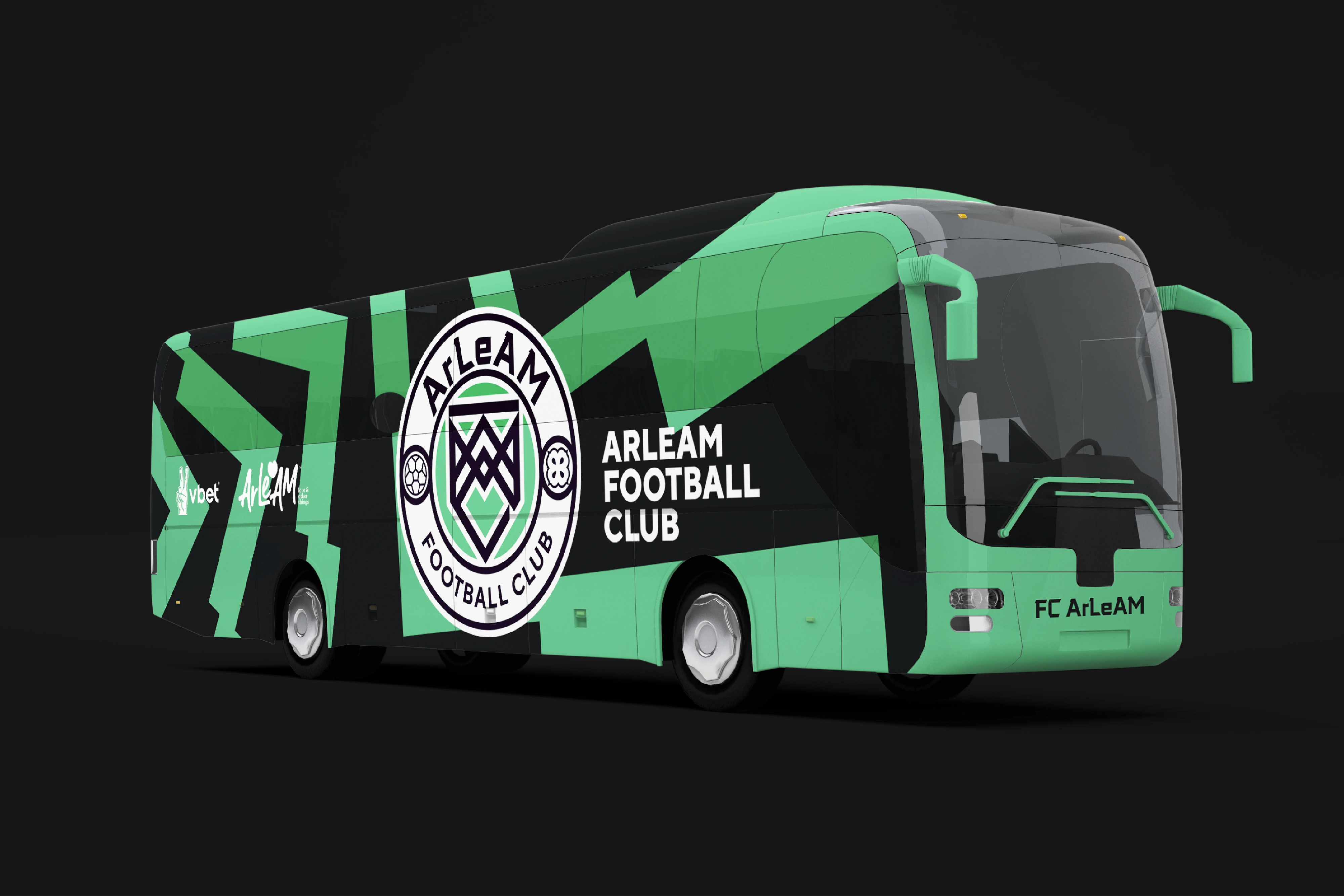
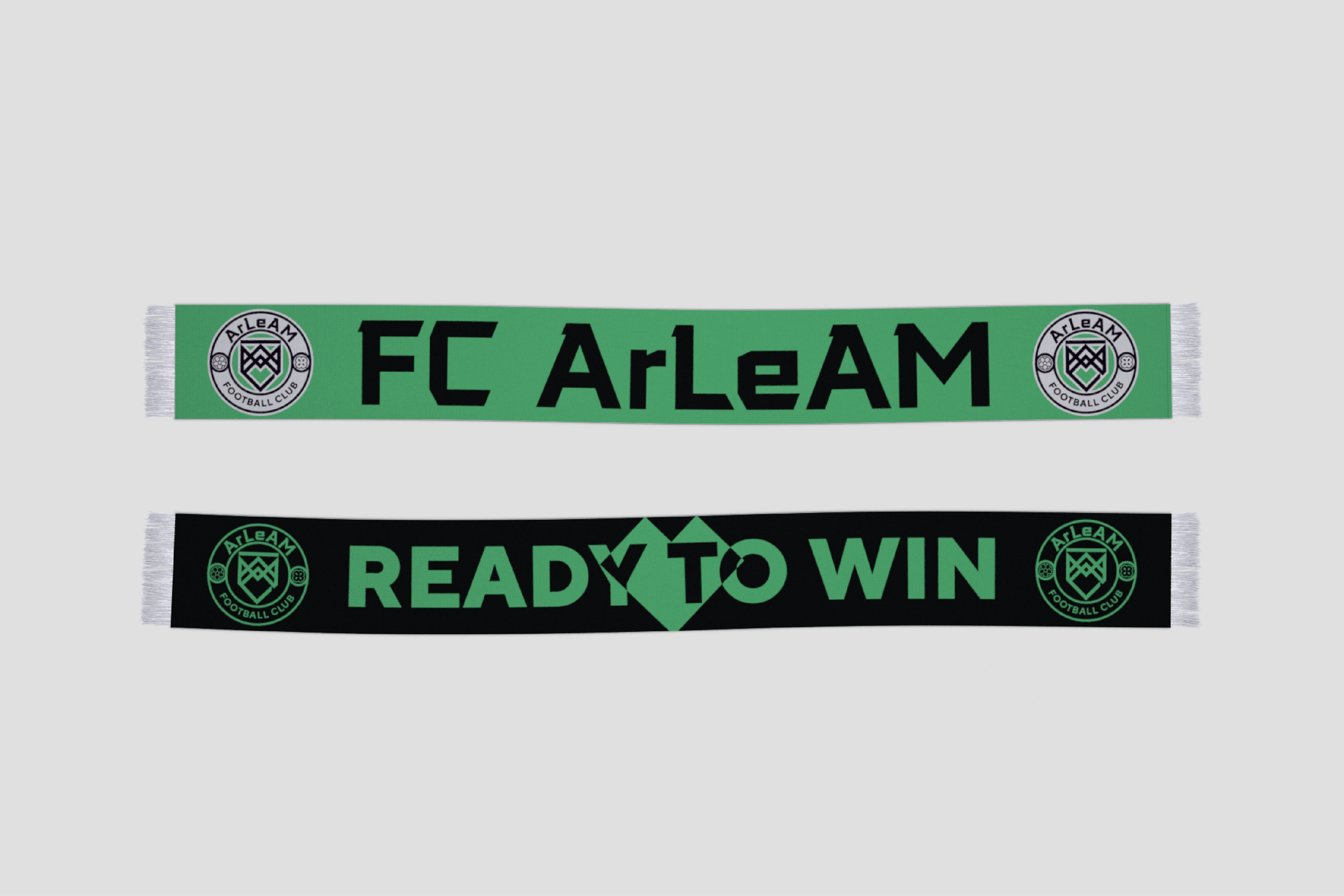
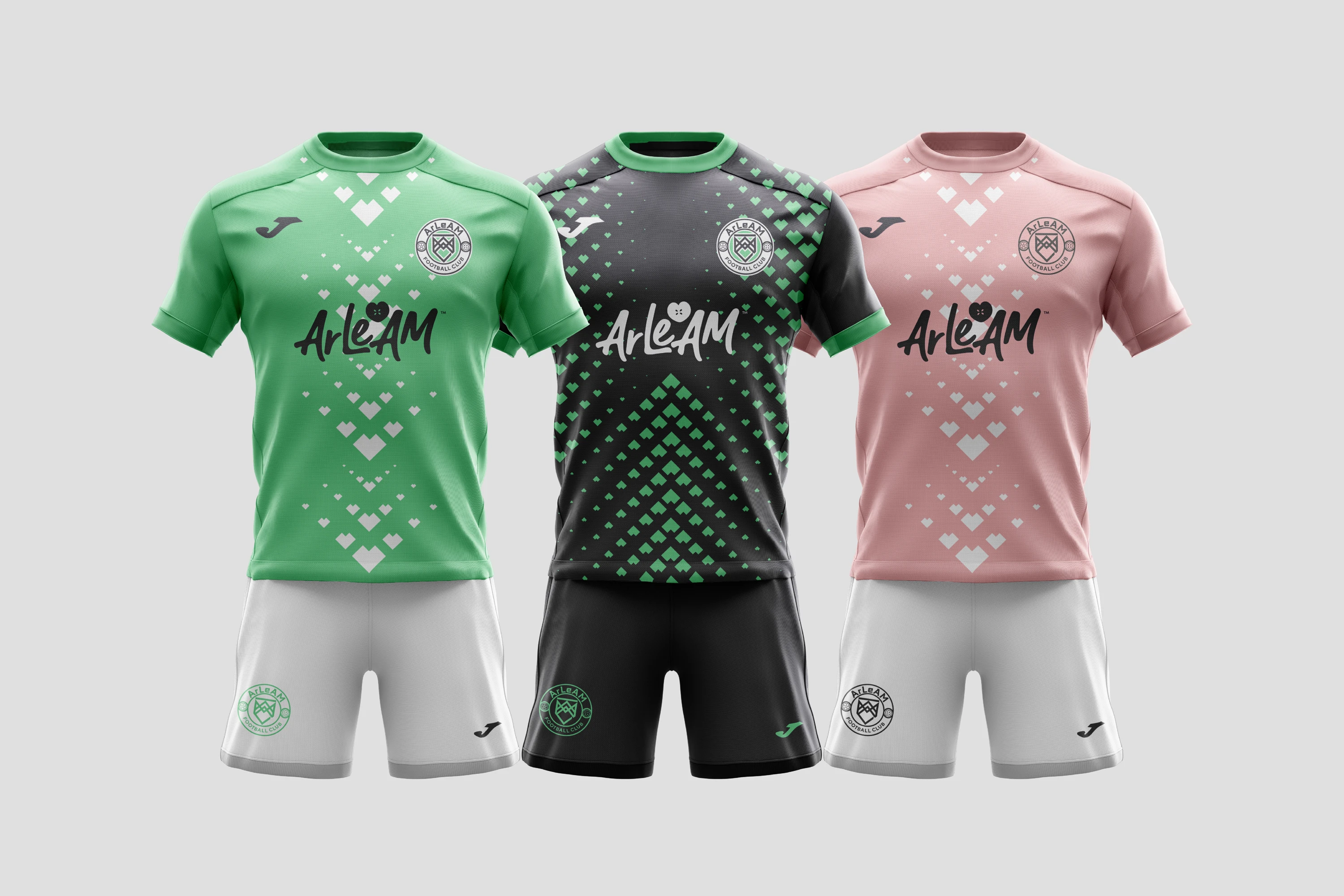
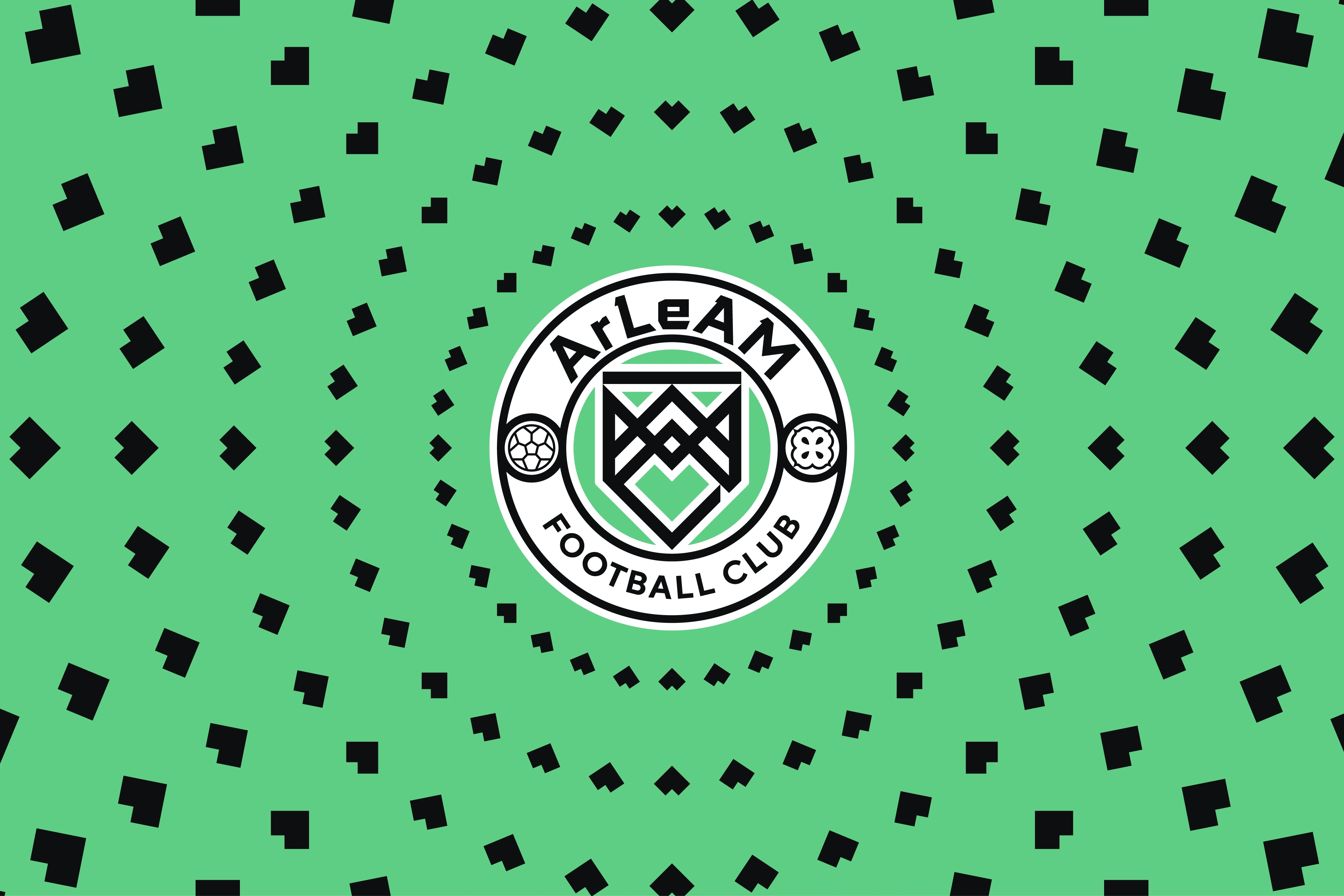
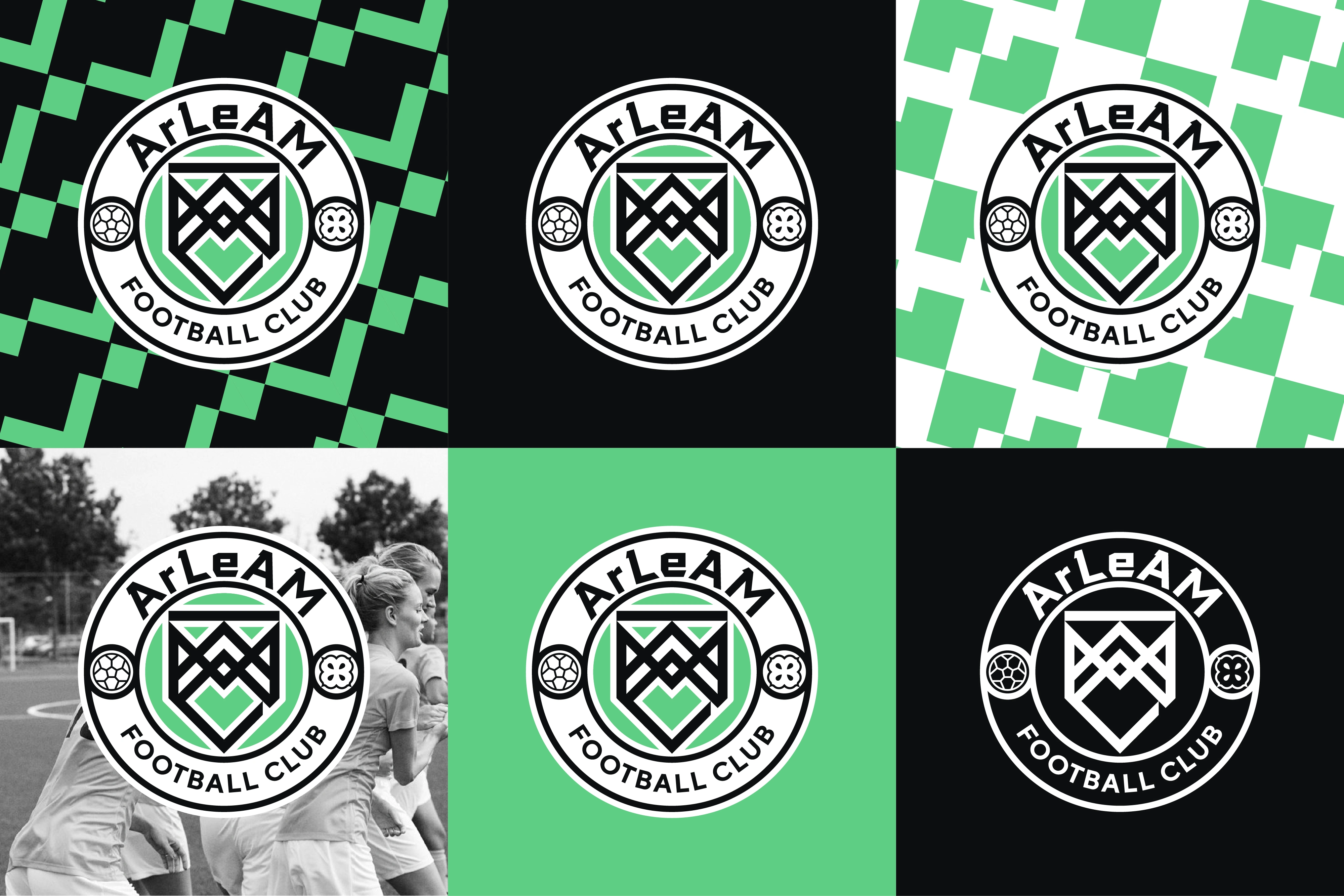
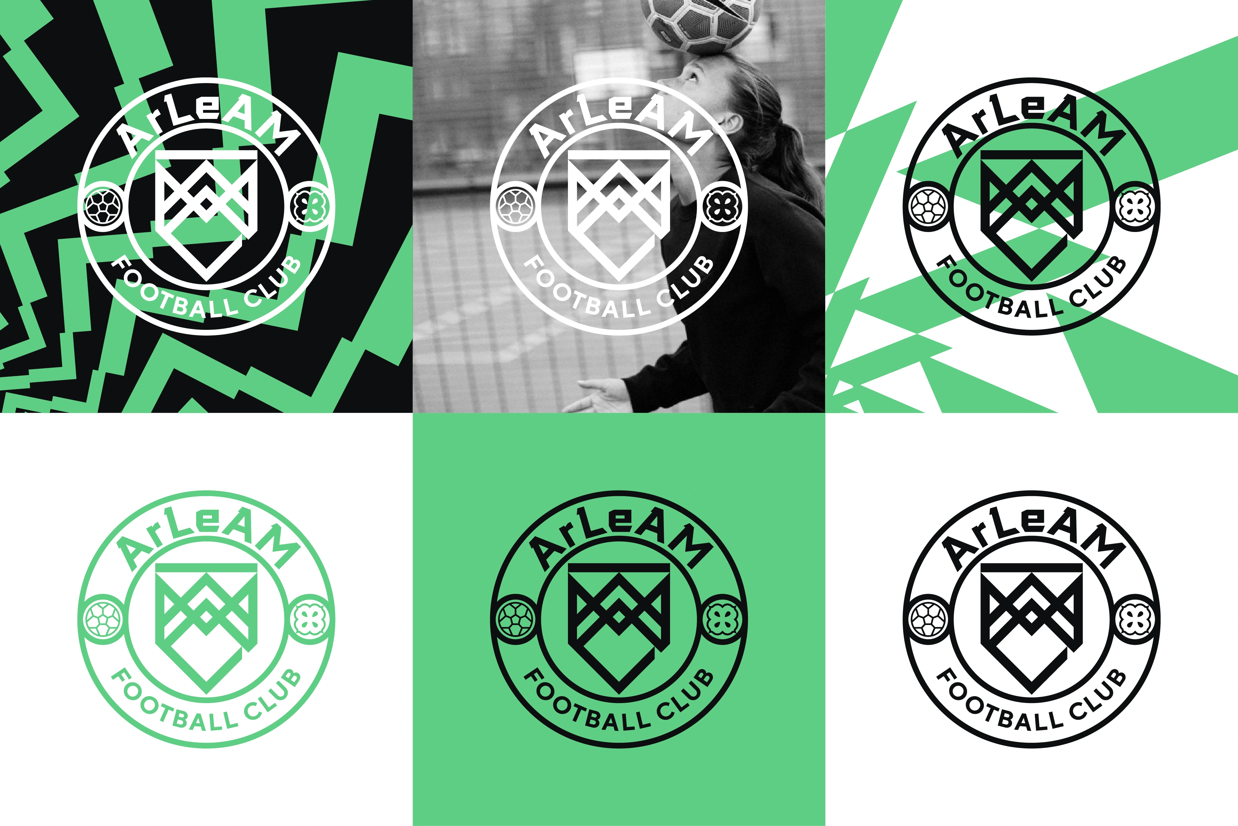
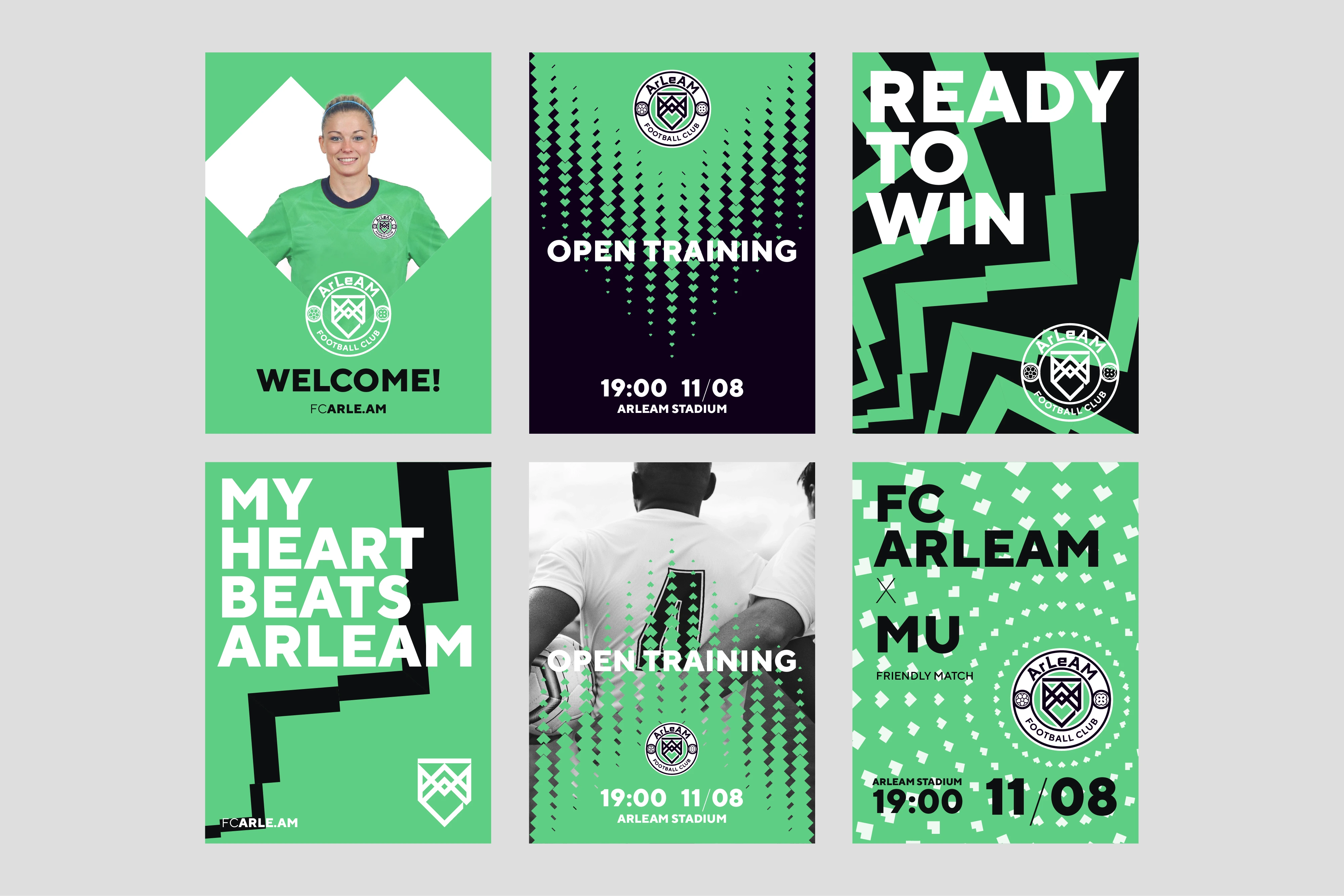
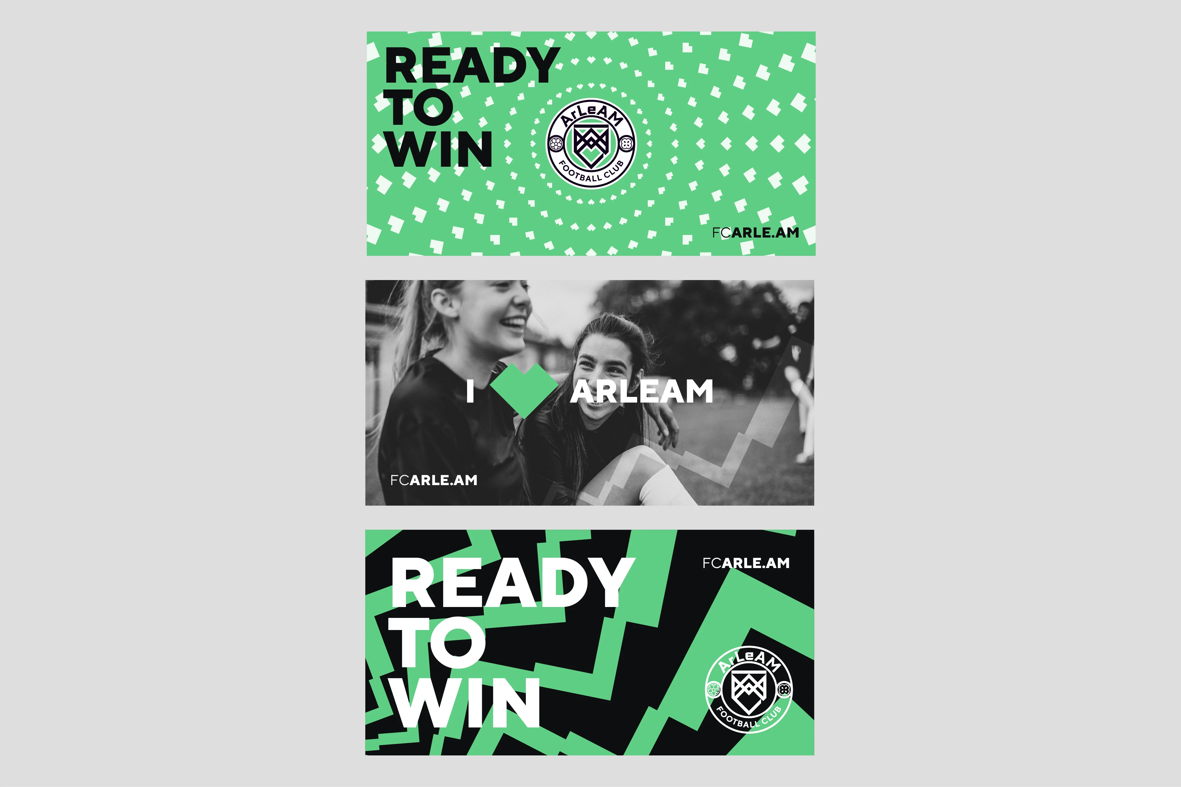
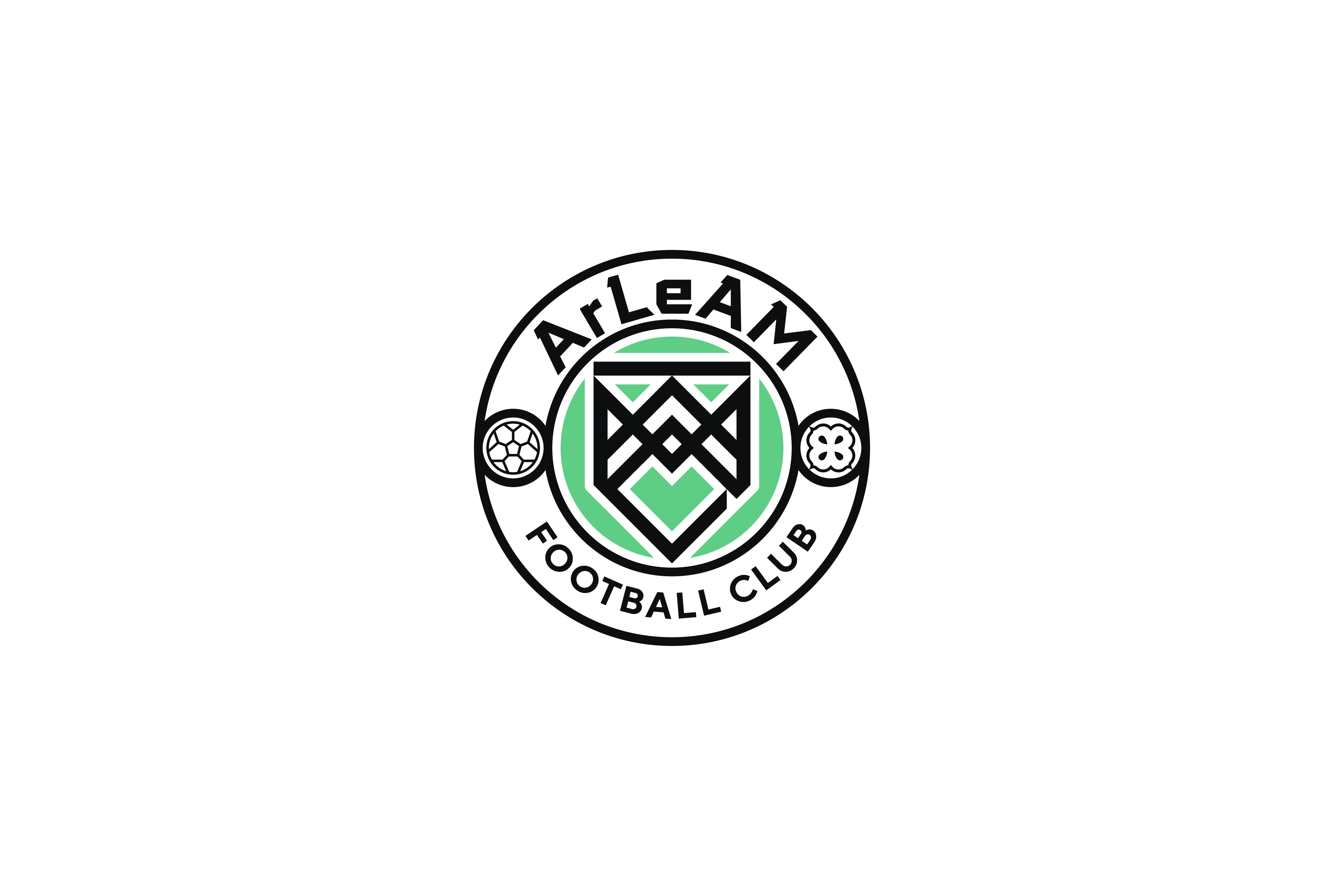
To maintain a connection to ArLeAM's origins, we have retained the green color scheme but adjusted the tone. The team's crest logo showcases the initials "A," "L," "A," and "M," representing the names of the team owner's children, from which the company's name is derived. These letters form a concealed heart symbol within the negative space of the logo. As a secondary symbol, a flower icon is incorporated into the logo, featuring four leaves and four seeds, symbolizing the family values of the company.
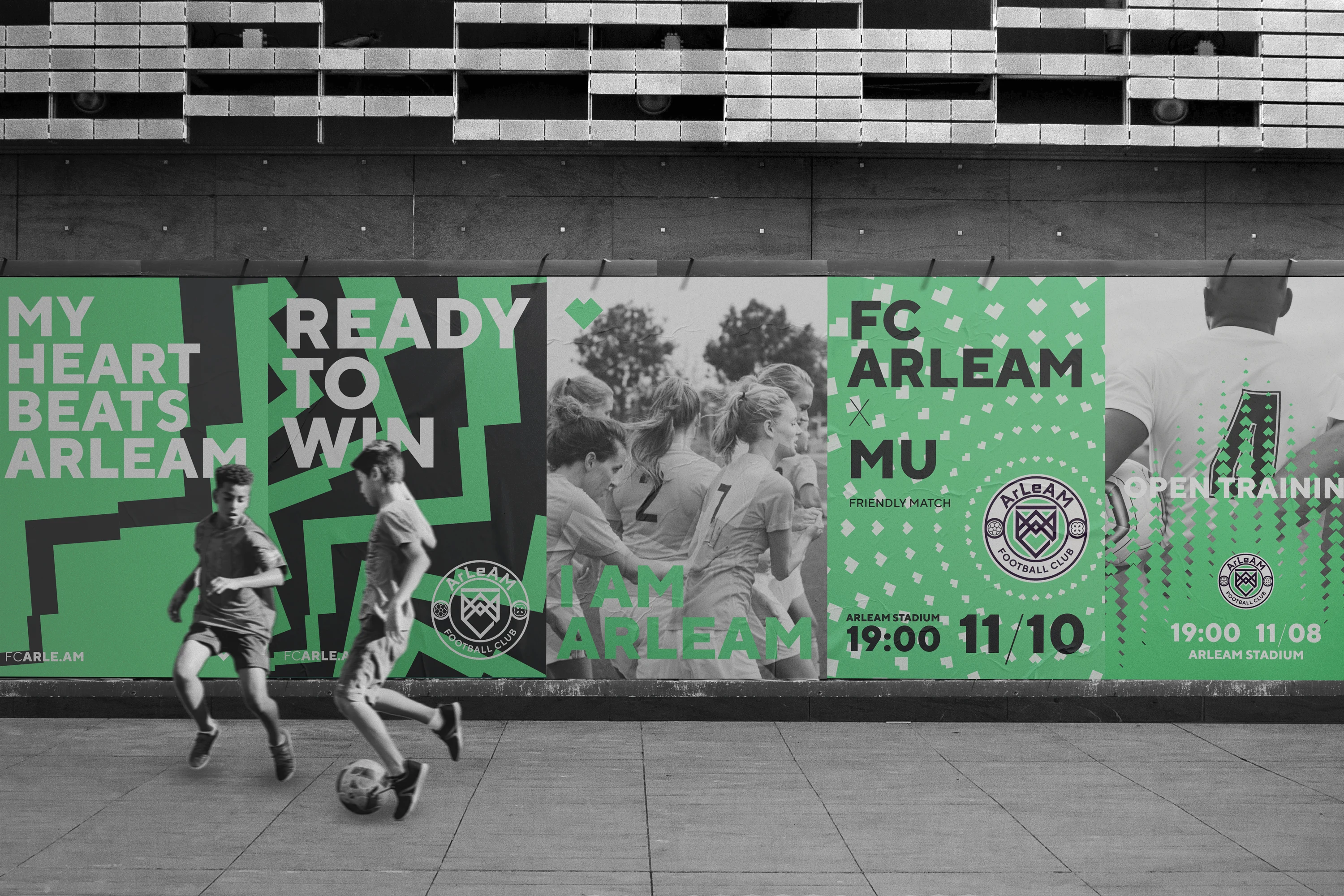
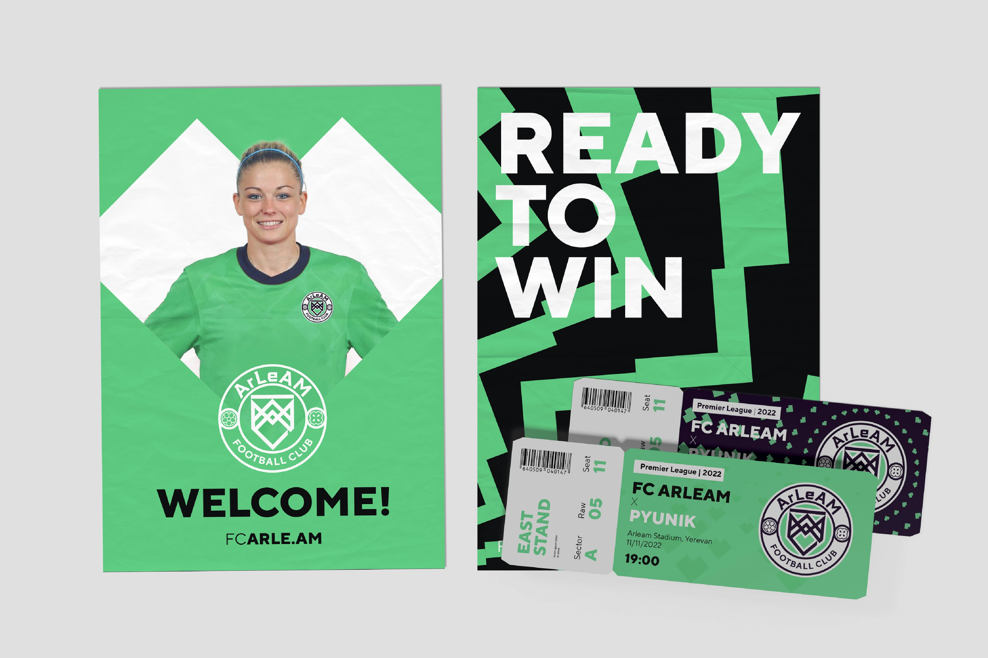
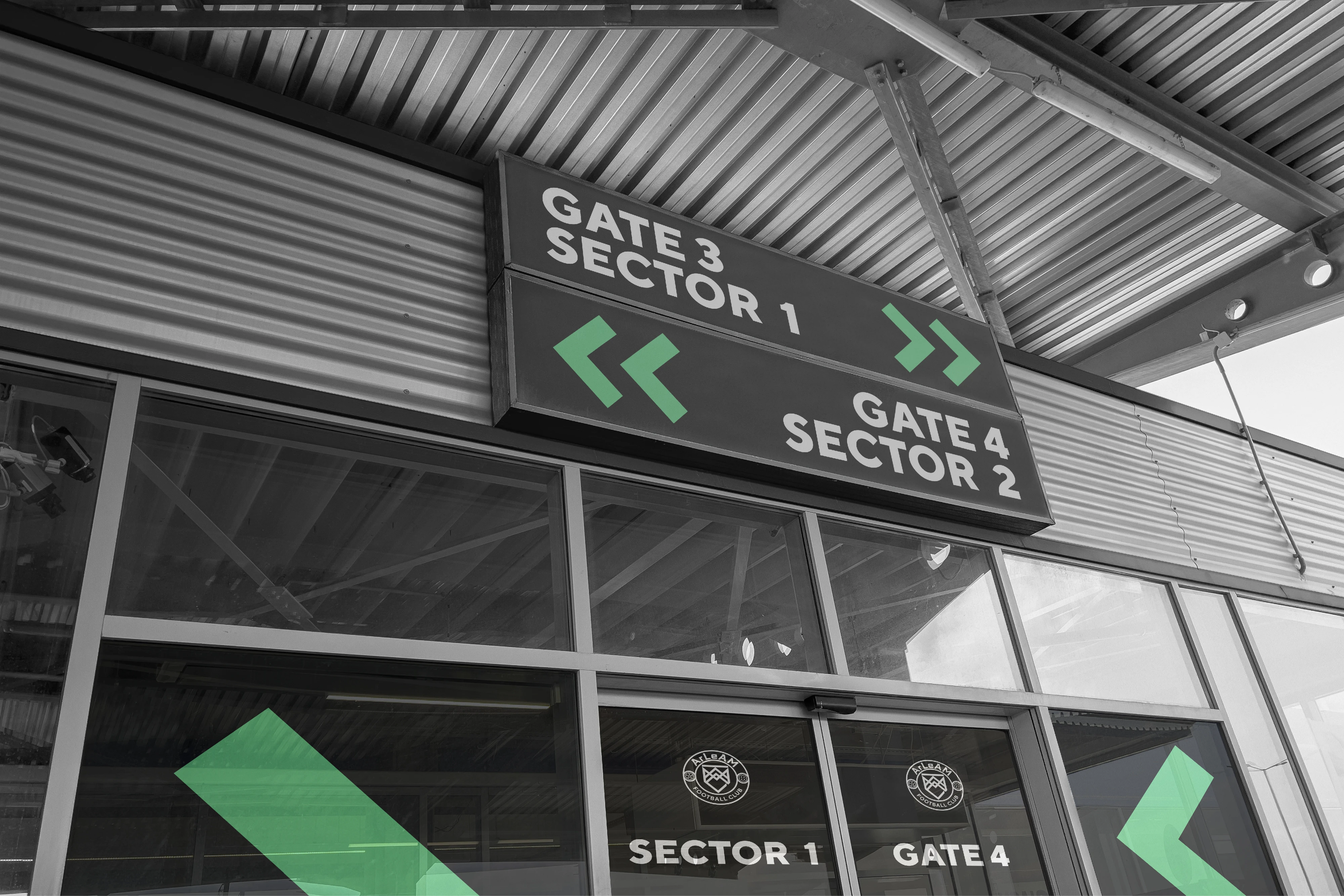
Using the logo's elements, we have developed a series of dynamic patterns to complement the brand's visual identity.


Like this project
Posted Mar 3, 2026
FC ArLeAM is a football club founded by a food company. Its crest hides a heart within the initials A, L, A, M, inspiring dynamic brand patterns.
Likes
1
Views
1
Collaborators