Wonky: Celebrating Food Differences

Rubik Design


The problem
Imperfect produce has a marketing problem, not a quality problem. Most "ugly food" brands lean on guilt — waste statistics, apology framing, discount positioning. That framing tells customers they're settling. Wonky needed the opposite: a brand that makes a crooked carrot feel like the better buy.
The idea: imperfection as the identity
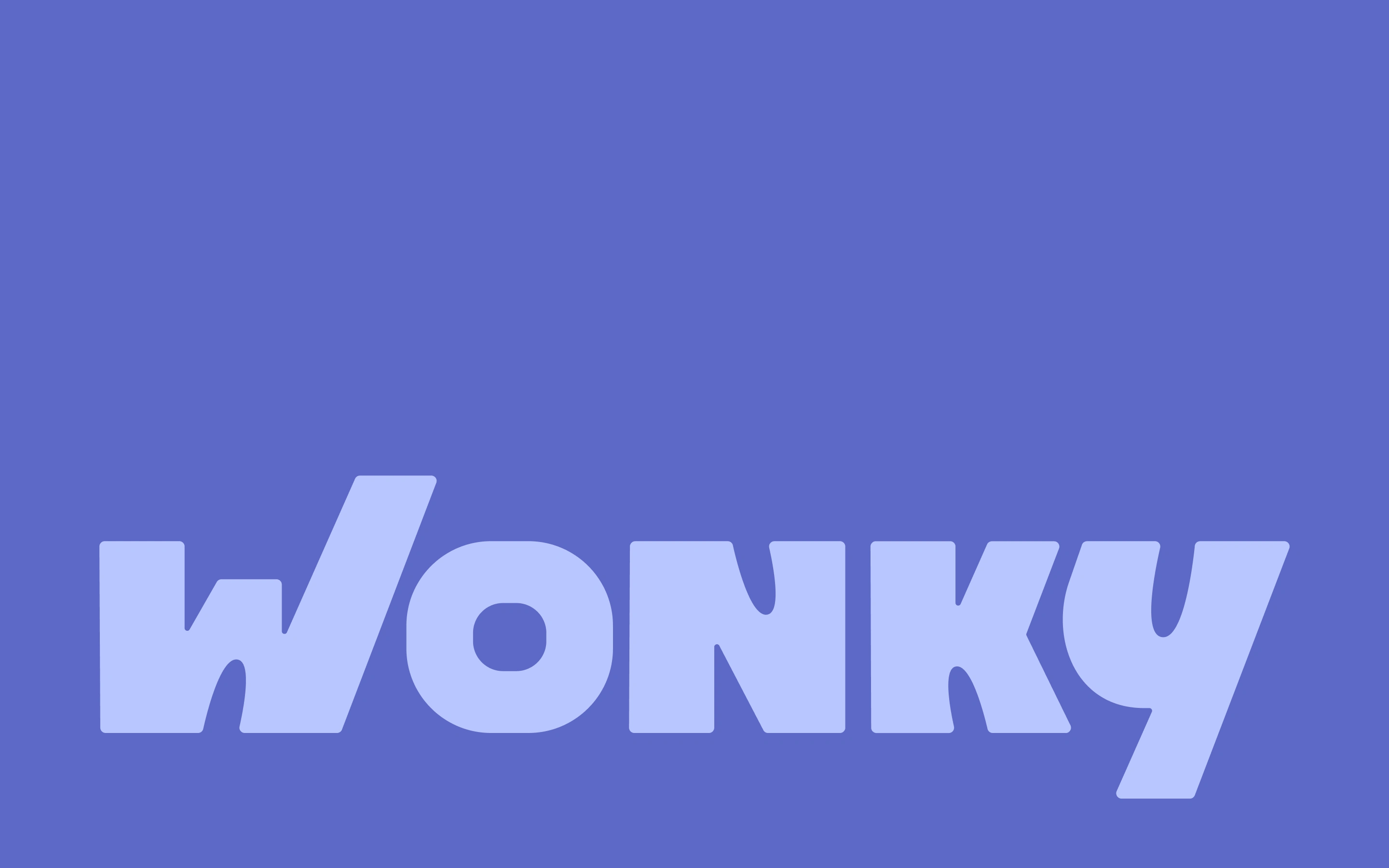
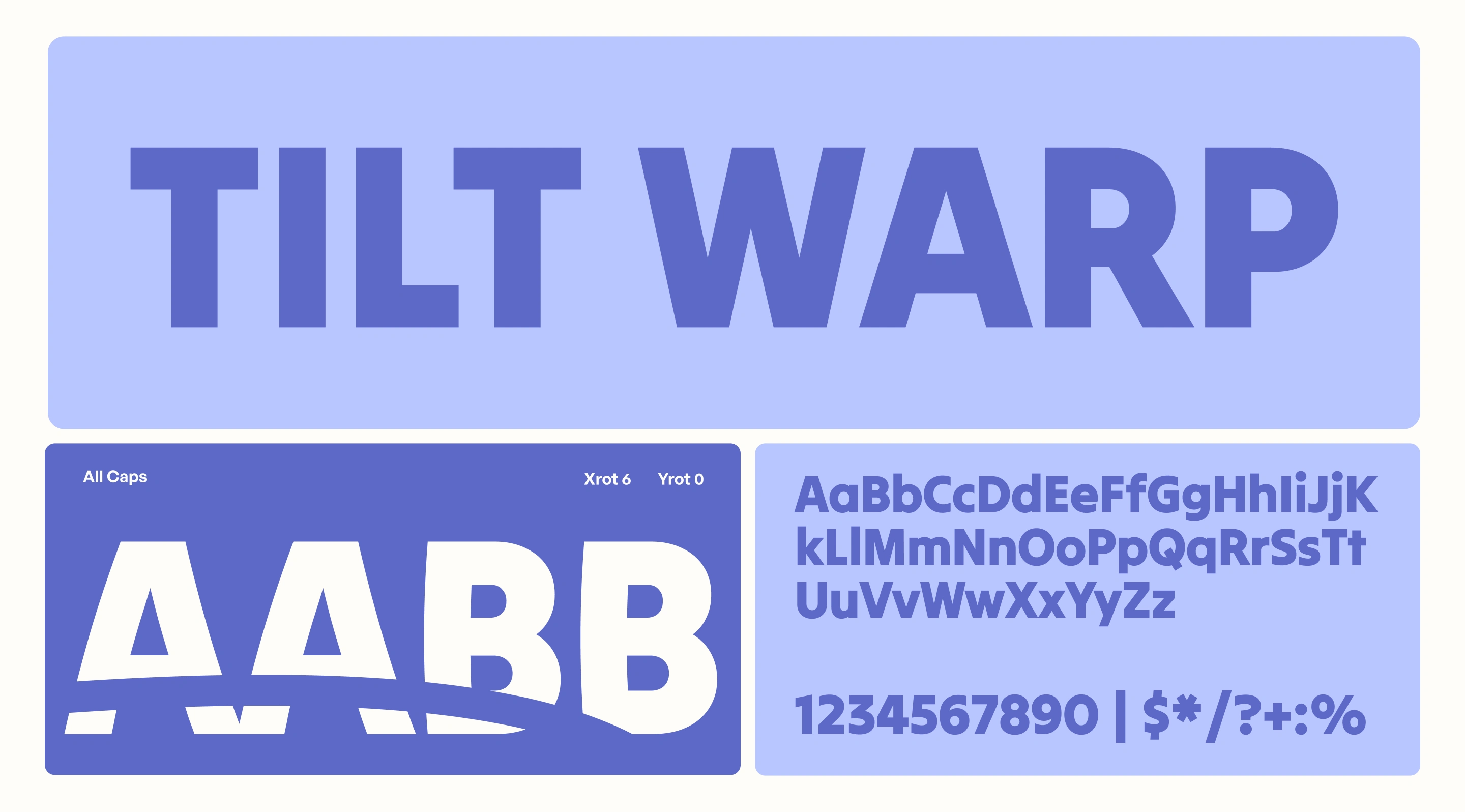
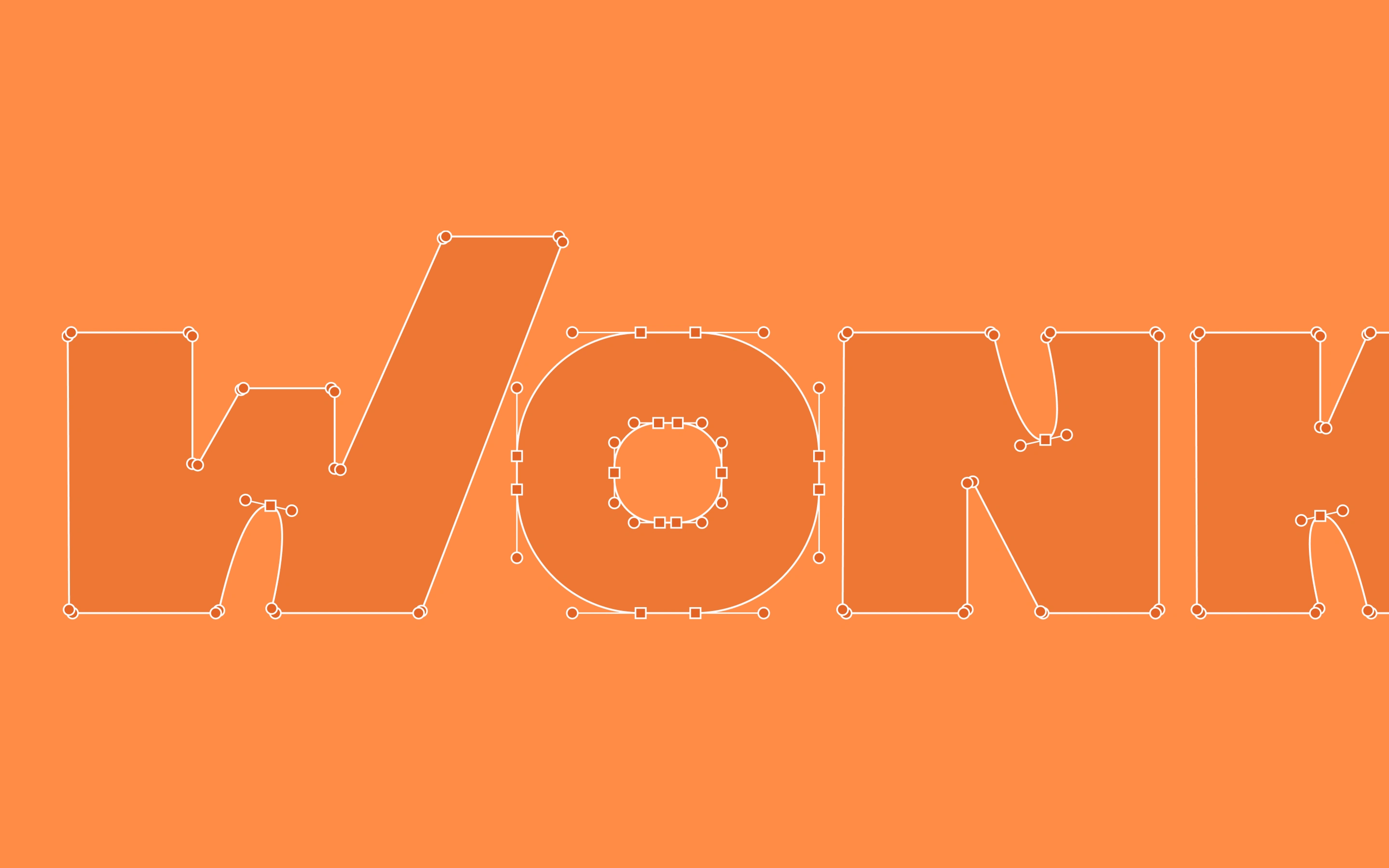
We built the whole system around variation. No two shapes repeat. The logotype bends, the illustrations wobble, the packaging never lines up the same way twice. Nothing in the brand is symmetrical, because nothing in nature is.
What we designed
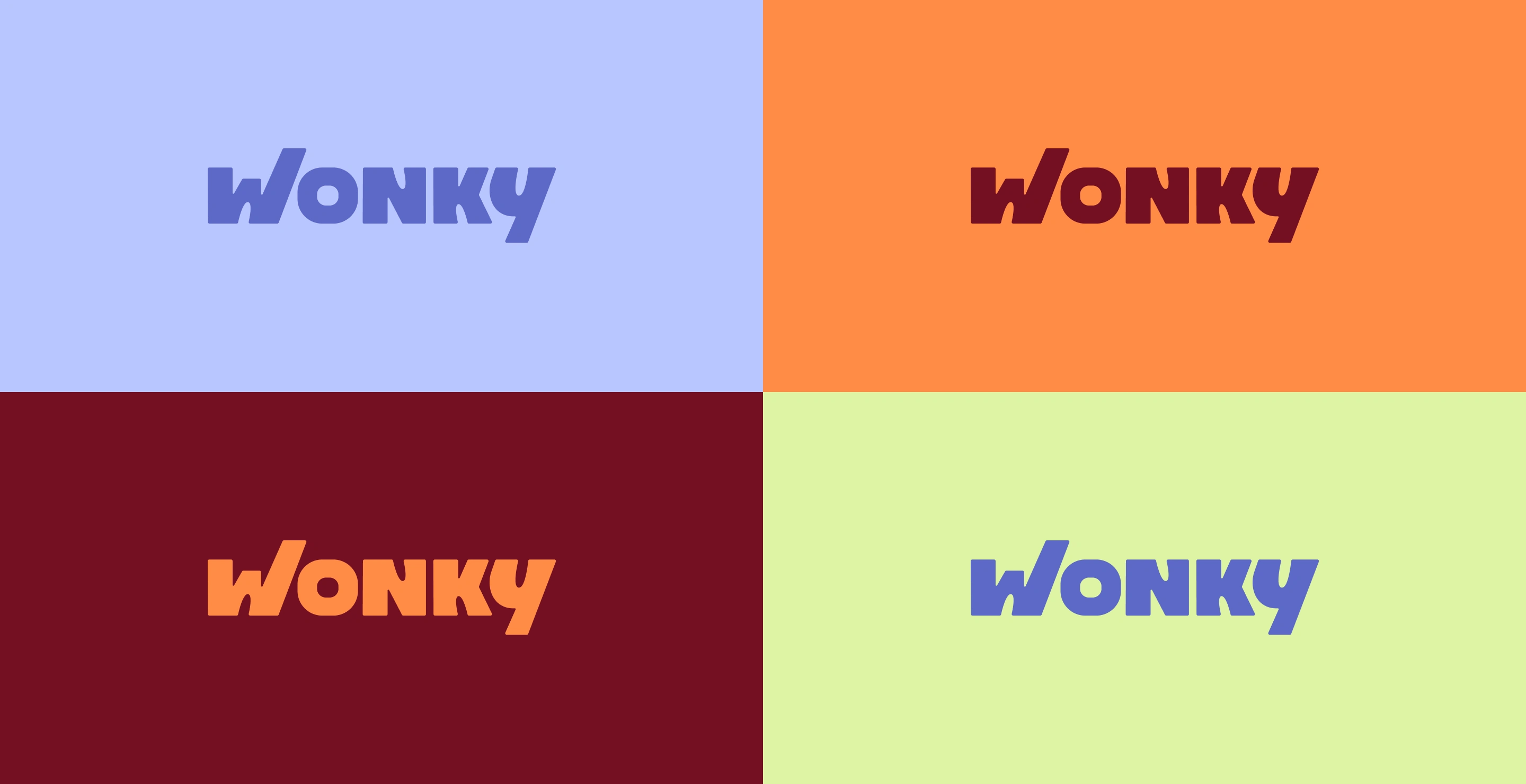
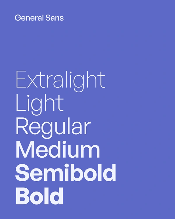
Logotype and wordmark, with variable weight for shape and hierarchy
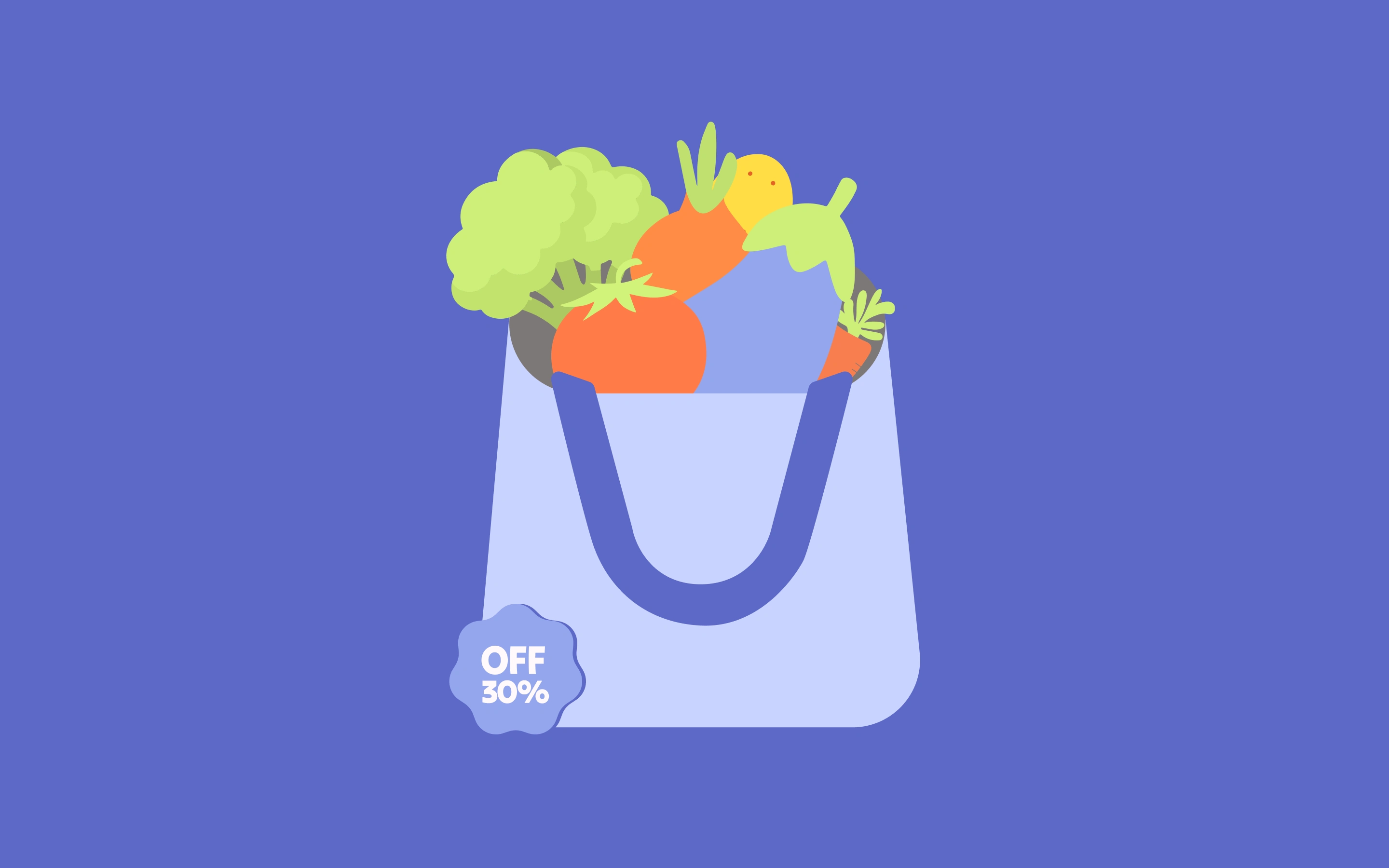
Illustration system — a library of rescued produce characters, each visibly different
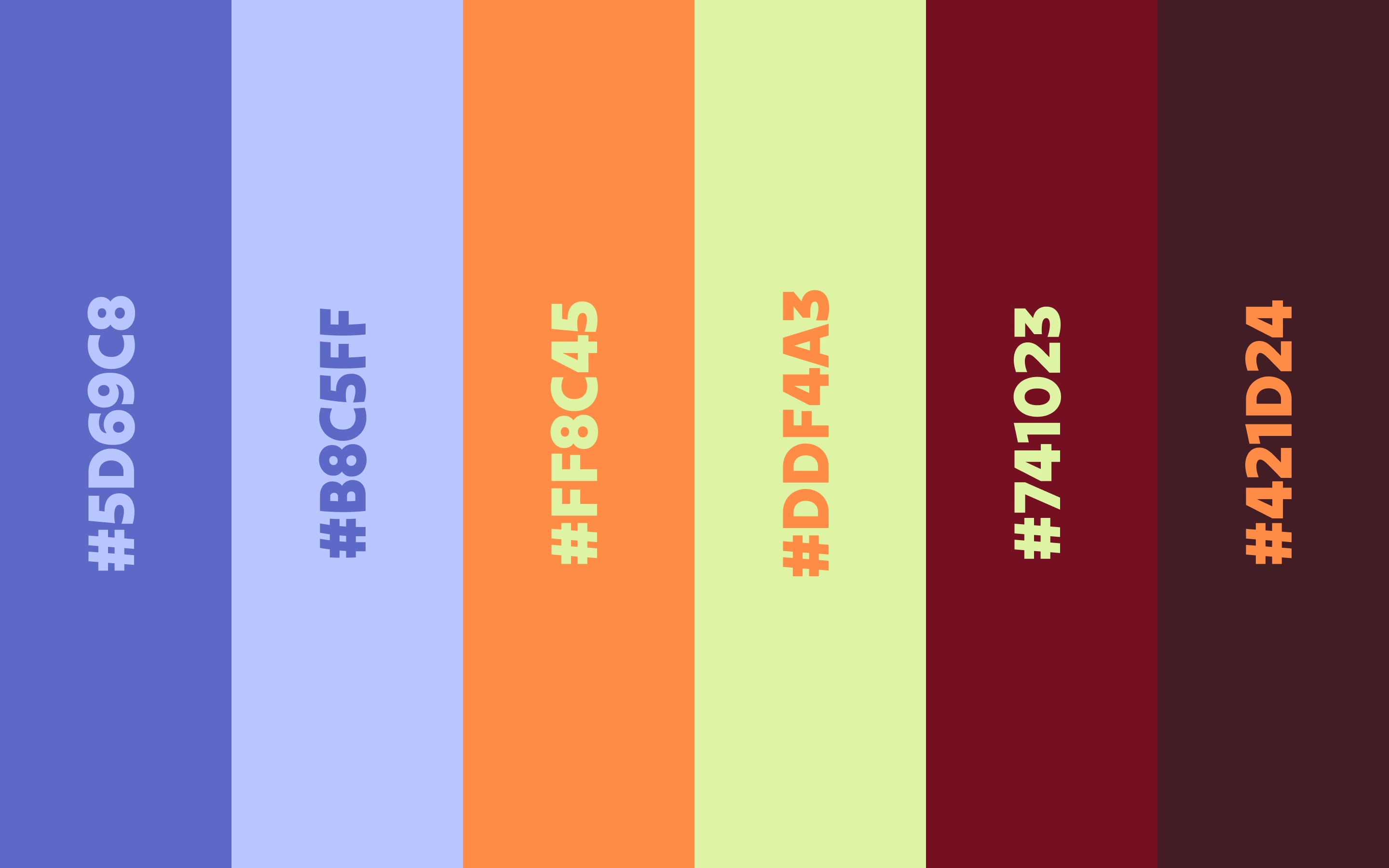
Colour palette pulled from real produce, not from a trends board
Packaging and label system across box sizes
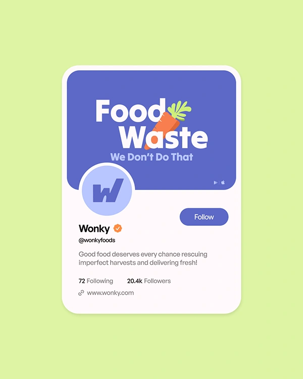
Motion identity — animated logo, transitions, and social loops built in After Effects
Social and campaign templates the team can run without a designer
The rules we set
Never apologise for the produce
Never straighten a shape to make a layout tidy
Show the food itself, unretouched, at every opportunity
Outcome
A brand system that works from a delivery box to a 6-second social loop, and one the in-house team can extend without breaking. [Add a real result here if you have one — launch date, retail rollout, campaign reach.]
Tools: Figma, Adobe Illustrator, Adobe After Effects
Links
Full case study on Behance → https://www.behance.net/gallery/253934861/Wonky
More branding work → https://www.rubik.design/work
Talk to us → https://www.rubik.design
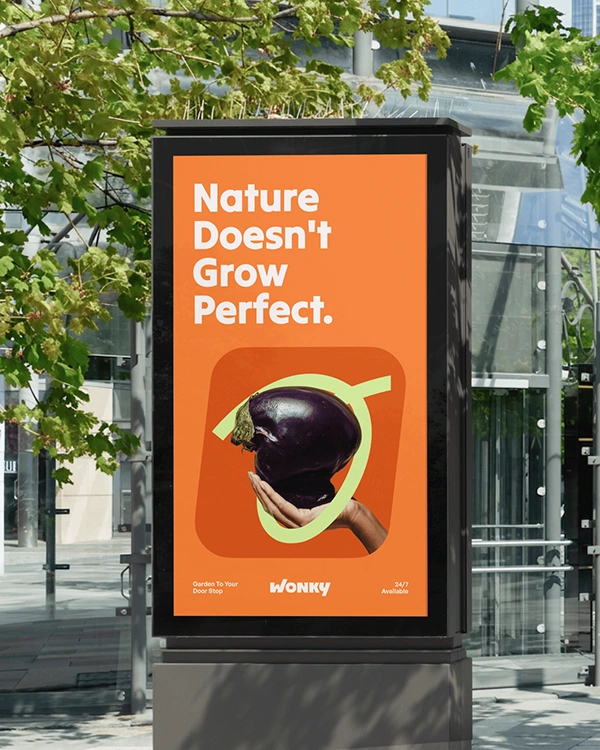
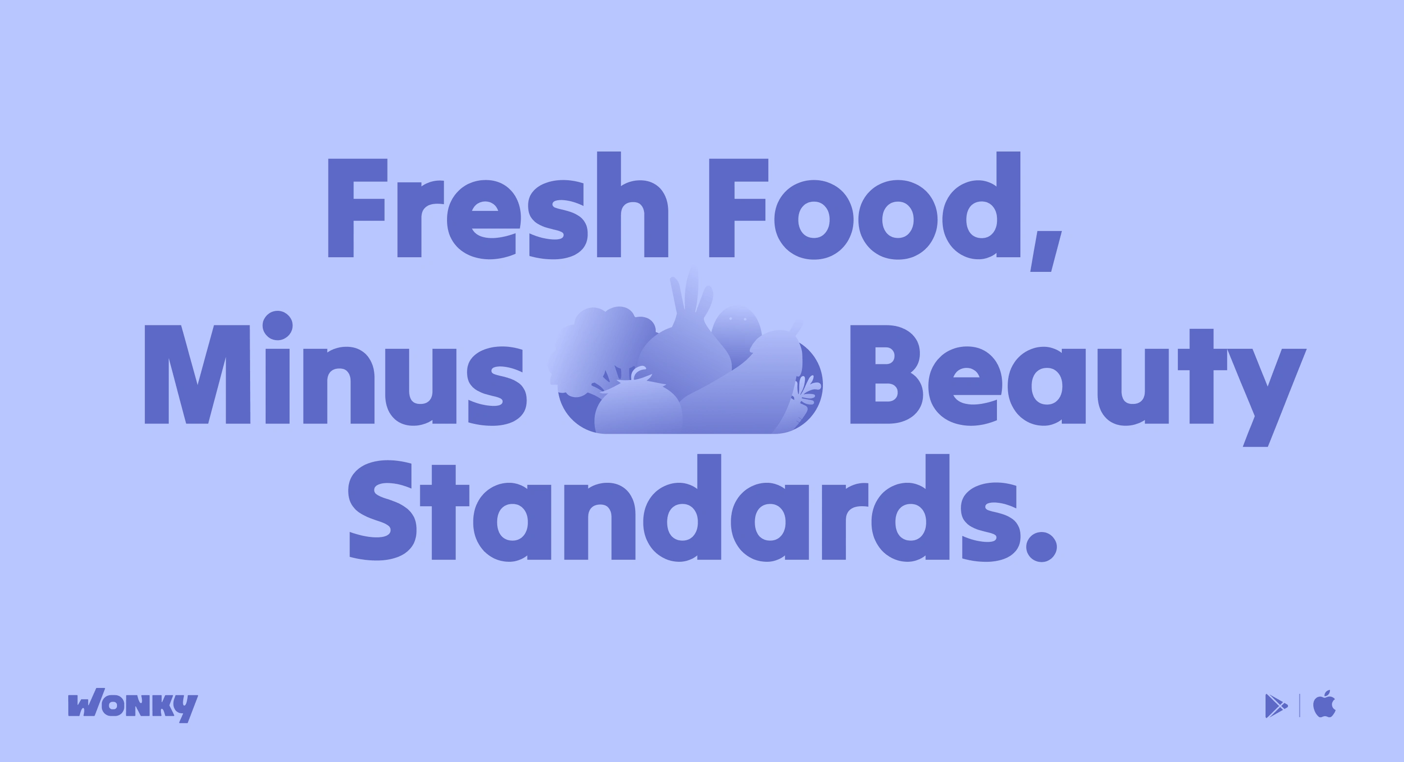
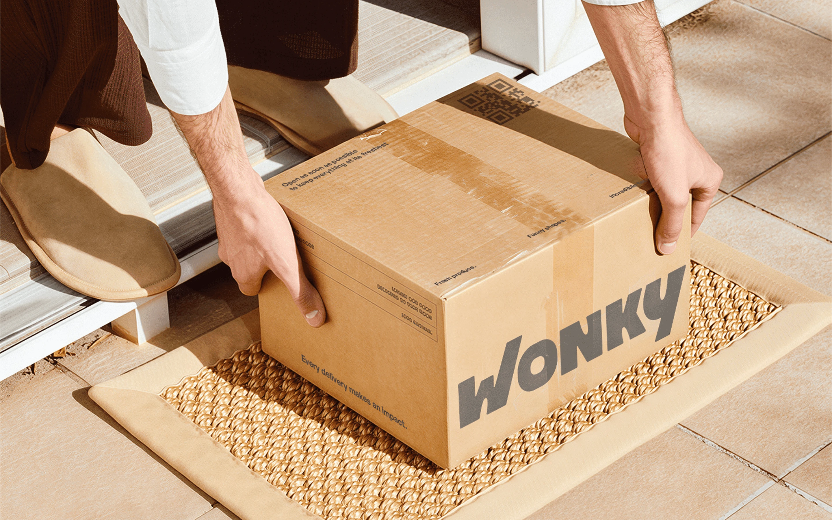
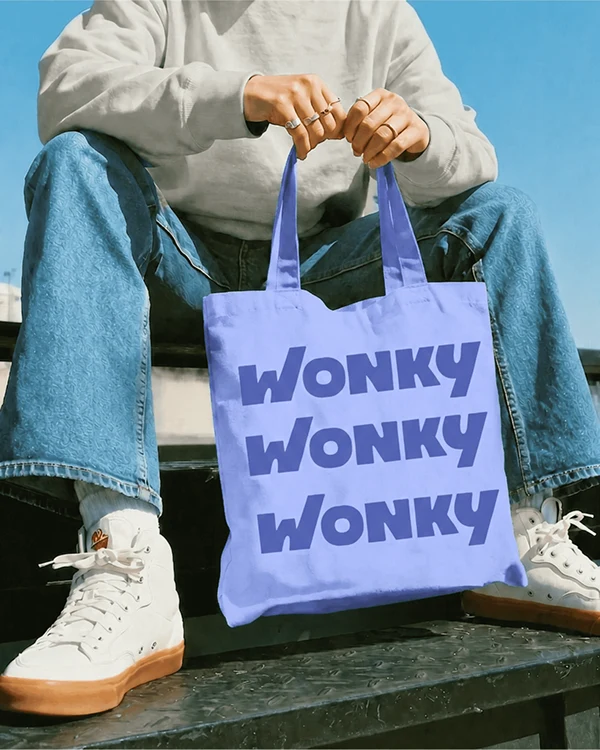
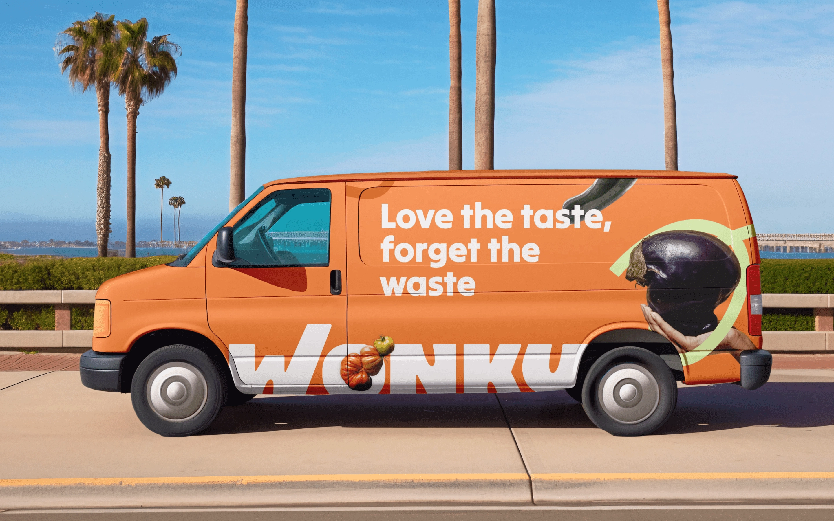
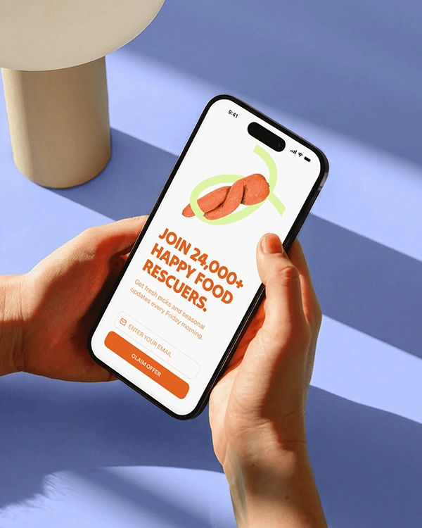
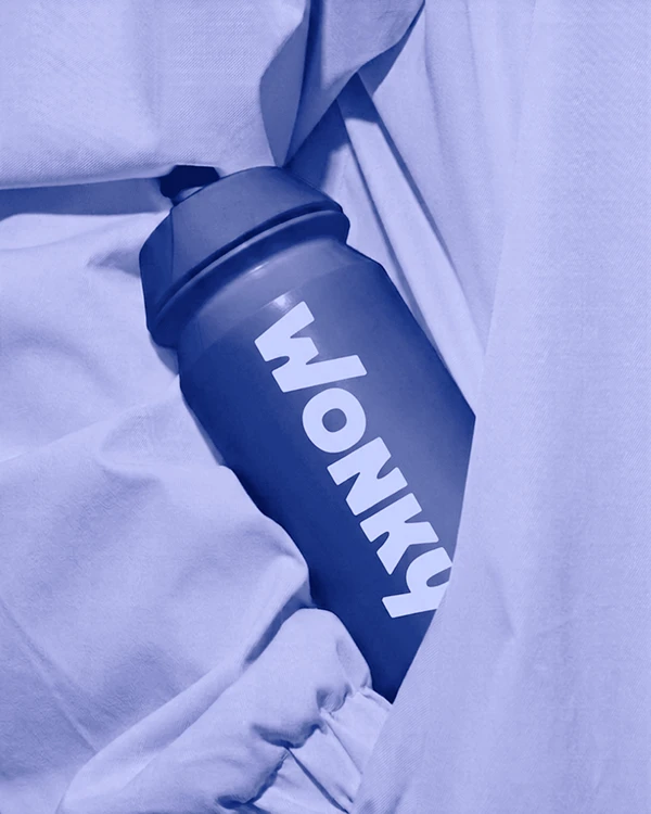
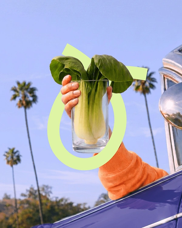
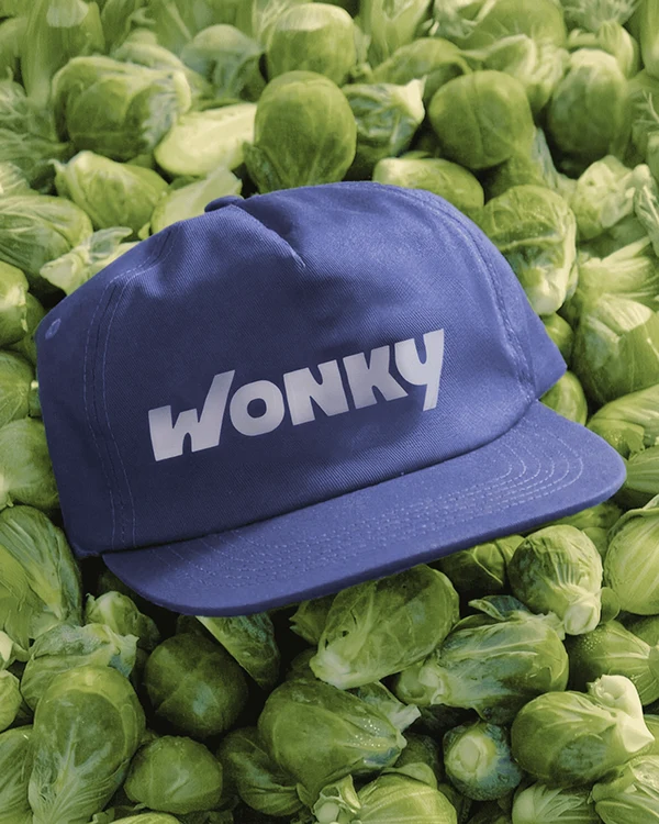
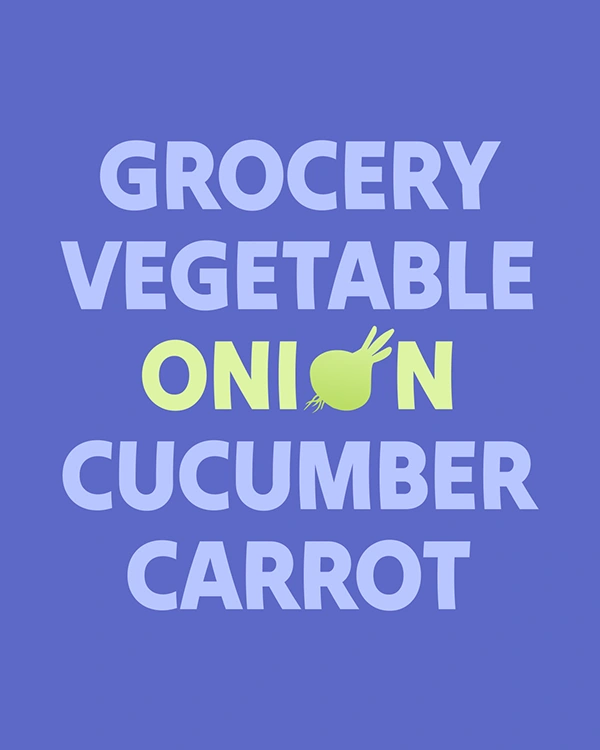
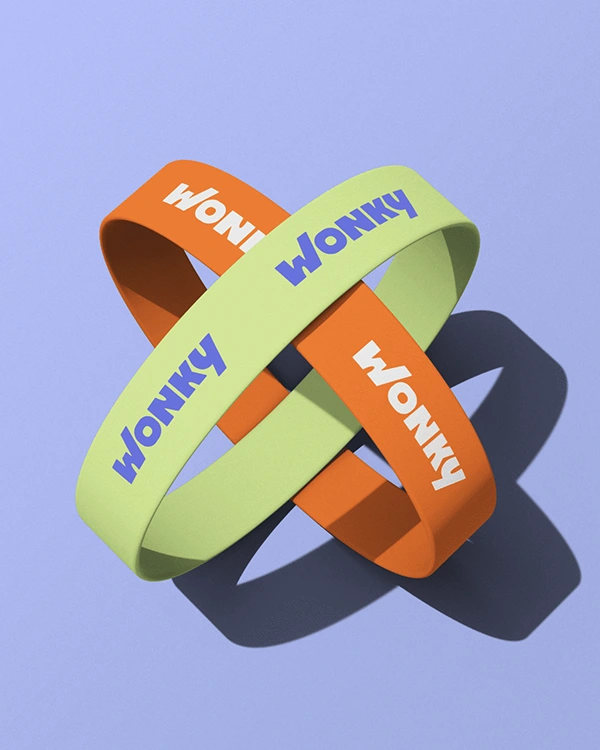
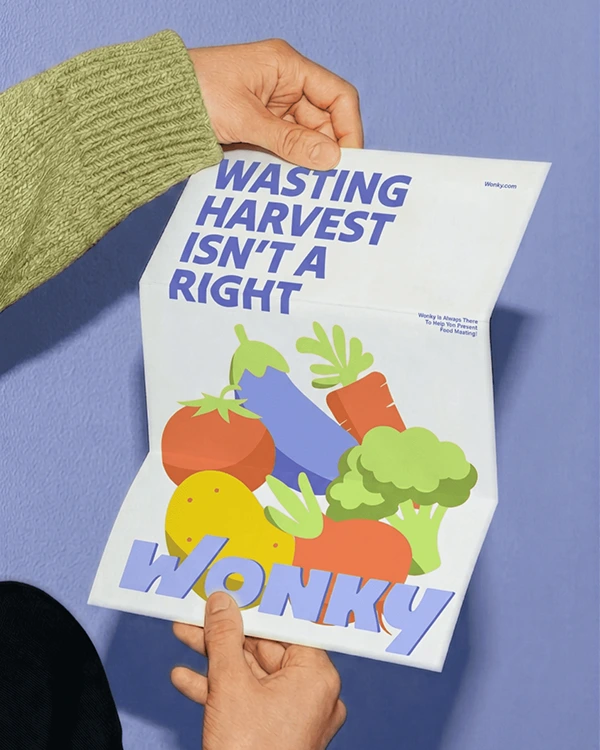
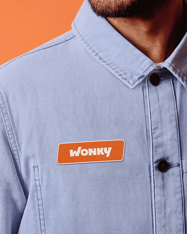
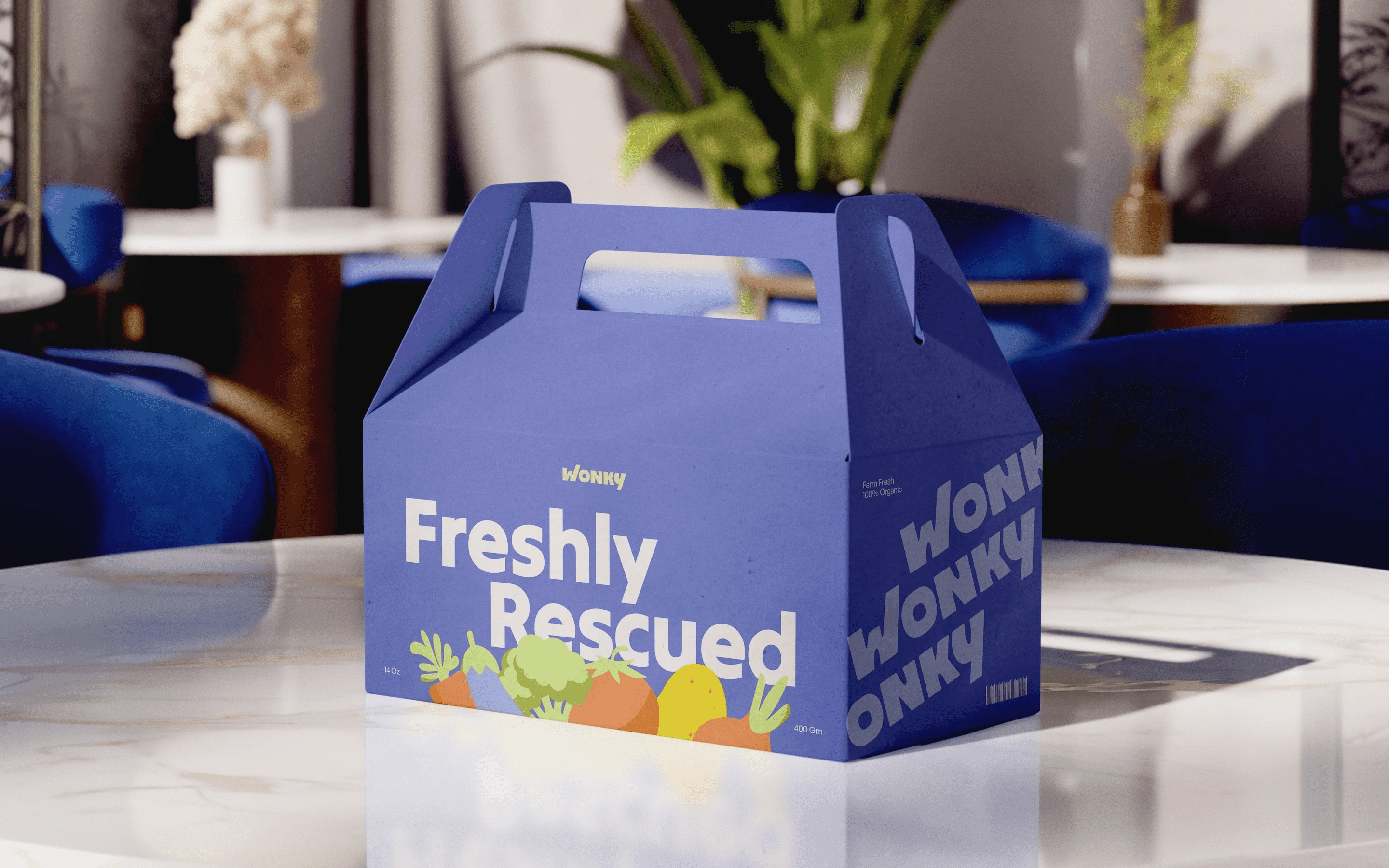
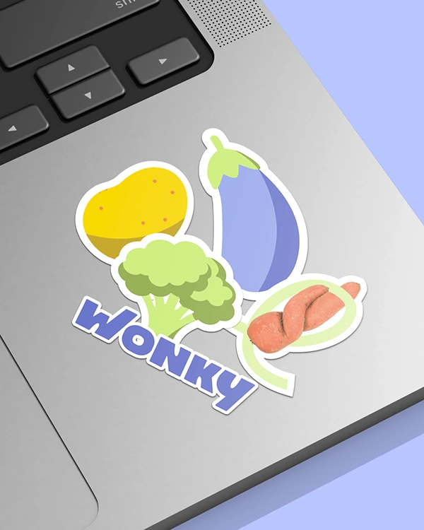
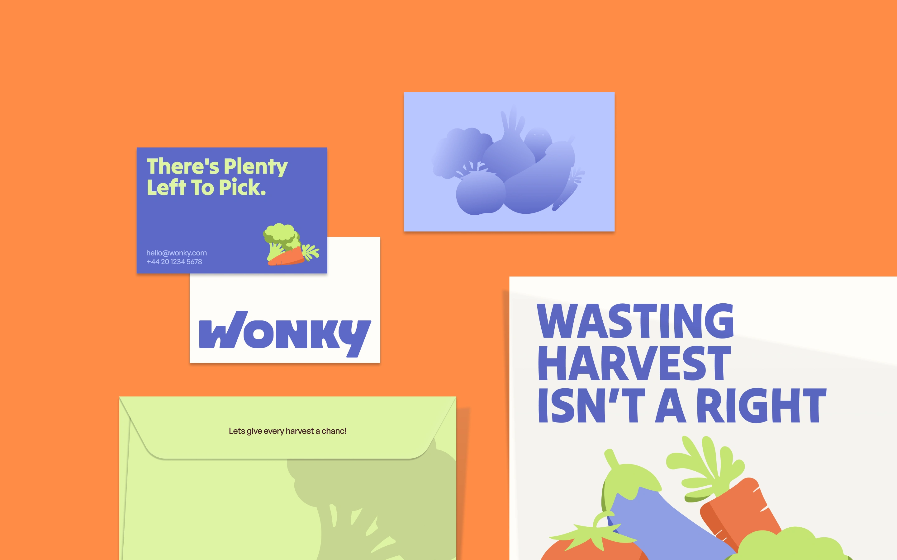
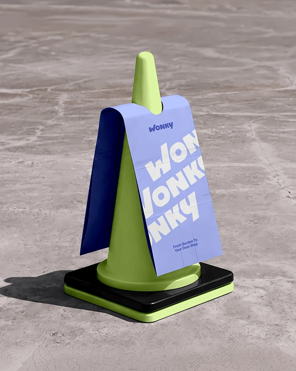
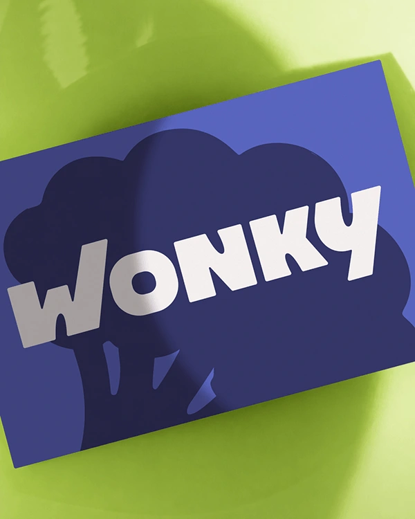
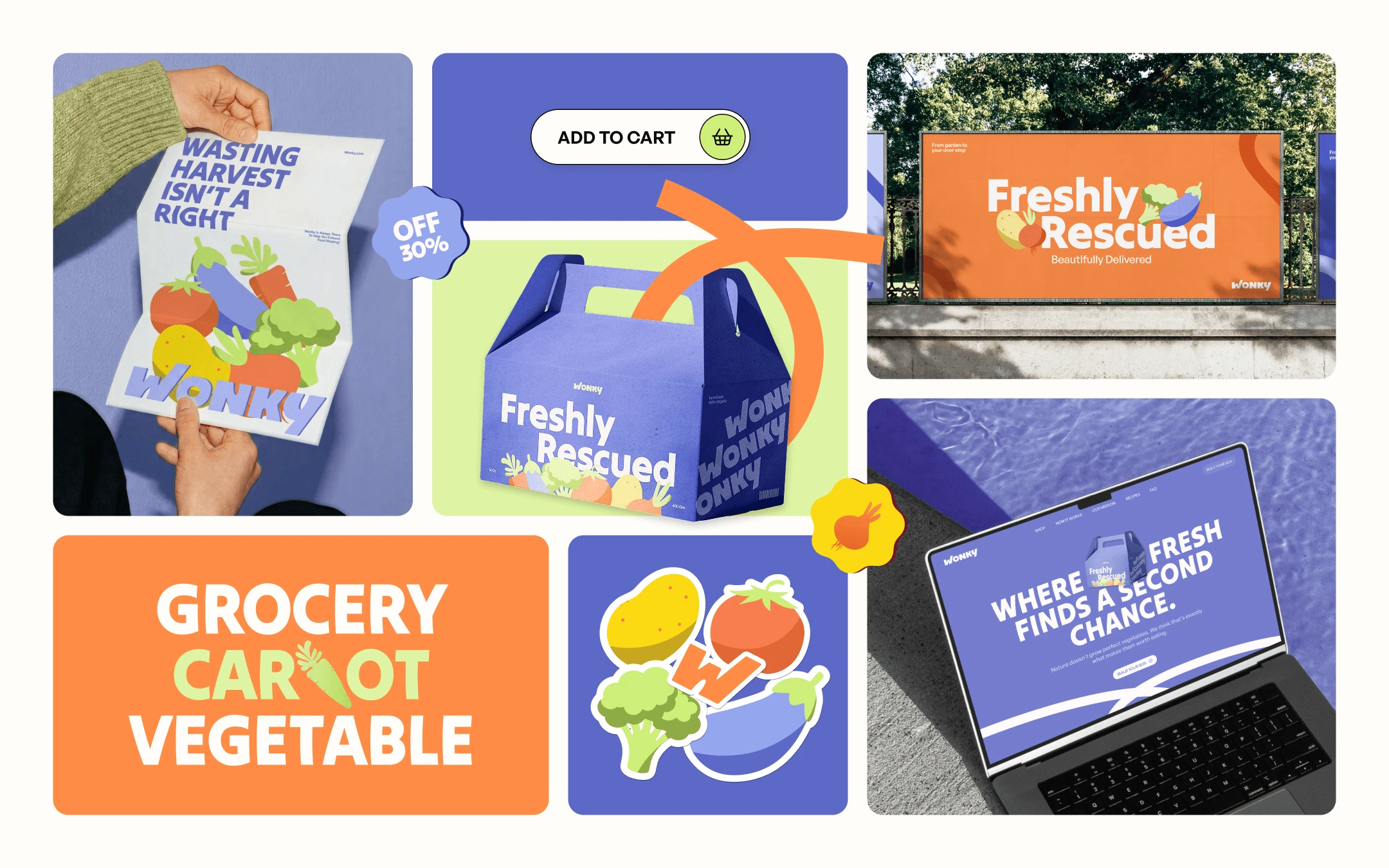
Wonky is a grocery delivery brand built around rescued fruits and vegetables that don't meet supermarket beauty standards - but are just as fresh, nutritious, and delicious. Instead of hiding imperfections, the brand celebrates them. Every curve, bump, and unusual shape becomes part of the story.
The brand doesn't ask customers to compromise. It invites them to rethink what quality actually means. That shift became the foundation of the entire identity.
Nature is wonderfully unpredictable. Every rescued carrot, crooked cucumber, and oddly shaped tomato carries the same freshness, flavor, and nutrition as its picture-perfect counterpart.
Wonky exists to celebrate food differences.
Because good food shouldn't go to waste.
.............................................................................................................................................
Let’s bring your vision to life.
Like this project
Posted Aug 21, 2026
A grocery brand for rescued produce. We built an identity where no shape repeats — because nothing in nature does. Logo, packaging, illustration, motion.