Designing a mobile shopping experience

Rubik Design


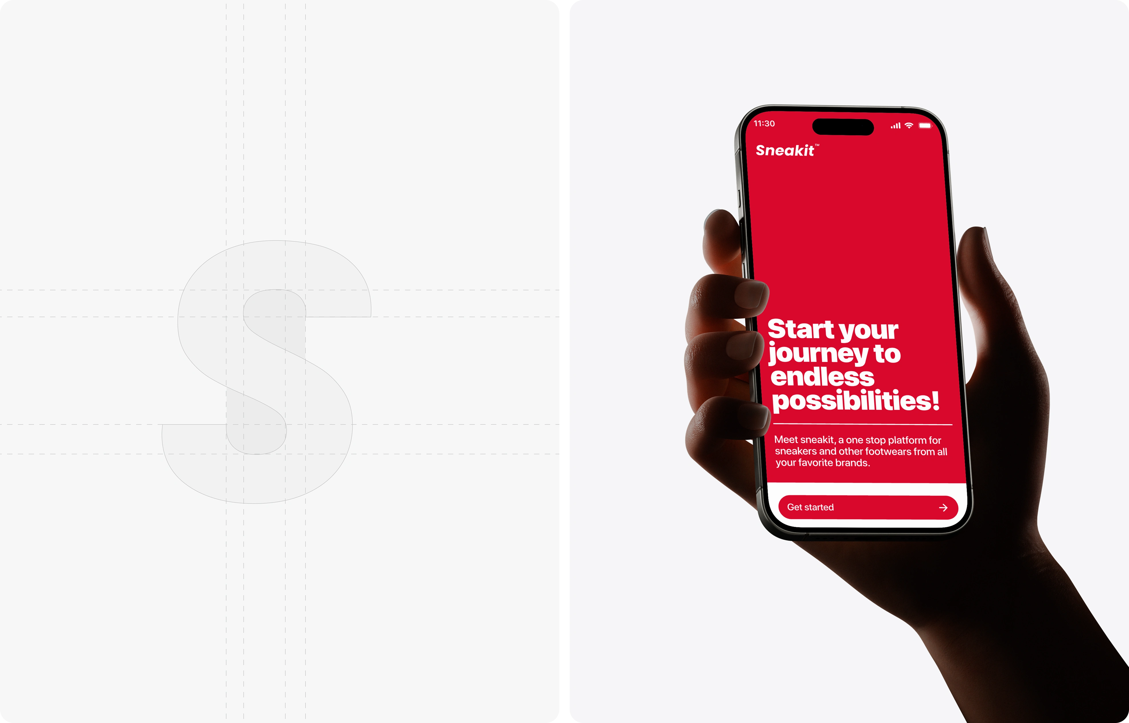
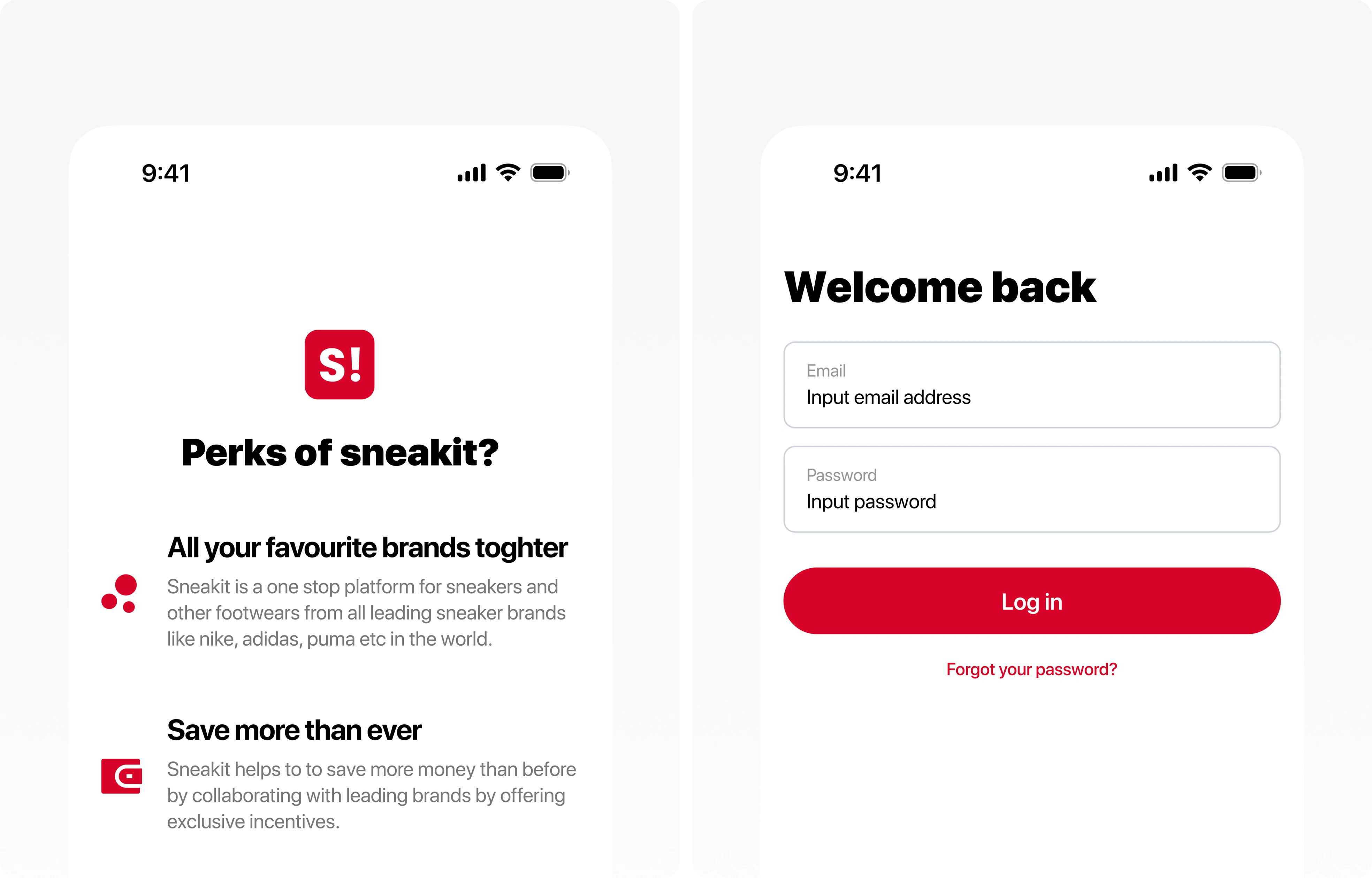
Sneakit is a mobile-first sneaker marketplace. The brief: get someone from opening the app to completing a purchase with as little friction as possible, on a category where browsing is half the fun. Speed and discovery pulling against each other is the entire design problem.
The problem
Most shopping apps solve one and break the other. Discovery-heavy apps bury checkout under filters and feeds. Conversion-heavy apps strip out everything that makes browsing enjoyable. We needed both — an app you'd scroll for fun that still gets you to checkout in a few taps.
What we designed
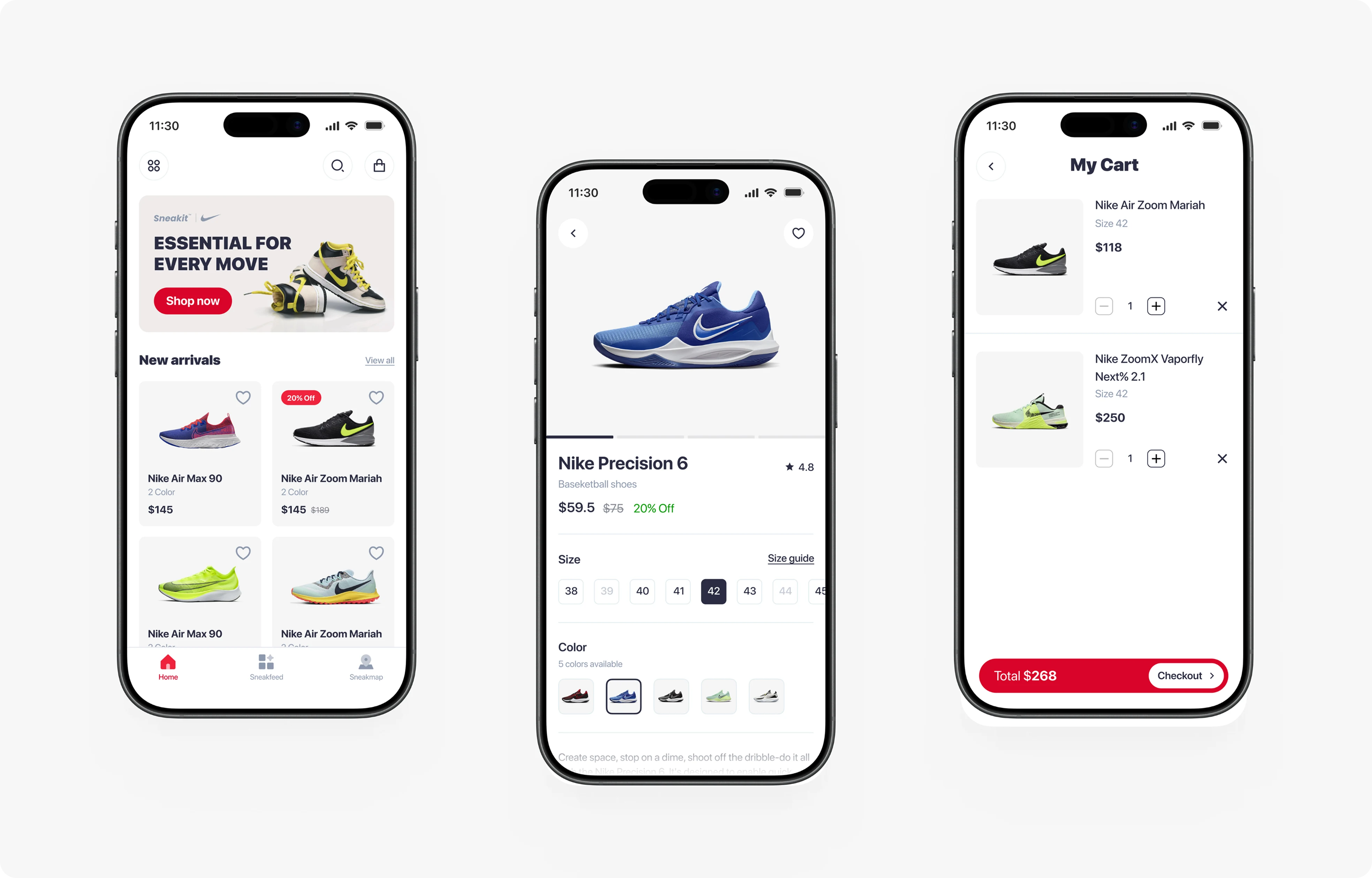
Discovery — a home feed built around drops, collections, and personalised picks instead of a flat product grid
Product detail — full-bleed imagery, size and colour selection above the fold, one primary action
Search and filter — filters that apply live, so results update as you narrow instead of after
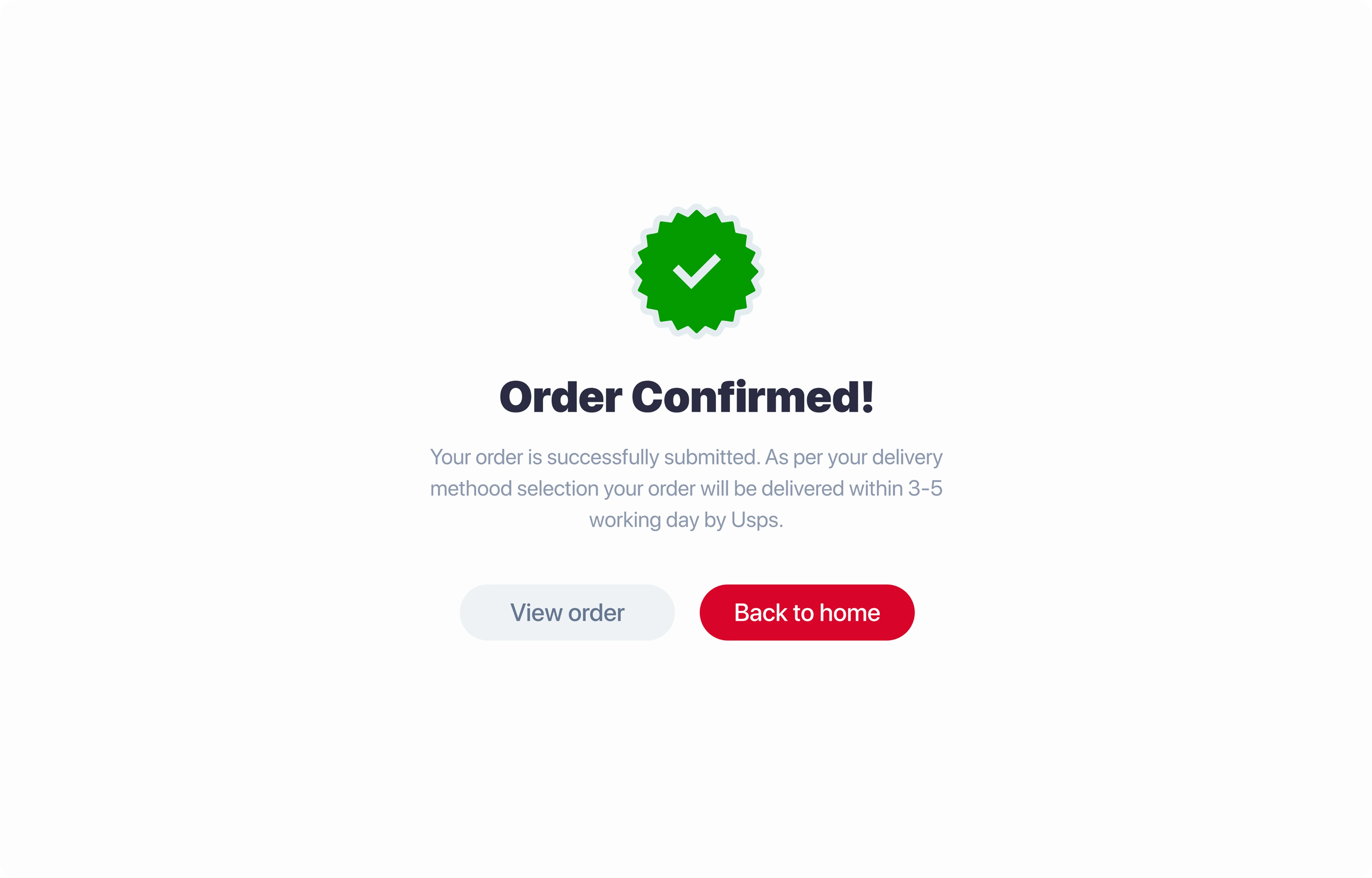
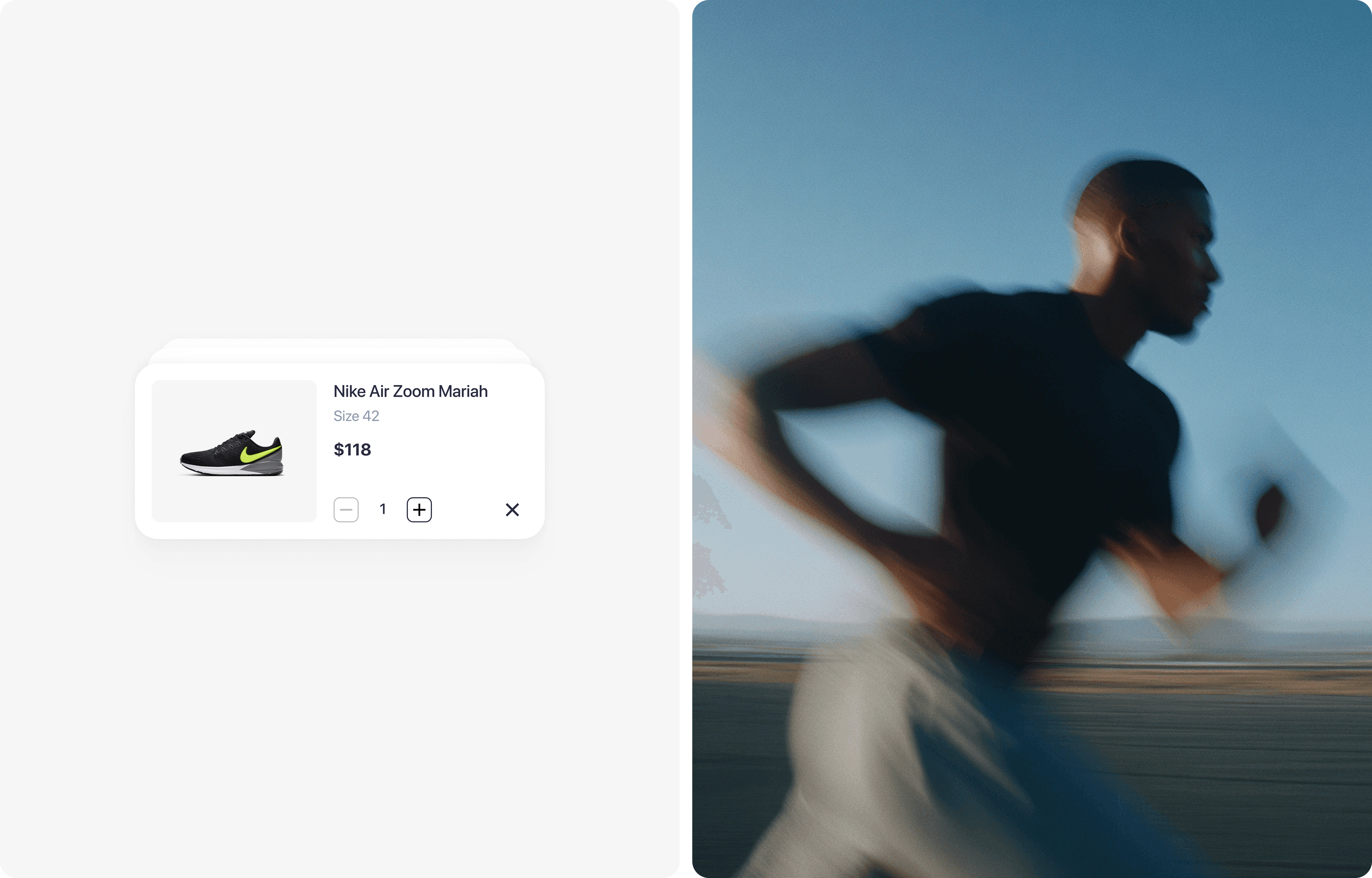
Cart and checkout — a short flow with saved payment and address, no forced account creation
Motion — transitions that carry context between screens so users never lose their place
Design decisions worth naming
One primary action per screen. Everything else is secondary.
Thumb-zone first: every interactive element sits in the bottom two-thirds of the screen.
Imagery does the selling. Copy stays out of the way.
Process
Flows and wireframes first, then a component library in Figma, then a prototype used to pressure-test the checkout path before any visual polish. [Add: rounds of testing, number of screens, timeline — if you have them.]
Tools: Figma, Figma Make, Claude
Links
Full case study → https://www.rubik.design/work/sneakit
More product design work → https://www.rubik.design/work
Start a project → https://www.rubik.design

Like this project
Posted Aug 21, 2026
Browsing you'd scroll for fun, checkout in a few taps. We designed Sneakit's mobile sneaker marketplace — discovery, product pages, and a short cart flow.