Cultural identity concept
Antoine Jarno
A few months ago, I came across an open call for a cultural place. The goal was to create the visual identity for the new cultural season 2024-2025. One specific point struck my attention, it was a place with different activities/programs. On one side there are concerts, on another there’s clubbing, both encapsulated in a singular place. These two activities were directed to different social profiles that require a different graphic treatment. That’s why I asked myself, how can you keep graphic consistency and identity for a multi-activities place ?
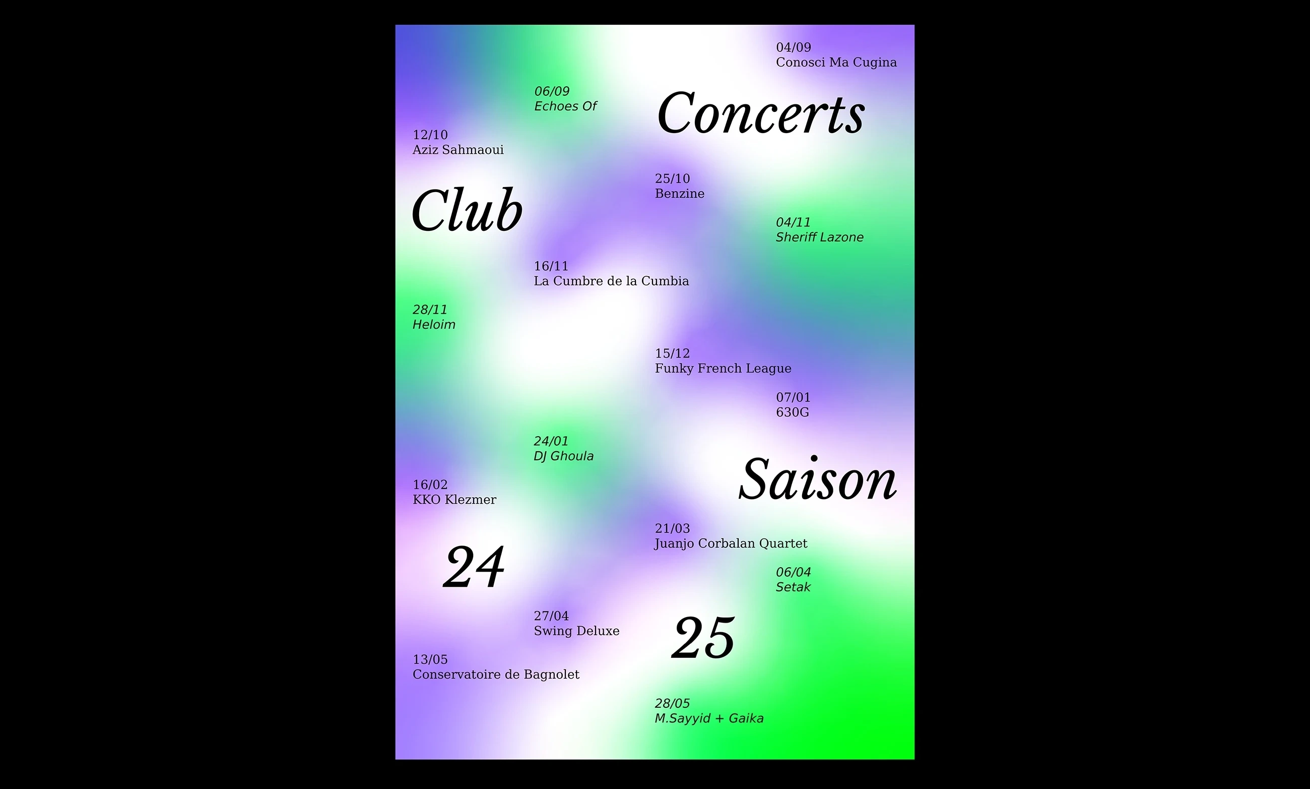
Season '24-'25 poster
To answer that tricky question, I imagined a graphic theory or matrix based on the differentiation of events within a coherent identity. It required finding some graphical turning points to rotate the identity around. I chose to articulate this idea around typography and color identification for the different activities. By building a graphic visualization of the system (fig. 1), it allows the designer to be playful with the identity but also to maintain consistency. Whether you are promoting a concert, or a clubbing event, the target audience will easily identify which one it is but most importantly recognize the brand identity.
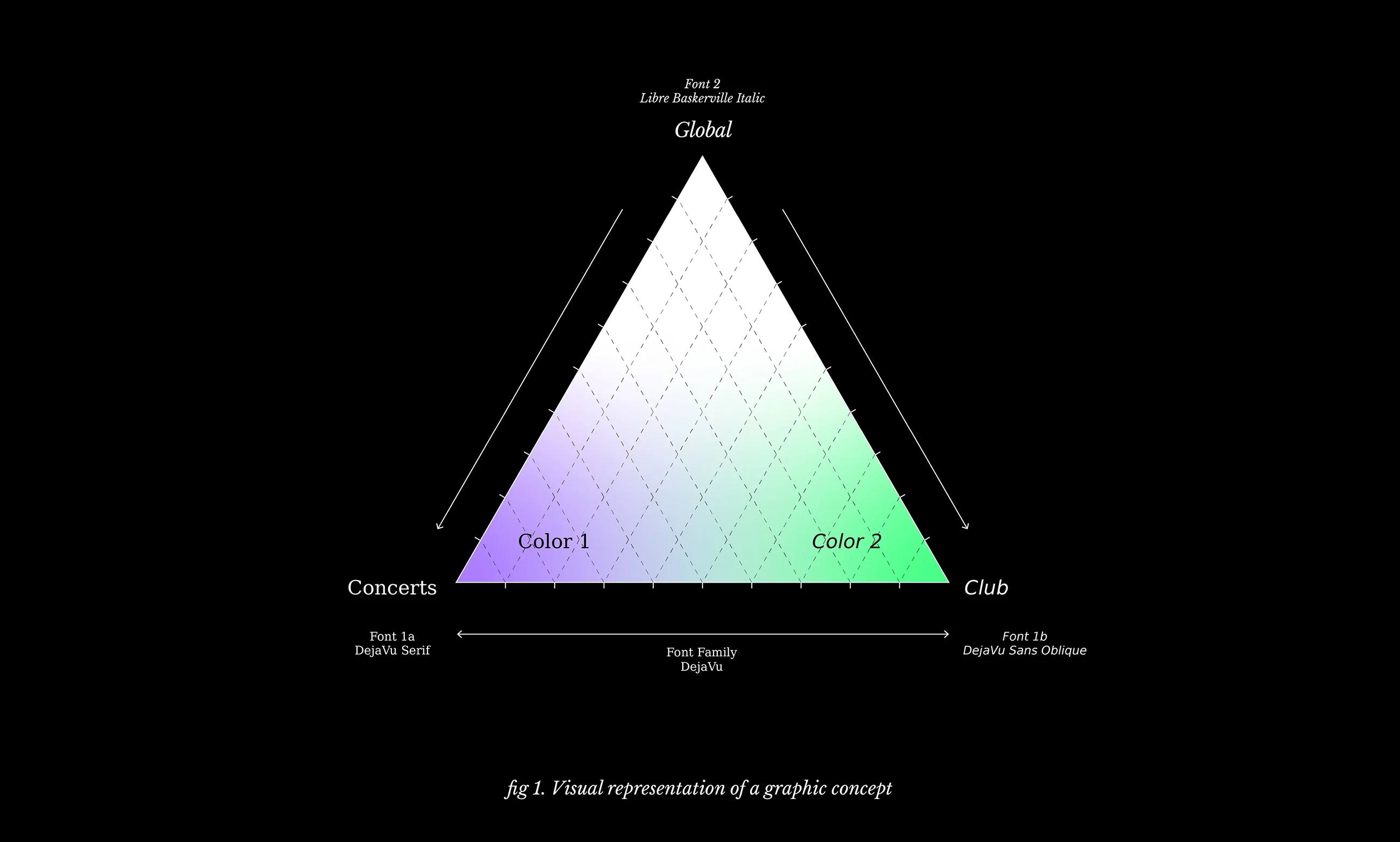
Graphic concept matrix
To test this visual identity theory, I worked on different mediums. The main poster to promote the new season encapsulates every artist in a single piece, making a difference between concerts and clubbing by the use of typography and color background. I chose to work with a serif to sans font family to identify concerts and club events. This choice allows me to differentiate events while maintaining consistency with a single family. A second font, a serif italic, was chosen to be used in the global communication of the place, bringing typographic contrast. According to color choices, I thought of using neon colors that could be printed using risographs. Two vibrant colors with a huge contrast to strengthen the differentiation. The program that comes along is a tri-fold leaflet with two booklets. The color of the booklet and the typography used allows the audience to clearly identify the nature of the event.
Typography : DejaVu Family / Libre Baskerville by Impallari Type
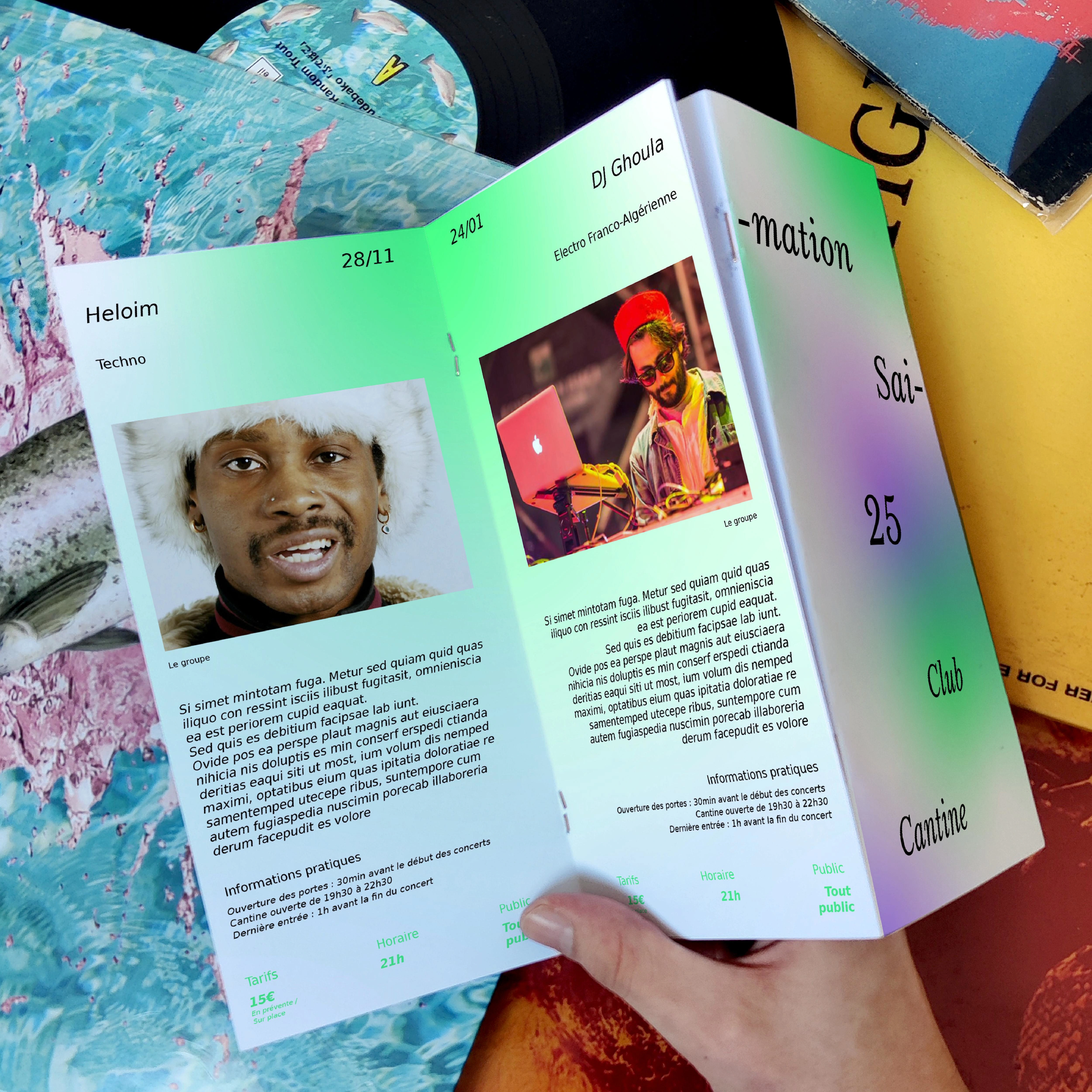
Season program, Tri-fold leaflet
Season program cover
Like this project
Posted Sep 25, 2024
Visual identity for a cultural place, season identity and concept