Northbound: A Token-Driven Design System, Shipped as Code

Maty Sandoval


Northbound: A Token-Driven Design System, Shipped as Code
A Figma system is only as good as what an AI tool can actually build from it. Northbound proves it can: the same 156-token architecture, read live through Claude Code and Figma MCP, shipped as 25 coded components, three screens, and a deployed Storybook.
PROJECT OVERVIEW
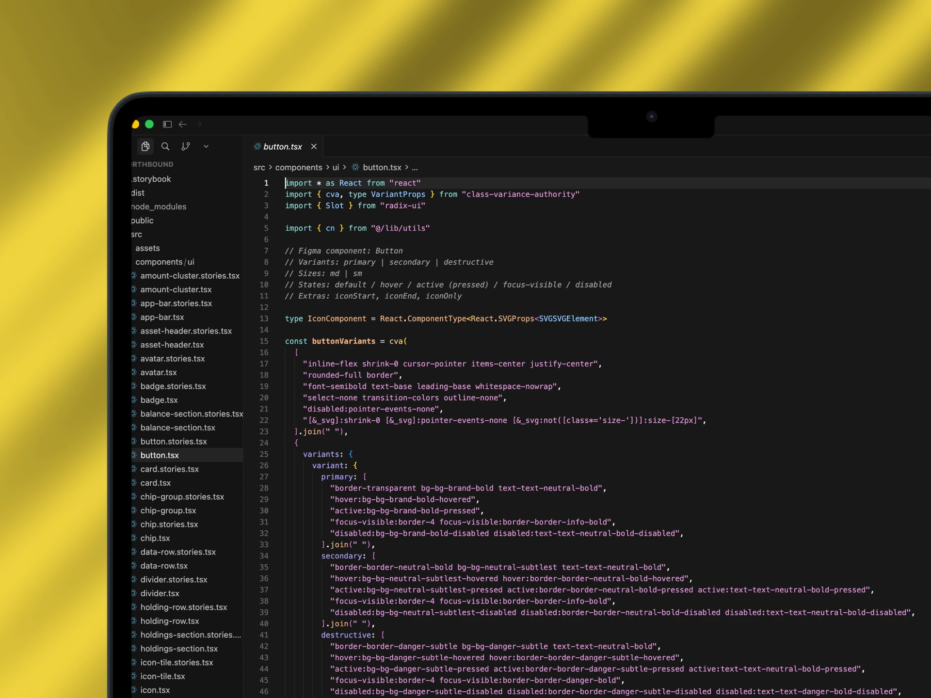
The same token architecture from the Figma case study, taken through Claude Code and Figma MCP into a coded component library, three assembled screens, and a Storybook deployed on Chromatic. AI design tools are only as good as the system they consume, this is the proof.
Read the previos case study → https://contra.com/p/MrmPmmWU-northbound-156-token-design-system-for-investing-app?referralExperimentNid=DEFAULT_REFERRAL_PROGRAM&referrerUsername=matysandoval
Read the long case study →
View the live Storybook → https://www.chromatic.com/library?appId=6a470152b0f836d9404953f1
View the repo → https://github.com/matibeast/Northbound
The Challenge
A design system that only lives in Figma makes a promise it can't fully back: that the naming grammar holds when a real build tool has to read it and generate something. AI coding tools make that promise testable, and most systems fail the test, not because the components are wrong but because the token layer underneath was never built to be machine-legible. Northbound's Figma foundation, 156 semantic tokens, two themes, a 4-level component structure, was built to prove the naming grammar could scale without a rename. CS2 is that same claim pushed one boundary further: can the system be read by Claude Code through Figma MCP and rebuilt as production code, token for token, without the architecture breaking on contact with a real build tool.
The Solution
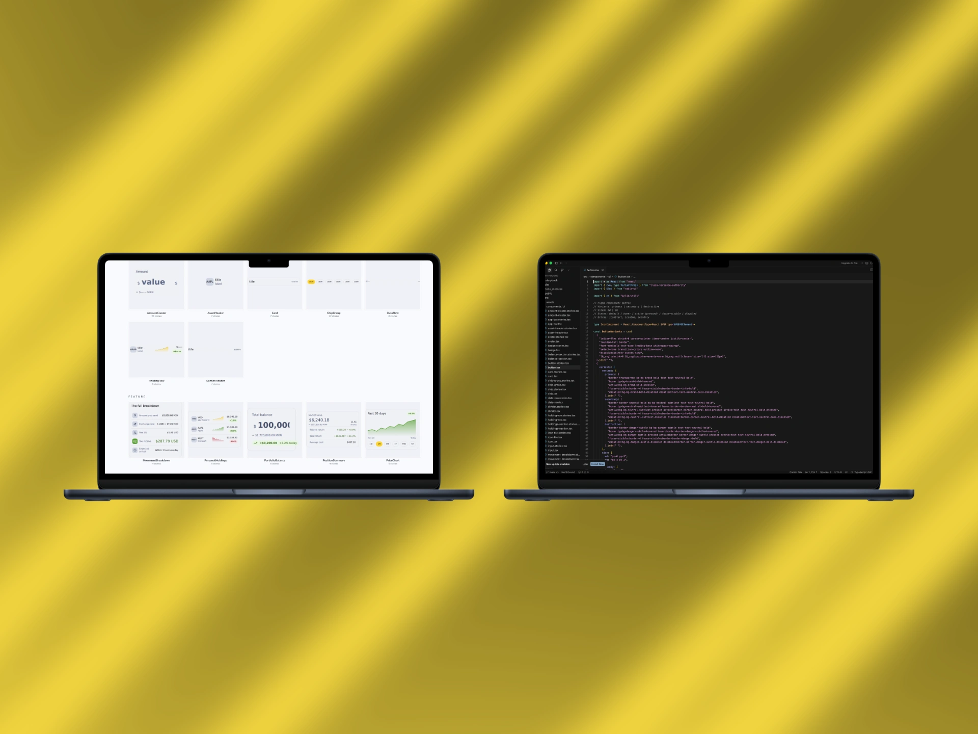
Three screens ship as working React, assembled from the coded component library and Vite: Portfolio Dashboard, Asset Detail, and Deposit & FX Conversion. Underneath sits the same 25-component library from CS1, rebuilt as code across four layers, each layer depending only on the layer below it: 9 Foundation components (Icon, Avatar, Button, Input, Divider, Chip, Badge, Icon Tile, Sparkline), 7 Composite (Chip Group, Amount Cluster, Data Row, Asset Header, Section Header, Card, Holding Row), 5 Feature (Movement Breakdown, Price Chart, Position Summary, Personal Holdings, Portfolio Balance), and 4 Layout (AppBar, BalanceSection, HoldingsSection, ScreenScaffold). Every component has a Storybook story covering its variants and states, plus a dedicated Design Tokens documentation page, and the whole library auto-publishes to Chromatic on every push to
main, so the Storybook link is always the current state of the repo, not a snapshot. The theme toggle runs on the same semantic layer CS1 described: switching light to dark is a class swap, not a re-theme, and it's the single click that demonstrates the entire architecture live.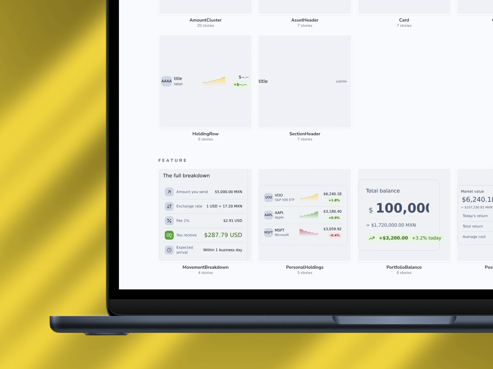
Like this project
Posted Aug 10, 2026
Northbound 156-token Design System, through Claude Code and Figma MCP, shipped as 25 coded components, three screens, and a deployed Storybook.
Likes
8
Views
32
Timeline
Jul 1, 2026 - Jul 31, 2026