Northbound: 156-Token Design System for Investing App

Maty Sandoval


Northbound: A 156-Token Design System for a Cross-Border Investing App
PROJECT OVERVIEW
A token-driven, Figma-only design system foundation for a concept investing app serving non-US investors accessing US markets, built to prove that a naming grammar can scale past three screens without a single renamed token.
The Challenge
Most Figma-only design systems are a UI kit with no system underneath: named color styles with no traceable link back to a raw value, no way to prove a fill isn't just an eyeballed match. That gap disappears on one screen and becomes obvious the moment a product needs two themes, six feedback purposes, and a currency conversion screen where the same red has to mean two different things in two different places. Northbound, a concept investing app for non-US investors moving into US stocks and ETFs, was built to put exactly that pressure on a token system: currency duality and FX transparency don't forgive decoration dressed up as architecture.
Key Decisions & Trade-offs
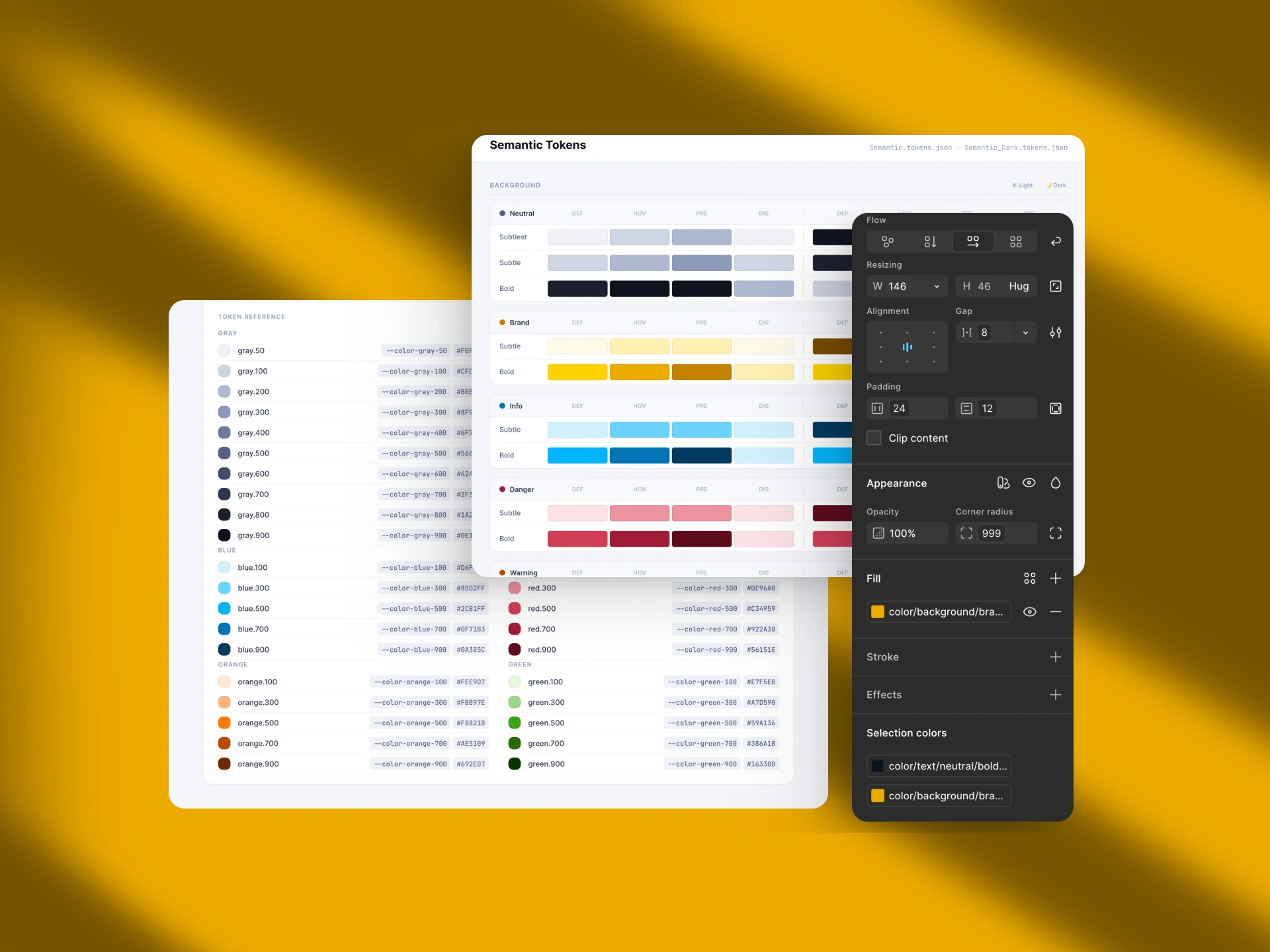
The gold ramp skips steps 200 to 400, the range a dark-theme hover state would pull from. It's left unfilled on purpose: nothing breaks today, and adding speculative steps for a state that doesn't exist yet is just more surface to maintain. The bigger trade-off is scale over scope: the semantic layer stayed at its full 156 tokens rather than trimming to what three screens actually use. That's a bet that a system built at product scale, even partially exercised, proves scalability better than one trimmed to fit the demo.
The Solution
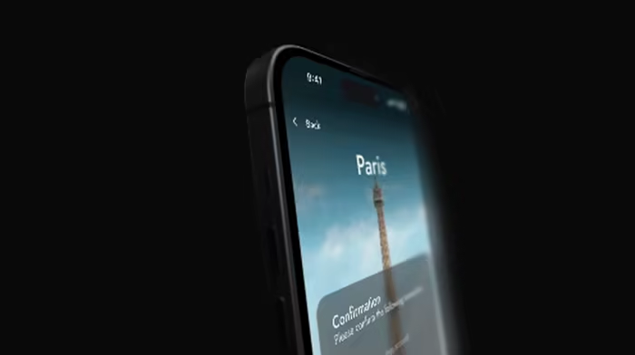
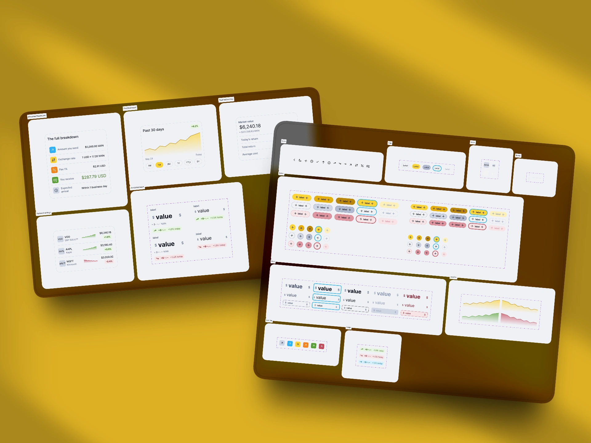
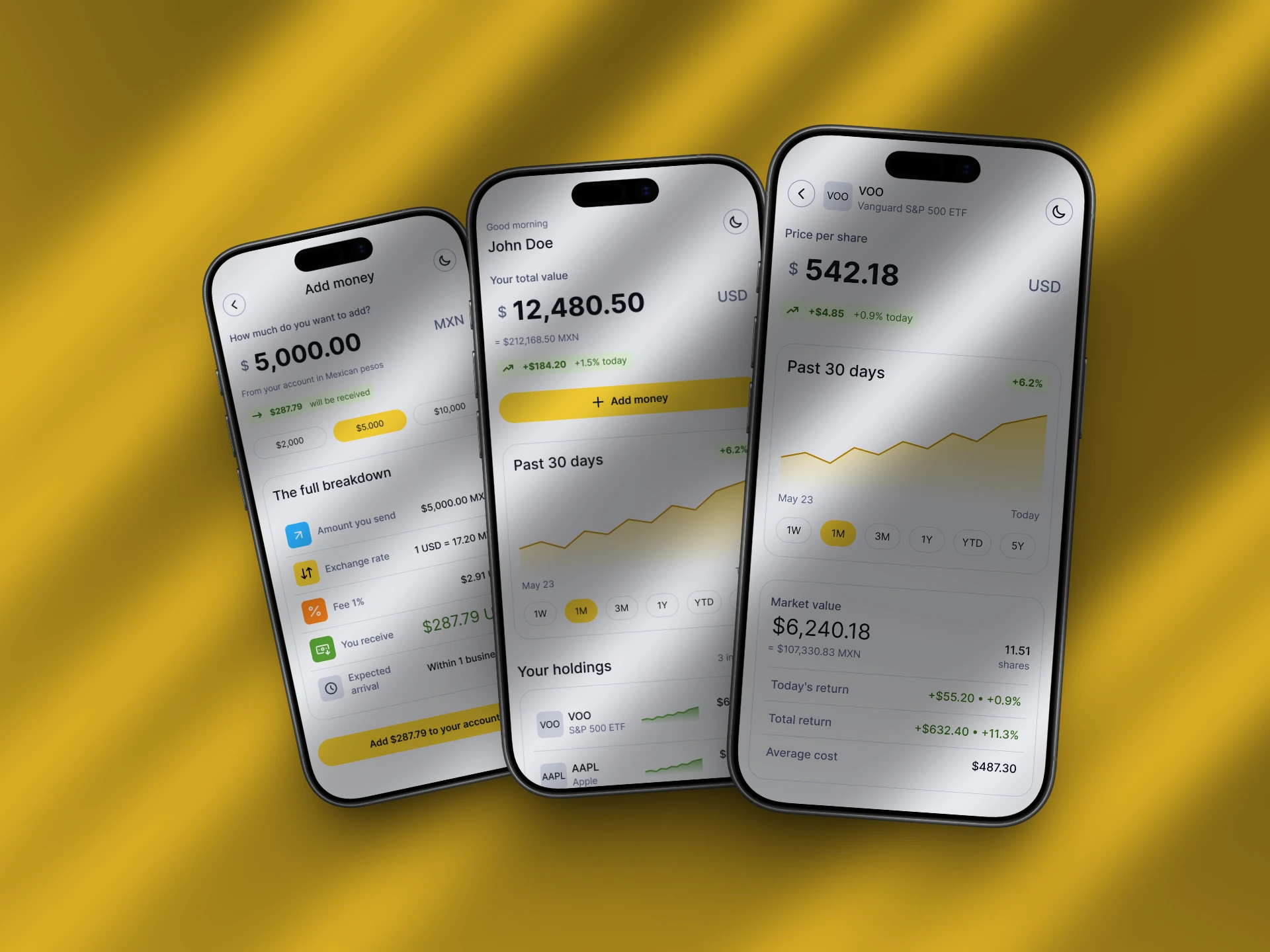
The file holds three screens built entirely from the token system: Portfolio Dashboard, Asset Detail, and Deposit and FX Conversion, the last one carrying the app's real differentiator, a full breakdown of amount sent, exchange rate, fee, and amount received in both currencies. Underneath sits a 25-component library across four levels: 9 Foundation (Button, Input, Icon, Avatar, Divider, Chip, Badge, Icon Tile, Sparkline), 7 Composite (Card, Data Row, Chip Group, Amount Cluster, Asset Header, Section Header, Holding Row), 5 Feature (Movement Breakdown, Price Chart, Position Summary, Personal Holdings, Portfolio Balance), and 4 Layout (AppBar, BalanceSection, HoldingsSection, ScreenScaffold). Every component exists in both light and dark, driven by the same tokens, so the two themes are the same file read against a different value set.
Like this project
Posted Jul 11, 2026
A UI kit isn't a system. Northbound proves it: 156 tokens, one naming grammar, two themes, zero renamed tokens across three screens.