Advanced Sales Dashboard & Data Analysis in Excel

karanJot Singh

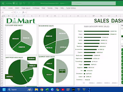
I developed a dynamic and interactive sales dashboard using Microsoft Excel to deliver comprehensive insights into sales performance across various dimensions. The dashboard is designed to transform complex data into clear, actionable insights that are crucial for decision-making. By integrating multiple data sources, I organized the sales information into a structured and user-friendly format. This setup allows for easy exploration of key metrics such as SALES, PROFIT, and QUANTITY SOLD, CATEGORIZED BY PRODUCT TYPE, CUSTOMER DEMOGRAPHICS, GEOGRAPHICAL REGIONS, and TIME PERIODS. VISUALIZATION is a key aspect of this project. I used a variety of charts and graphs to present the data in an engaging and easily interpretable way. The FUNNEL CHART, for example, provides a clear visualization of sales distribution across different product subcategories, helping to identify the best and worst performers. Bar charts and line graphs illustrate sales trends over time, while a geographical heat map highlights state-wise sales performance This project is ideal for sales managers, analysts, and business leaders who need a powerful tool to monitor sales performance, identify trends, and make data-driven decisions.
Like this project
Posted Dec 11, 2024
I developed a dynamic and interactive sales dashboard using Microsoft Excel
Likes
0
Views
0