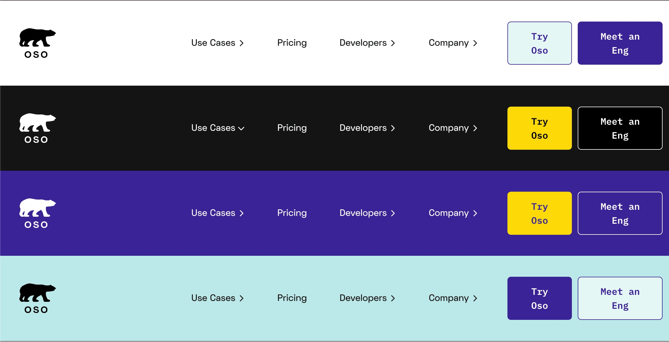
New navbar for Oso's Webflow site
I love Webflow — in fact, I worked there for a while as a product manager for the Designer — but it can be way too easy to get a Webflow site into a weird, wonky state, especially when several team members have been in there making changes.
Stephie from Oso reached out for help debugging and fixing a host of small issues with their site at osohq.com, from misaligned buttons in a row of cards, to blog post backgrounds that turned purple, but only at certain breakpoints.
Over the course of some 1-1 "clinics" and a few days of heads-down work, I was able to identify and clean up the hairiest problems.
The centerpiece was a complete rebuild of the site's primary nav bar. Webflow's Navbar and Dropdown elements, while convenient for brand-new or simple sites, are both individually hard to customize because they rely on predefined jQuery and CSS that isn't always visible or customizable in the Designer UI. If used together, it can be a mess.
Having first tried to build a new nav using those built-in elements, or with Webflow's Interactions feature, I finally rolled up my sleeves and made an entirely custom implementation using Webflow custom elements and some GSAP code.
Why did I go down a custom-code rabbit hole? The design called for submenus to behave as drop-downs at desktop size, but disclosure/accordion sections on mobile. By using custom code, I was able to have total control over the experience and avoid any unexpected problems or edge cases.
In addition to building a custom menu experience, I also included support for Oso's four brand color schemes in a single component, reducing the amount of duplicated content (and therefore the number of things that could break down the line) while keeping a friendly, visually expressive look and feel.

Like this project
Posted Nov 12, 2024
Alongside dozens of small fixes, I built a custom navbar component with GSAP animations and support for brand color variants.


