Barile — Brand Identity & Launch Campaign

Mauricio Pontual


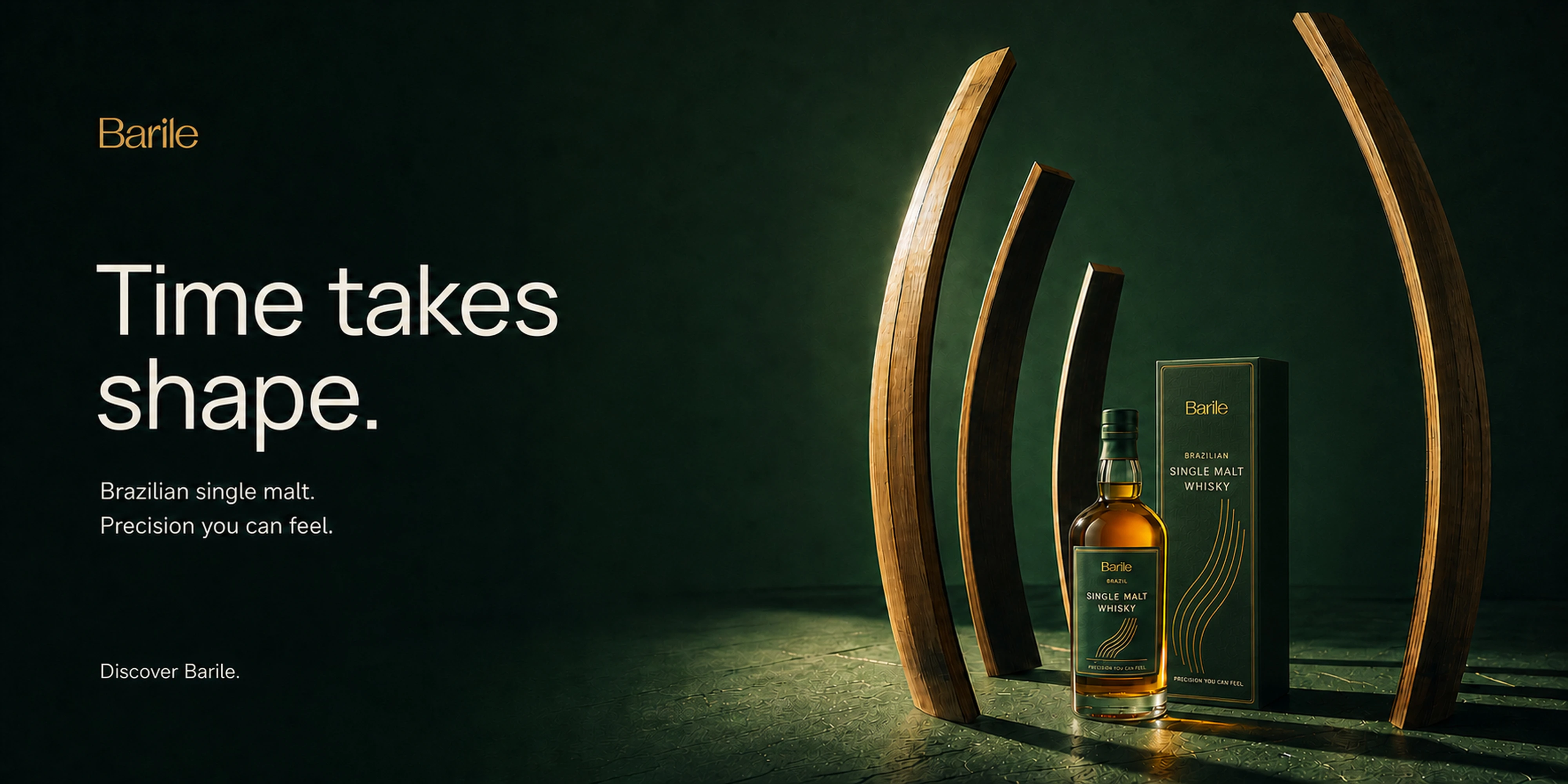
Barile — Brand Identity & Launch Campaign
Precision you can feel. A Brazilian single malt imagined as an object of art.
Disciplined craft meets creative curiosity
Barile is a fictional Brazilian spirits brand born from the partnership between a meticulous technician and a restless creative. The brief called for a distinctive identity and a digital launch campaign that would present its single malt and collector’s box to an international audience.
The idea was to make precision feel warm, expressive and tangible. From the wordmark to the sculptural imagery, every element brings structure and imagination into the same frame.
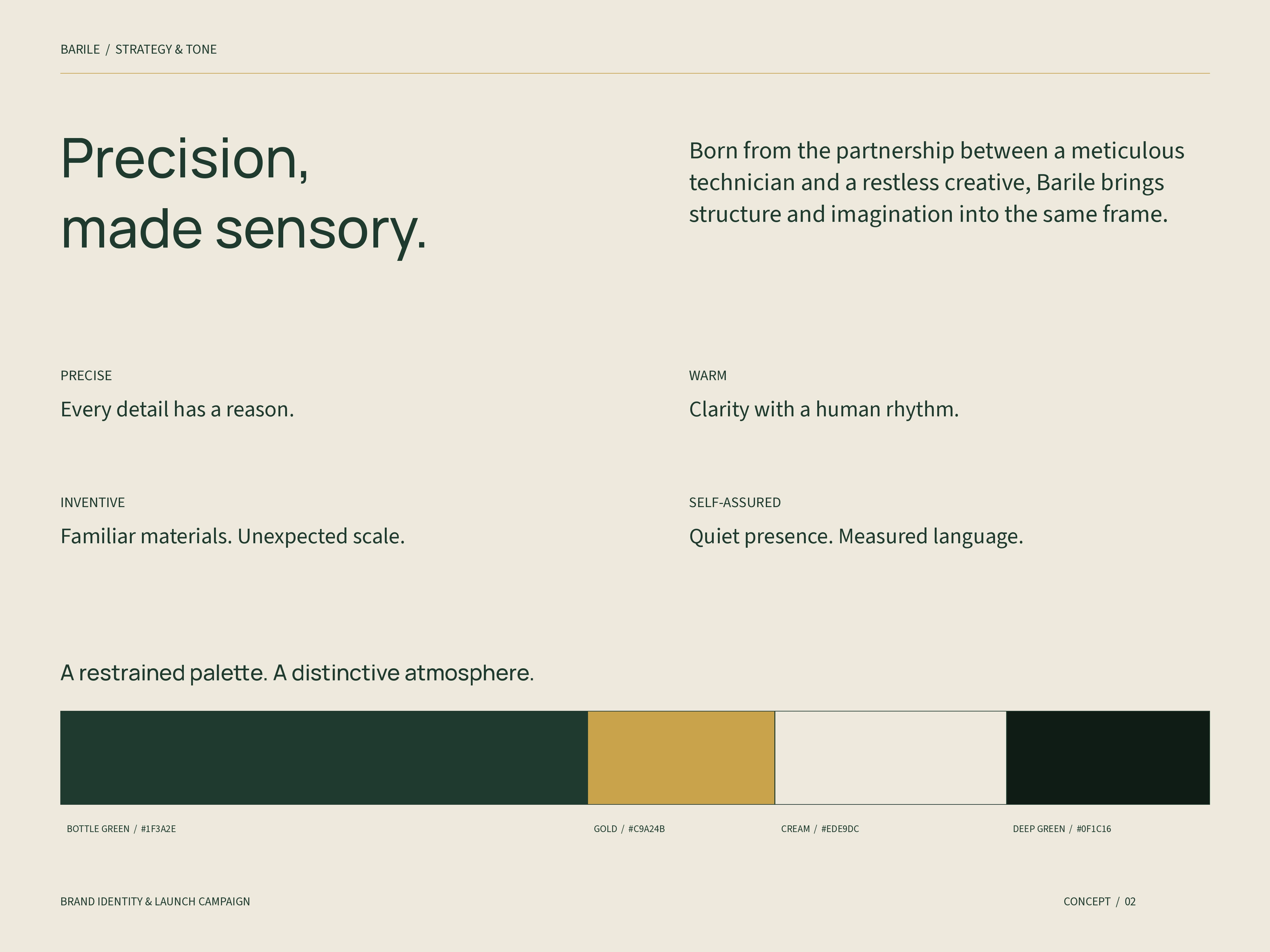
Brand character & color
Precise, warm, inventive and self-assured. Short sentences and concrete imagery give the brand a poetic yet clear voice. Bottle green builds recognition; gold brings selective emphasis, supported by cream and deep green.
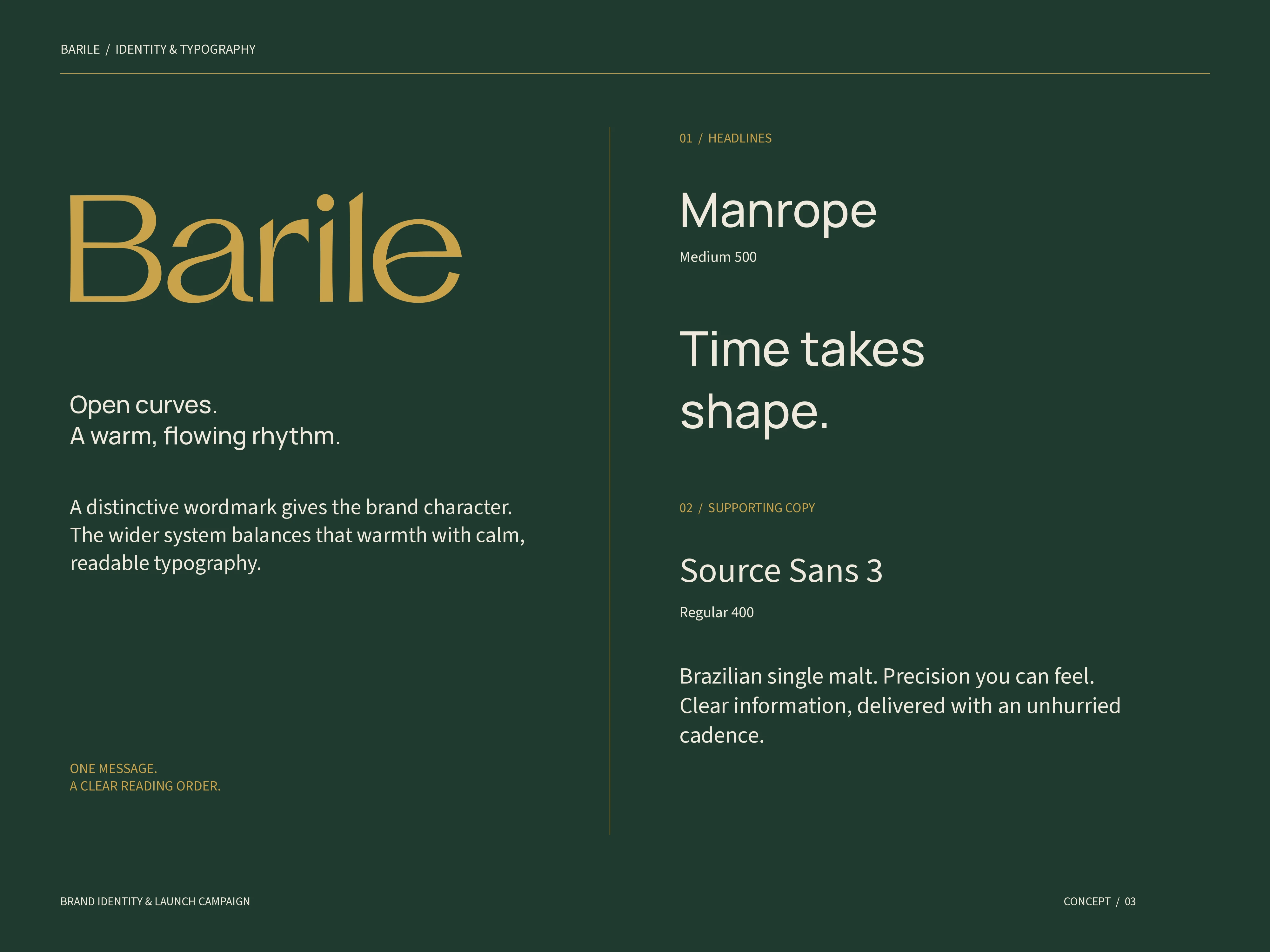
Warmth with structure
The wordmark uses open curves and a flowing rhythm. Manrope Medium gives headlines a clear, contemporary voice; Source Sans 3 Regular supports longer reading. The hierarchy gives each composition one primary message, followed by product information and a discreet brand signature.
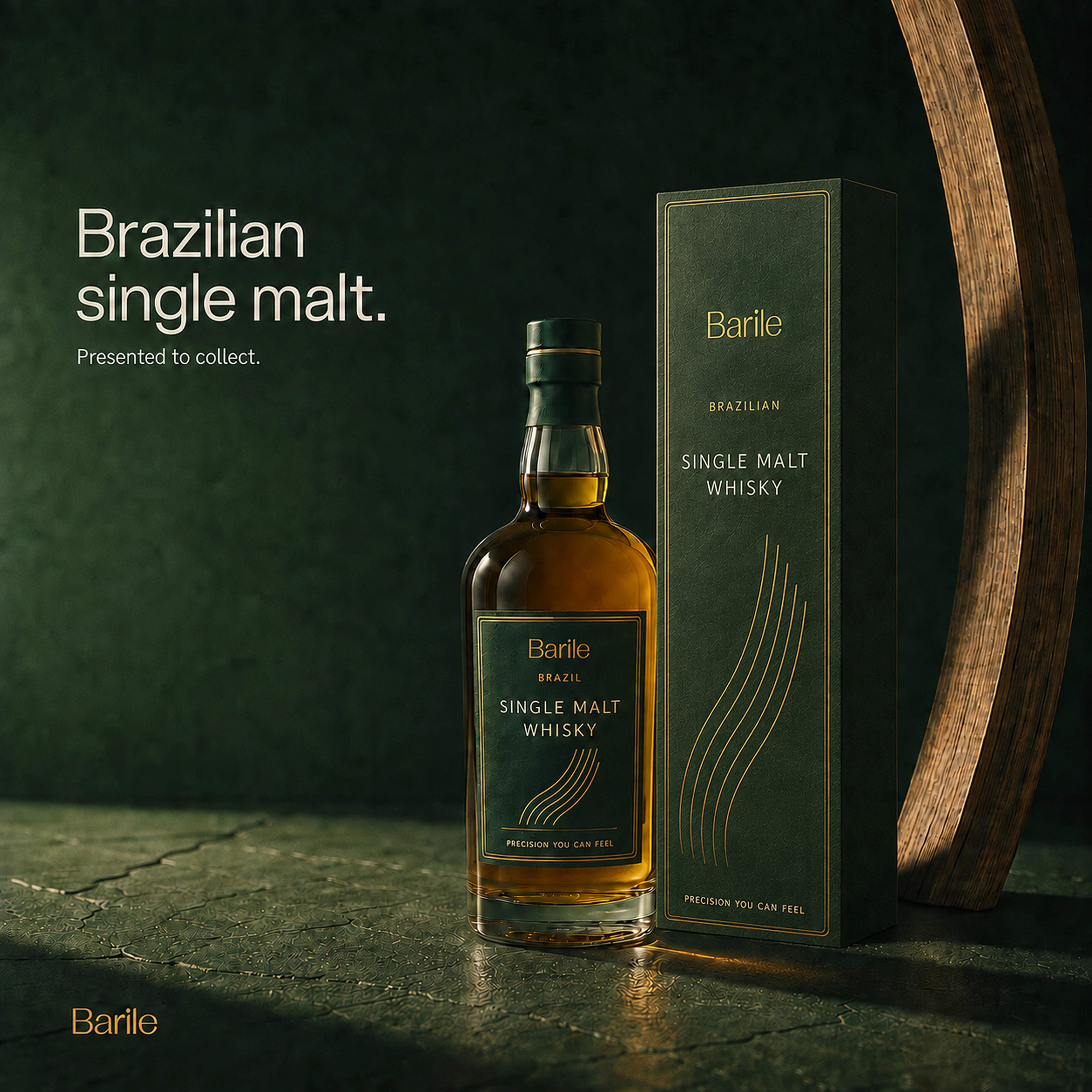
The collector’s object
The label and collector’s box translate the identity into tactile surfaces: textured green paper, fine gold borders and curved linework. Brand, origin, category and signature follow a clear sequence. The curves connect the packaging to the monumental wooden forms in the campaign.
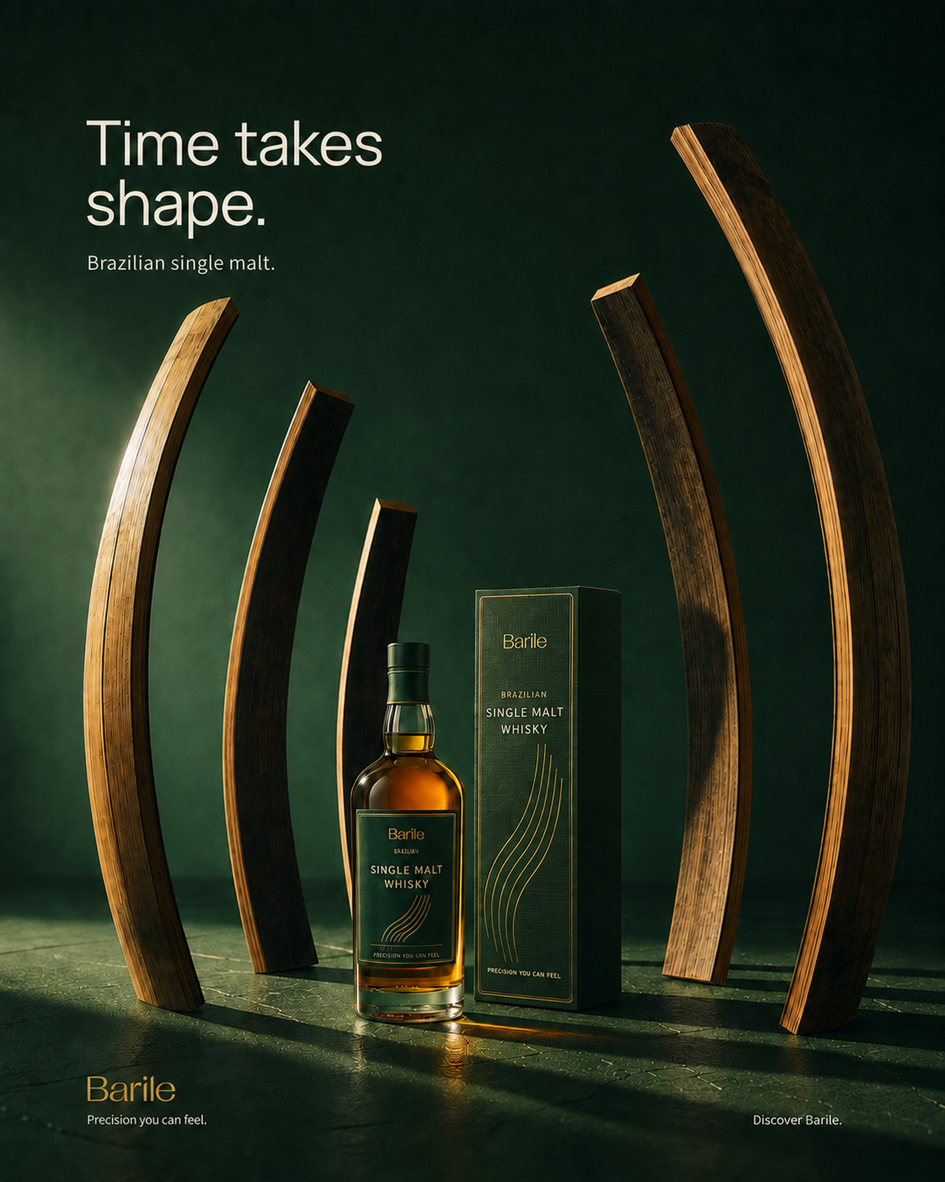
Time takes shape
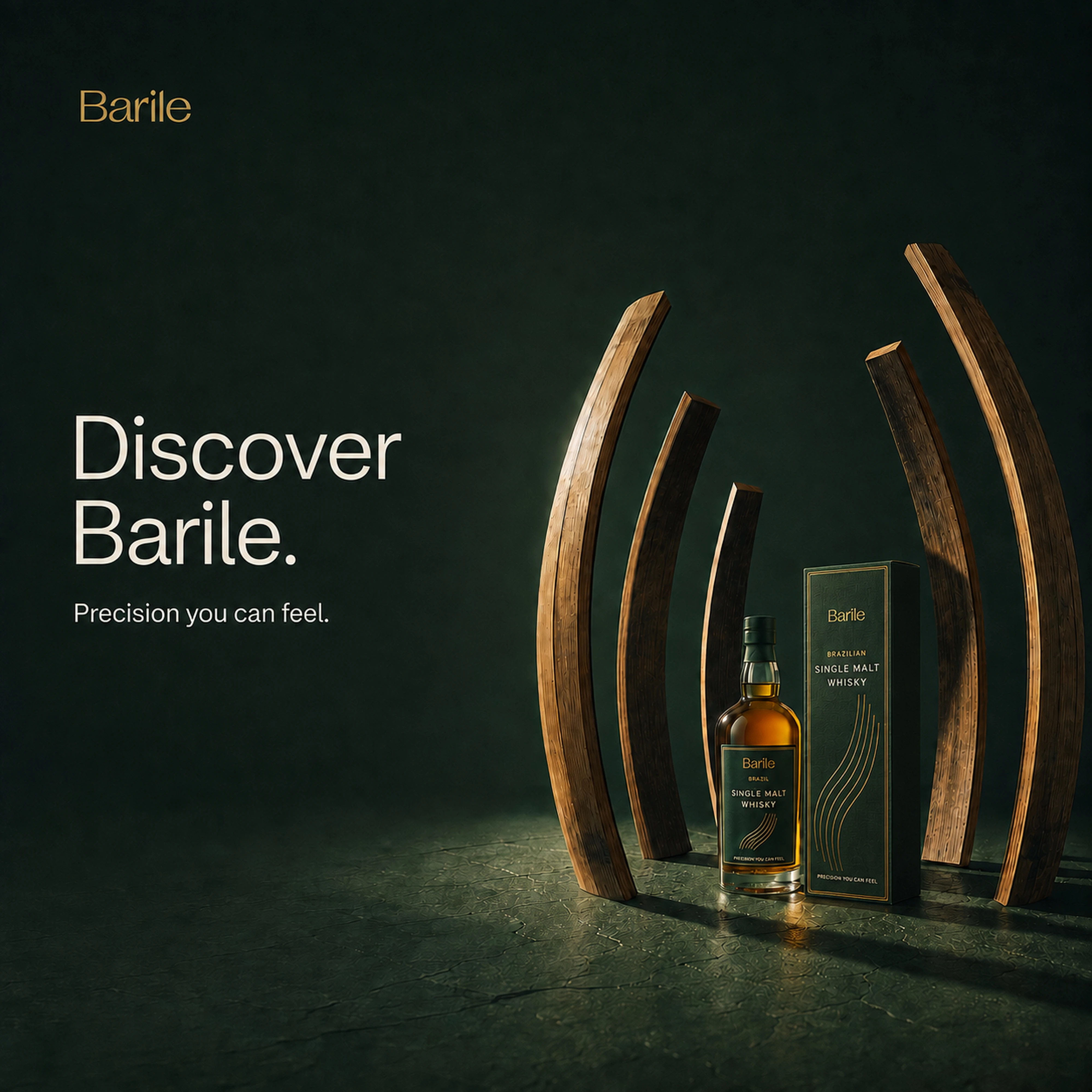
What if the production process became the protagonist? Curved barrel staves become a monumental sculpture around the bottle. The shift in scale makes aging visible, while grazing light, tactile wood grain and amber glass keep the scene grounded in material.
The 4:5 key visual introduces the central campaign idea.
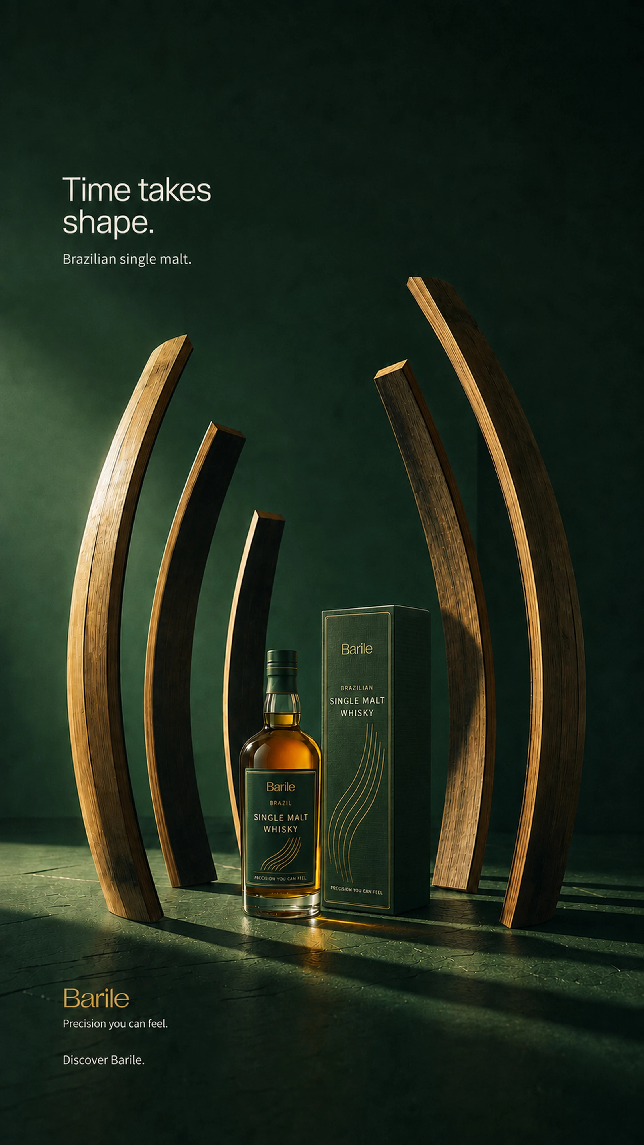
Scale, in a vertical frame
The Stories and Reels composition emphasizes the height of the wooden sculpture. The same palette, light and hierarchy carry the campaign into a 9:16 format.
A sequence of encounters
The square campaign moves through concept, material, product and invitation. Each frame stands on its own while sharing the same visual language. The collector’s object shown above forms the product chapter; the following pieces complete the sequence.
01 — The central idea
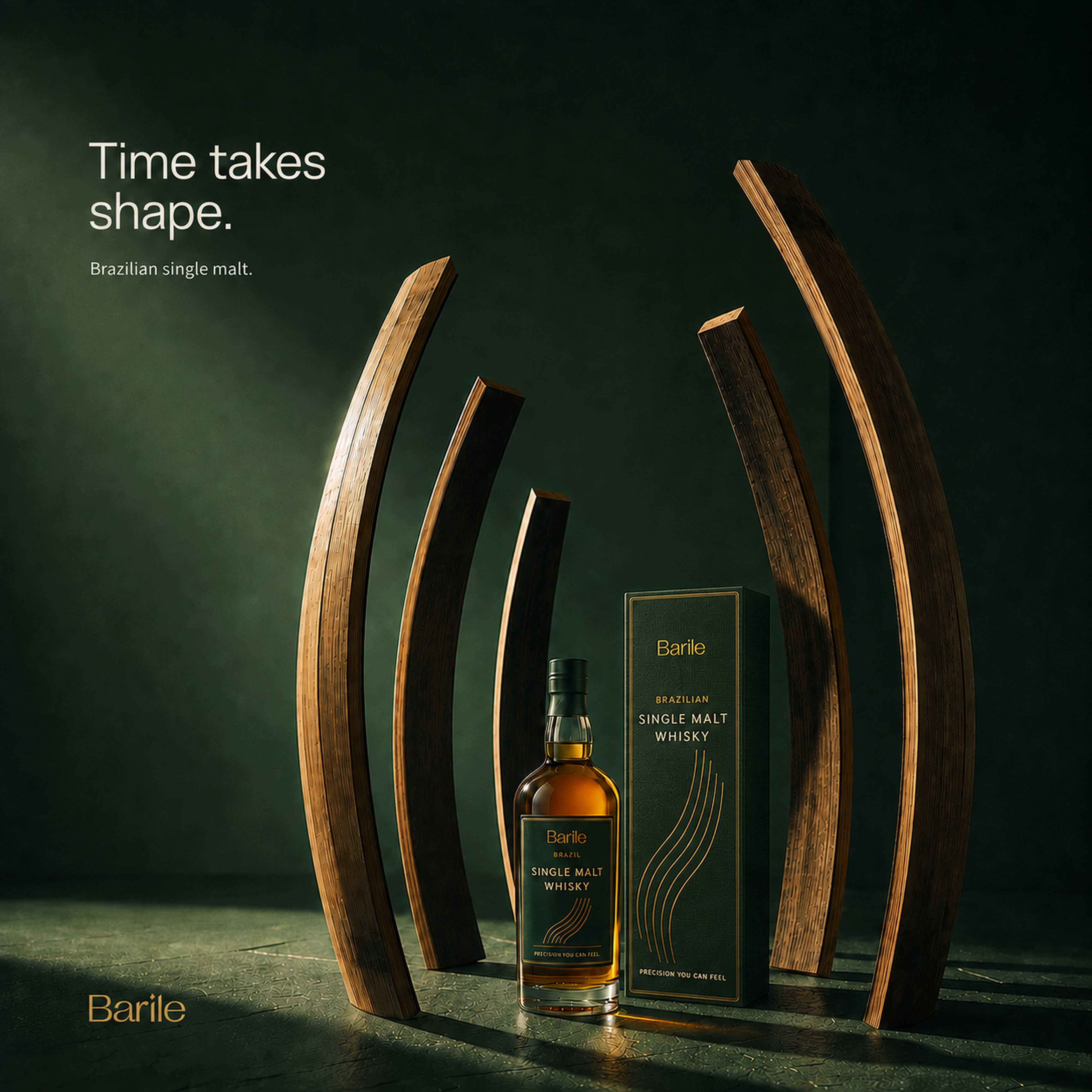
02 — A meeting of precision and imagination
A close encounter with wood grain shifts attention from the whole sculpture to the material that gives it meaning.
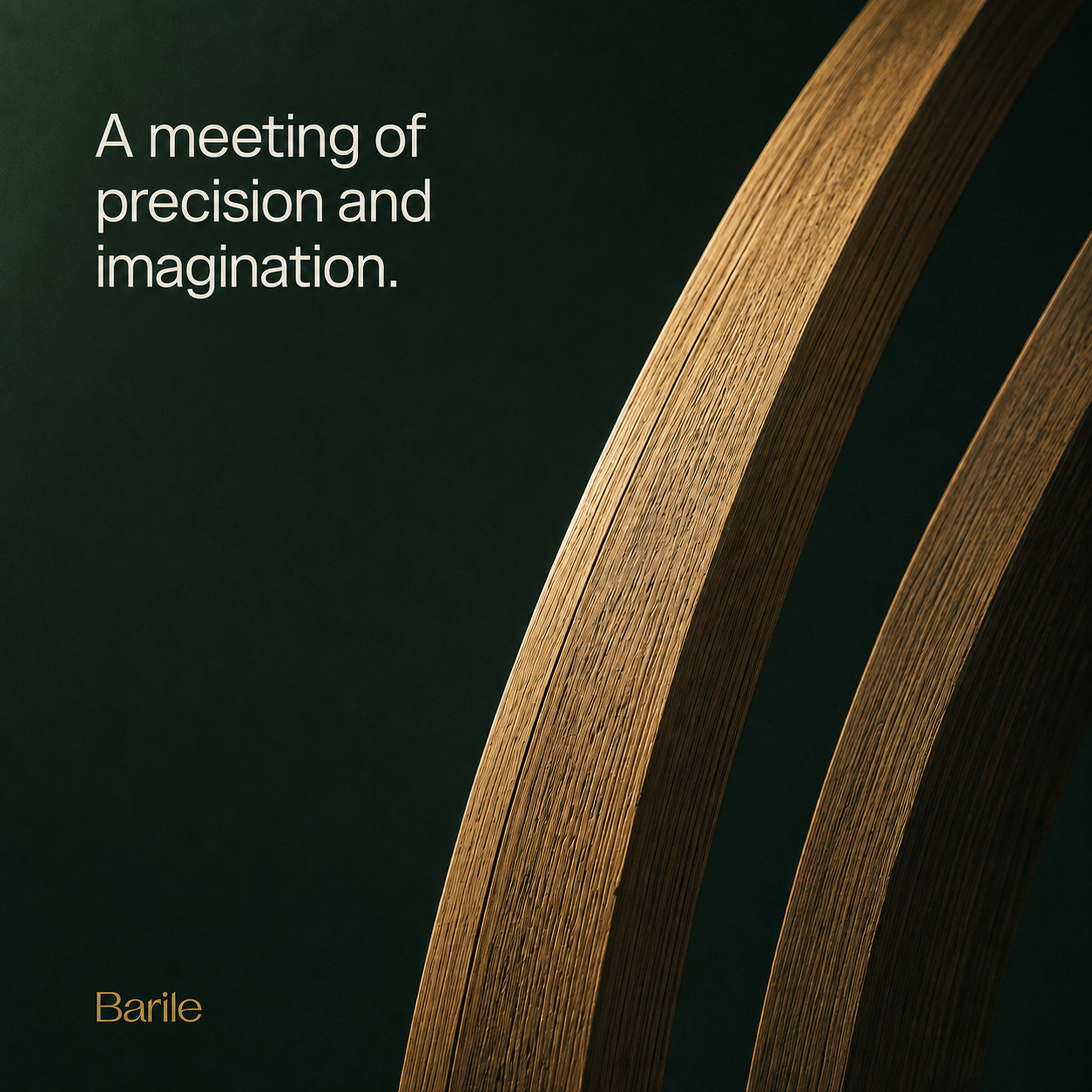
04 — The invitation
The closing frame returns to the complete composition and invites the viewer to discover Barile.
From material to motion
The 15-second film moves from a close study of wood grain to a passage between the monumental curves, ending with a full product reveal. Deliberate camera movement, foreground parallax and an atmospheric soundtrack extend the campaign’s sensory mood.
Seedance 2.5 · 15 seconds · 720p · Sound on.
Project scope
Brand positioning and verbal direction · Wordmark and typography · Color system · Conceptual packaging · Launch key visual · Feed, Stories/Reels, carousel and email adaptations · Brand film.
The wide campaign artwork at the opening of this case is the email hero adaptation, designed for a more editorial reading experience.
About this project
Self-initiated concept project for a fictional client. AI-assisted visual development with creative direction, selection and refinement. Packaging is presented as a concept visualization. No commercial launch results are claimed.
Like this project
Posted Sep 5, 2026
A Brazilian single malt imagined as an object of art. Brand identity, packaging concepts, surreal launch imagery and a 15-second film.