Built with Framer
Woosh App Website Redesign

Septimiu Cotoi


✏️ Woosh – A Simple, Fast Redesign That Helped a Notes App Stand Out
Project Overview
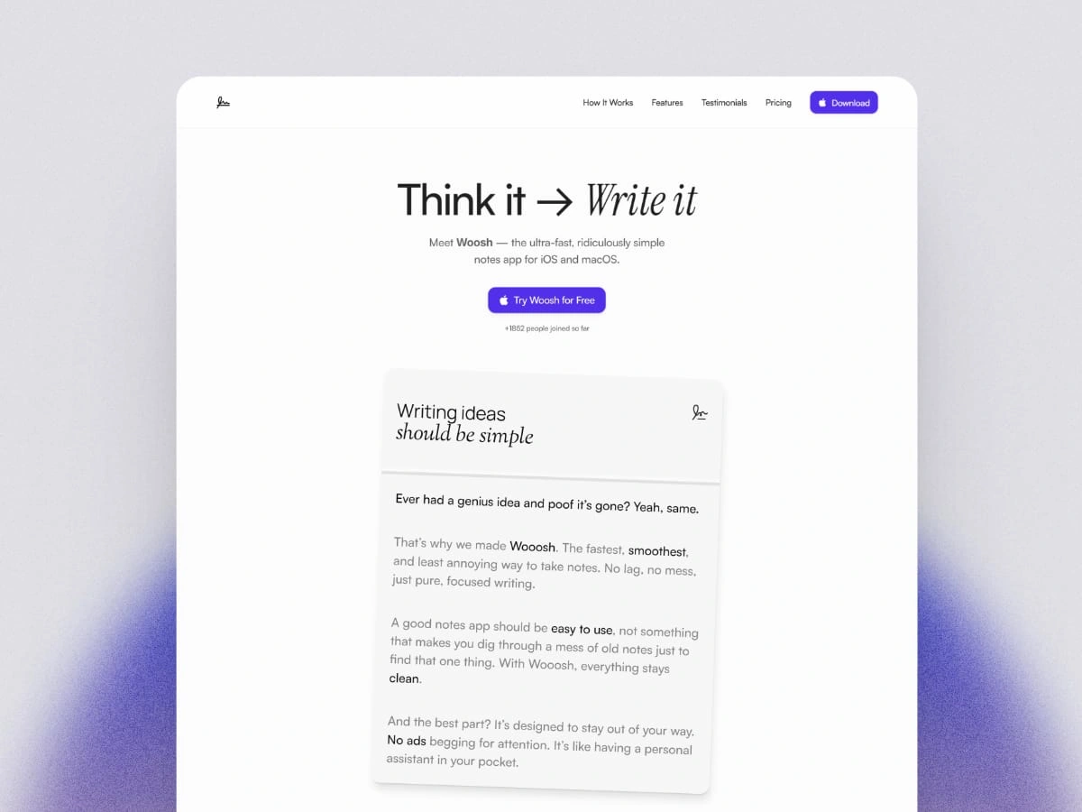
Woosh is a minimalist note-taking app designed for speed, clarity, and focus. When the founder approached me, the product had a strong backend but lacked a clear brand voice and a visual identity that resonated with modern users. My role was to reimagine the app’s online presence and ensure the product experience matched its value: fast, intuitive, and beautifully simple.
Preview the live version here:
What Was the Problem?
Woosh is a note-taking app made to be fast and easy. The product itself worked great — it was quick, smooth, and clean. But the website didn’t show any of that.
The founder came to me because:
The website didn’t explain what Woosh really does
It looked plain and forgettable
People didn’t stay long or sign up
Even though the app was solid, it wasn’t getting noticed. It didn’t have a voice. It didn’t feel special.
How I Helped
I didn’t just change how the website looked, I helped the founder expose the real benefits of their product.
🧠 Getting Clear on What Matters
First, I talked with the founder about who this app is for and why it matters.
We realized:
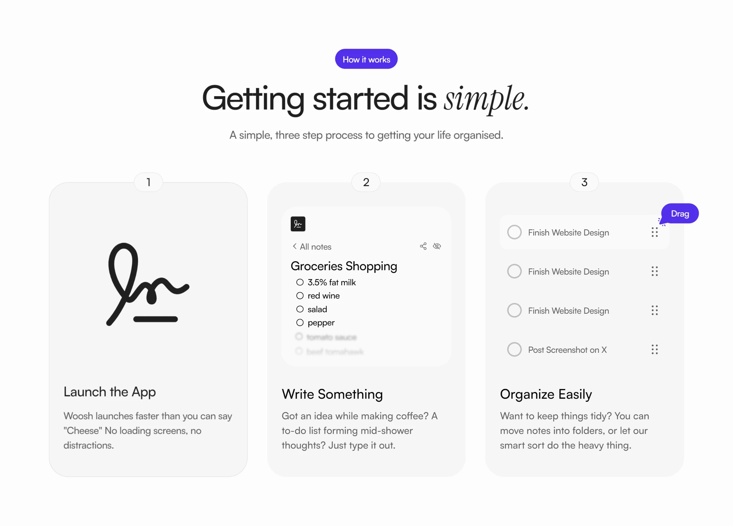
Woosh is for busy people, founders, writers, thinkers — who need to take notes quickly
It’s all about speed, calm, and not getting distracted
People should feel like they can trust the app right away
✍️ Writing Words That Make Sense
I rewrote all the words on the website to be clear and helpful. No big, fancy phrases. Just simple messages that speak directly to the visitor.
For example:
“Start capturing in seconds” — tells you exactly what to expect
“Your notes. Anywhere. Anytime.” — shows how easy and flexible it is
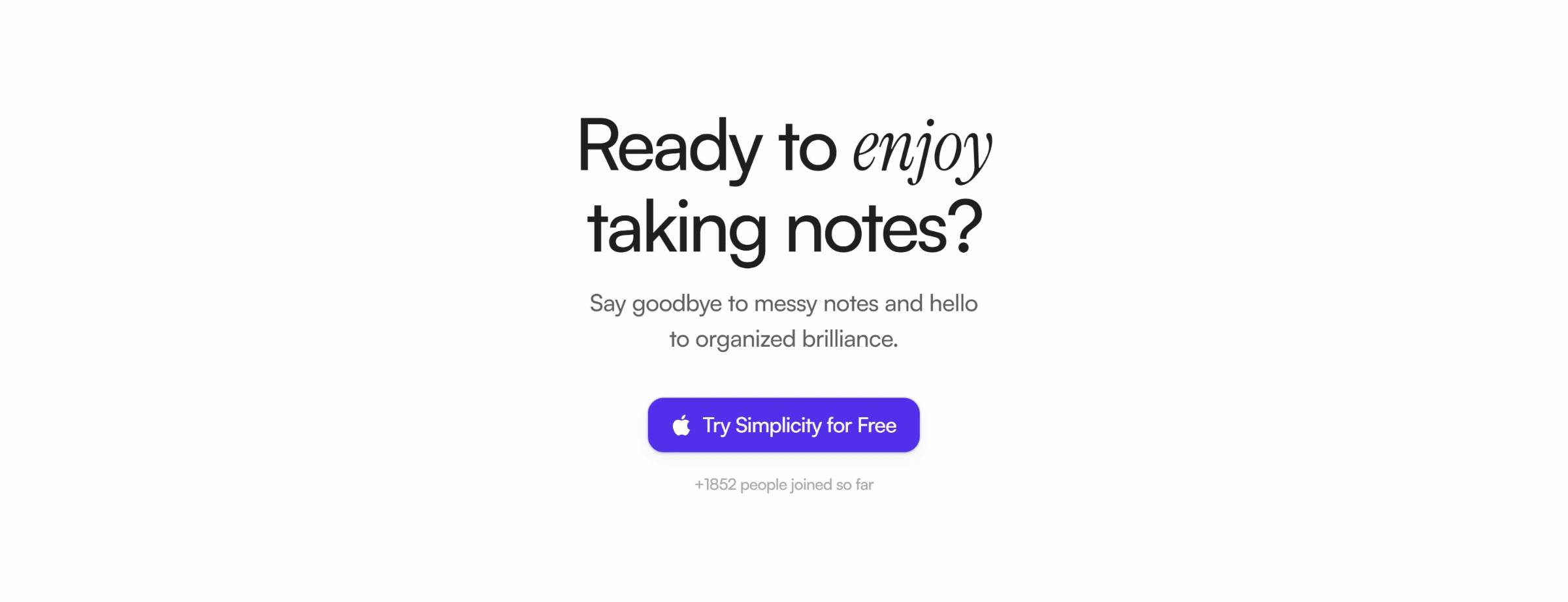
Buttons that say things like “Try Woosh Free” — so users know what happens next
🎨 A New Look That Matches the App
I rebuilt the site using Framer, making sure it:
Looks calm, clean, and modern
Works great on phones, tablets, and computers
Has smooth, quiet animations that make it feel polished without being too much
📱 Works Perfectly on Every Device
The landing page is fully responsive.
Whether someone visits from their phone, tablet, or laptop. No pinching. No zooming. Just a smooth, clear experience every time.
What Changed?
✅ Clearer Identity – Now the website actually feels like Woosh: simple, smart, and helpful
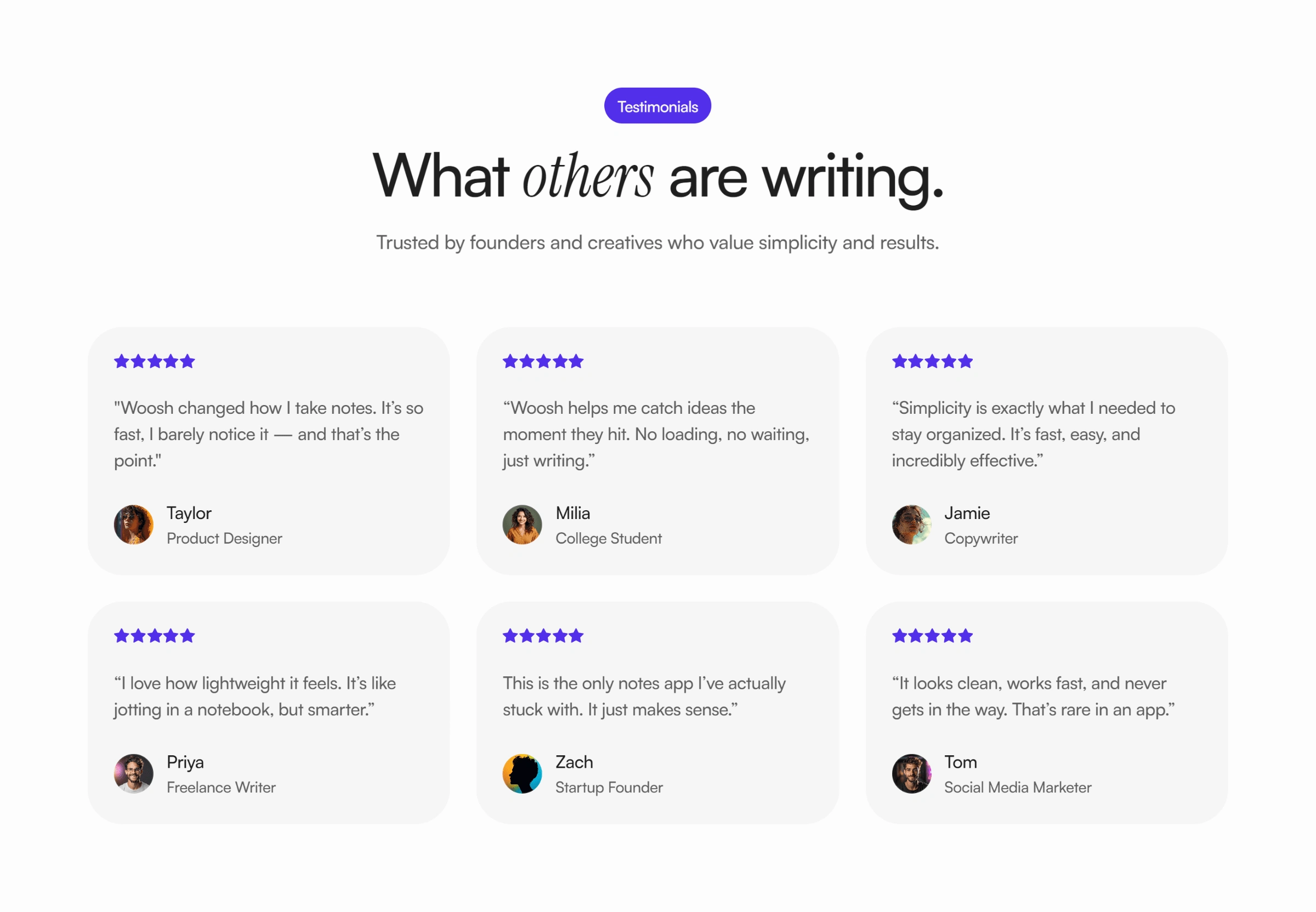
📈 More Signups – With easier words and a better layout, more people stayed and tried the app
🌍 More People Found It – The faster, cleaner site helped improve how easily people discovered Woosh
💬 Founder Confidence – The founder now uses the site in meetings, pitches, and even investor calls
Why This Matters?
This wasn’t just about “making things pretty.” It was about helping a real person with a real product get seen and understood.
Now, Woosh has a home online that matches what it does so well. A fast, easy, thoughtful tool that makes life a little simpler.
🚀 You're ready to upscale your bussines?
If you’re building something great but feel like your website doesn’t show it, I can help.
I build websites that:
Feel clear from the first second
Help people trust what you’re building
Make it easy to sign up, buy, or book
👉 Let’s make something powerful together. Reach out anytime. See ya!
Like this project
Posted Apr 30, 2025
Redesigned Woosh app's website for better clarity and user engagement.
Likes
0
Views
4


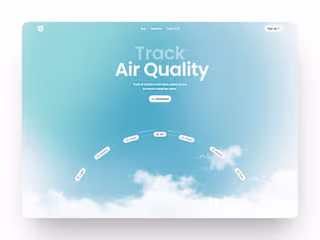
Air Quality Web App
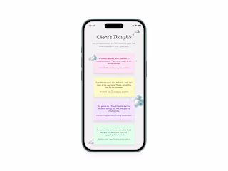
Testimonial Section on a mobile

Notepad Hero section
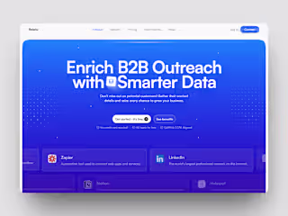
Relatix B2B & CRM Website