Built with Framer
Air Quality Web App
Septimiu Cotoi
Process
• Finding the Problems:
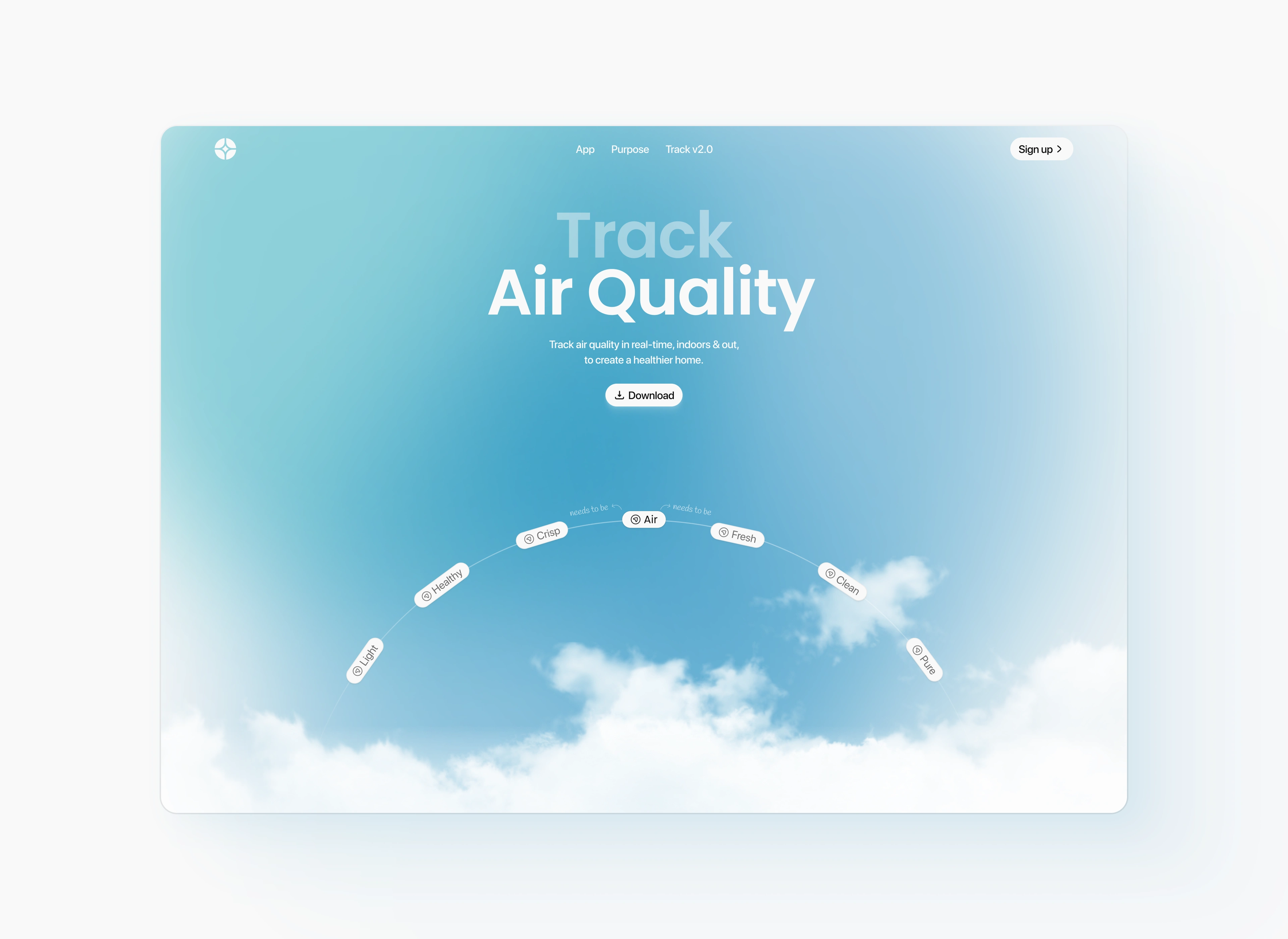
The old design looked a bit heavy and wasn’t easy to read or explore. The message wasn’t super clear, and users might not have understood what the app was about right away.
• Design Refresh:
I redesigned the page to feel fresh, calm, and easy to understand. I used a soft color palette, added more breathing space, and improved the way info is shown so people can instantly get what the app does.
• User Experience Improvements:
I simplified the layout and made the main message stronger. The “Download” button is now easy to find, and visitors can quickly see what the app tracks and why it matters.
Results
• A lighter, friendlier design that fits the product’s purpose
• Clearer message and easier navigation
• Stronger first impression for users and potential customers
Like this project
Posted Apr 9, 2025
I redesigned everything in Figma with a soft, airy look and feel, from the background and layout to the typography and button placement.
Likes
8
Views
108