Art Direction & Brand Design for an eco-friendly food app 🥕
Amine kuza
Let's eat ECO-LOGICAL!
ÉCOVOREA is a digital universe dedicated to eco-friendly consumers, seasonal-meal stans in particular, who have a conscience for all beings and nature 🍃 not for what they bring to them, but for themselves.
This case study will walk you through my process of how I developed this amazing art direction for this brand!
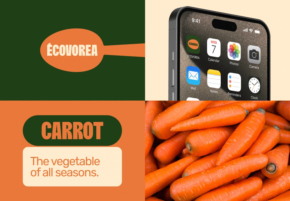
ÉCOVOREA
I. Naming
The name is a contraction of the prefix eco- and the root vore, in French, which means to eat. The small A at the end is to make the name rhyme with that of its creator, Victoria. Thus, ÉCOVORIA was born to embody the lifestyle of eating ecological.

NAMING
II. Art Direction & Brand Identity
Logotype: moderately simple: Using bold typography with a hint of quirkiness, as seen in the É & the R. Creating a subtle sense of being imposing and having its own character.
Main Palette: the main palette was derived from the colors of a carrot, one of the few vegetables that grow during all seasons. Opting for an organic vibe with tempered tones, and avoiding flashiness and exuberance.
LOGOTYPE & MAIN PALETTE
Secondary palette: A selection of the most popularly consumed pairs of fruit and vegetable in France by season. For instance, the winter pair is citrus and cabbage; hence, yellow and sea green compose the winter palette, featuring an upper and under tone for each color for balance. Following the same theme pattern as seen previously; organic and natty.
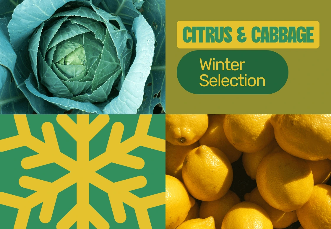
WINTER COLOR PALETTE
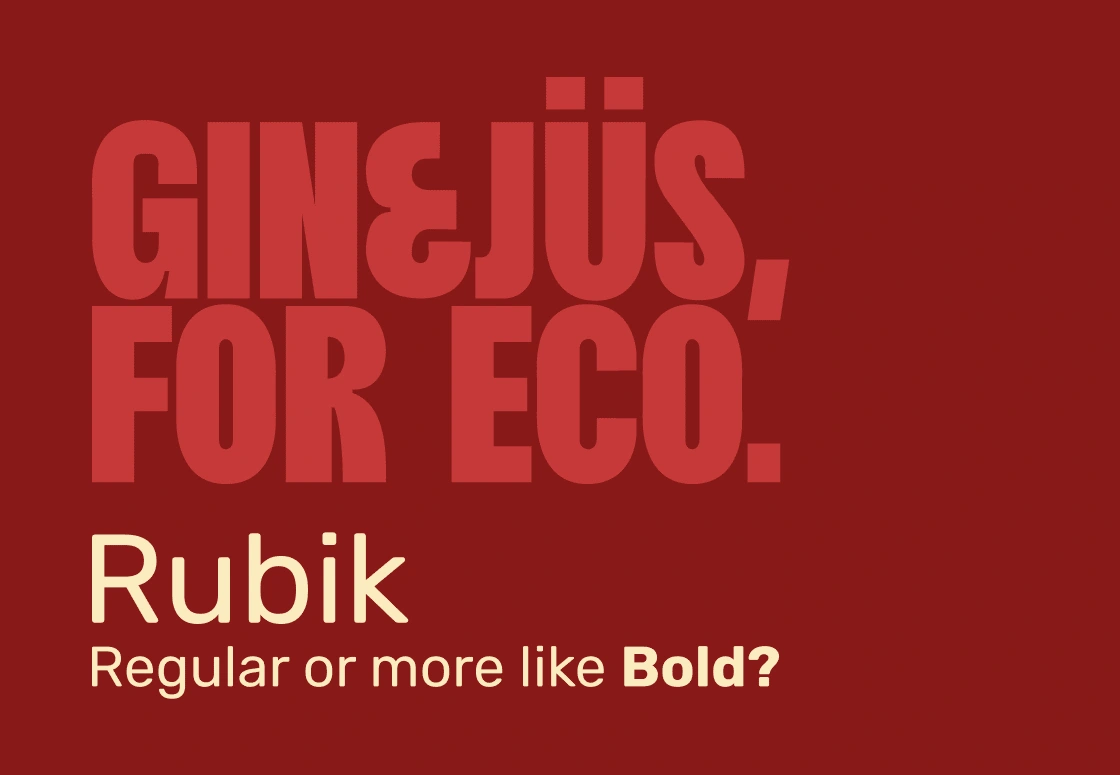
Typography: bold and Sans Serif, the choice for this brand. Legibility is uncompromisable for an almost fully digital presence.
TYPEFACES
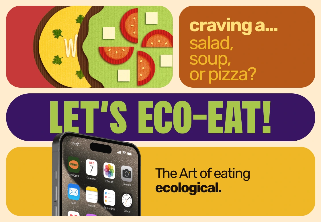
Illustration: definitely the little thing of this art direction! Inspired by a form of plastic art that aligns with ecological standards: Cardboard Art. Each piece is created with a meticulous superposition of layers made of cardboard images, designed entirely in Adobe Illustrator, but can be designed physically if one day this brand will come to life! The perfect extension to the organic, ecological and natty theme.
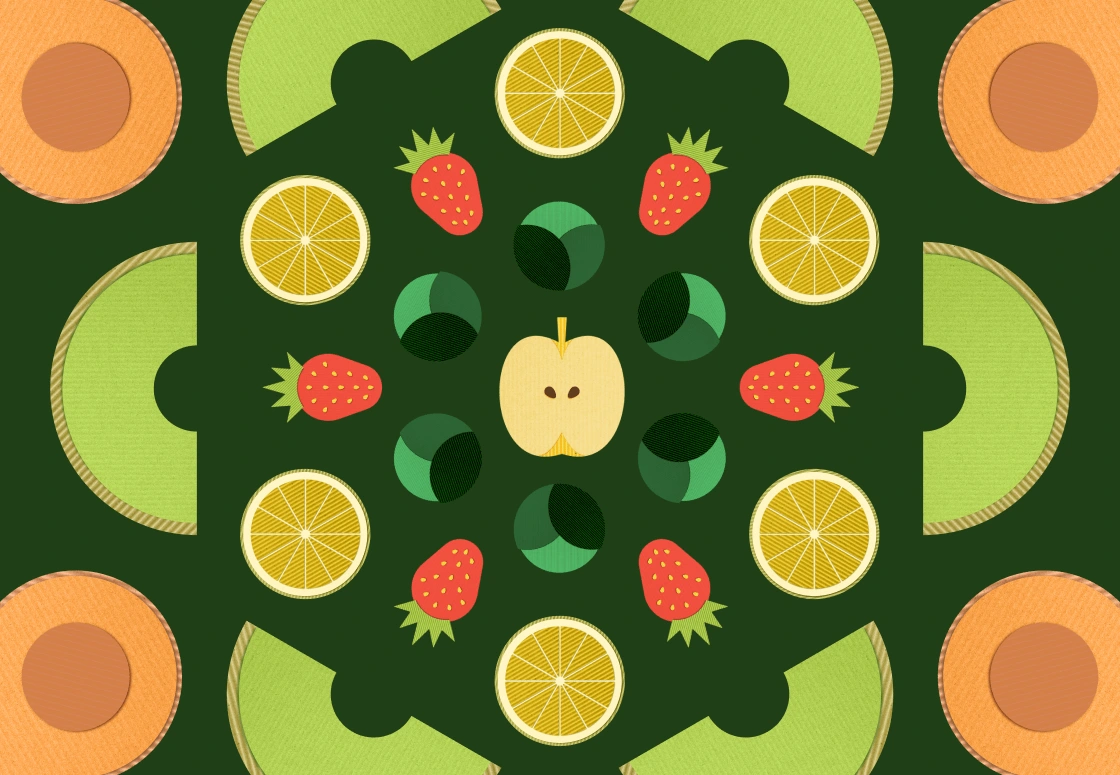
CARDBOARD ART ILLUSTRATIONS
III. Mobile App
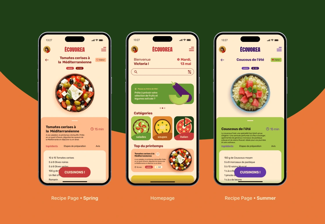
UI Design: with modest skills in UI design, the app was created around the cycle of the seasons. Each new season, the interface sheds its skin and refreshes with a new look to match the seasonal aspect of the meals. This makes the experience on the app more enjoyable and definitely not boring to the eyes.
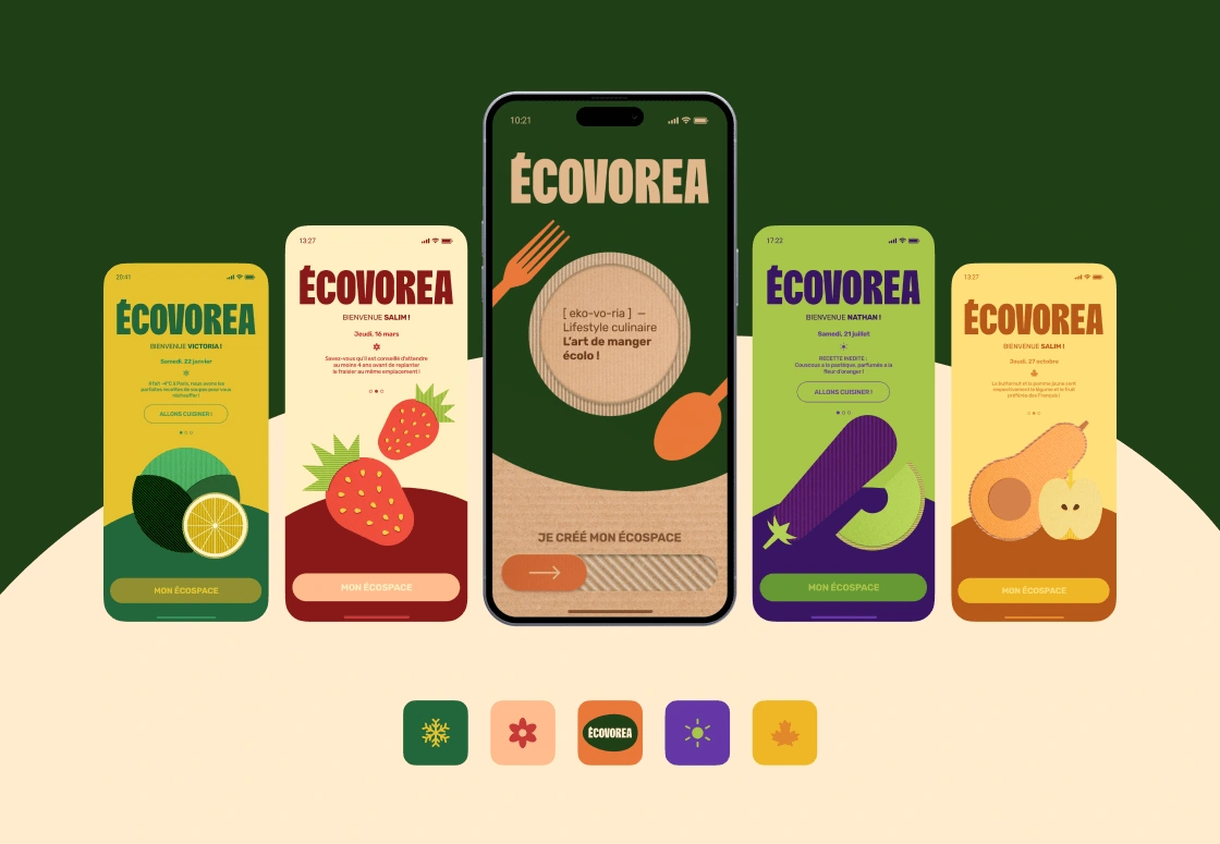
LOG-IN SCREENS VARYING WITH SEASON
UX Design: The whole app is designed to bring an intelligent and ergonomic experience to eco-aware users. It offers suggested meals based on the weather, information on consumption and ingredients, their origins and cultural significance, quizzes, and good-to-know facts. This way, the users are at the center of the experience and are provided with the best eco-friendly solutions they could ask for.
Like this project
Posted Jul 4, 2024
ECOVOREA is a digital universe dedicated to eco-friendly consumers, seasonal-meal stans in particular, who have a conscience for all beings and nature. 🍃