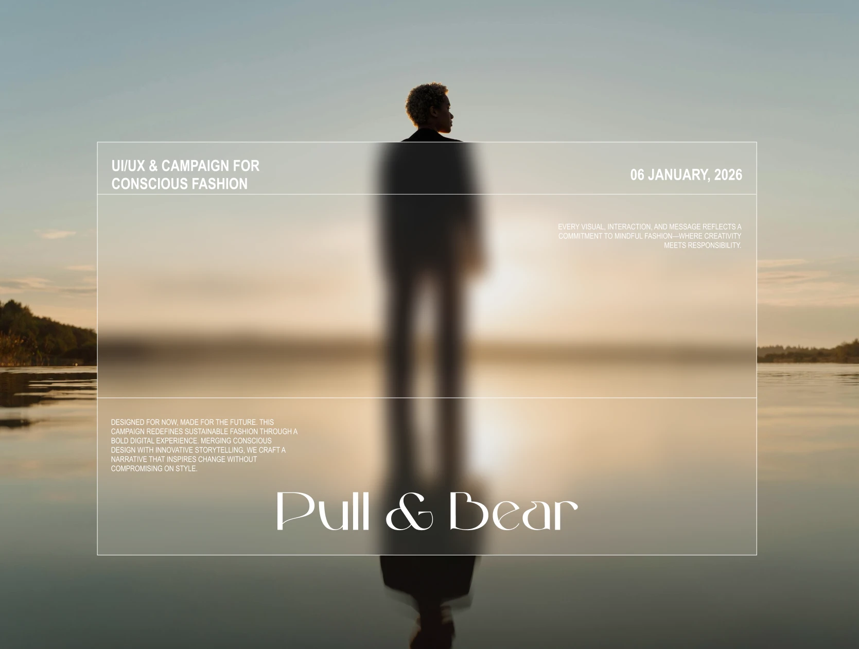
Pull&Bear Website Redesign for Sustainability
Crina Iolanda
Insight & Motivation
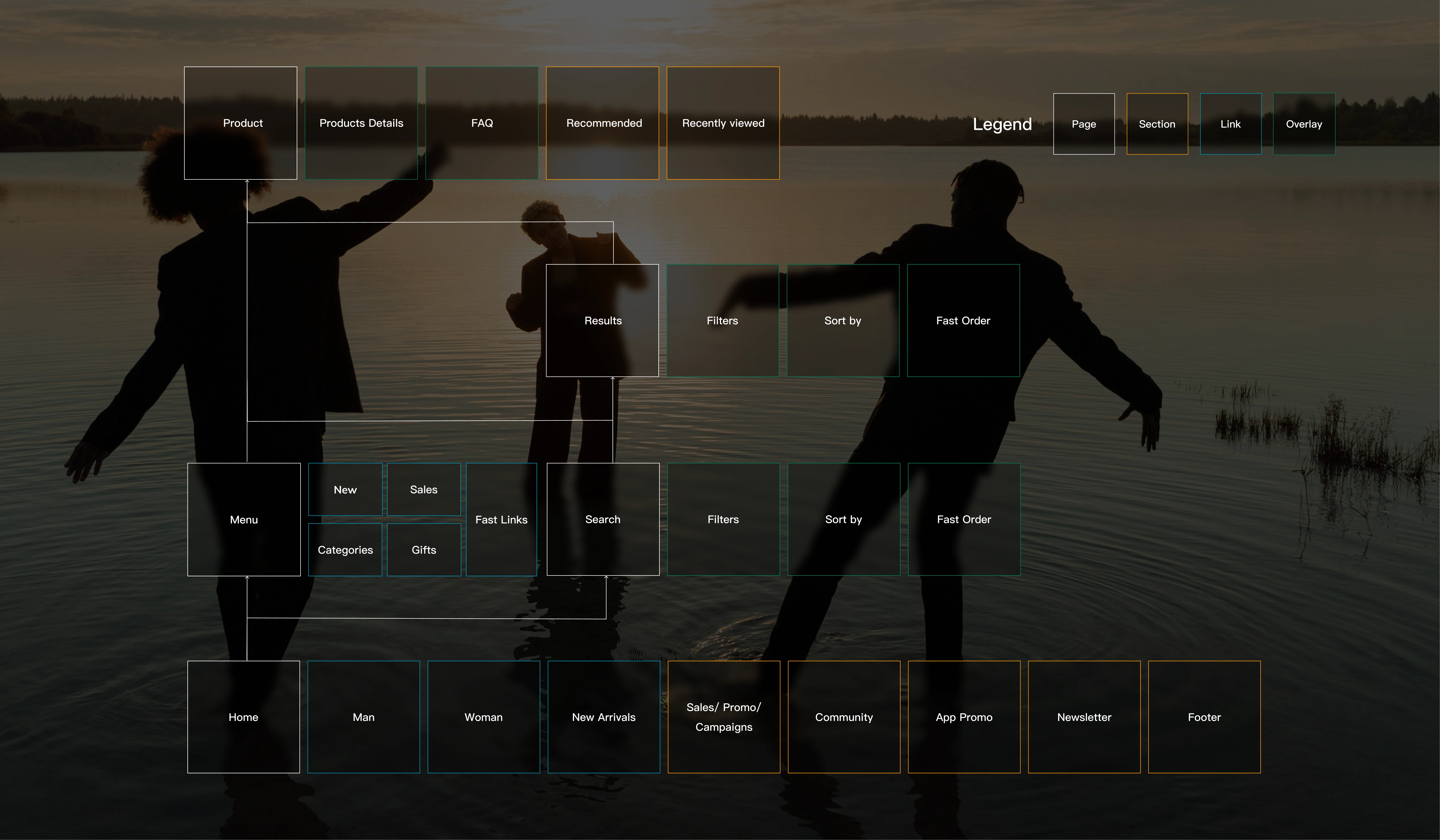
Pull&Bear’s site looked trendy but buried its growing sustainability story and made core tasks likr browsing, filtering, and checking out feel clunky. I set out to prove a cleaner path was possible and that a greener message could drive engagement, not distract from it. Below you'll find an infographic with the user flow that I refined.
Gap spotted
Sustainability buried three clicks deep
Navigation dense, filters hidden, cart flow disjointed
Visual clutter: heavy banners, competing promos, small type
Objectives
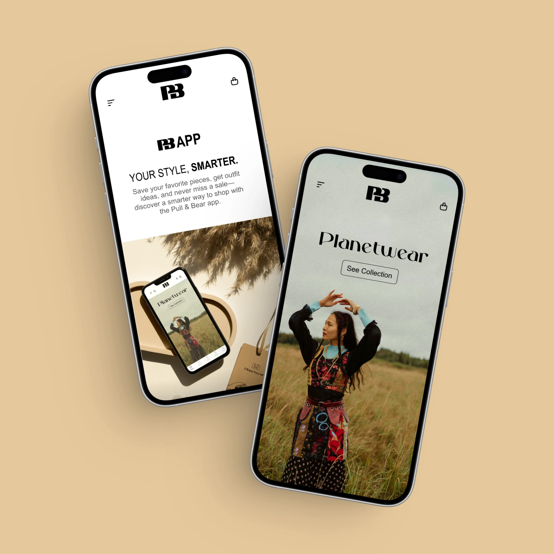
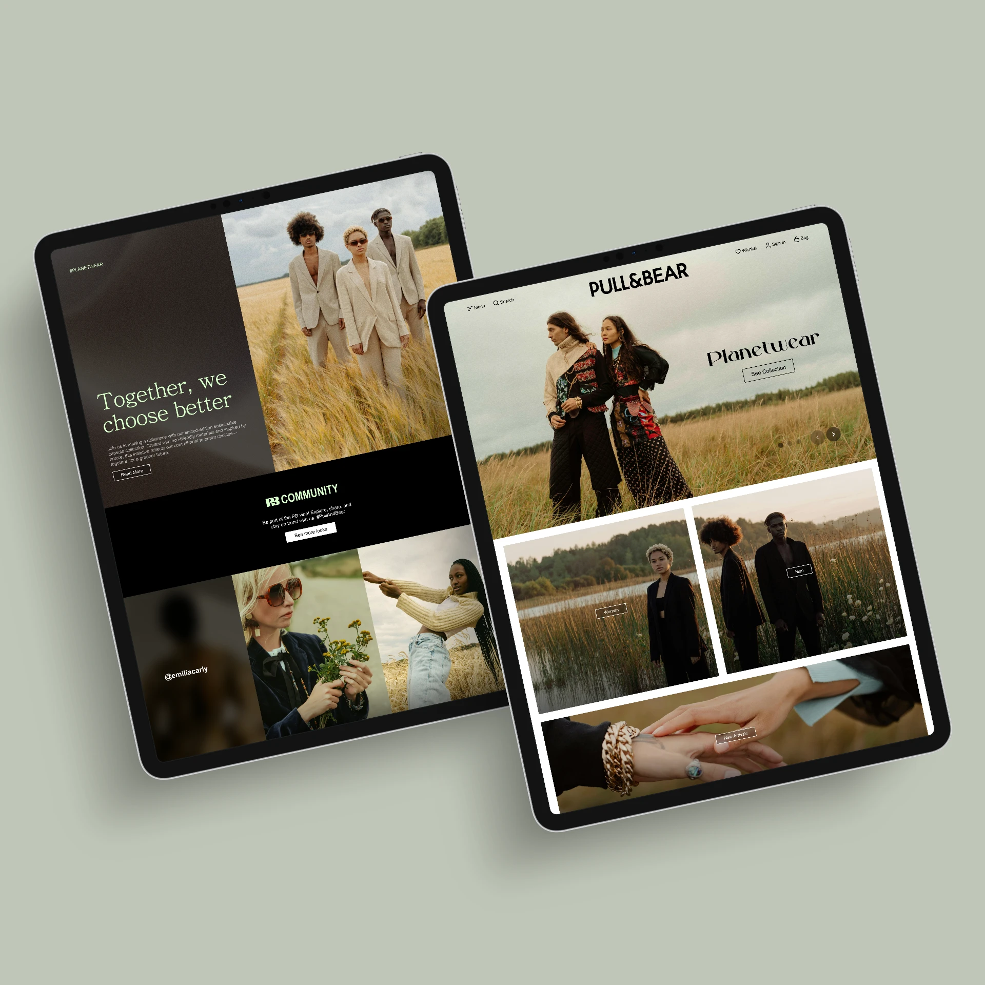
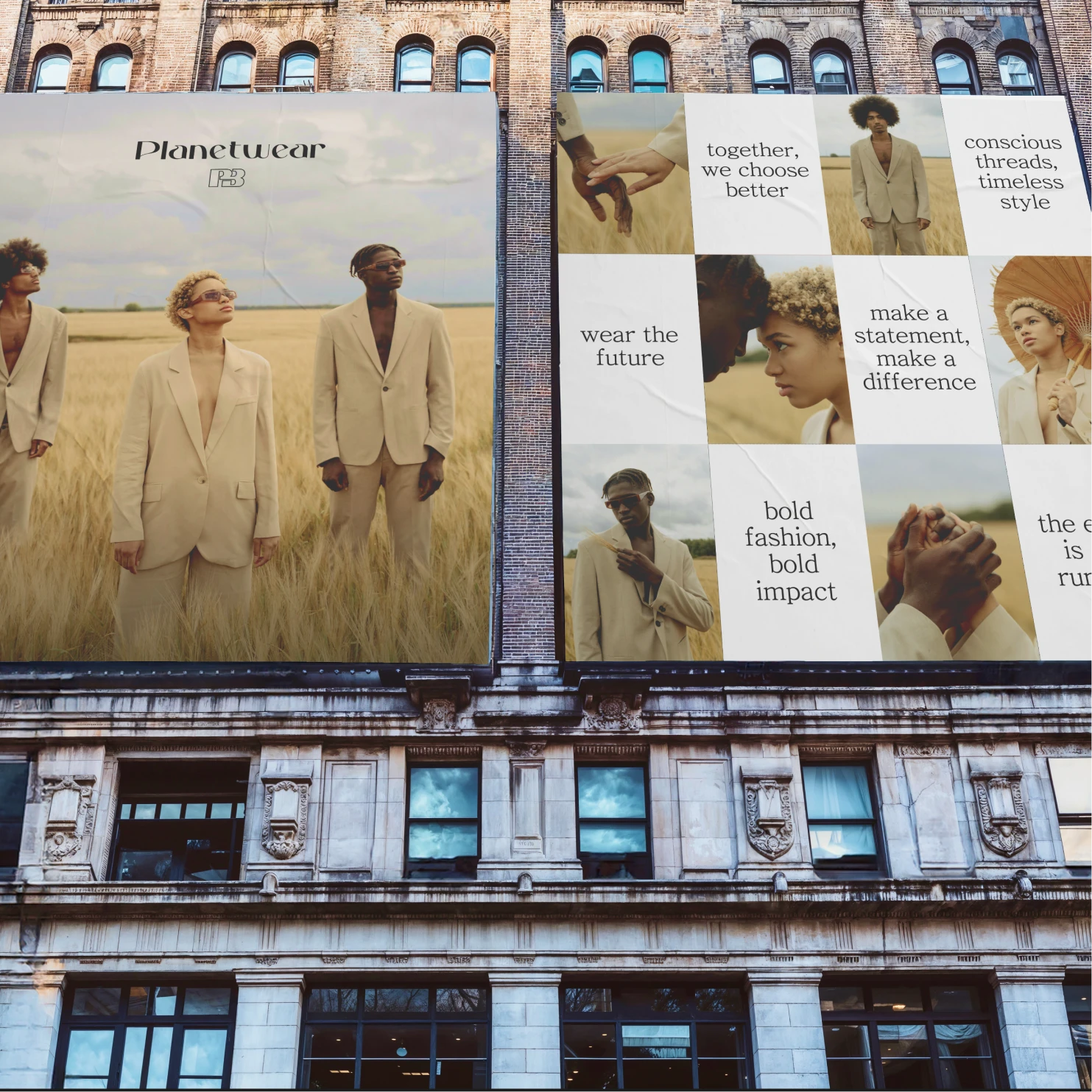
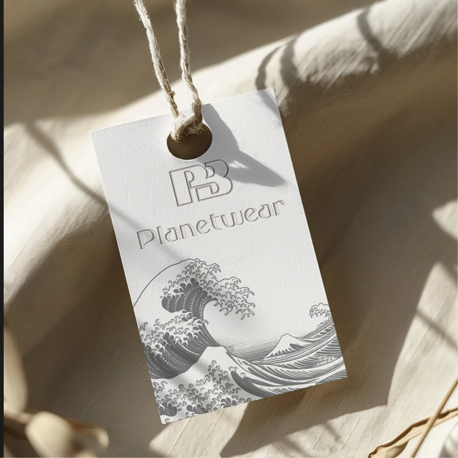
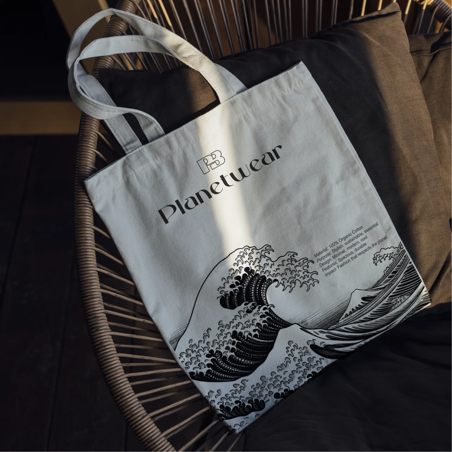
Surface an eco narrative with the new Planetwear hub
Simplify browse → cart in three intuitive steps
Refresh UI for clarity, readability, and faster decisions
Design Direction
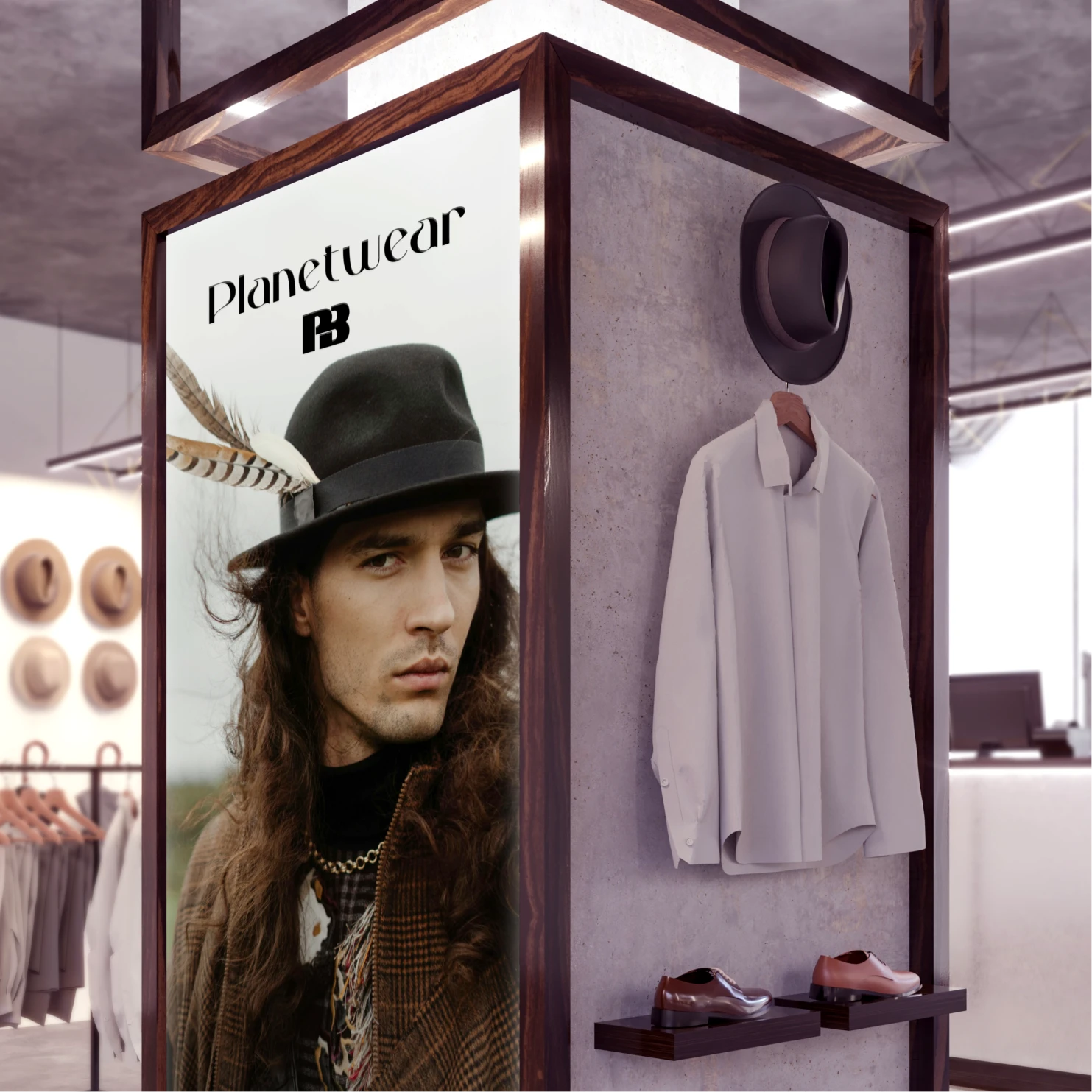
“Planetwear” became the north star: bold, editorial visuals balanced with soft, eco-toned accents. The system had to feel young, global, and instantly shoppable.
Key moves
Modular grid with generous white space and larger product cards
Sticky filter bar, one-screen checkout summary
Gentle greens and creams paired with Pull&Bear’s signature black for contrast
Sustainability badges and impact meters on product page.
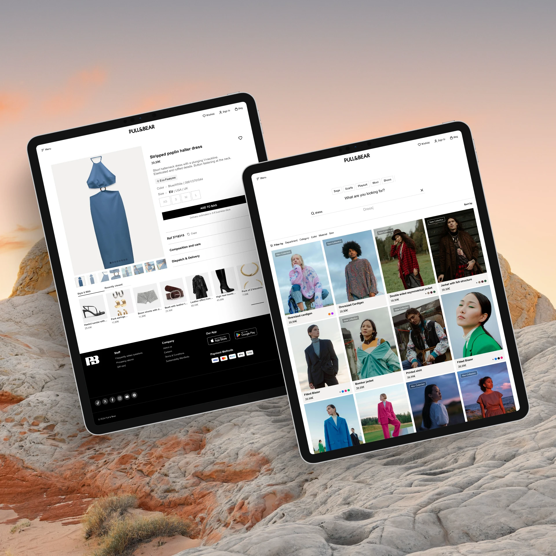
Outcome & Prototype
The clickable prototype is showcasing eco collections, cutting friction, and inviting community action.
Highlights
30 % fewer steps from homepage to checkout
Accessibility color contrast AA+ across all components
Planetwear landing, impact meters, and community challenges woven into the main nav
Usability test (5 users): task success 100 %, avg. completion time ↓ 42 %


Like this project
Posted Jan 11, 2026
Redesigned Pull&Bear's site for better sustainability focus and user experience.