Re'es Brand Identity
Kidus Minyelshowa
The Re’es brand is built on tension — old and new. It starts with a crow, a bird known to be both a messenger and a witness. Its body faces the future, head looking back.
The logo perches this crow on an R, standing tall against hues of red, colors that recall history’s blood and fire.
A bold serif typeface grounds the design, formal yet fierce. This is a brand that doesn’t whisper. It jolts, then asks, “What do you see?”
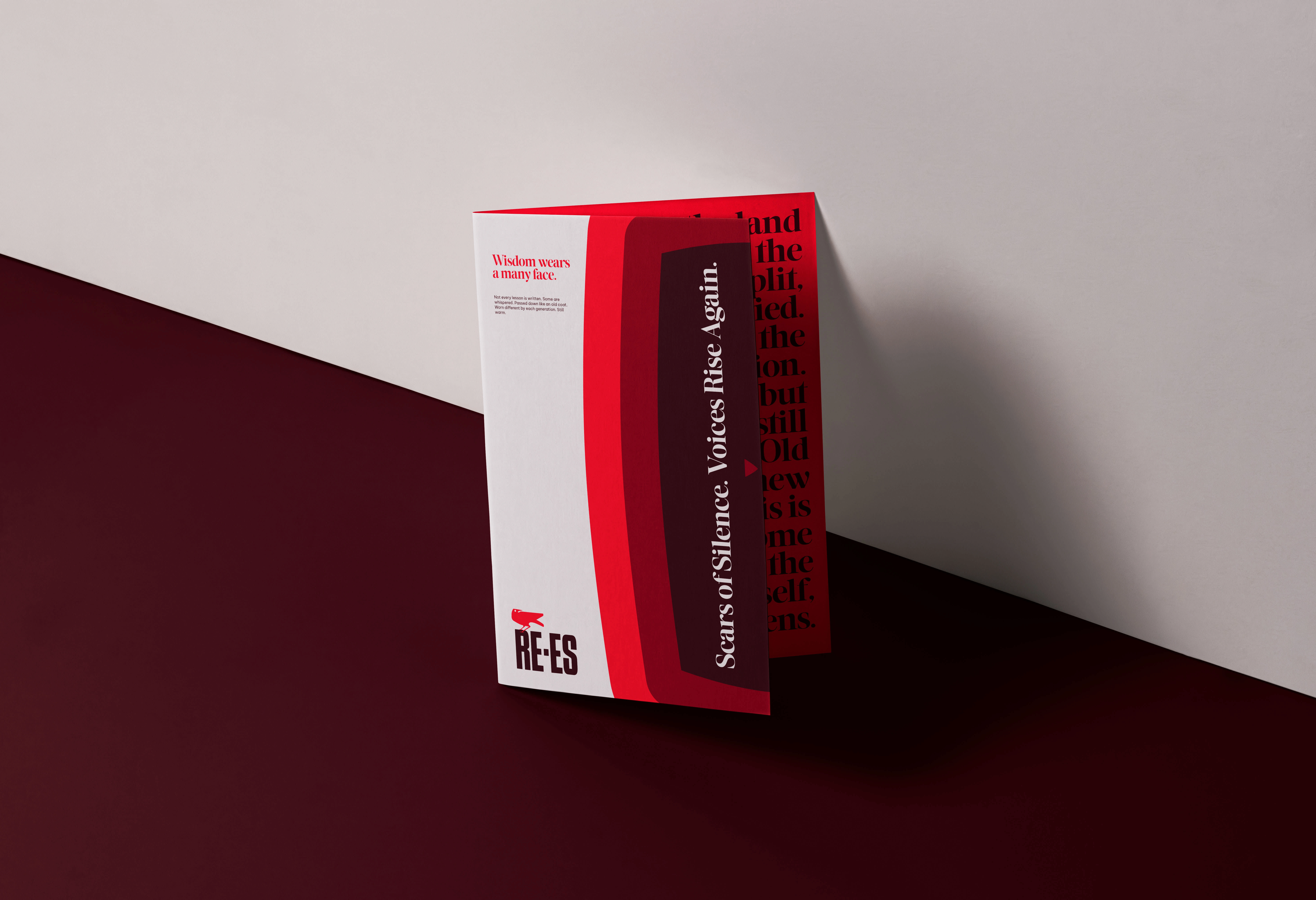
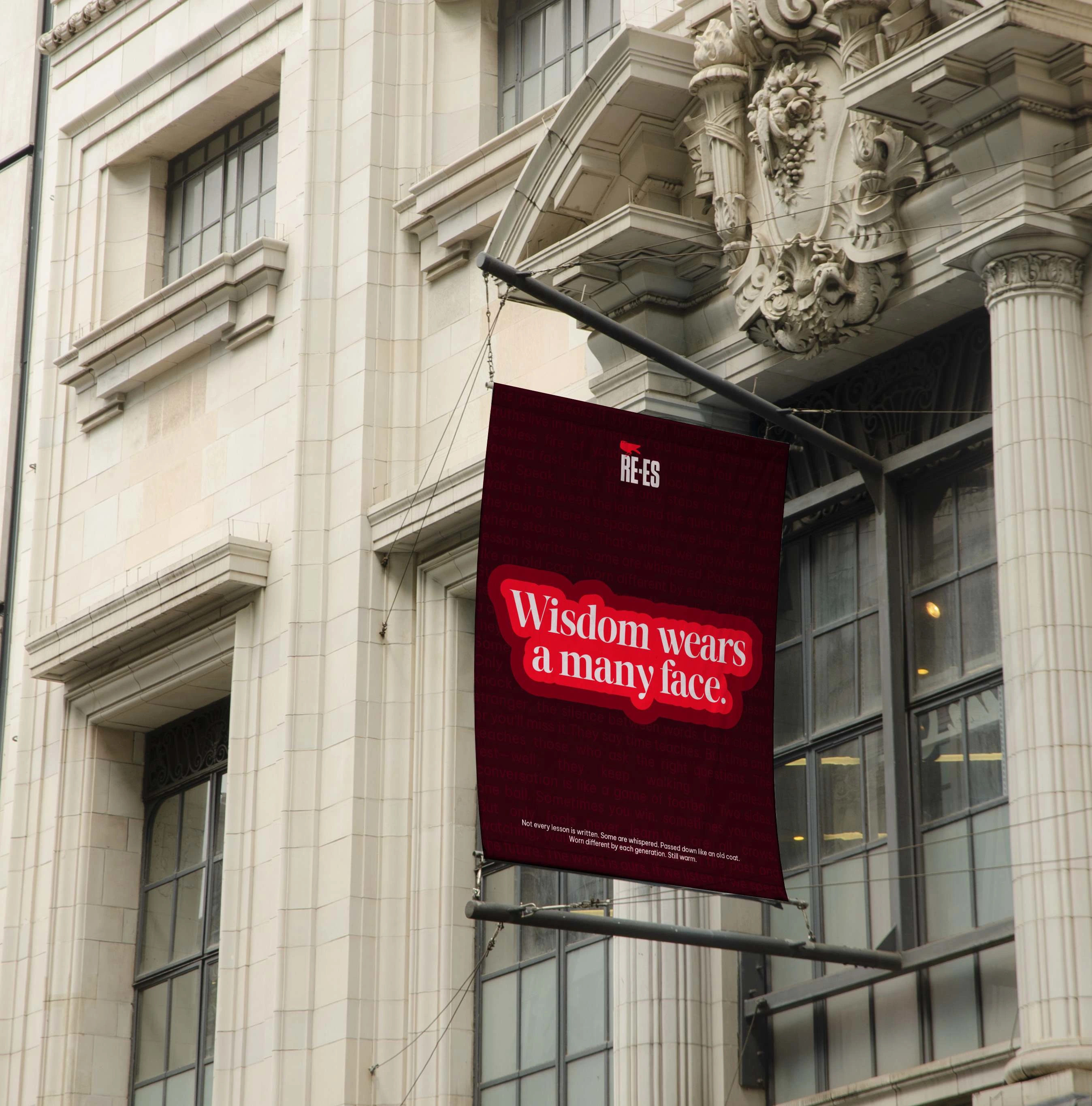
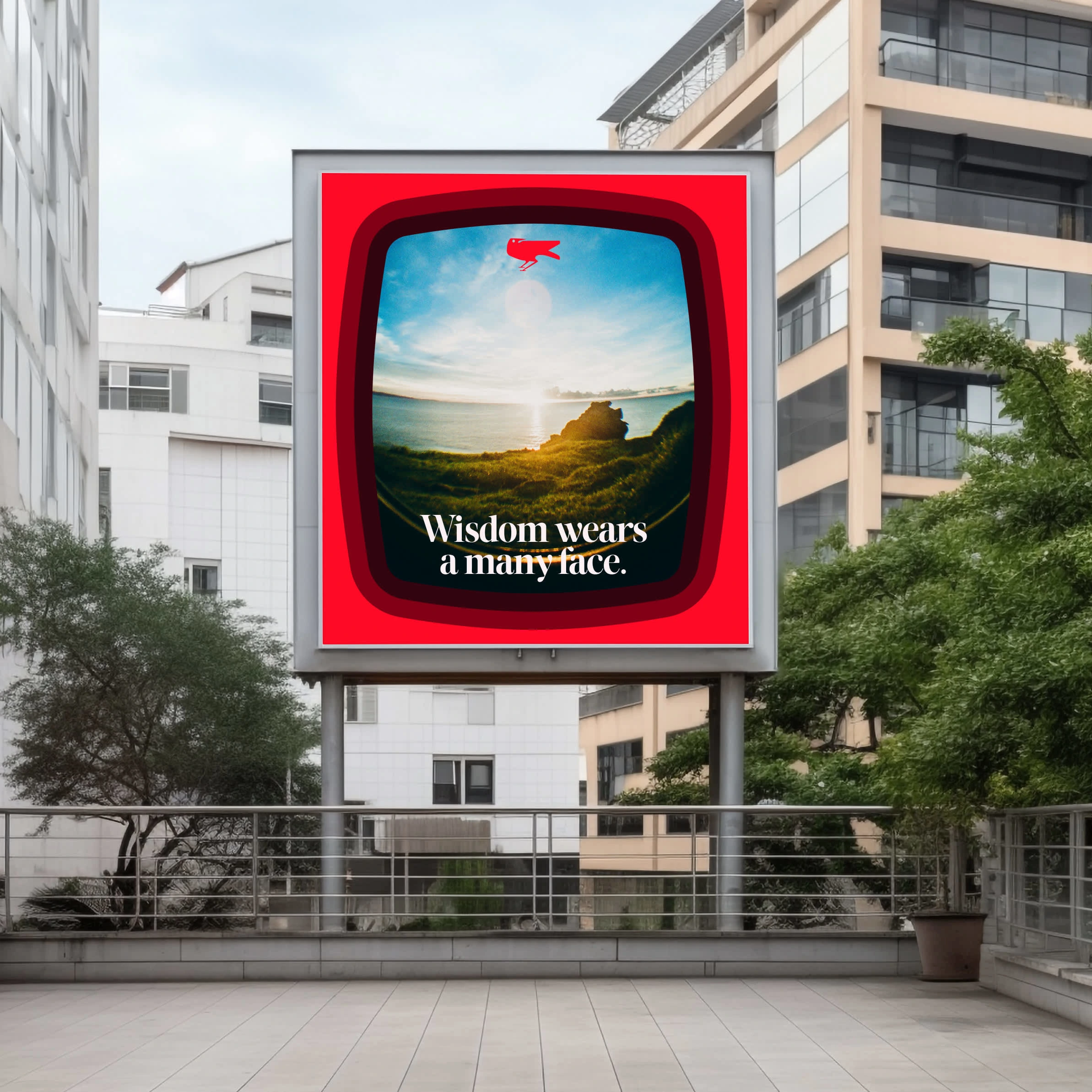
Re’es wants shock first, conversation after. The visuals? Curved squares like a vintage TV, repeating, reminding us that what’s behind often returns.
Like this project
Posted Oct 22, 2024
Re’es branding shook the room. It forced eyes open with bold reds, a crow looking both ways, and sharp, repeated forms. It hit first, then sparked thought.