EEC Rebranding
The brand needed a shift—17 years of history, now looking forward.
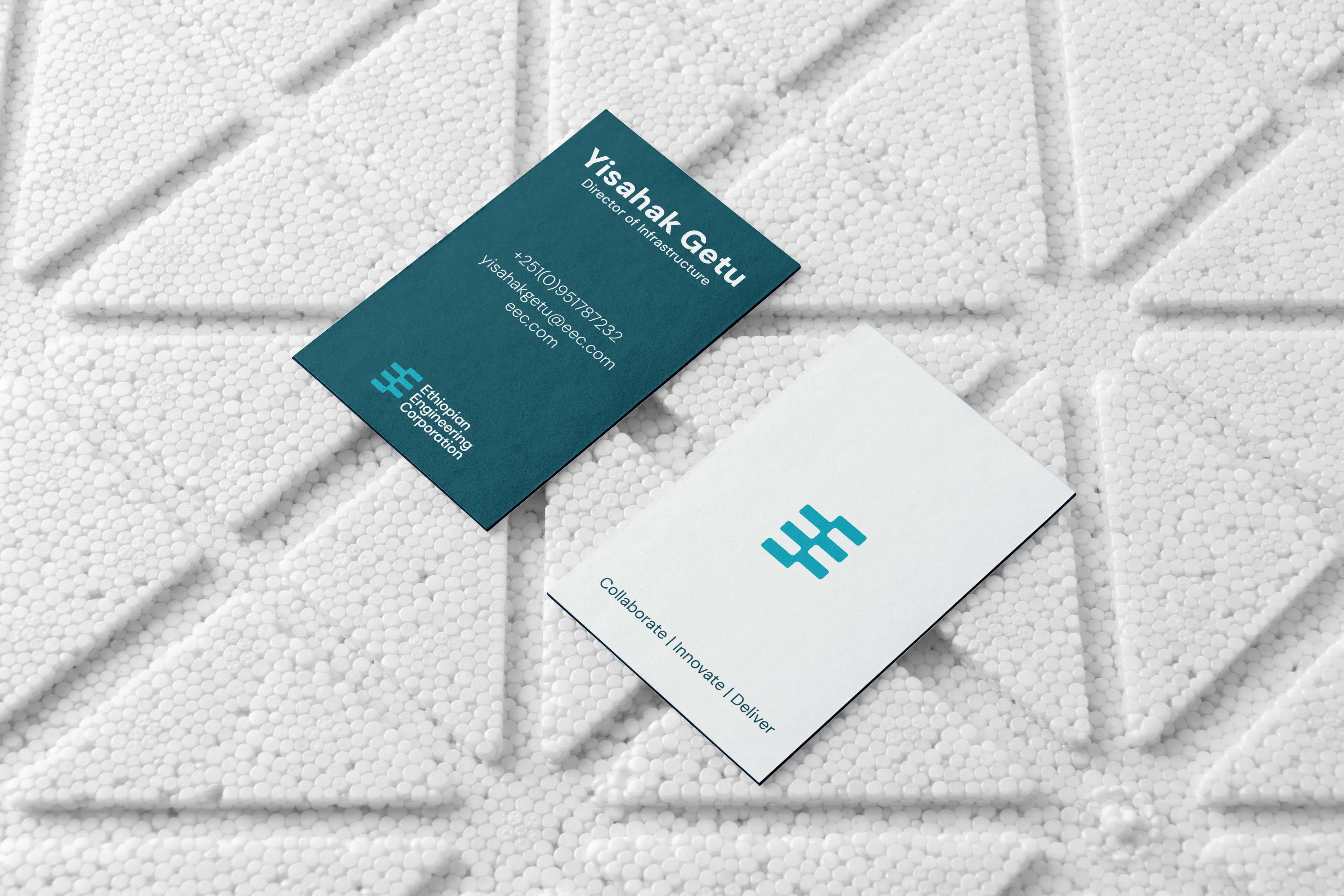

The logo, two E’s, one from negative space, created a sense of flow and movement.
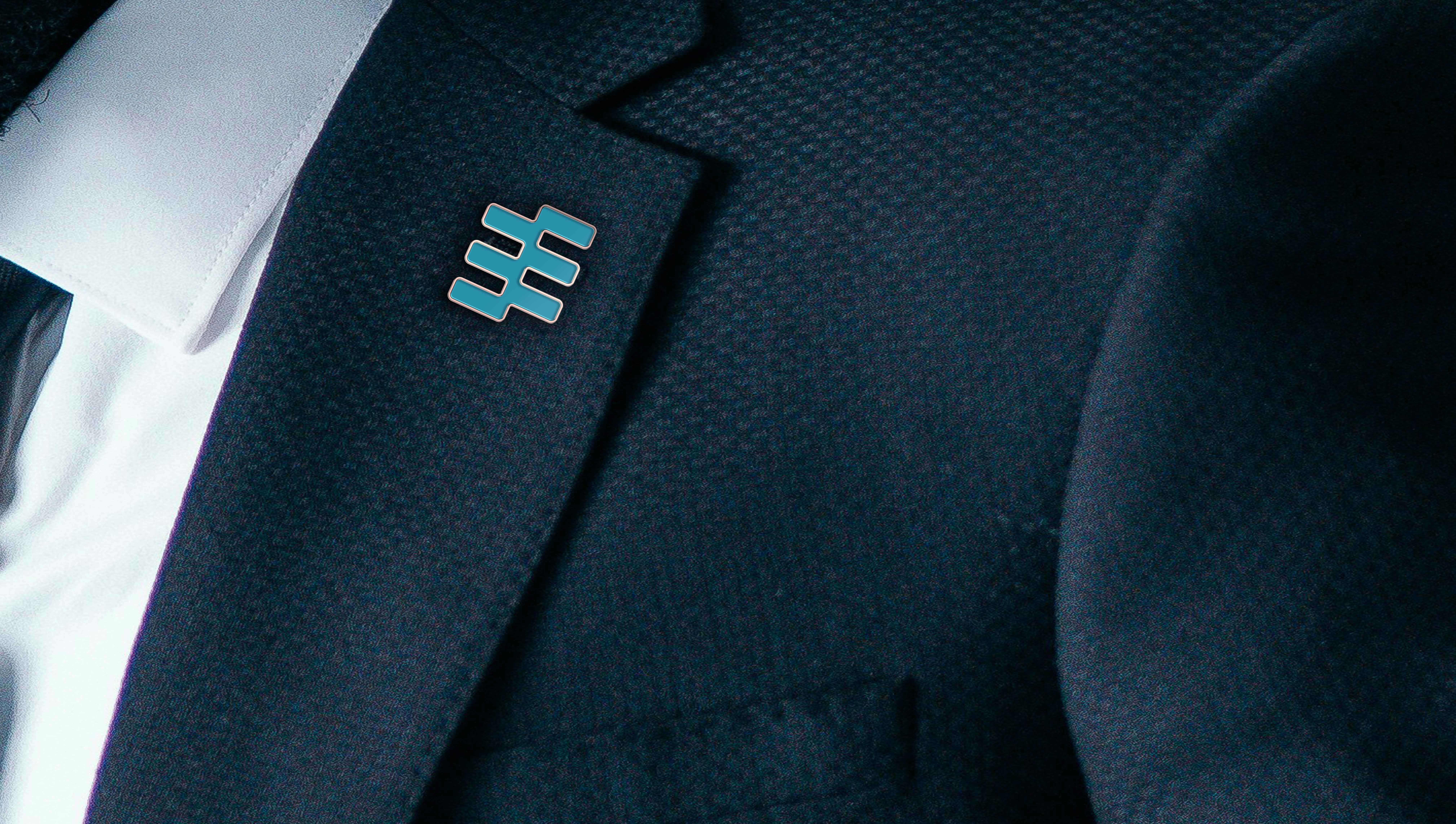
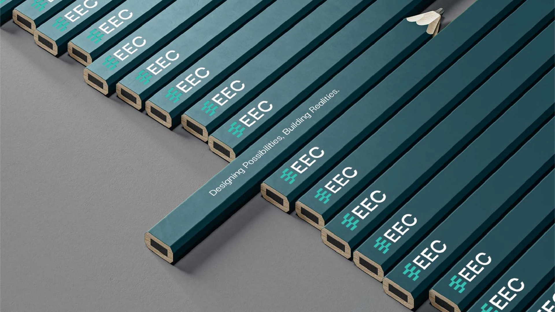
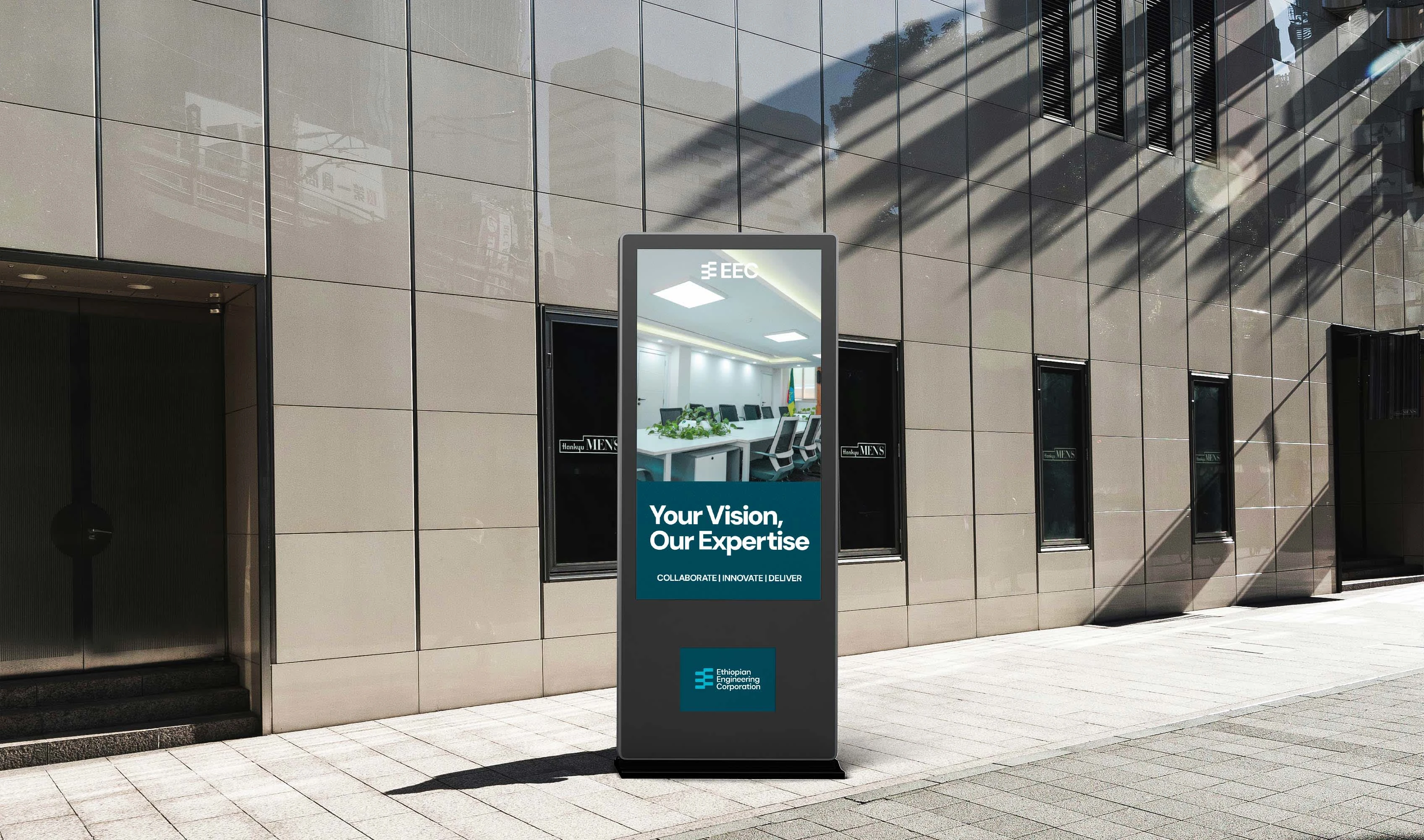
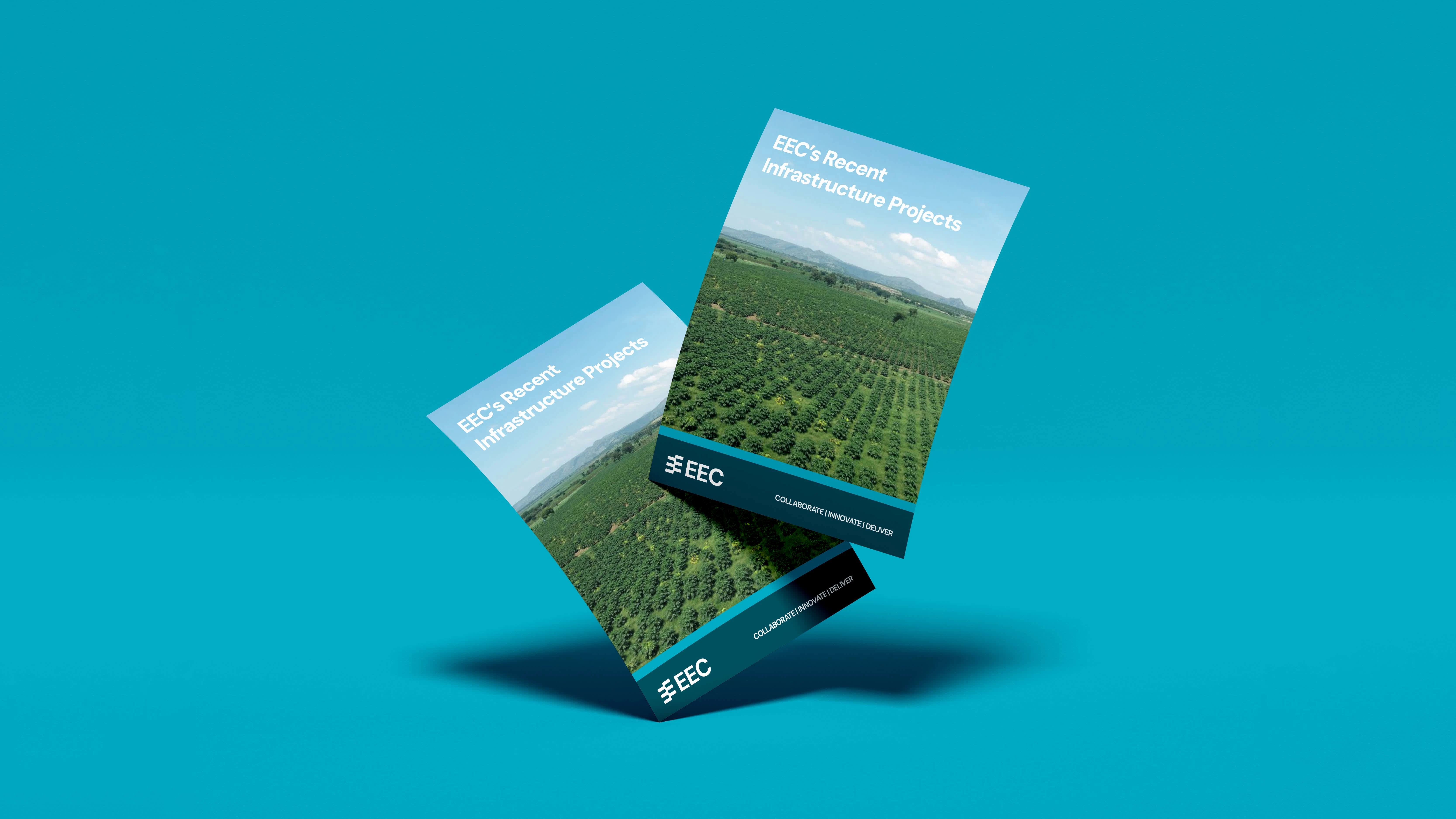
Undulating waves echoed collaboration and innovation, key to EEC’s DNA.
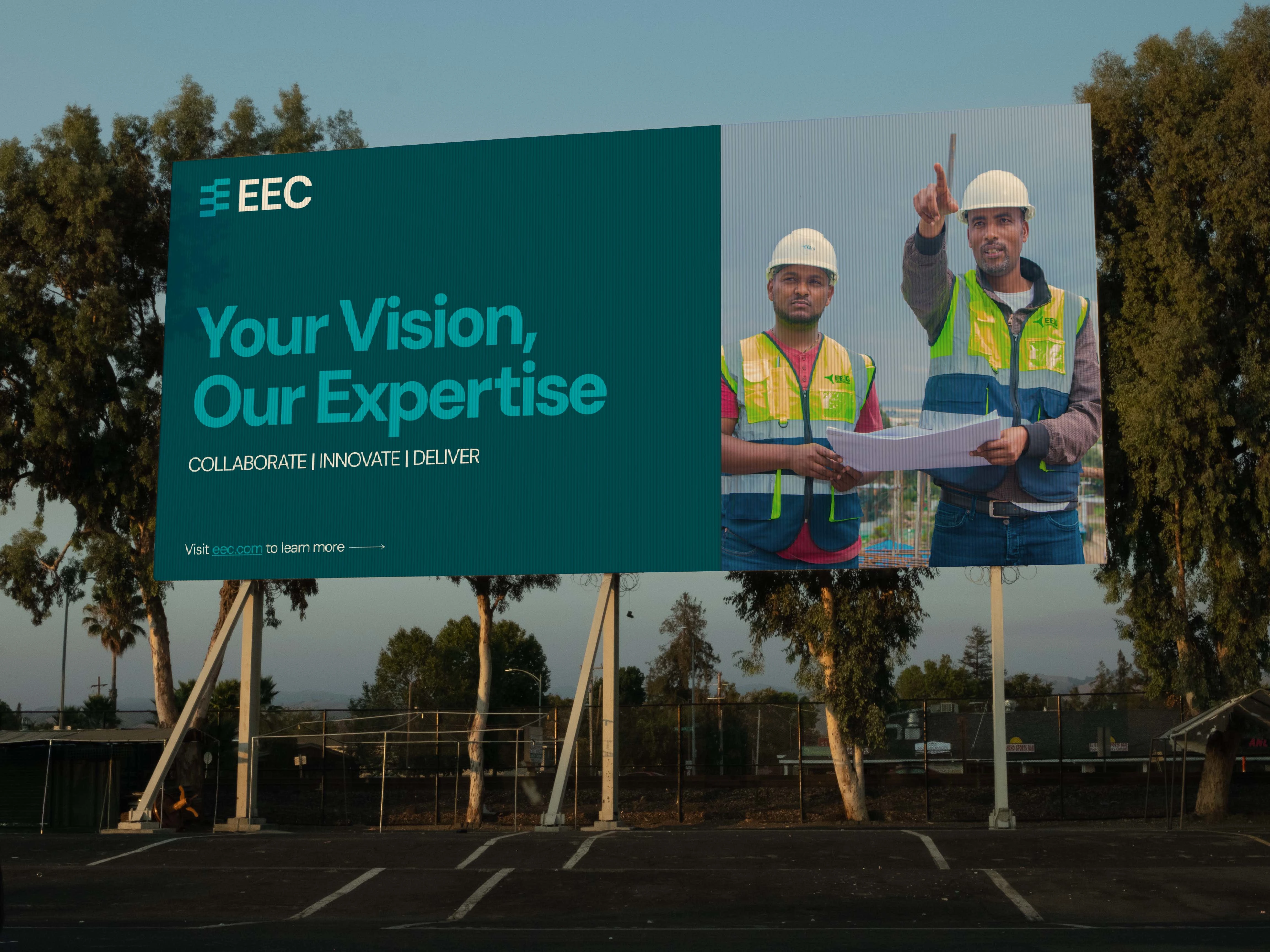

The turquoise and teal palette kept it fresh, while charcoal black grounded it. DM Sans, clean and geometric, spoke of precision.
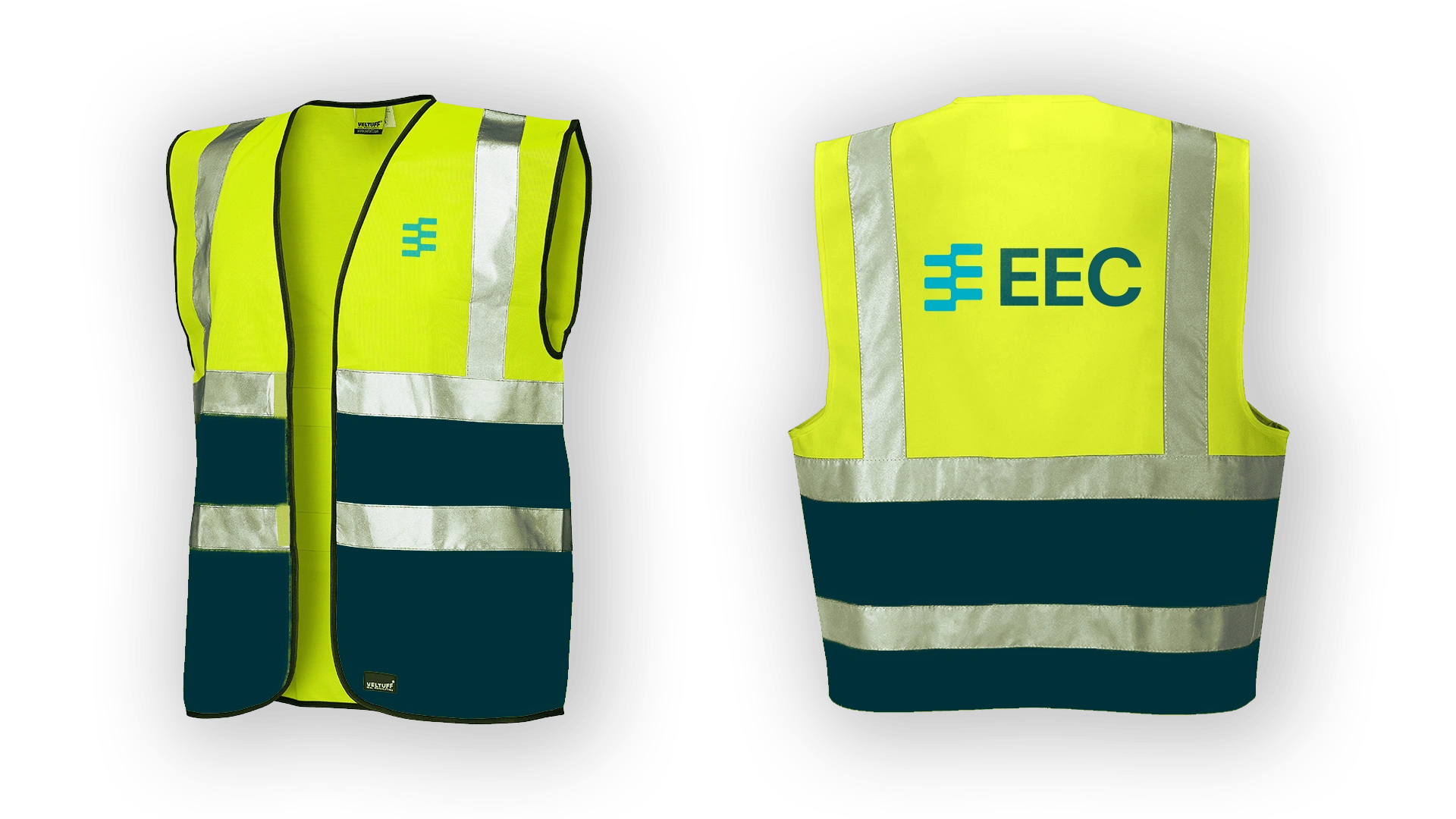
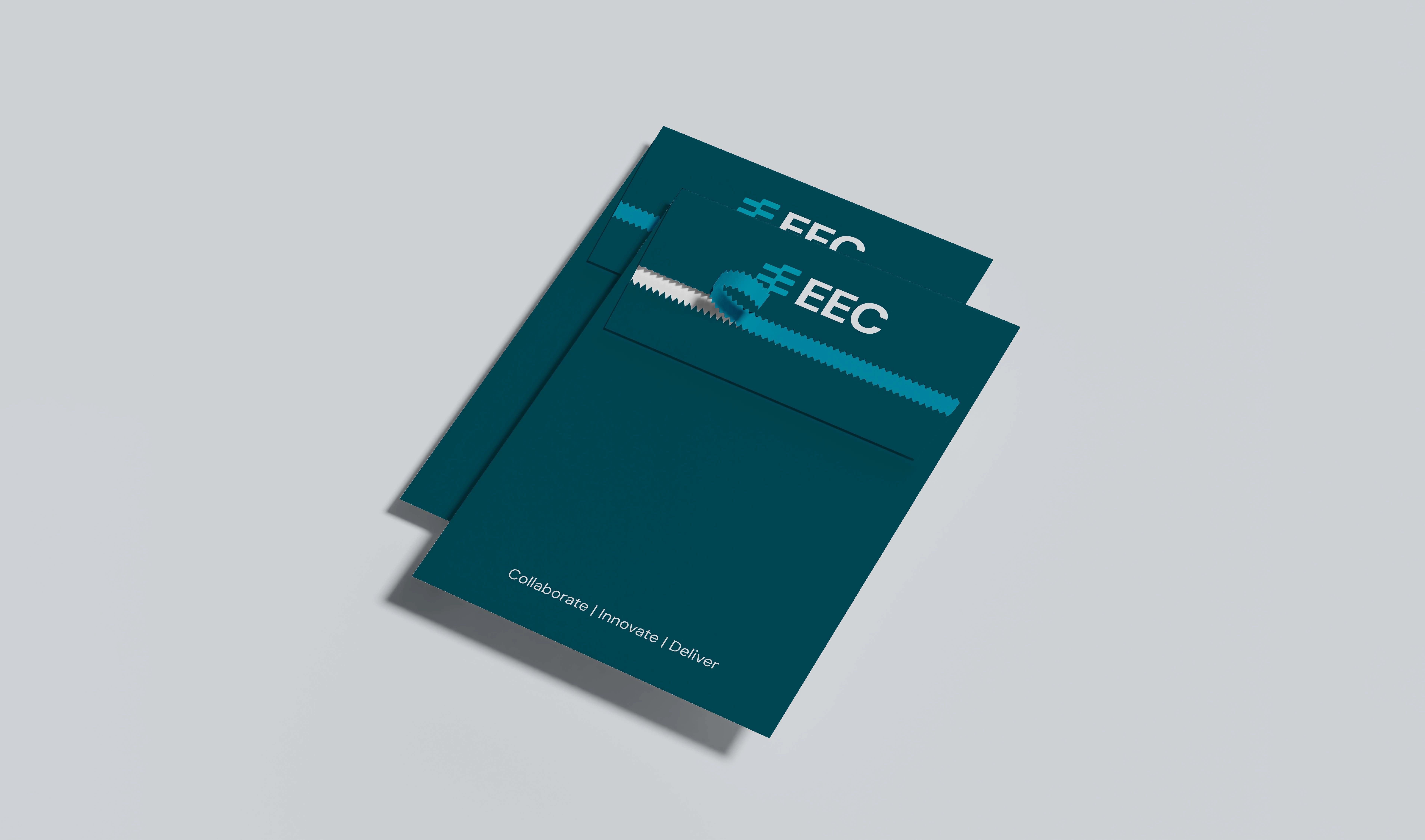
This brand became more than just engineering—it was about delivering on promises. Strong. Clear. Ready to build the future.
Like this project
Posted Oct 23, 2024
The rebrand sharpened EEC’s identity—bold, modern, and precise. It reinforced trust with its clients, signaling a new era of collaboration and innovation.


