Bank of America Mobile Experience (Product Design)
Overview
Bank of America’s iOS app has near 5 stars in the app store. The purpose of this project was to audit and identify areas of improvement for Bank of America’s mobile user experience.
Real user reviews were used to identify such areas, and come up with data-driven design solutions. Fromnavigation to AI-powered assitance, the redesign addresses the disconnect between user satisfactionand design in the current mobile app design.
Research
Problem Definition
At first glance, the app is a near 5-star success in the Apple App Store. However, further inspection into the app store revealed ample discontent with the current app's design and the company's service.
Complaints revealed several areas for improvement, which I was able to use a foundation for redesigning the mobile user experience.
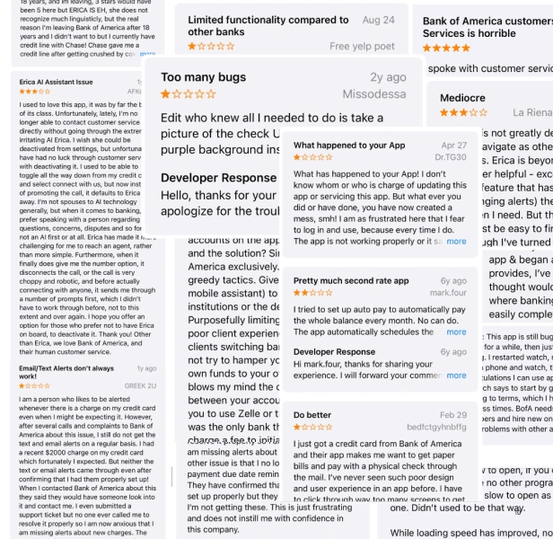
Several ratings and reviews in the Apple App Store were used to identify areas of improvement
Research Process
Gather Data & Affinity Mapping
The research process began by first identifying common complaints about the mobile experience. Five areas of improvement were identified:
Navigation (information architecture)
Customer Support
Notifications
Transaction management
Erica's Usefulness (AI assistant)
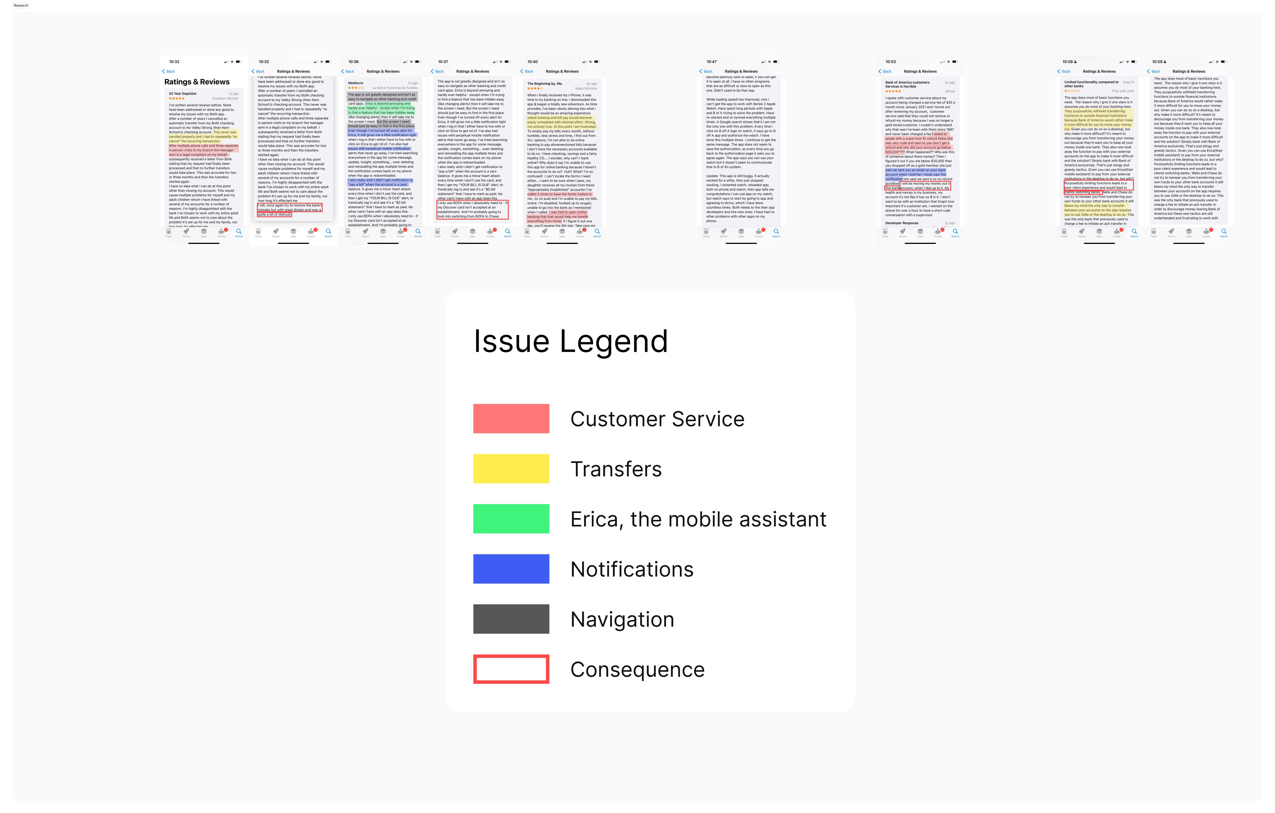
Affinity Mapping 5 Areas of Improvement based on App Store reviews
Using chatGPT to backup findings
While the research was 100% human-led, I used chatGPT to help me verify and validate my findings. This consisted of using chatGPT's 4o model for image-to-text recognition, prompting for a summary of each review and and action items to improve the design.
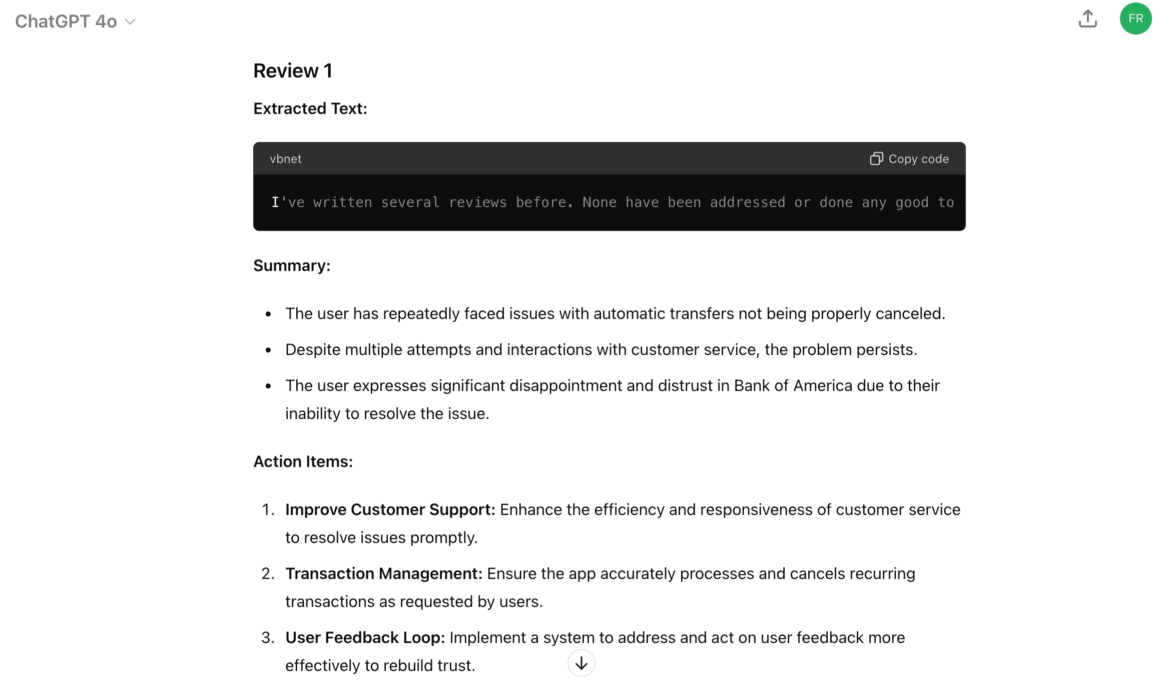
chatGPT research output
Product Design Requirement
By aggregating the themes and summaries, three key requirements were created:
Improve navigation throughout the app, rethinking information architecture around the areas of improvement identified in the previous step of research.
Redesign how notifications are implemented, focusing on relevancy and clear communication
Leverage Bank of America's AI assistant to improve customer support
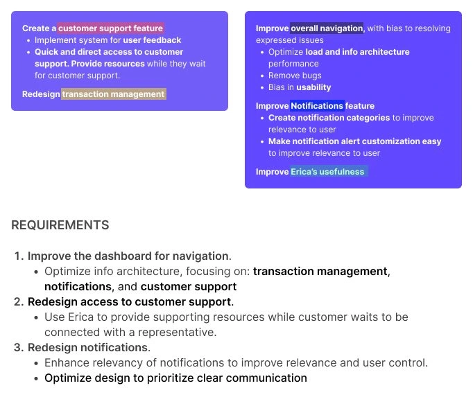
Cards with Affinity Mapping and Action Items from chatGPT, and Design Requirements
Design
Navigation
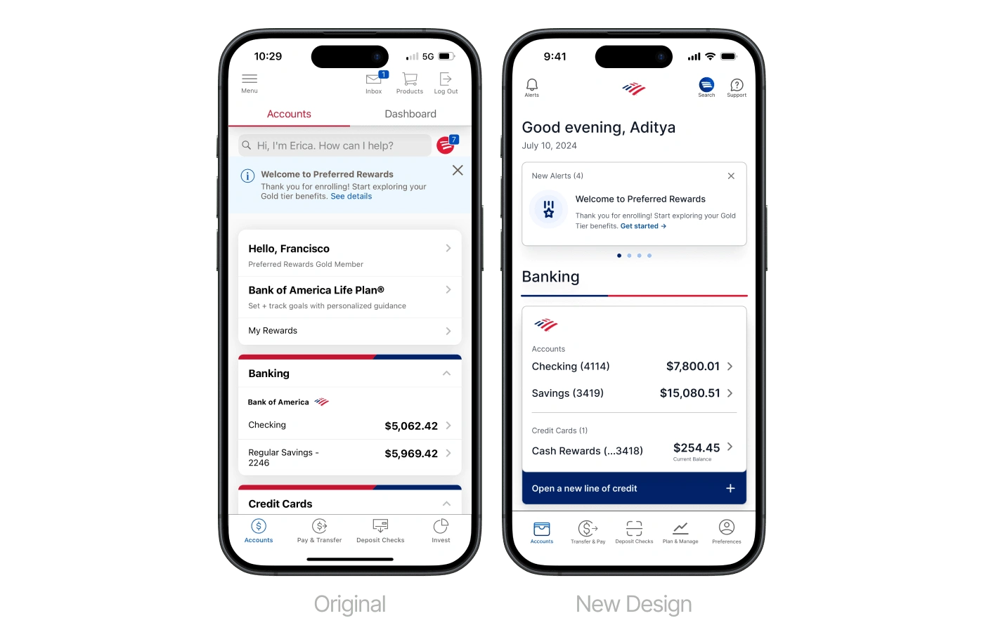
Key Improvements
Customer support visibility
Header relevancy and information density
Clear section and visual hierarchy
Clear calls to action (CTA's)
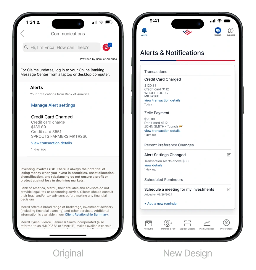
Notifications
Key Improvements
Clear visual hierarchy
Clear functionality and legibility of nested sections
Improved communication for account, settings, and custom reminders
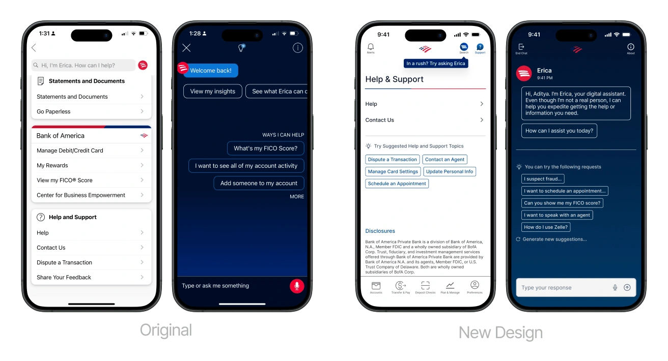
Erica & Customer Support
Key Improvements
Improved visual hierarchy
Improved usability of Erica, focusing on customer support and troubleshooting
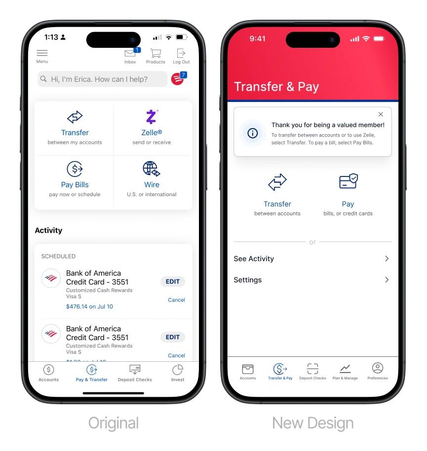
Transaction Management
Key Improvements
Improved information architecture, focusing on information density and nested functionality
Simplified on-brand experience
Conclusion, Reflection, and Next Steps
This project was both challenging and fun. Given more time, a budget, and access to stakeholders, I would have included even more extensive research, including assessing and incorporating business goals in my design.
The next step would consist of gathering stakeholder feedback, including business goals to assess the redesign's proposed information architecture in place. This would look like adding/subtracting sections in the design to include product offerings in a way that further serves Bank of America's current user base.
Next, usability testing would be a key step to an shipping update. This would look like defining 3-5 user stories, depending on said stakeholder feedback, designing and prototyping the corresponding screens, and conducting a usability test with real Bank of America users.
Lastly, the new design would be wrapped up by conducting an audit of new UI components, documenting color schemes, and create design tokens to build a foundation for a scalable design system.
Like this project
Posted Aug 4, 2024
Usability and design audit for Bank of America's mobile iOS app.

