Rhode: redesigning a skincare & beauty brand in minimalism
The Rhode skincare and beauty brand, founded by Hailey Bieber and based in Los Angeles, embodies a commitment to minimalism, reflected in its clean and understated product design. In my redesign project, I sought to enhance this brand identity while infusing it with a more vibrant and inviting aesthetic.
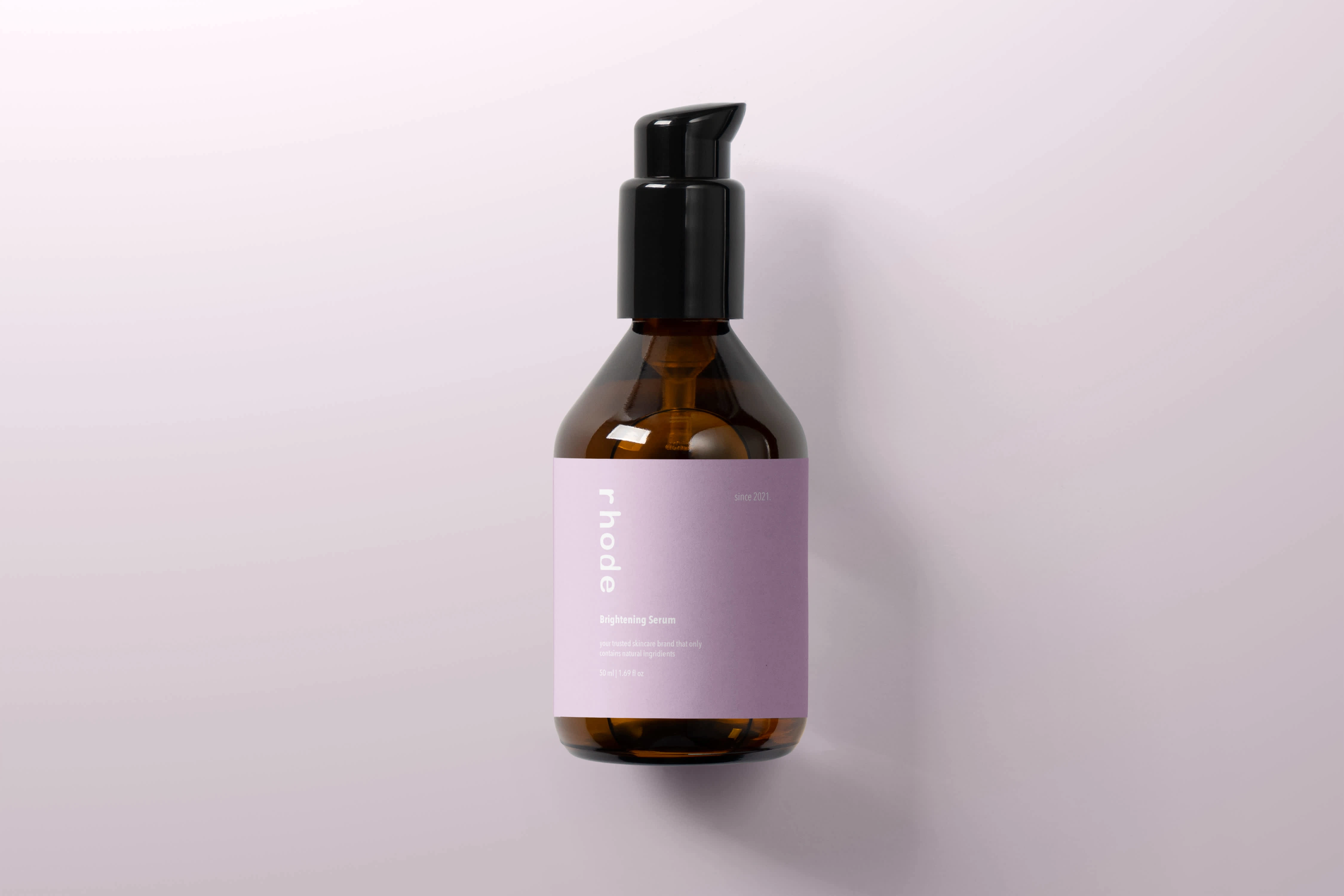
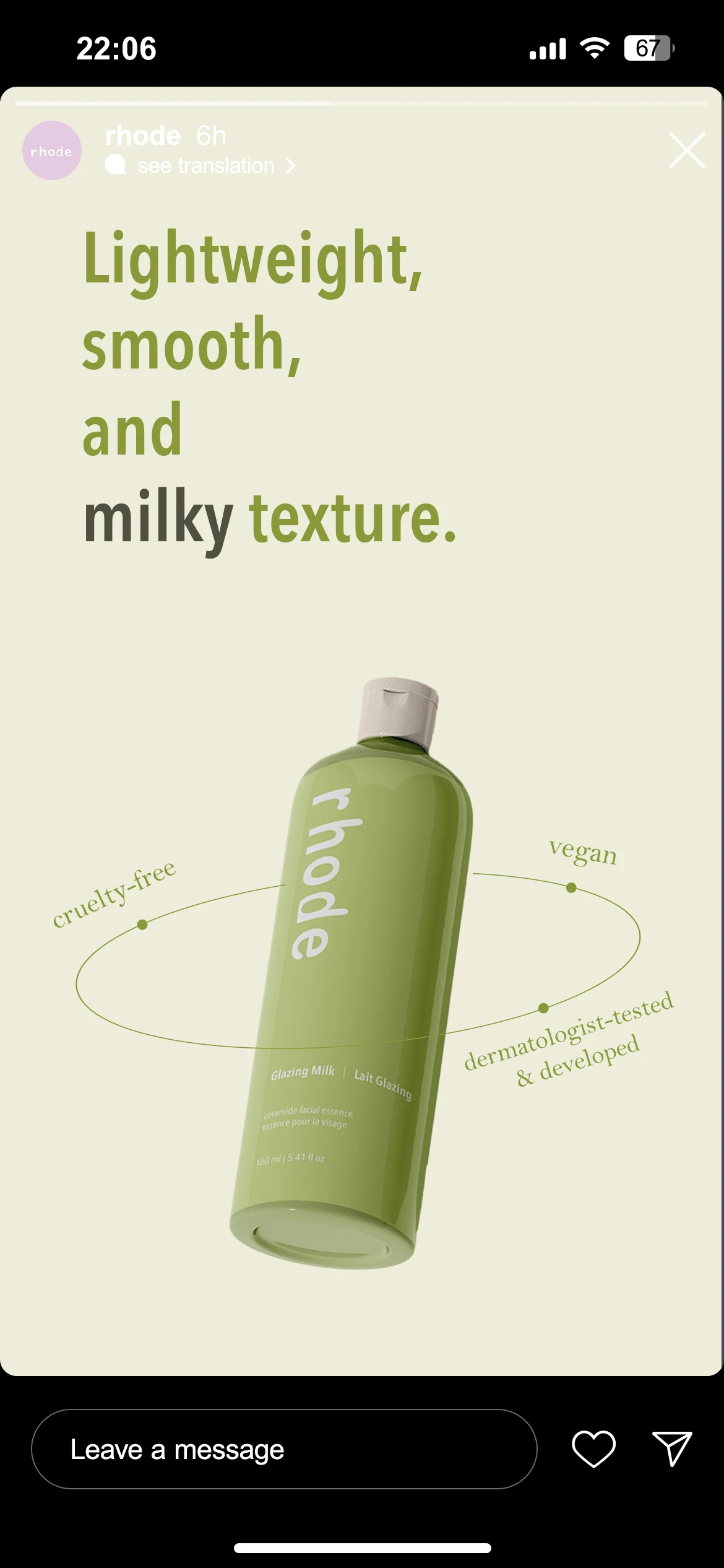
While Rhode's original palette featured a muted grey, I proposed a refreshing color scheme that includes light purple and avocado green. These colors were carefully selected for their psychological impact; light purple evokes a sense of calm and creativity, while avocado green symbolizes renewal and harmony. Together, they create a visually comforting experience that resonates with consumers seeking both beauty and tranquility in their skincare routines.
The principle of minimalism guided my approach throughout the redesign. By stripping away unnecessary elements, I focused on creating a streamlined experience that highlights the products themselves. The packaging features clean lines and ample white space, allowing the new colors to stand out without overwhelming the viewer. This balance fosters an elegant yet approachable look, inviting customers to engage with the brand on a deeper level.
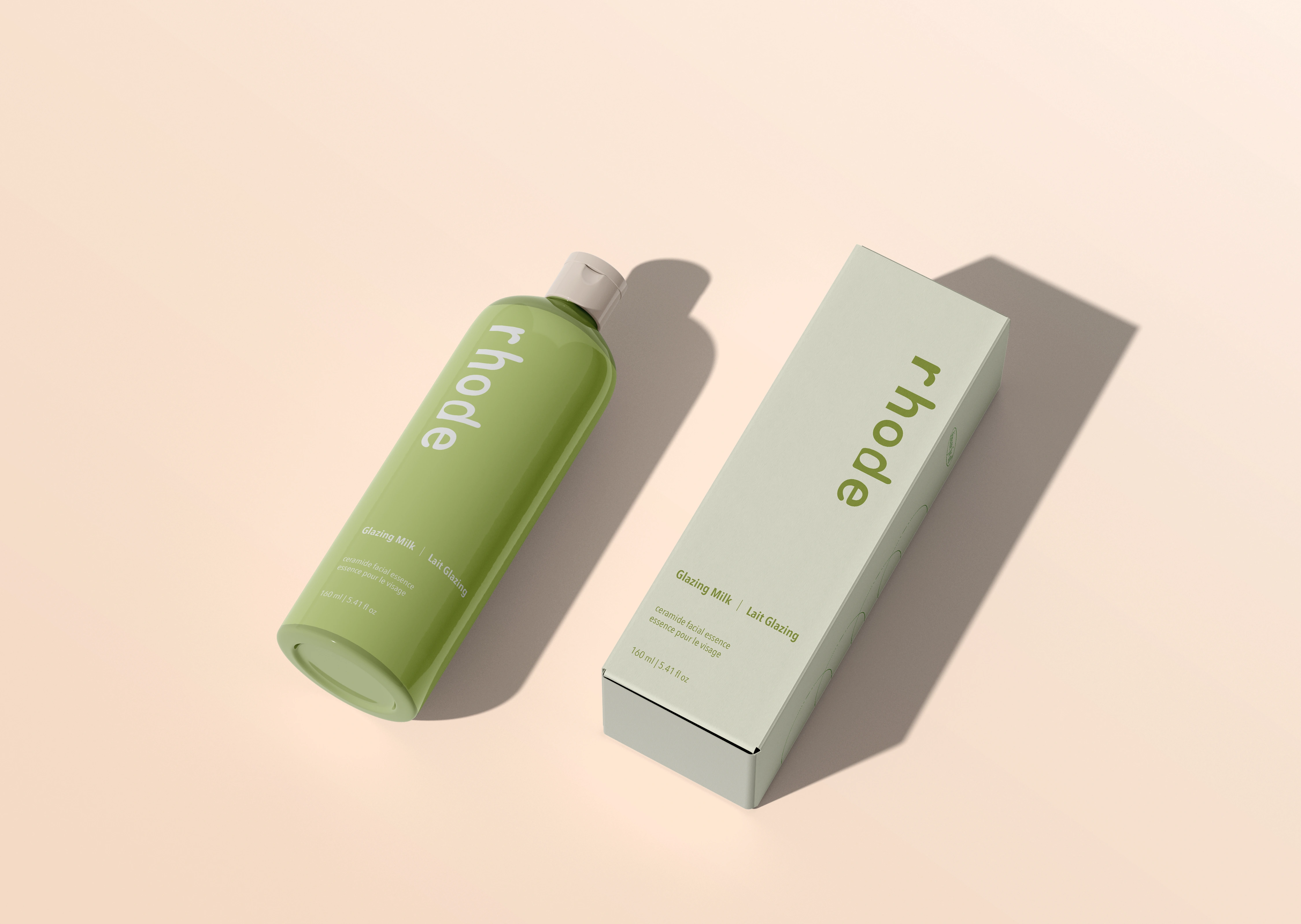
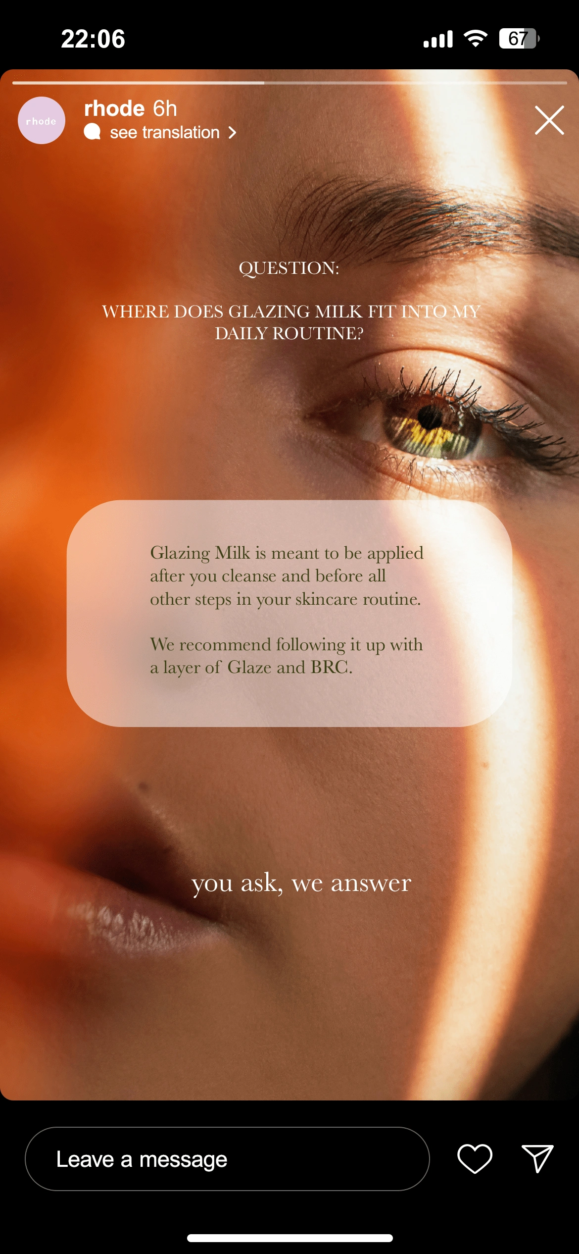
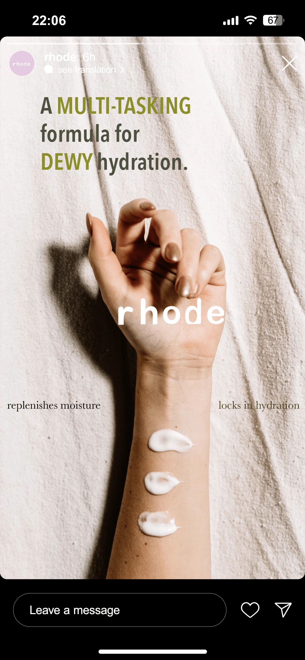
In addition to the packaging and bottle labels, I applied this colorful and minimalist aesthetic to the brand's social media presence. The visual content emphasizes simplicity and clarity, using the new color palette to create cohesive and aesthetically pleasing posts. By incorporating engaging imagery and succinct messaging, the social media strategy not only promotes products but also cultivates a sense of community among followers.
Overall, this redesign aims to modernize Rhode's brand identity while staying true to its minimalist roots. By introducing a more colorful and welcoming palette, I believe the brand can better connect with its audience, enhancing their overall experience and fostering brand loyalty.
Like this project
Posted Nov 14, 2024
The Rhode is a skincare brand that embraces minimalism. In my redesign project, I enhanced its identity with a vibrant and inviting aesthetic.

