CHIKO: branding project for a local cafe
CHIKO is a vibrant cafe aims to create a cozy atmosphere where customers can enjoy great coffee and live music. To enhance this experience, CHIKO regularly hosts performances by local musicians and collaborates with nearby brands for pop-up events.
The owner envisions an energetic and youthful vibe for the cafe. To achieve this, I chose a color palette of red and light yellow, as these colors are known to evoke feelings of energy and positivity. For the brand logo, I used the "Foo" font, which adds a playful and fun touch.
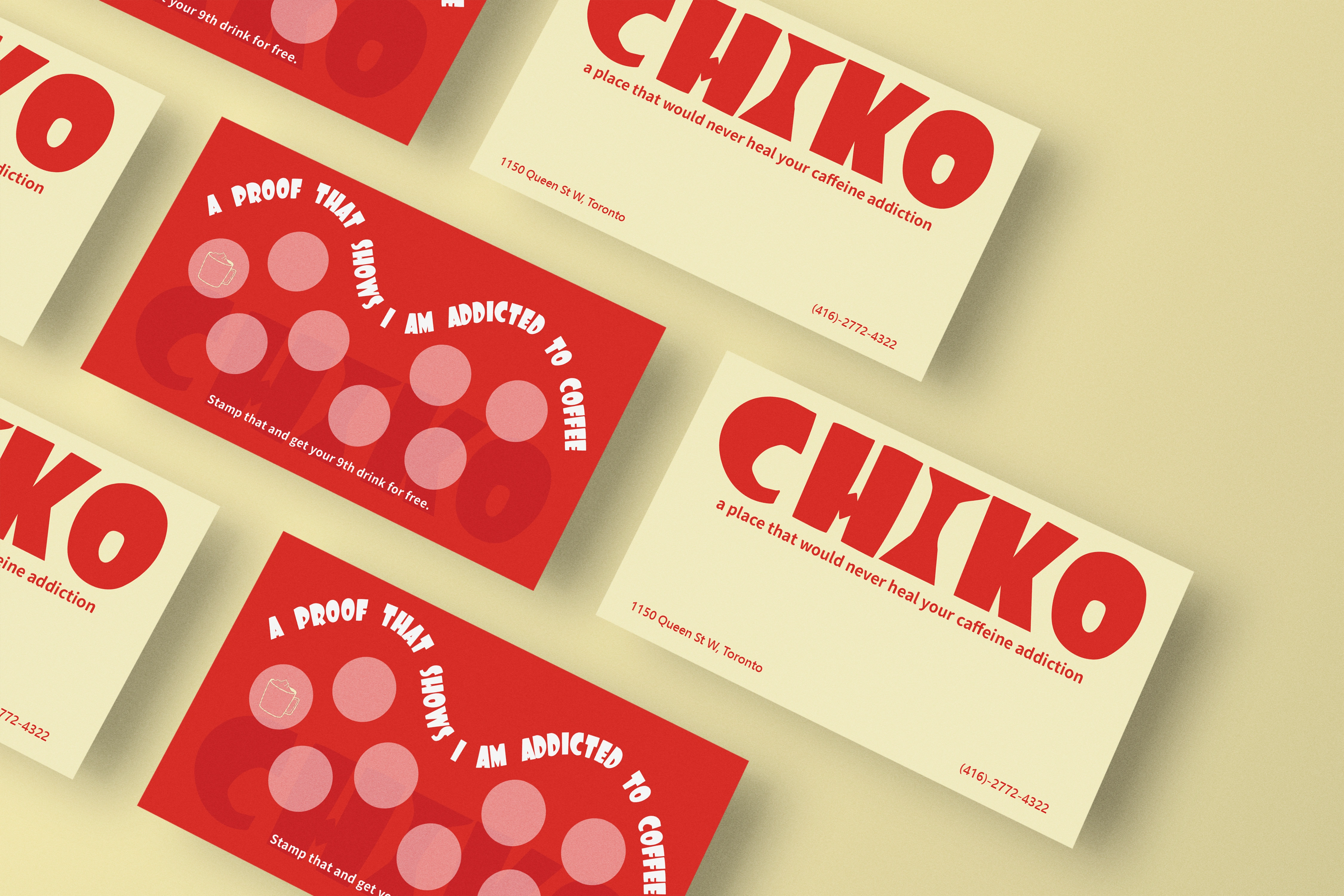
The stamp card of CHIKO.
To maintain this playful theme, I designed the stamp cards with the phrase "a proof that shows I am addicted to caffeine" instead of simply labeling them as "stamp card." This adds a lighthearted touch that reflects the café's lively spirit.
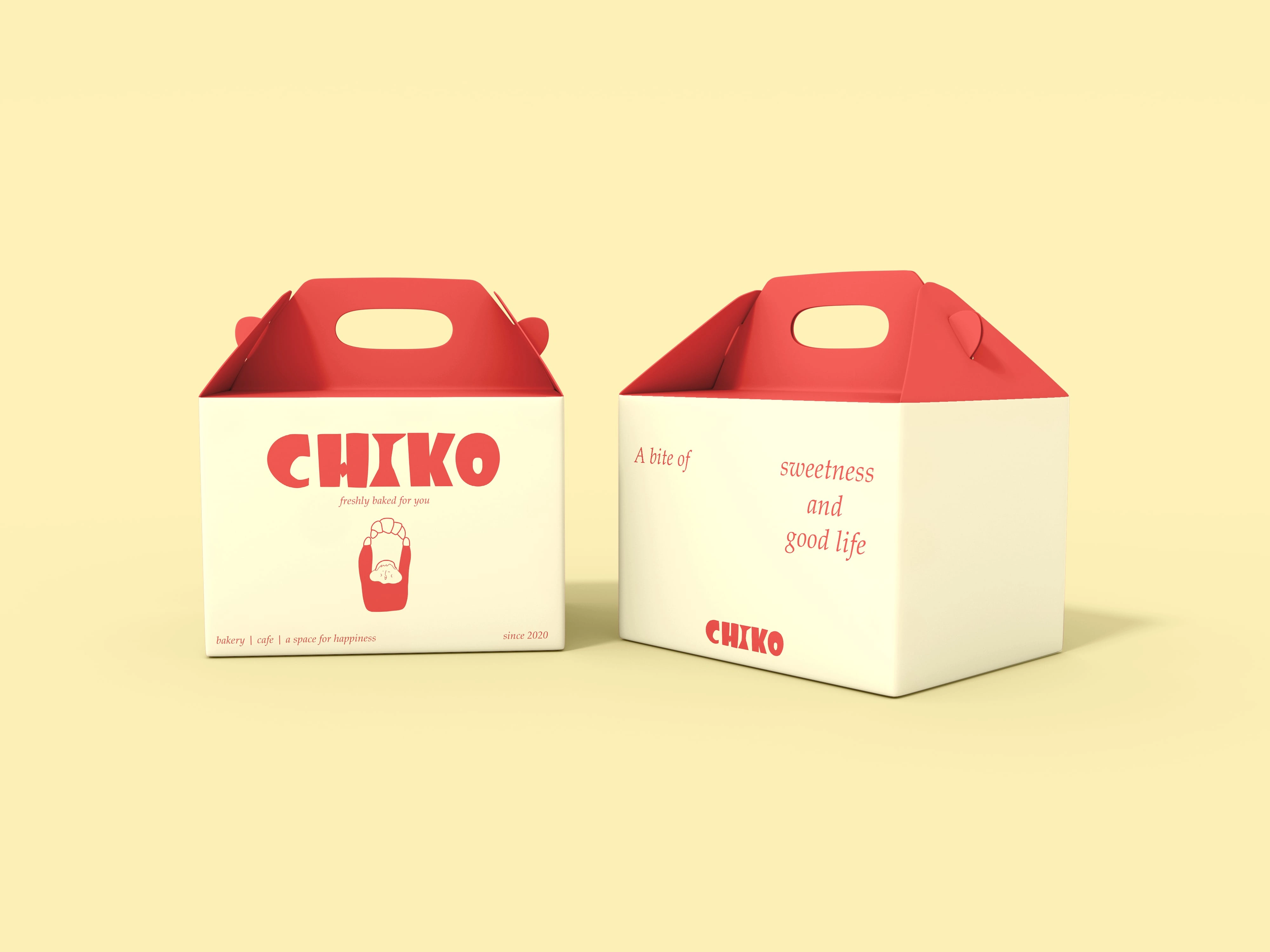
The cake box design of CHIKO.
For the cake box design, I created an illustrated logo featuring a character joyfully holding a croissant, which represents CHIKO's signature product. This design not only enhances brand awareness but also embodies the café's commitment to quality and freshness in its baked goods.
By employing principles of balance and emphasis, the character is positioned centrally, drawing the eye and conveying a sense of delight. The color palette remains the same as the brand color which reinforces the brand's vibrant personality. This cohesive design approach effectively highlights CHIKO's identity and invites customers to experience the joy of freshly baked treats.
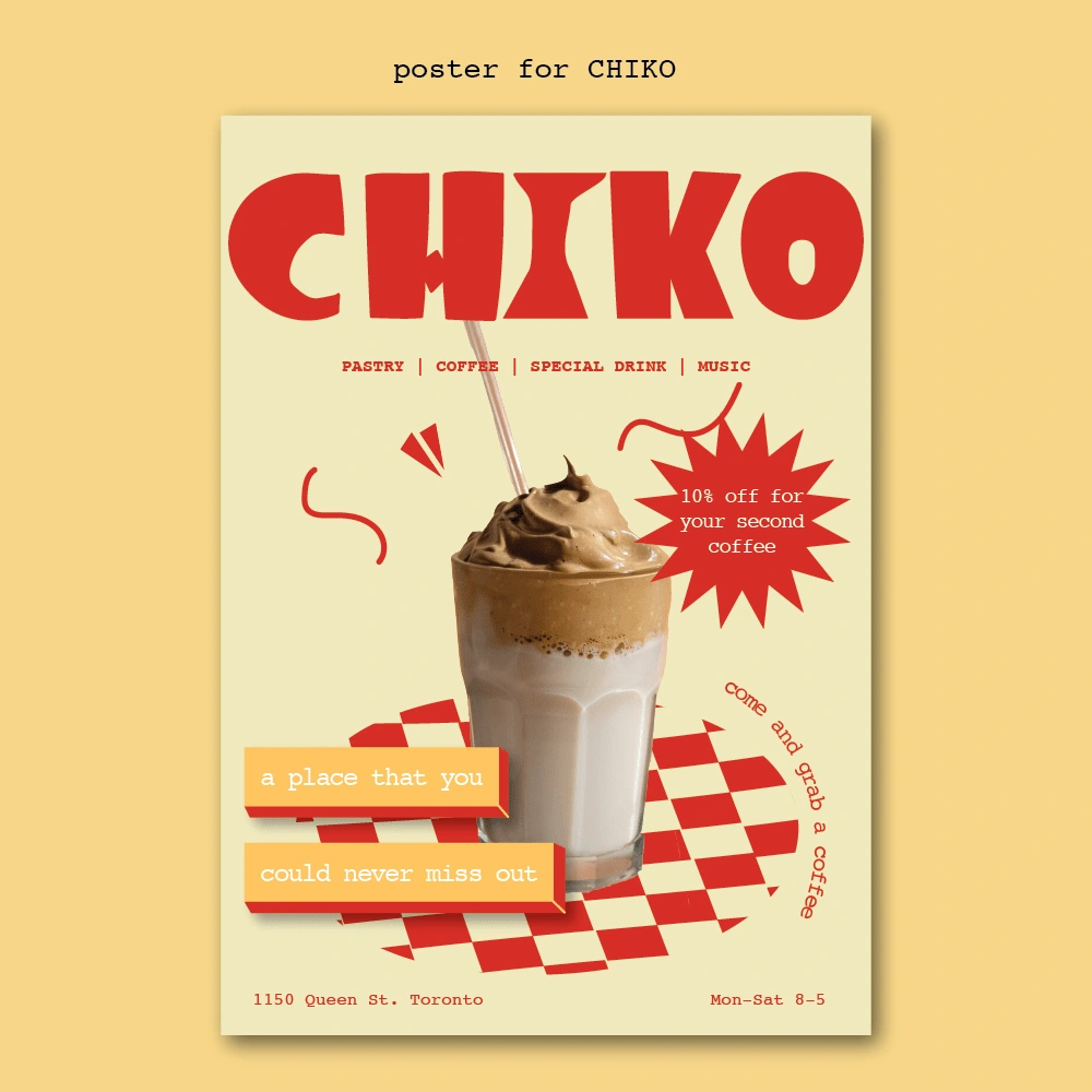
poster of CHIKO
This poster showcases CHIKO's signature drink while conveying that the café is a vibrant hub for music and art. It effectively highlights essential information, including the address and opening hours.
To enhance its appeal, I infused a retro vibe into the design, making it funky and eye-catching. The brand's colors—retro red and light yellow—were intentionally chosen for their harmonious combination, perfectly complementing the retro theme and creating an inviting atmosphere. This design captures the essence of CHIKO, inviting patrons to engage with both the café experience and its artistic community.
Like this project
Posted Nov 14, 2024
Designed the brand and marketing materials for CHIKO, a vibrant new café, enhancing its identity and attracting a dynamic clientele.
Likes
0
Views
16
