4Perscent — The Self-Care Candle Experiment
Joshua Lipka
My Creative Insight
Every design decision came back to one core belief, that self-care doesn’t need to be grand to be transformative. The 4Perscent identity visualizes what happens when you give just 4% of your day back to yourself: you create balance, clarity, and a spark of light that lasts.
Client Type: Wellness & Lifestyle Brand
Services Provided: Brand Identity, Packaging Design, Product Naming, and Visual Storytelling
Overview
4Perscent is a candle brand created around the belief that dedicating just 4% of each day to self-care can profoundly improve balance and well-being. The brand’s mission is simple yet powerful: consistency in small daily rituals leads to long-term harmony.
I was brought in to design a visual brand identity and packaging system that would reflect this philosophy: modern, meaningful, and emotionally grounding. Each candle carries a story, color, and scent designed to inspire reflection and connection, while the brand as a whole expresses calm focus through thoughtful geometry and tactile materials.
Challenges
Create packaging that conveys both mindfulness and modernity without feeling overly spiritual or clinical.
Develop a label system that reflects the 4% philosophy and encourages emotional engagement.
Ensure packaging remained sustainable, reusable, and visually cohesive with the brand’s mission of balance and renewal.
Goals
Translate the idea of “4% self-care” into a symbolic, minimalist visual language.
Design transparent labels that allow the candle’s natural glow to become part of the brand experience.
Establish a modular label and box system that can evolve with future collections and scents.
The Solution
Visual Identity System
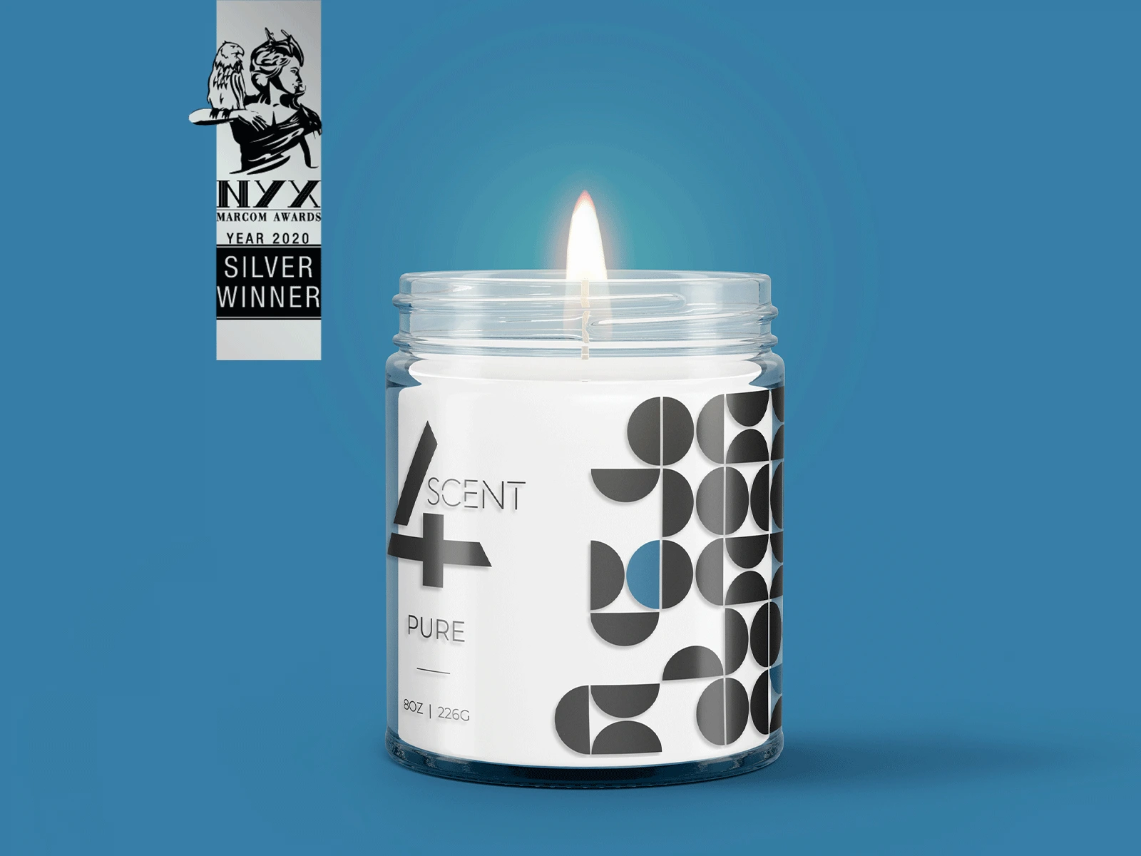
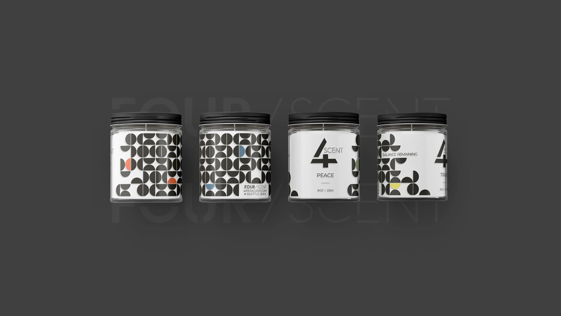
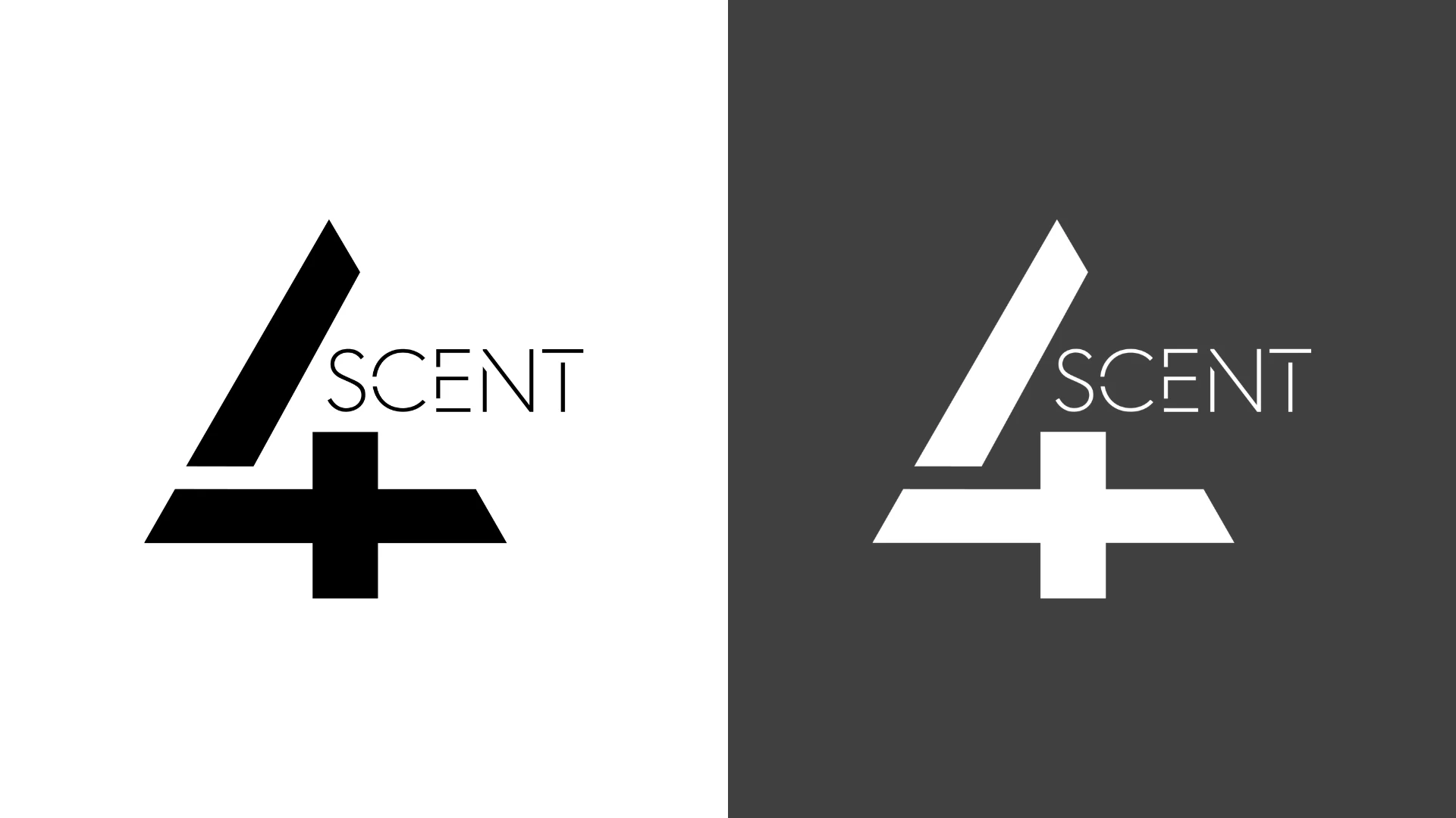
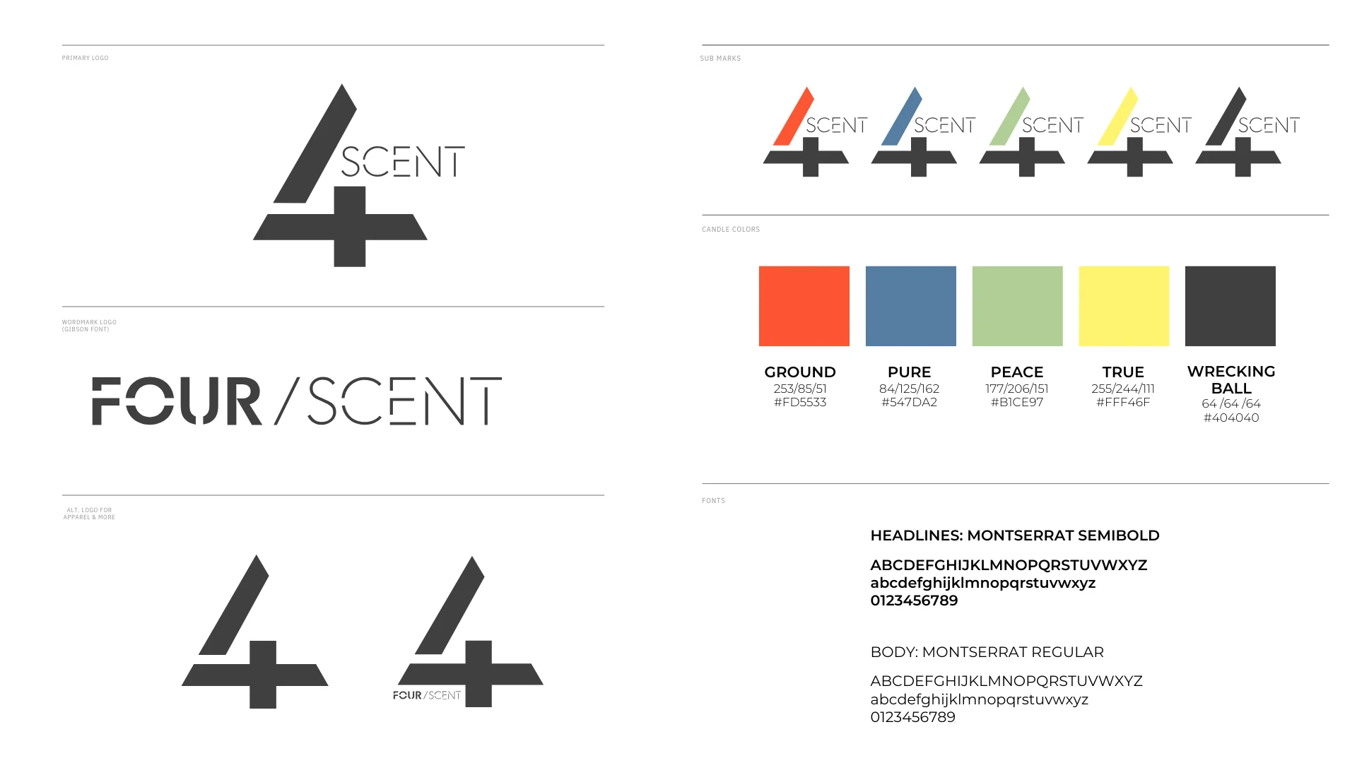
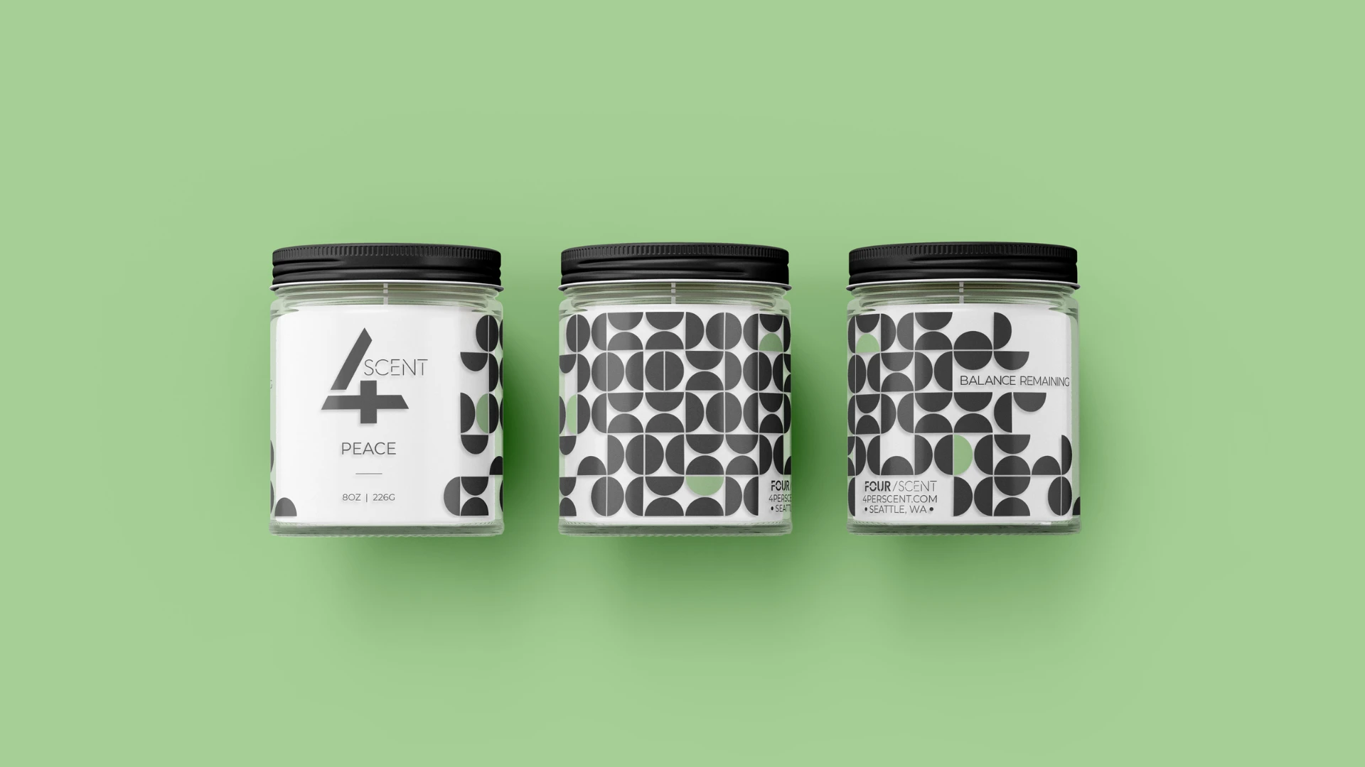
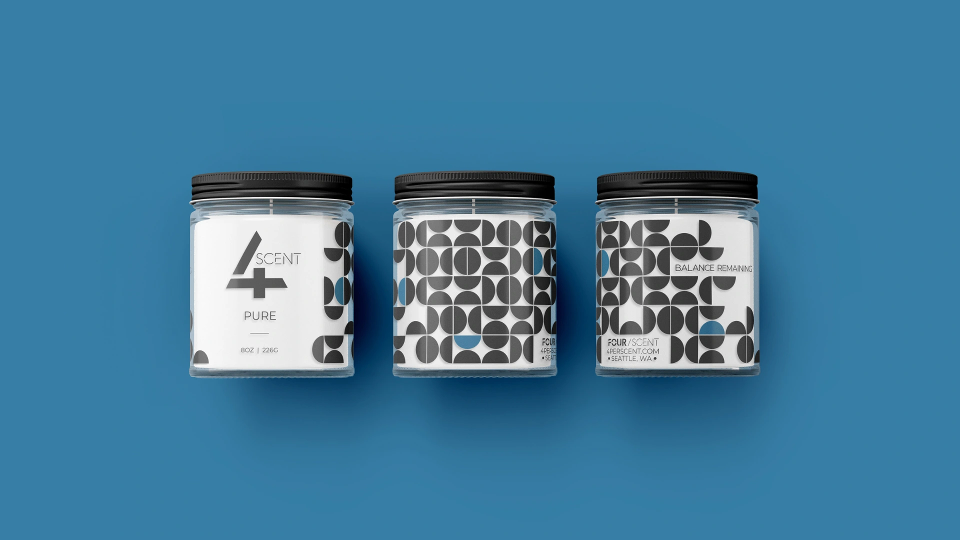
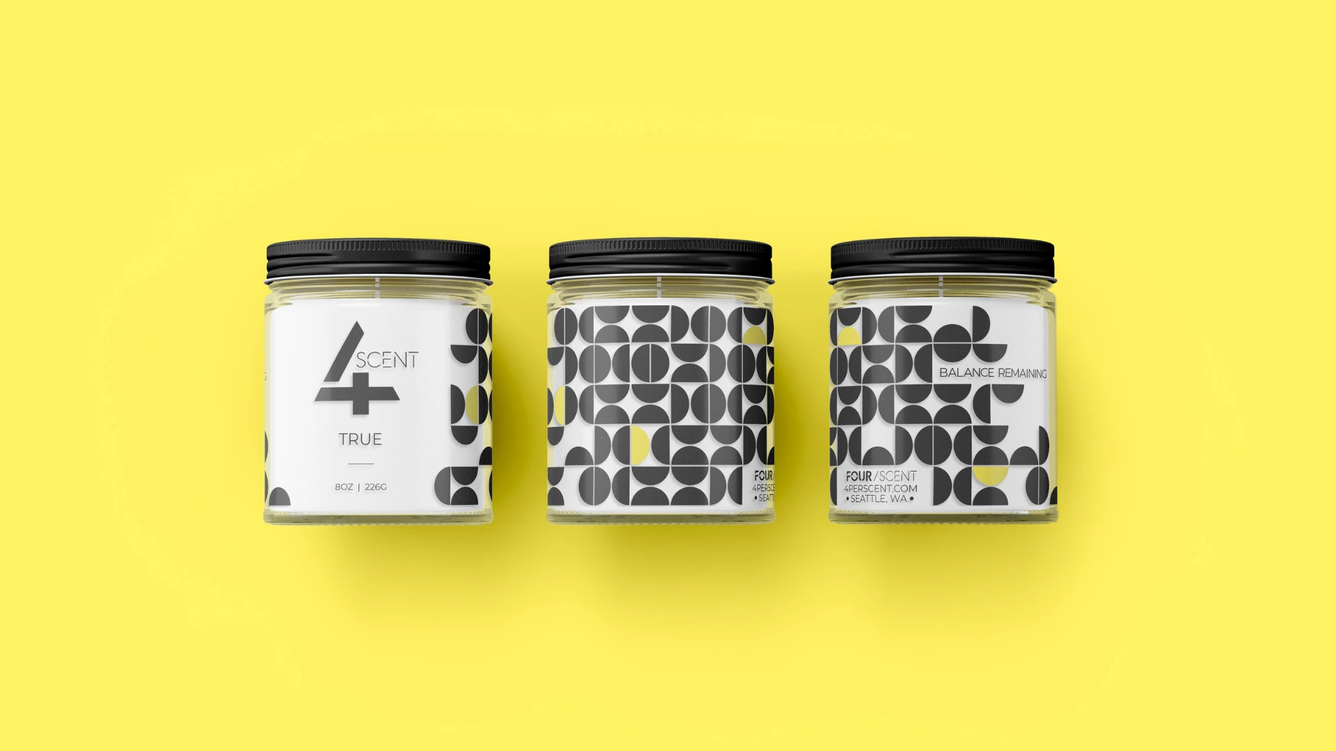
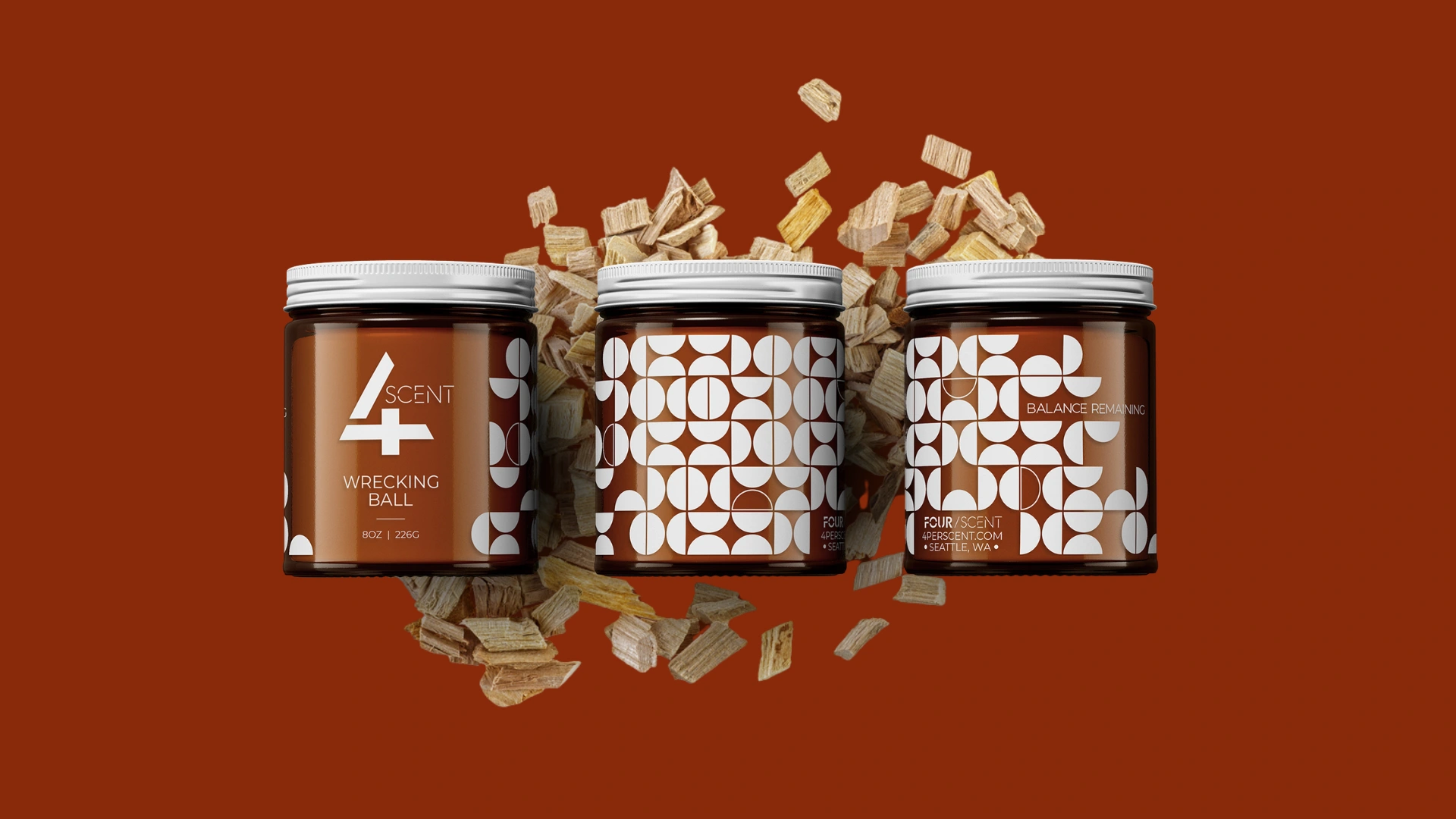
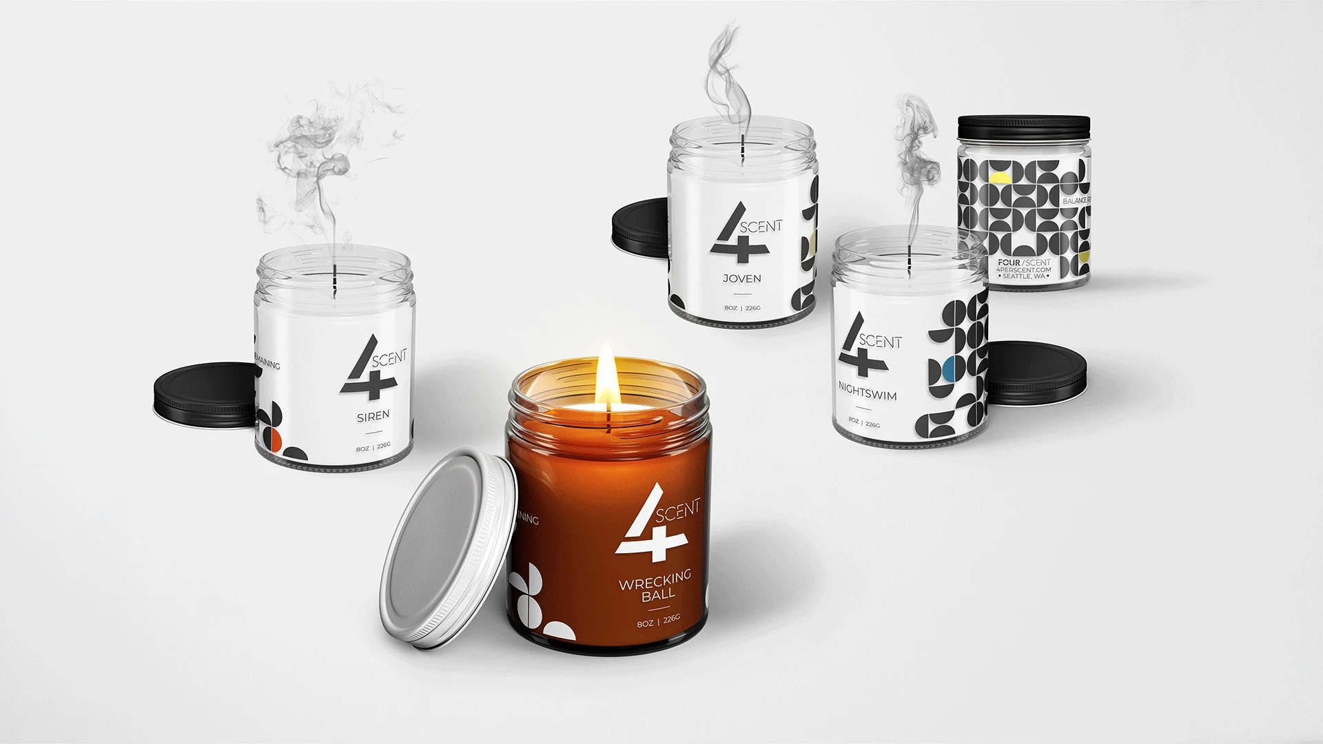
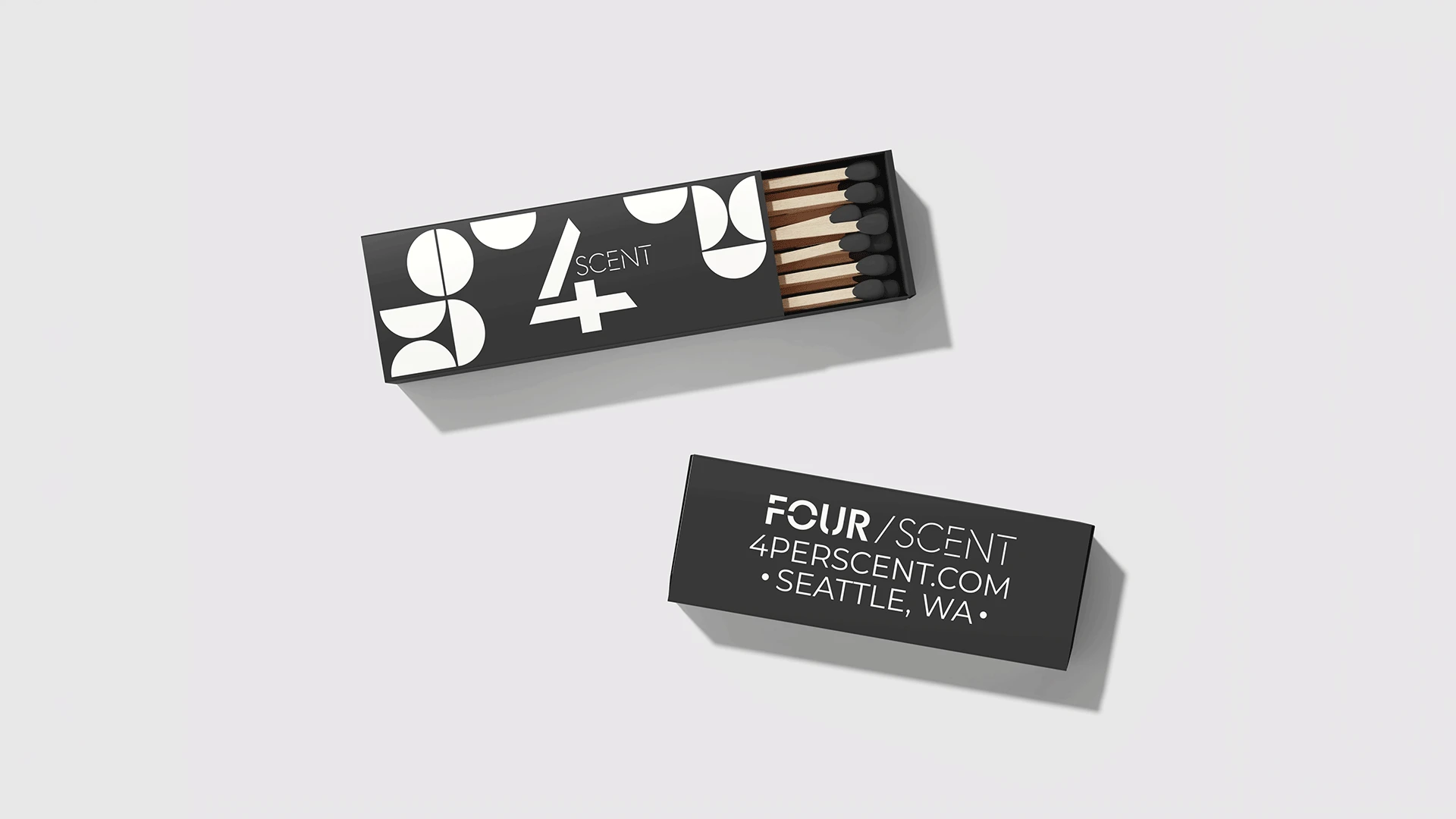
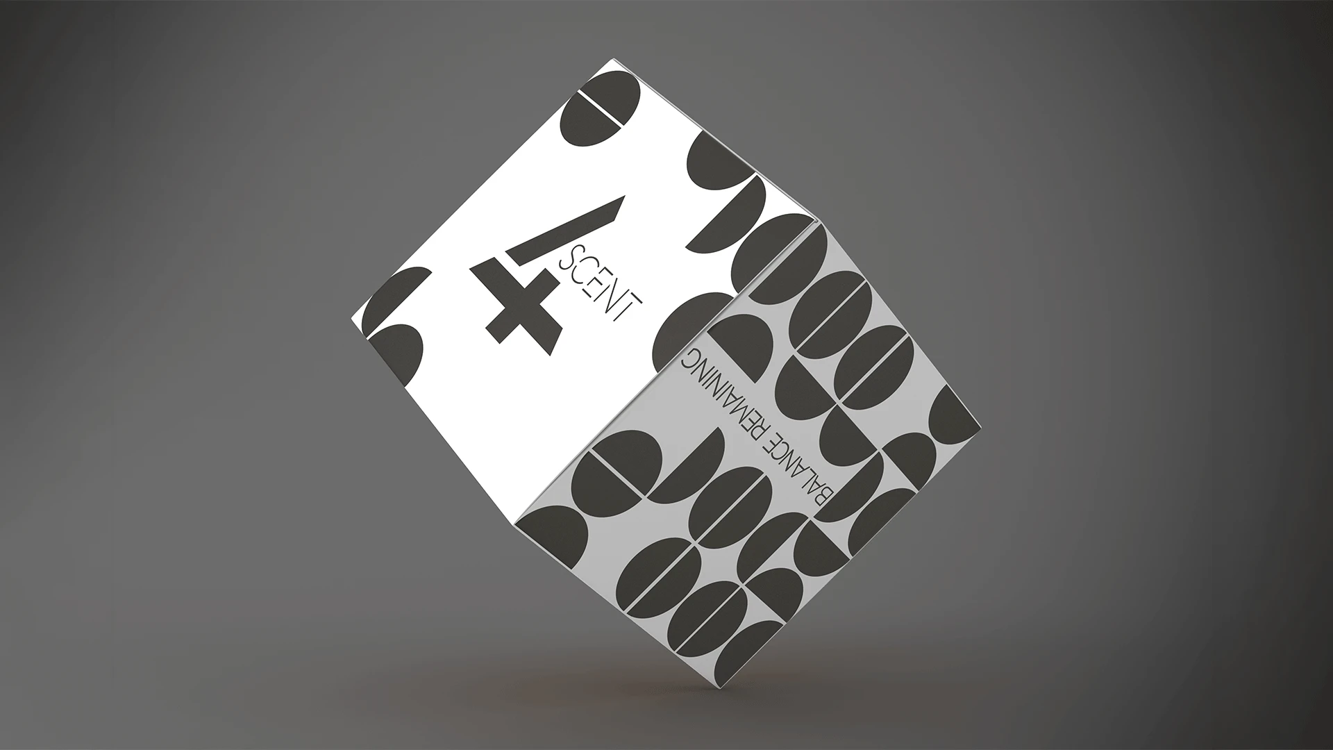
The logo combines a bold numeral 4 and a forward slash (/) that doubles as the word “per,” forming a visual representation of Four Percent. The mark feels mathematical yet human, a nod to the delicate balance between structure and emotion in self-care.
Packaging Design
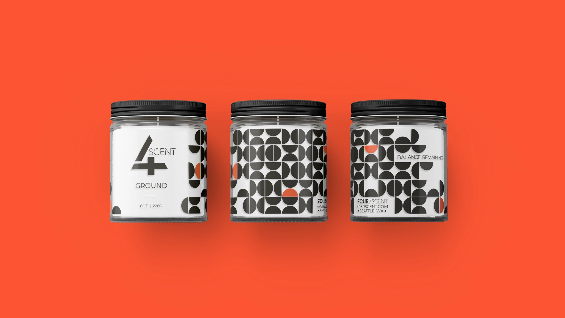
The candles use transparent, textured labels printed with a geometric pattern of 100 half-circles, four of which are distinct. This subtle symbolism mirrors the 4% principle: a small, intentional portion of time set aside for oneself can make a complete difference.
Color & Material Story
Each candle has its own unique color palette, name, and personality. Warm amber glass jars evoke grounding and introspection, while the clear labels let light filter through for an inviting glow. Once the candle is finished, the jar becomes a reusable keepsake.
Shipping & Unboxing Experience
Brown Kraft packaging reinforces the brand’s natural tone, featuring modern iconography for Self-Care, Harmony, and Balance. Typography and layout were intentionally minimal to keep focus on texture and tactile interaction.
Results
A visually unified brand that seamlessly connects meaning, form, and function.
A distinct packaging identity that stands out in the self-care market and resonates emotionally with customers.
A reusable, eco-conscious product design aligned with the brand’s long-term sustainability goals.
Design Elements Delivered
Logo & Brand Identity System
Candle Label Design & Texture Finishes
Box & Shipping Design
Color Palette & Typography System
Symbol System for Brand Values
Production-Ready Files for Print
Timeline
8 Weeks Total
Week 1: Brand Discovery & Concept Development
Weeks 2 – 4: Visual Identity Design
Weeks 5 – 6: Packaging Design & Prototyping
Week 7: Box Design & Production Prep
Week 8: Final Review & Delivery
Like this project
Posted Oct 2, 2025
I was brought in to design a visual brand identity and packaging system that would reflect this philosophy — modern, meaningful, and emotionally grounding.
Likes
0
Views
5
Timeline
Dec 18, 2020 - Mar 18, 2021